Thompson Liquid Dietary Supplement
premium athletic supplements
Thompson Liquid Dietary Supplement is a premium brand, meticulously crafted by MARKAWORKS, a leading branding agency in London and Dubai. Our brand design agency specializes in creating complete web design and development. Thompson Liquid Dietary Supplement’s brand strategy encompasses proteins and amino acids, designed to cater to athletes seeking optimal performance and superior health benefits.

Crafting the Thompson Brand Identity
Our objective for Thompson was to translate their product’s integrity – an organically grown California hemp oil – into a visual identity that resonated with their core values. The design strategy aimed to convey strength, professionalism, and a comprehensive approach through a timeless aesthetic.
The Client: Thompson & Their Vision
Thompson is a Canadian brand specializing in liquid dietary supplements, specifically a full-spectrum hemp oil derived from organically grown California hemp. Our partnership focused on establishing a brand identity that truly reflected their product’s quality and integrity. Key to this endeavor were the guiding principles: creating a brand that felt Strong, Professional, Comprehensive, and Timeless, ensuring it stood out in a competitive wellness market.
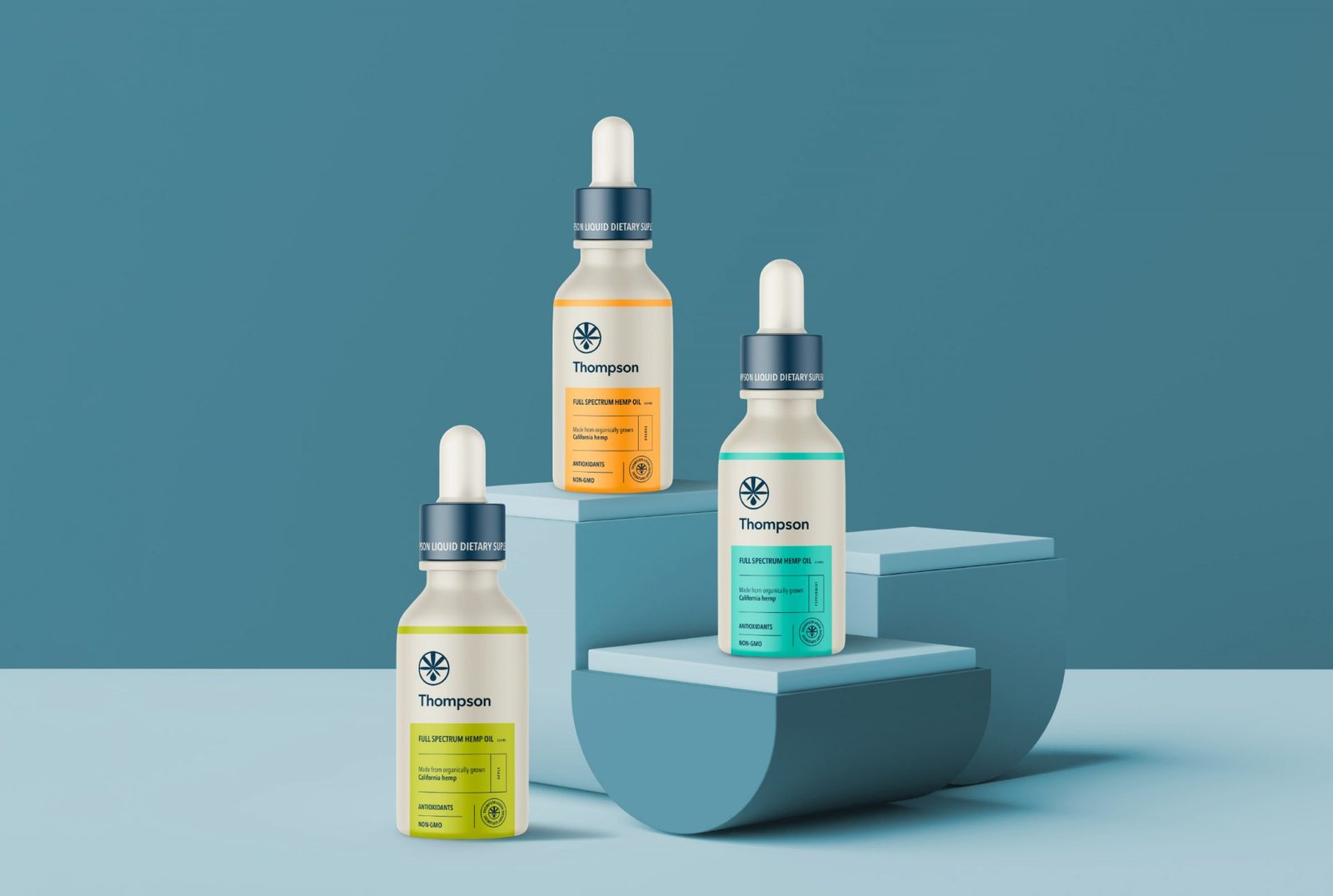
Iconic Branding & Visual Identity
To embody Thompson’s core values, we developed a distinctive branding solution. The logo features a classic, refined font that conveys professionalism and timelessness. Complementing this, a custom-designed hemp illustrated emblem was integrated, subtly communicating the product’s natural origins while adding a touch of sophistication. This combination ensures immediate recognition and an intuitive understanding for viewers.
Strategic Color Palette & Flavor System
A crucial aspect of the packaging design was the implementation of a clear and appealing color system. We established four distinct main colors, each directly correlating to a specific flavor profile: vibrant orange for the orange flavor, fresh green for apple, cool mint for peppermint, and rich violet for blueberry. These were harmoniously balanced with two additional colors chosen for the packaging background and typography, creating a cohesive and attractive visual experience across the entire product line.
Professional Packaging & Information Hierarchy
The overall label layout was meticulously crafted to exude professionalism and clarity. The brand logo and the custom hemp emblem were strategically placed at the top of the label, commanding immediate attention. All essential product information was prominently positioned at the front of the packaging, organized and separated by specific lines and colors that reinforced the flavor system. This thoughtful design, combined with a matte transparent bottle, results in a sleek, informative, and visually appealing product that resonates with consumers.


Let’s make the work they’ll copy.
Talk to an expert now


