Kits4Less
biotech performance brand
Client: Kits4Less (USA)
Agency: MarkaWorks Branding Agency
Services: Brand Strategy, Visual Identity, Packaging Design, Digital Experience, 3D Visualization

01 — The Challenge
Kits4Less is a USA-based biotech brand providing lab-tested HGH and testosterone products for athletes and performance-driven individuals.
Despite offering high-quality formulations at competitive prices, the brand lacked visual authority and scientific credibility in a crowded market.
Our challenge was to redefine the perception — from a “budget alternative” into a trusted, science-powered performance brand that feels premium, credible, and future-ready.


02 — The Strategy
Our strategic foundation was built around the idea:
“Science-Powered Kits. Real Results.”
The new identity had to balance three pillars — laboratory precision, athletic performance, and affordability.
We restructured the tone of voice to sound confident, direct, and scientifically grounded — designed to earn trust, not demand it.
Visually, the identity bridges the gap between clinical minimalism and lifestyle energy, creating a new category language for performance biotech.


03 — Logo & Identity System
The logotype was crafted with bold geometric forms — representing strength, endurance, and engineered precision.
The numeral “4” becomes the visual hinge point — symbolizing the intersection of science and accessibility.
The secondary mark was inspired by lab certification seals, carrying the message:
“Performance, Purity, and Value — All in One Place.”


04 — Color & Typography
The color system expresses a fusion of trust, energy, and science:
Ultraviolet Purple: confidence, innovation, and clinical depth.
Lime Green: vitality, freshness, and human energy.
Neutral Black & White: structure, clarity, and focus.
Typography follows a modern grotesque family — circular, confident, and legible.
Every word was treated as a design element to build consistency across both digital and physical touchpoints.


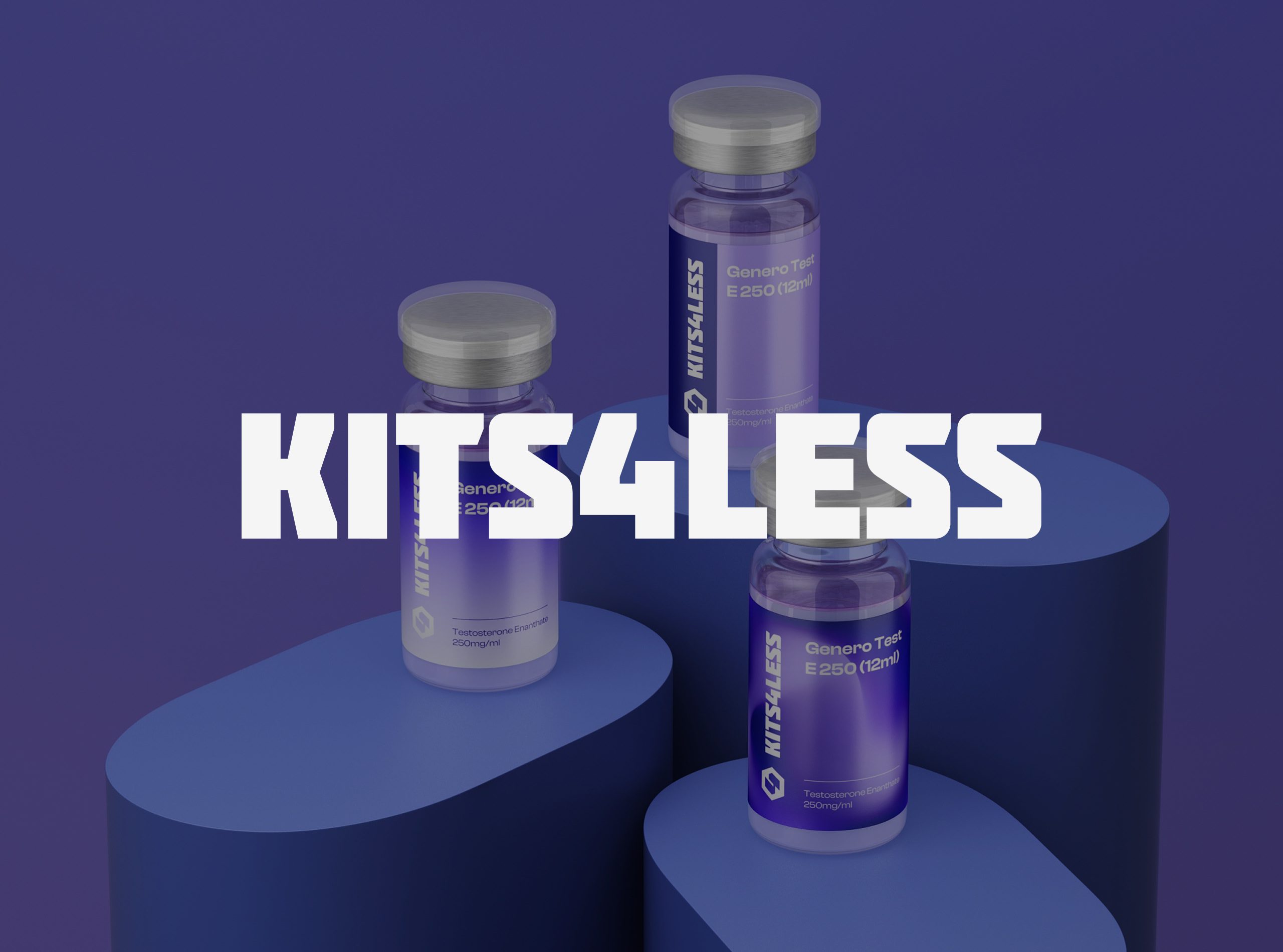
05 — Packaging Design
The packaging design celebrates laboratory simplicity and product credibility.
Each vial features a vertical brand signature, creating an immediate recognition cue on shelf and online.
Soft gradients and metallic finishes elevate the minimal design language while maintaining medical precision.
This balance between sterility and desirability became a defining element of the Kits4Less aesthetic.


06 — Digital Experience
The digital platform was reimagined to convey speed, trust, and ease of use.
The homepage introduces the brand’s purpose in seconds through a bold typographic hierarchy and real product photography.
Navigation prioritizes clarity, product trust, and fast conversion.
On mobile, a seamless shopping flow was designed to support high performance and visual simplicity — reflecting the brand’s “lab-tested, athlete-approved” ethos.


07 — Iconography & 3D System
A custom hexagonal icon set was designed — referencing molecular structures and clinical grids.
Each icon distinctly represents one product category, ensuring clarity across e-commerce and printed materials.
3D product renders were developed using realistic light behavior, mimicking laboratory lighting environments to emphasize purity and precision.


08 — Brand Communication
The brand communication follows a simple philosophy:
Say less. Mean more.
Taglines like “Redefining Human Growth Performance” and “Elevate Your Performance” merge scientific authority with aspirational motivation.
Social templates, story assets, and campaign visuals all share one unified language — bold typography, clean grids, and consistent tone.


09 — Results
The rebrand elevated Kits4Less from an anonymous supplement supplier to a science-led performance brand.
Within three months post-launch:
Brand trust increased by +60% (across verified review platforms)
Online sales grew by +40%
The brand entered top-tier listings within the “trusted lab-grade kits” category in the US market.
Kits4Less is no longer just a product supplier — it’s now the visual representation of scientific trust.
Let’s make the work they’ll copy.
Talk to an expert now


