Bloomy Wellness
joyful family wellness essentials
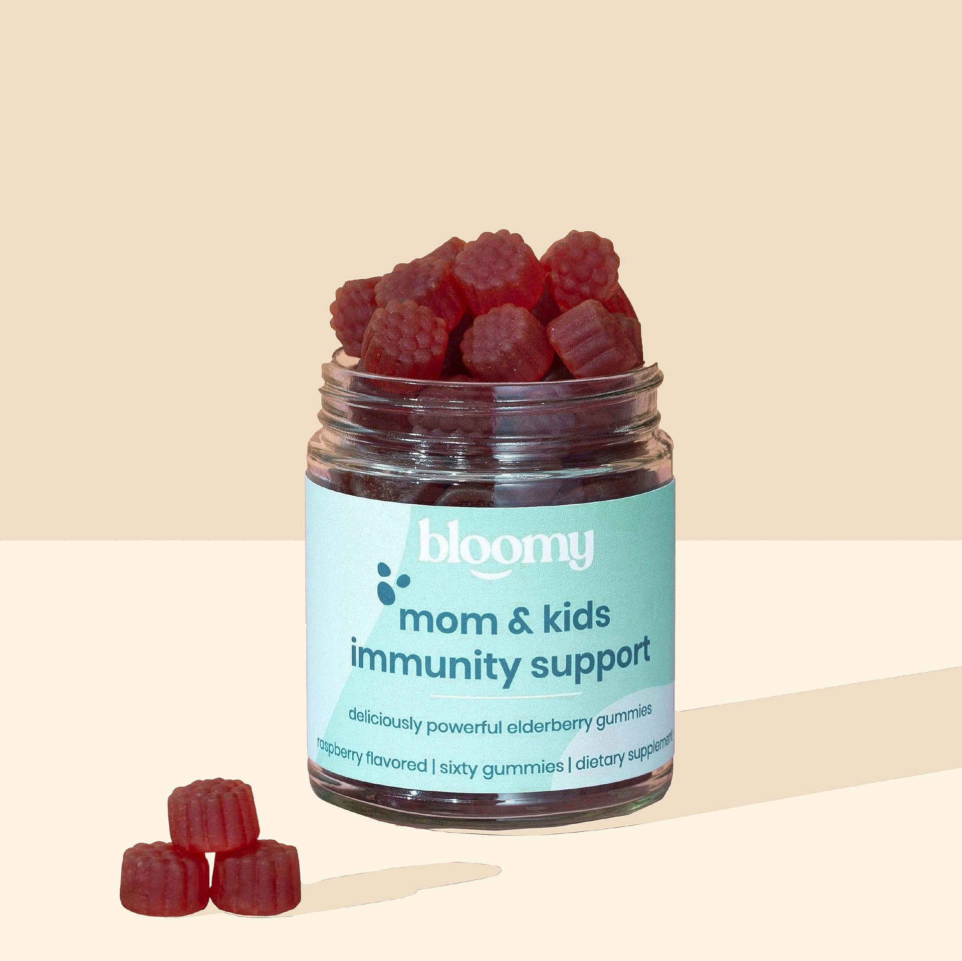
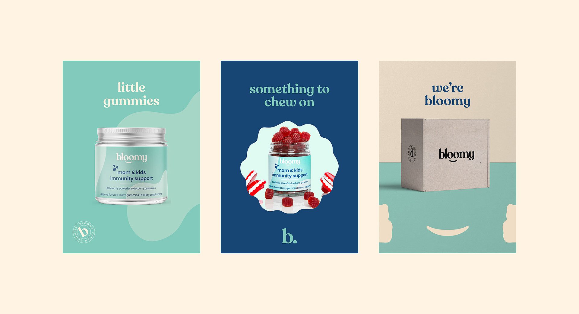
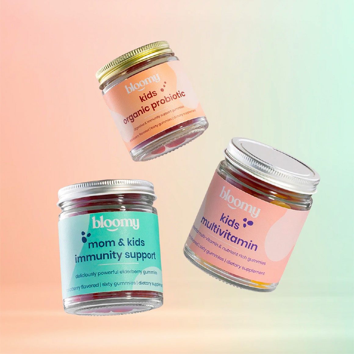
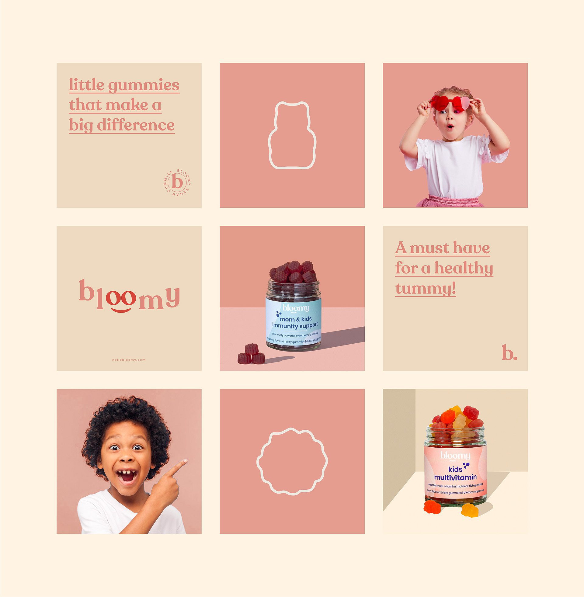
Bloomy Wellness, brought to life by MARKAWORKS, is a delightful brand designed to bring joy and care to mothers and children. Its sympathetic and cute identity, featuring playful “o” emblems, is complemented by vibrant, pastel packaging that clearly highlights each product, making wellness accessible and fun for the whole family.

Designing for Target Audiences: Mothers and Children
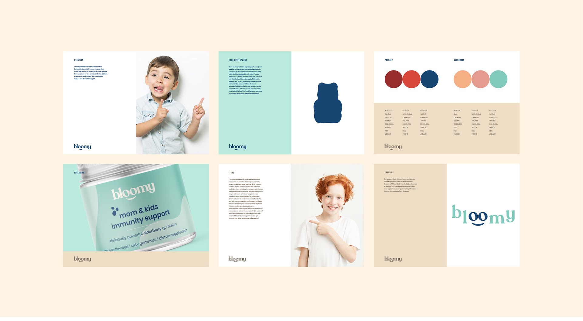
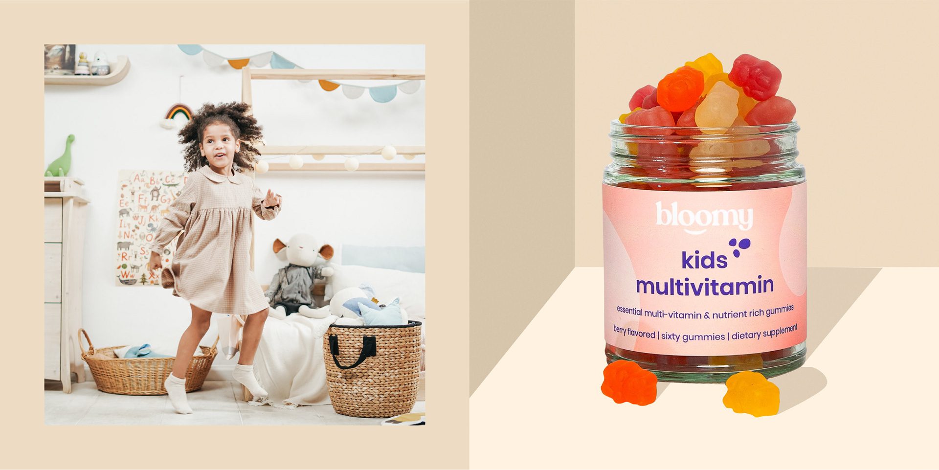
Our objective for Bloomy was to create a memorable brand identity that resonates with mothers and children. This involved designing a logo with an integrated emblem and developing distinct packaging for three different products, each differentiated by its color palette and clear product naming.
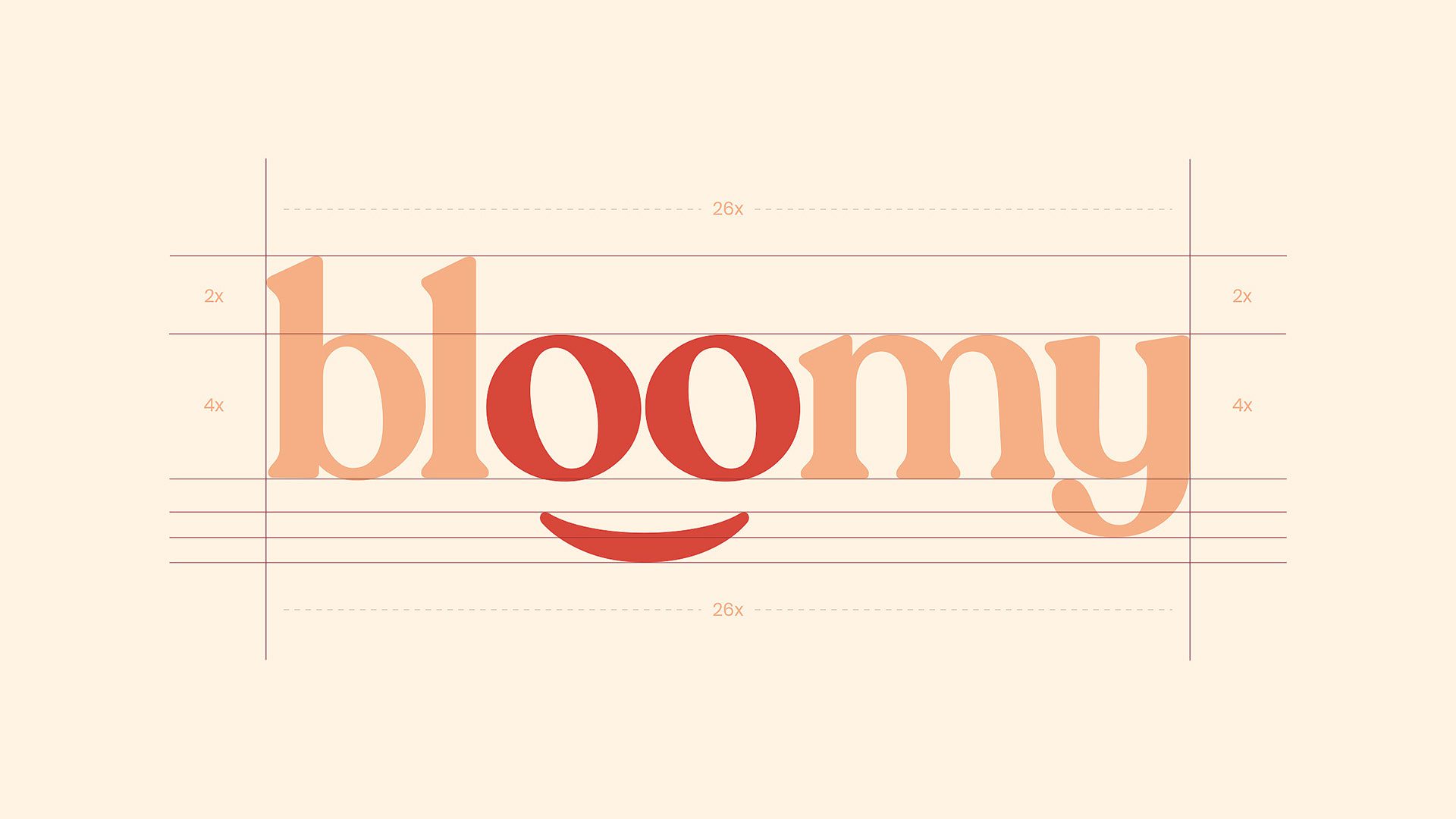
The Bloomy Brand Identity: Sympathetic and Cute
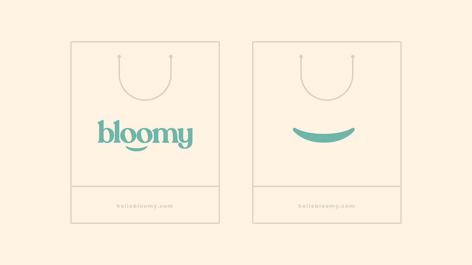
While creating the Bloomy brand identity, we aimed for the logo to look sympathetic and cute, and we achieved this through the letters “o”. We integrated the emblem with the logo and created a brand identity that could appeal to its target audience.

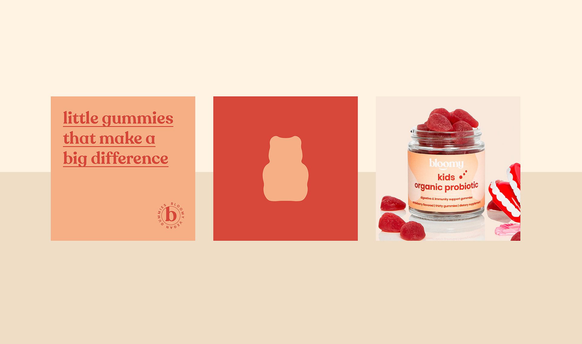
Packaging Design: Energetic Atmosphere and Clear Product Names
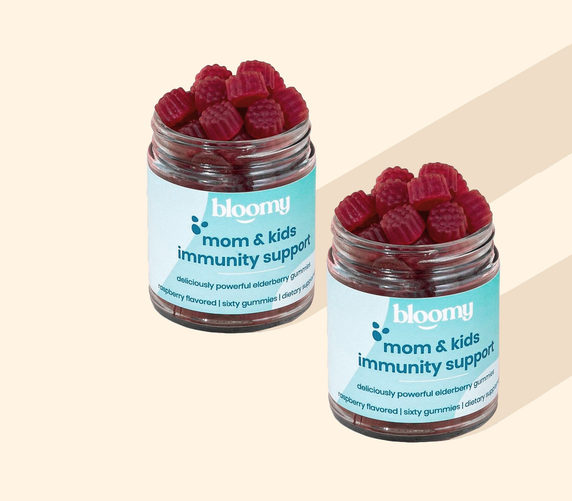
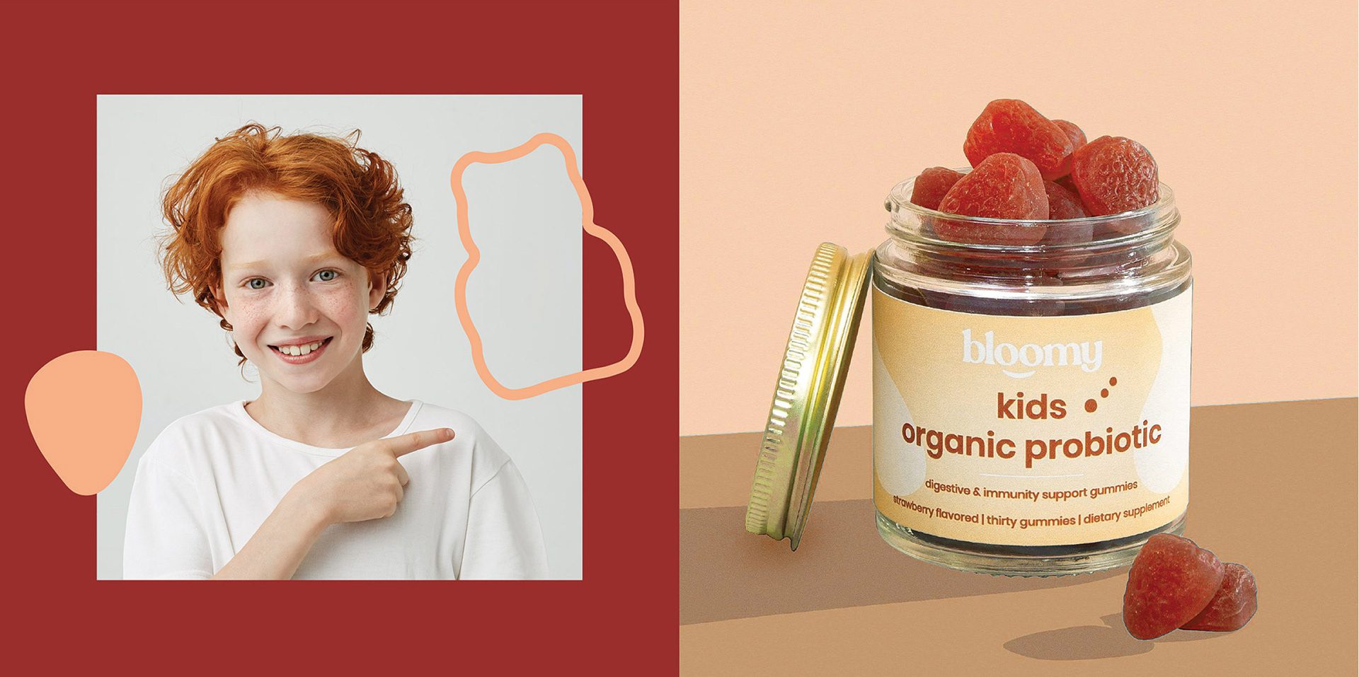
We also achieved an energetic atmosphere with the pastel tones we created for the packaging. In addition, we brought the product names to the fore as much as possible and ensured that they were at least as prominent as the brand.
Client & Objective Recap
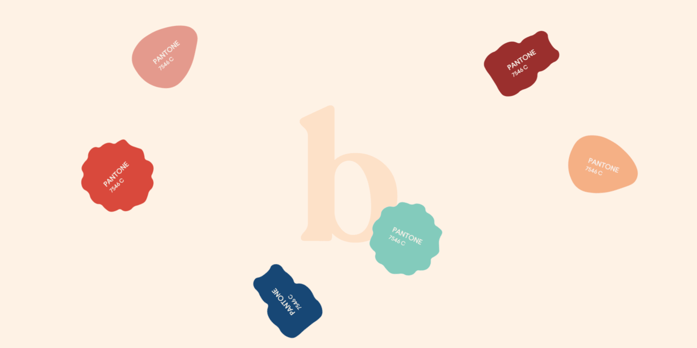
For Bloomy, we aimed to place an emblem inside the logo. We also aimed to design three different packages for three different products. We differentiated these products from each other with the color palettes we created. We have designed the product names on the packaging of each product in such a way that they do not get in the way of the brand identity, and at the same time, we have created them so that they can be seen clearly.


Let’s make the work they’ll copy.
Talk to an expert now


