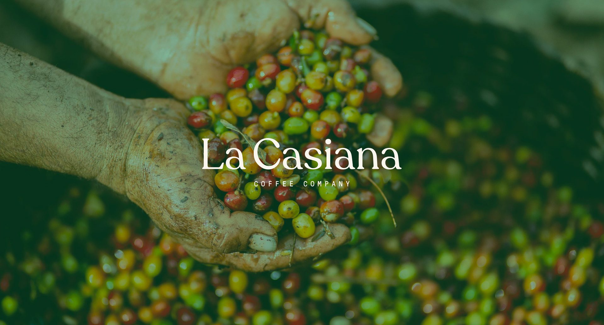
La Casiana Coffee
global beans, vibrant journeys
La Casiana Coffee is a vibrant destination offering meticulously sourced global coffee beans. MARKAWORKS crafted a bold brand identity that celebrates the unique origins and diverse processes of each brew, creating an unforgettable sensory journey for every customer.

A Bold Approach to Coffee Branding
We developed a comprehensive branding strategy for La Casiana Coffee, focusing on creating a visual identity that reflects the unique offerings and vibrant atmosphere of the coffee shop. Our approach combined classic typography with modern design elements and a rich color palette to create an unforgettable brand experience.
The Client: La Casiana Coffee
La Casiana is a coffee shop that offers its customers coffee from different parts of the world and different processes.
The Keywords: Vibrant / Meaningful / Bold / Eye-catchy
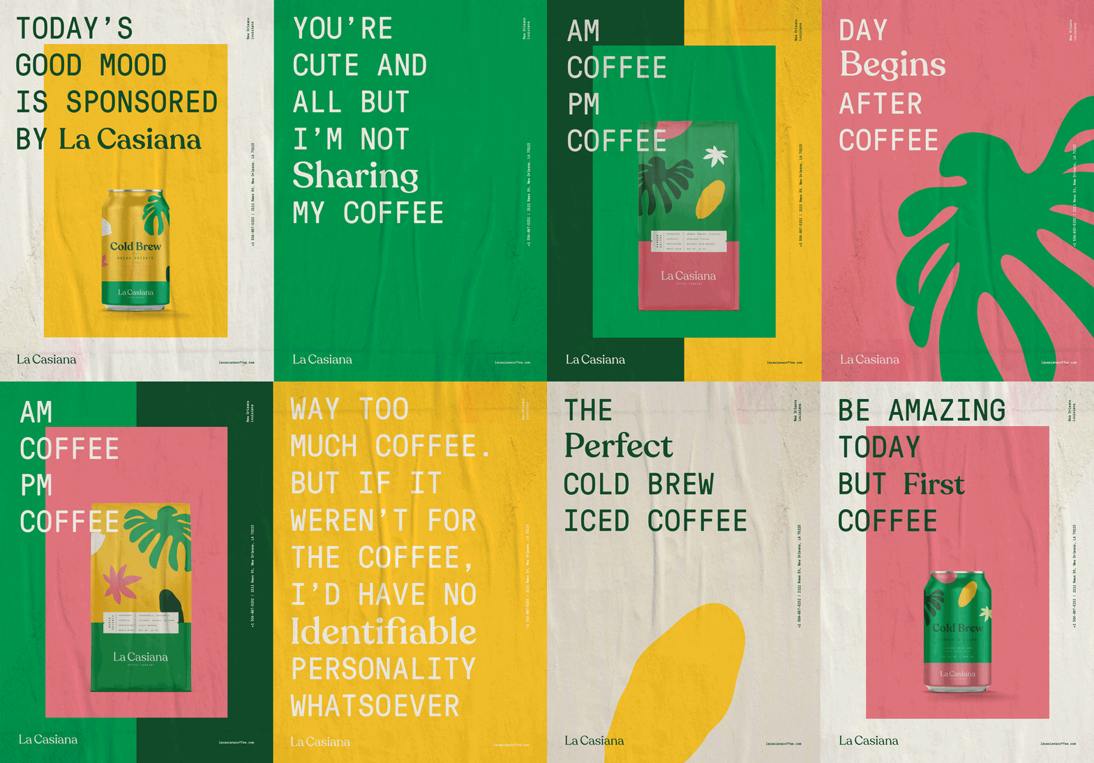
These keywords guided our design process, ensuring that every element of the brand identity communicated energy, purpose, and a strong visual presence.
The Solution: Logo and Typography
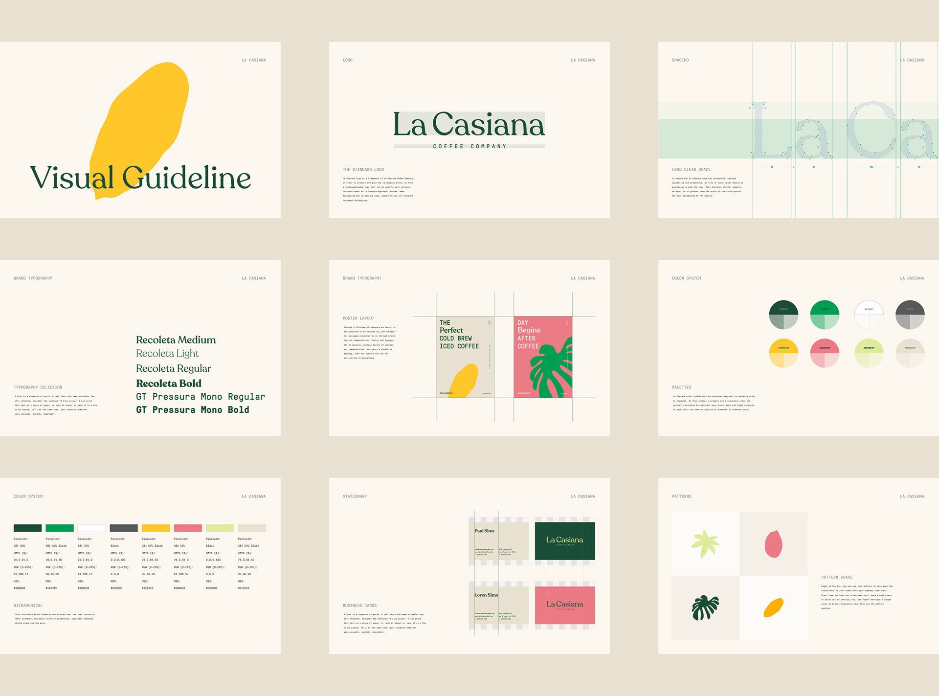
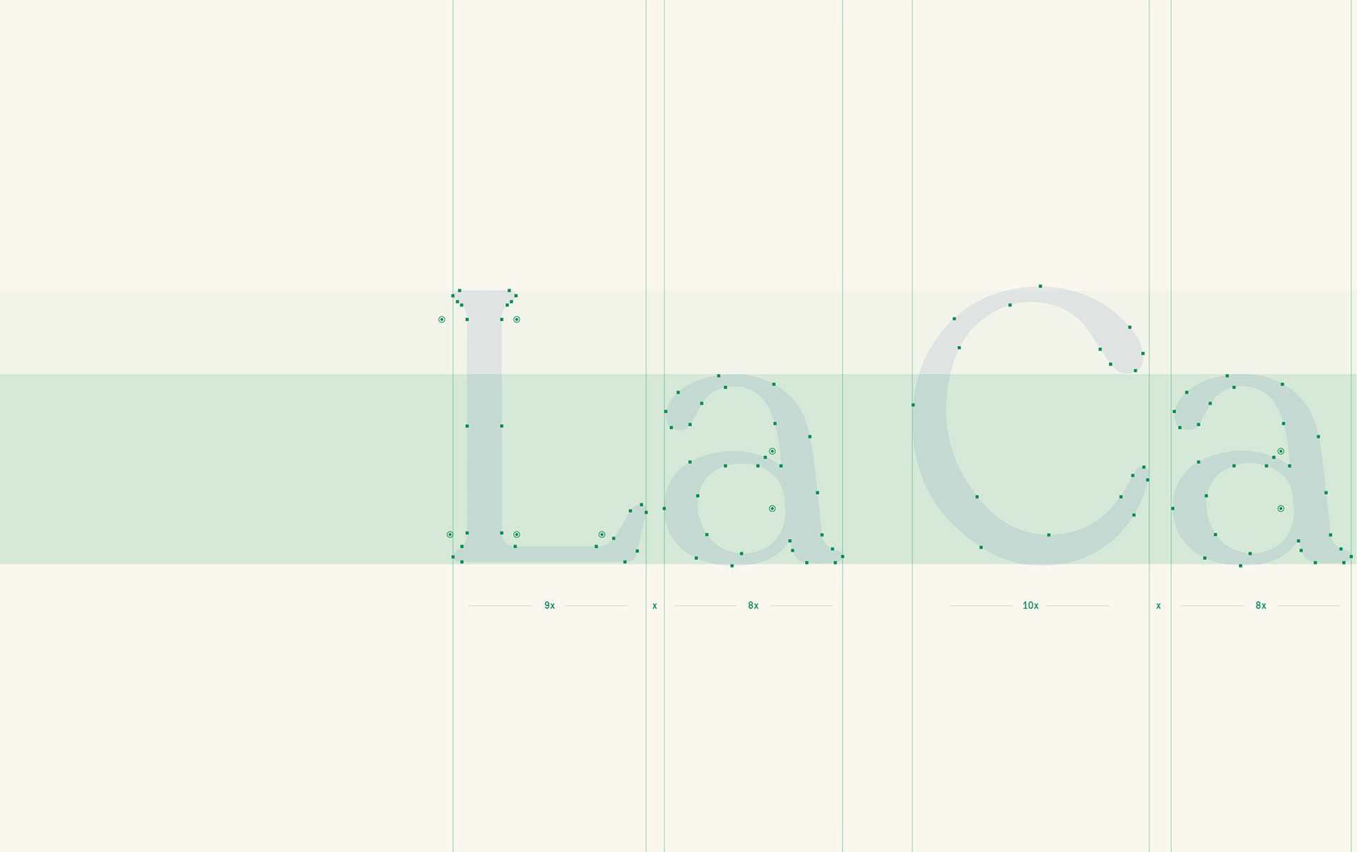
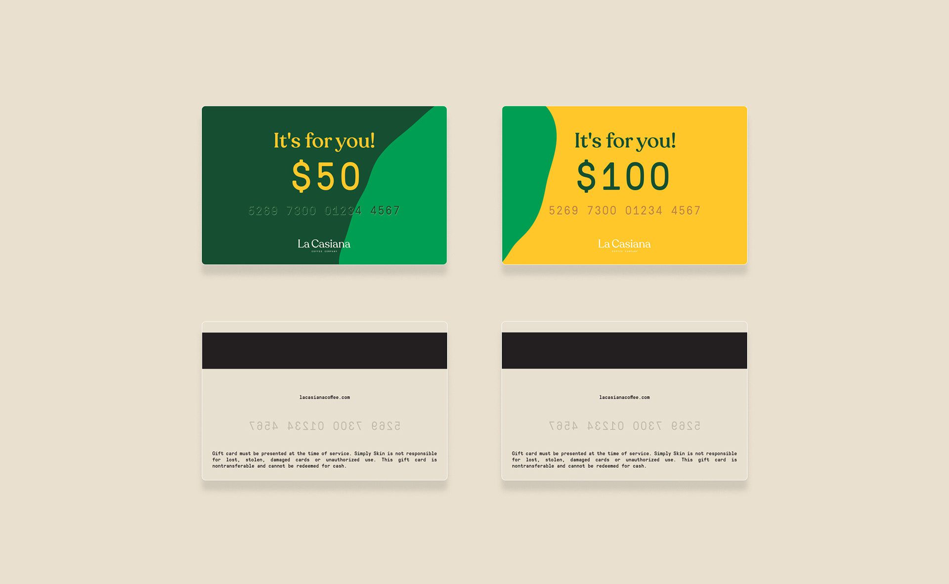
Considering the name of the brand, we came up with a transitional serif font for the logo’s “La Casiana” and a sans serif font for the “Coffee Company.” This way, it gives a practical and modern feel at the same time.
The Solution: Color Palette and Patterns
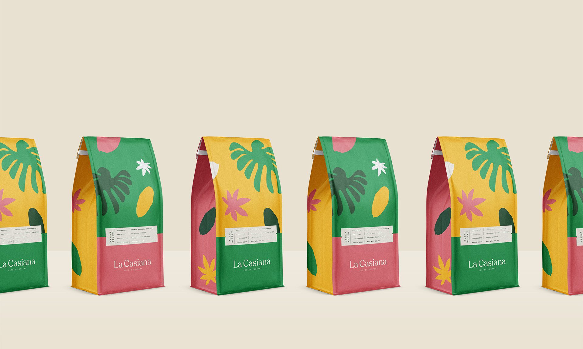
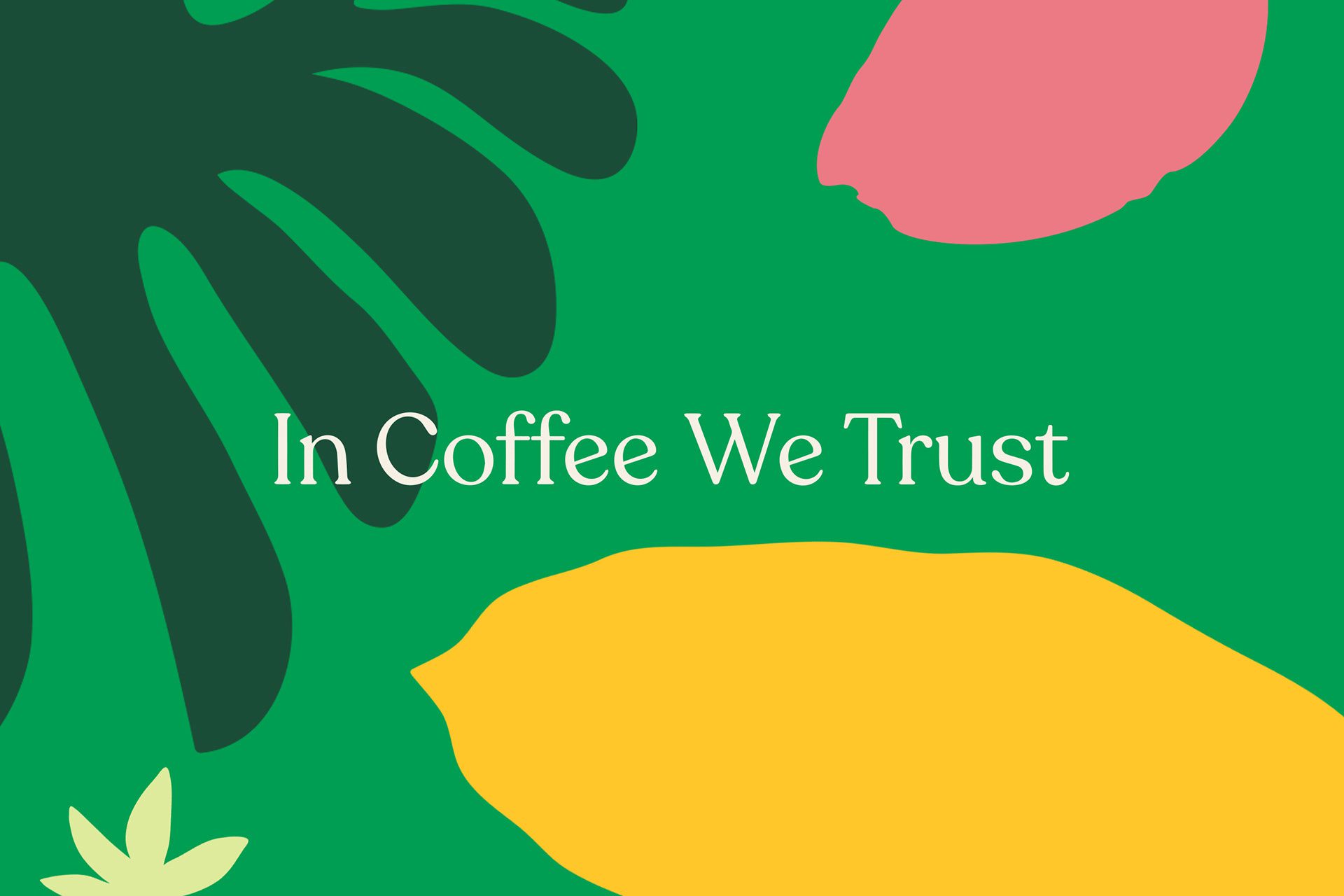
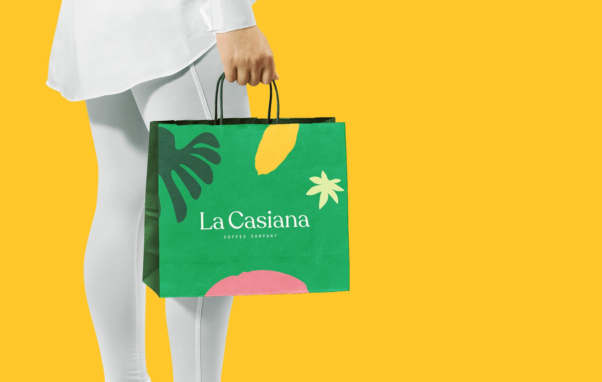
The colour spectrum is rich with green, orange, pink, and grey shades. Combining these colours creates a vivid and attention-grabbing look, which is the goal of our project. We have also created a vibrant pattern with leaf and flower illustrations and created them in multiple colour variations for different coffee flavours.
The Solution: Packaging Design
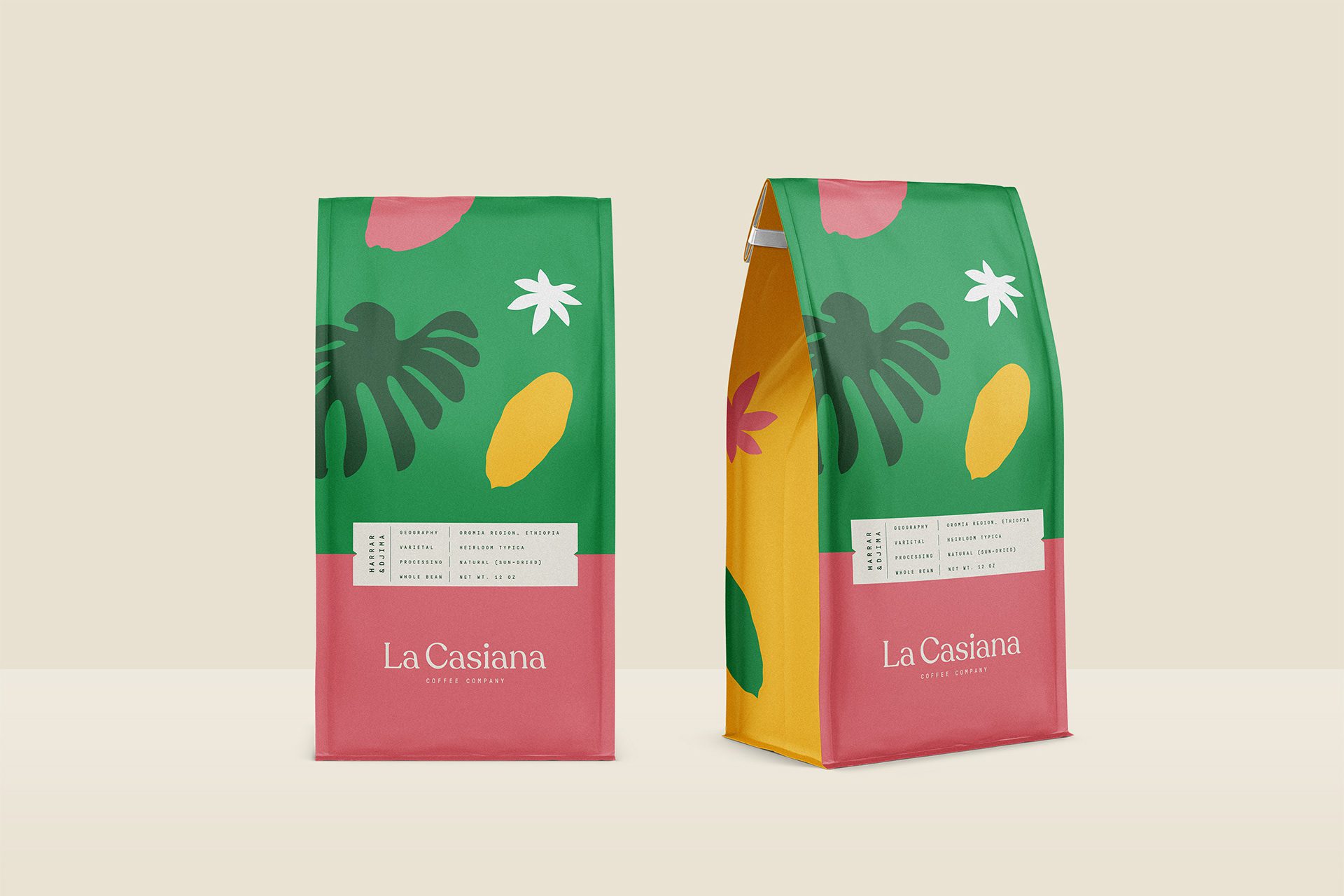
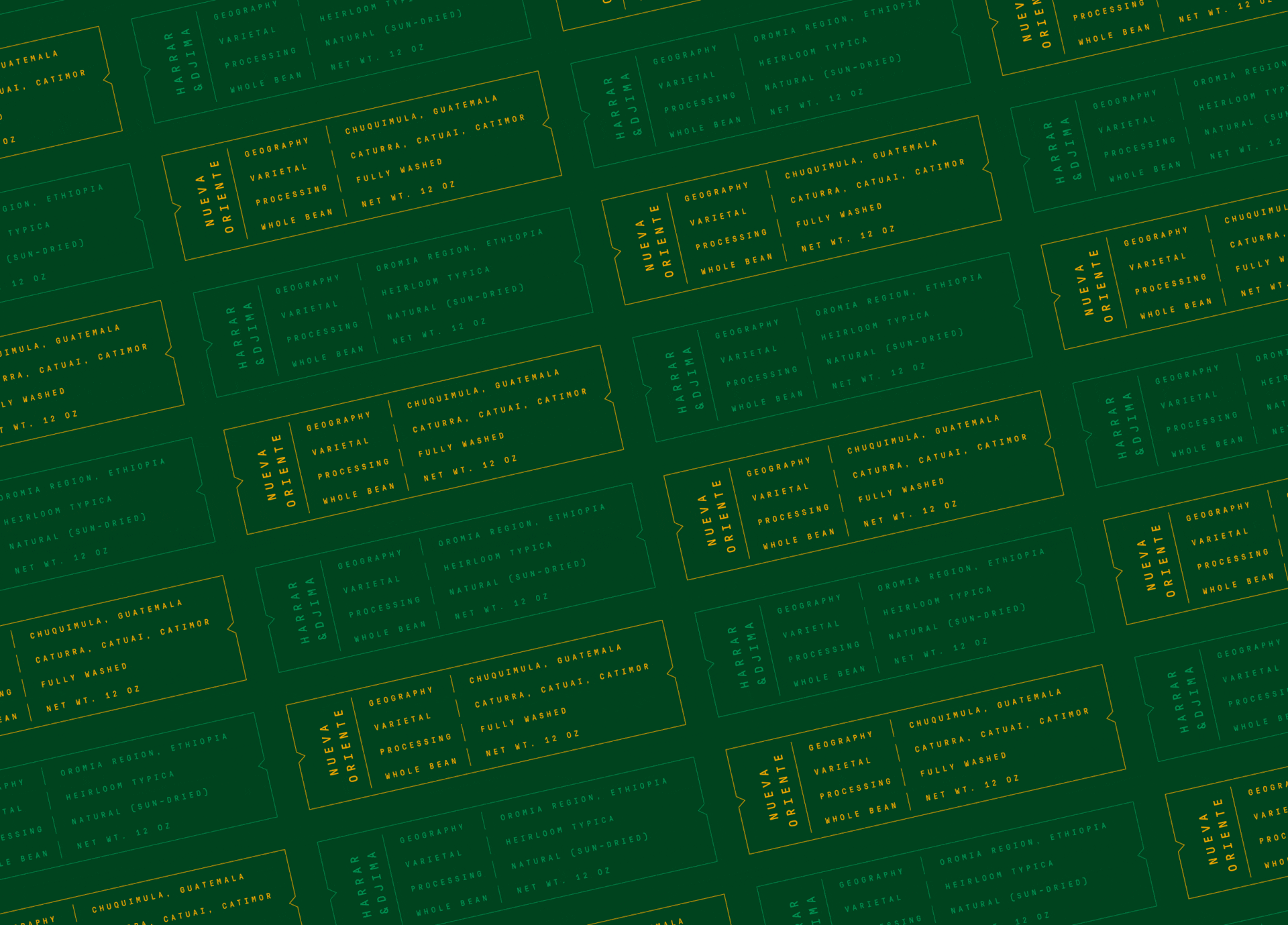
The vibrant packages that we created include the small white label, including main points about coffee production’s country and flavours. The logo is located at the centre bottom of the pink label. The upper part is fully covered with a pattern. There is also a yellow-coloured pattern on the sides of the packaging.
The Solution: Coffee Cup Holders and Cold Brew Packaging
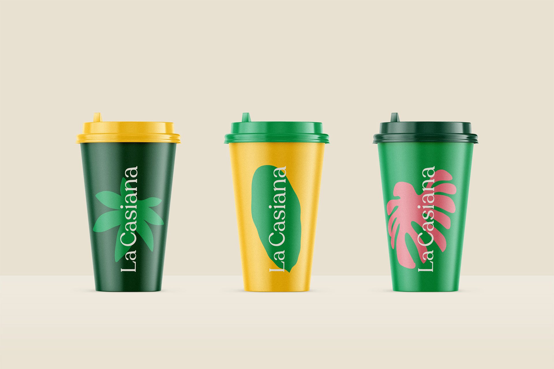
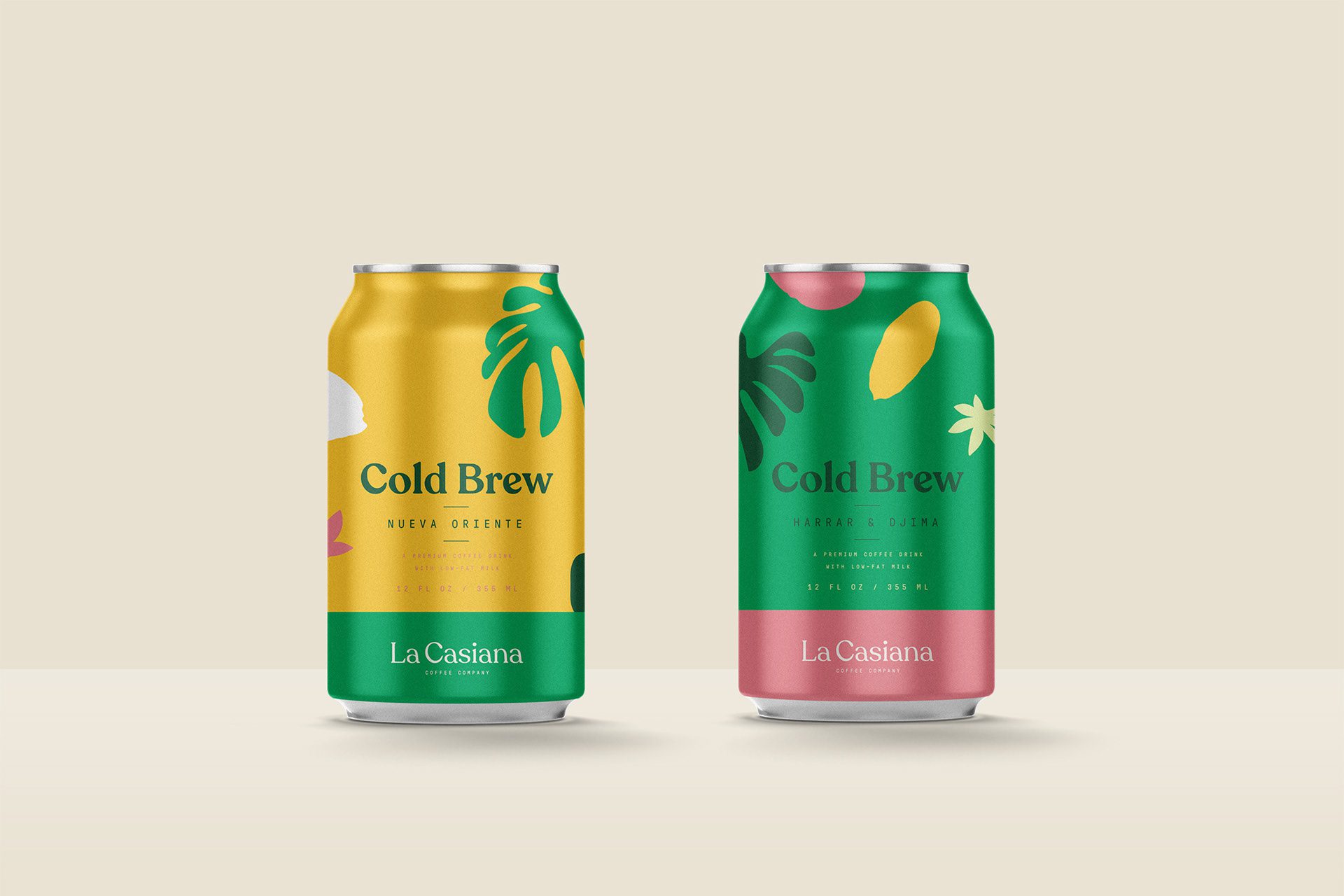
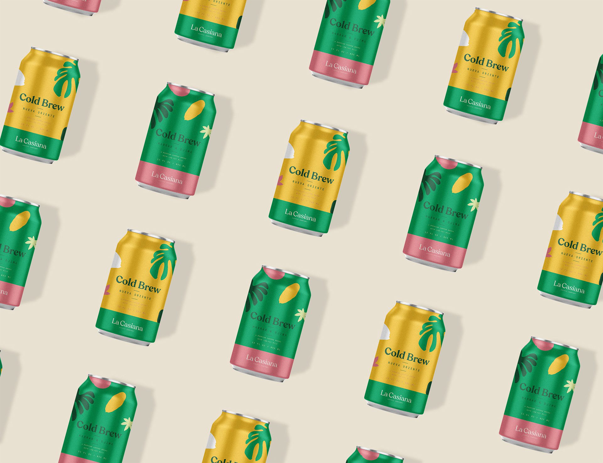
The coffee cup holders combine comfort and vibrancy into great companions. That’s why we designed them both in the most matching and combinational way. There are also cold brew coffees that La Casiana offers, and we created them the same way as the main coffee packages. The bottom parts are one colour and the upper parts are fully patterned with the minimal, but informative layout.

Let’s make the work they’ll copy.
Talk to an expert now
Work with a 38 team of the
industry’s top 1% talent.



