Bodynell
boldly effective self-care lotion
Bodynell is a premium body lotion brand that offers a holistic approach to skincare, blending bold aesthetics with timeless efficacy. MARKAWORKS has crafted a memorable and stunning brand identity, focusing on minimal yet contrasting design elements to evoke luxurious self-care.
A Holistic Approach to Bodynell Branding
Our comprehensive branding strategy for Bodynell spanned from conceptual logo design to impactful packaging, all meticulously crafted to resonate with their discerning audience. We focused on translating Bodynell’s core values of boldness and timelessness into tangible visual elements, ensuring a cohesive and compelling brand narrative.
The Client & Keywords
The Bodynell is a body lotion brand based in the United Kingdom. The keywords we focused on were: Memorable / Stunning / Minimal / Contrasting.
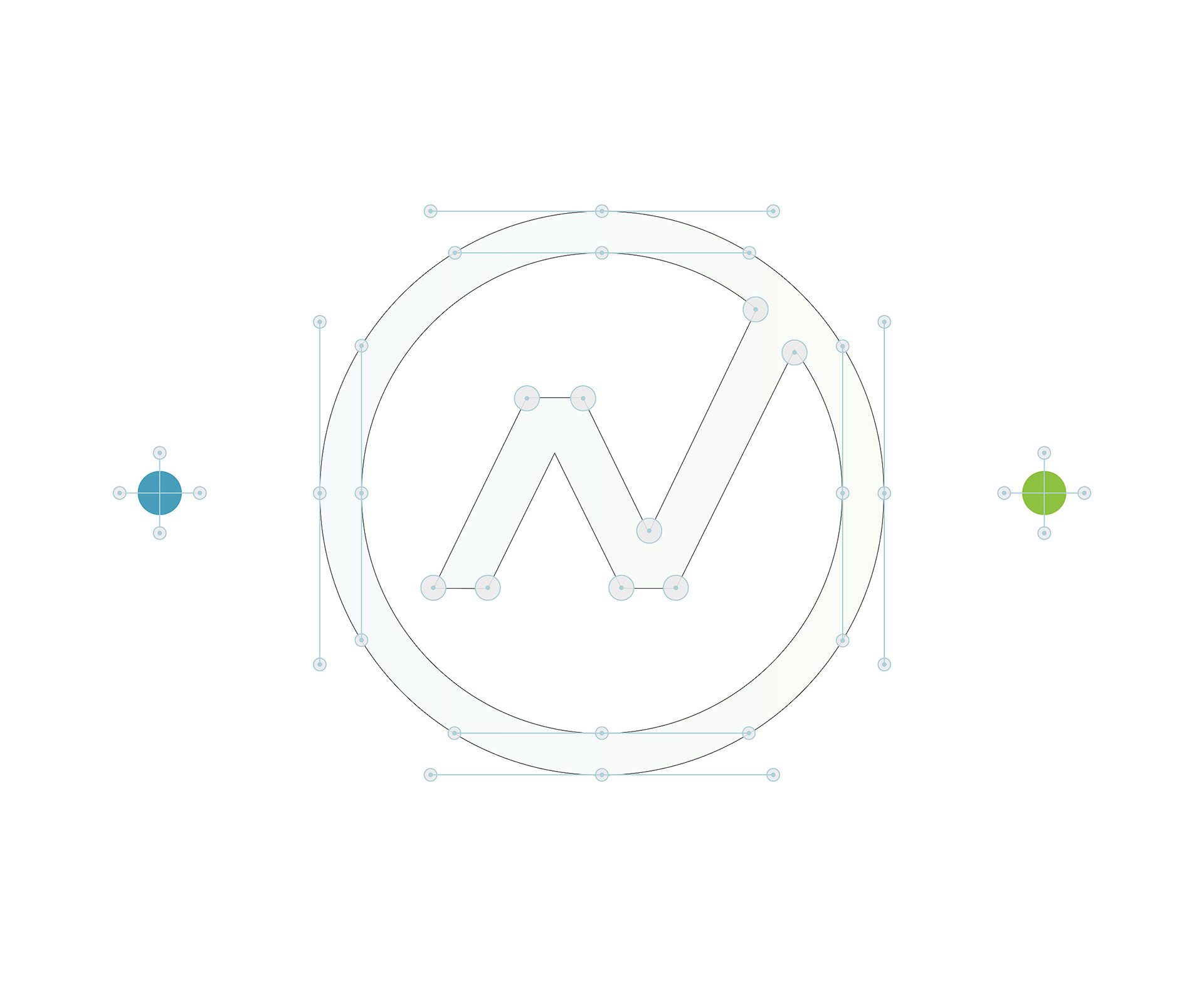
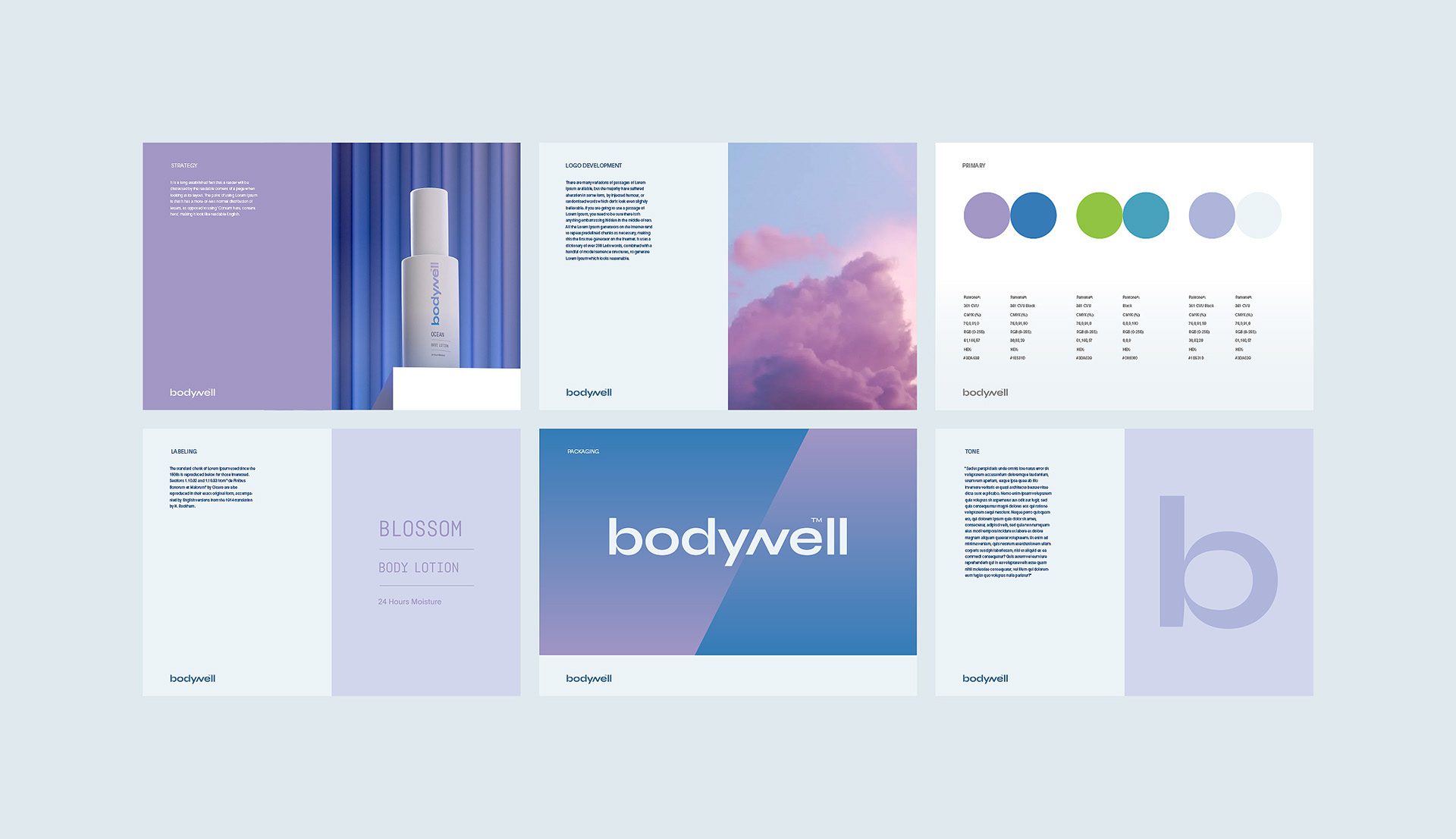
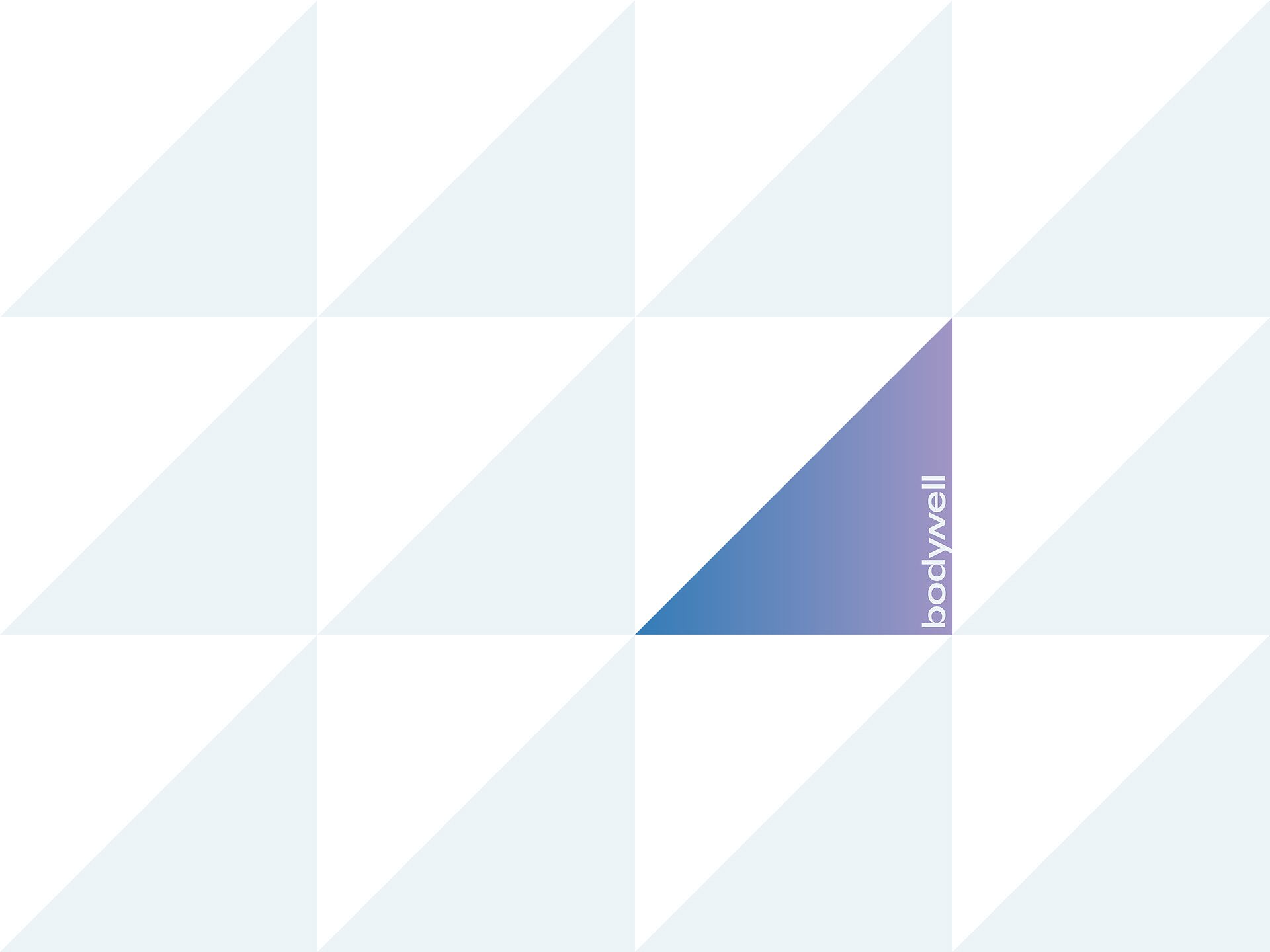
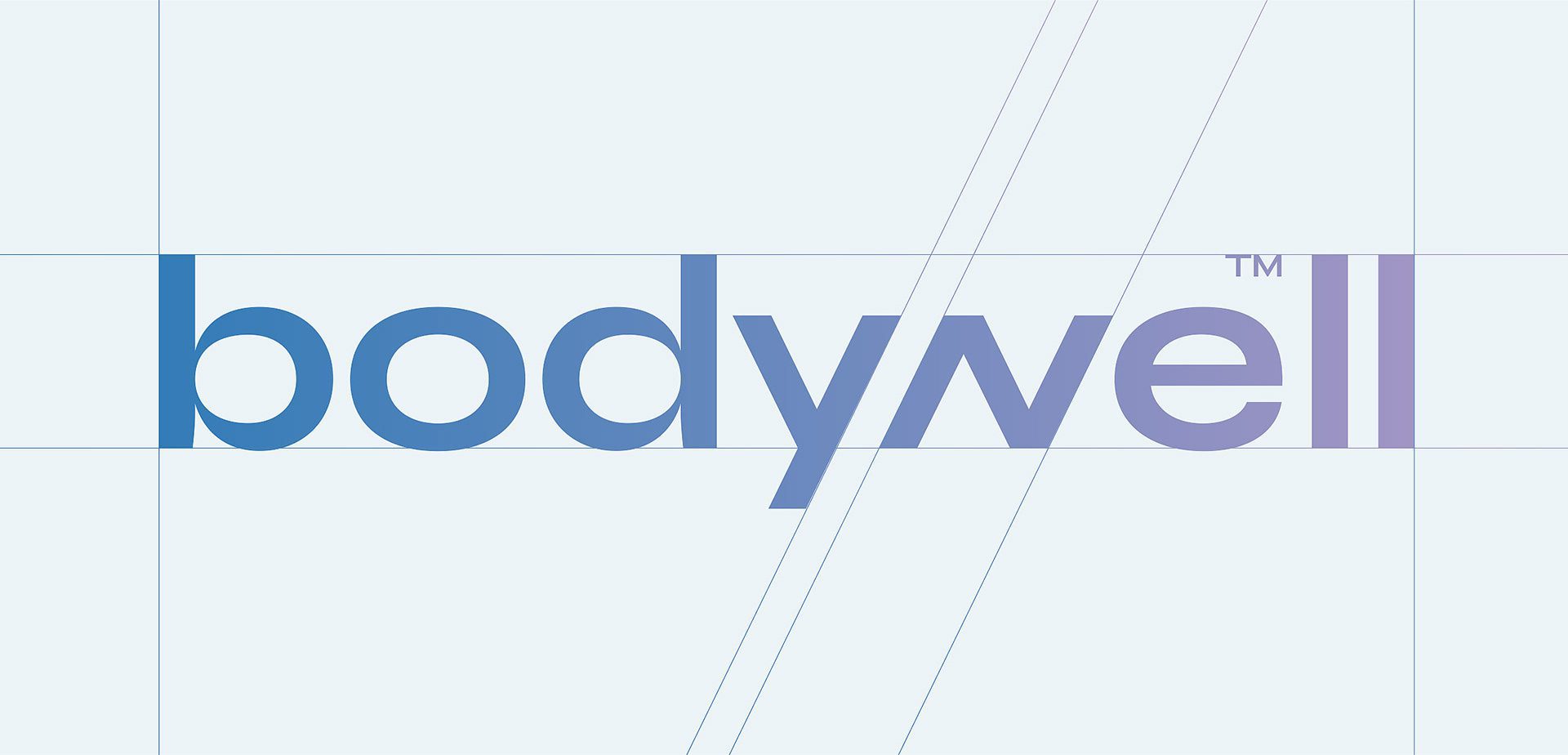
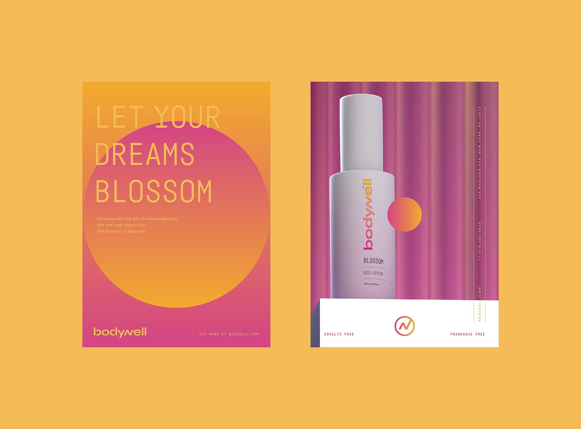
The Solution: Logo Design
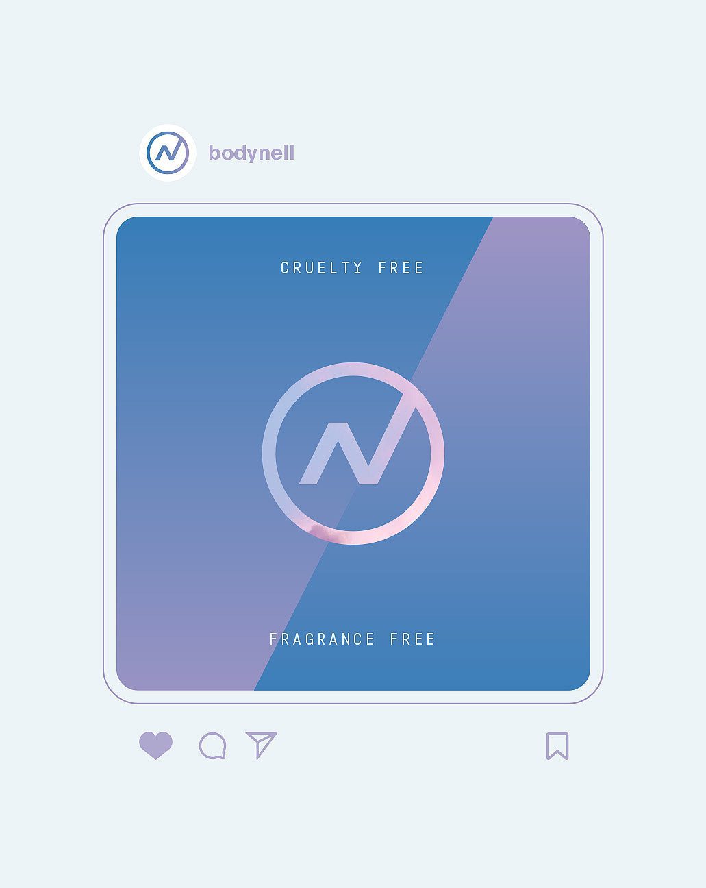
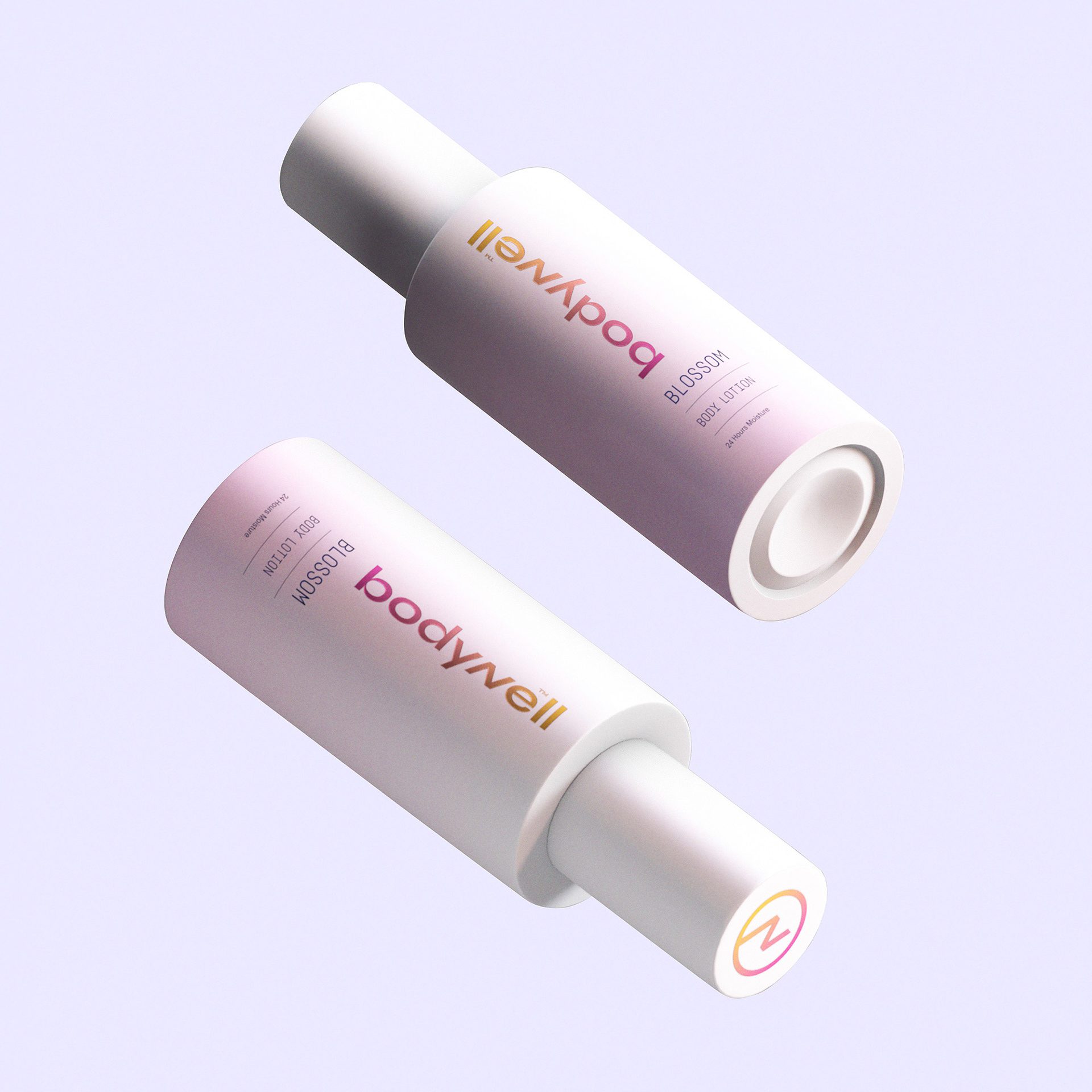
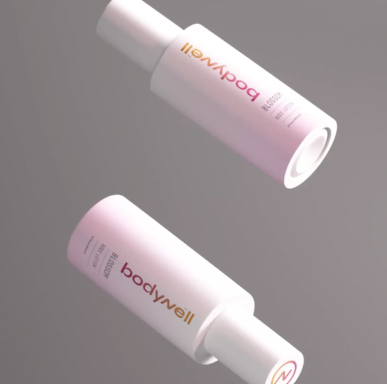
We decided to create a minimal logo with the highlight on the “N”, which has a slant as it is the “w” letter. This way, the logo has more association with something “well” for the body.
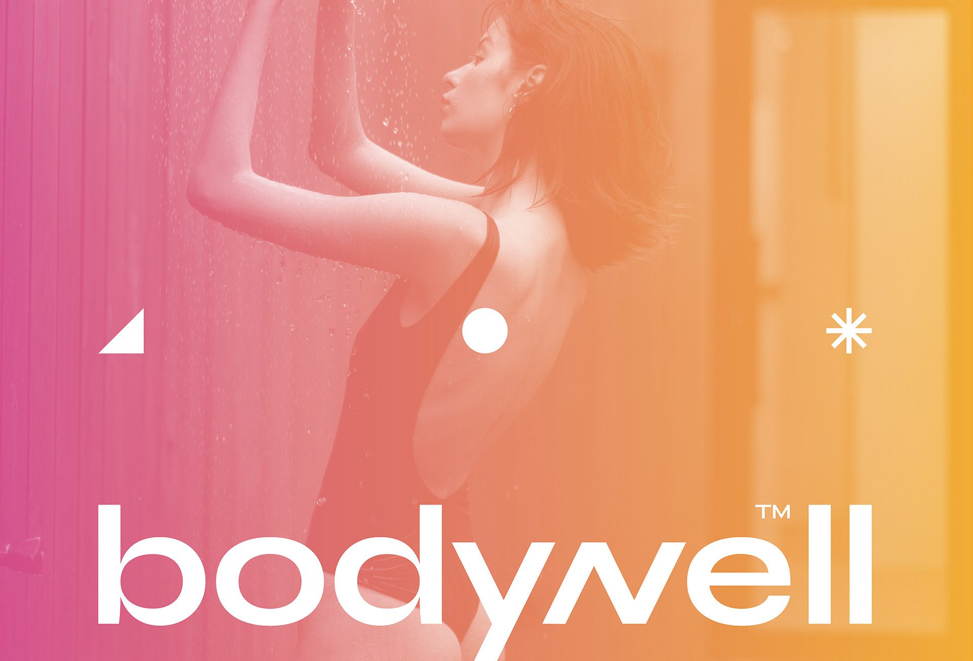
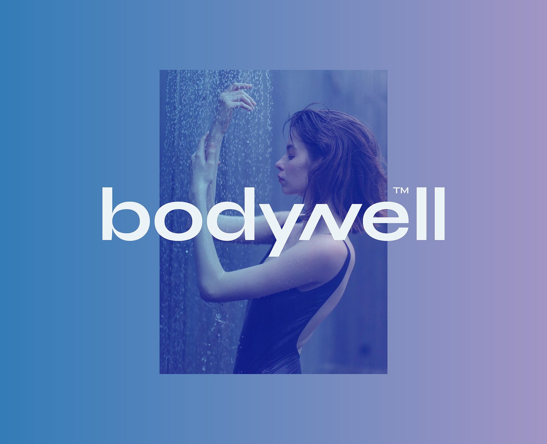
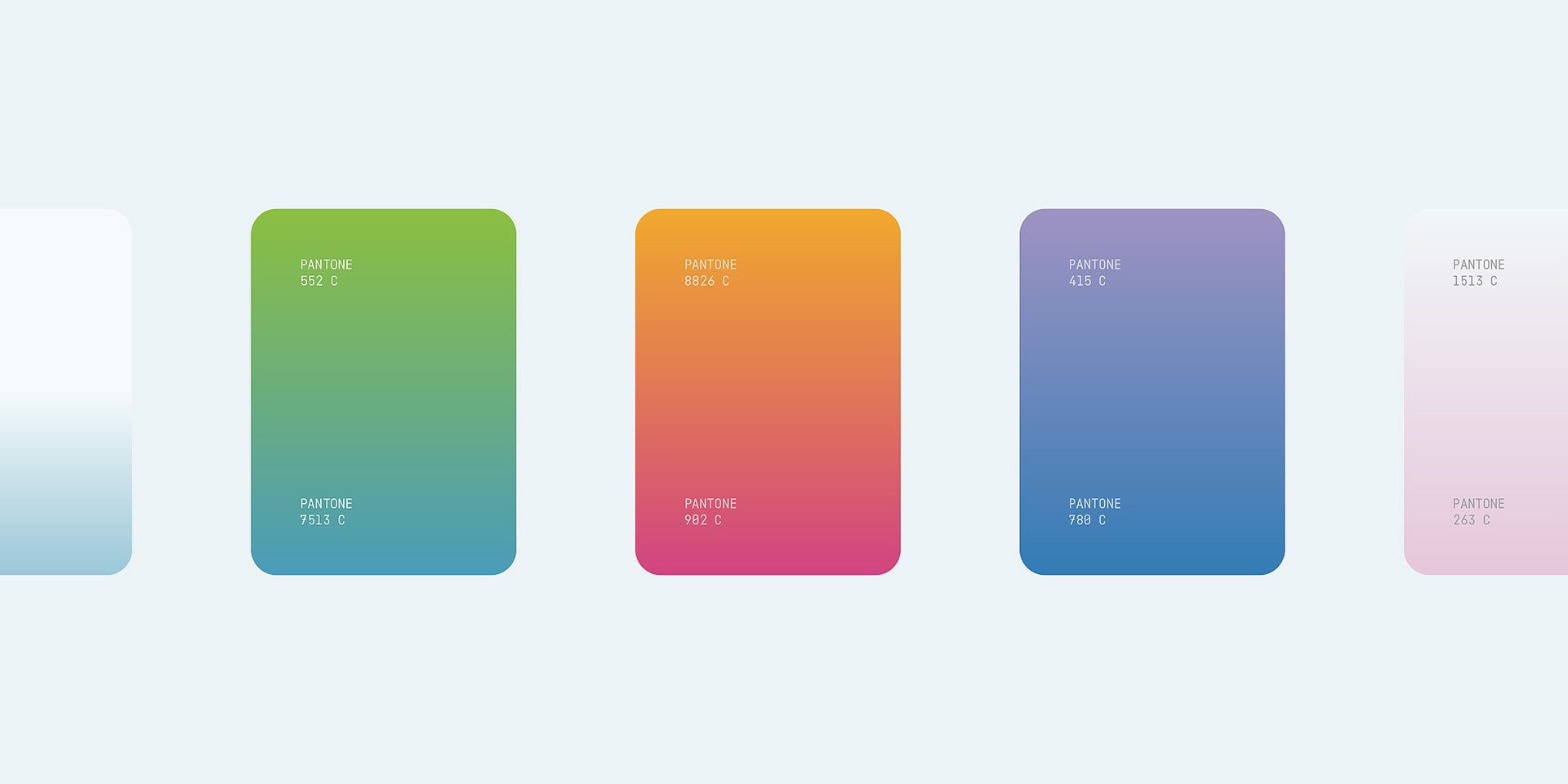
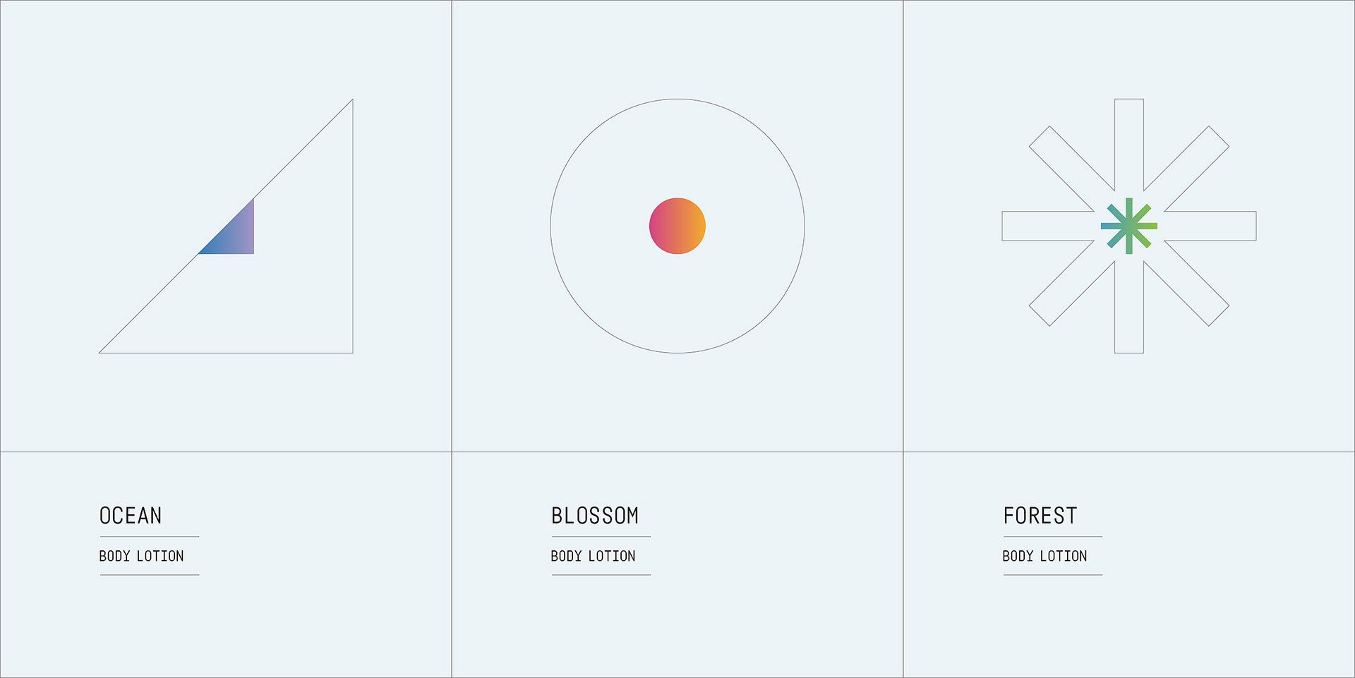
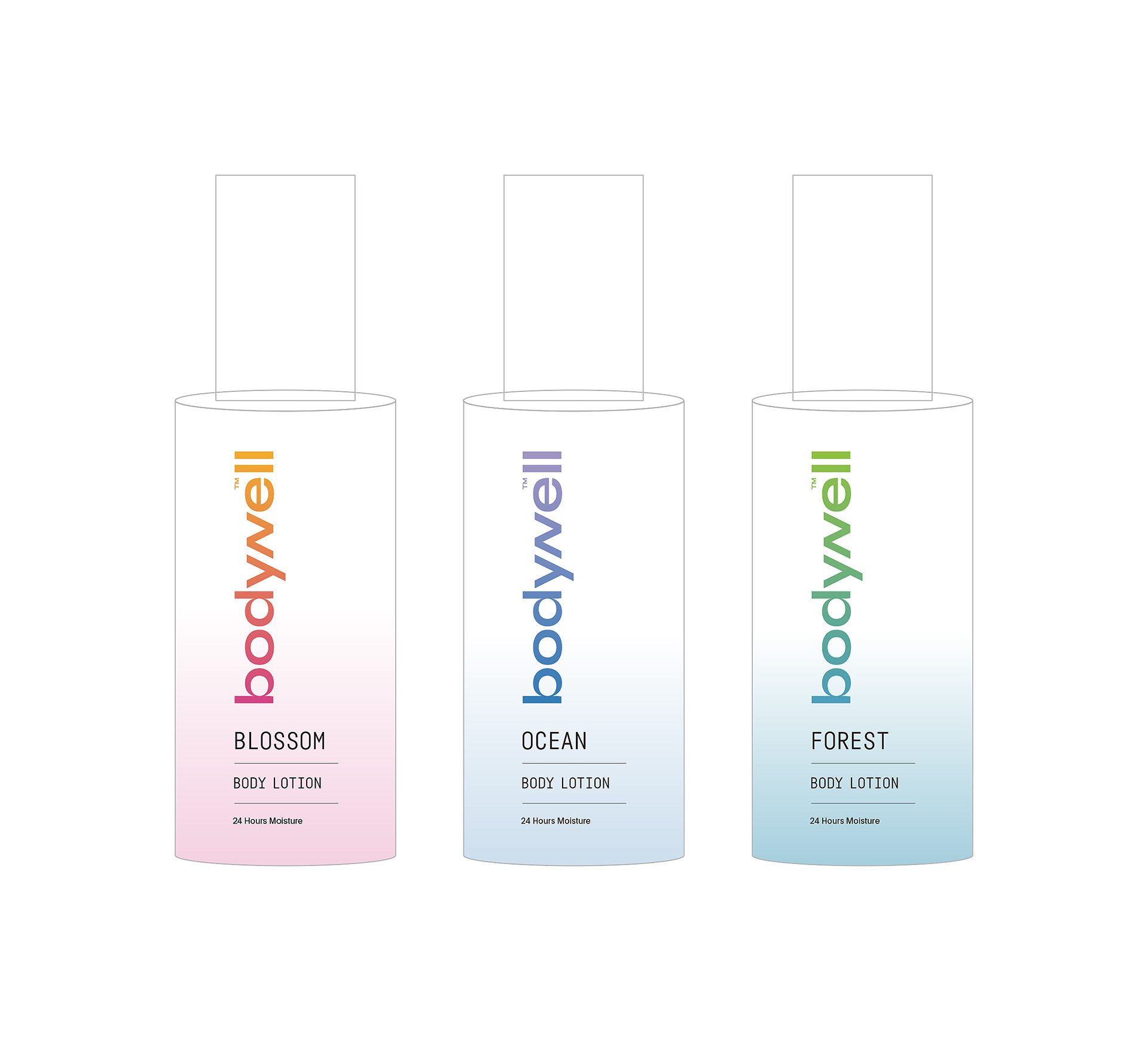
The Solution: Color Palette
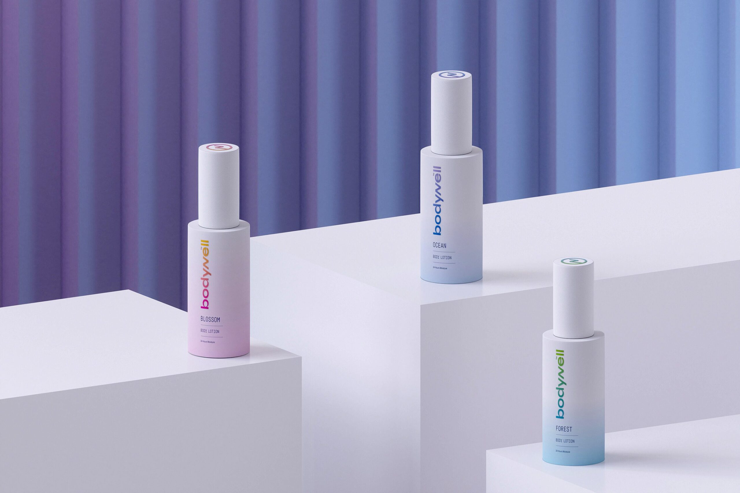
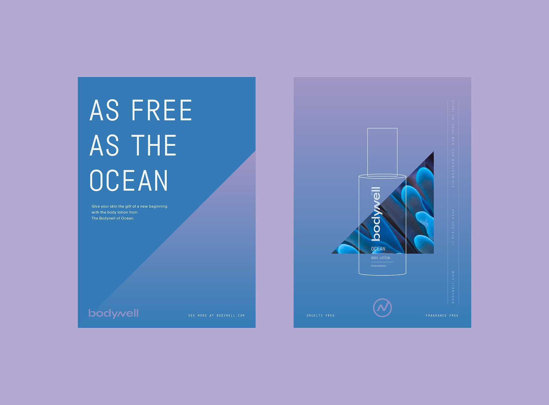
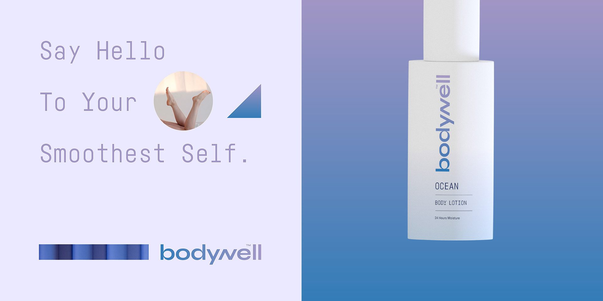
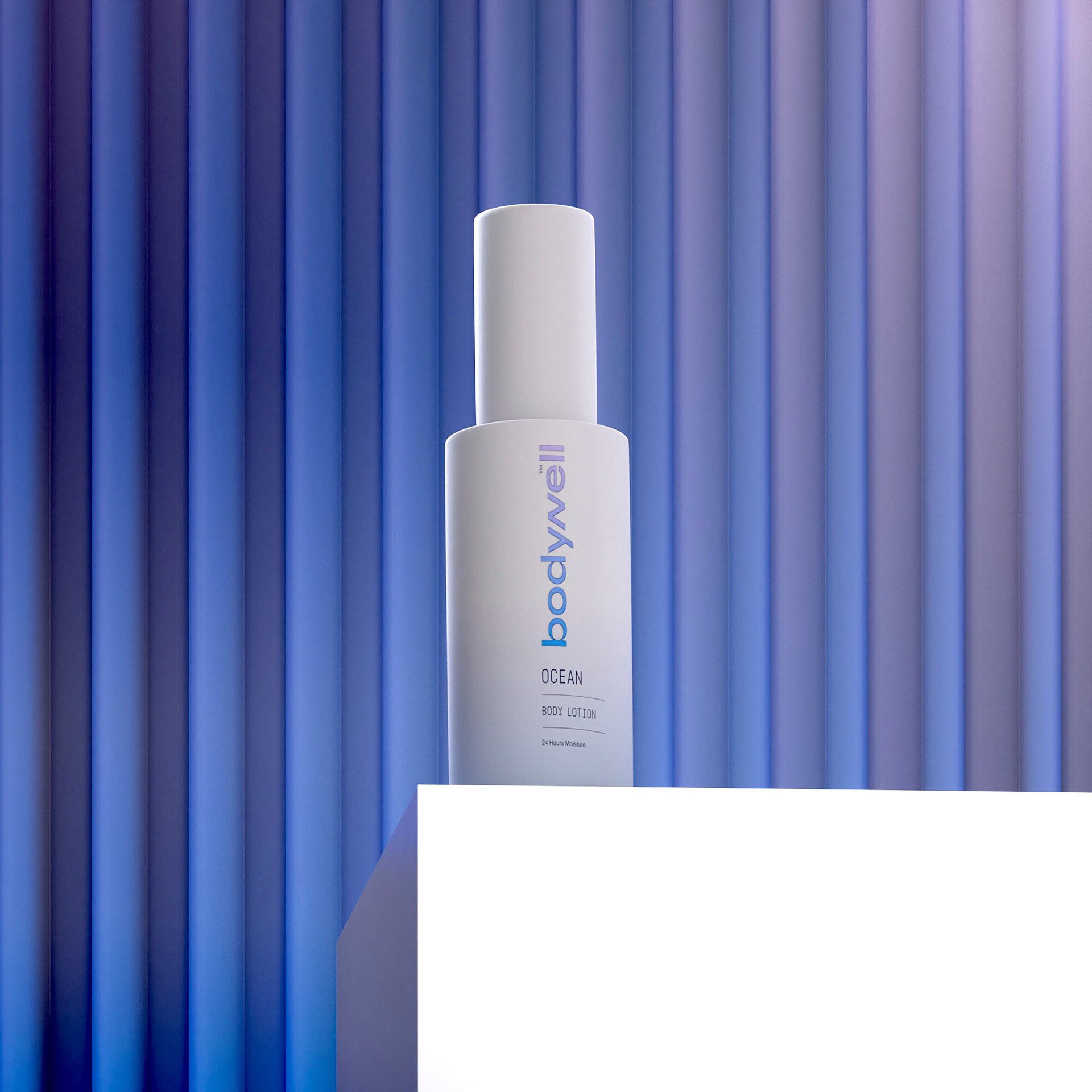
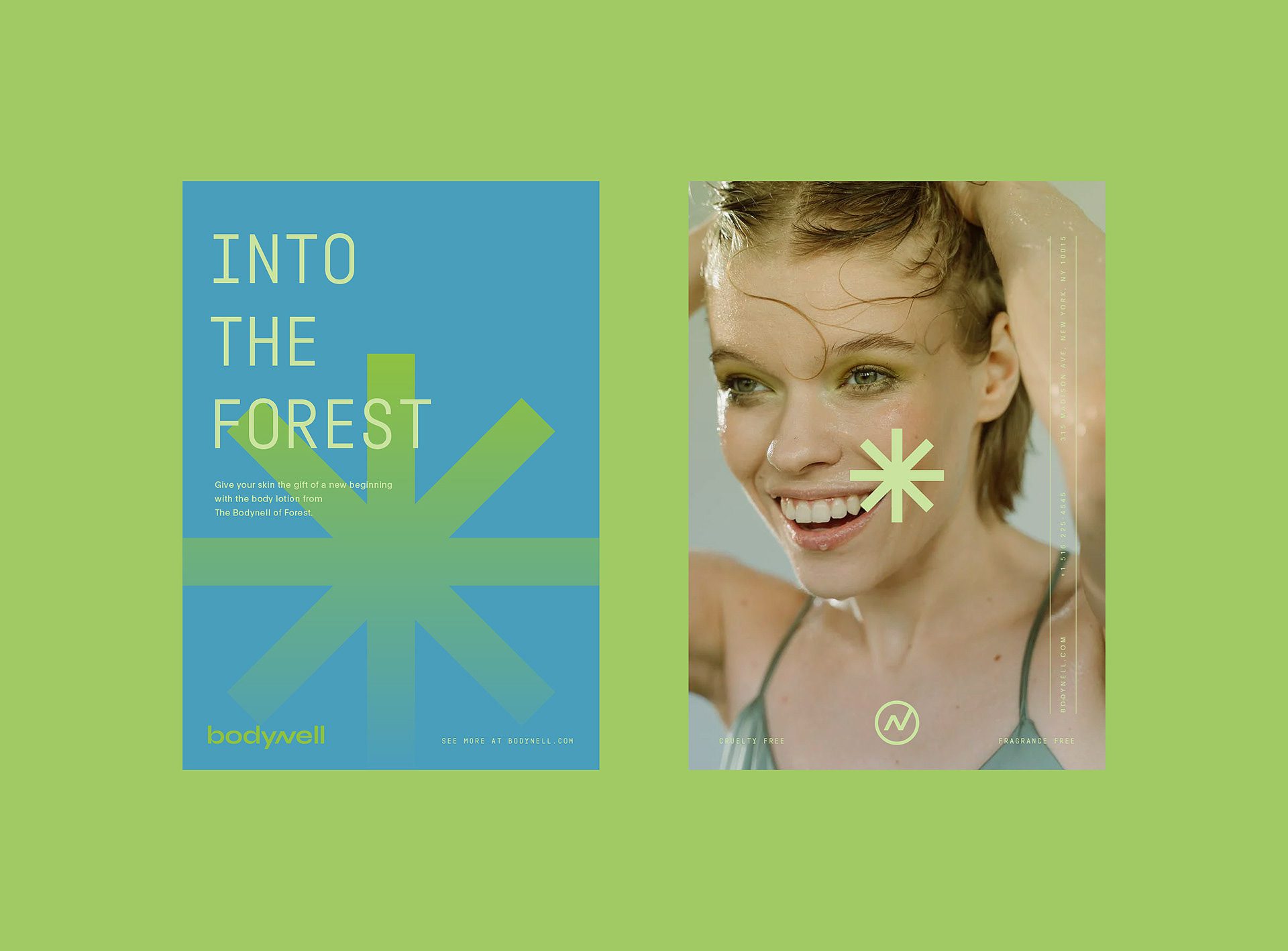
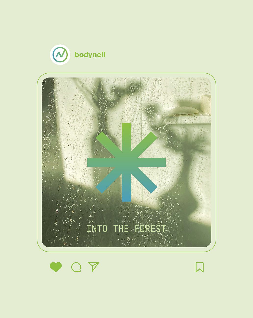
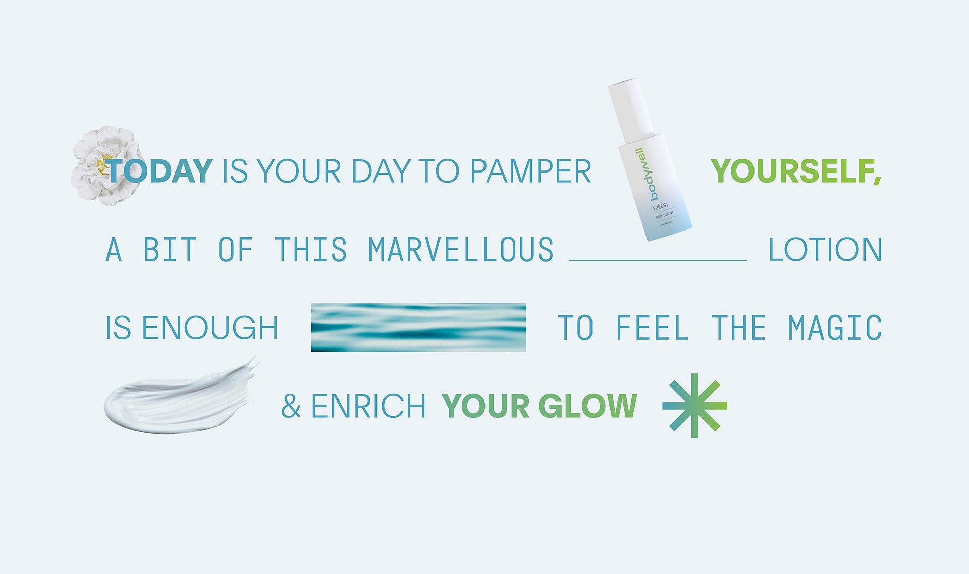
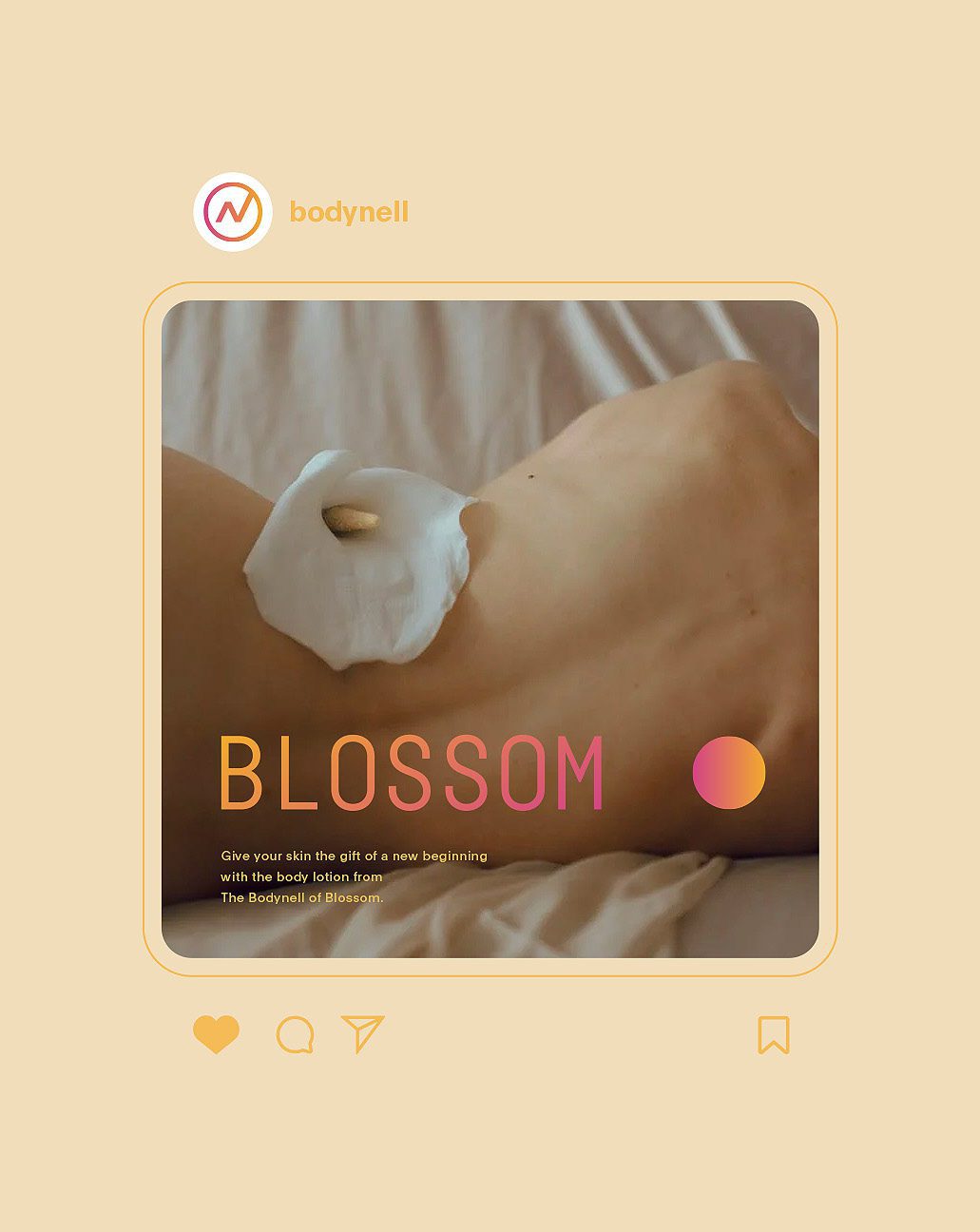
The colours we selected are contrasting and vibrant. Each colour combination has been picked for a specific body lotion flavour. For the “Blossom” aroma, we chose pink, orange, and yellow as these colours have associations with flowers and have meanings of positive, enthusiastic, and caring energies. For the “Forest” aroma, we applied blue to the green gradient, associating it with nature. For the “Ocean” aroma, we selected this blue-to-violet gradient because of its association with water and clean energy.


The Solution: Packaging Design
As for the packaging, we designed a simple layout with a white background. For simplicity, we have stated only the logo, aroma, and moisture time on the front part of the bottle. This way, it looks more professional and luxurious.


Let’s make the work they’ll copy.
Talk to an expert now
Work with a 35+ team of the
industry’s top 1% talent.


