
MUUM
baby care brand
MUUM is a new-generation baby-care brand created to bring softness, safety, and modern minimalism into the daily routines of families. Our goal was to build a visual world that feels as gentle as a mother’s touch — warm, natural, and effortlessly clean.

01. Brand Strategy & Positioning
The brand is positioned at the intersection of safety, softness, and contemporary simplicity. Instead of the traditional baby-care clichés, MUUM introduces a calm and modern aesthetic grounded in trust and nature.
Core attributes:
Clean — Pure and minimal design language
Soft — Gentle curves and comforting forms
Friendly — Approachable and warm personality
Nature-inspired — Organic elements and earthy tones
These pillars guided every design decision across identity, packaging, and digital presence.
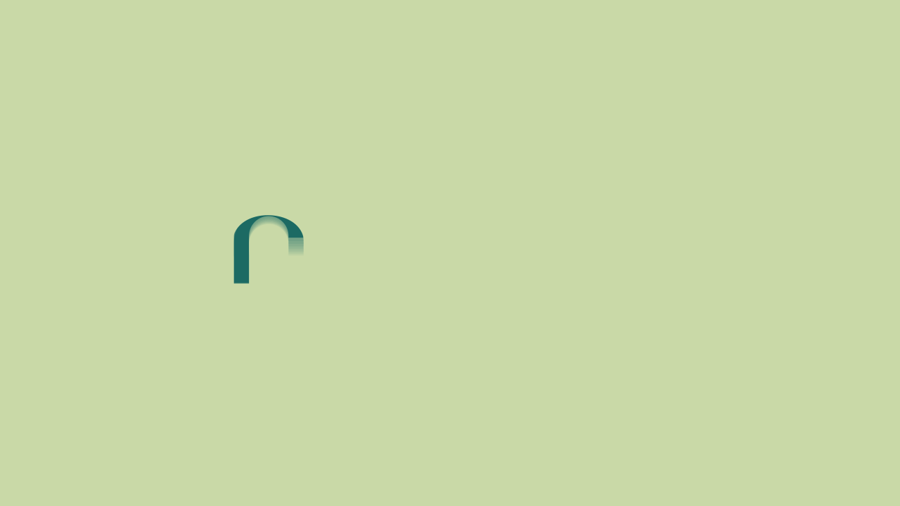


02. Logo & Visual Language
The MUUM logotype is built on rounded, human-centered geometry — reflecting softness, protection, and a gentle touch. Its fluid curves mimic the comfort of holding a baby, creating an instant emotional connection.
A secondary mark was developed for compact and digital-first applications, ensuring a flexible, scalable identity system.
Key design principles:
Smooth, organic letterforms
Soft capsule-like shapes
Minimal compositions with generous breathing space
A sophisticated aesthetic suitable for modern parents


03. Color System
The color palette draws inspiration from nature and delicate skin tones. Each shade was selected to evoke tranquility, safety, and purity.
Palette foundations:
Mint Green → clean & safe
Pastel Pink → warmth & softness
Soft Beige → skin & comfort
Teal/Nature Green → trust & care
The result is a soothing and cohesive visual ecosystem.

04. Typography System
Typography plays a key role in reinforcing MUUM’s gentle personality. A soft-edged serif for headlines brings warmth and character, while a clean sans-serif ensures clarity and readability. Together, they deliver a premium yet approachable tone.

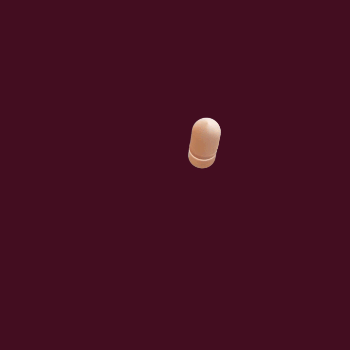
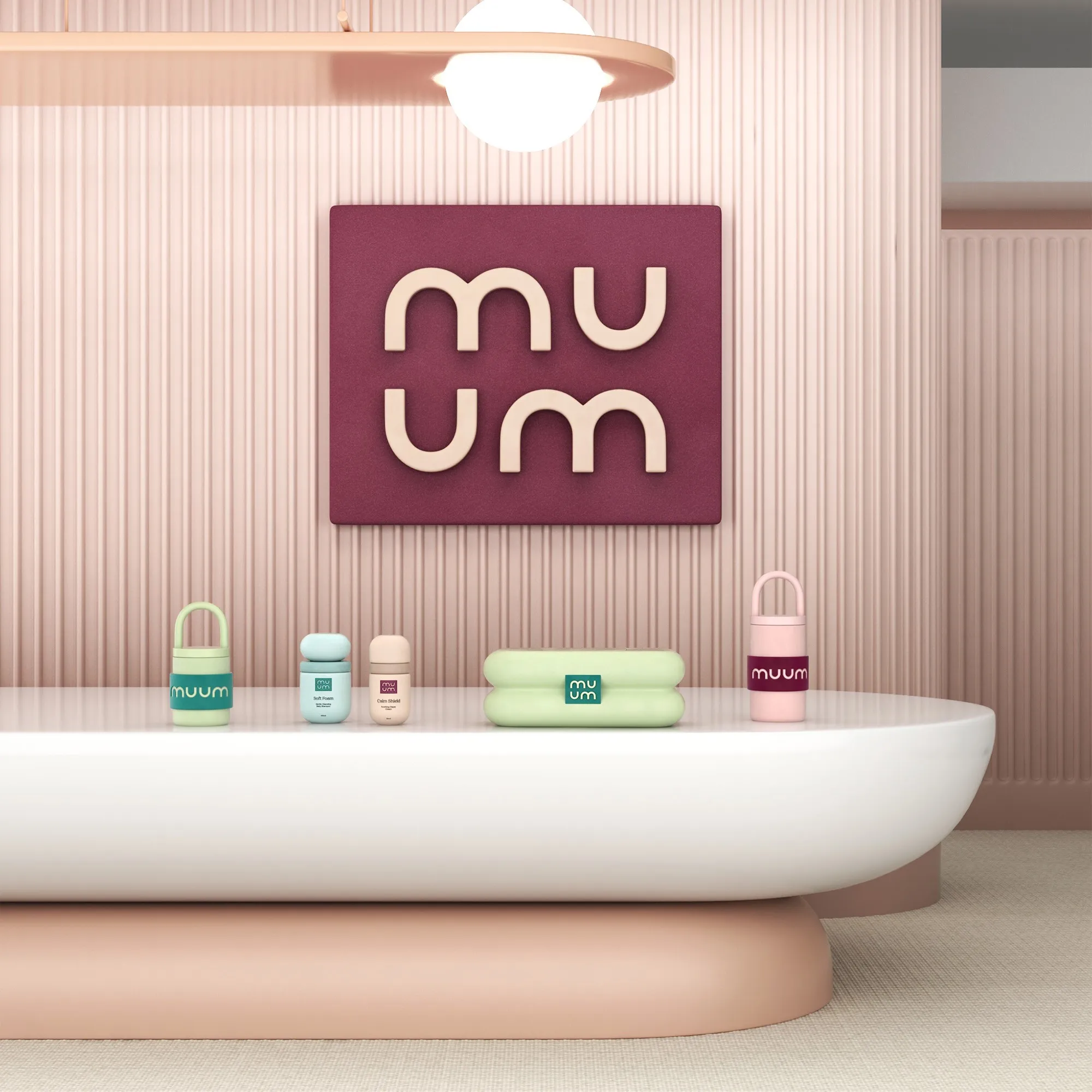
05. Packaging Design Exploration
MUUM’s packaging moves beyond conventional baby-care visuals and introduces iconic, modern product forms. Each container is designed to feel protective, ergonomic, and memorable, blending playful curves with functional simplicity.
Design focus points:
Soft, rounded silhouettes
Pastel and nature-driven color blocking
Minimal label architecture
Iconic 3D form development
Collectible, visually recognizable shapes across product lines
Every product became its own object of comfort — visually and ergonomically.


06. Social Media System
The digital identity was crafted to translate MUUM’s quiet softness into a modern content structure.
Content system highlights:
Gentle gradients and airy layouts
Real mother–baby photography
High-conversion post templates
Minimal storytelling with emotional messaging
Consistent, calm grid aesthetics
This system boosts both engagement and trust across digital touchpoints.


07. Web Experience
The website delivers a serene, intuitive browsing experience aligned with the brand’s tone.
Notable design decisions:
Soft gradient hero sections
3D product showcases
Clearly structured ingredient storytelling
Micro-interactions that add a layer of modernity
Lightweight, breathable page layouts
The result: a digital space that feels warm, safe, and reliable — just like the products themselves.


08. Final Outcome
All brand elements — from logotype to packaging, from social templates to the web interface — unite to create a cohesive, calming, and premium baby-care brand. MUUM stands as a gentle companion for modern parents, balancing emotion with clarity, and aesthetics with functionality.


Let’s make the work they’ll copy.
Talk to an expert now
Work with a 35+ team of the
industry’s top 1% talent.


