SOLANKI
Real Estate Brand Identity & Development Brand System
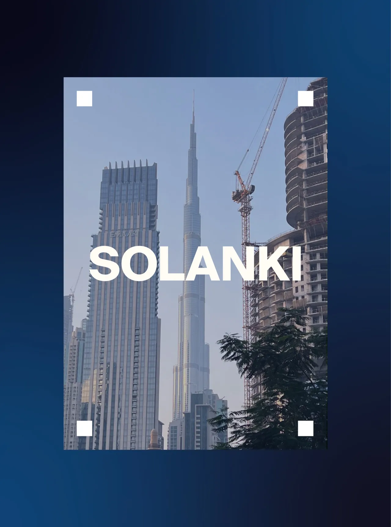
SOLANKI is a Dubai-based real estate and development brand built around trust, structure, and long-term vision.
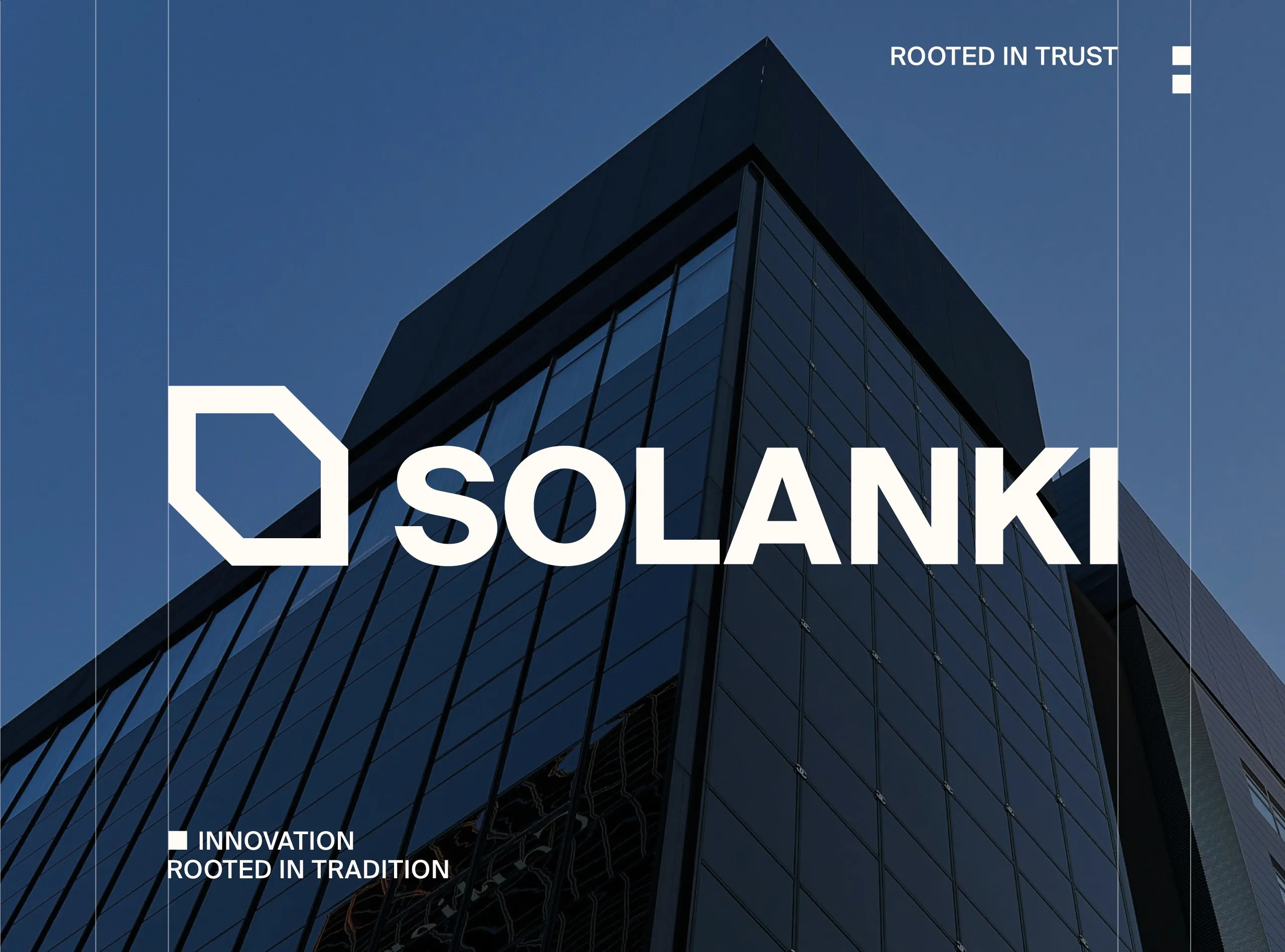
SOLANKI is a Dubai based real estate and development brand, and the real estate branding brief was built on three words the company uses about itself: trust, structure, and long term vision. All three are difficult to design, because they are qualities a viewer decides rather than qualities a brand can assert.
MarkaWorks resolved it structurally. Bold geometric forms, clean typography, and a restrained palette drawn from modern urban environments give the brand the character of the buildings it is describing, so the impression of permanence comes from construction rather than from a claim about it.
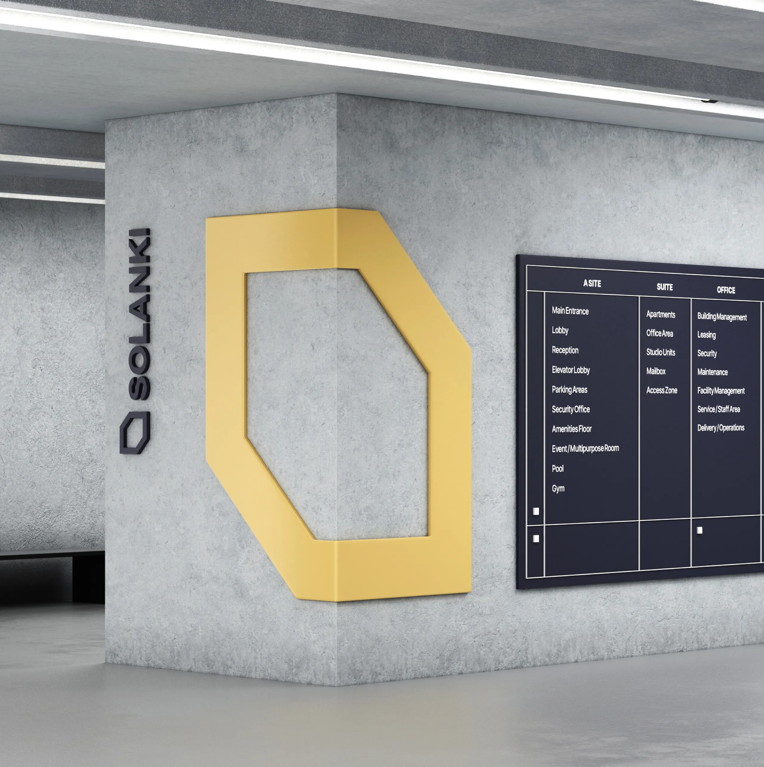
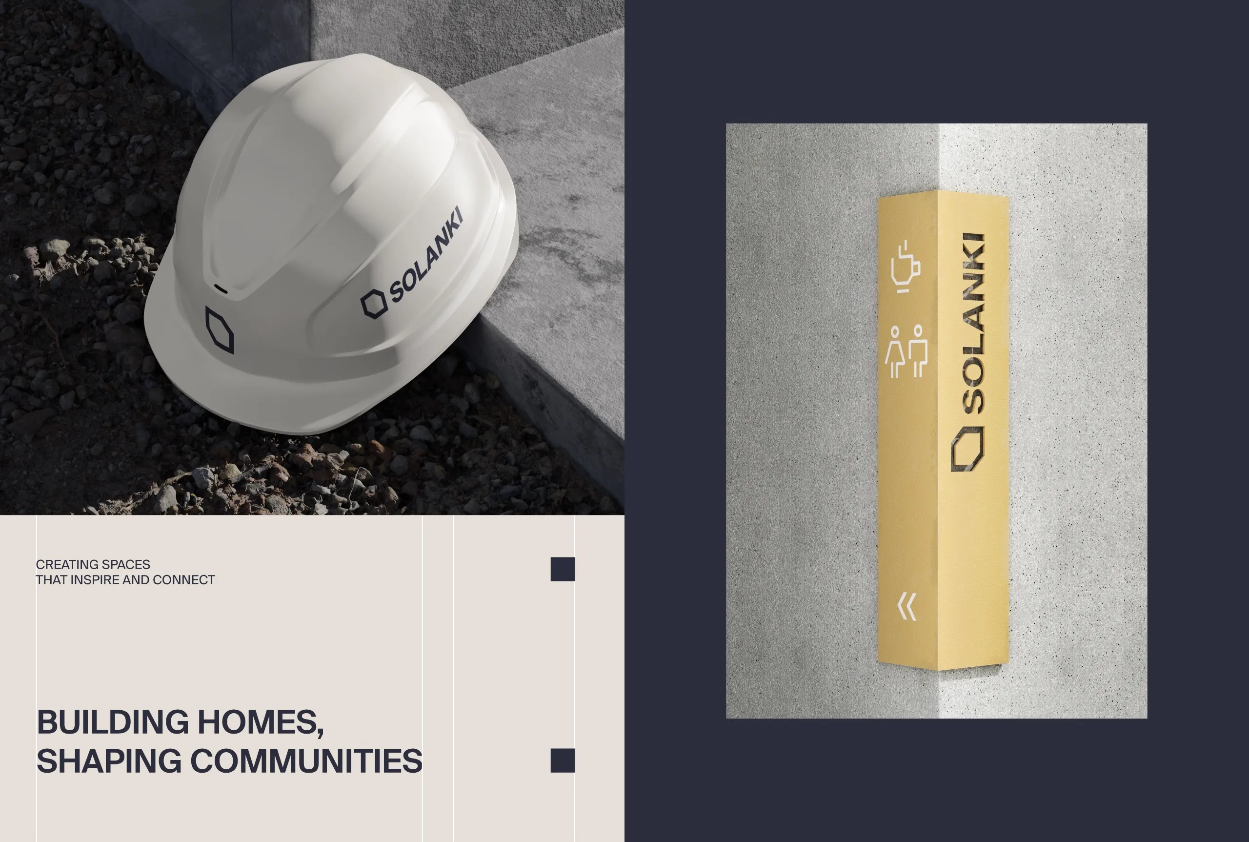
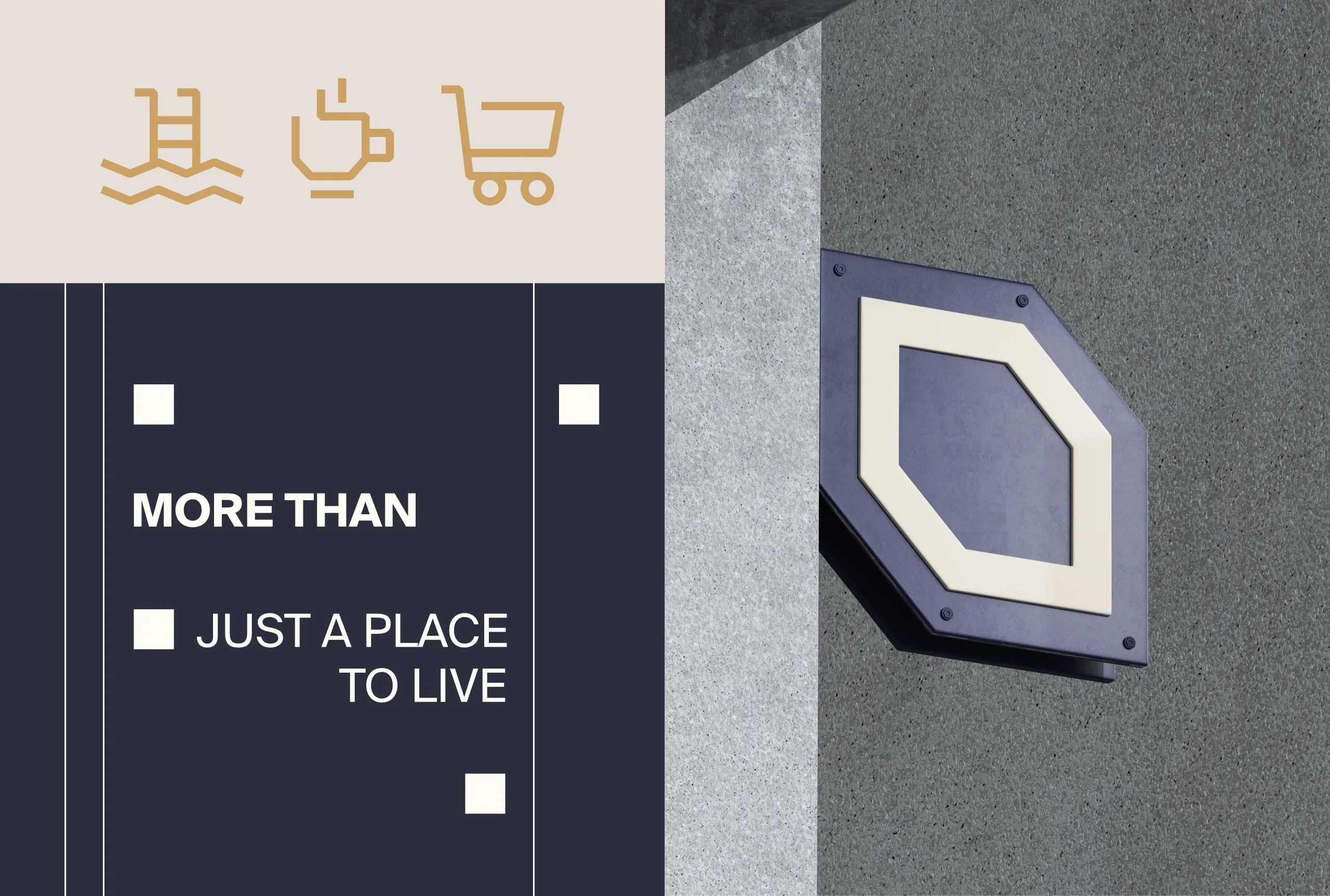
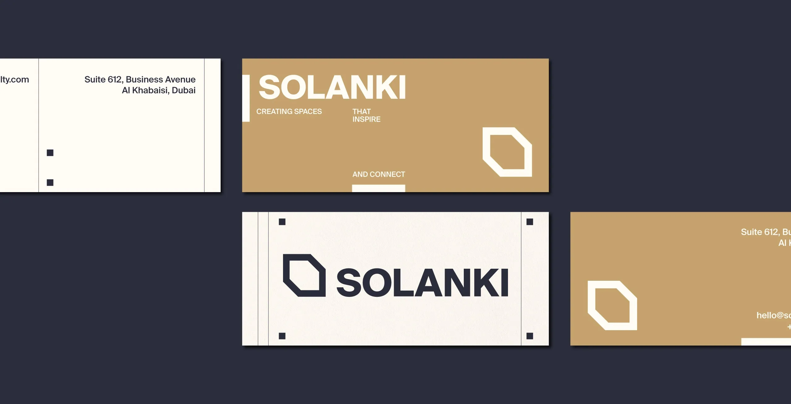
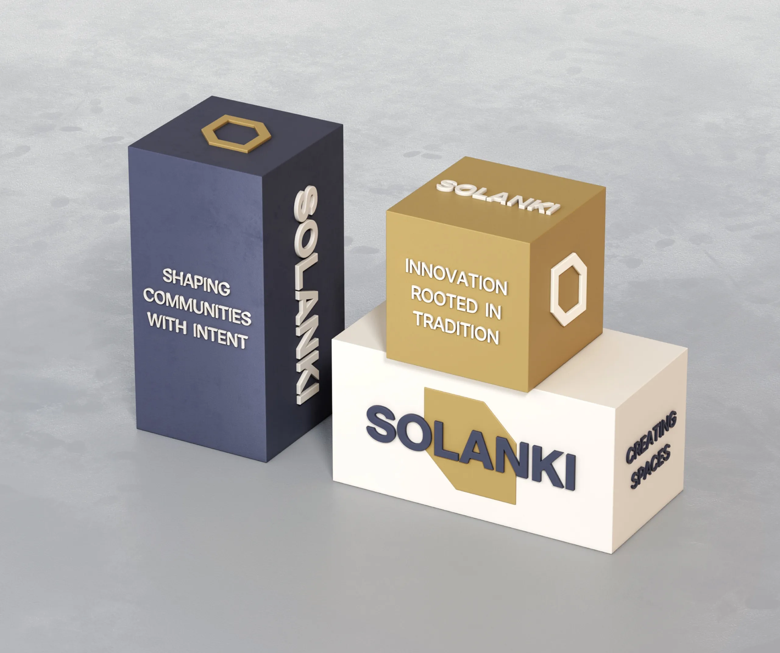
At the center is a custom emblem derived from architectural silhouettes and structural framing systems. It reads as stability, direction, and continuity because those are properties of the forms themselves, not because a caption says so. That is the difference between a mark that means something and a mark that is explained.
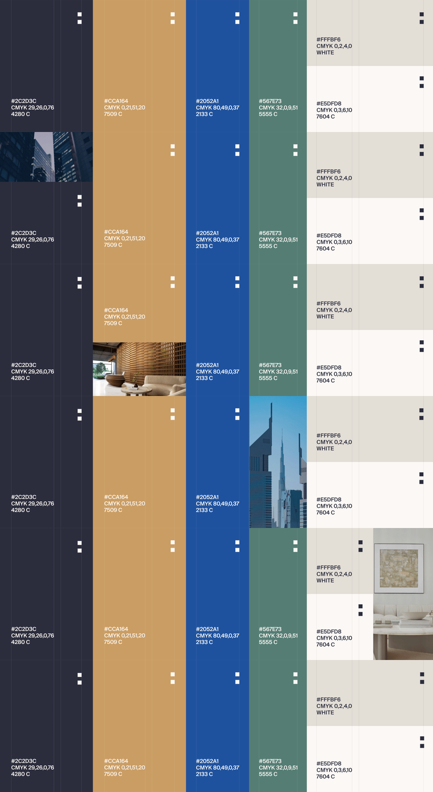
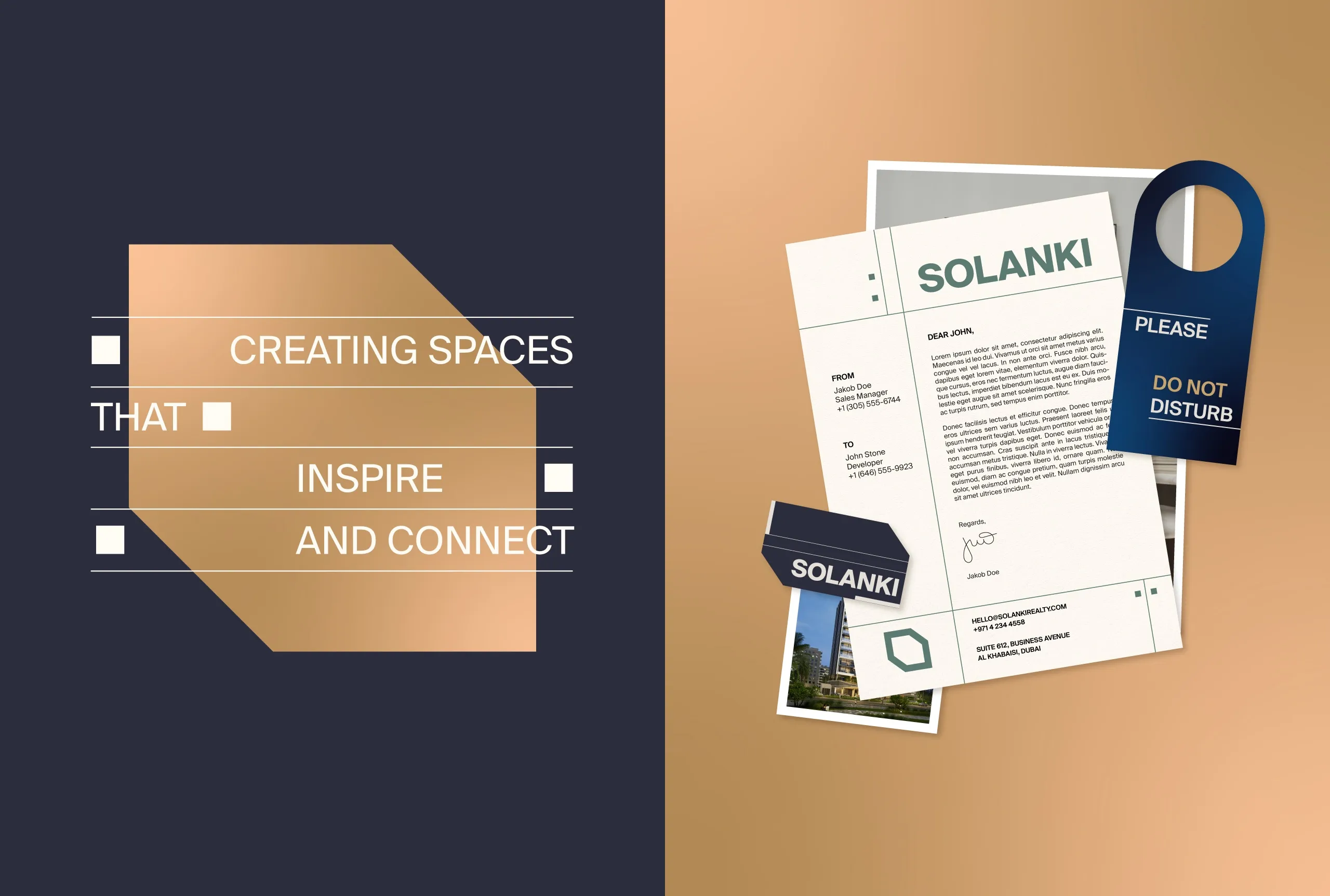
The approach avoids the visual clichés this category usually reaches for. Instead of luxury signals, the system runs on quiet confidence: minimal layouts, intentional spacing, strong composition, and timeless color relationships. In a market where a premium look is the default, restraint is the position that stands out, and it also ages better than the alternative.
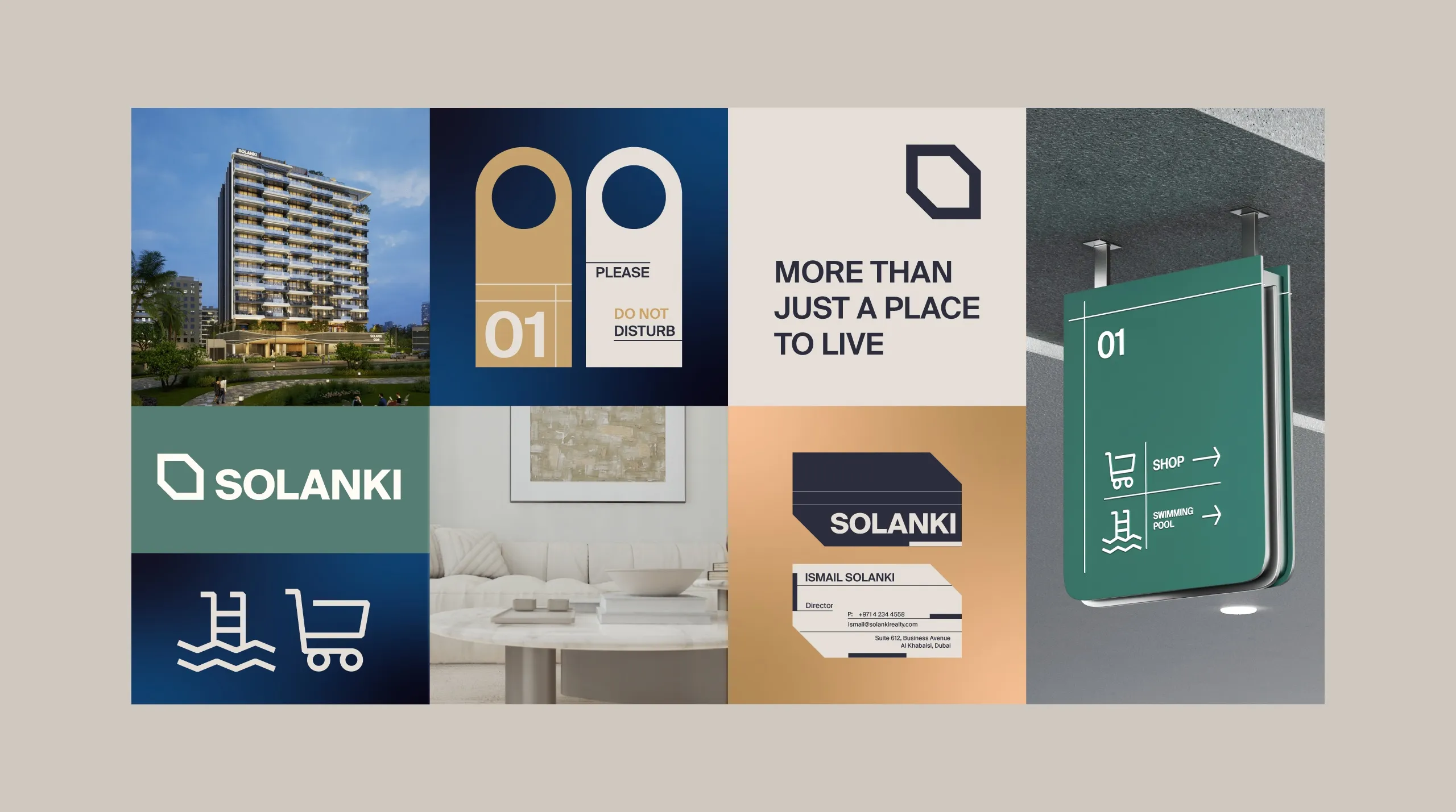
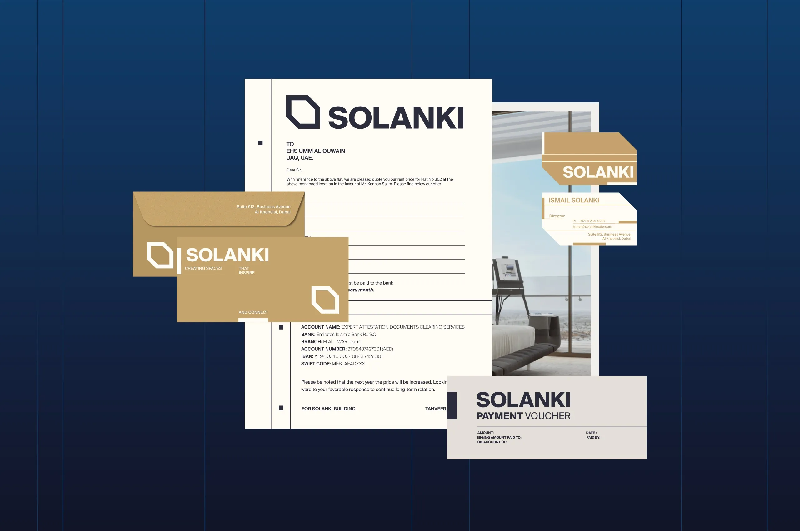
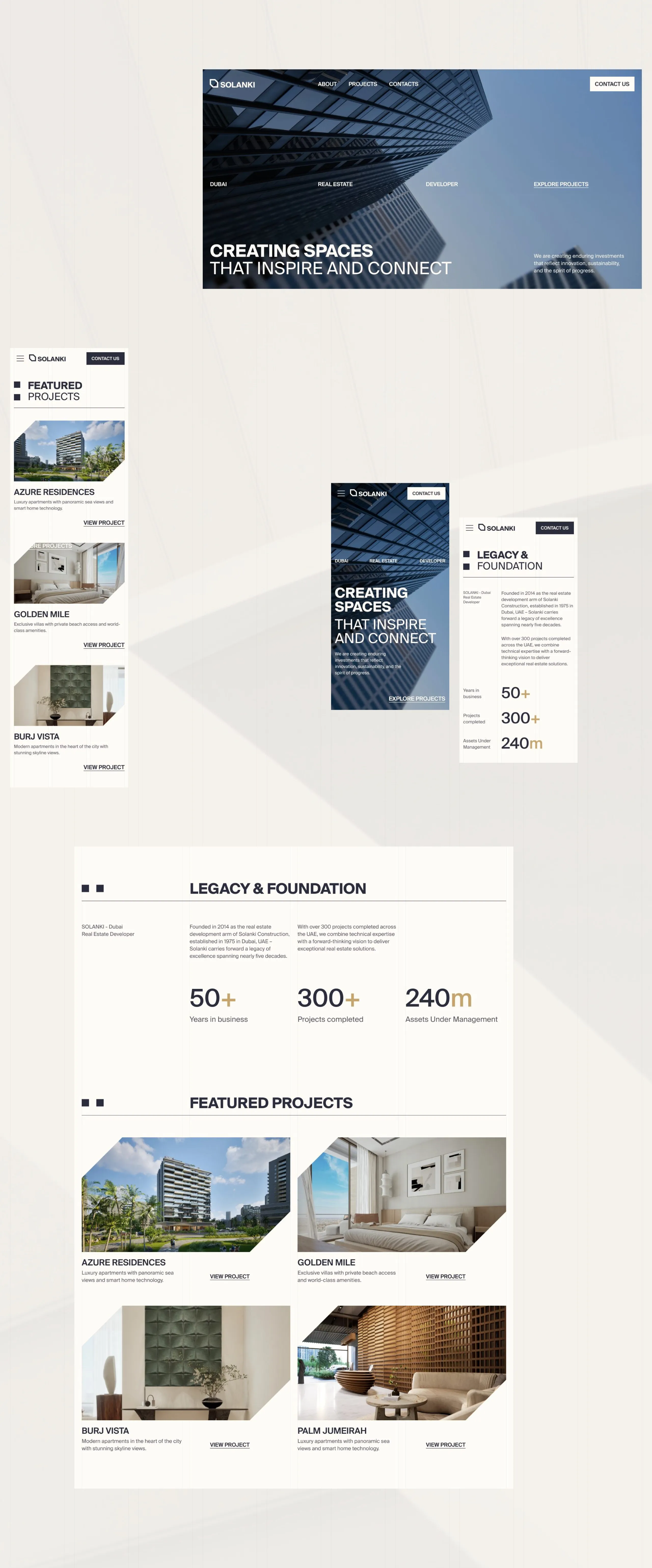
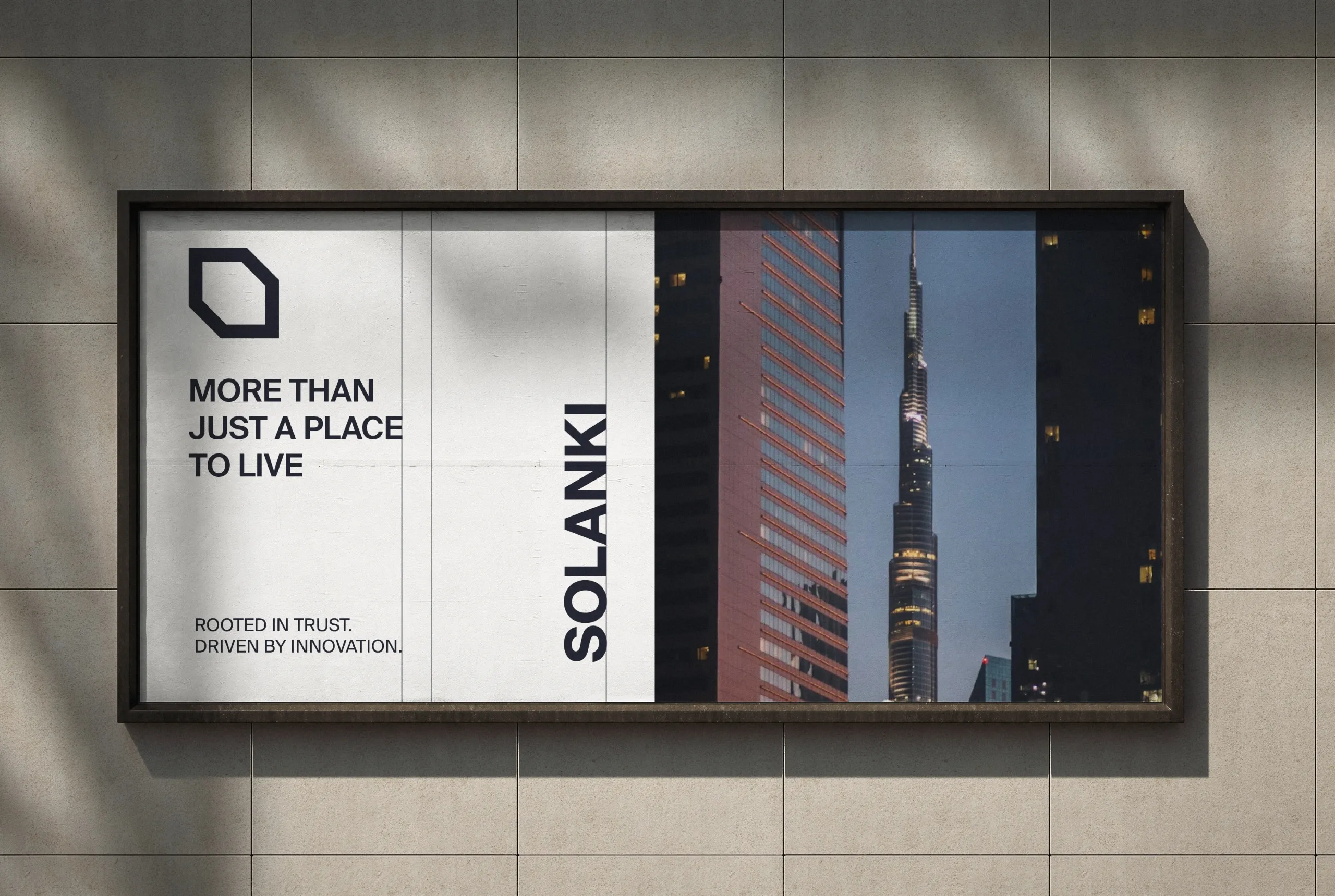
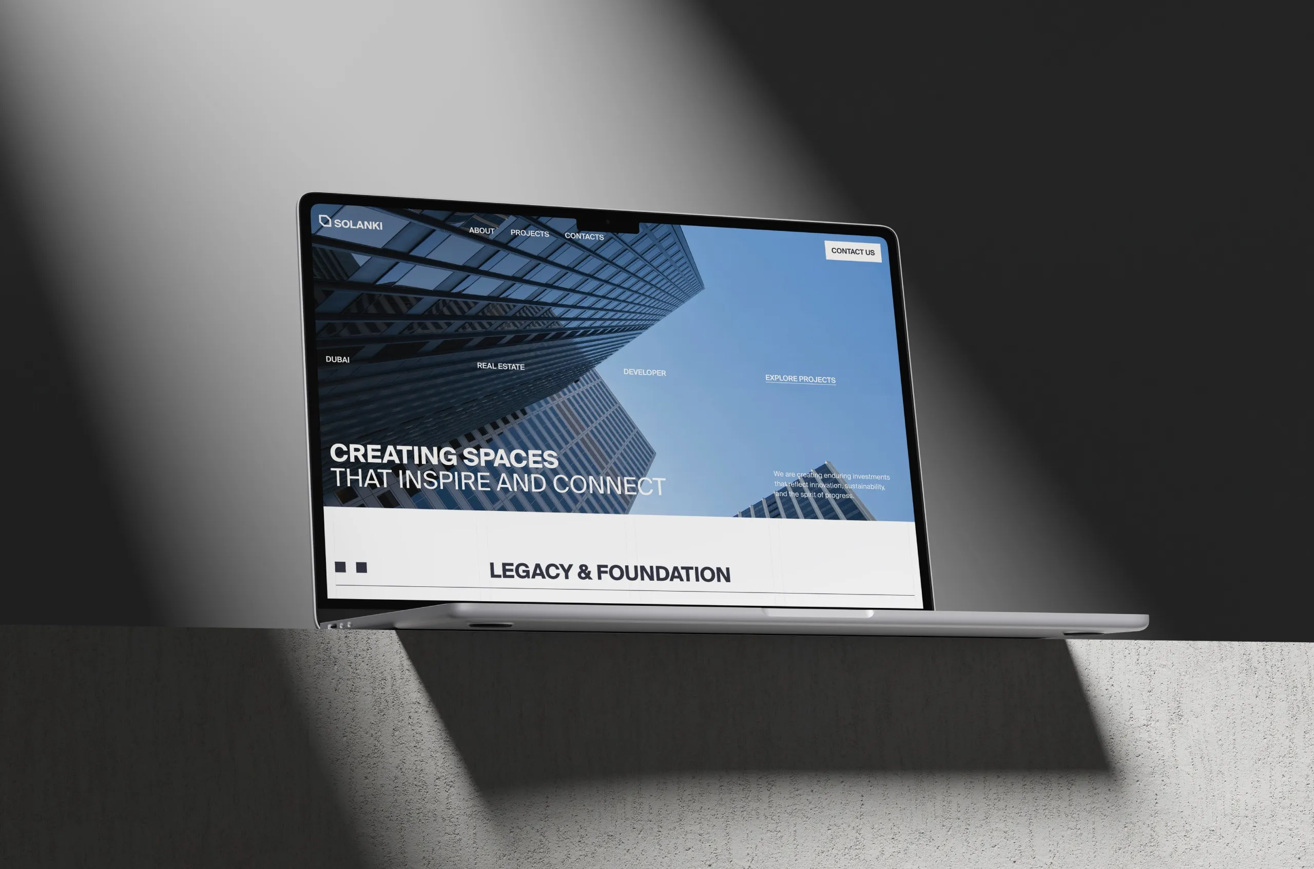
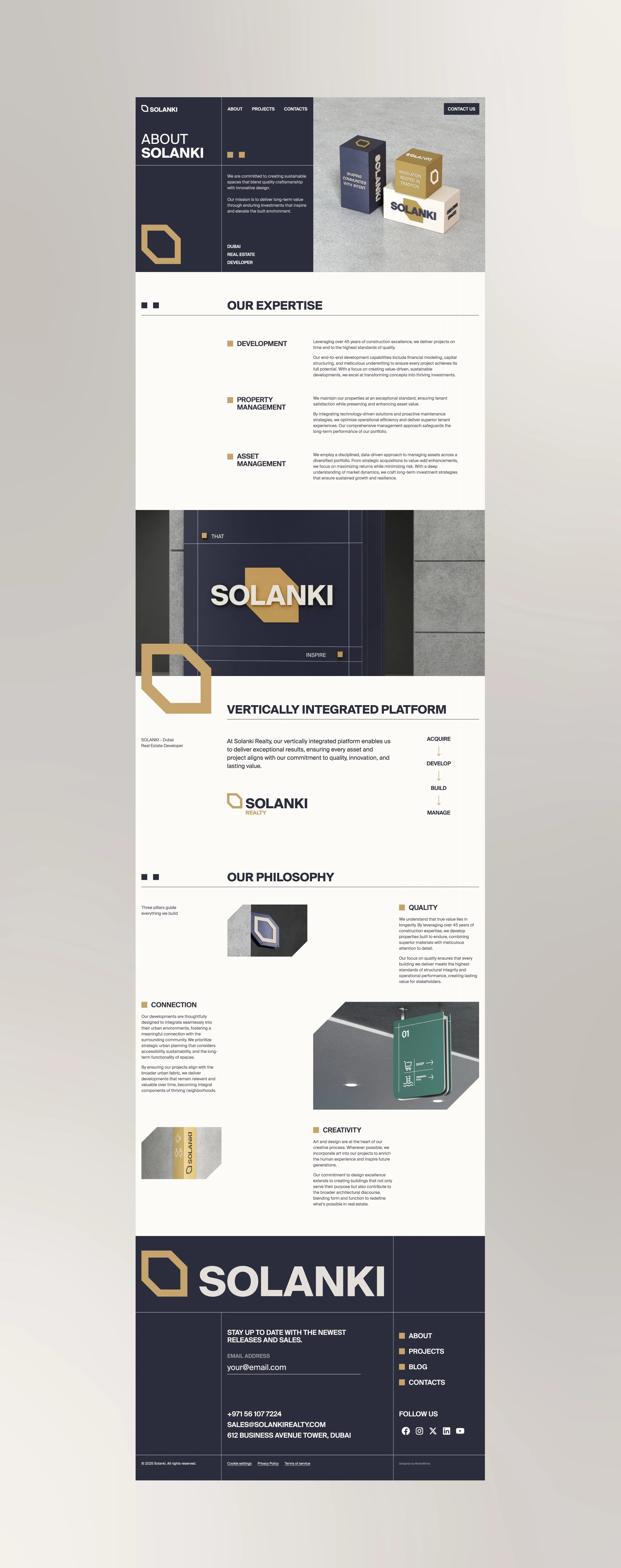
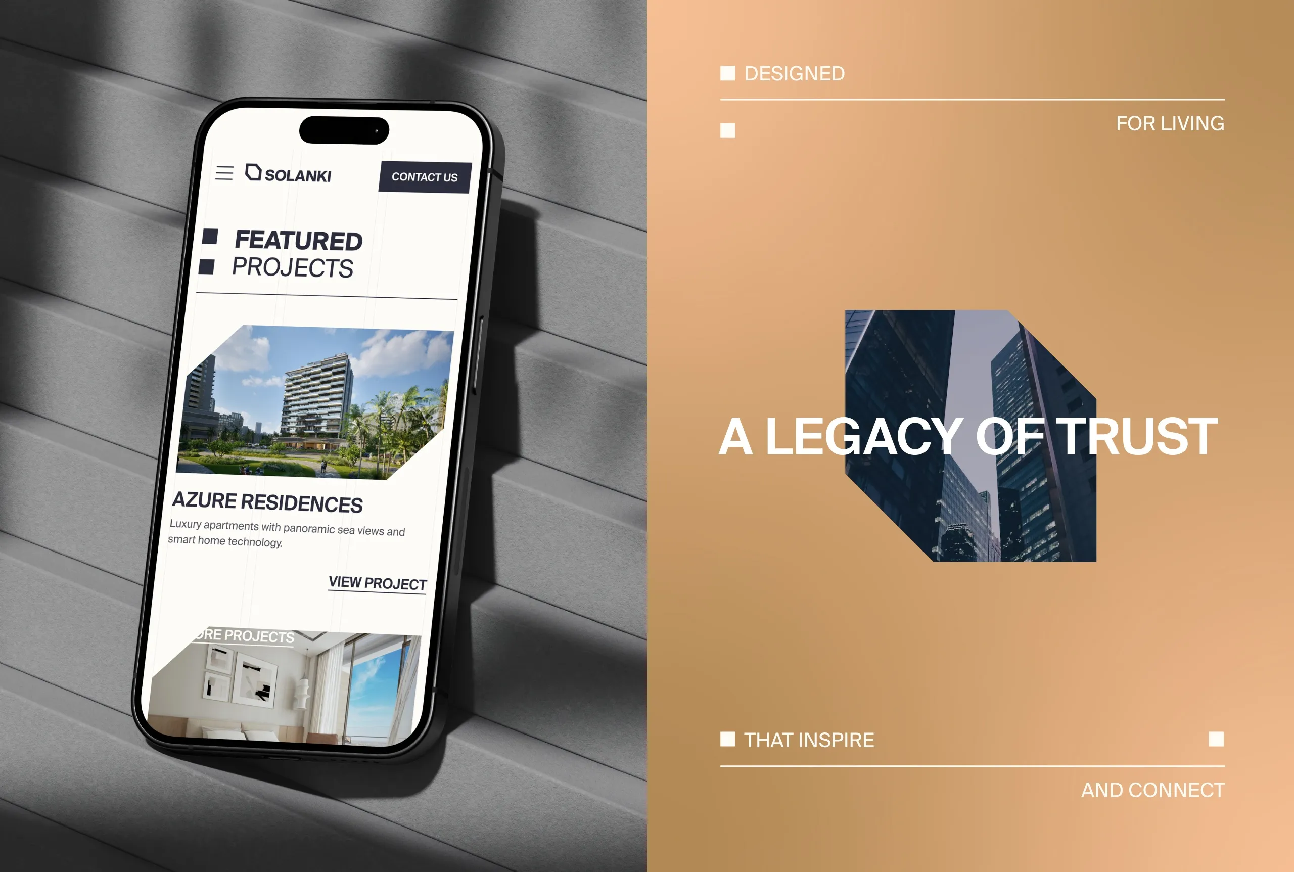
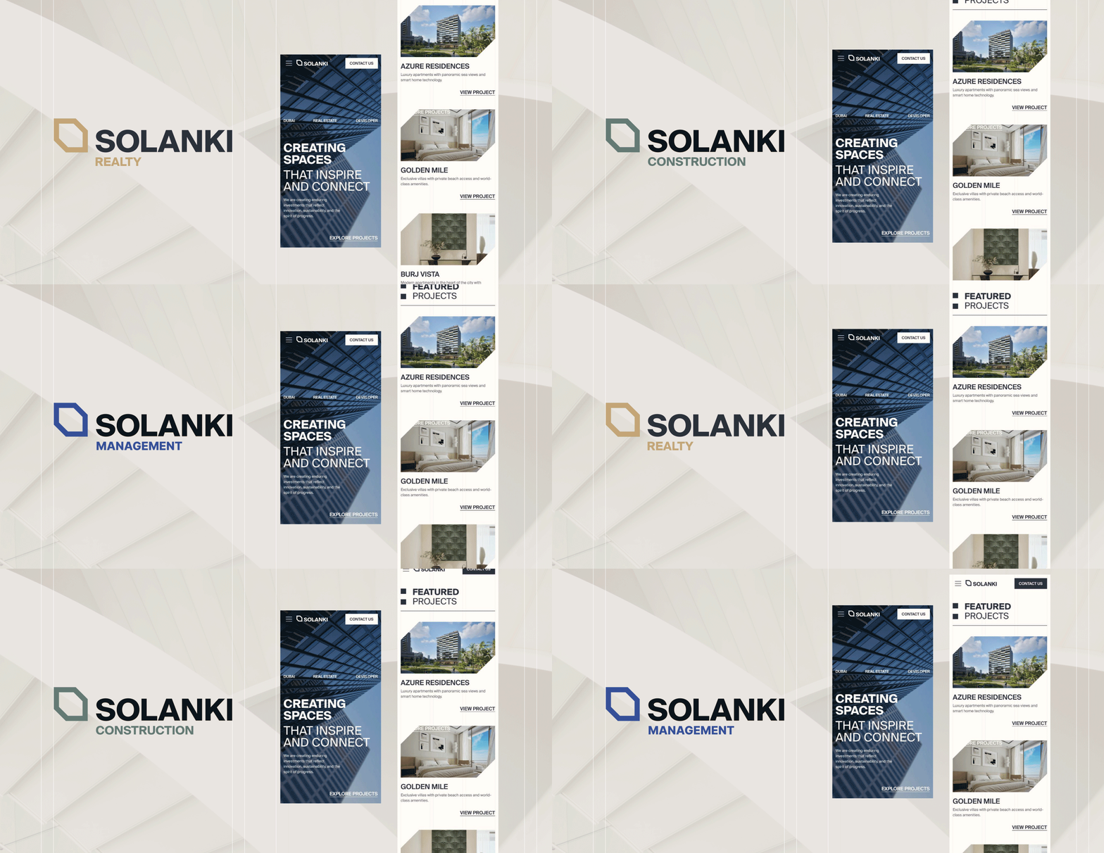
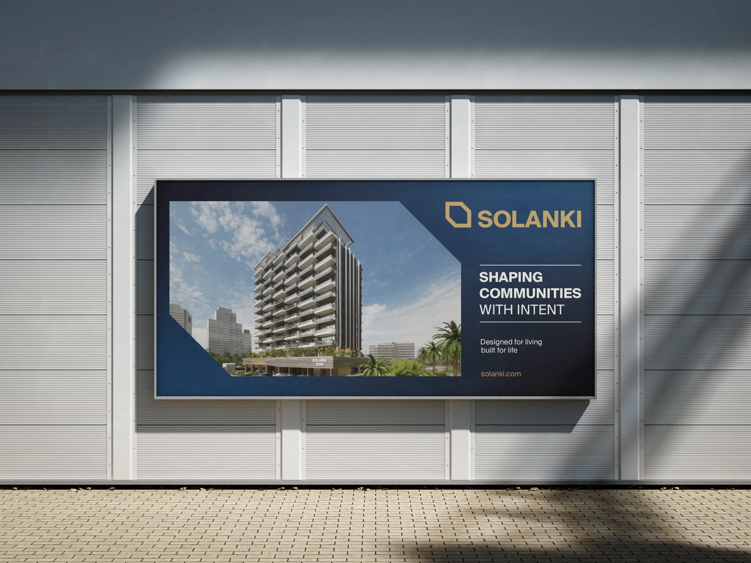
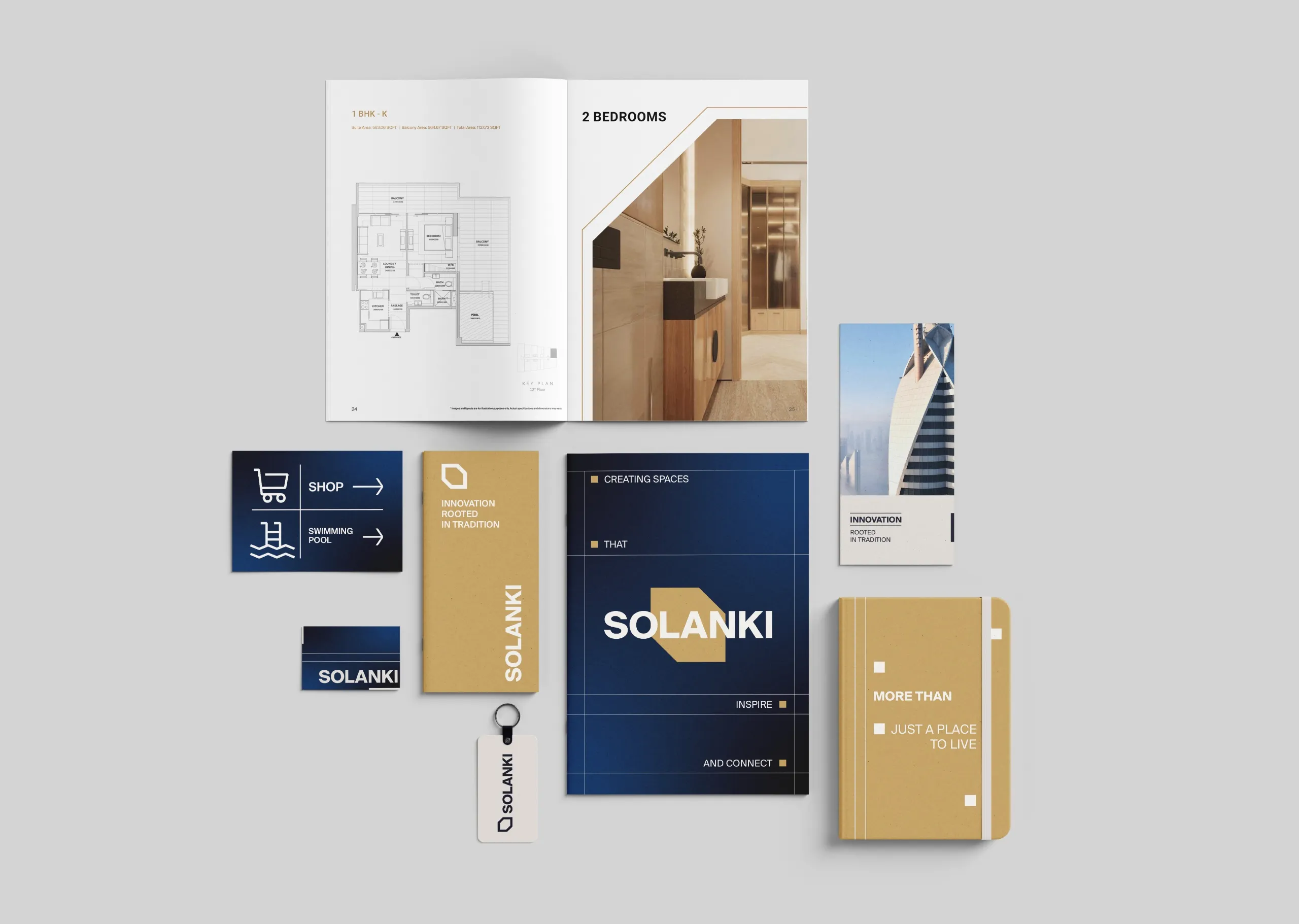
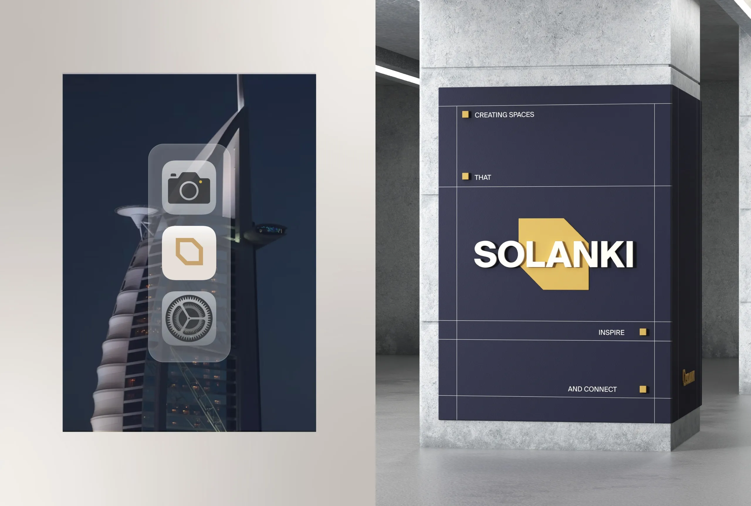
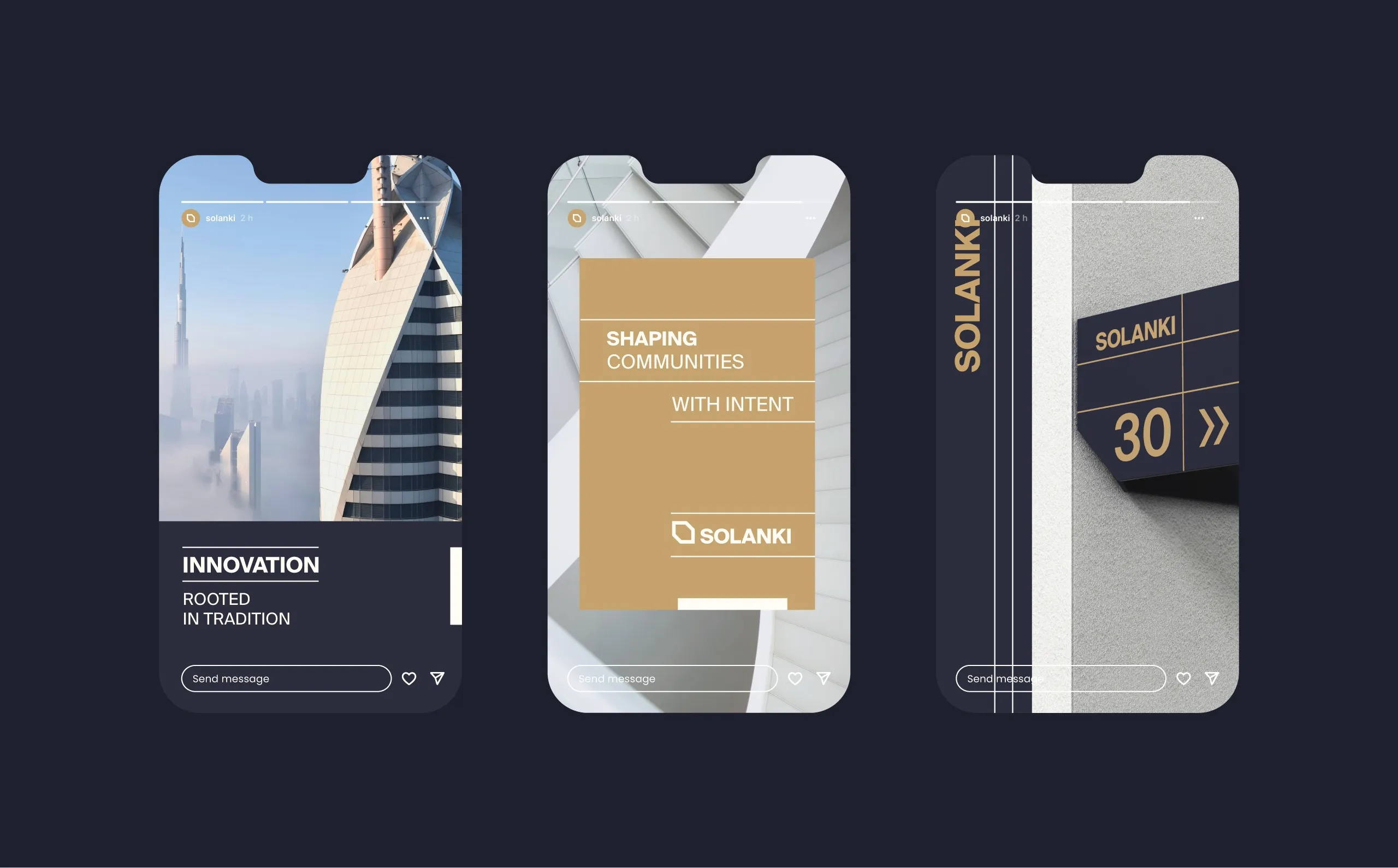
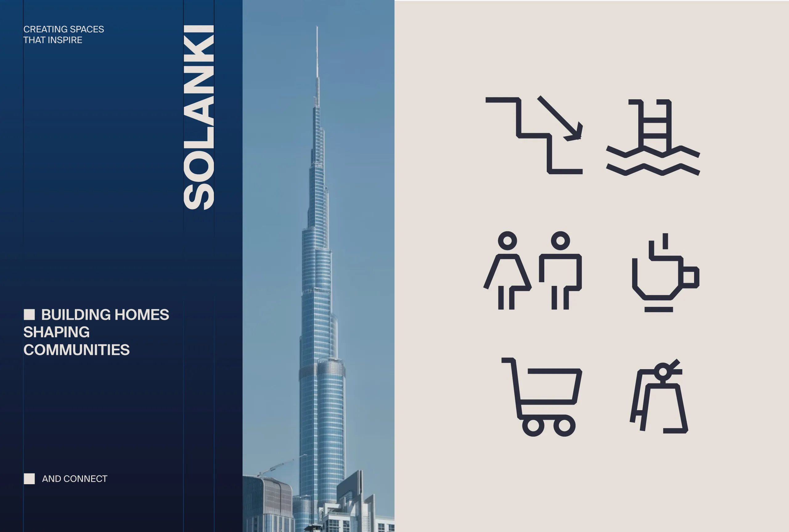
The system extends across signage, print collateral, digital platforms, environmental graphics, and marketing materials. Environmental graphics matter more here than in most sectors, because a development brand is encountered in physical space before it is encountered anywhere else, and a system that was designed only for screens falls apart at building scale.
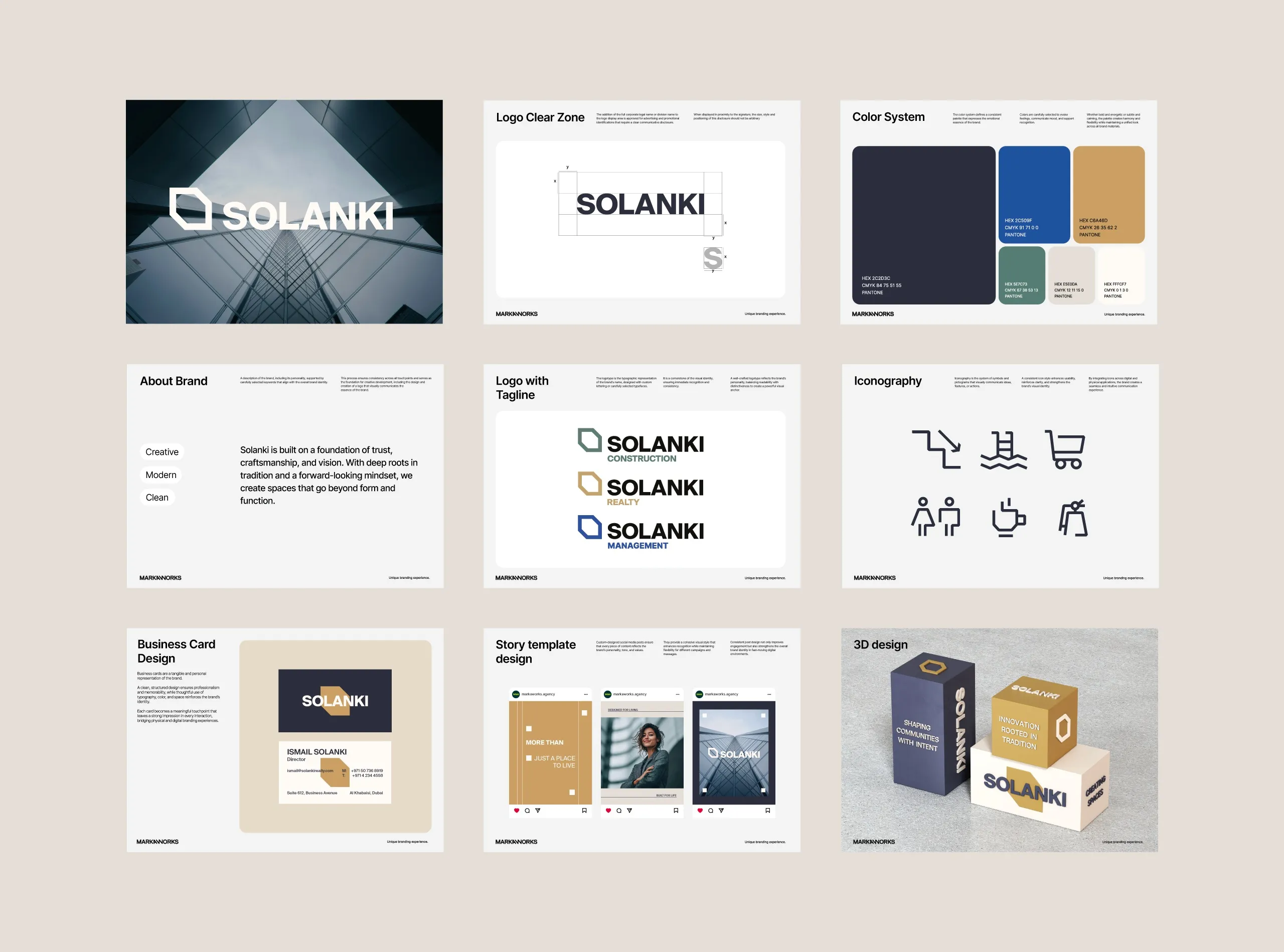
Guidelines matter more here than the word usually suggests. A development brand is applied by contractors, signage fabricators, and agents rather than by designers, so the system had to be documented tightly enough to survive hands that never see the original files. That constraint shaped the design as much as the aesthetic did: simple geometry and clear spacing rules are also the parts that get built correctly.
The delivered scope covers brand strategy, visual identity, art direction, brand guidelines, environmental design, and digital experience. What we delivered adds up to a brand that positions itself as one shaping living environments rather than as a company selling property, and the design carries that claim instead of stating it.



Let’s make the work they’ll copy.
Talk to an expert now
Work with a 38 team of the
industry’s top 1% talent.



