Process inks reach about 55 percent of spot colours. What the rest of that gap costs you, and the tolerance number to put in your print specification.
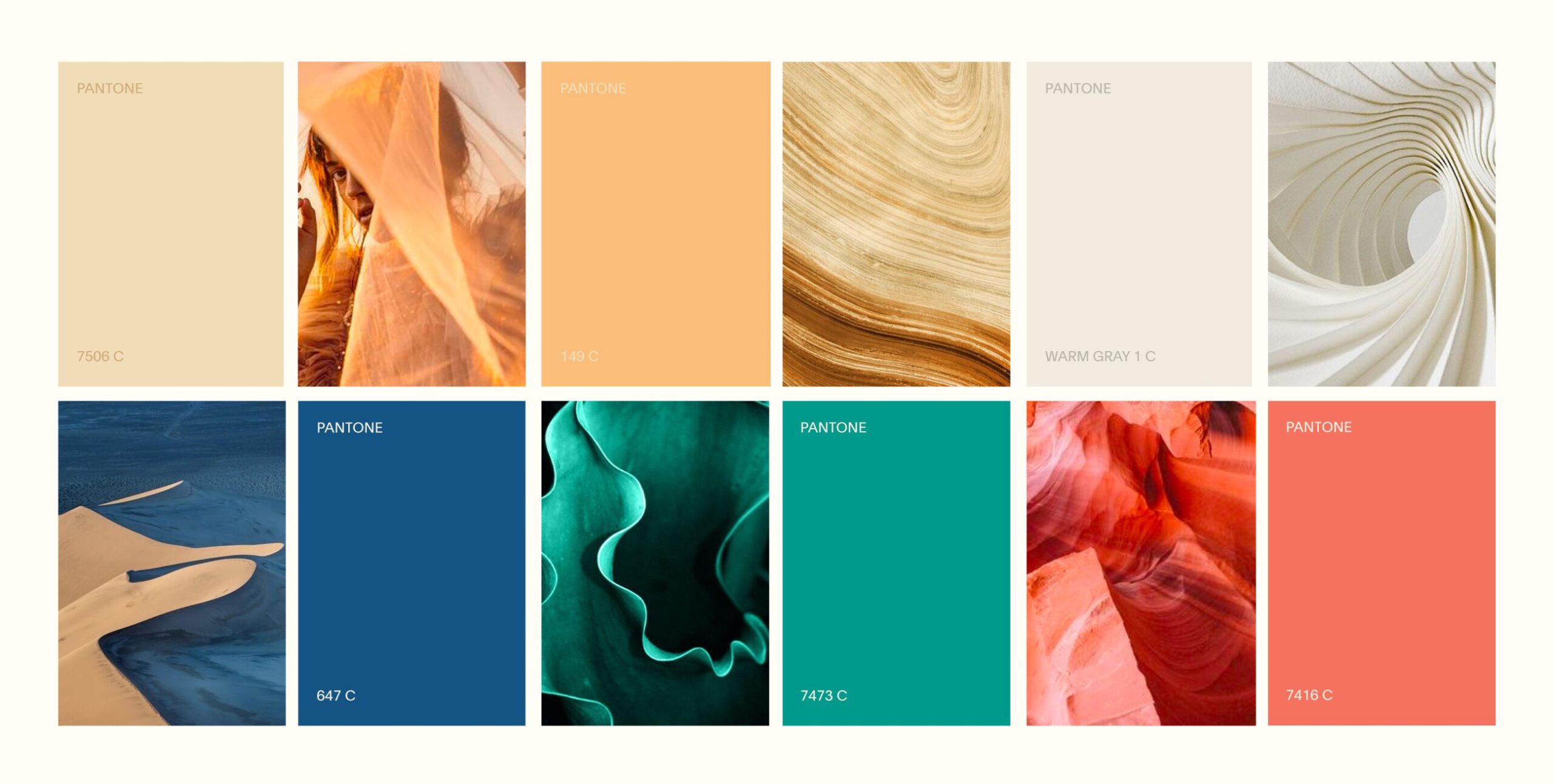
Because most colours cannot be built from four inks. Measured from the published matching data, four-colour process reaches about 55 percent of spot colours, digital process about 65 percent, and a seven-colour press about 90 percent. Your brand colour either sits inside that reach or it does not, and the answer decides what you pay.
Three reaches, one decision
Read this as a purchasing question, not a technical one.
| How the colour is made | How much of the spot range it reaches | What it means for you |
|---|---|---|
| Four-colour process | About 55 percent | Cheapest, and the most likely to shift |
| Digital process | About 65 percent | Short runs, still a build and not the ink |
| Seven-colour press | About 90 percent | Wider reach without a dedicated ink per colour |
| Spot ink | The colour itself | Mixed to the reference, priced per colour per pack |
The two systems are different things before they are different numbers. Pantone writes it plainly on its own technical page: “Spot color is a method of applying a premixed color of ink directly to the page. Process color applies four or more standard ink colors (the basic four are cyan, magenta, yellow and black) in very fine screens so that many thousands of colors are created.” These three percentages share one denominator: they are proportions of the spot colour range. A percentage quoted for a printing process, such as a gamut coverage figure, is a proportion of something else and does not belong in this table.
If your mark lives on one colour, buy the ink. If your colour is decorative and your range is wide, a build may be the better trade. The mistake is assuming the build will match and discovering the gap on the first pallet.
A tolerance you can actually sign
Ask for the tolerance in writing and ask which version of it. Proof tolerance moved to CIEDE2000 in 2016, and that move brought a threshold of 2,5 for spot colours.
Delta E is the measured distance between two colours, and a tolerance is the largest distance both sides agree to call a match. This matters because Delta E versions differ not only in formula but in what the threshold means, so “within Delta E 2” from one supplier and from another are not the same promise. Name the version and the number in the specification, then a disagreement about a printed pack has an arbiter that is not taste.
Where the reference itself has limits
The reference system has published constraints of its own, and knowing them is what lets you decide what to specify rather than argue about it afterwards.
There is a 31 colour difference between the Formula Guide and the Color Bridge, which is the hardest published statement of what process ink cannot reach. Metallic references are only available on coated stock, so a metallic on an uncoated carton is already outside the reference. And there is no official figure for how much of the library falls outside process gamut, which is why anybody quoting one is quoting an estimate.
November 2022, and why your old files still carry it
Pantone libraries were removed from Adobe applications in November 2022, and colours in files that relied on them turned black.
For you that is a housekeeping question with a deadline attached: if your identity was built before that date and nobody has opened the source files since, you may be one export away from finding out. Ask whoever holds your artwork to confirm the colour values are embedded rather than referenced, and to give you the values per process rather than a single code.
If the range is already in market
A colour that has already shipped is a different problem from a colour being chosen, and the fix is not always a reprint.
The check takes an afternoon and runs in three steps.
- Pull one pack from each variant and from each supplier that prints for you.
- Lay them side by side under one light and look at them together, never one at a time.
- Decide which you have: a colour problem, where one supplier drifts from the reference, or a specification problem, where nobody was given the same reference to hit.
A single pack that reads slightly warm is invisible; four packs from three printers that each read slightly differently is the thing your buyer notices. MarkaWorks does this check at the start of a range project, because the two problems have different prices.
The measurement conditions, in one line
Two labs can measure the same printed pack and disagree, which is why the condition belongs in the specification. ISO 13655 defines the M0 to M3 measurement conditions, and those conditions settle the optical brightener problem that otherwise makes paper stock look like a colour error.
You do not need to understand the conditions. You need your specification to name one, so that “it matched” has a meaning both sides accepted in advance.
Four lines for the print specification
Four lines cover it, in this order.
- The colour system you are buying: a spot ink, a build, or a seven-colour press.
- The values per process, not one code reused everywhere.
- The Delta E version and the threshold, named together.
- The measurement condition the tolerance will be checked under.
MarkaWorks writes those four into the artwork handover, because a colour argument after the run is expensive and the same argument before the run costs one sentence.
Put your current values on the table at the start. If they exist only as a screen reference, that is the first thing to fix, and it is cheaper to fix before the range grows than after.
Colour in the MarkaWorks handover
Colour is specified by the designer and reproduced by the supplier, and MarkaWorks sits on the first side of that line. MarkaWorks writes the four lines above into the artwork handover: the colour system, the values per process, the Delta E version with its threshold, and the measurement condition. On a range already in market, we run the side-by-side check first, because it says whether you have a colour problem or a specification problem. Both belong to the packaging and product design service.


