
Caffeinication
Caffeinication Brand Identity and Packaging Design
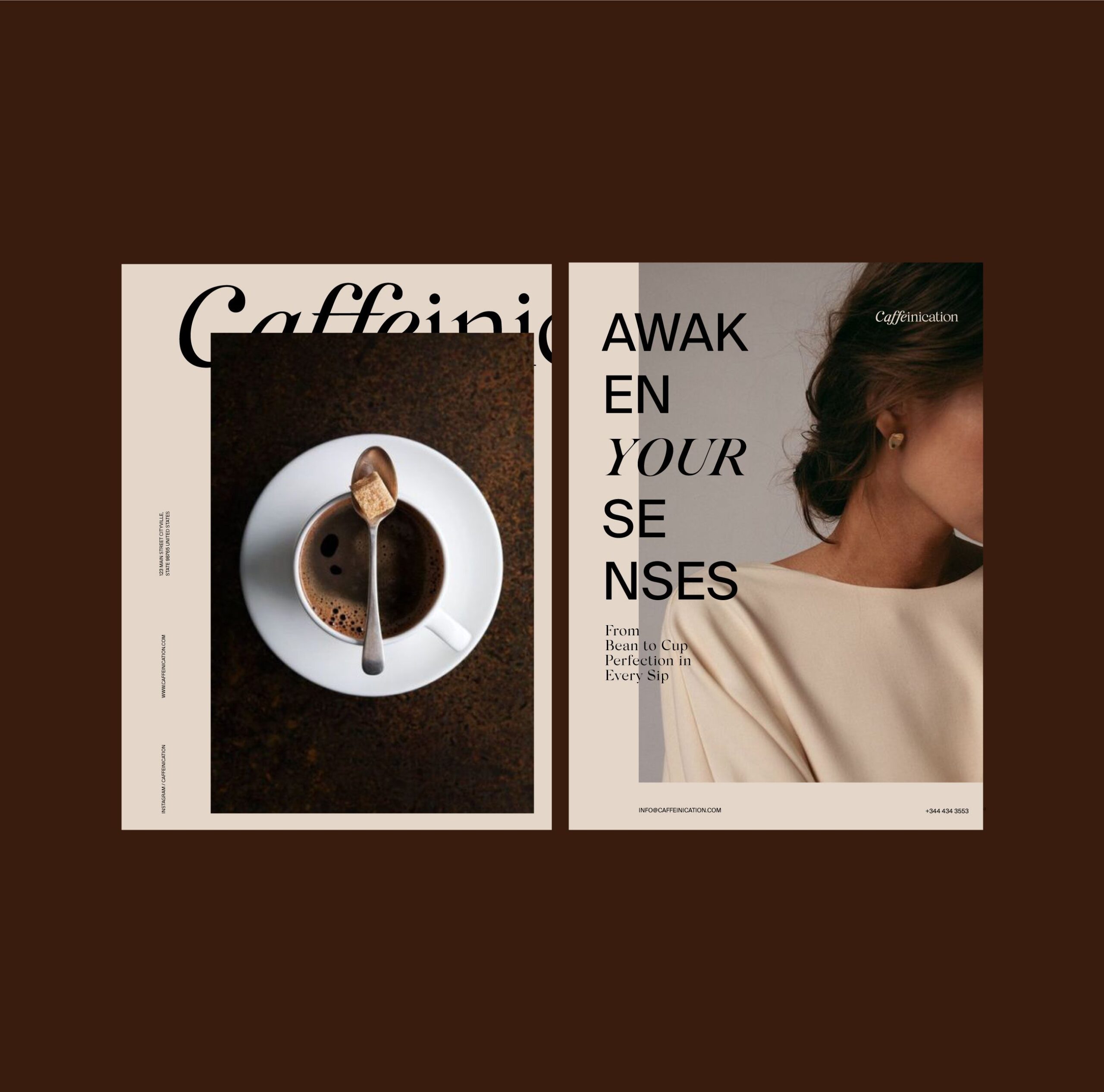
Caffeinication is a modern coffee brand crafted for coffee enthusiasts who view coffee as both craft and ritual. The brand design project focused on establishing a refined visual identity that communicates sensory richness, premium quality, and emotional warmth across all touchpoints.

Coffee as craft and ritual rather than fuel: that is who Caffeinication was made for. Caffeinication is a coffee brand, and the design problem in specialty coffee is that the category’s premium signals are exhausted: everyone uses kraft paper, hand lettering, and origin stories, so none of them separate one bag from another any more.
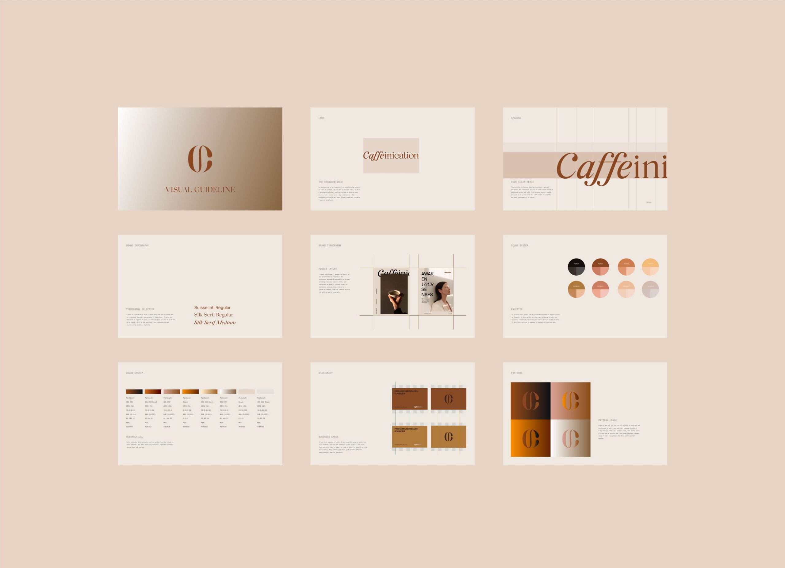
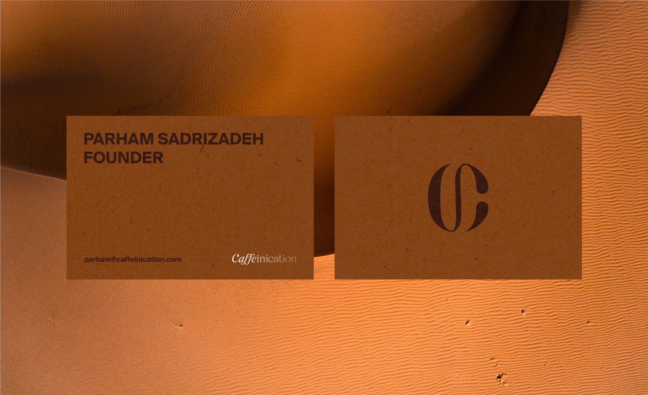
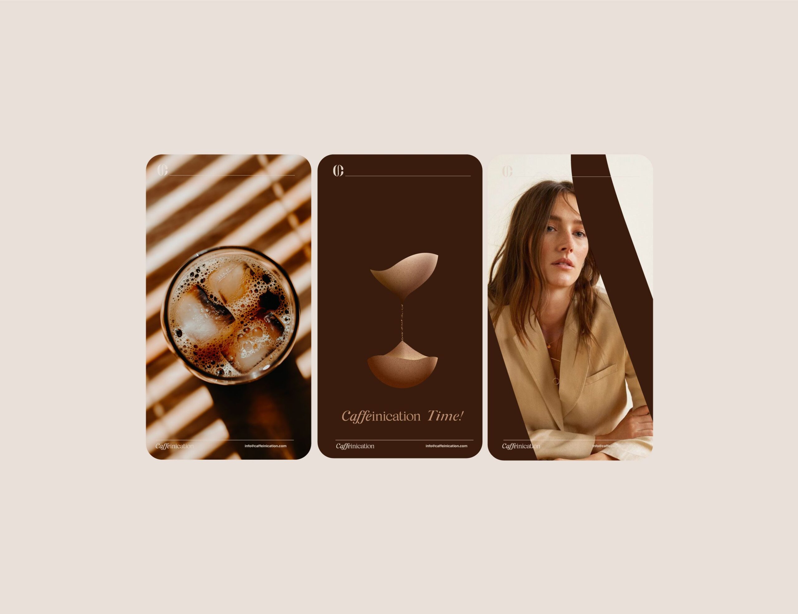
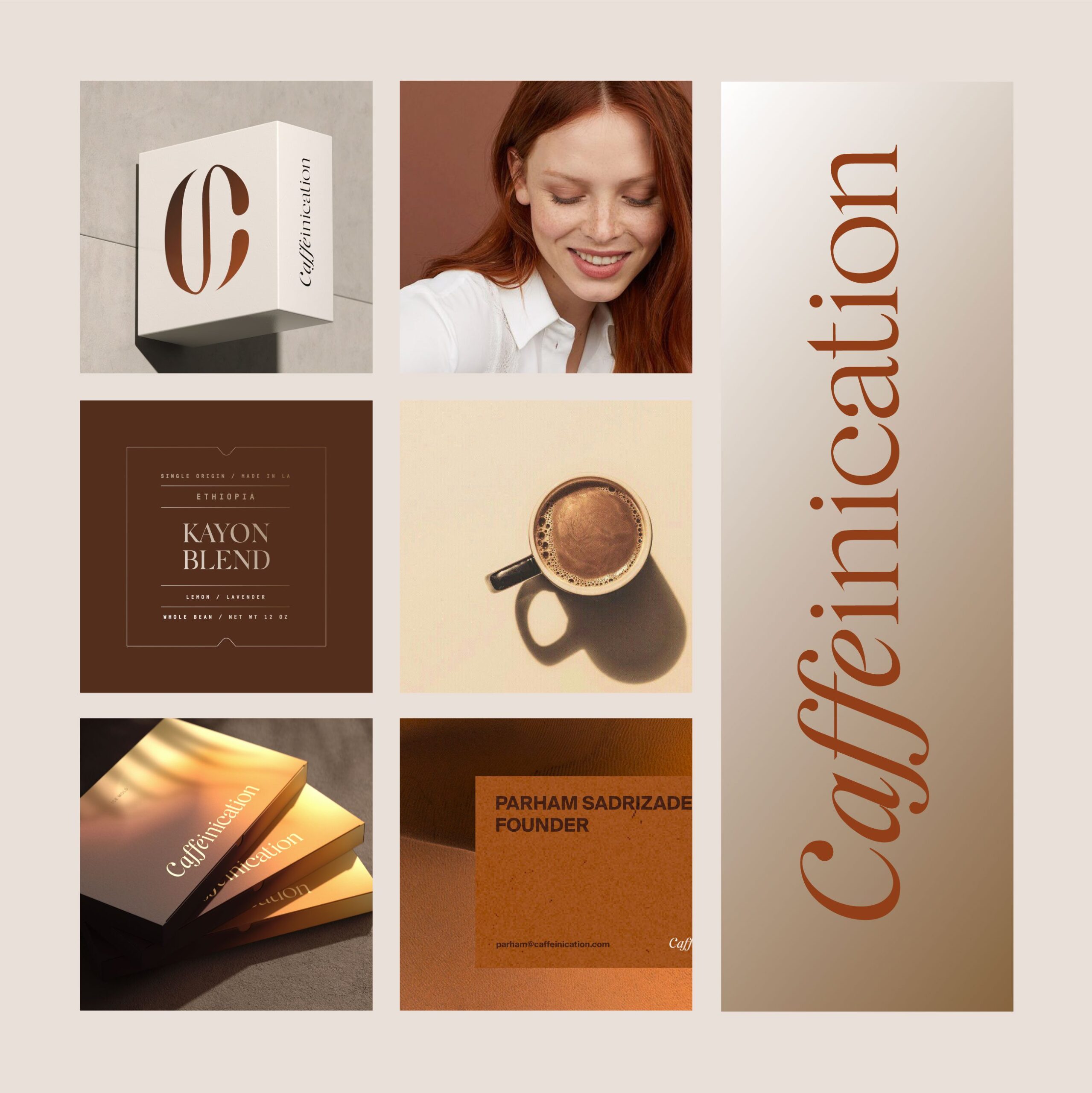
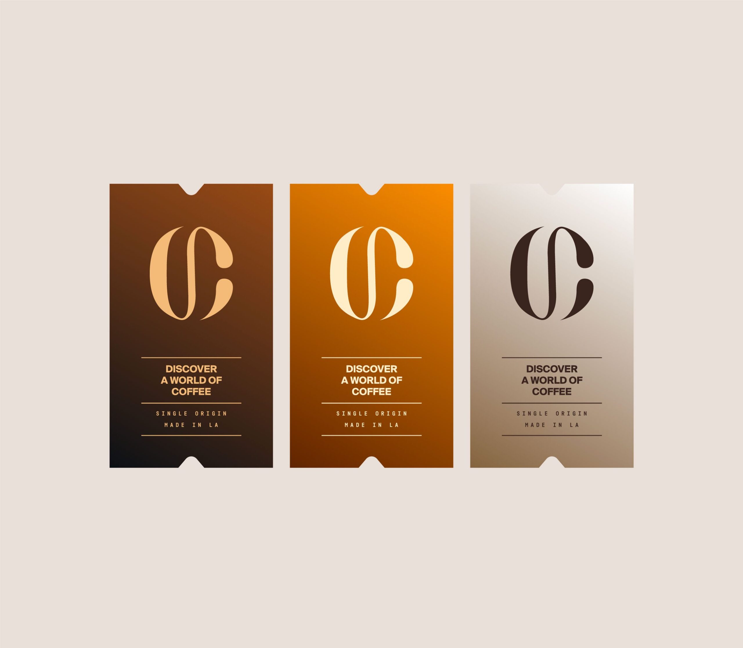
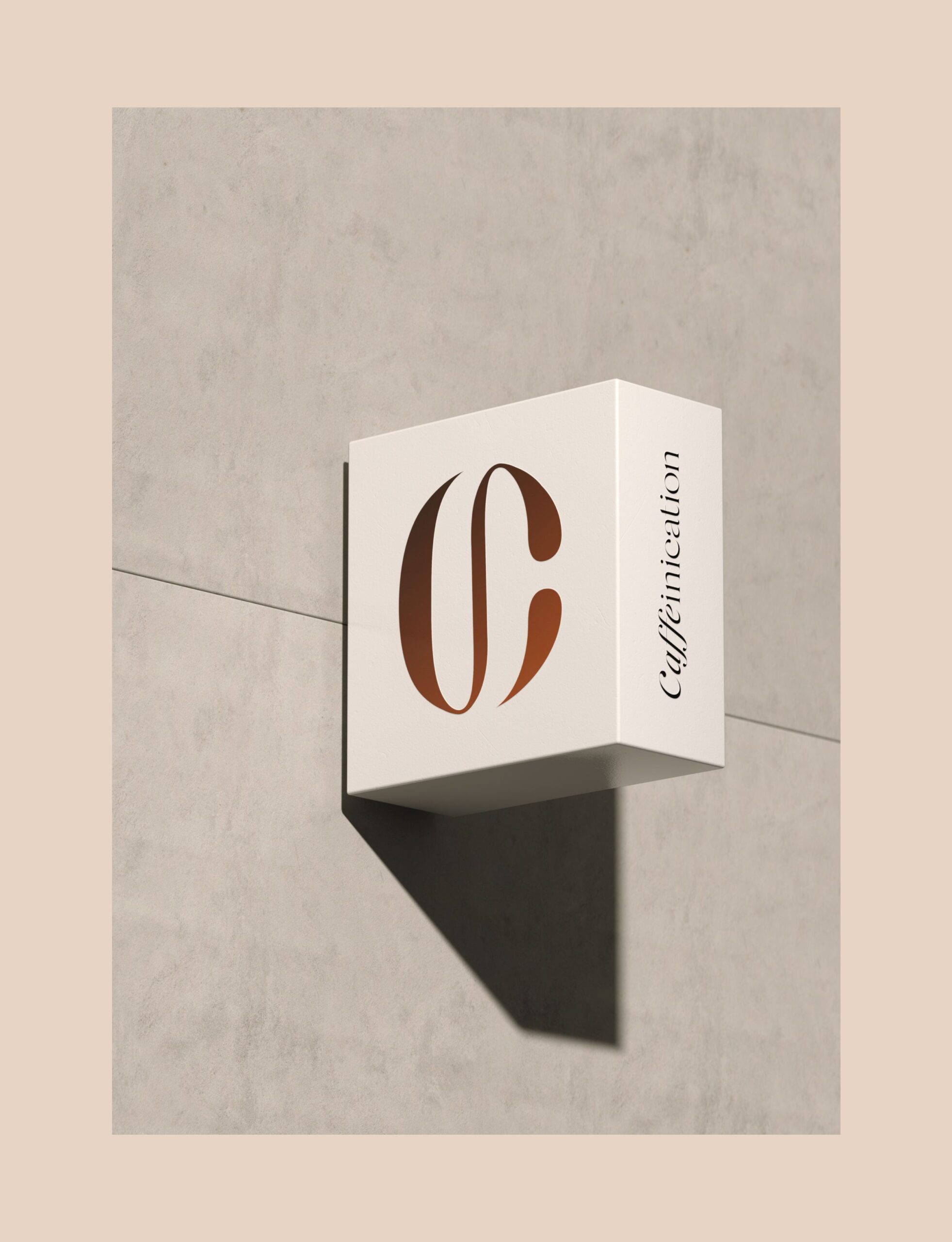
At MarkaWorks we anchored the brand identity on a monogram paired with an expressive logotype. The symbol references coffee’s basic elements without illustrating a bean or a cup, which keeps it working at the sizes a brand actually needs: a bag panel, a cup seal, a favicon, a stamp.
See more coffee and tea branding case studies.
Brand Strategy and Visual Identity
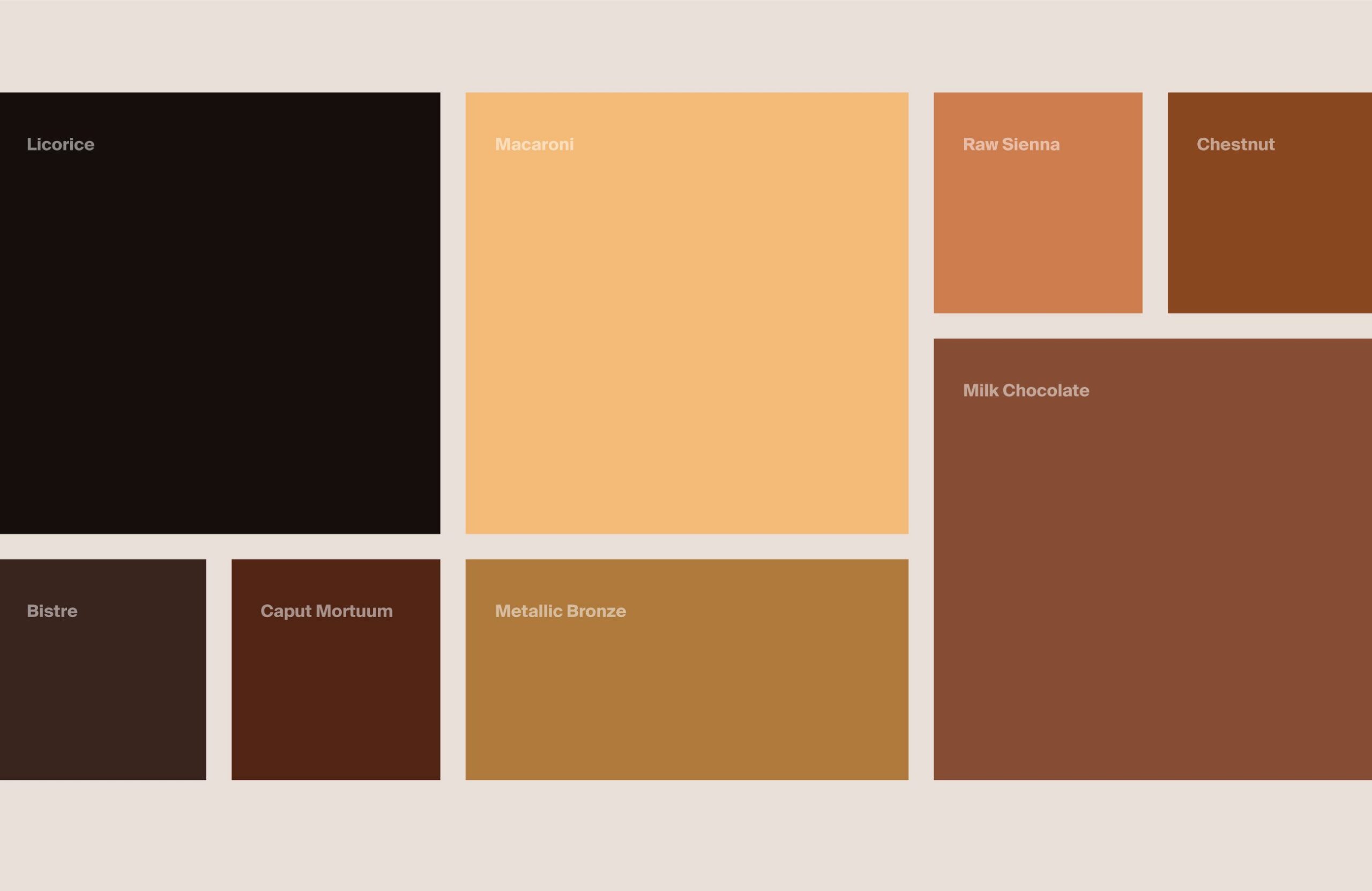
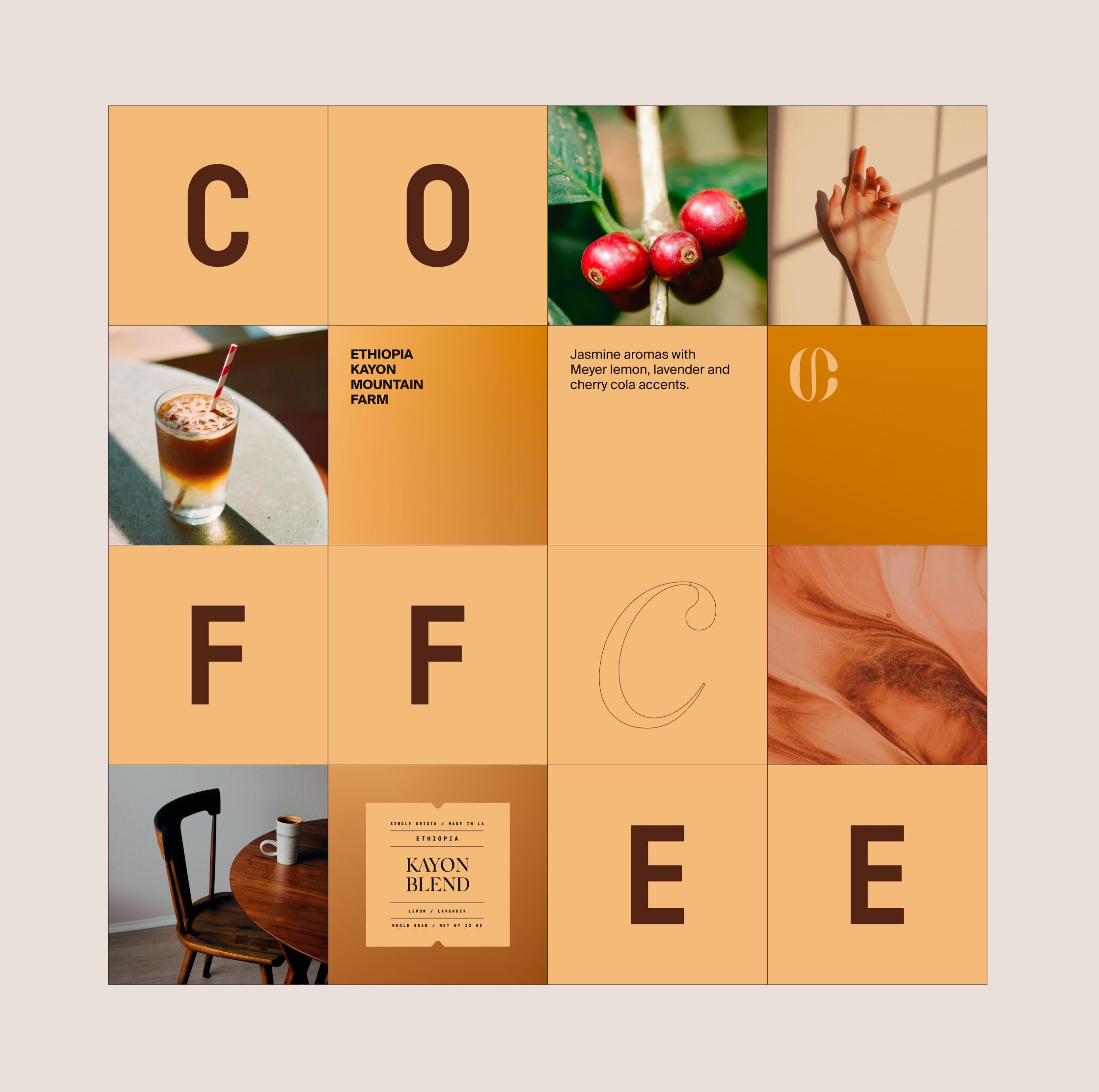
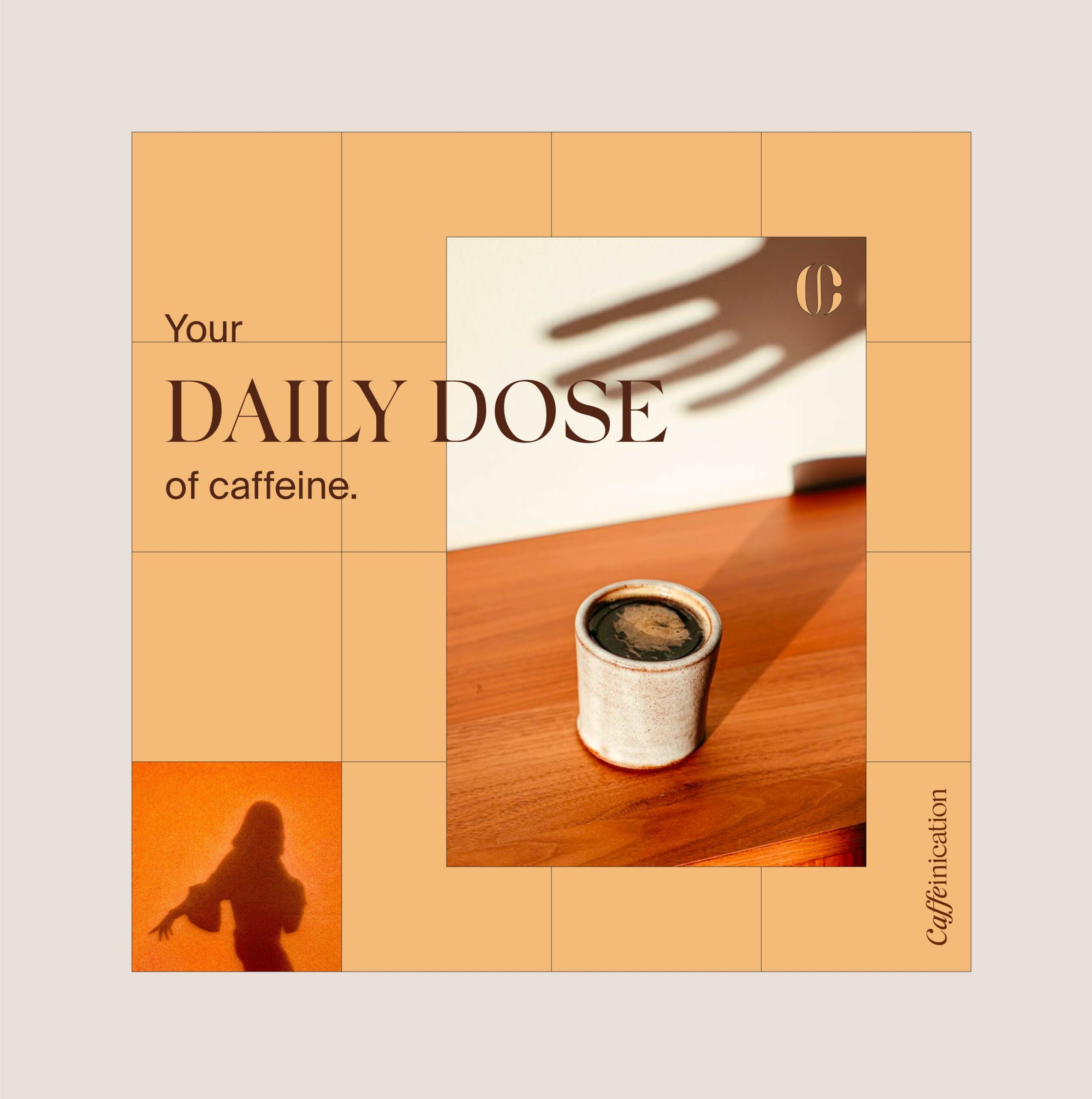
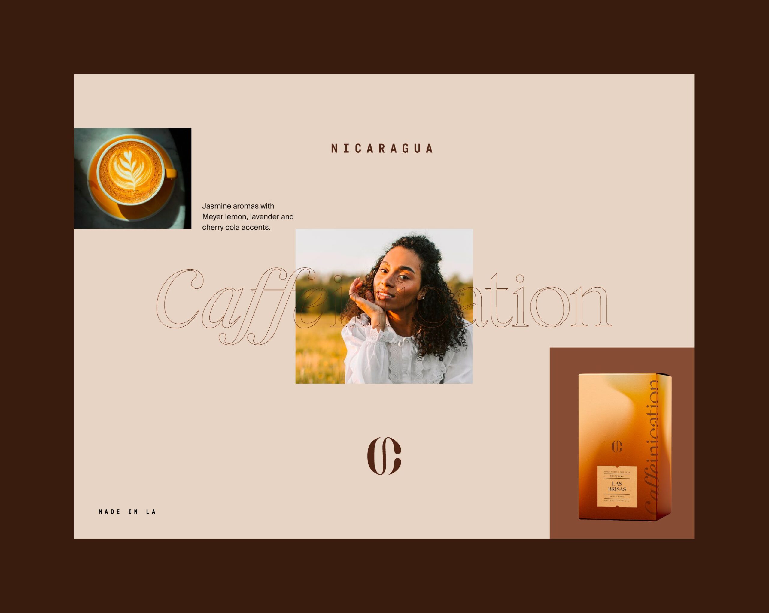
Color carries the sensory argument for Caffeinication. Rich browns, warm bronze, and deep neutrals point at roasted beans, crema, and chocolate notes. In a category where a buyer cannot smell or taste before purchase, color is the only channel that can suggest what the product will be like, so we treated the palette as product information rather than decoration.

Packaging Design and Product Expression
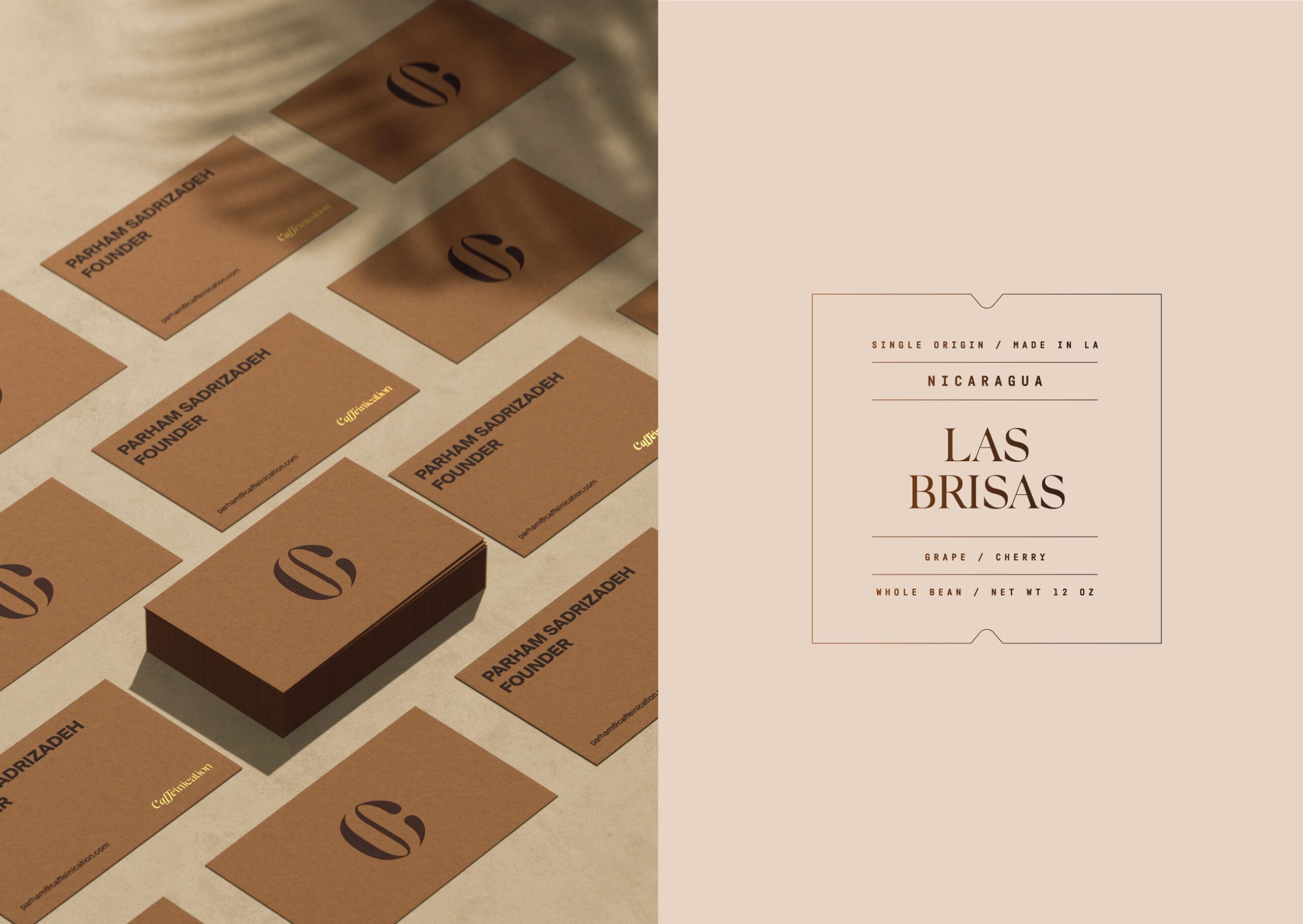
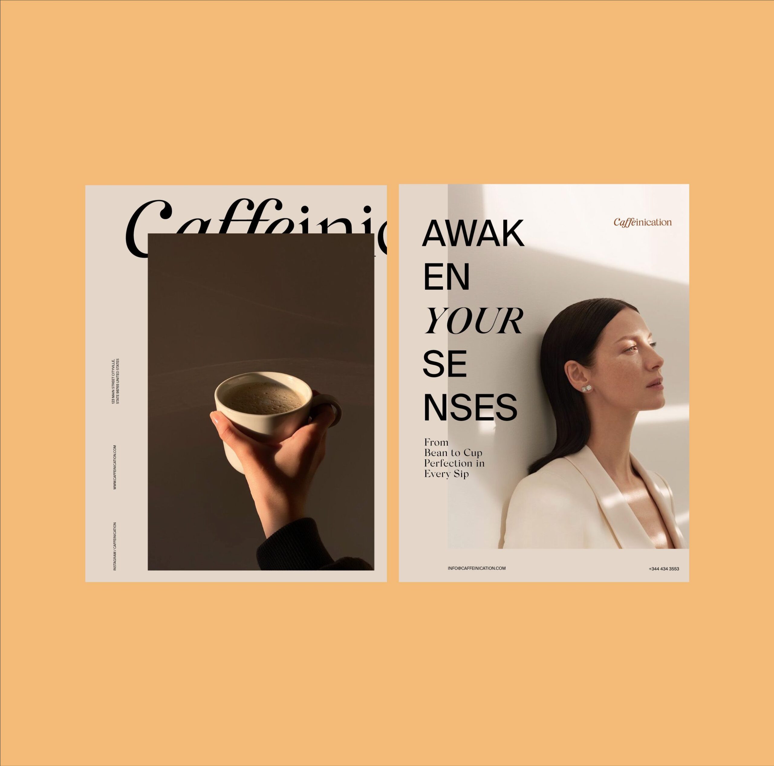
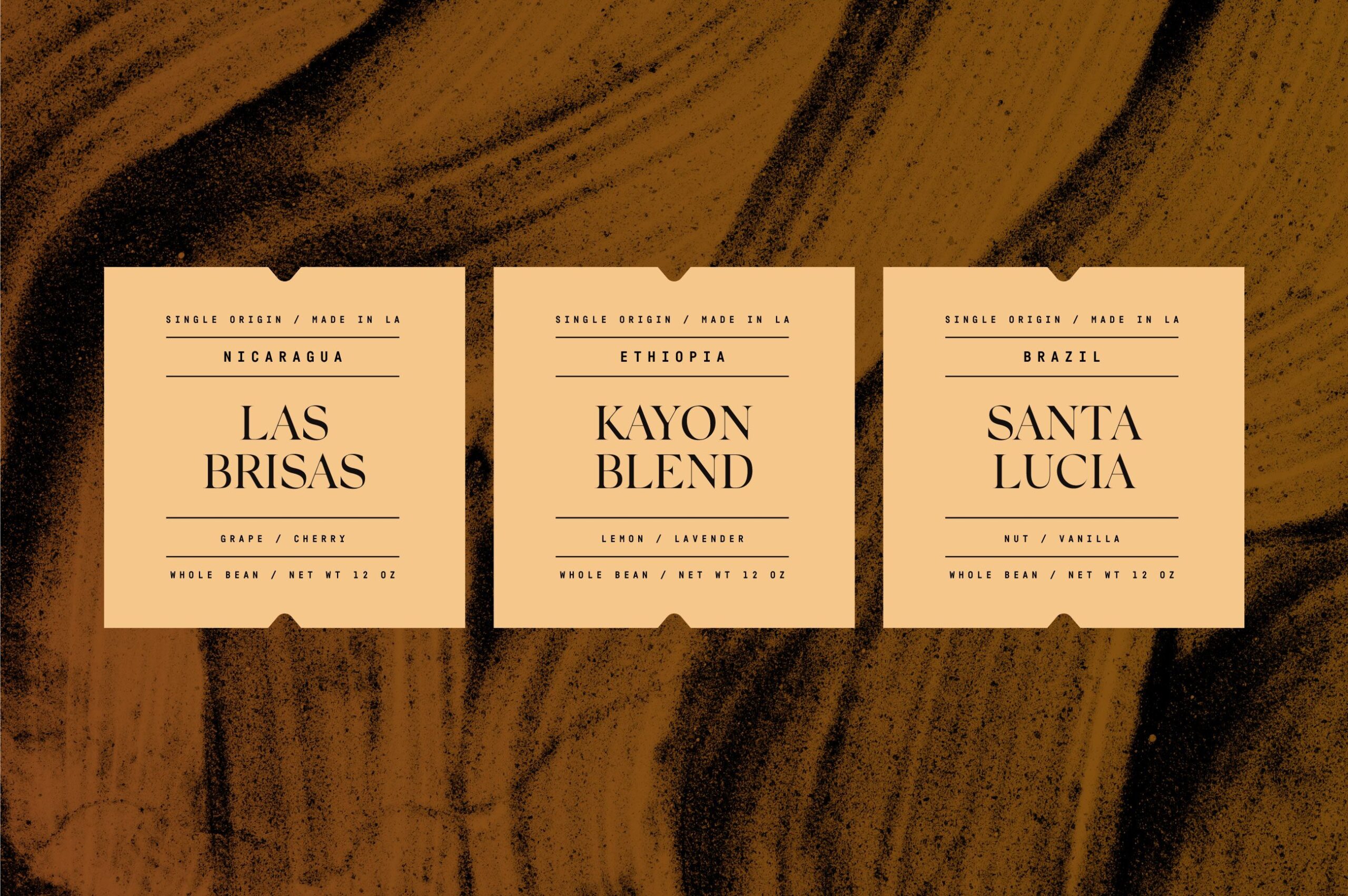
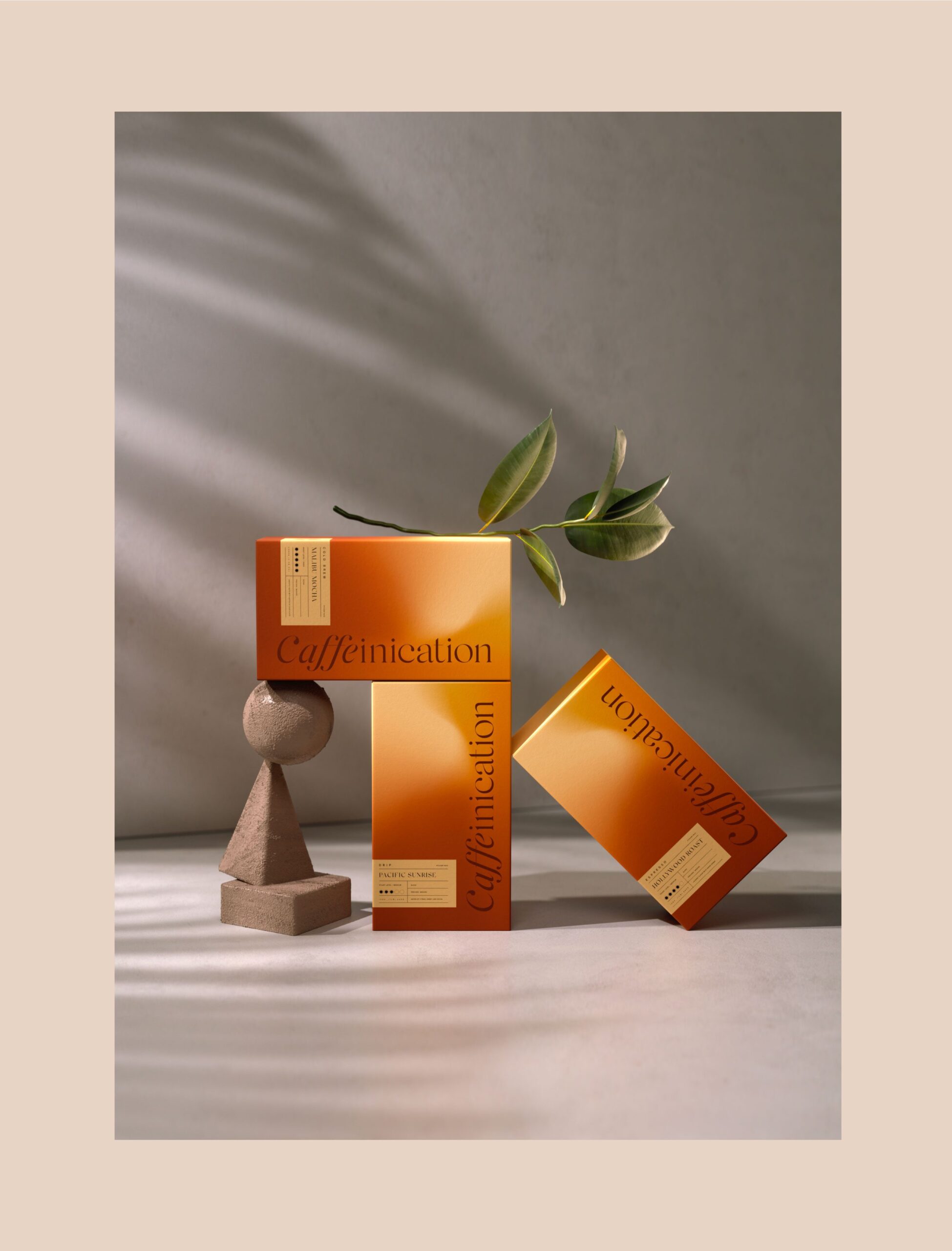
Typography balances modern restraint against classic form, and we built the system for hierarchy first. A coffee label has to carry roast level, origin, and tasting notes in a small area, and a buyer comparing two bags is looking for the same three things in the same order.

3D Visualization and Brand Experience
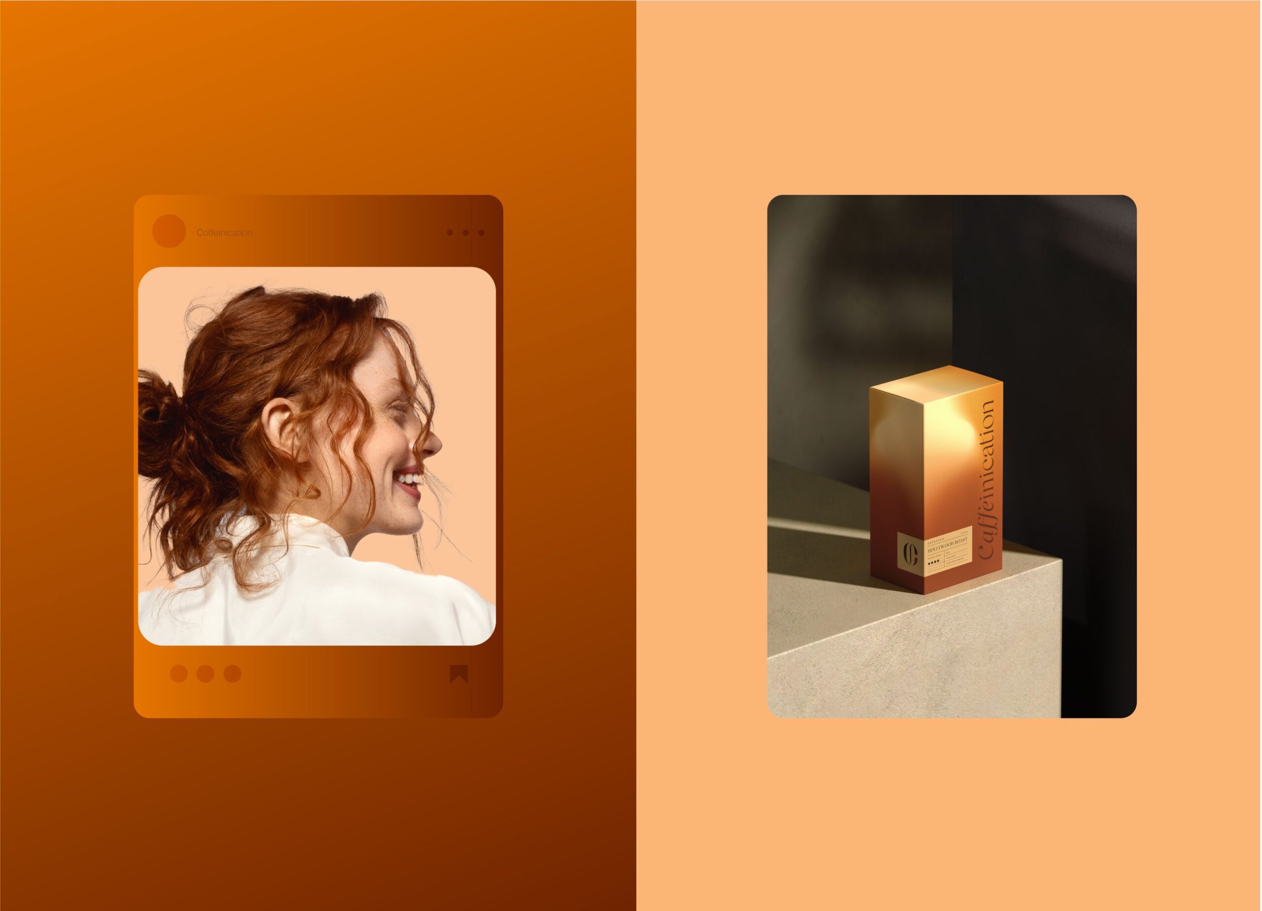
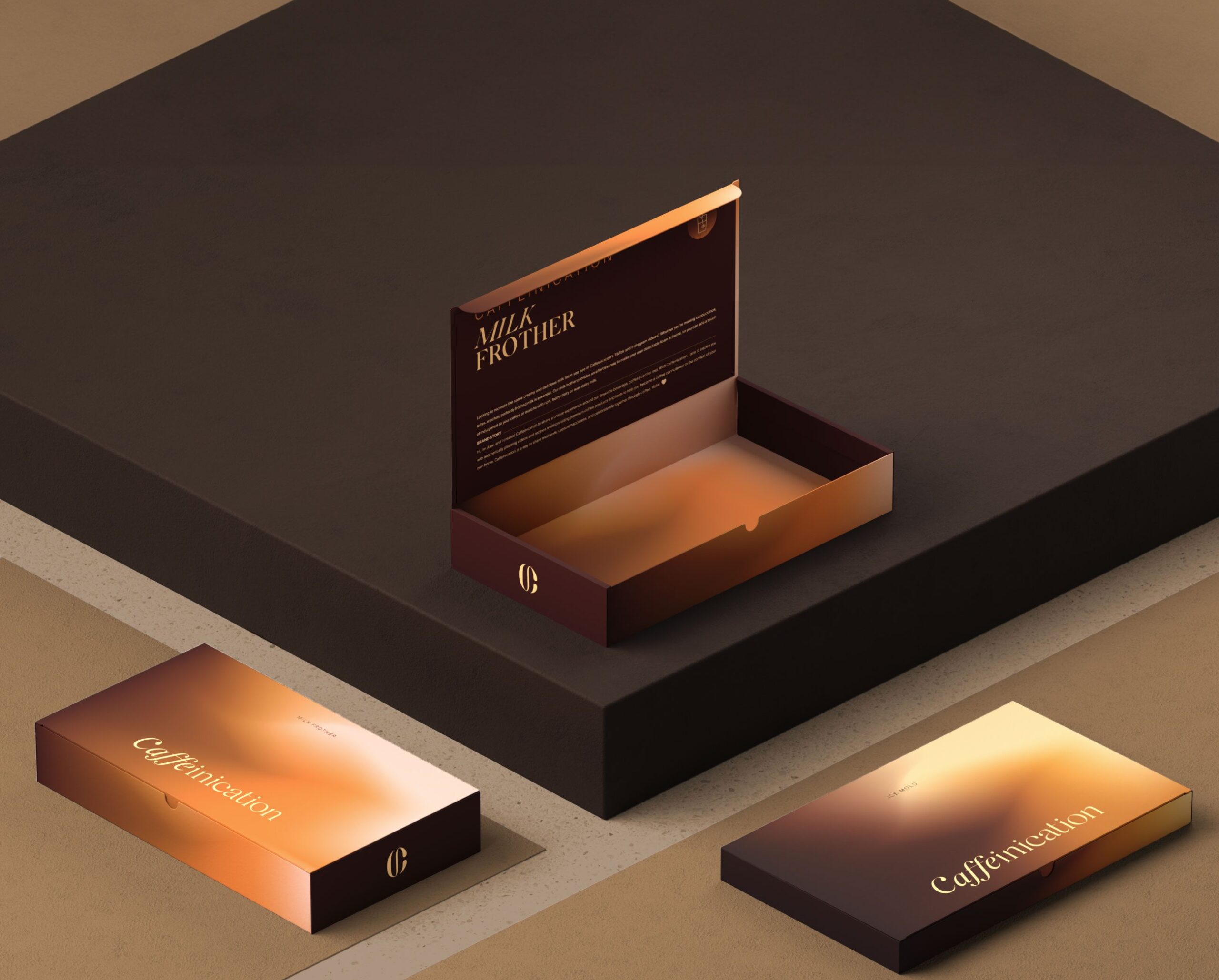
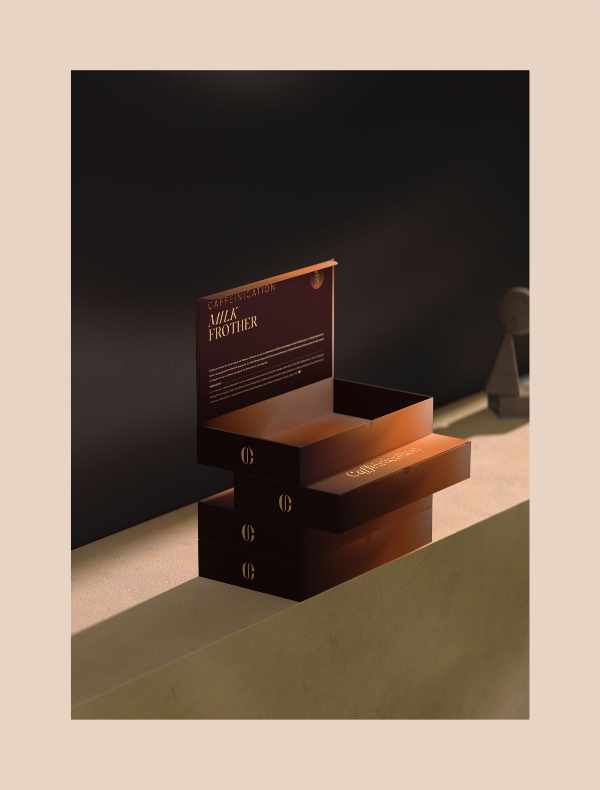
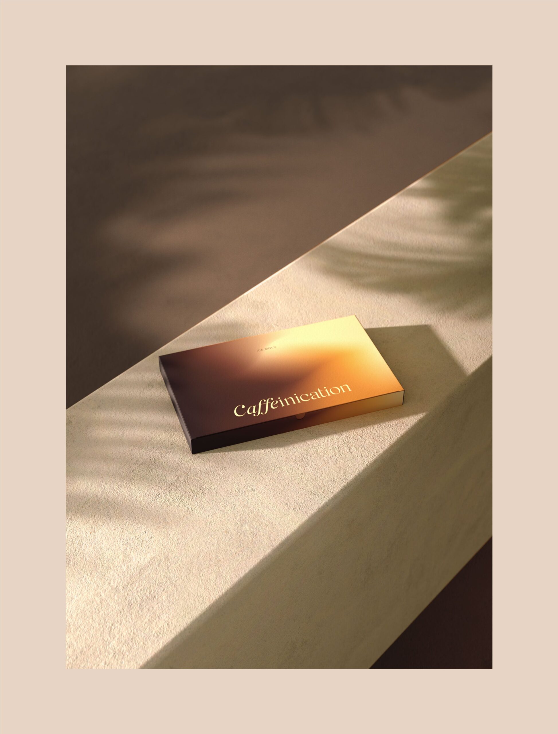
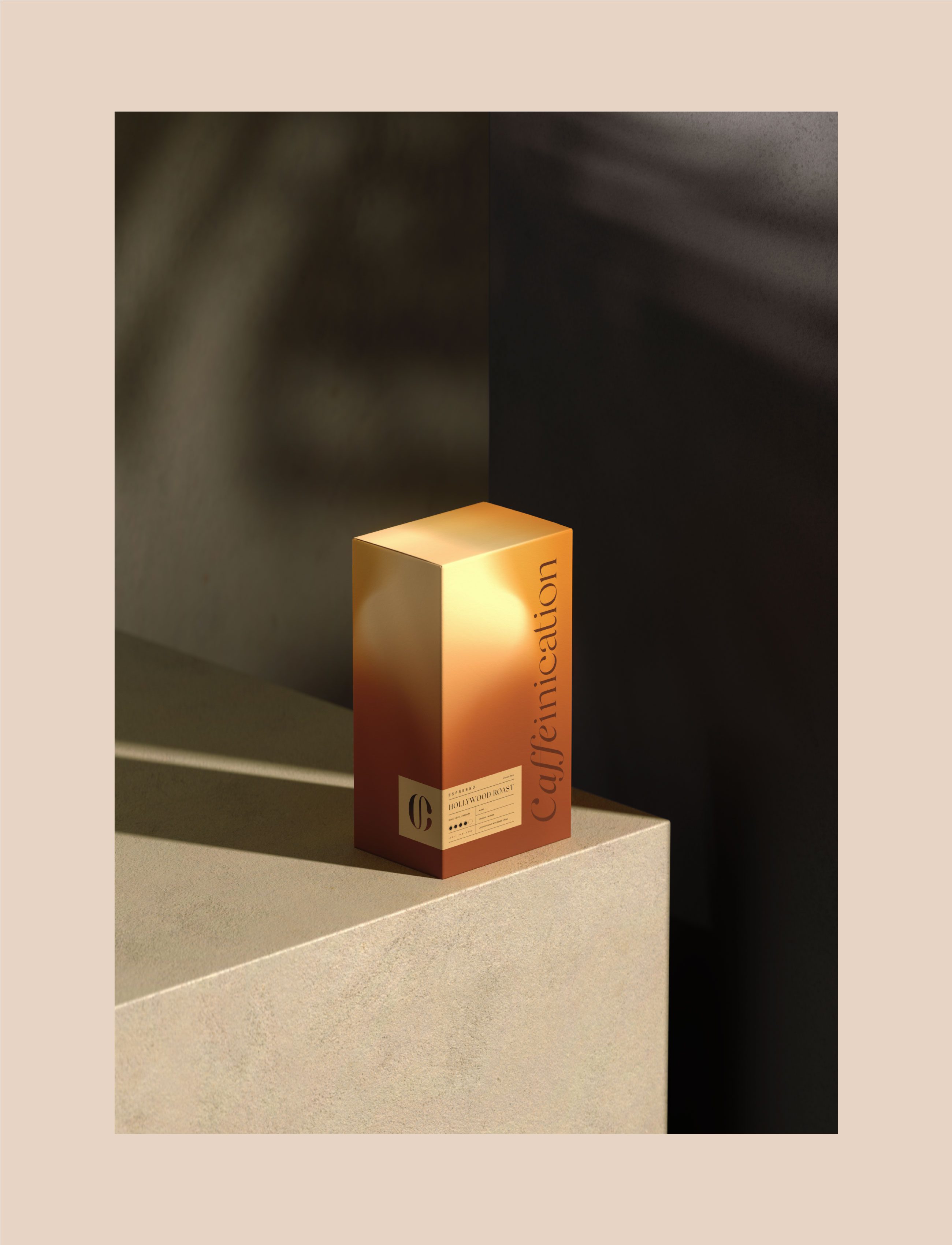
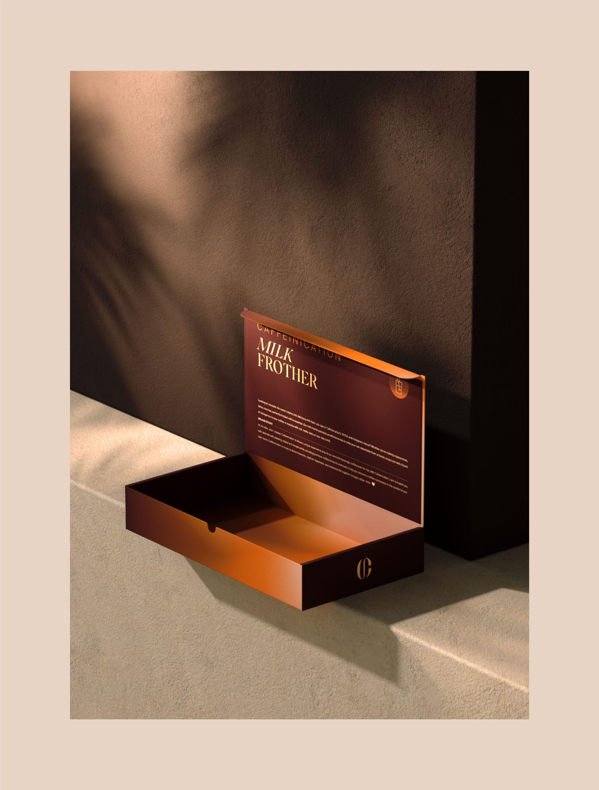
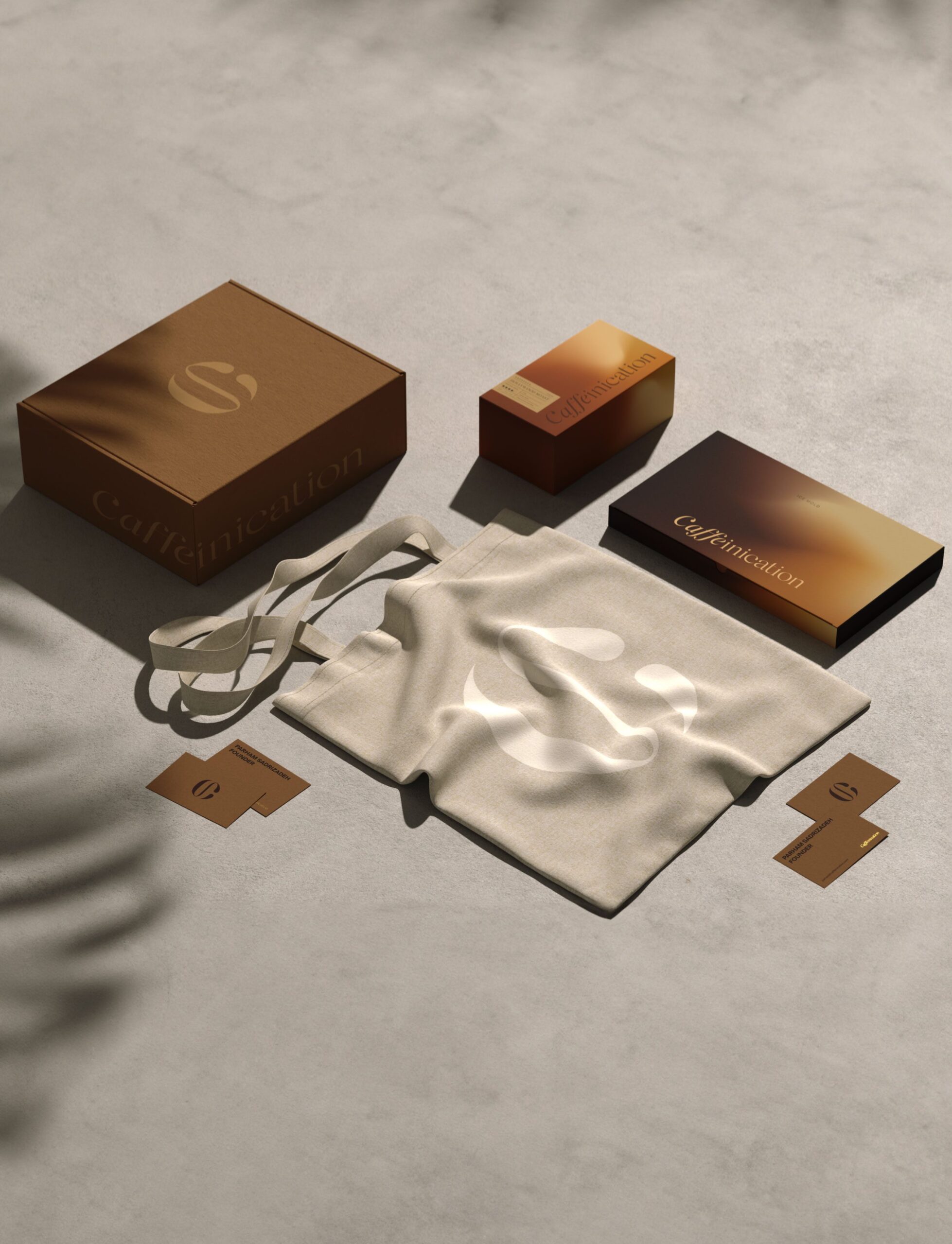
Packaging pushes the same idea into material. Textured surfaces, metallic details, and warm gradients signal quality by how the bag feels in the hand, not by what the copy claims. In specialty coffee the pack is picked up before it is bought, and finish is one of the few things that survives that test.

Let’s make the work they’ll copy.
Talk to an expert now
Work with a 38 team of the
industry’s top 1% talent.



