Chick Magnet
Fast-Food Brand Identity & Visual System
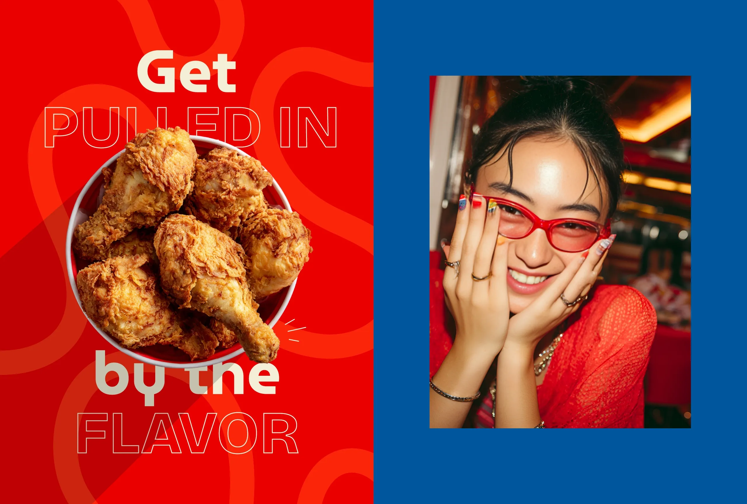
Chick Magnet is a bold fast-food brand identity built around one simple idea: irresistible attraction.
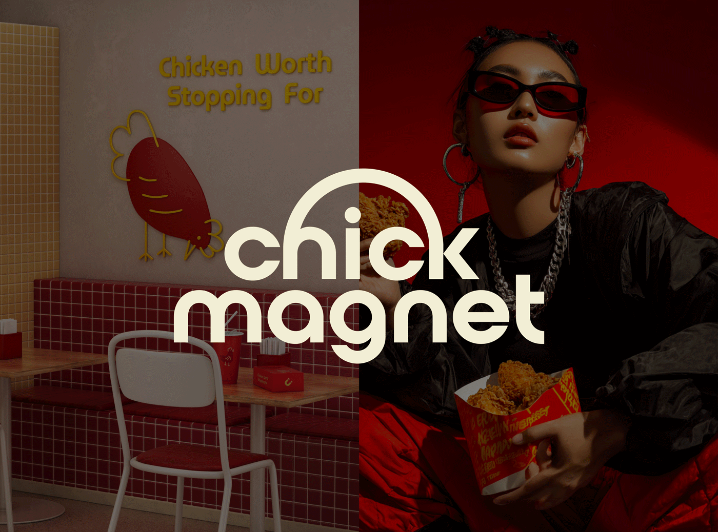
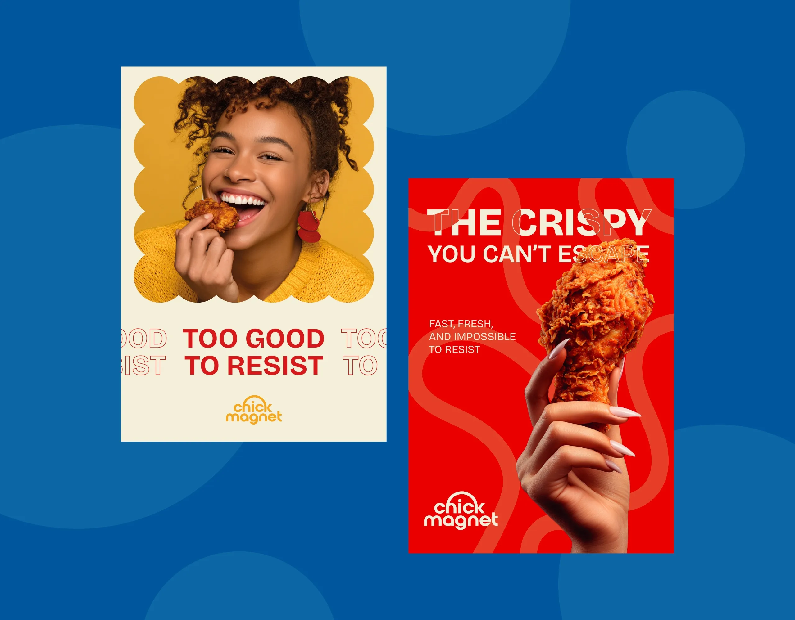
Chick Magnet is a bold fast-food brand identity built around one simple idea: irresistible attraction. Inspired by the magnetic pull of crave-worthy fried chicken, the brand combines playful energy with a confident visual system designed to stand out in a crowded quick-service market.
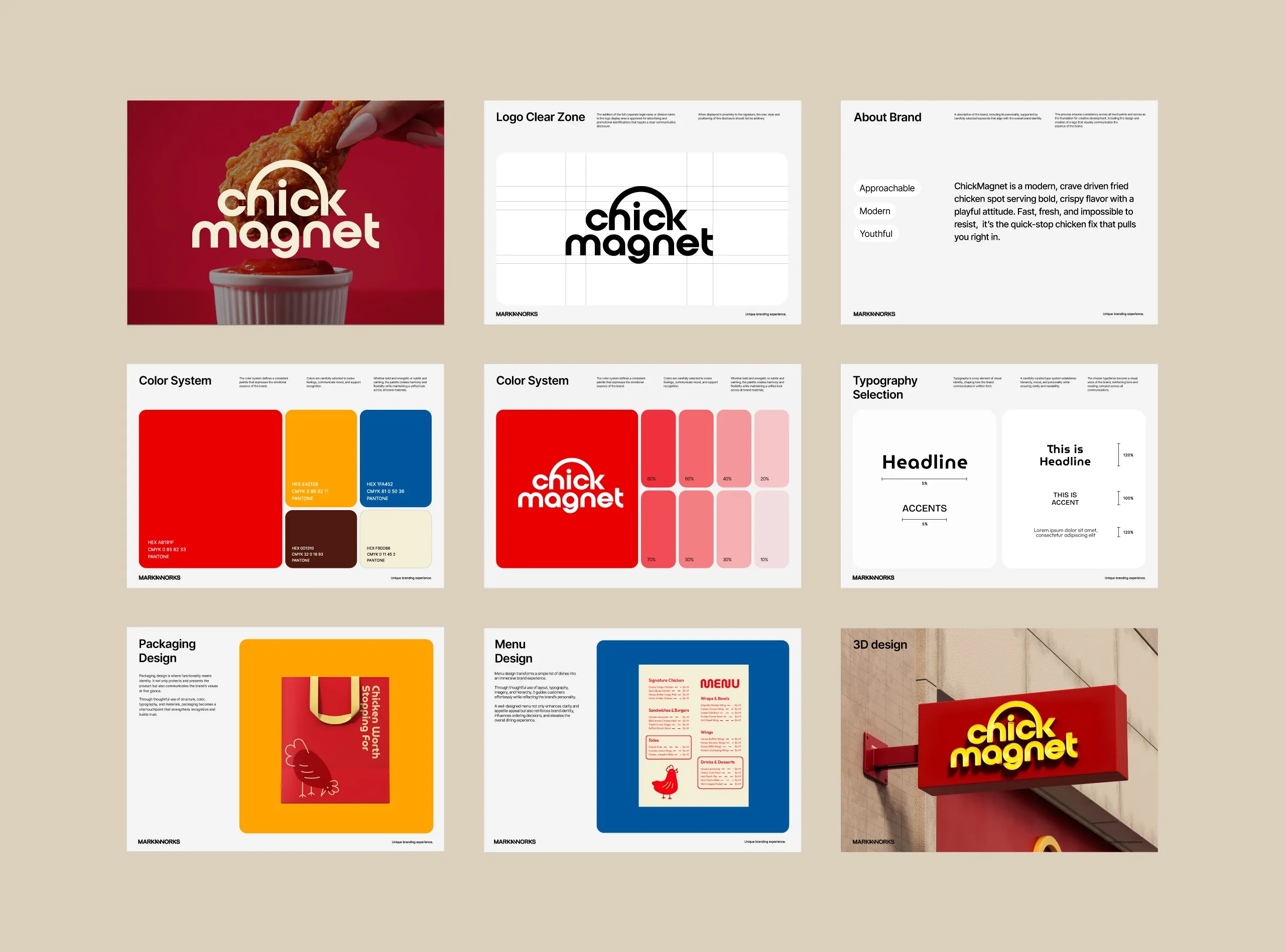
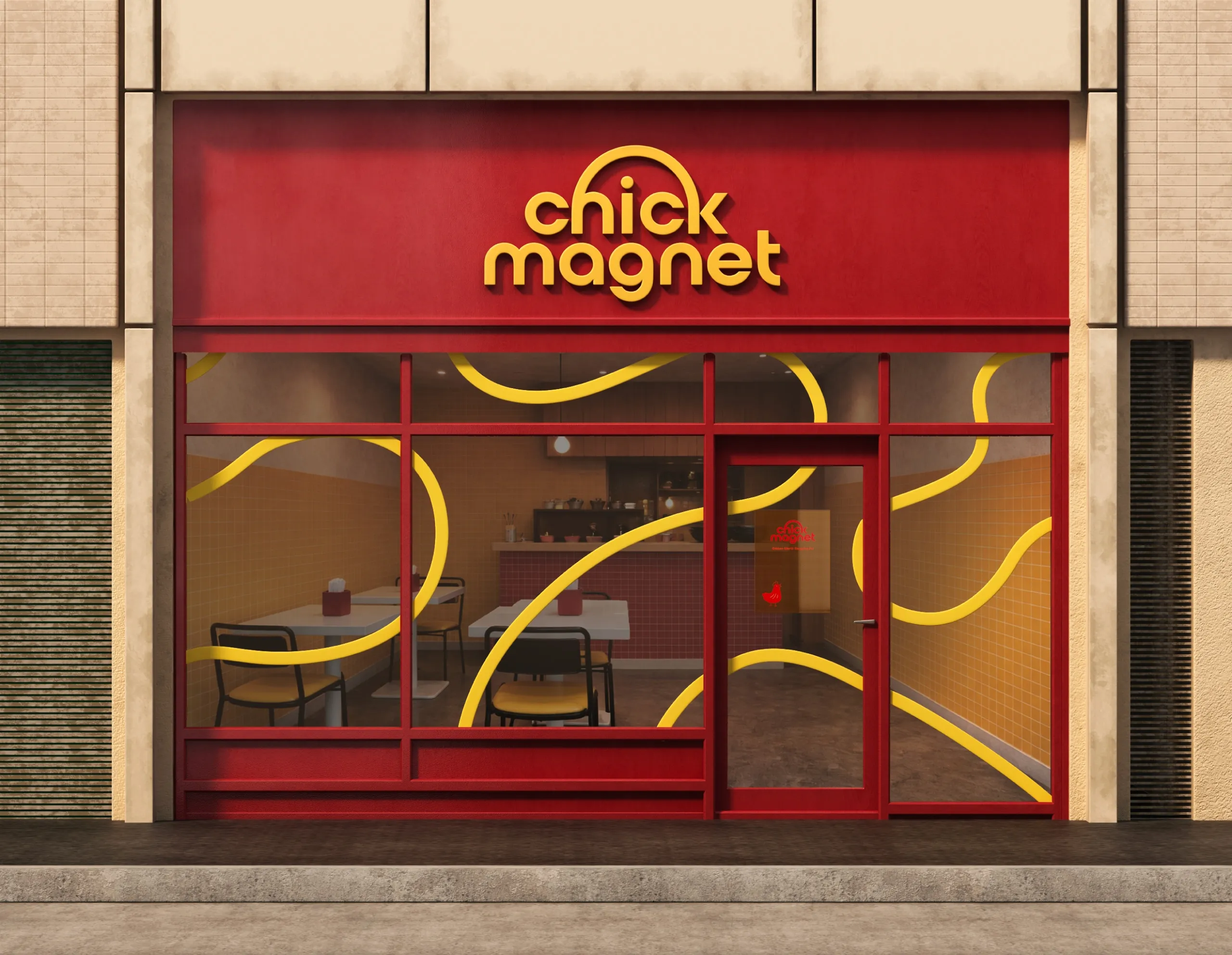
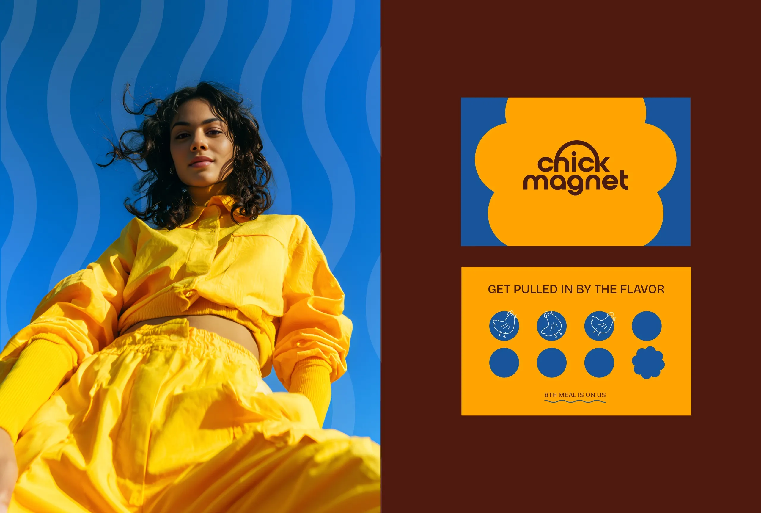
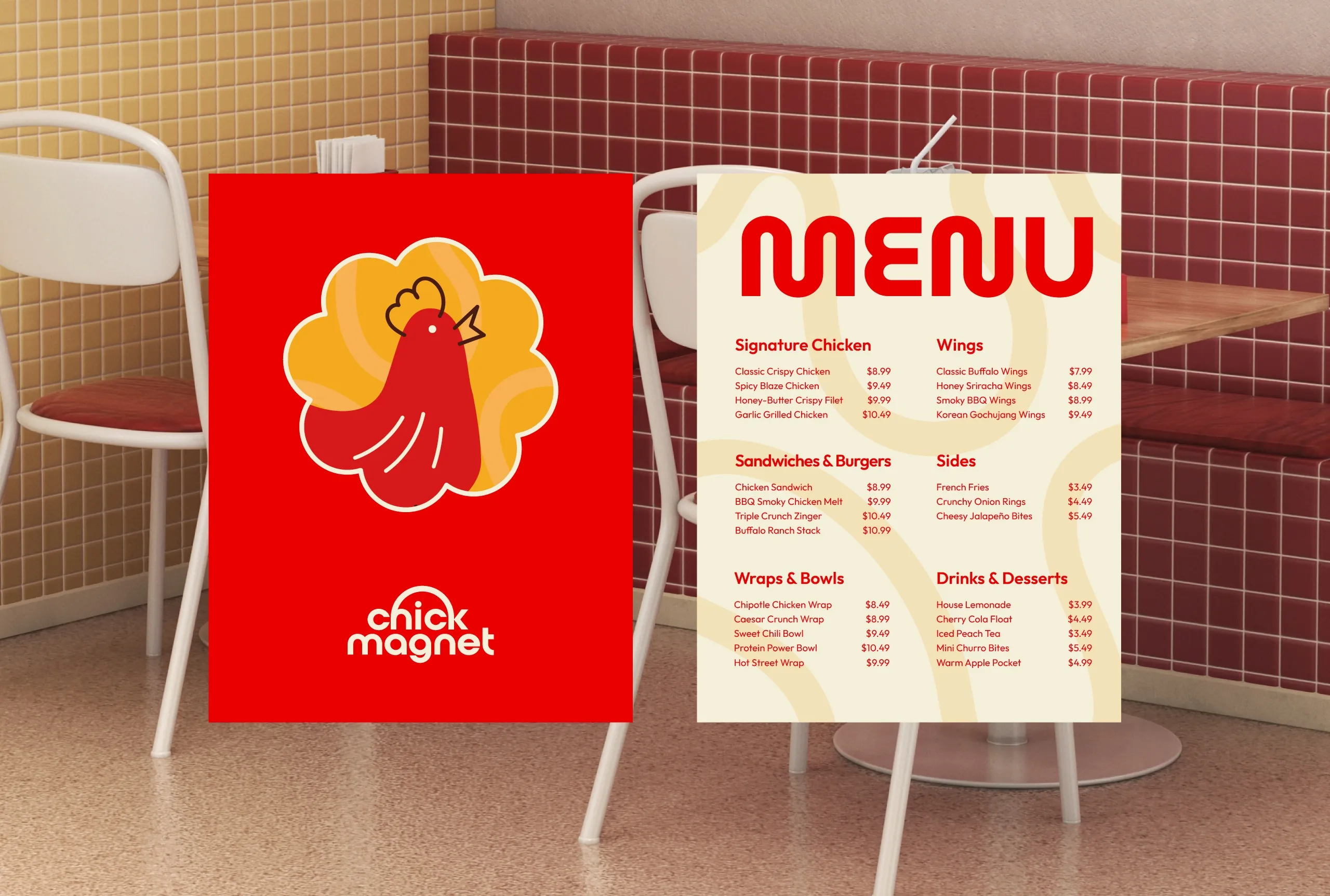
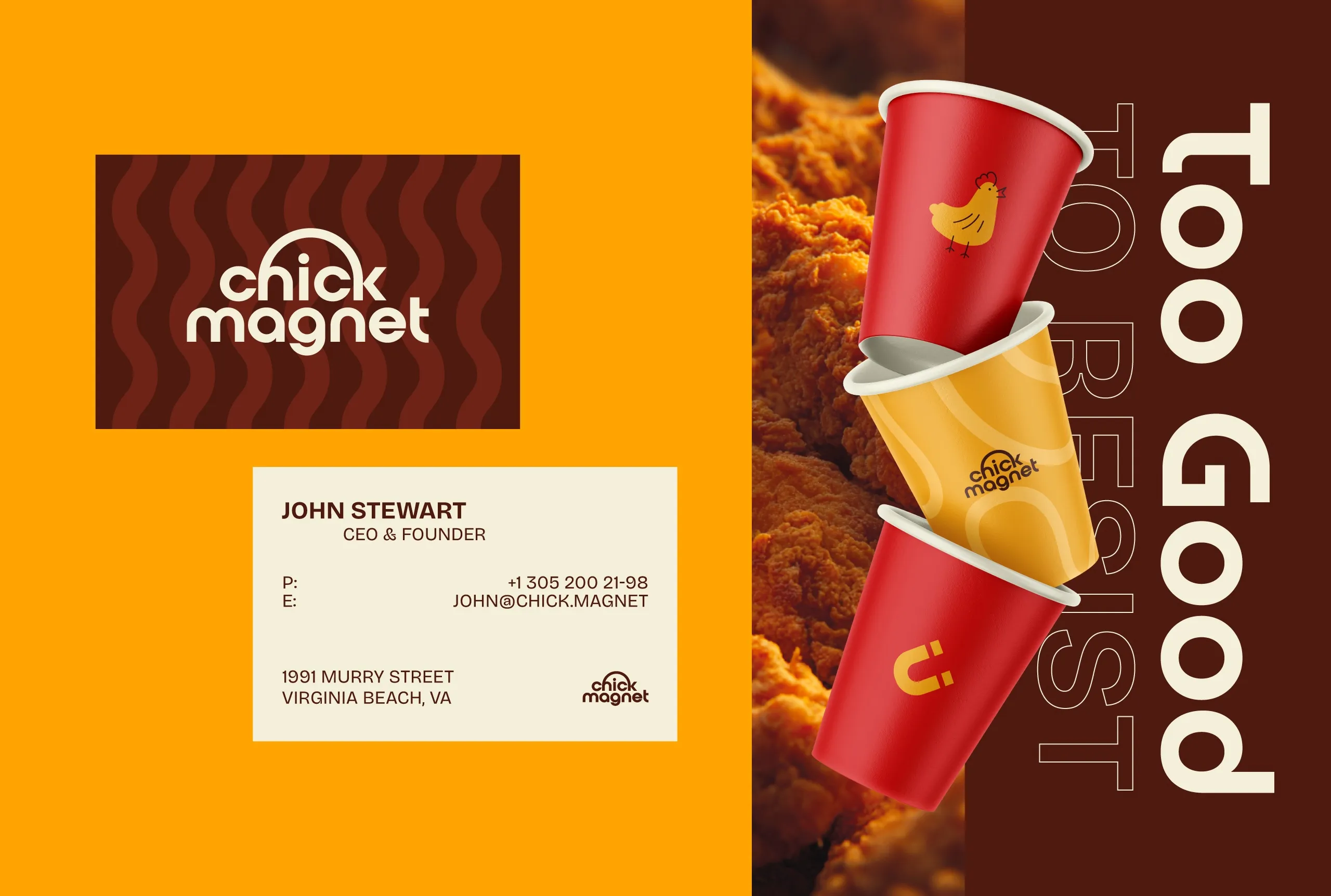
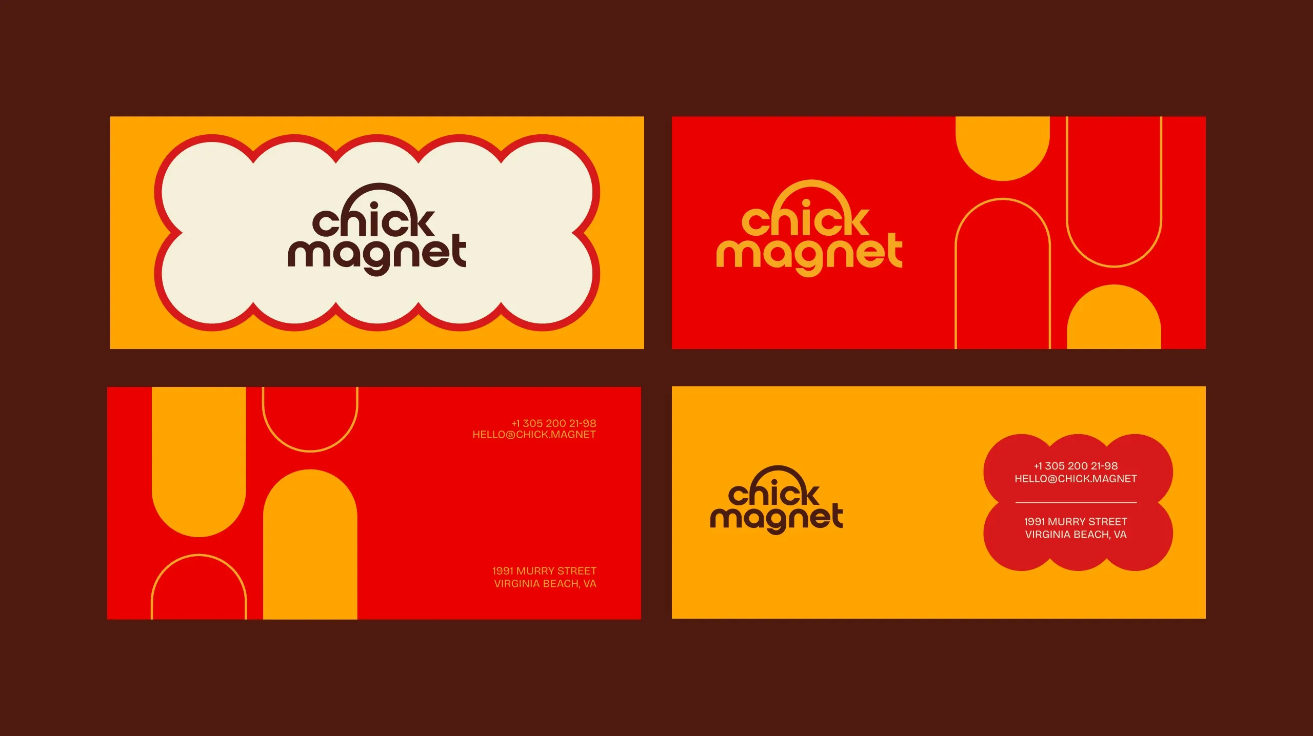
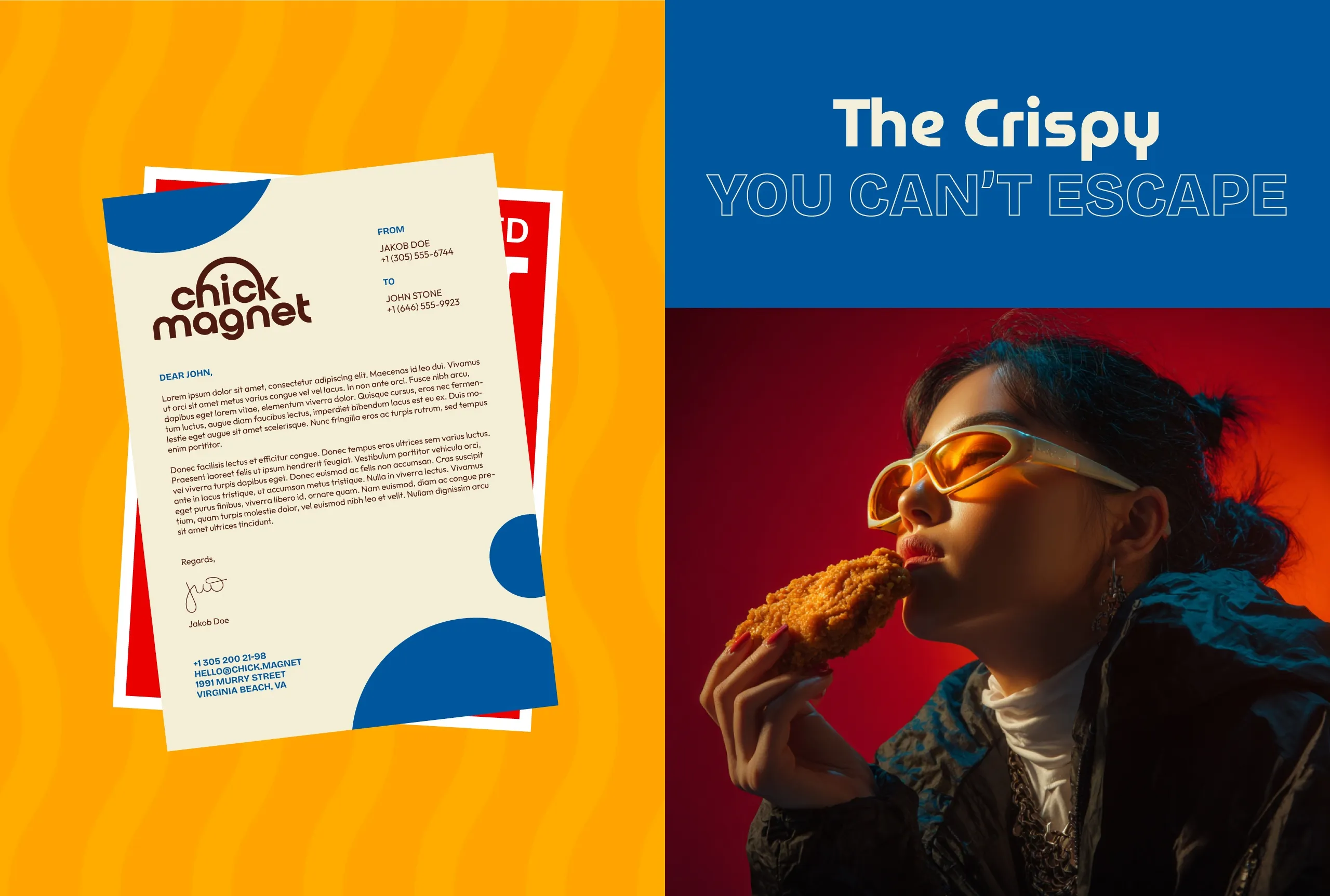
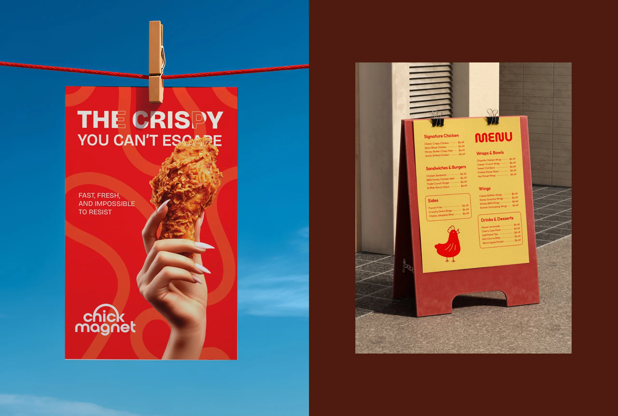
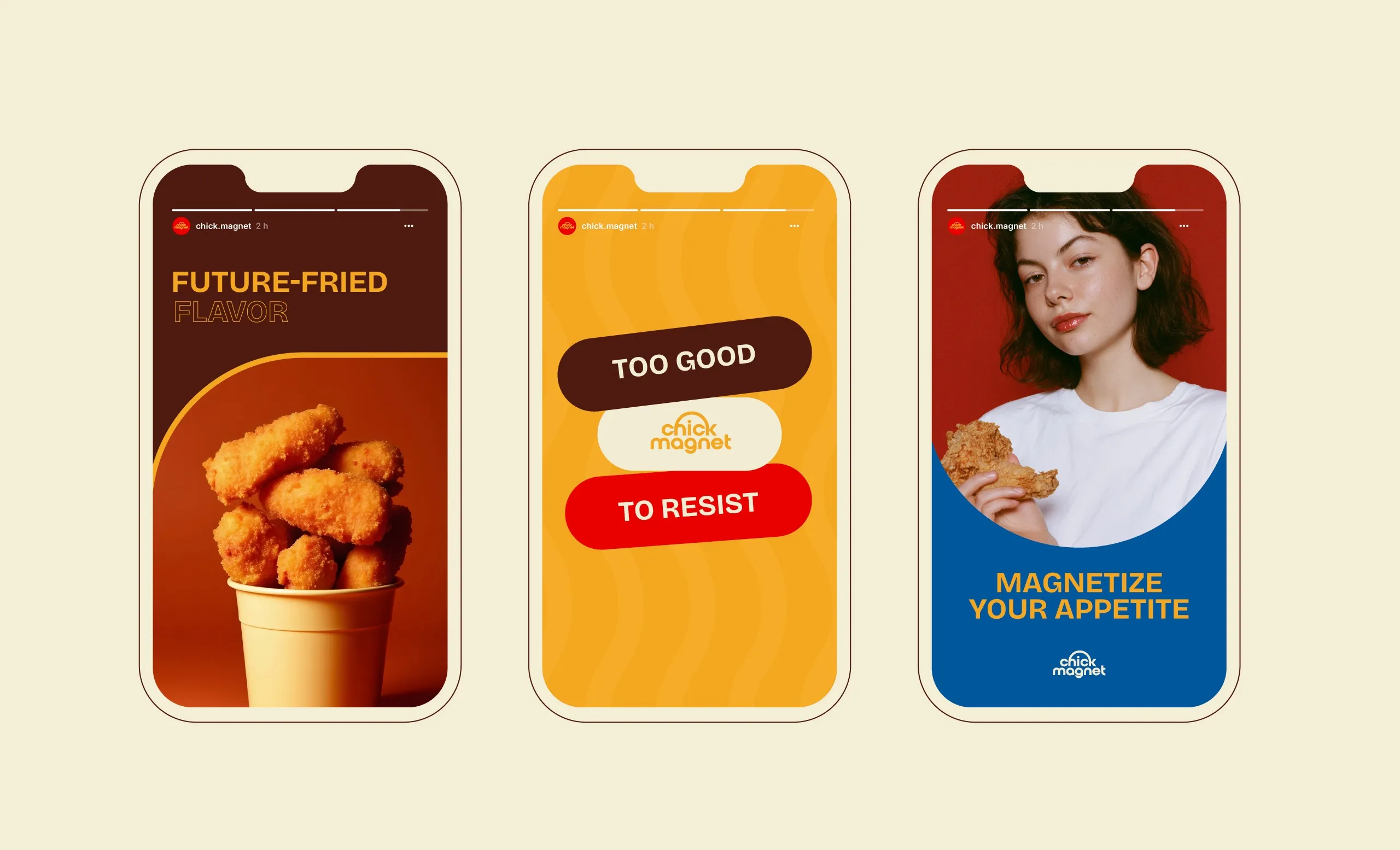
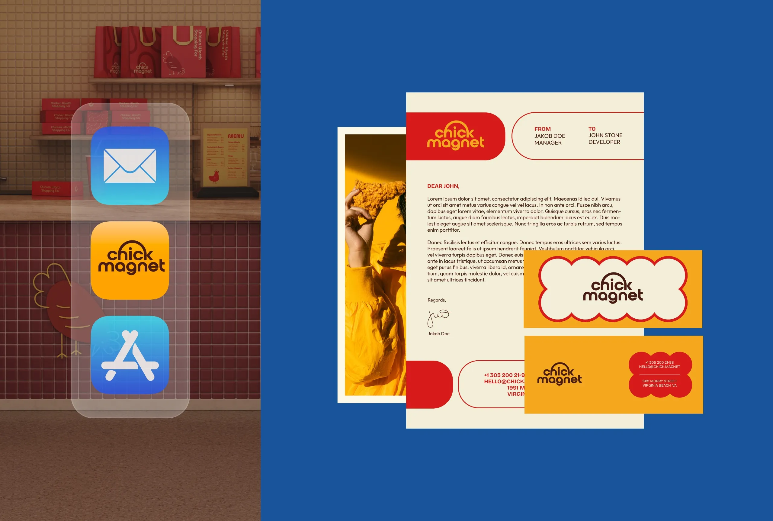
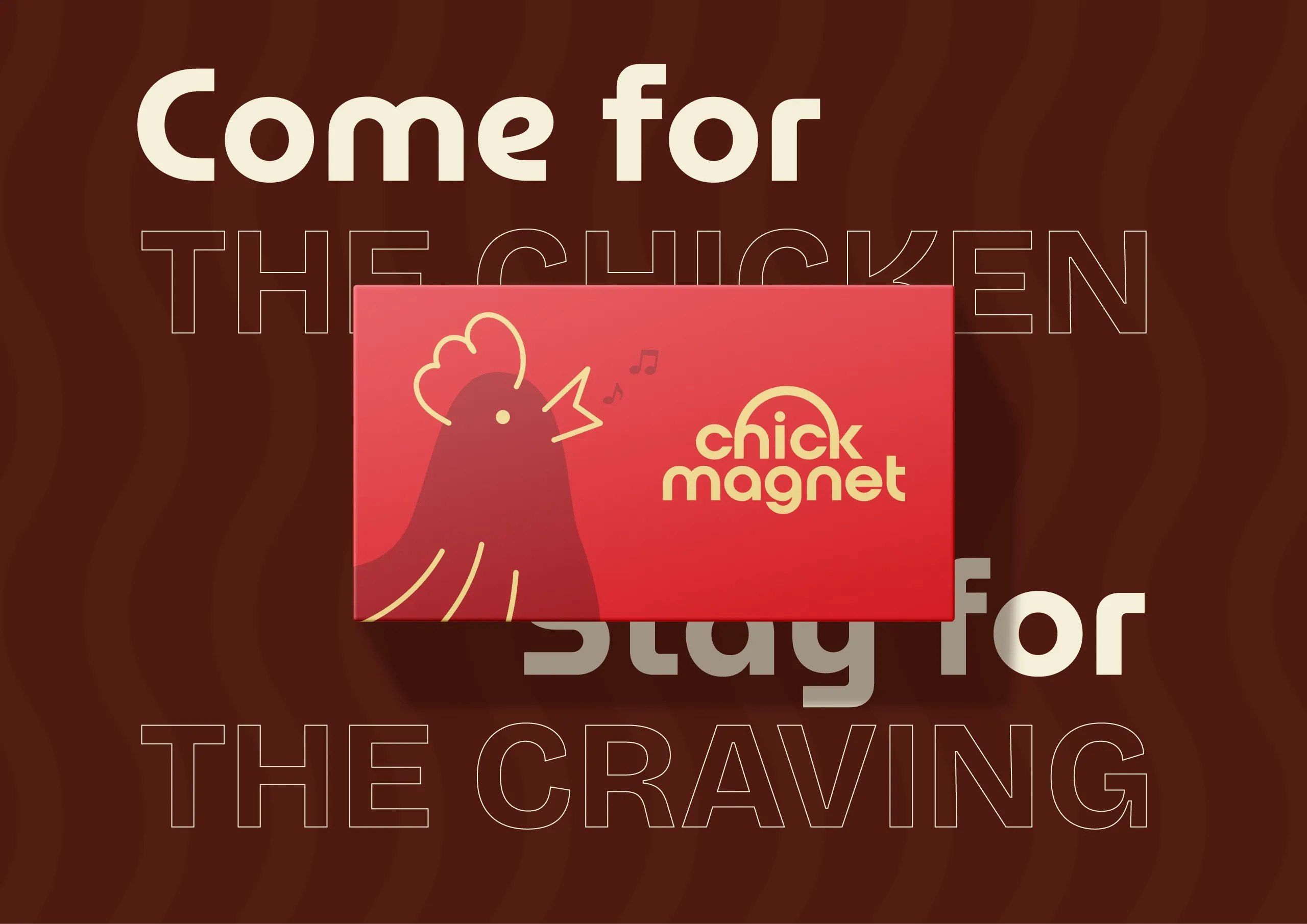
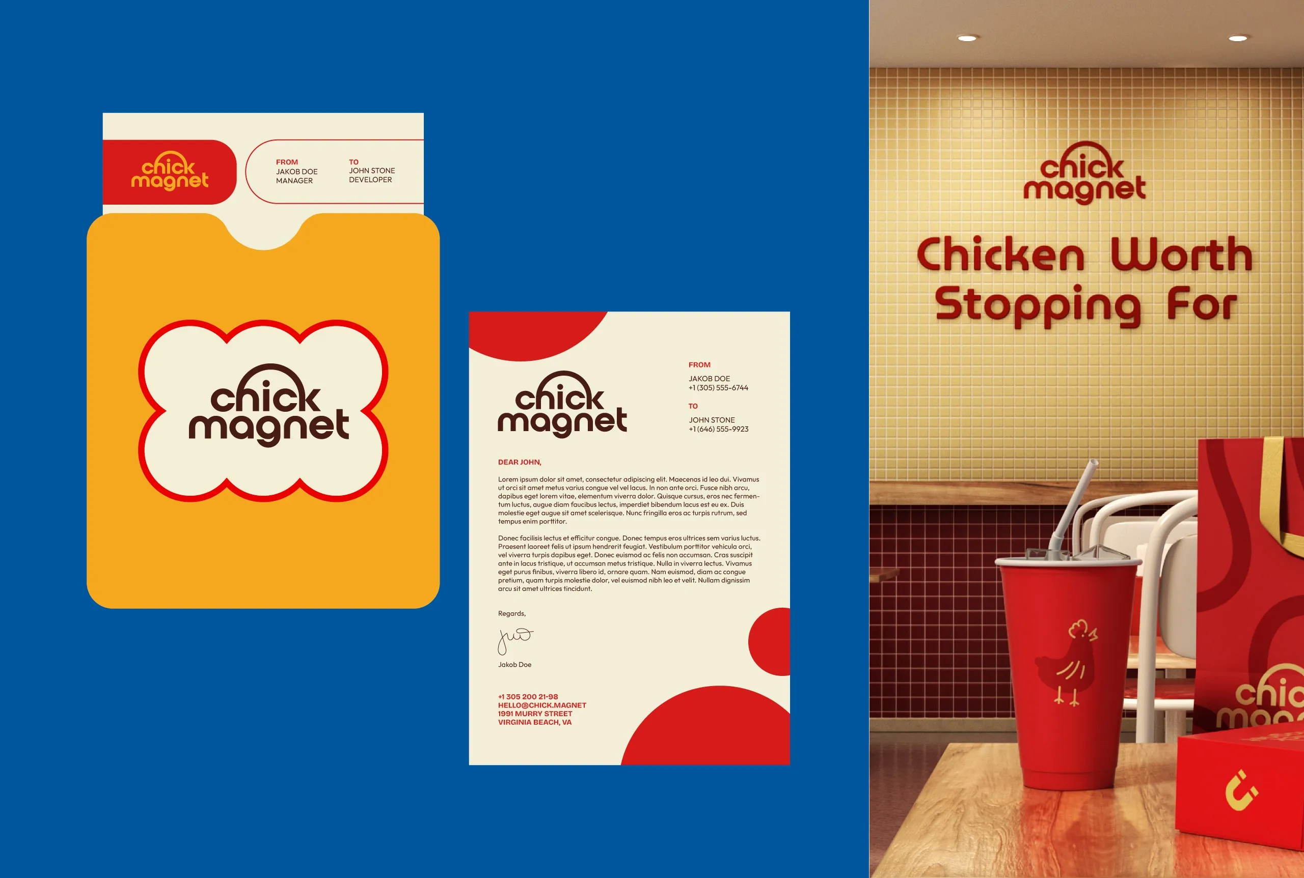
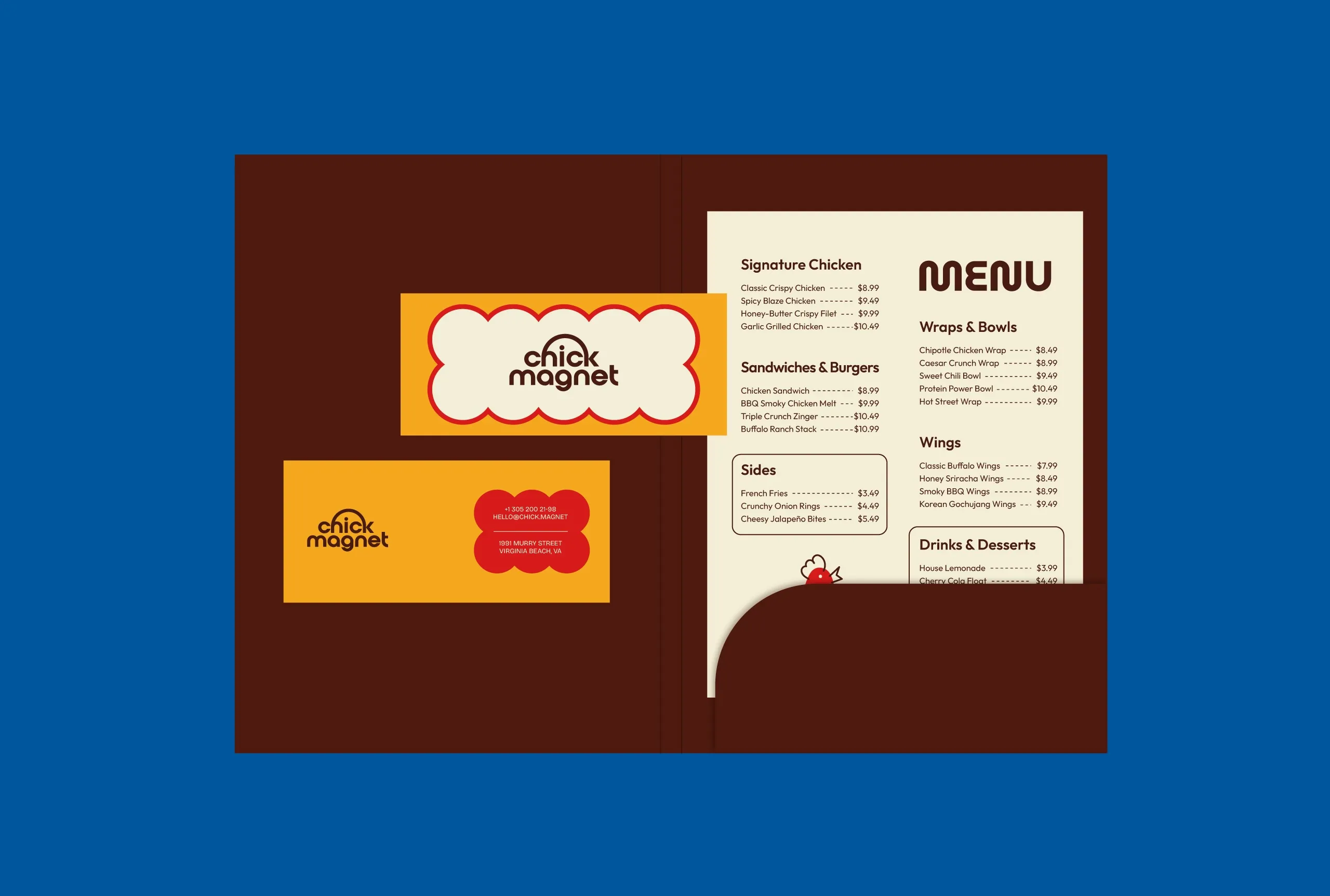
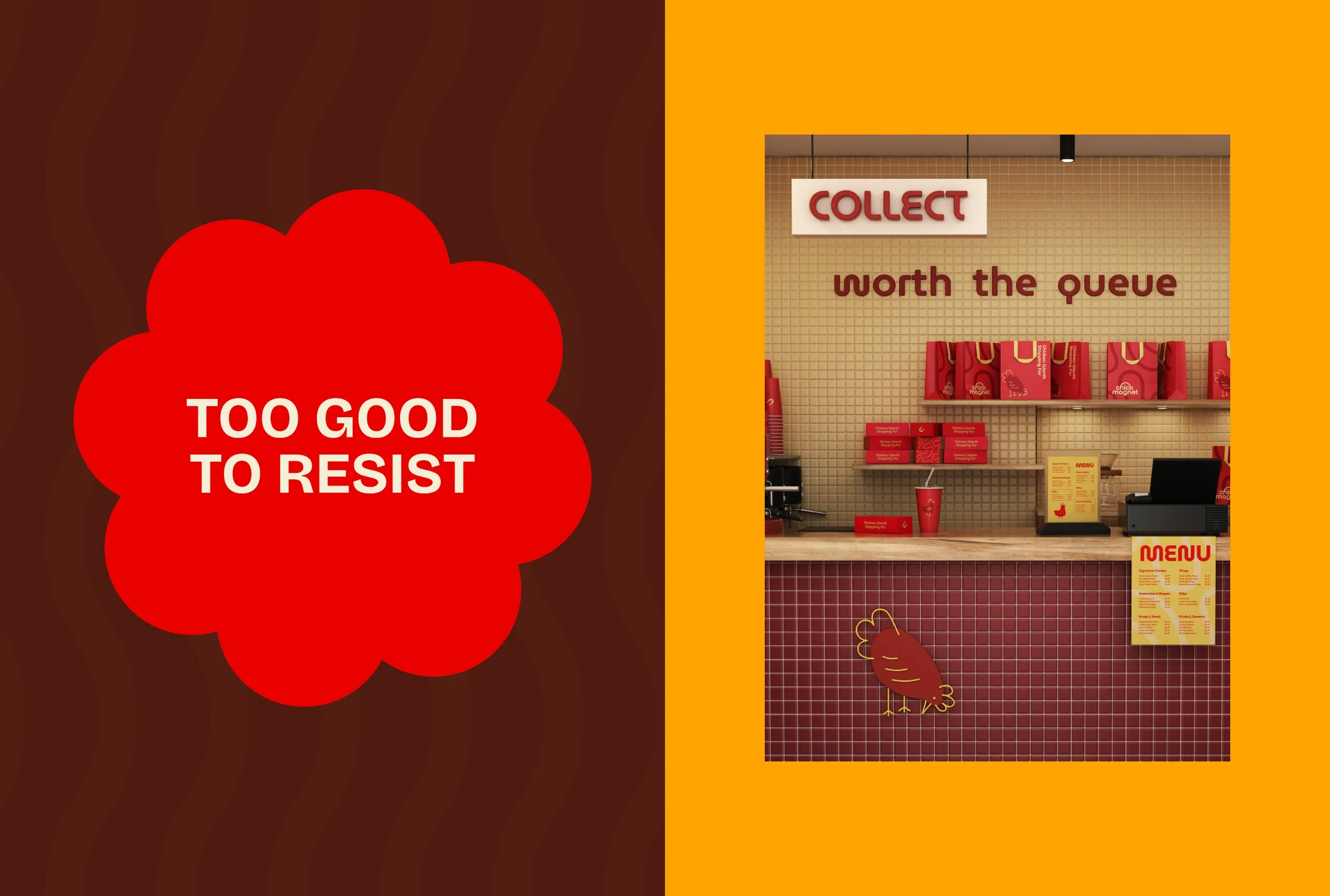
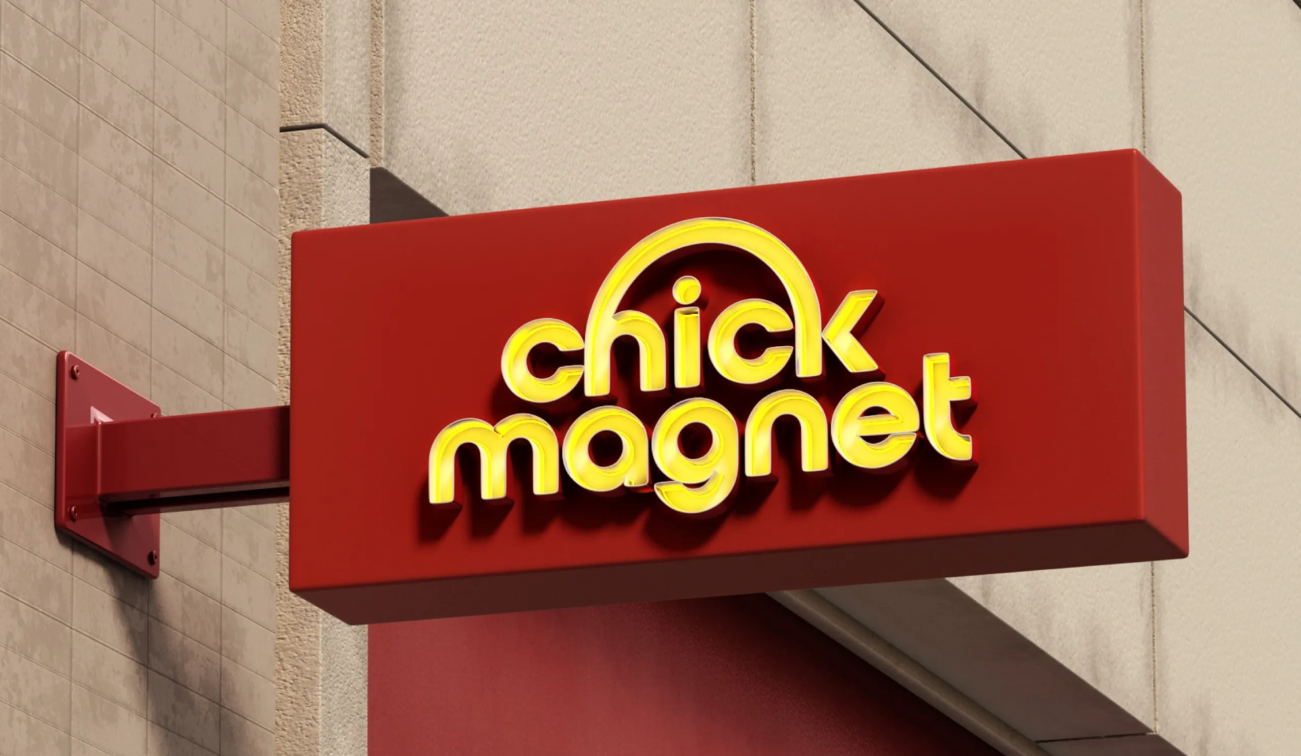
The identity centers around a custom wordmark, vibrant color contrasts, and expressive graphic elements that create a memorable and highly recognizable brand experience across every touchpoint. From packaging and signage to digital campaigns and environmental graphics, every detail is designed to reinforce the feeling of being drawn in by flavor.
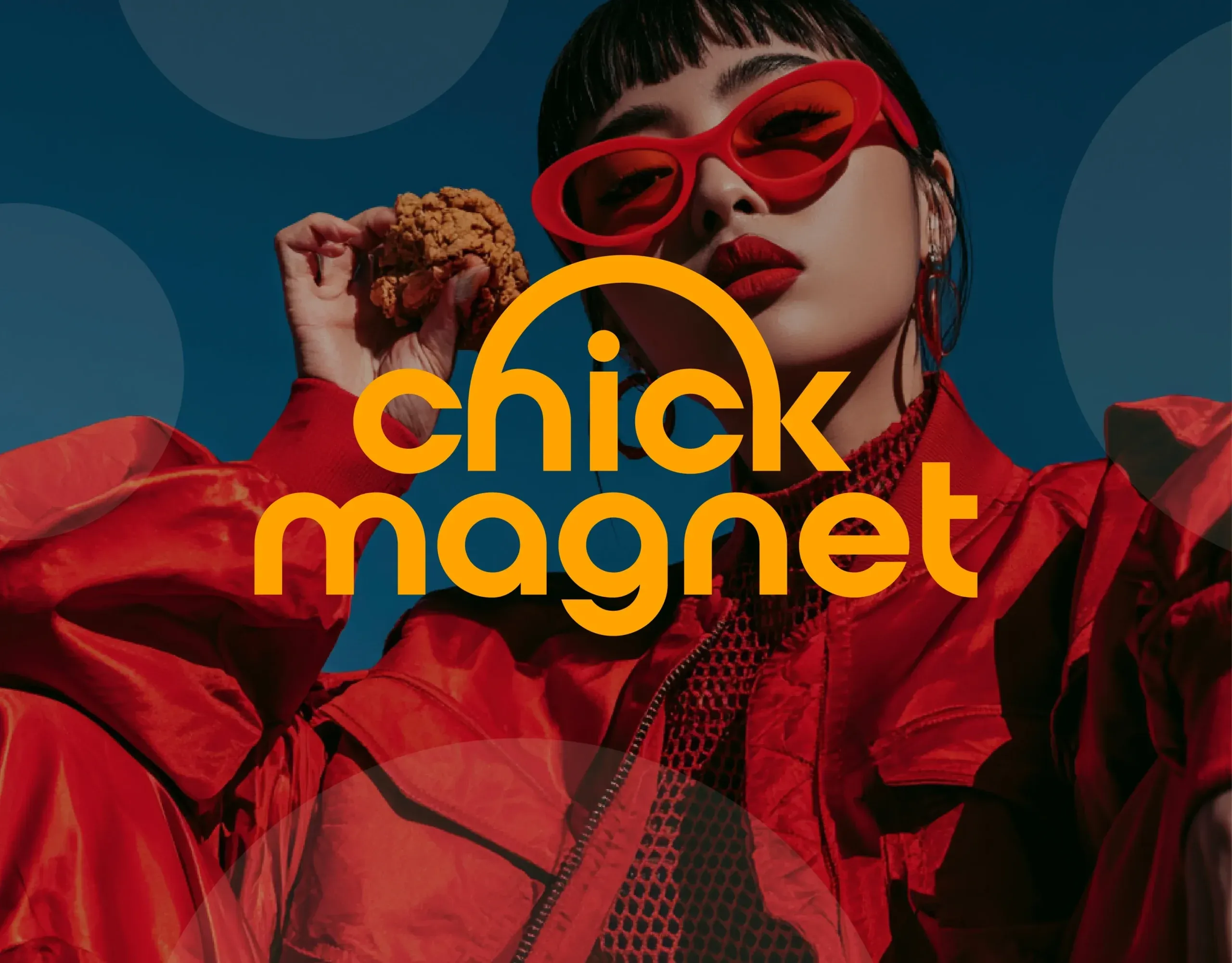
A dynamic palette of red, golden yellow, deep blue, and rich brown reflects the product itself while bringing a fresh, contemporary attitude to the category. Paired with lifestyle-driven imagery and bold messaging, the system transforms a simple chicken restaurant into a distinctive cultural brand with strong visual magnetism.
The result is a flexible identity that feels energetic, approachable, and instantly memorable—built to attract attention, spark cravings, and create a cohesive customer experience both online and in-store.
Services
Brand Strategy · Brand Identity · Logo Design · Visual System · Packaging Design · Environmental Graphics · Signage · Social Media Assets · Art Direction


Let’s make the work they’ll copy.
Talk to an expert now
Work with a 35+ team of the
industry’s top 1% talent.


