Cube Investments
timeless property portfolio growth
Cube Investments is a London-based property market investment company that offers a comprehensive and timeless path to sophisticated portfolio growth. MARKAWORKS crafted a bold, professional brand identity, leveraging a prestigious palette and symbolic emblems to signify expertise and enduring value.
Crafting a Timeless & Professional Brand for Cube Investments
Our approach for Cube Investments focused on developing a brand identity that is both professional and understandable, reflecting the serious nature of property market investment. We aimed to create a strong, prestigious, and luxurious association with the brand through careful design choices.
The Client & Keywords
Cube Investments is a property market investment company based in London. The key values we aimed to embody were Meaningful / Comprehensive / Timeless / Professional / Bold.

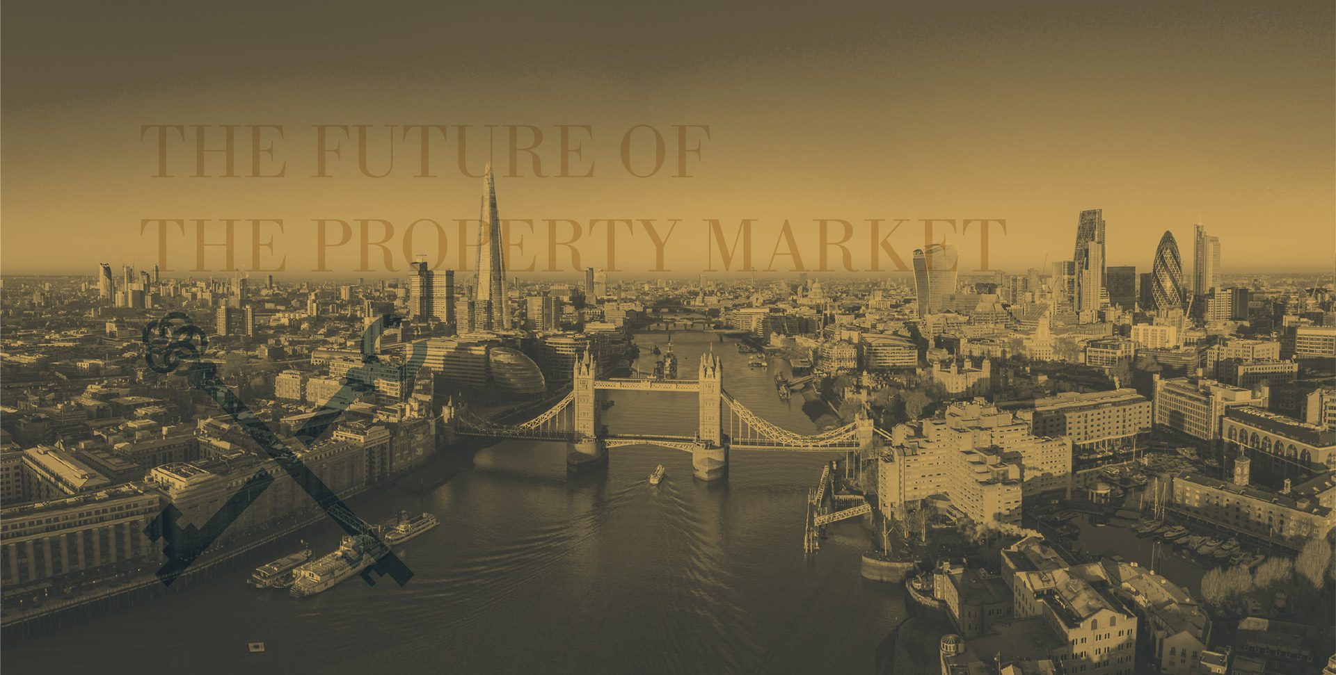

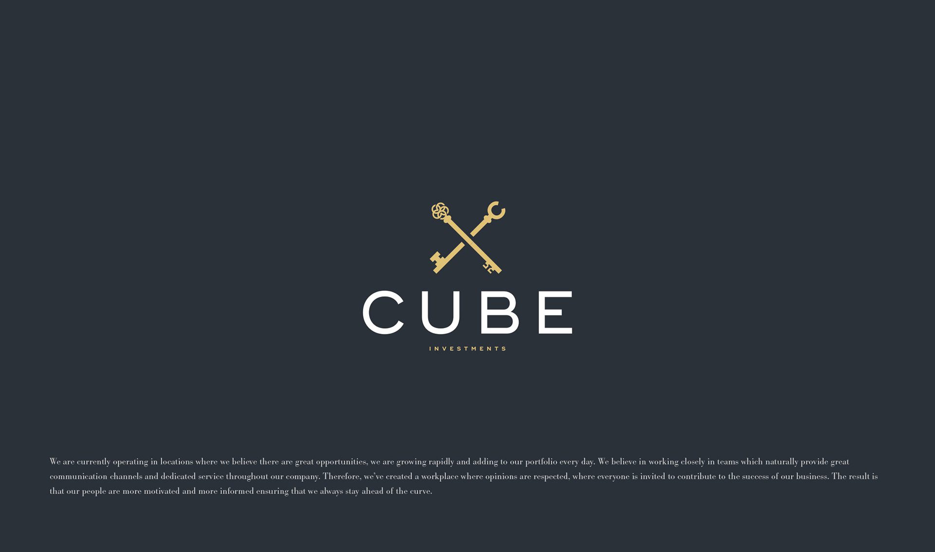
The Solution: Logotype & Emblem
The logotype and emblem for this brand were meant to be professional and understandable. For this reason, we designed a bold and monospaced logotype with a strong and affirmative look. We created the keys-crossing emblem, which gives the impression of a professional union of the investment and property market.
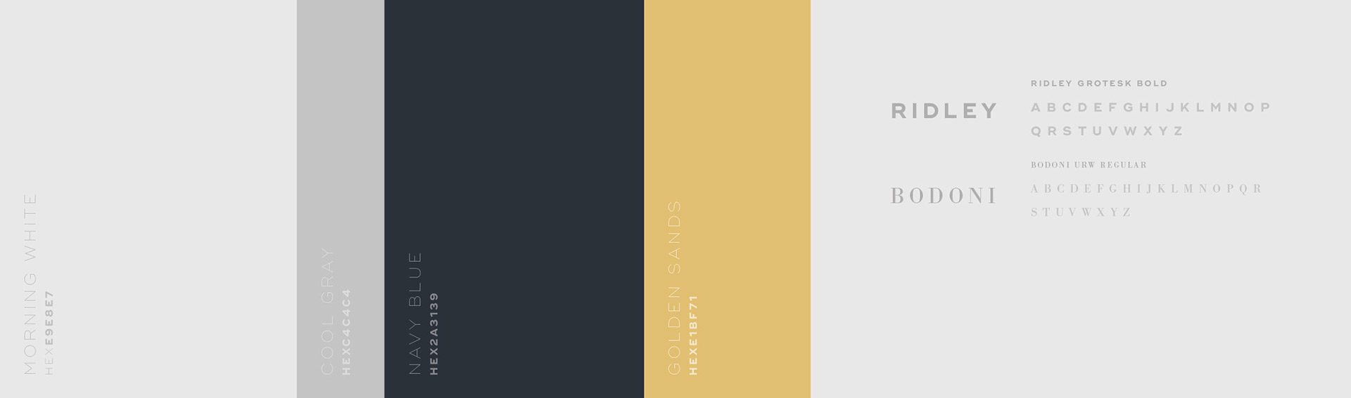
Color Palette & Pattern
To build a strong, prestigious and luxurious association with the brand, we selected a colour palette made up of neutral colours with gold as a highlight. The pattern we have designed includes key crosses.
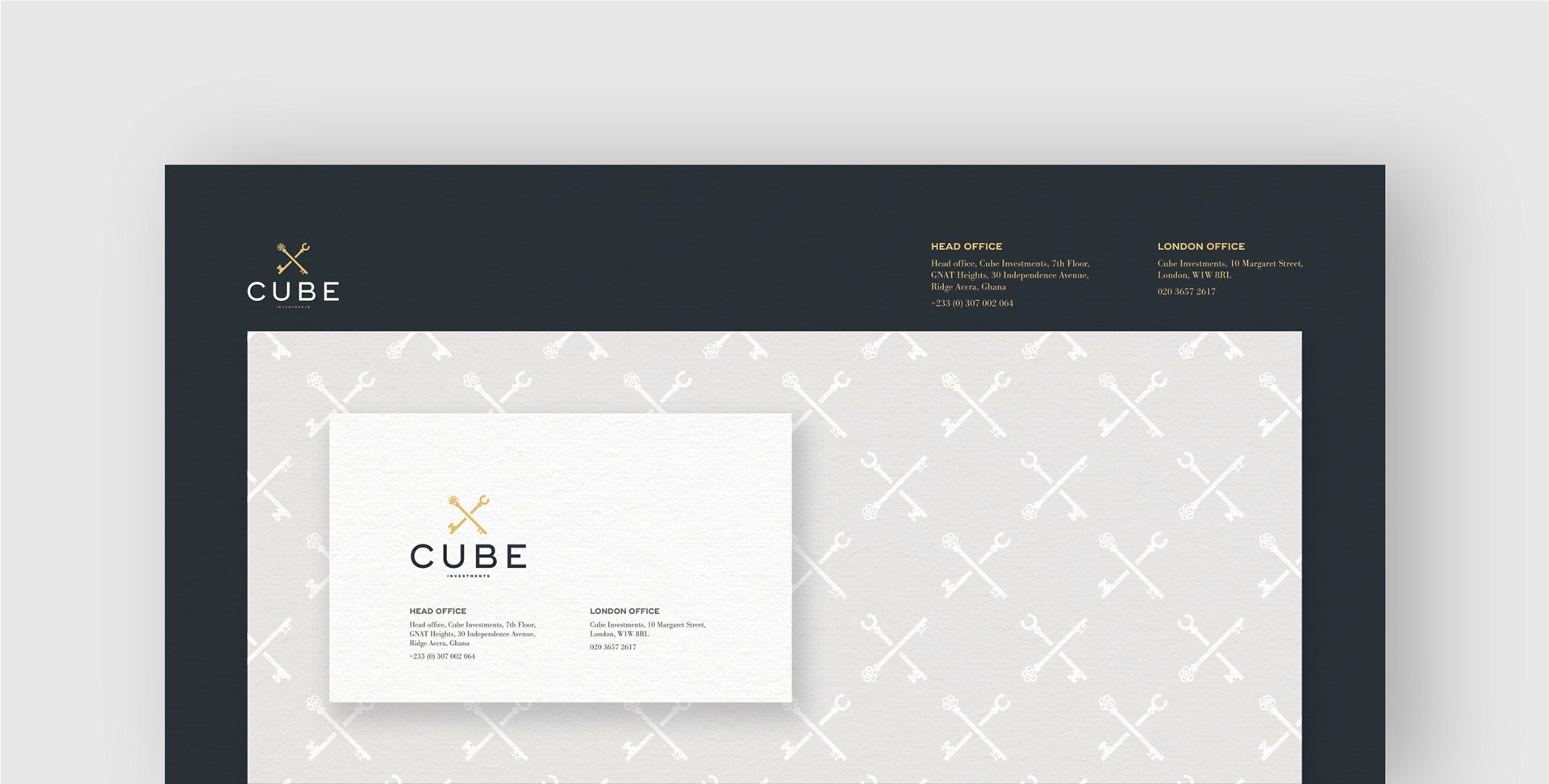
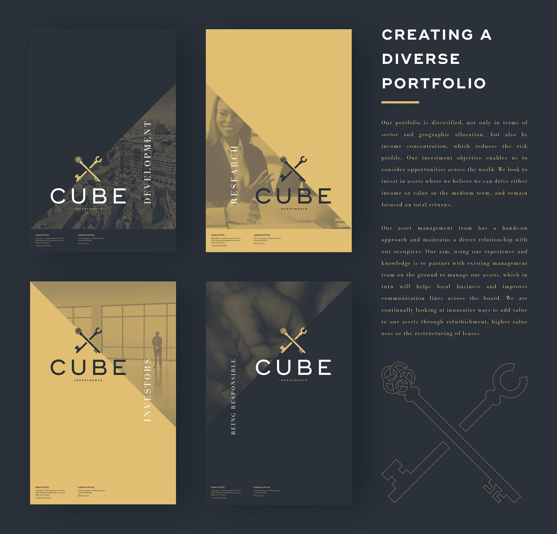
Brand Collateral: Website & Business Cards
We have created and designed the brand’s website and business cards as Cube Investments doesn’t have a product but a service.
Let’s make the work they’ll copy.
Talk to an expert now


