
Dose Herbal Tea
Designing a Joyful and Flavor Forward Tea Brand
Dose is a modern tea brand created to bring moments of joy, energy, and delight into everyday life. Built around the idea that even small rituals can have a meaningful impact, Dose positions tea as a simple yet powerful experience. Each blend is designed to deliver a dose of happiness, life, deliciousness, and magic in every cup.
The brand was shaped to feel playful, uplifting, and approachable, celebrating flavor and feeling rather than tradition or formality.
Brand Direction
Dose embraces tea as a daily pleasure rather than a ceremony. The concept focuses on bold flavors, positive emotions, and accessible wellness, appealing to a new generation of tea drinkers who value experience as much as taste.
The brand language is optimistic and lighthearted, reinforcing the idea that wellness can be enjoyable, colorful, and full of personality.


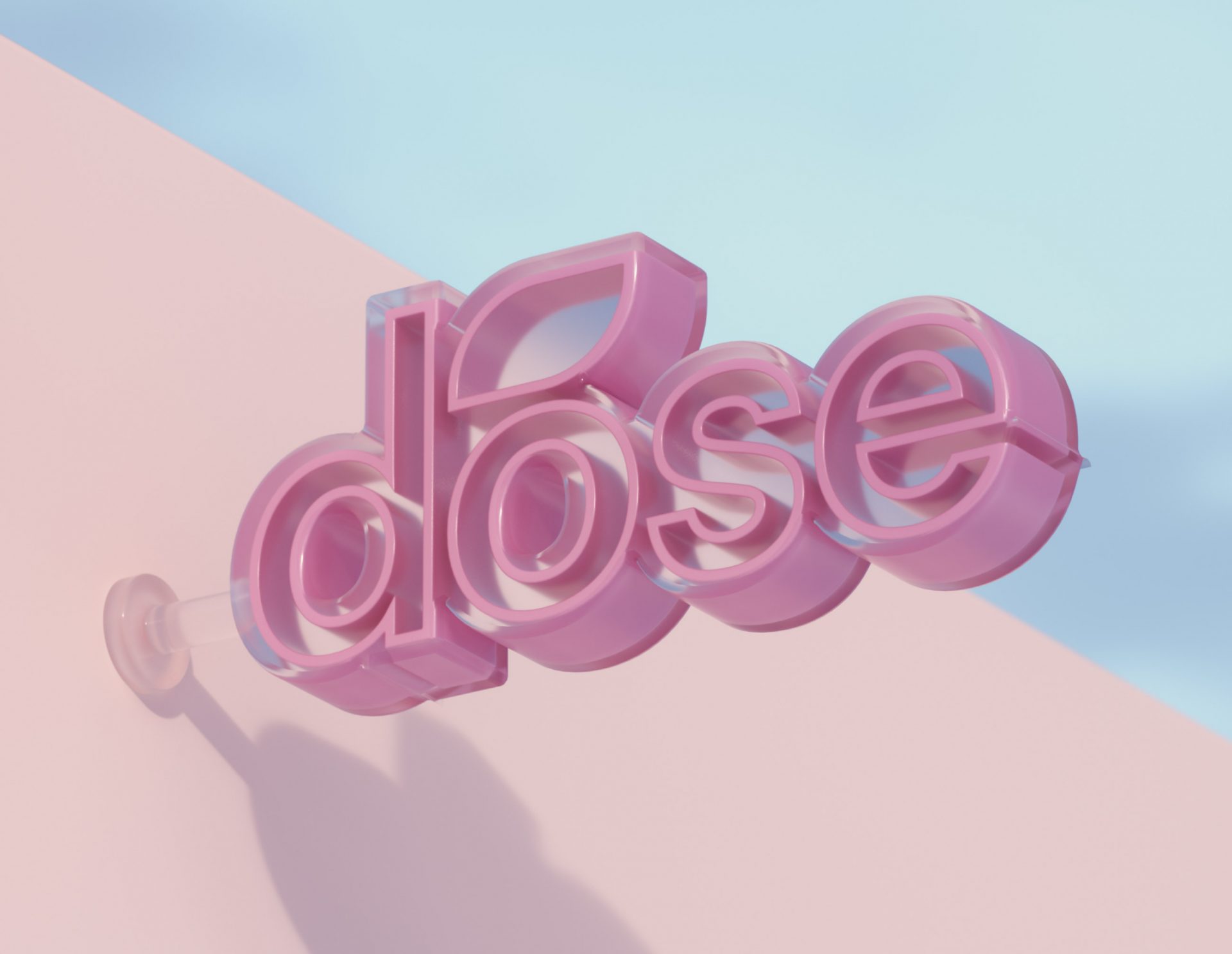
Visual Identity
The visual identity is bold, energetic, and instantly recognizable. A vibrant color palette inspired by tropical fruits, sunshine, and nature creates a sense of warmth and excitement. Bright yellows, greens, and soft corals work together to express freshness and vitality.
Typography is confident and modern, designed to stand out while remaining friendly and easy to read. The logotype feels playful yet grounded, supported by organic shapes and illustrated elements that add character and movement across applications.
Graphic patterns inspired by leaves, fruits, and natural textures reinforce the brand’s connection to flavor and nature while keeping the visual system dynamic and expressive.


Packaging Design
Packaging was designed to feel joyful and eye catching. Bold colors, clear product naming, and playful illustrations create strong shelf presence and instant flavor recognition. Each blend maintains consistency within the system while expressing its own personality through color and graphic detail.
The packaging invites interaction and curiosity, turning every product into a small moment of discovery and delight.


Brand Experience
Beyond packaging, Dose extends its visual language into lifestyle assets, merchandise, and digital touchpoints. The experience remains consistent across every interaction, reinforcing positivity, ease, and approachability.
The tone of voice stays upbeat and encouraging, making the brand feel like a companion in everyday moments rather than a functional product.


Let’s make the work they’ll copy.
Talk to an expert now
Work with a 35+ team of the
industry’s top 1% talent.


