GL Peptides
Setting a New Standard in Peptide Branding
GL Peptides is a research-driven peptide and performance wellness brand built on precision, transparency, and scientific integrity. Our mission in this project was to craft a visual identity that reflects the brand’s core pillars: clarity, consistency, and credibility — while elevating it beyond the typical pharmaceutical aesthetic.
GL Peptides — Setting a New Standard in Peptide Branding
Brand Identity • Packaging Design • Digital Experience
GL Peptides came to MarkaWorks as a research-driven peptide and performance wellness brand, and this case collects the peptide branding work in one place: brand identity, packaging design, and the digital experience. The project named three pillars, clarity, consistency, and credibility, and the page shows how we translated them into the labels, the packs, and the digital side of a peptide product line built on precision, transparency, and scientific integrity.
GL Peptides is a research-driven peptide and performance wellness brand built on precision, transparency, and scientific integrity.
Our mission in this project was to craft a visual identity that reflects the brand’s core pillars: clarity, consistency, and credibility — while elevating it beyond the typical pharmaceutical aesthetic.
01. Brand Strategy & Positioning
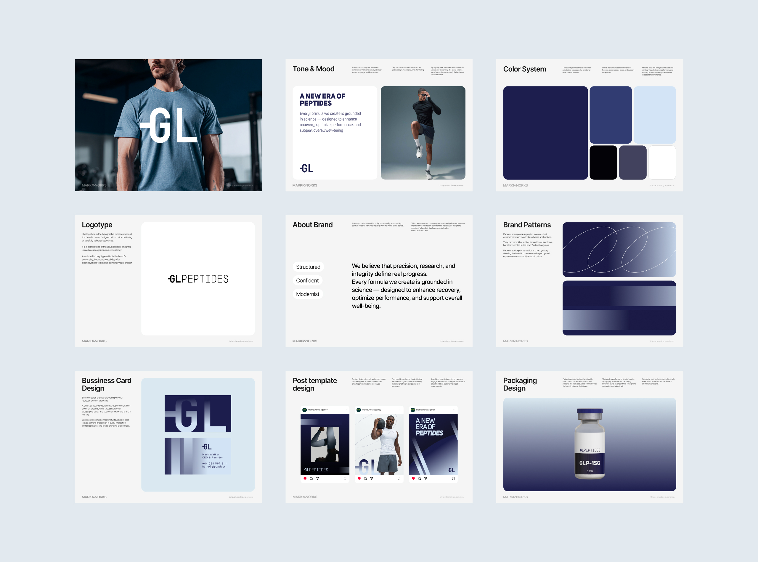
The positioning is grounded in science-first thinking and athletic performance culture.
We aimed to create a visual world that seamlessly blends biotechnology with modern fitness — serious, structured, and confidently future-focused.
Brand attributes:
Structured
Confident
Modernist
Science-backed
Performance-driven
Everything from typography to color was selected to project reliability and innovation.
02. Logo & Core Identity Development
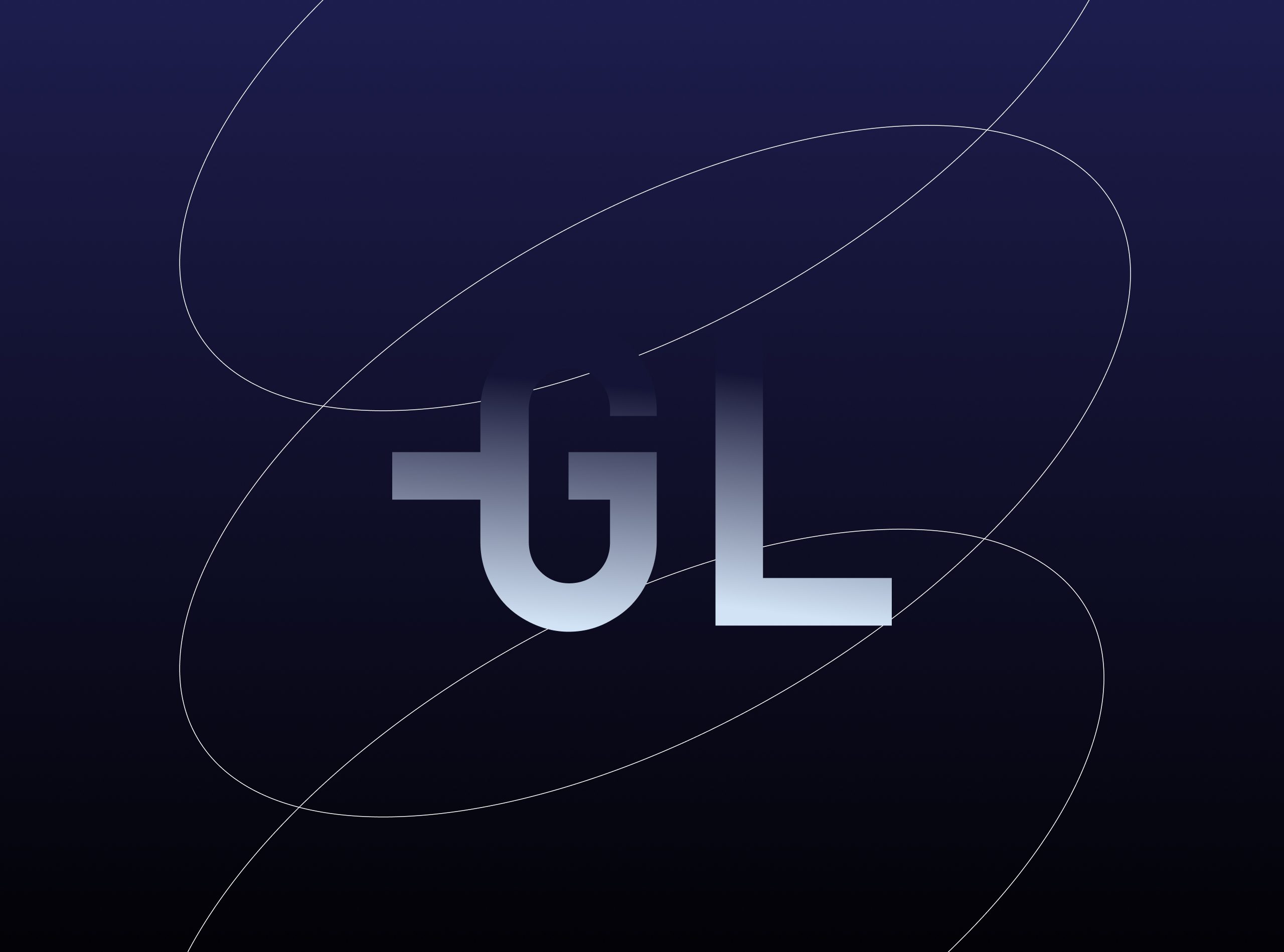
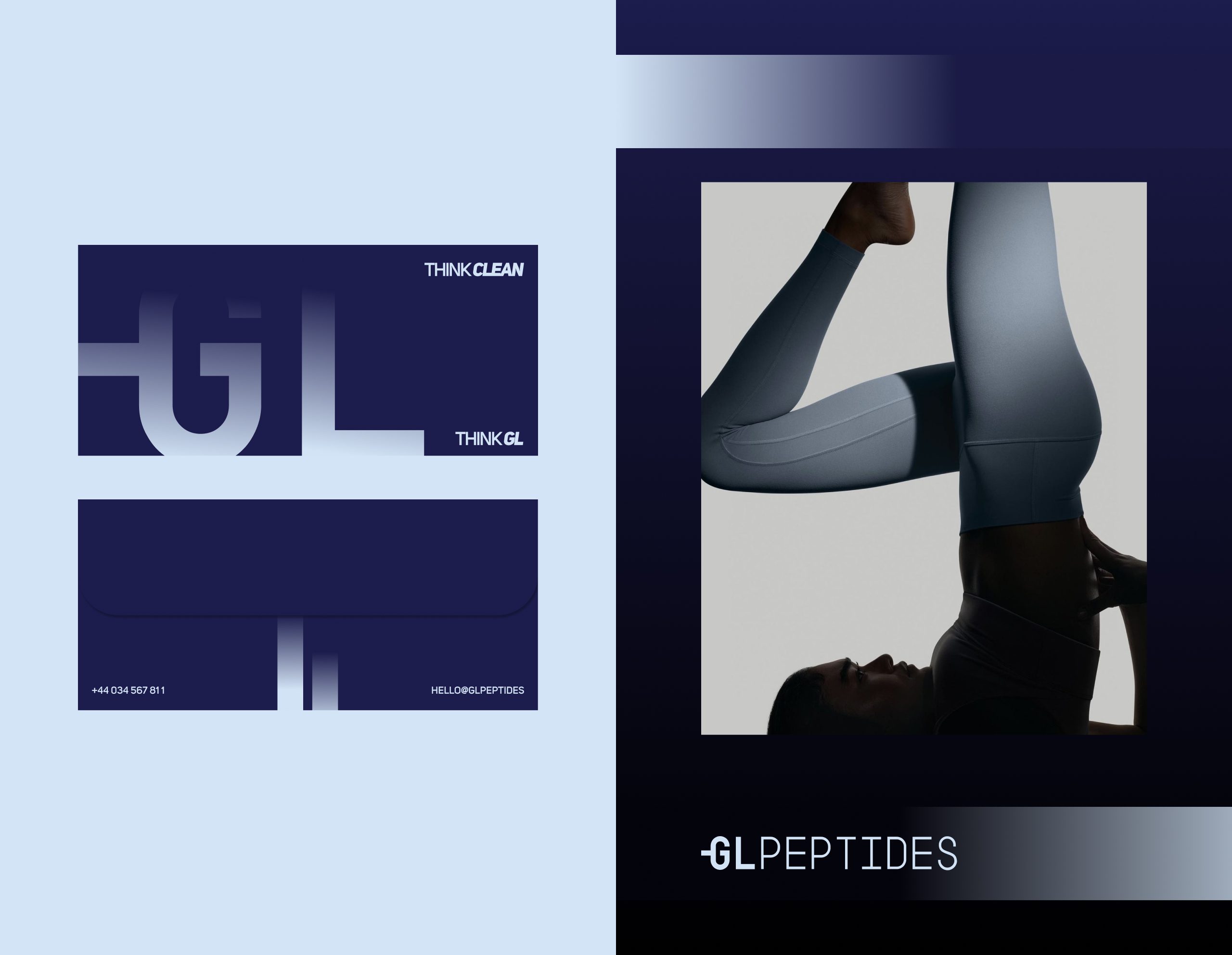
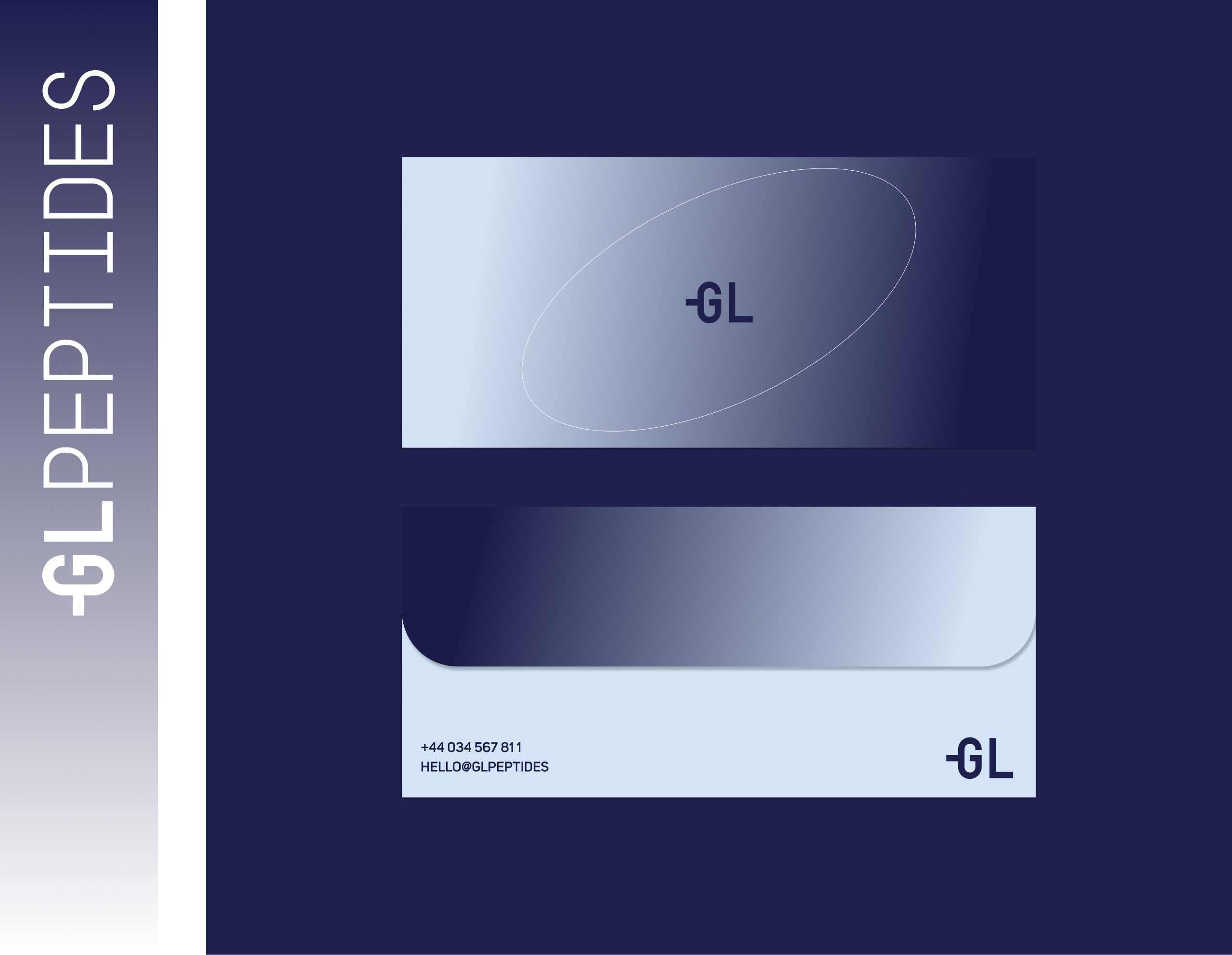
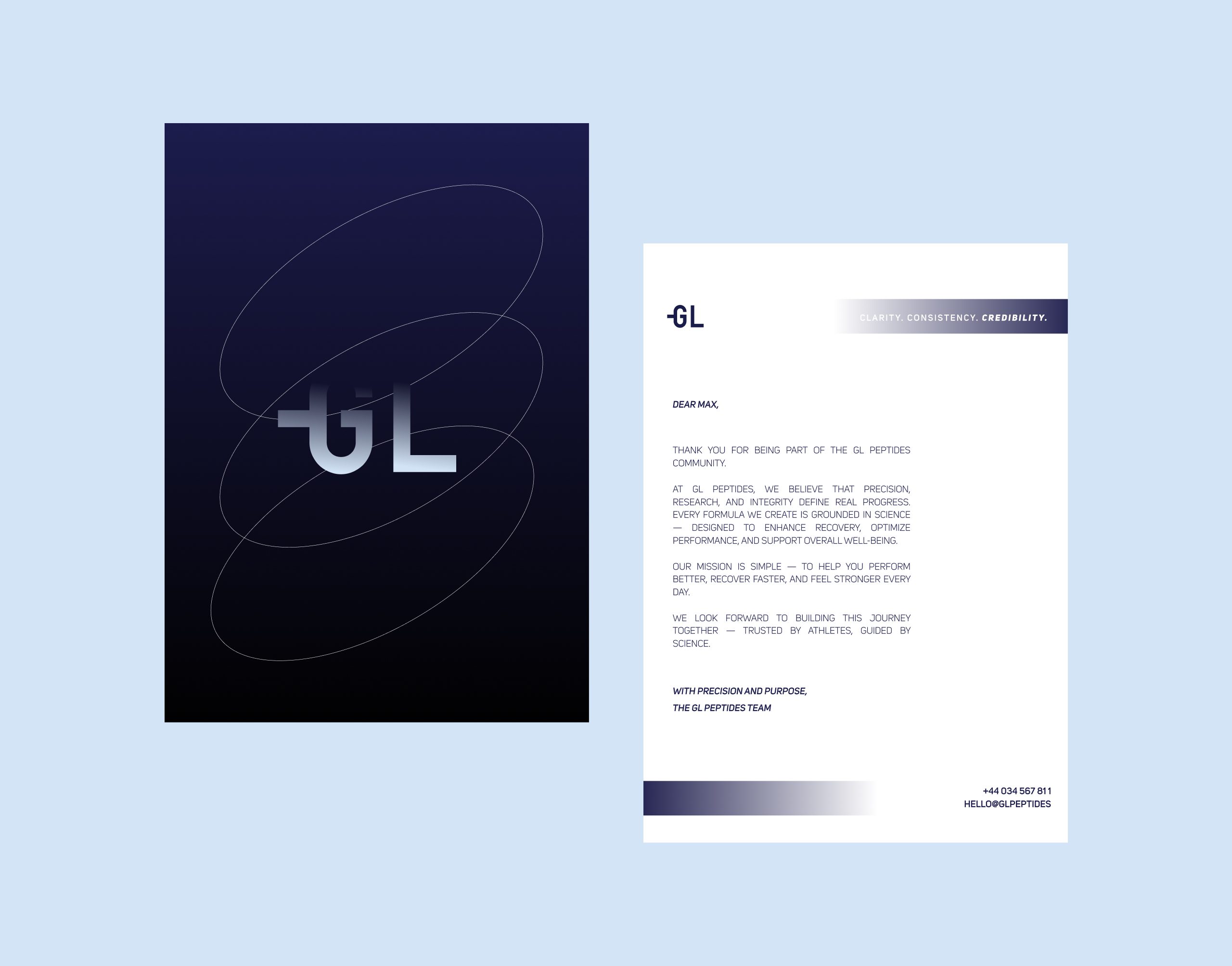
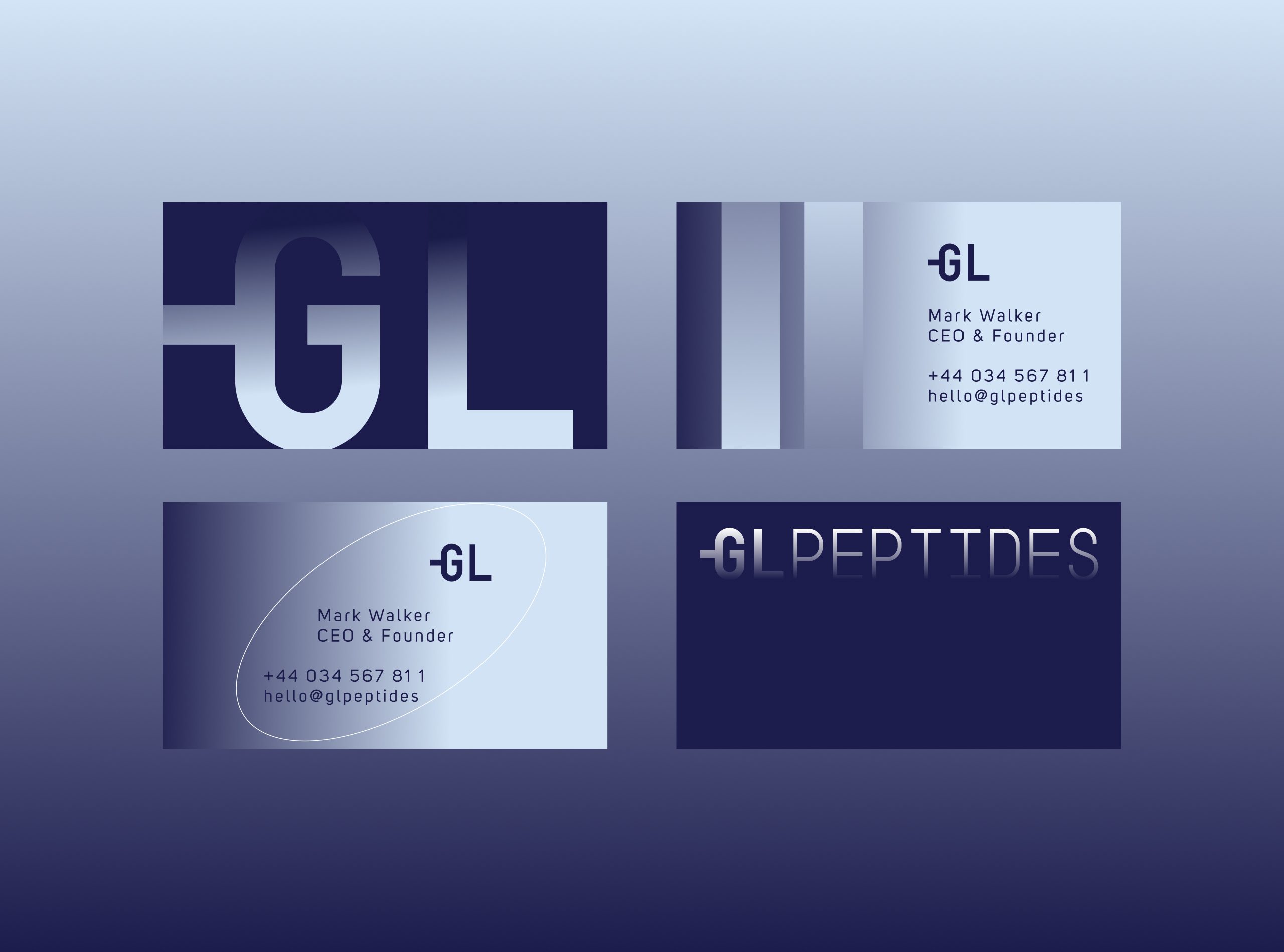
The GL monogram is designed as a bold, minimal symbol that instantly communicates precision.
The geometry is crisp and stable, echoing the brand’s commitment to exactness and scientific rigor.
The full wordmark GL PEPTIDES uses a clean, technical typographic approach — engineered for legibility, trust, and a modern pharmaceutical aesthetic.
Design decisions:
Balanced, scientific proportions
Angular, confident letterforms
A monogram that scales effortlessly across digital, packaging, and apparel
A modular construction suitable for lab-grade branding
03. Color System
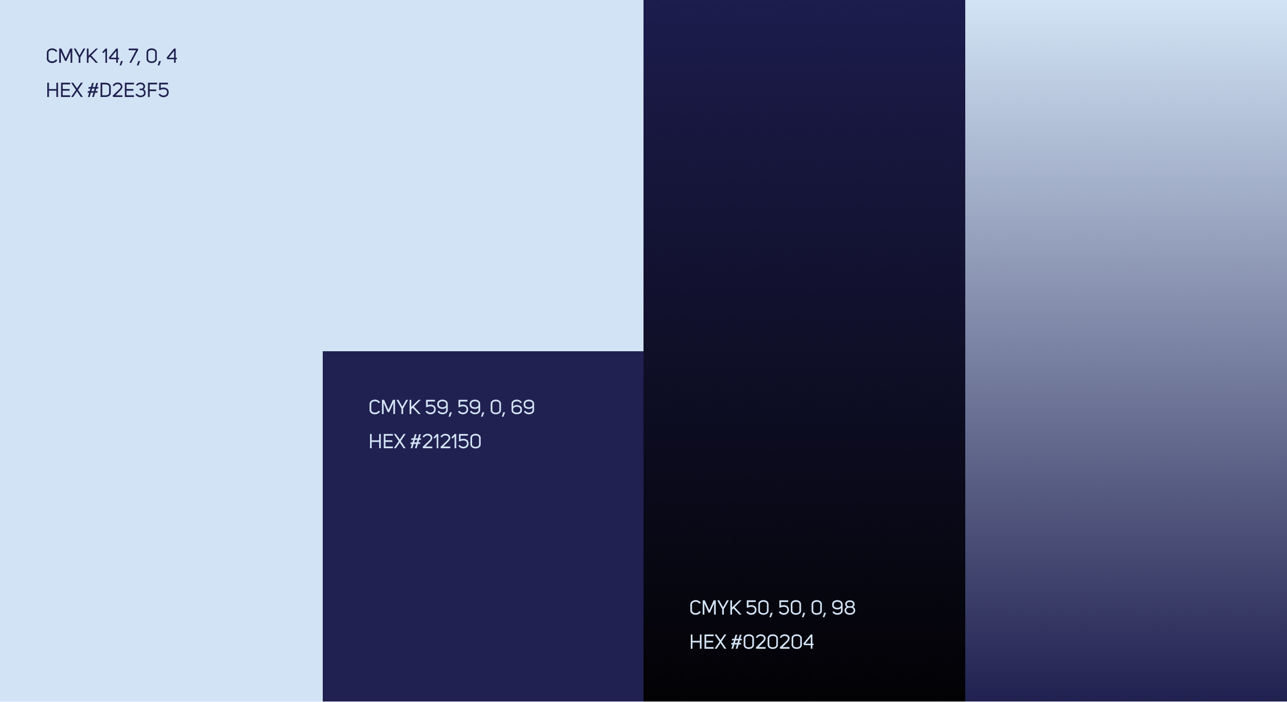
The palette is built around deep scientific blues and cool-spectrum gradients, emphasizing both trust and high performance.
Primary tones:
Midnight Blue → science, depth, authority
Ice Blue → clarity, purity
Graphite Black → precision, structure
Steel Gradient → innovation, modernity
The palette supports a clean, clinical look while still feeling bold and athletic.
04. Brand Patterns & Graphic World
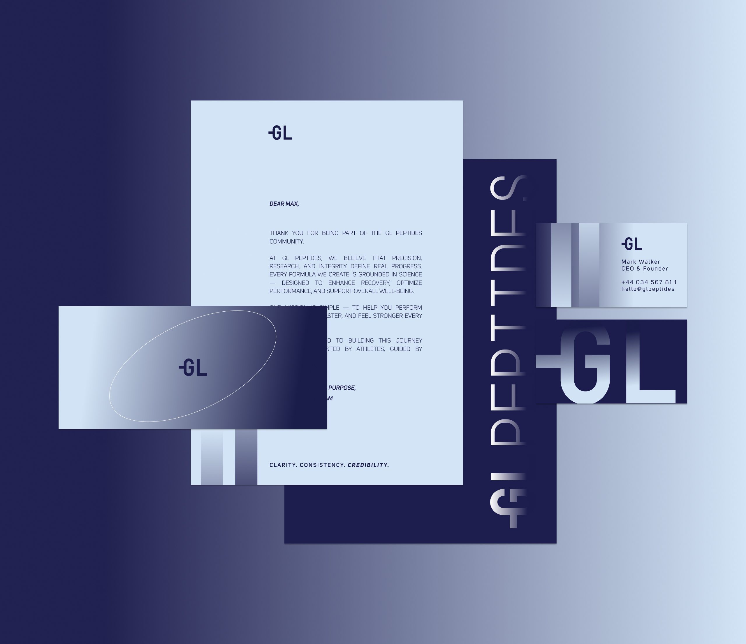
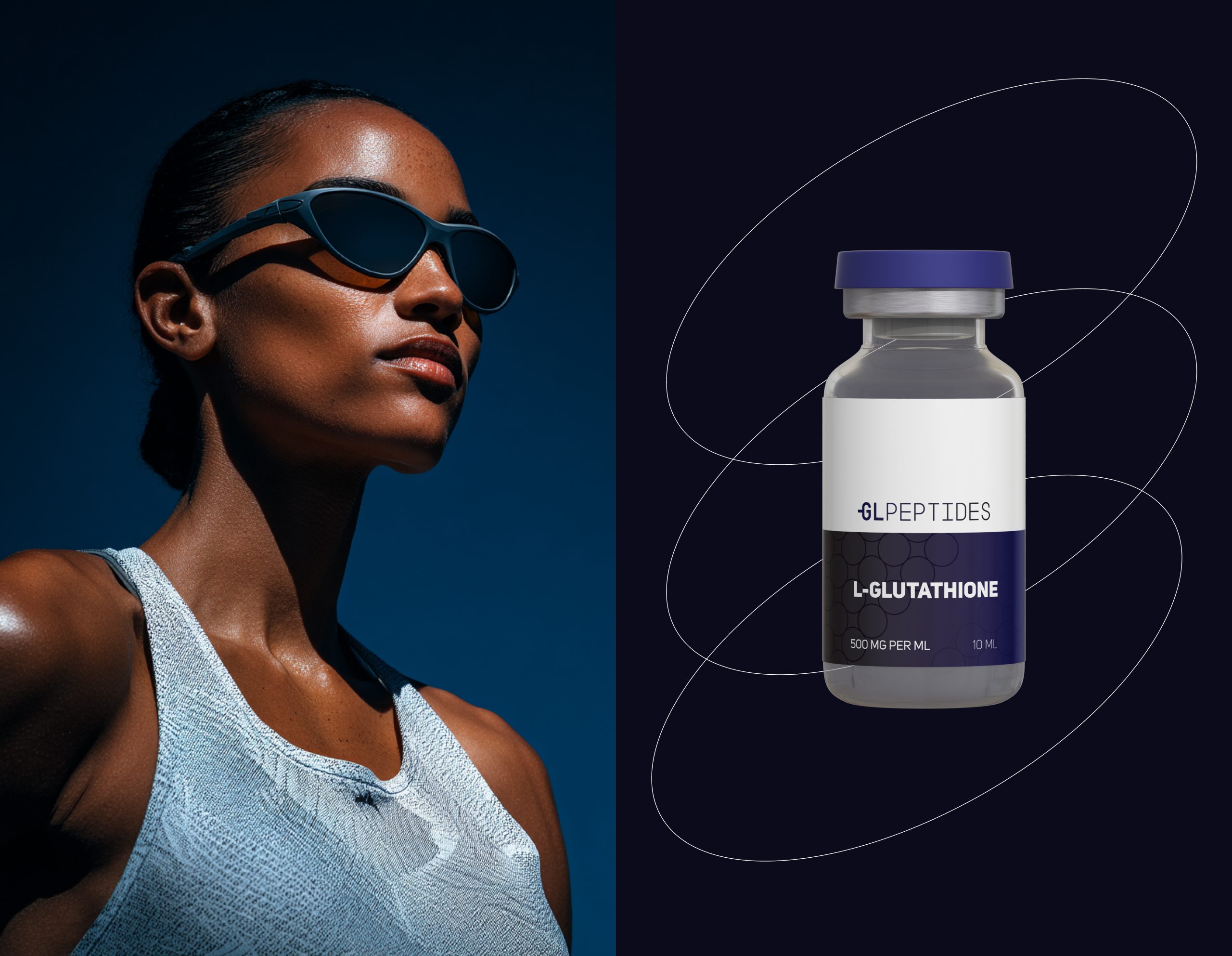
To elevate the brand beyond standard pharmaceutical visuals, we developed dynamic elliptical line patterns inspired by molecular trajectories and orbital movements.
These patterns:
introduce energy and motion,
symbolize molecular dynamics,
create a signature visual system recognizable across platforms.
They become a key asset in social media, packaging accents, and website UI.
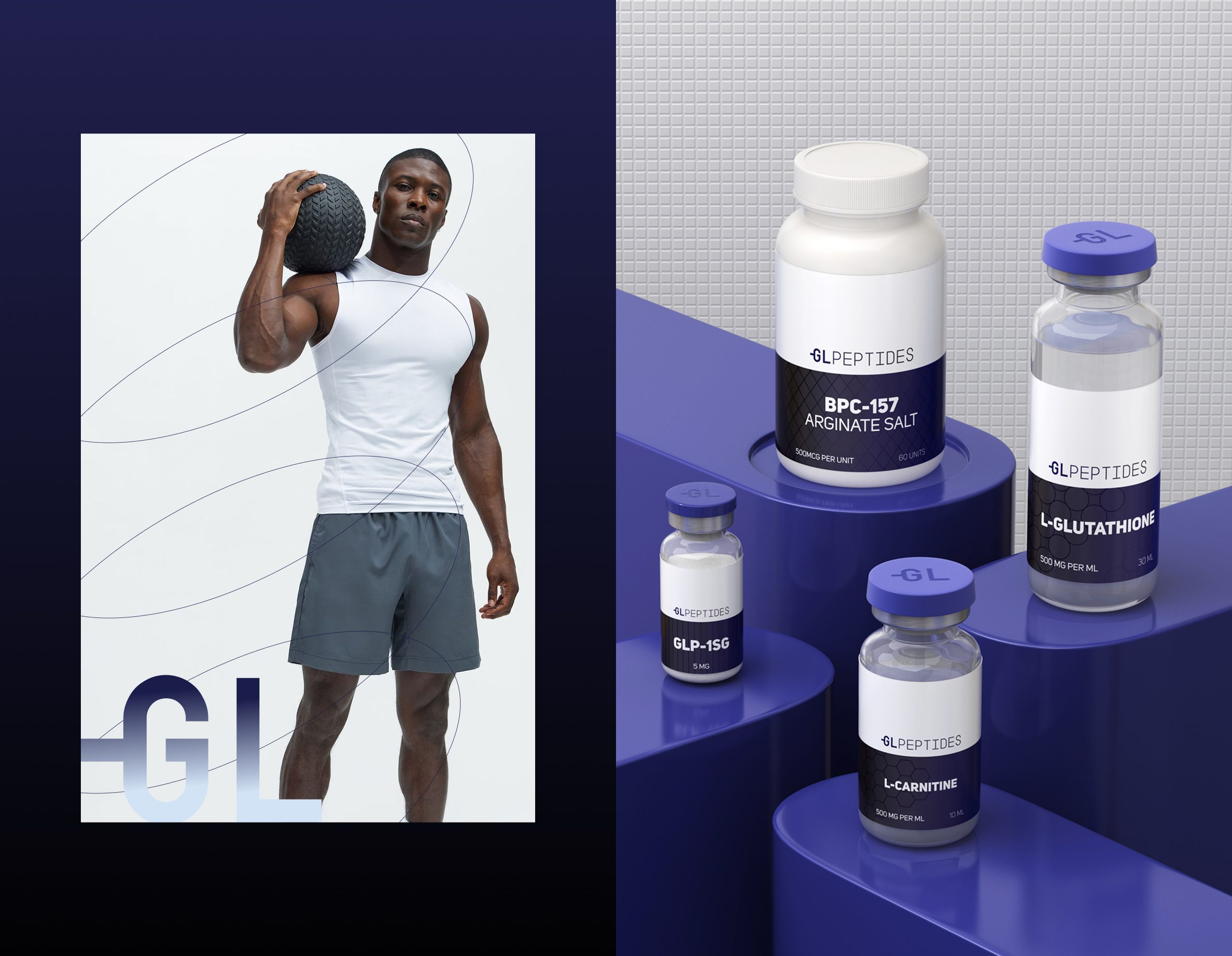
05. Packaging Design
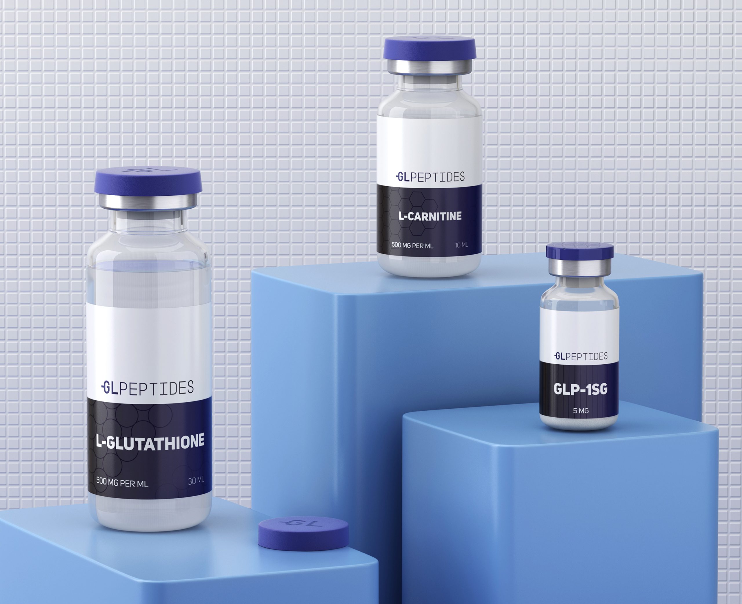
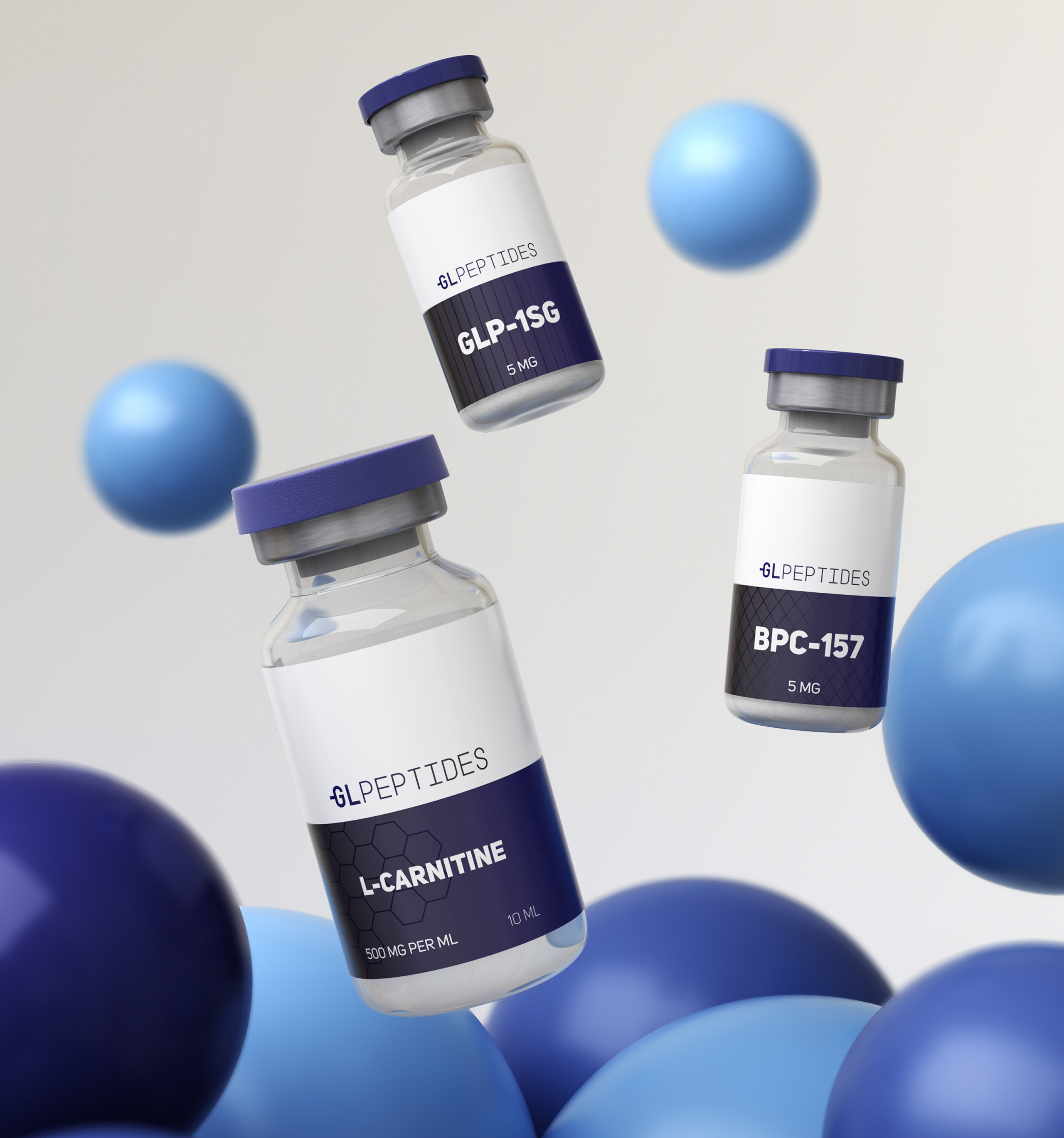
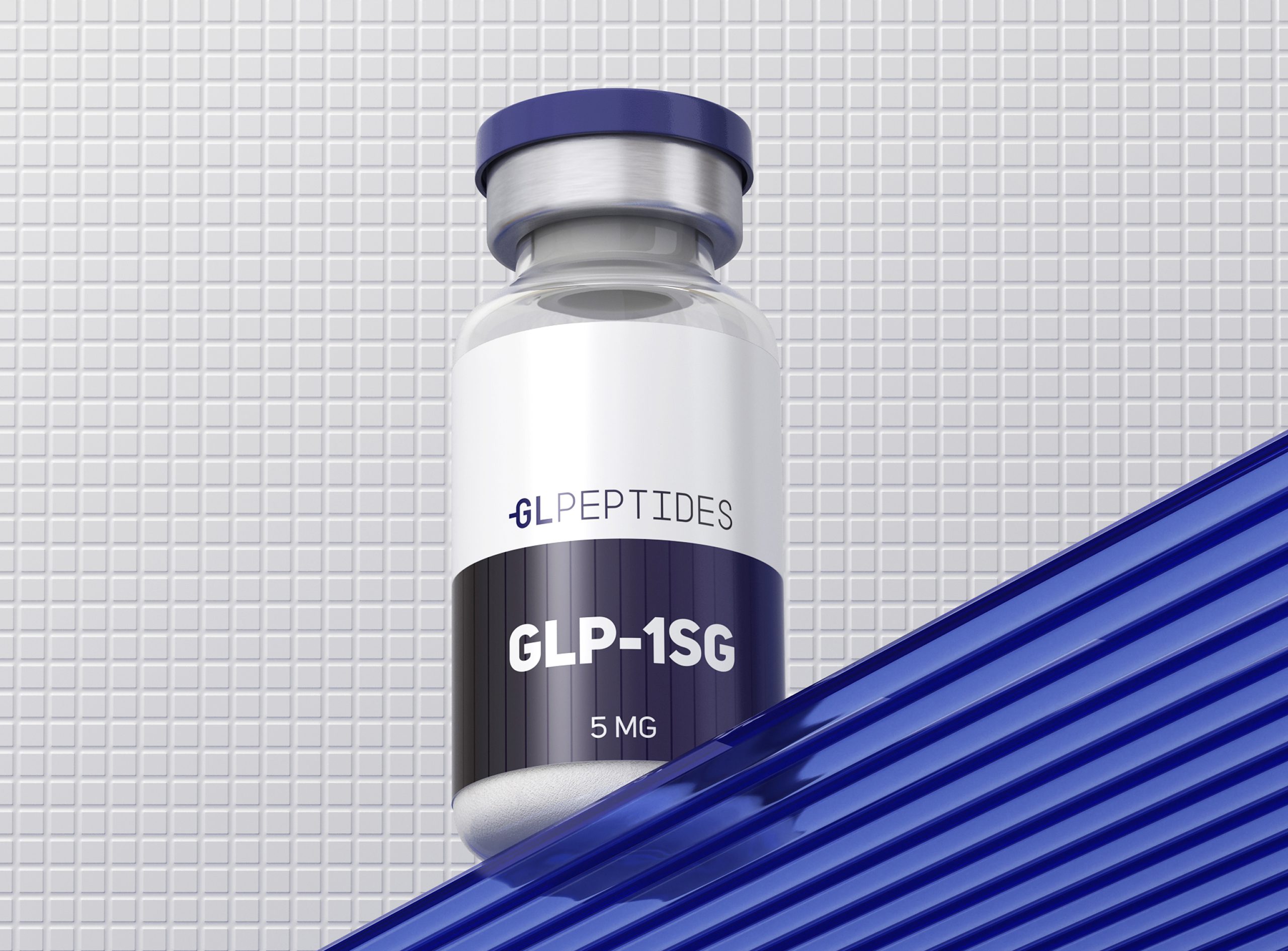
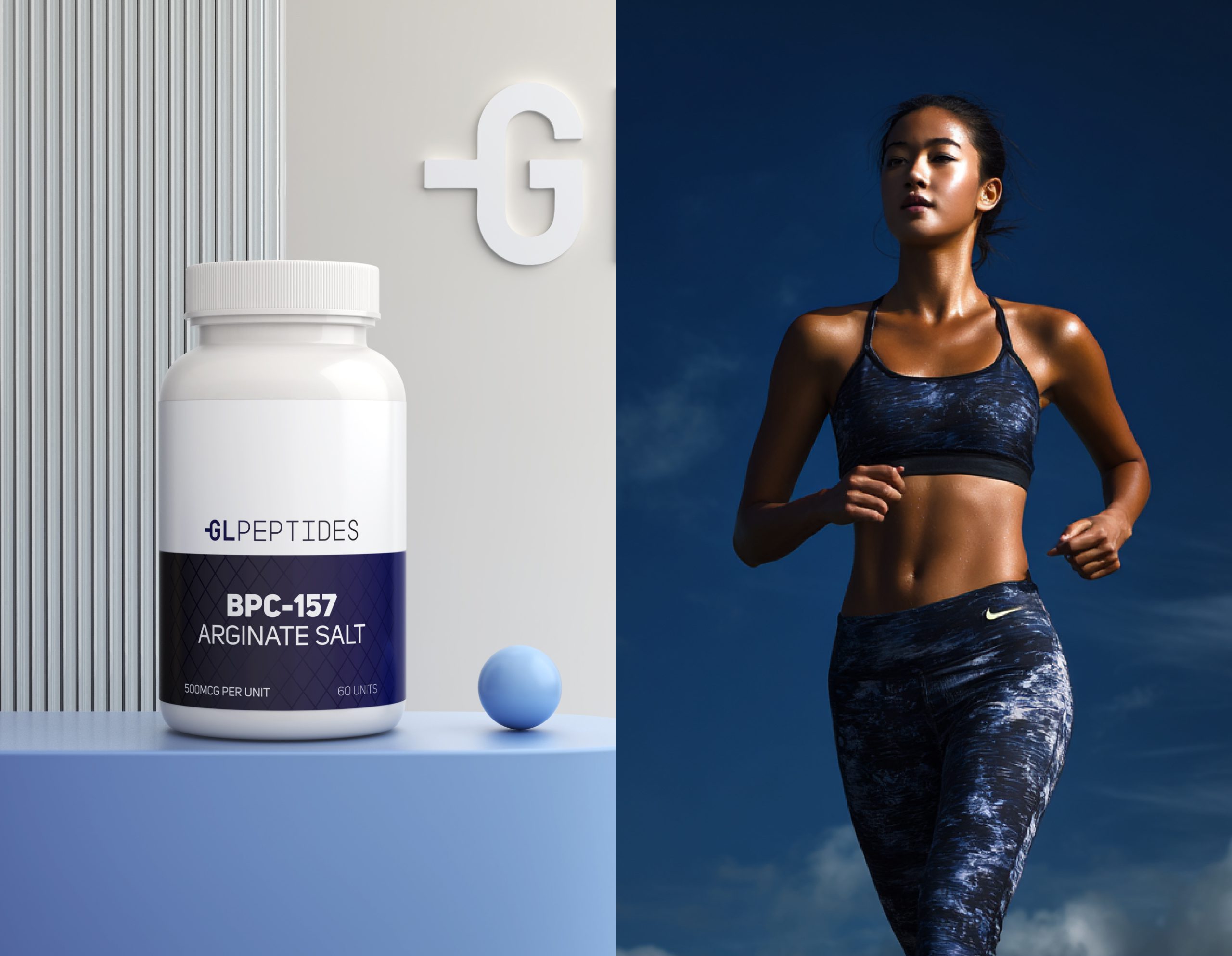
The packaging direction combines clinical simplicity with premium product clarity.
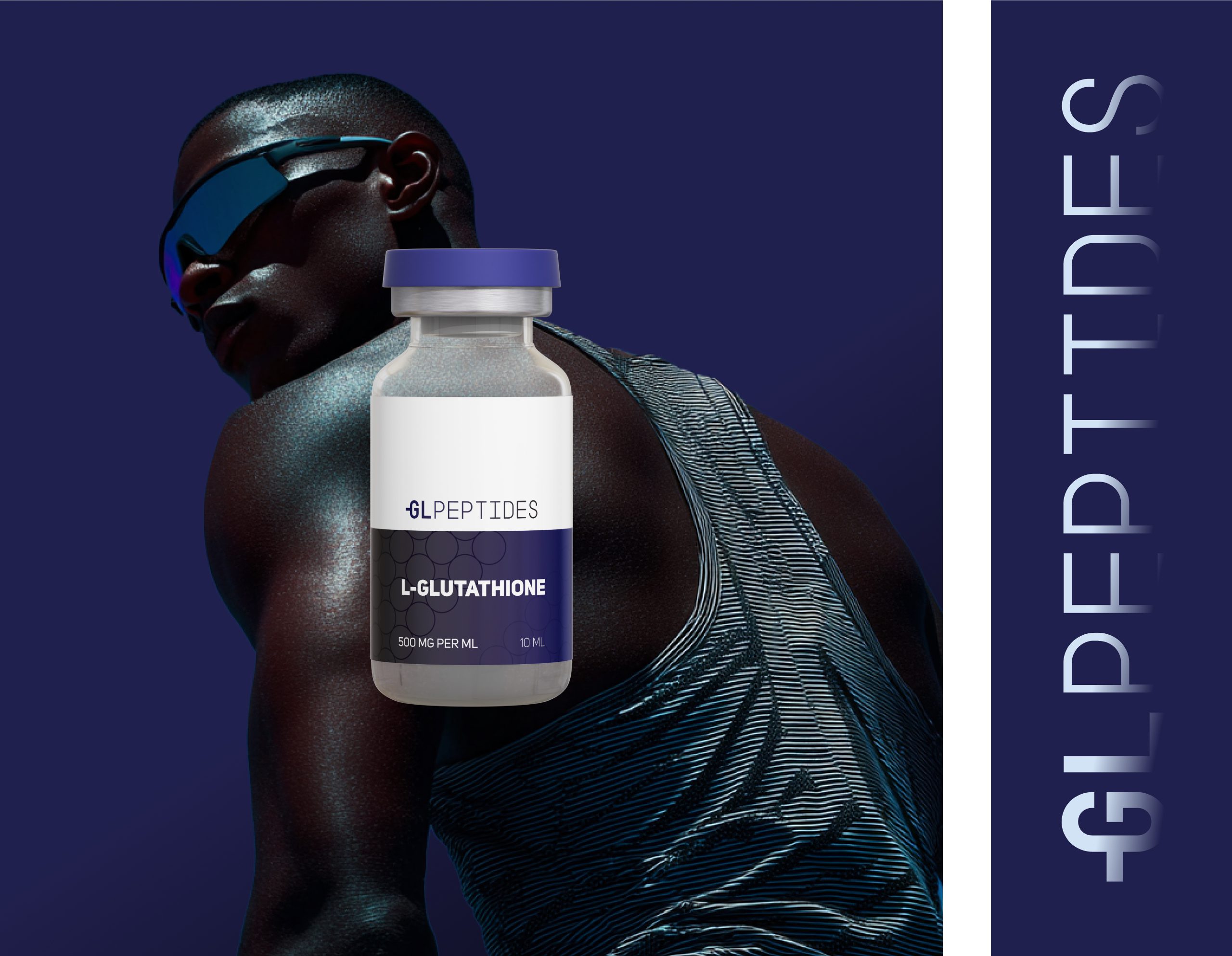
Each vial design follows a strict visual hierarchy to ensure instant readability and a professional, research-grade appearance.
Key elements:
Precise label grids
High-contrast typography
Minimal, lab-clean layouts
Molecular patterns for subtle scientific cues
A bold color block system to differentiate compounds
The result: packaging that feels trustworthy, modern, and ready for both lab environments and direct-to-consumer markets.
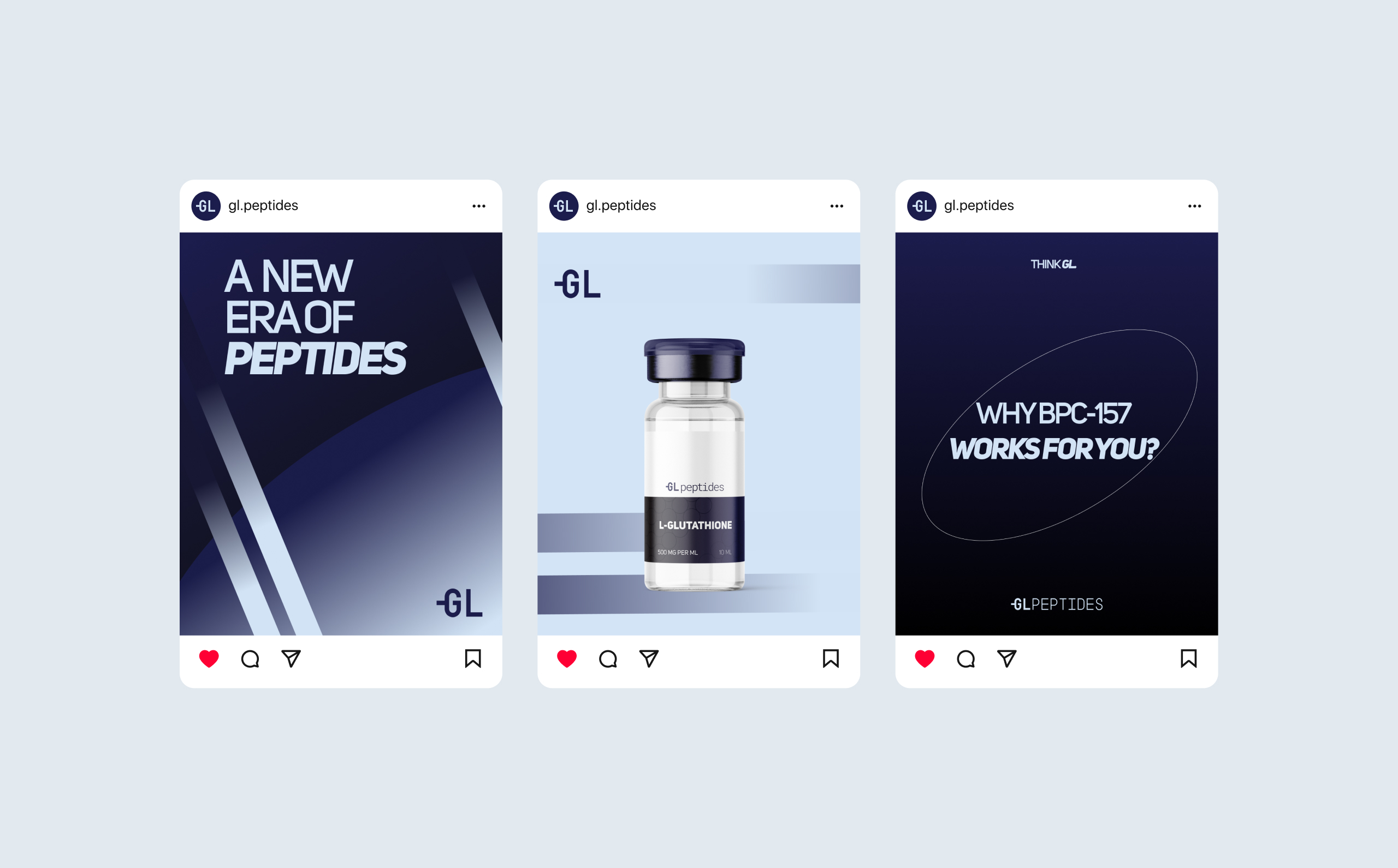
06. Social Media System
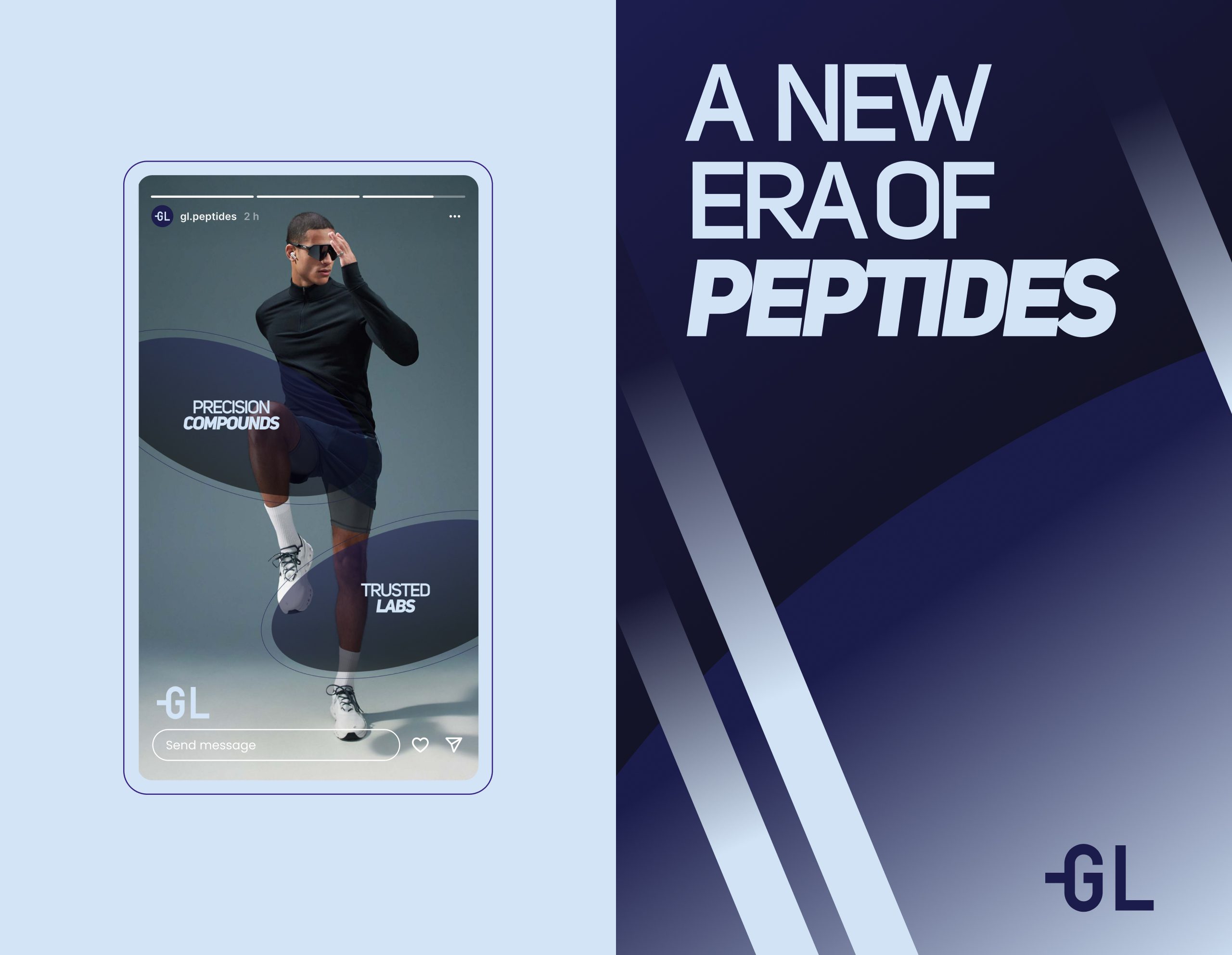
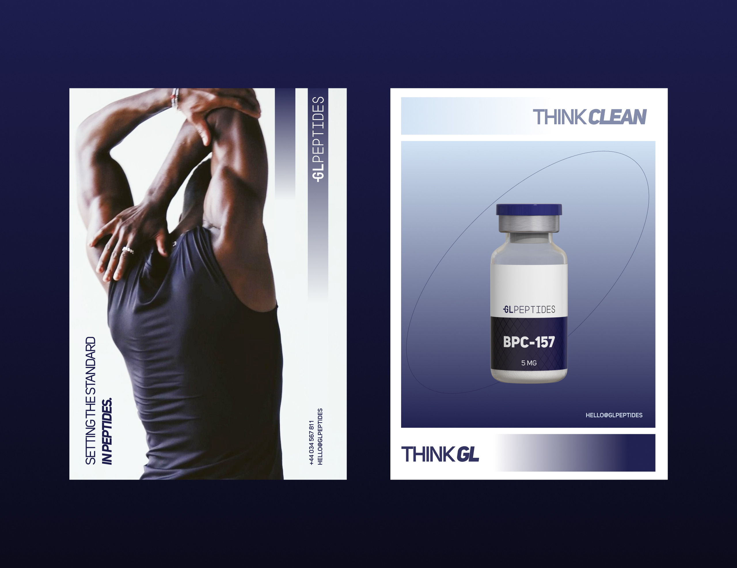
We built a digital system capable of educating, inspiring, and converting high-intent audiences — athletes, researchers, and wellness professionals.
Content structure includes:
High-contrast monochrome layouts
Hero product showcases
Molecular-inspired graphic accents
Key scientific statements
Modern performance photography
Everything is designed to build authority and emphasize the brand’s science-first commitment.
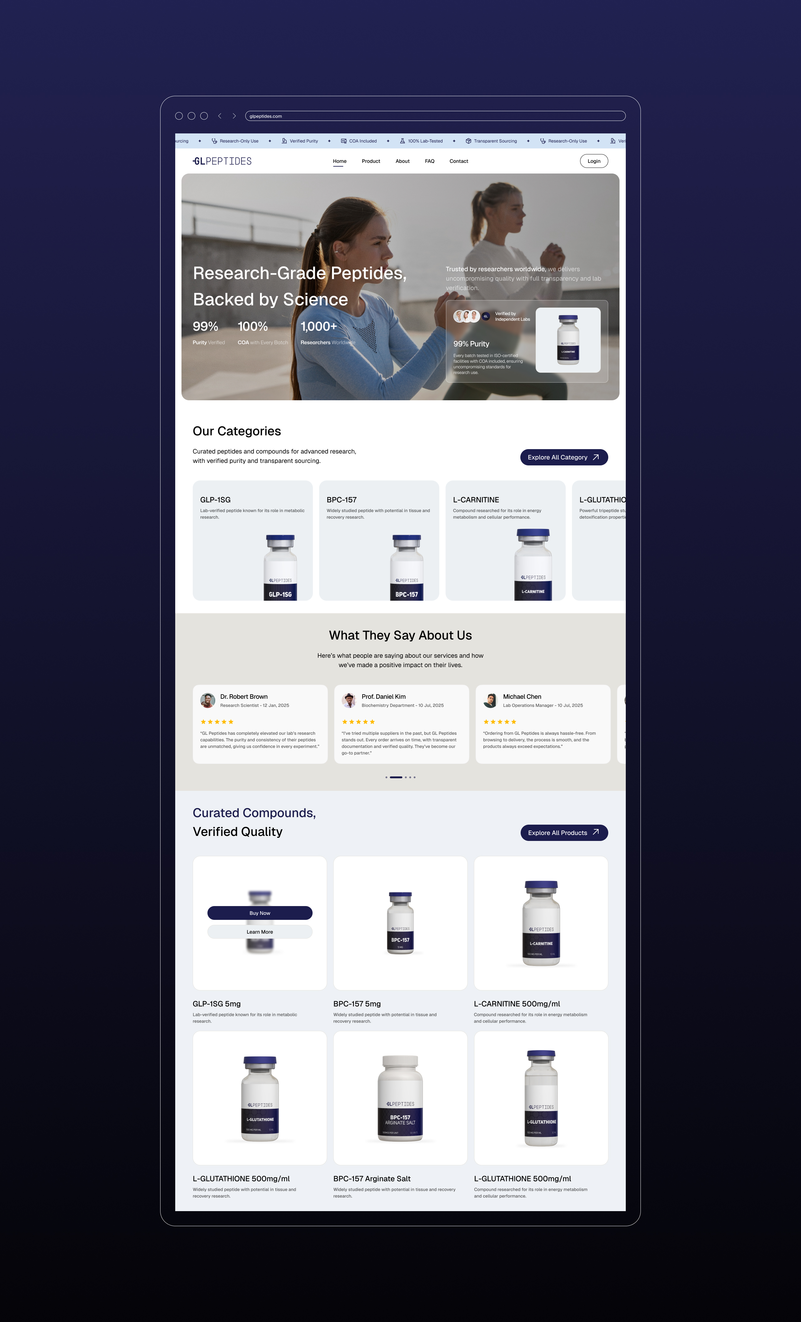
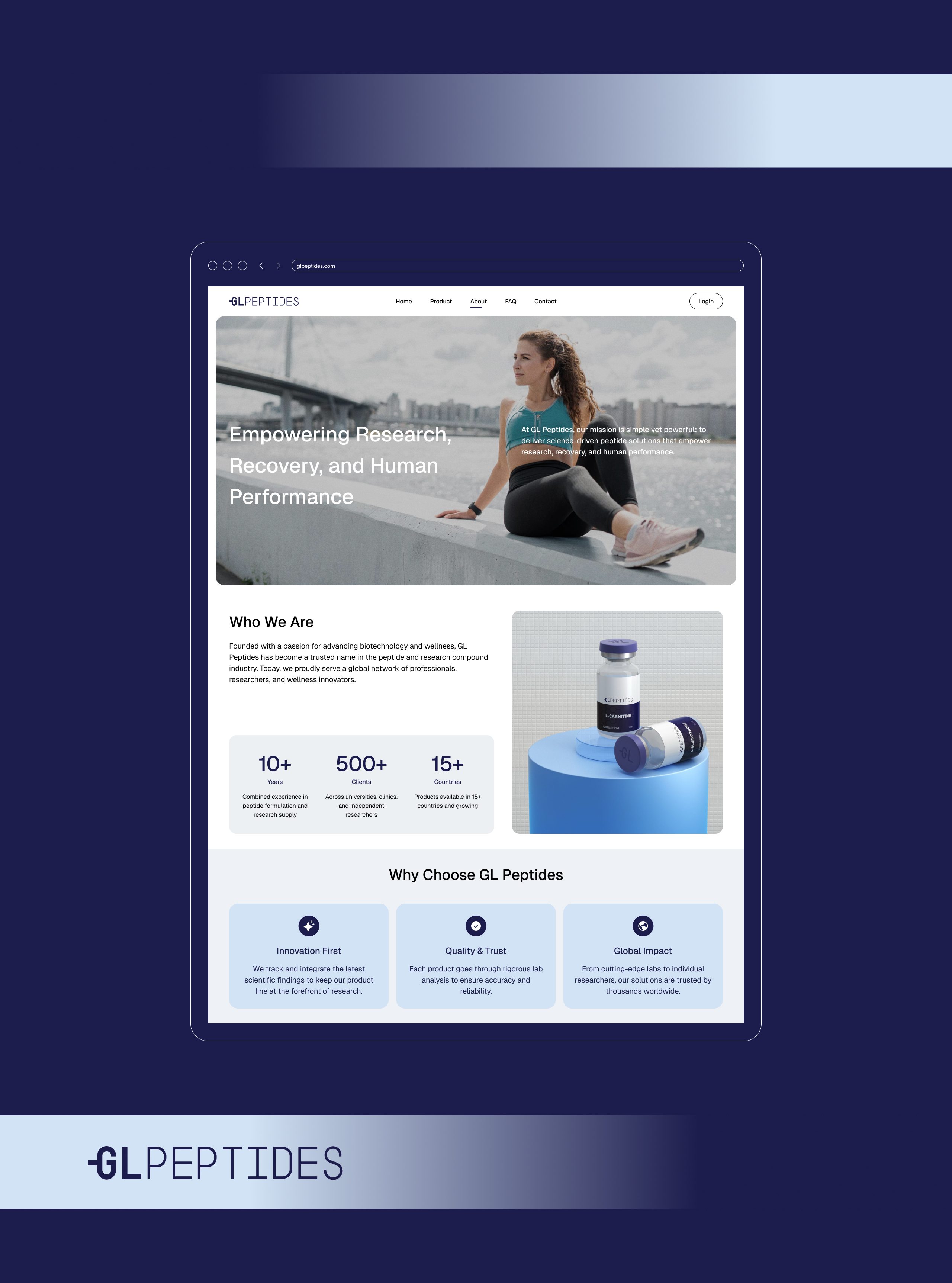
07. Web Experience
The GL Peptides website mirrors the brand’s clarity and credibility.
Clean UI, intuitive navigation, and data-forward structure support a strong first impression.
Highlights:
High-trust hero sections
Lab-grade product presentation
COA-focused transparency messaging
Multi-category product grids
Customer testimonials from researchers and professionals
Soft micro-animations and gradient transitions
The digital presence positions GL Peptides as a benchmark in peptide research and performance supplementation.



08. Final Outcome
Through a cohesive identity system — monogram, typography, patterns, packaging, and digital design — GL Peptides now stands as a modern, authoritative, and globally scalable peptide brand.
This identity elevates the brand from a typical supplement look into a scientific performance powerhouse with clarity, structure, and unmistakable presence.

Let’s make the work they’ll copy.
Talk to an expert now
Work with a 38 team of the
industry’s top 1% talent.



