HOLME — UI Design
Minimal Digital Interface & Experience
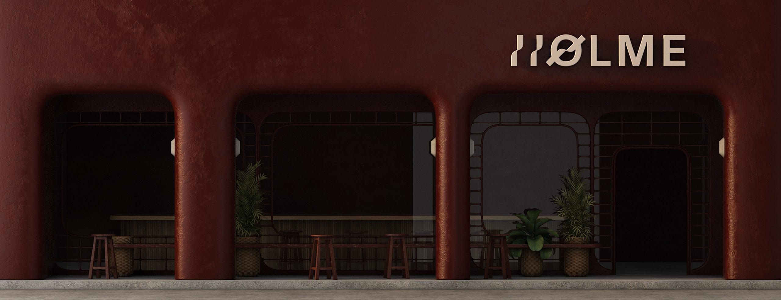
Designing a refined digital interface for Holme, a brand that treats objects as design pieces rather than consumable products. Developed with a clear emphasis on structure, hierarchy, and restraint.
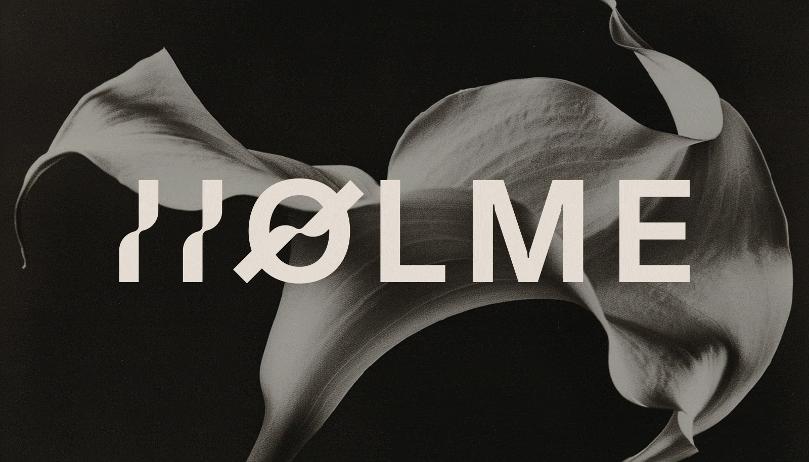

HOLME — UI
Design
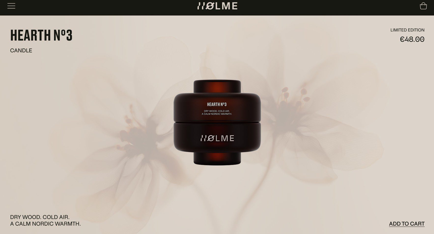
This project focuses on designing a refined digital interface for Holme, a brand that treats objects as design pieces rather than consumable products.
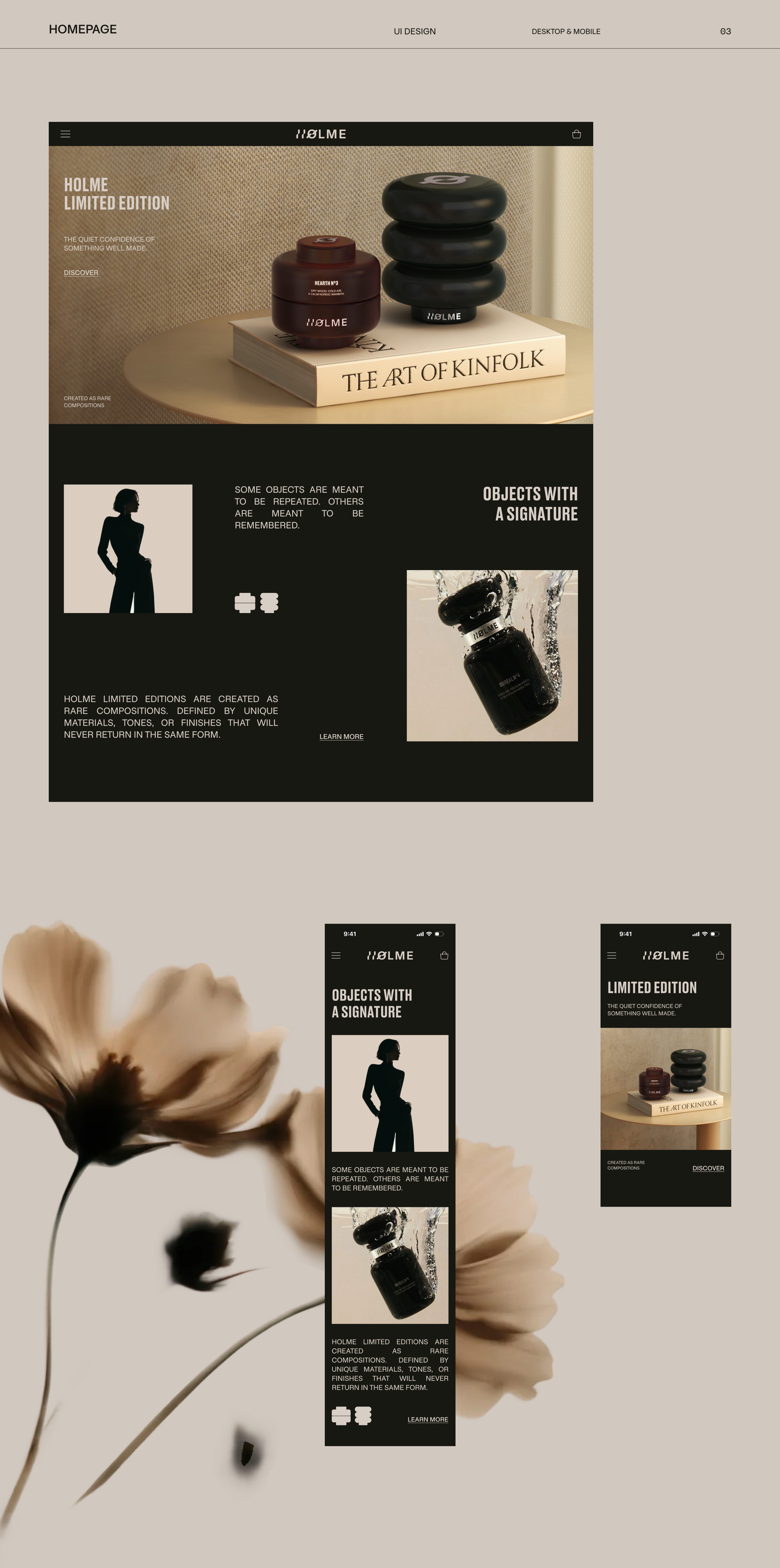
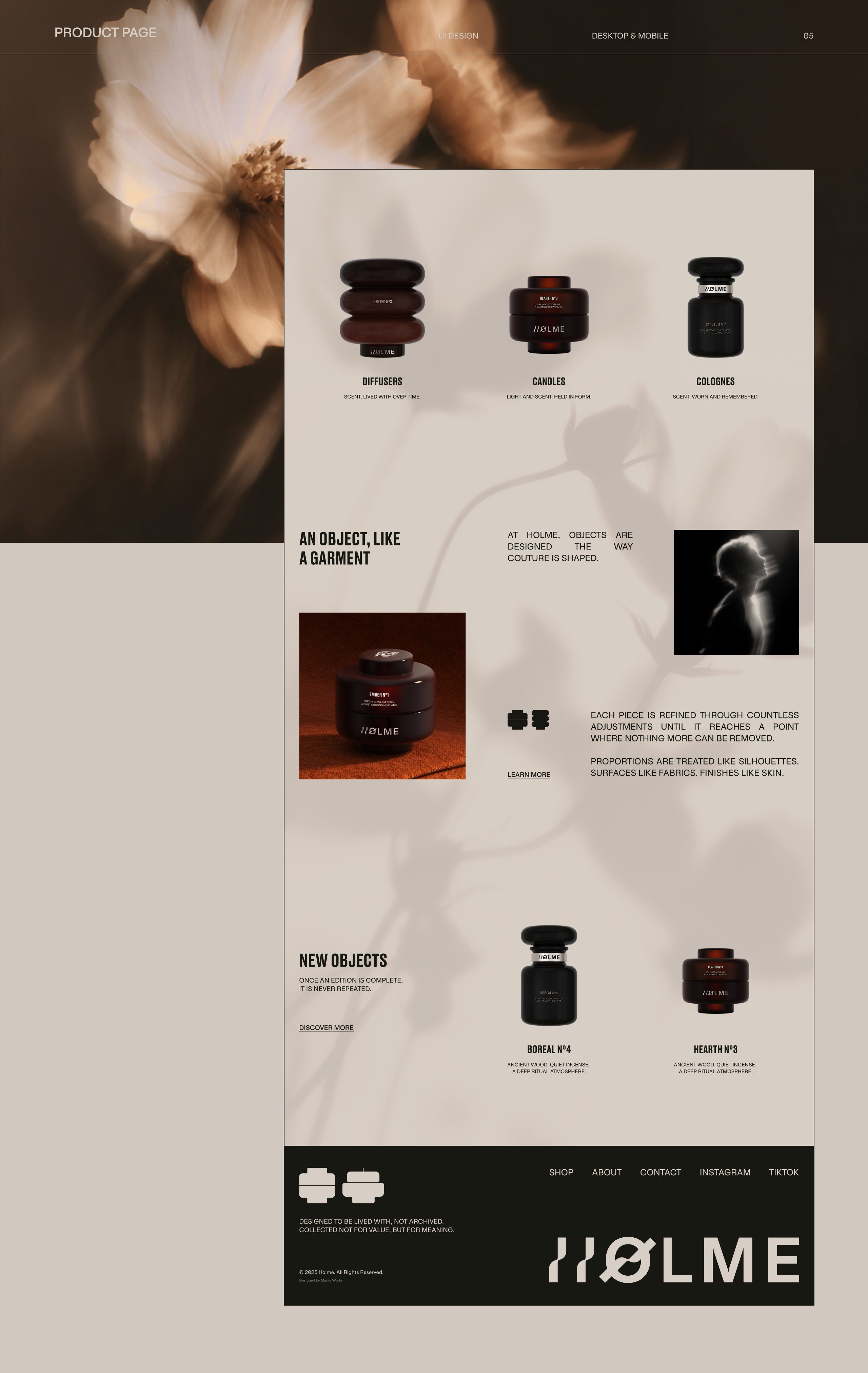
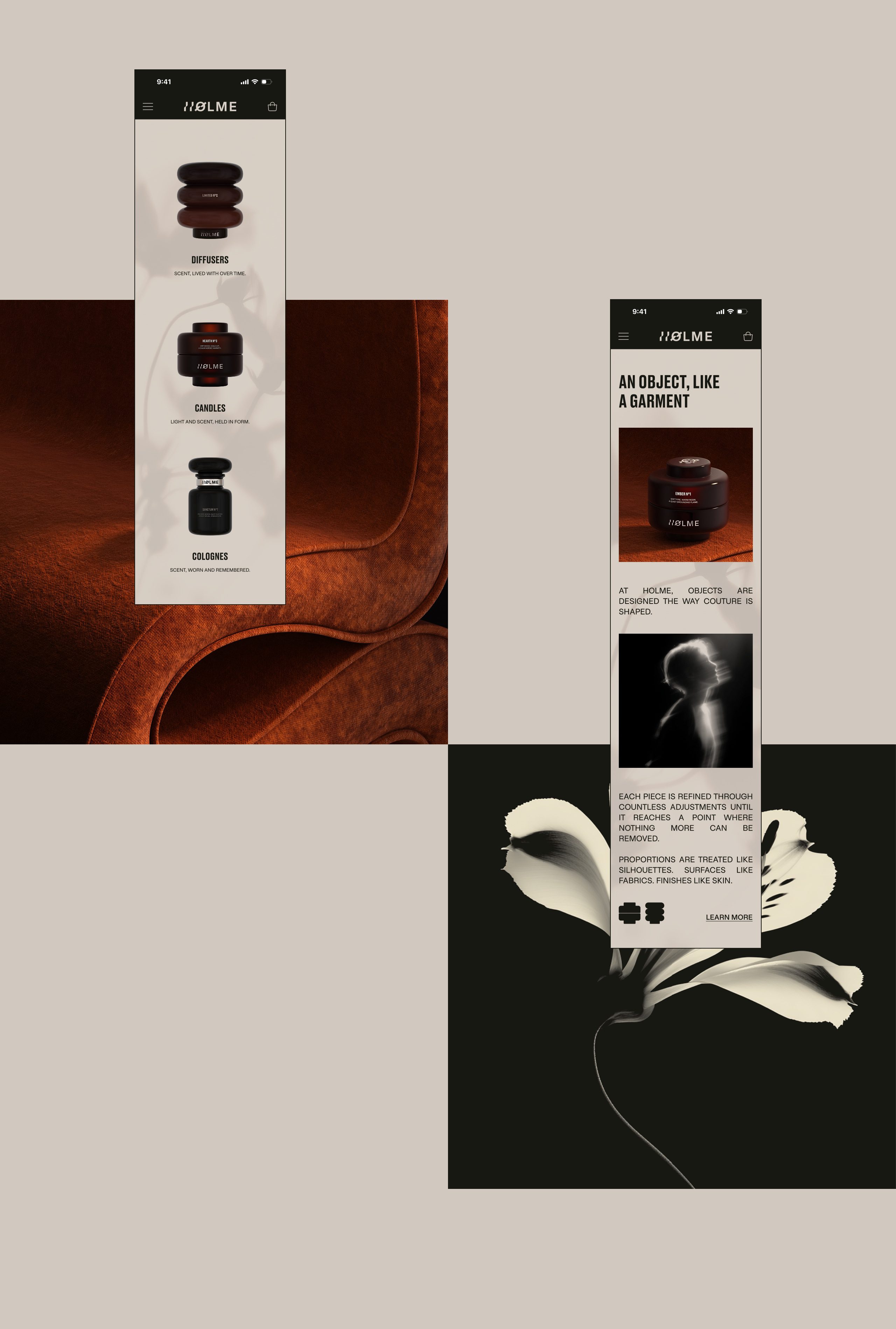
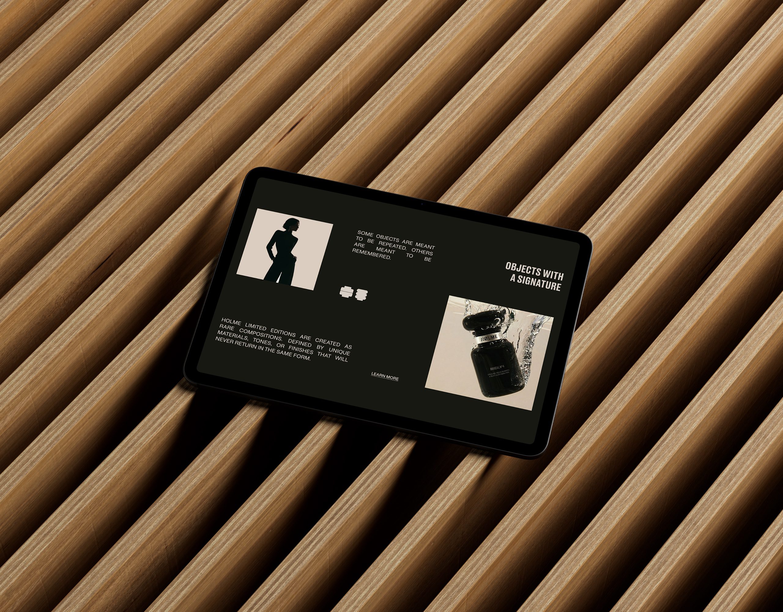
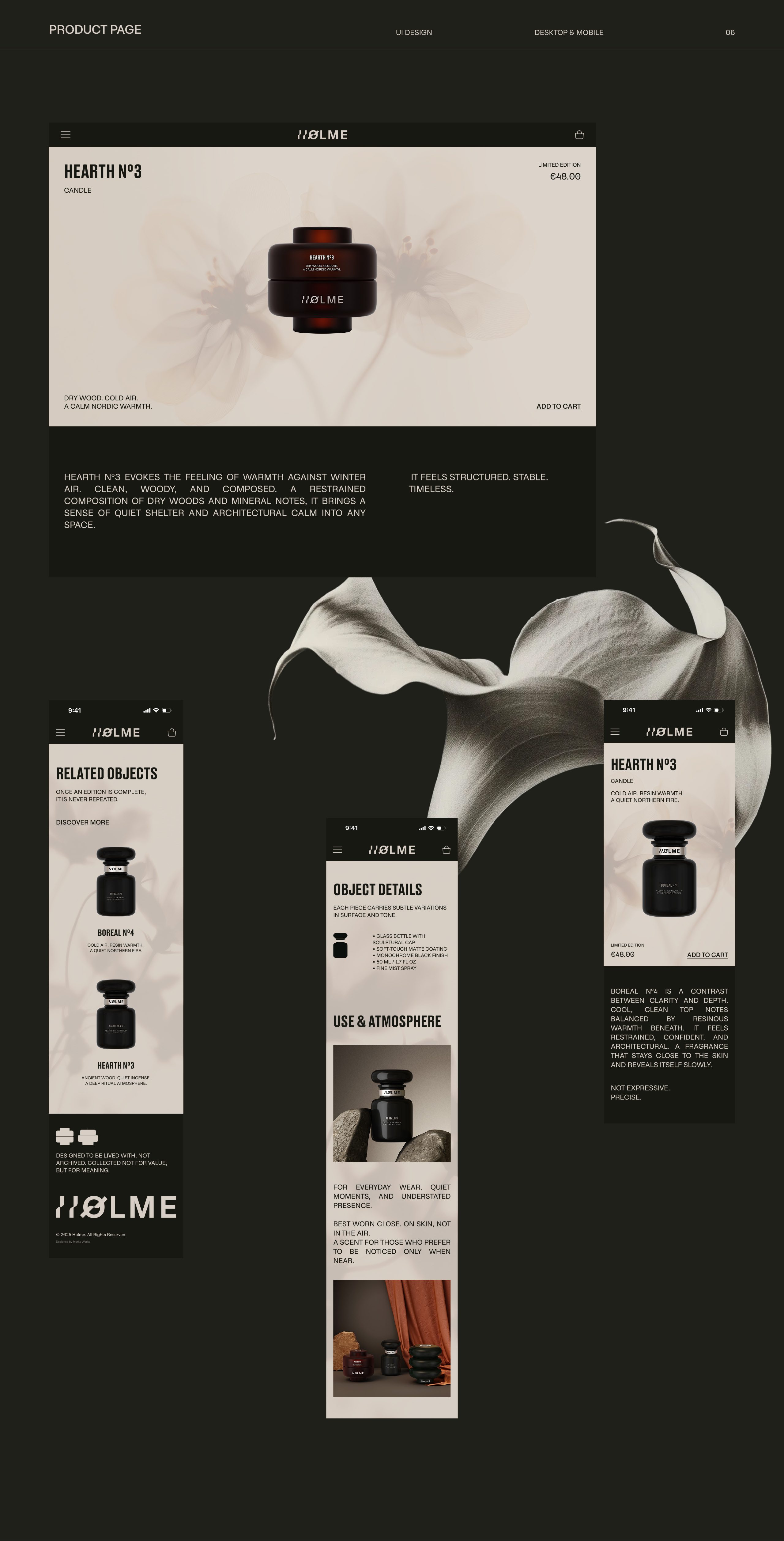
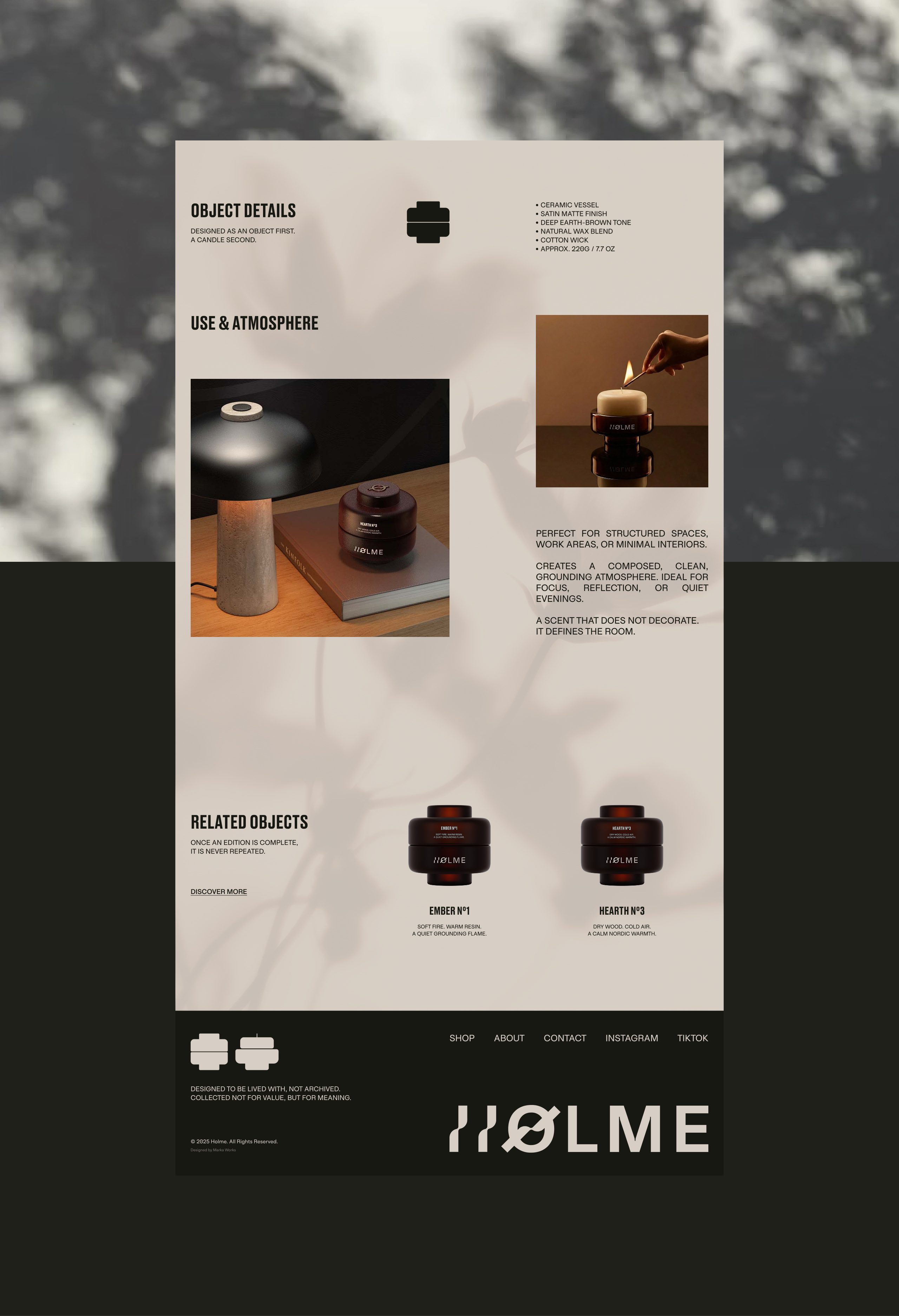
The UI was developed with a clear emphasis on structure, hierarchy, and restraint. Layout decisions were driven by proportion and balance, allowing each product to exist within its own visual space without distraction. The navigation flow was intentionally kept slow and minimal to reflect the brand’s calm and composed character.
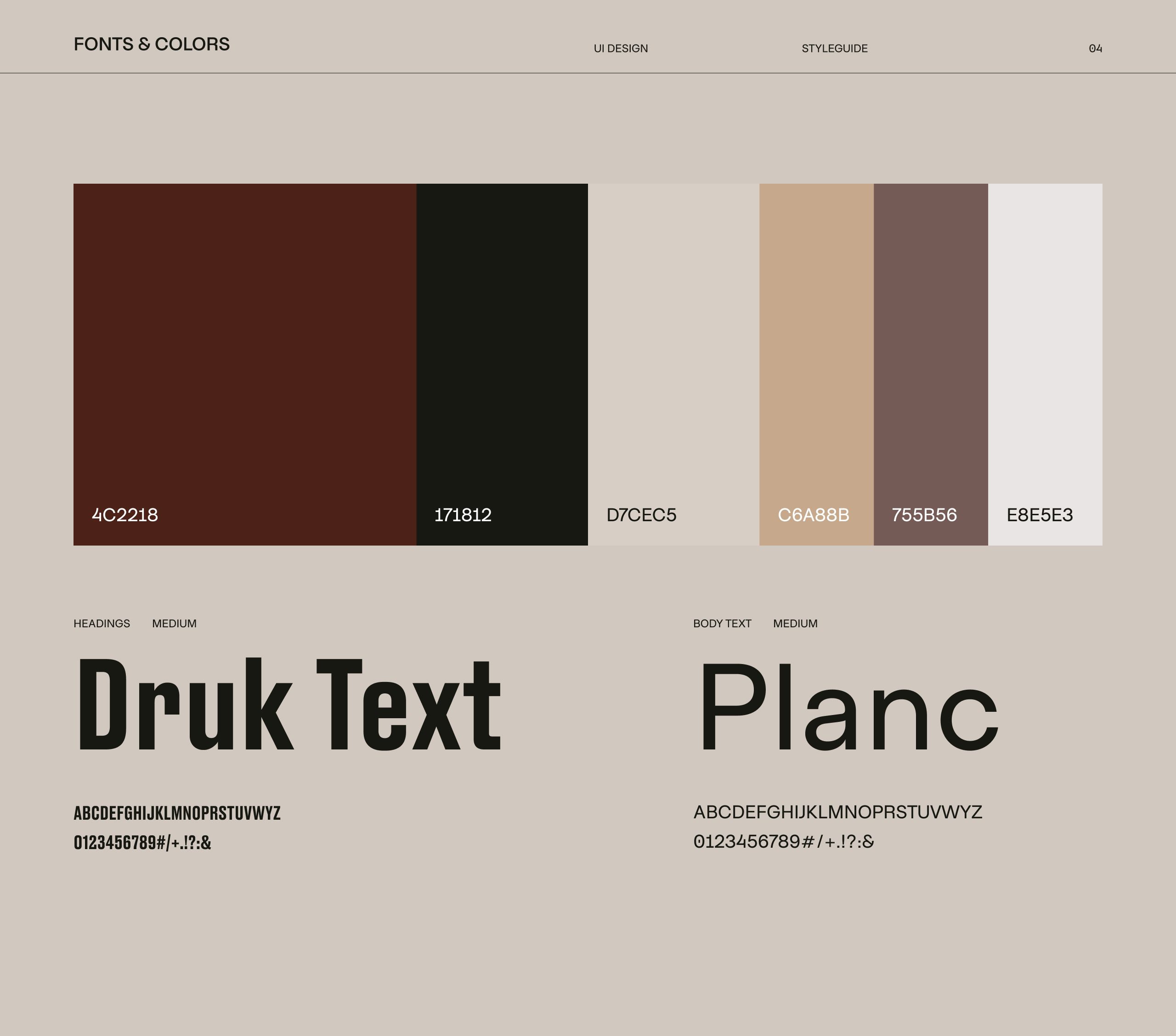
Typography, color palette, and spacing were carefully selected to support a tactile and architectural feel. Soft contrasts, muted tones, and controlled typography weights were used to create a sense of permanence rather than trend-driven aesthetics.
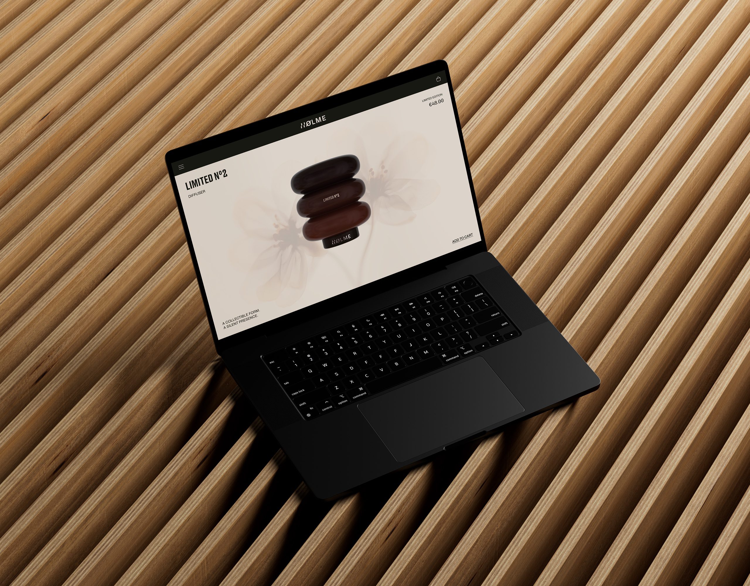
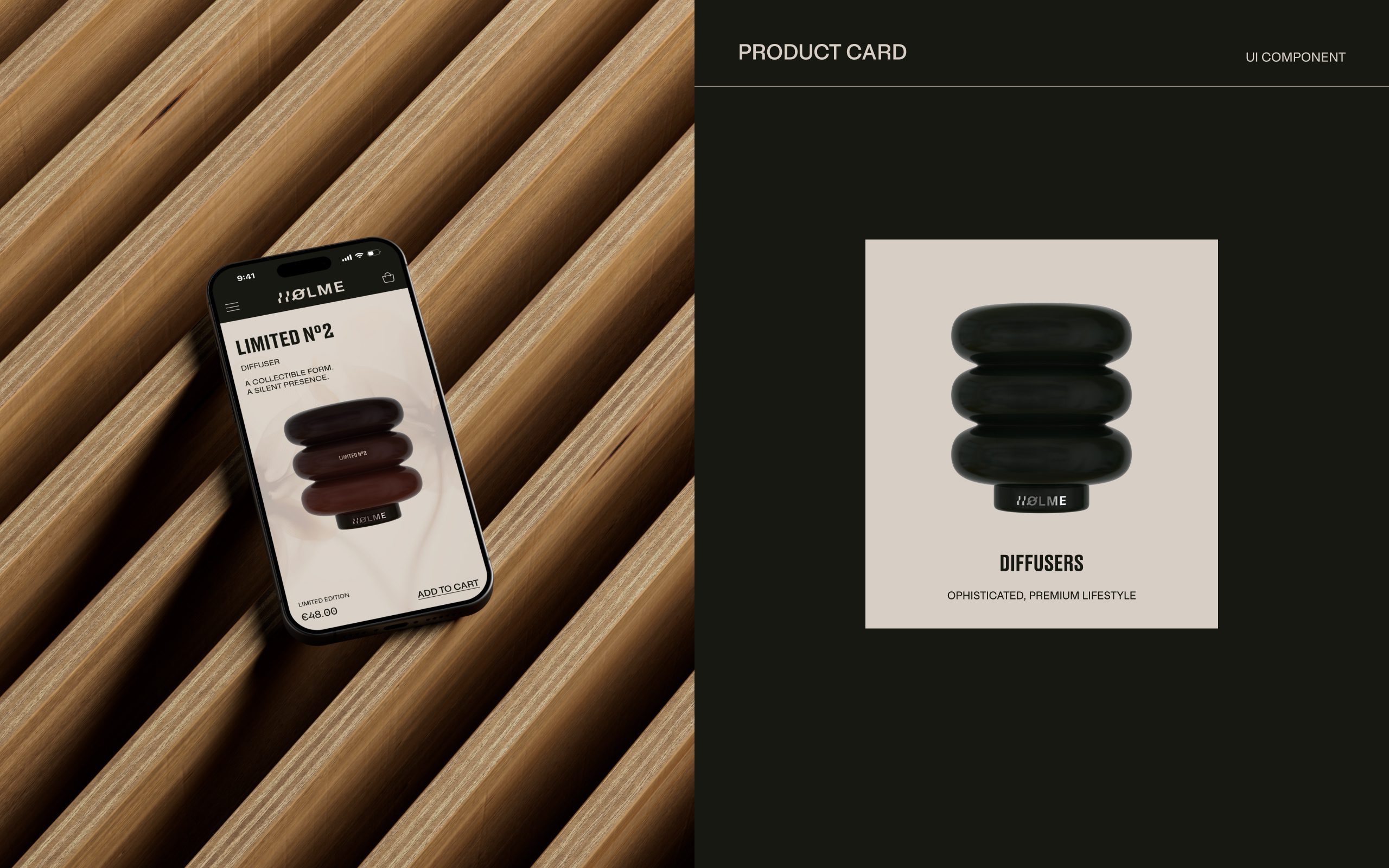
Product pages were designed to highlight material, form, and subtle variation, while limited editions are treated at a product level — not as a collection concept. The interface scales consistently across desktop and mobile, maintaining clarity, rhythm, and visual discipline throughout the experience.
The result is a digital system that supports the brand without overpowering it — quiet, structured, and intentional.
This project focuses on designing a refined digital interface for Holme, a brand that treats objects as design pieces rather than consumable products.
The UI was developed with a clear emphasis on structure, hierarchy, and restraint. Layout decisions were driven by proportion and balance, allowing each product to exist within its own visual space without distraction. The navigation flow was intentionally kept slow and minimal to reflect the brand’s calm and composed character.
Typography, color palette, and spacing were carefully selected to support a tactile and architectural feel. Soft contrasts, muted tones, and controlled typography weights were used to create a sense of permanence rather than trend-driven aesthetics.
Product pages were designed to highlight material, form, and subtle variation, while limited editions are treated at a product level — not as a collection concept. The interface scales consistently across desktop and mobile, maintaining clarity, rhythm, and visual discipline throughout the experience.
The result is a digital system that supports the brand without overpowering it — quiet, structured, and intentional.
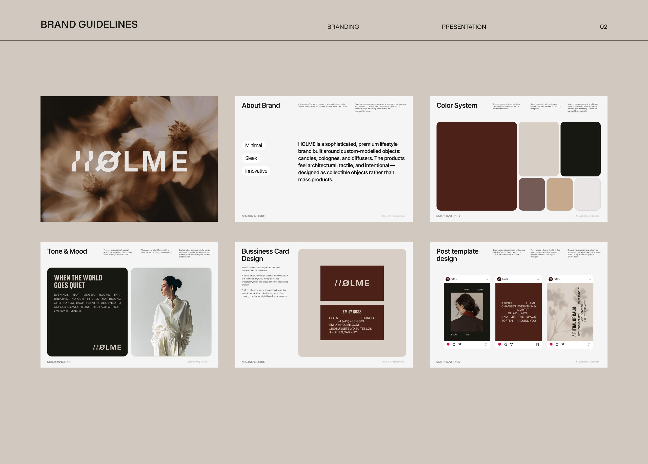
Unique
Branding Experience.
MarkaWorks
MarkaWorks


Let’s make the work they’ll copy.
Talk to an expert now
Work with a 35+ team of the
industry’s top 1% talent.


