
Hotel Palms
sun-kissed coastal serenity
Hotel Palms, a MARKAWORKS creation, embodies a luxurious, timeless, and friendly hospitality experience through its cohesive branding. This project defines the brand’s essence, crafting a distinctive visual language from logotype to unique patterns, all designed to evoke tranquility and a welcoming aura.
A Holistic Approach to Hospitality Branding
Our comprehensive branding strategy for Hotel Palms focused on translating its luxurious, timeless, and friendly essence into a cohesive visual language. This involved creating a distinct logotype, an evocative emblem, and a secondary mark, all supported by a carefully curated color palette and a unique pattern.
Defining the Brand Essence: Keywords & Vision
The core keywords for Hotel Palms were identified as Luxurious / Timeless / Minimal / Friendly / Affirmative. These keywords guided the entire design process, ensuring that every element created would resonate with the desired brand perception and guest experience.


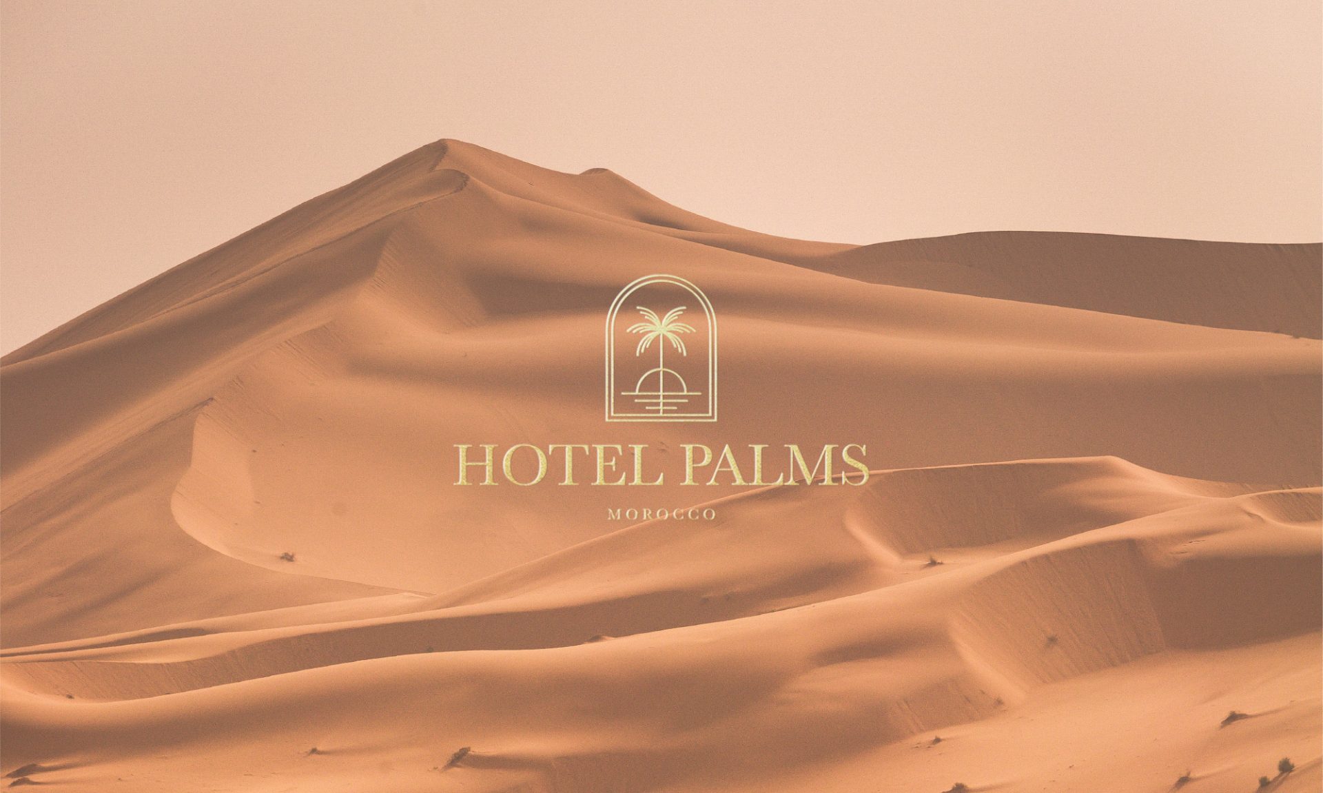
Crafting the Logotype and Secondary Mark
For the logotype, we selected a minimal and old-style serif font using capital letters to convey an affirmative and sophisticated feel. The secondary mark was ingeniously derived from the first letters of the logotype, ensuring brand recognition and versatility across various applications.


Designing a Relaxing and Comforting Emblem
The emblem was designed to be both relaxing and comforting, featuring illustrations of a palm, the sea, and the sun. These elements directly correspond with the vacation and hotel theme, evoking a sense of tranquility and escape for guests.


A Minimal, Eye-Catching Color Palette
Considering the geographical location, we selected sand and sea-associated colors to create a minimal, eye-catching, and soft color palette. This palette enhances the brand’s connection to its environment and contributes to a serene aesthetic.


Creating a Unique Pattern for Brand Application
We developed a simple pattern that reminds us of small sand pieces. This pattern was used for various brand touchpoints, including bags and social media posts, ensuring a consistent and memorable visual presence.


Comprehensive Brand Representation
Due to its hospitality industry nature, we had to create every detail and consider every aspect of the business. Even match design is important. That’s why we created absolutely everything that represents the hotel and its welcoming aura.
Let’s make the work they’ll copy.
Talk to an expert now


