LA MAMA
Brand Identity & Digital Experience
LA MAMA was conceived around the idea of care as something learned, practiced, and repeated — much like the quiet discipline of a mother’s presence.
LA MAMA
was conceived around the idea of care as something learned, practiced, and repeated — much like
the quiet discipline of a mother’s presence. Not loud or performative, but constant. The kind of
care that shows itself in details, routines, and the way everyday things are done
properly.
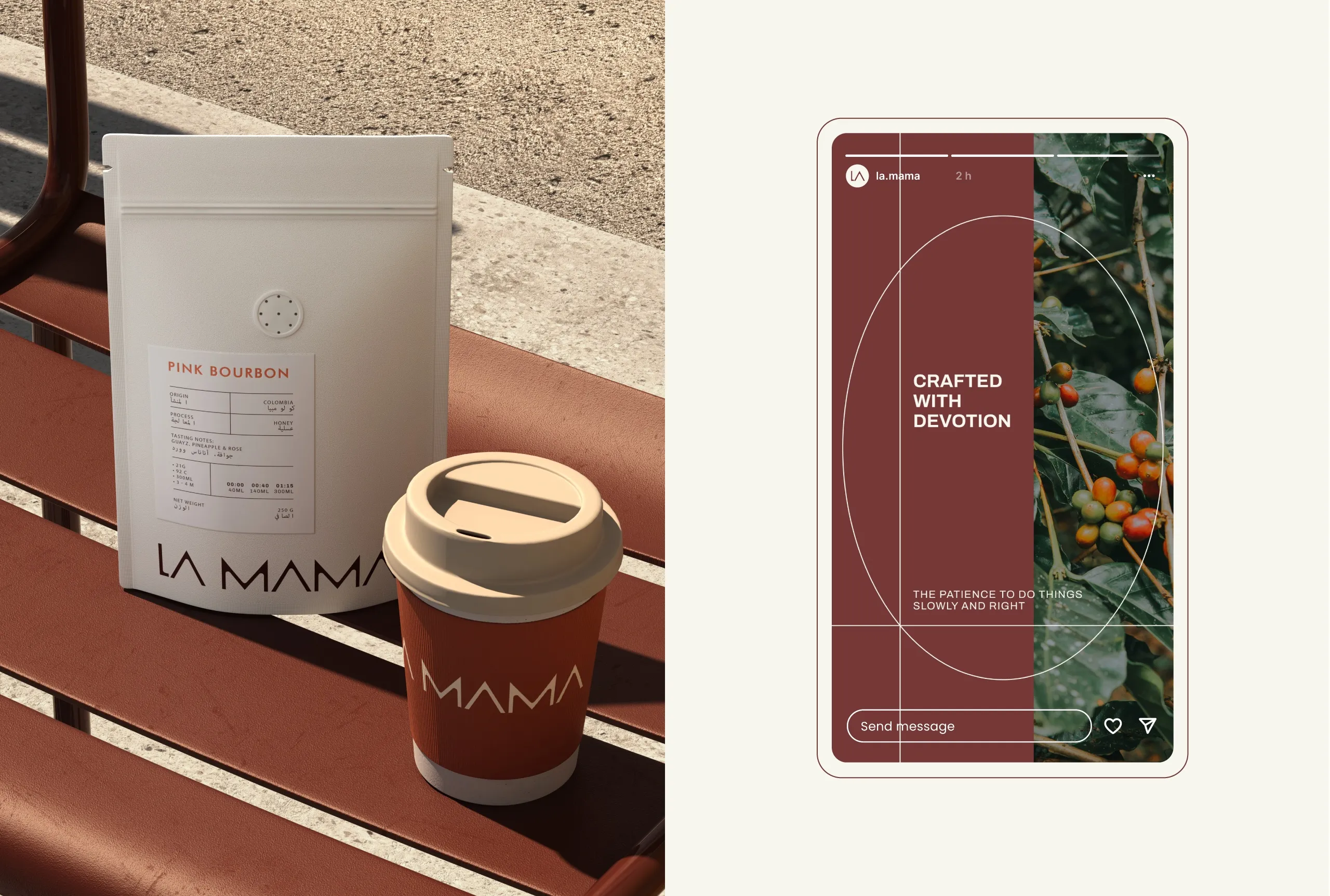
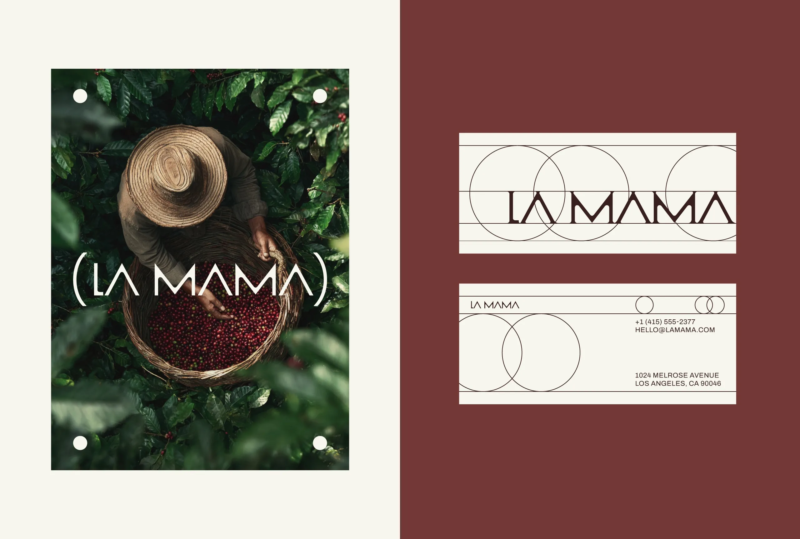
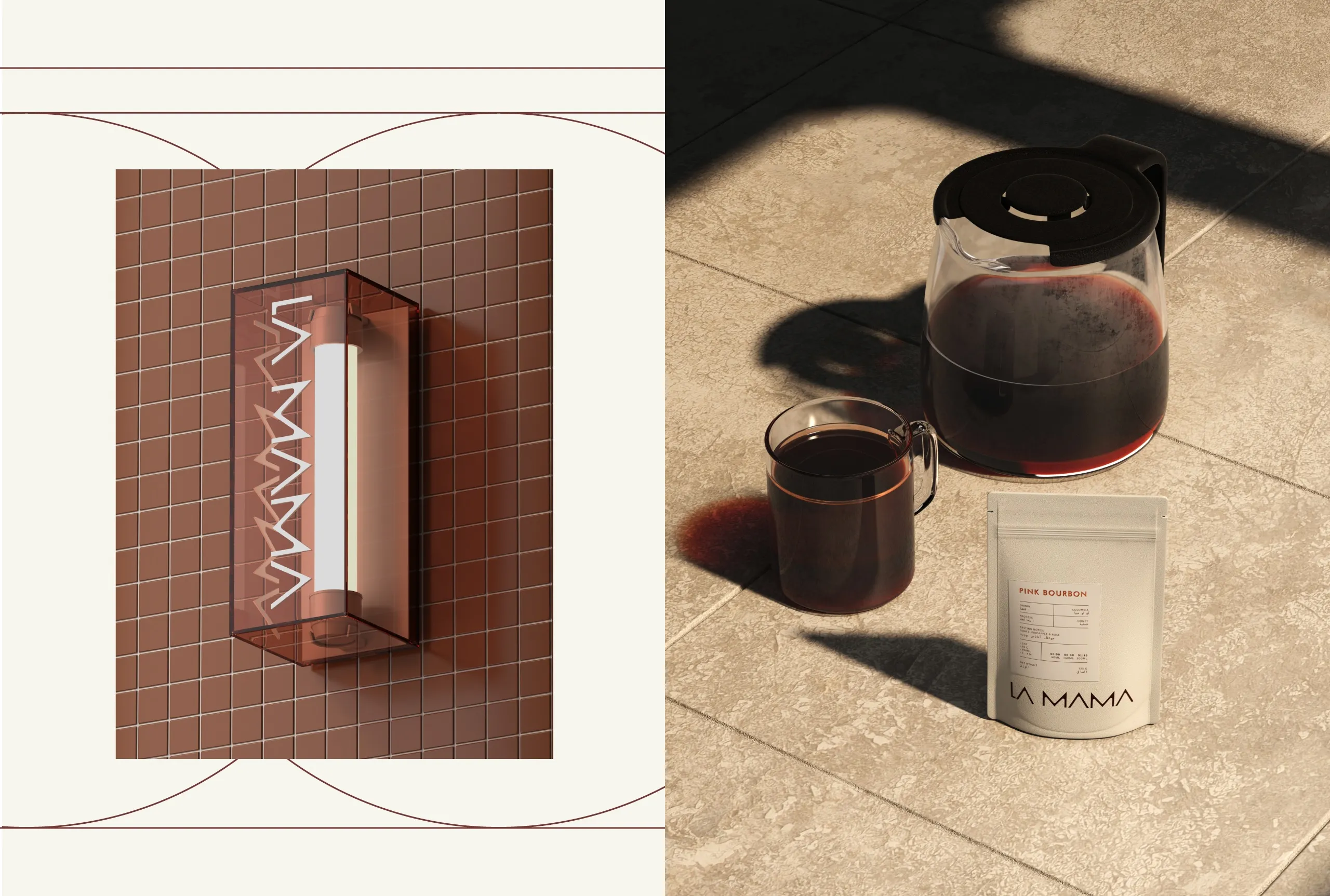
The brand narrative moves away
from overt sentimentality and instead focuses on the feeling of being looked after without being
told so. Coffee here is not positioned as a luxury statement or a lifestyle symbol, but as part
of a daily ritual — familiar, grounding, and dependable.
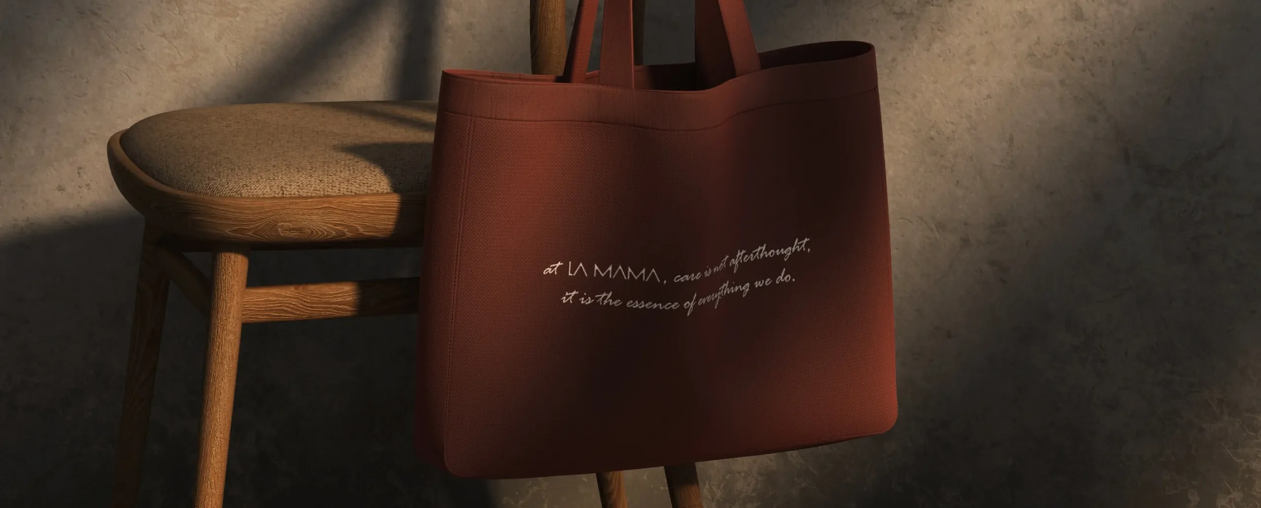
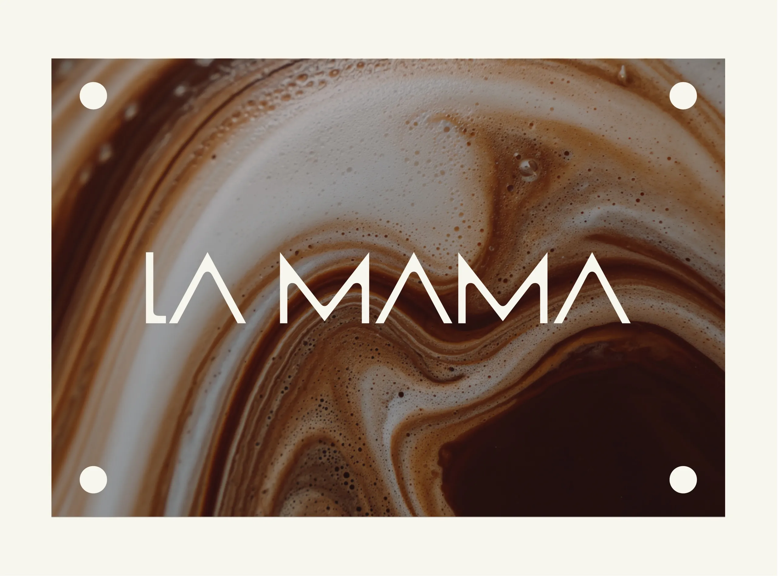
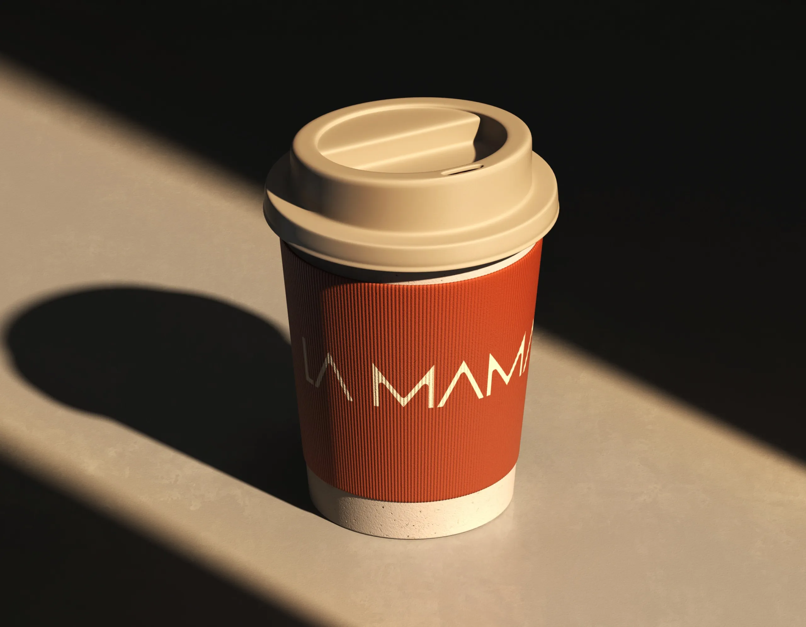
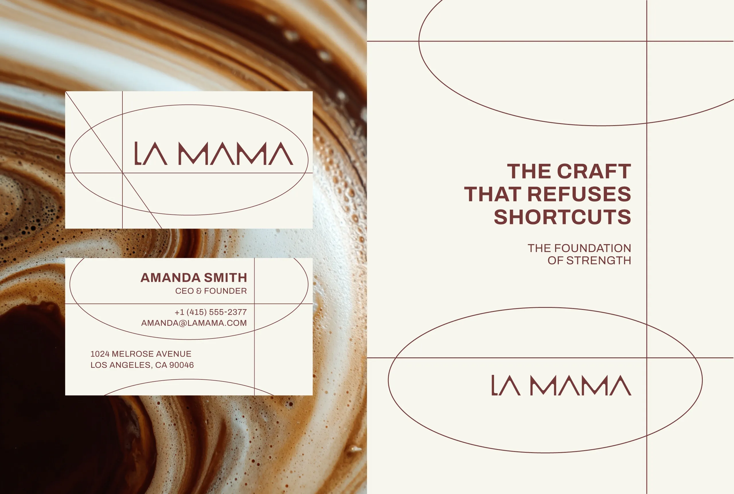
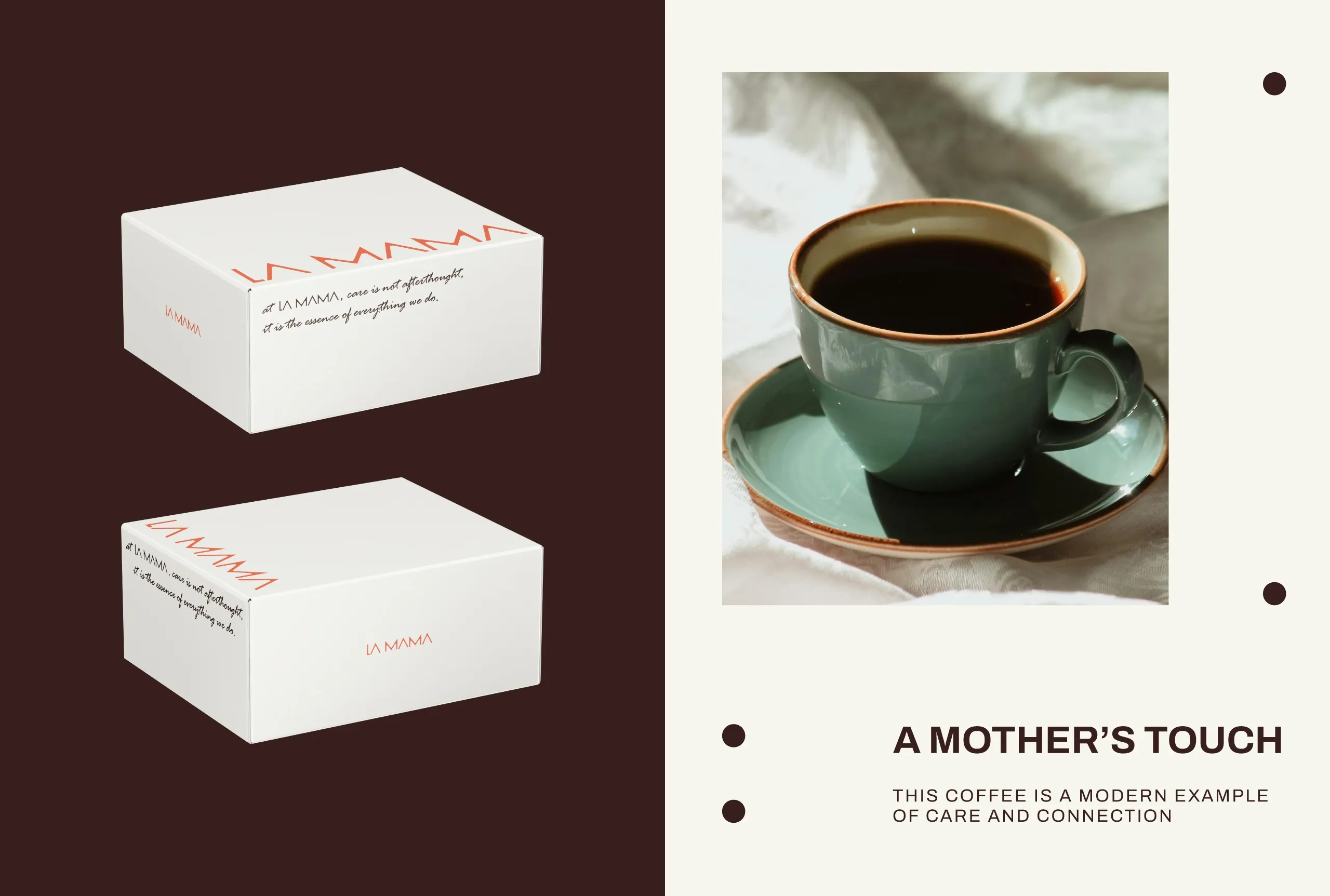
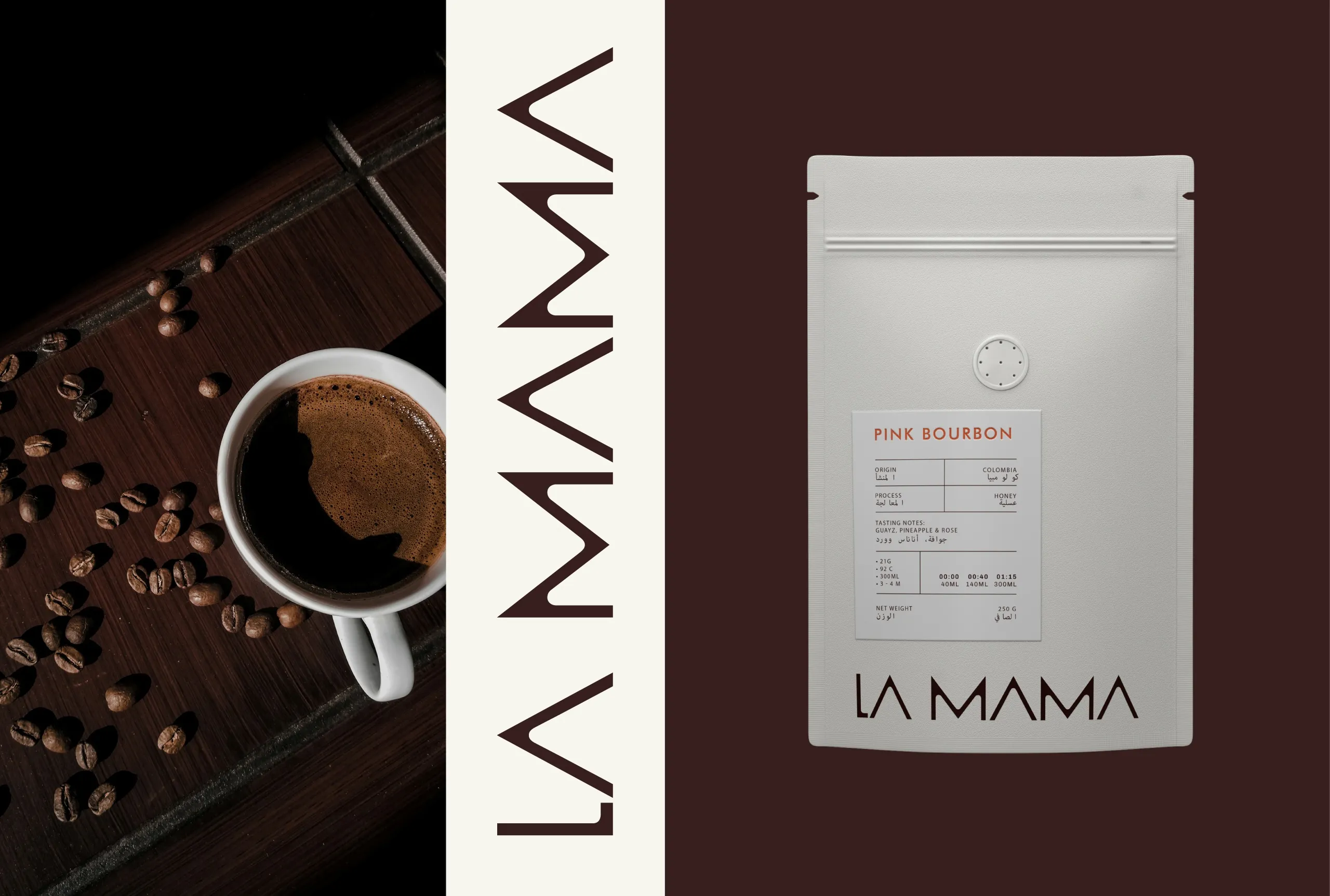
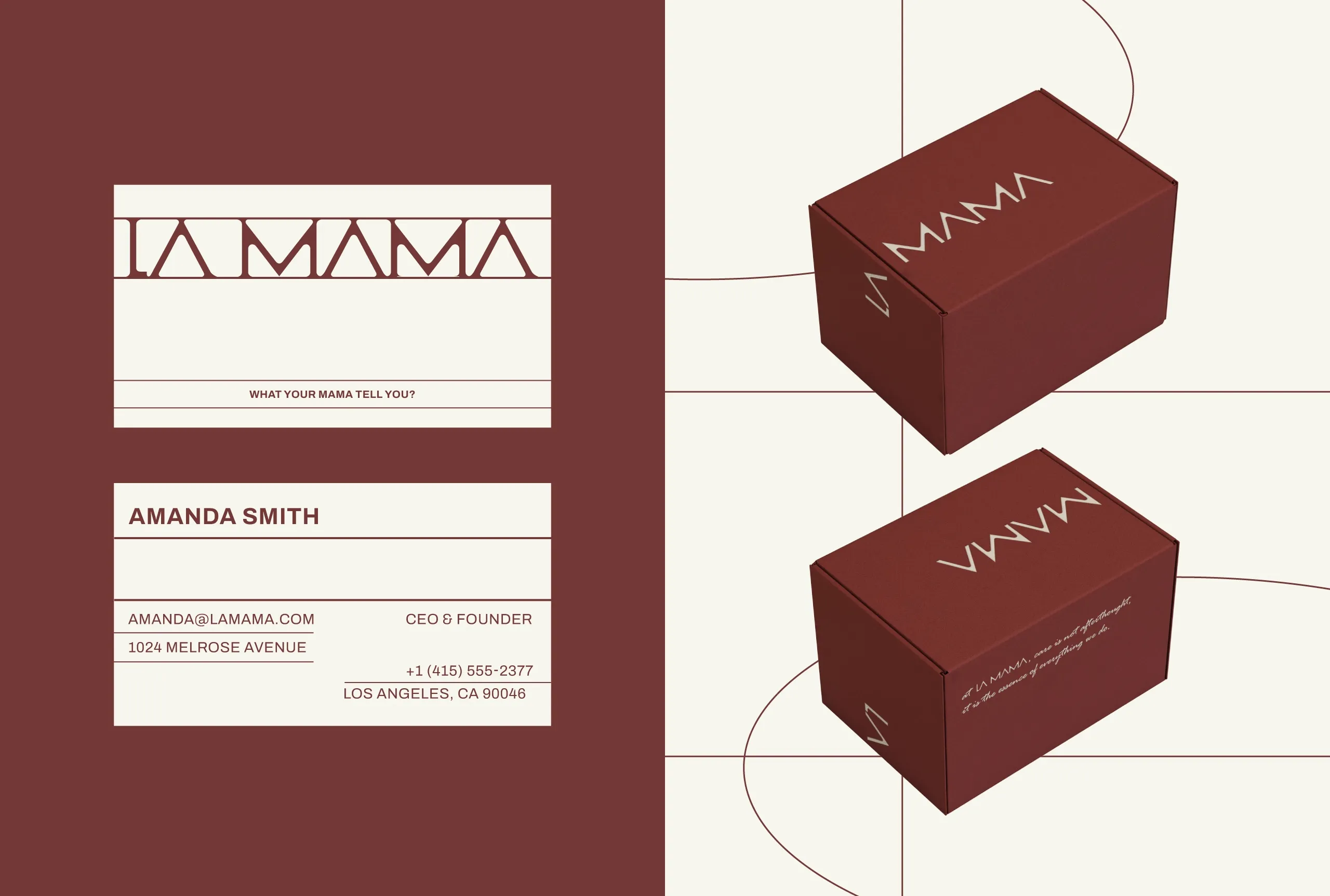
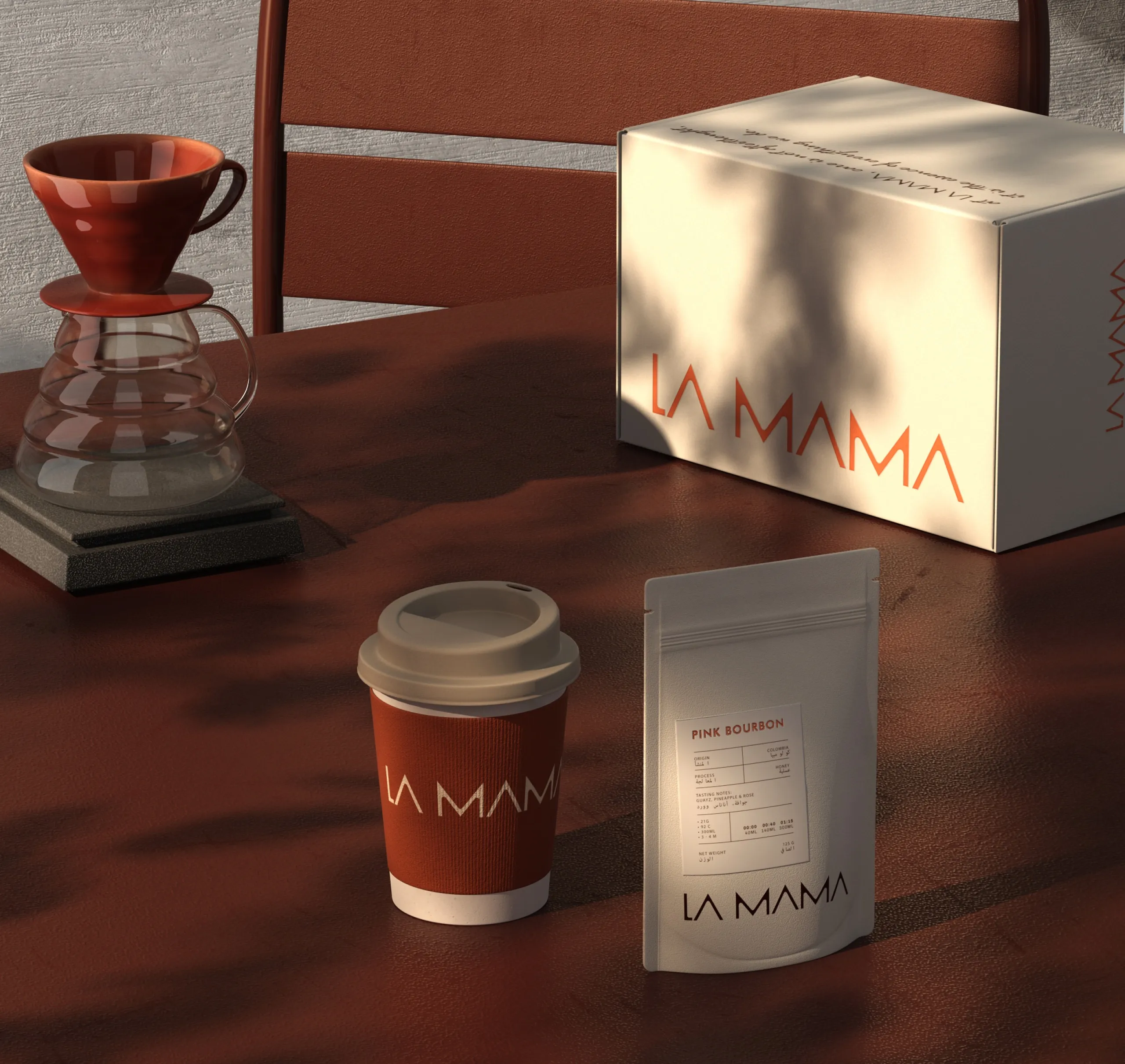
The logotype reflects this
balance. Its form is restrained yet warm, designed to feel steady rather than expressive. The
geometry avoids sharp tension and excessive softness, creating a visual language that feels
reassuring and composed. The rhythm of the letters suggests continuity, echoing the repetitive
comfort of daily habits.
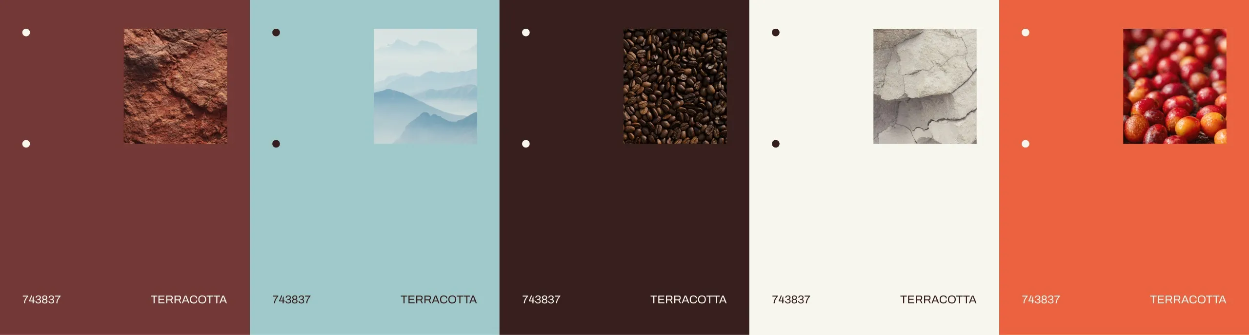
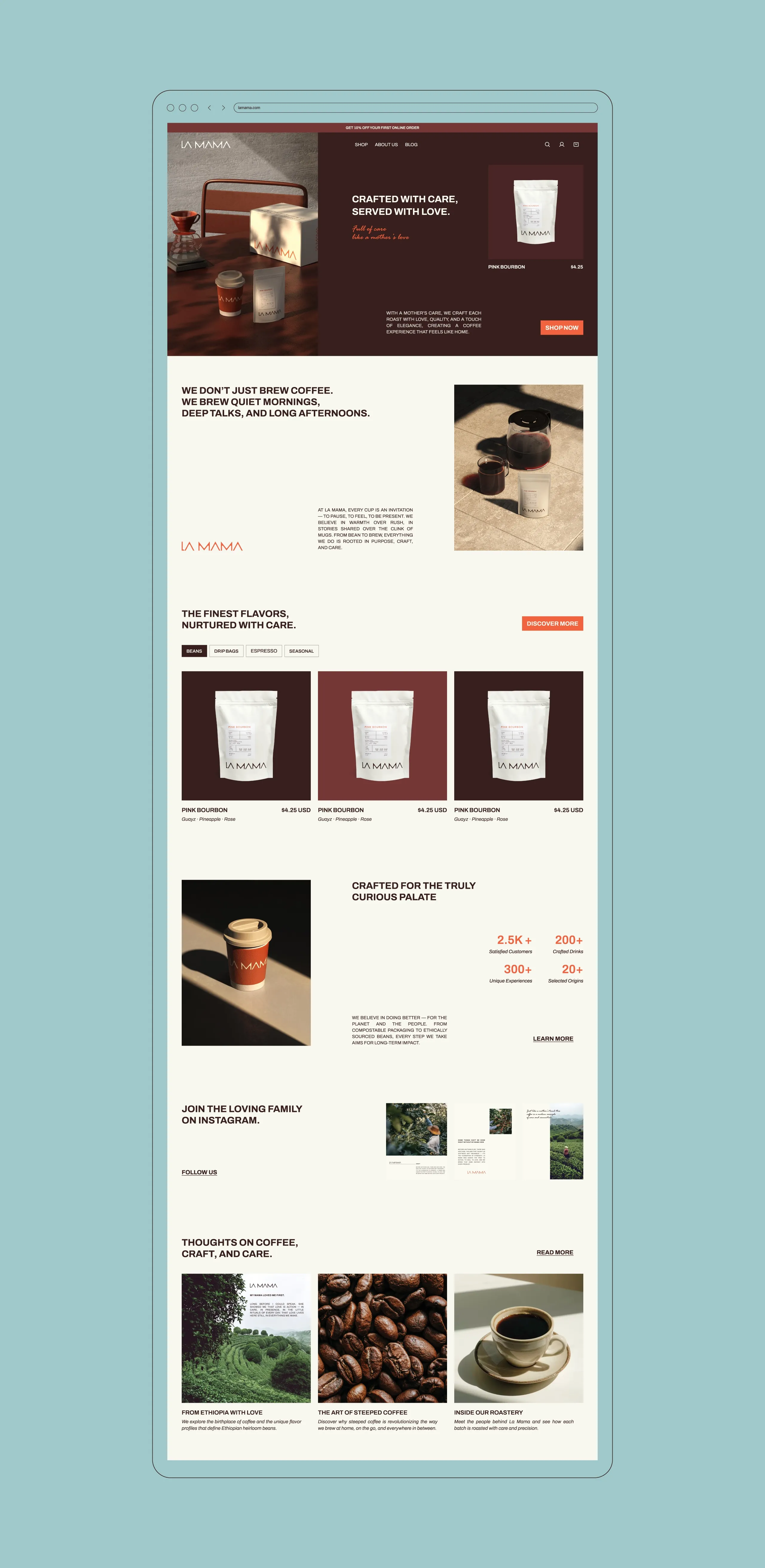
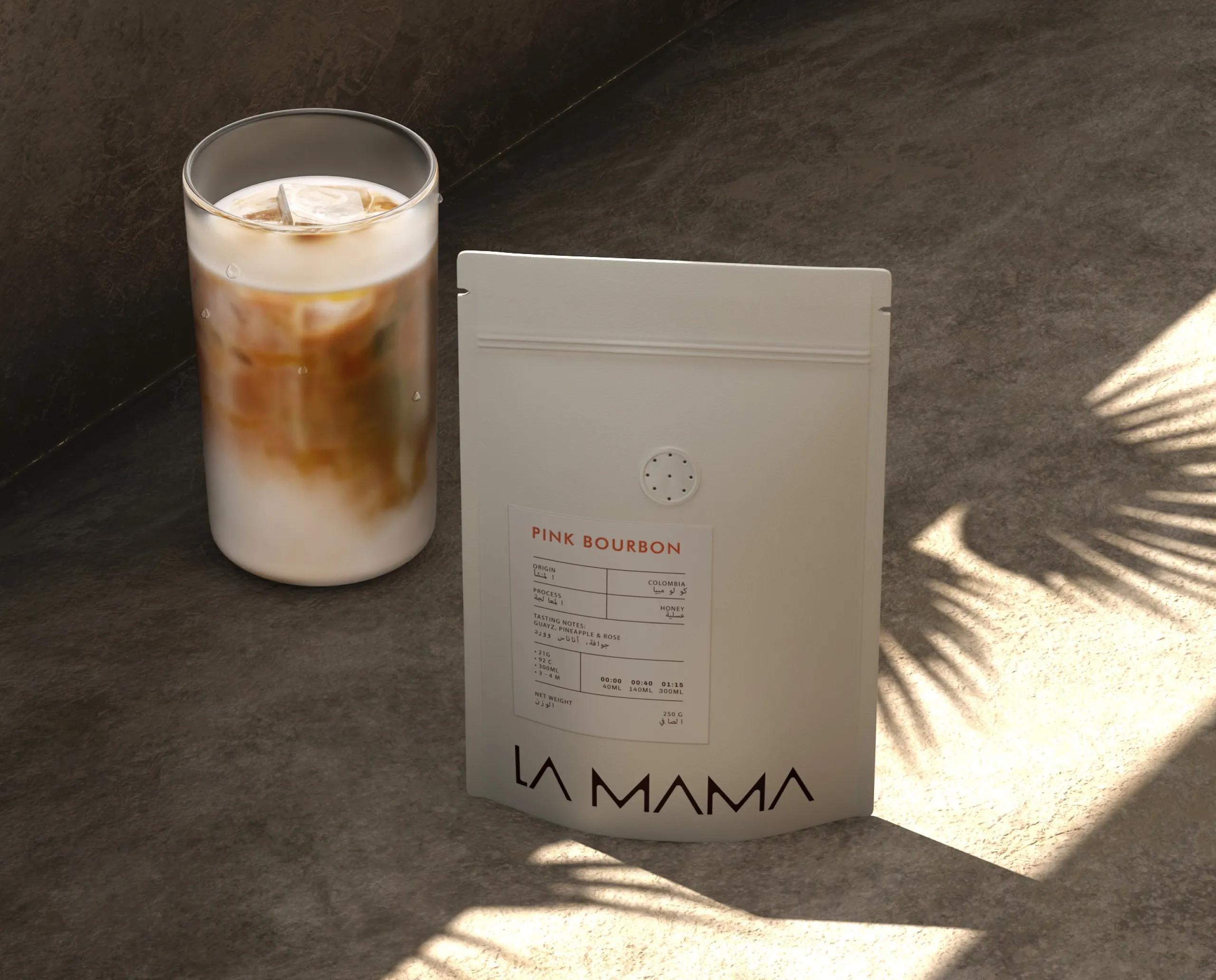
Color choices support this idea of
quiet care. Earthy tones and soft neutrals were selected to evoke warmth, safety, and calm
without drifting into nostalgia. Instead of emotional contrast, the palette creates visual
comfort — allowing the product and material textures to carry the experience.
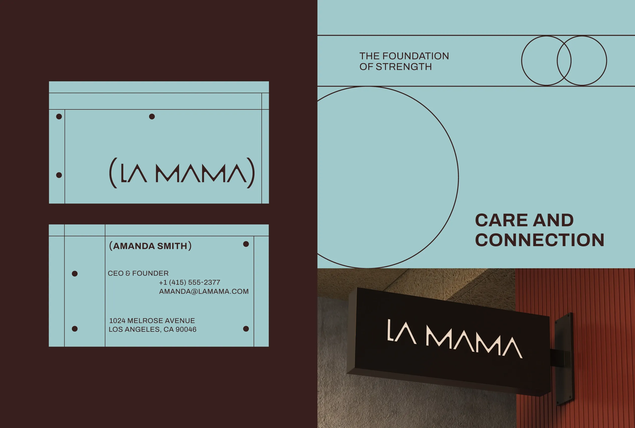
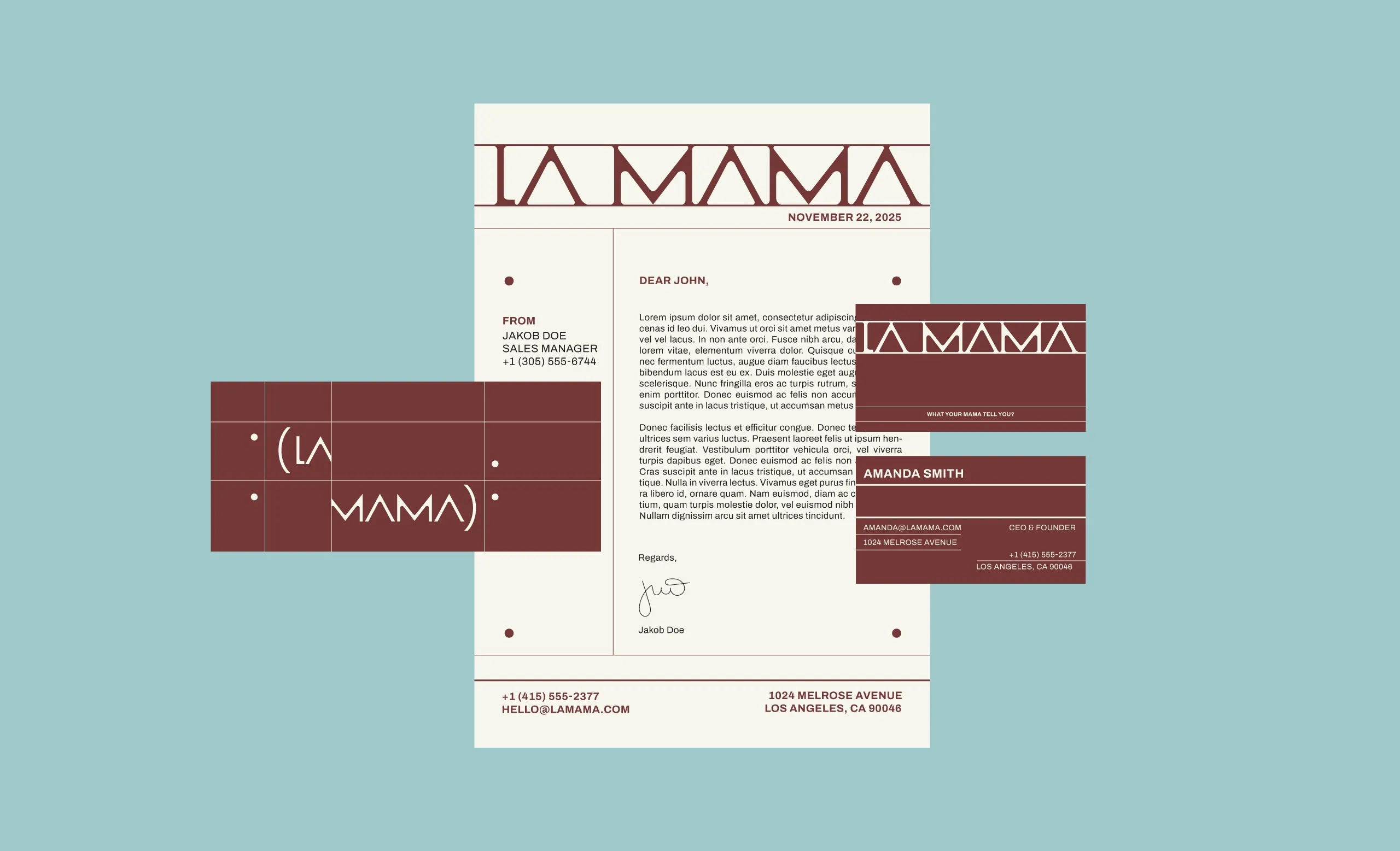
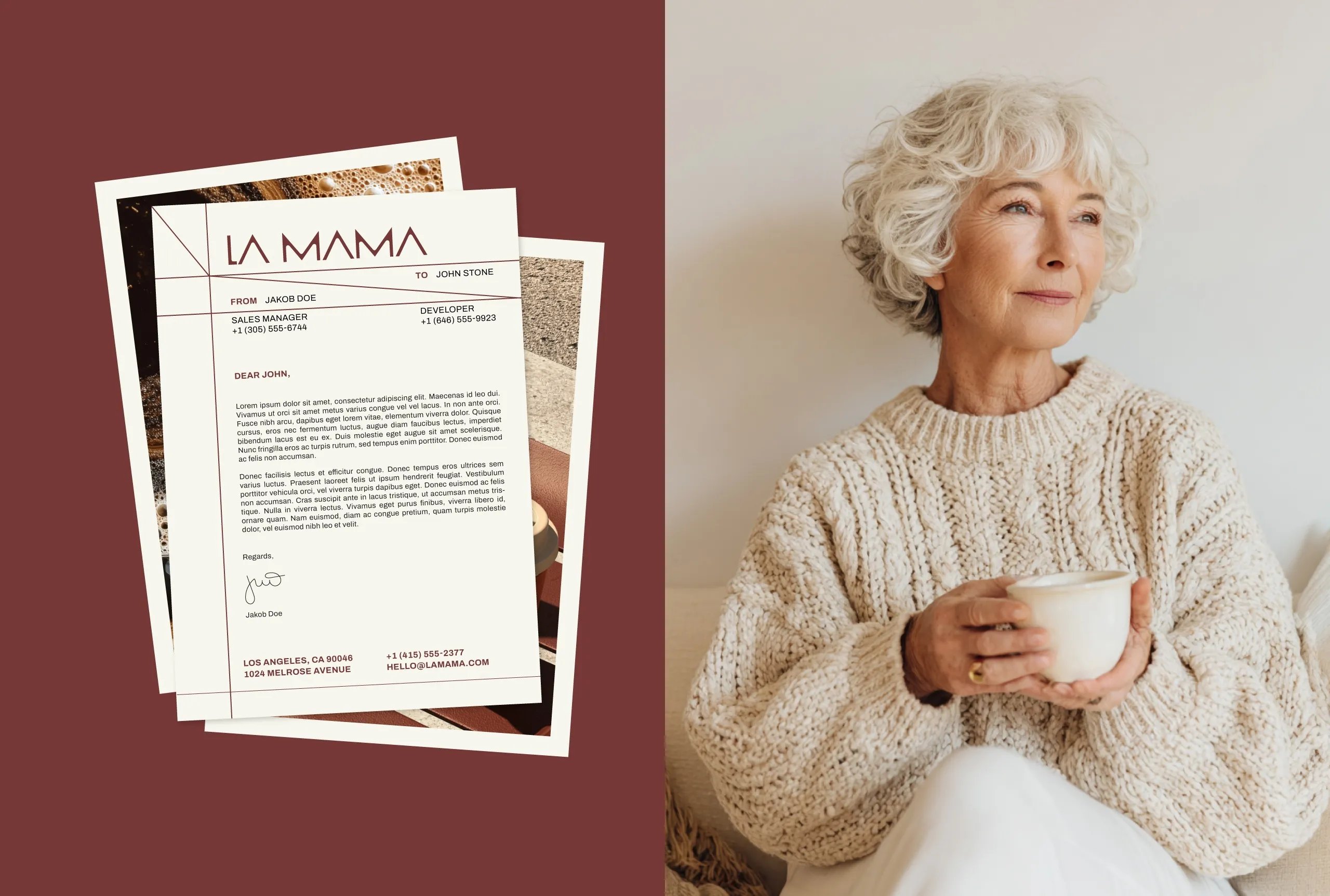
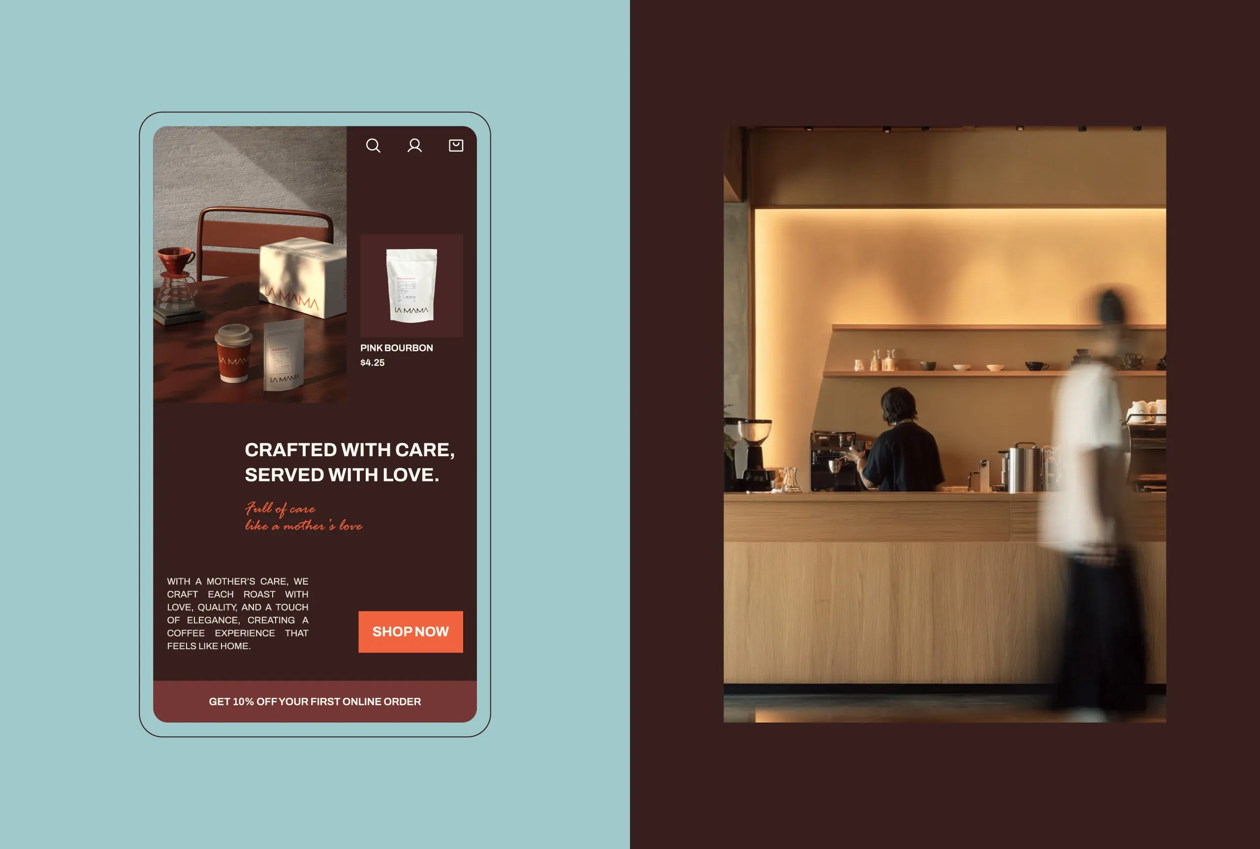
Typography and layout were treated
as tools of clarity rather than expression. Clear hierarchy, generous spacing, and structured
grids ensure everything feels intentional and easy to navigate. Nothing competes for attention;
every element has a reason to be where it is. This reflects the brand’s core idea — care shown
through order and consideration.
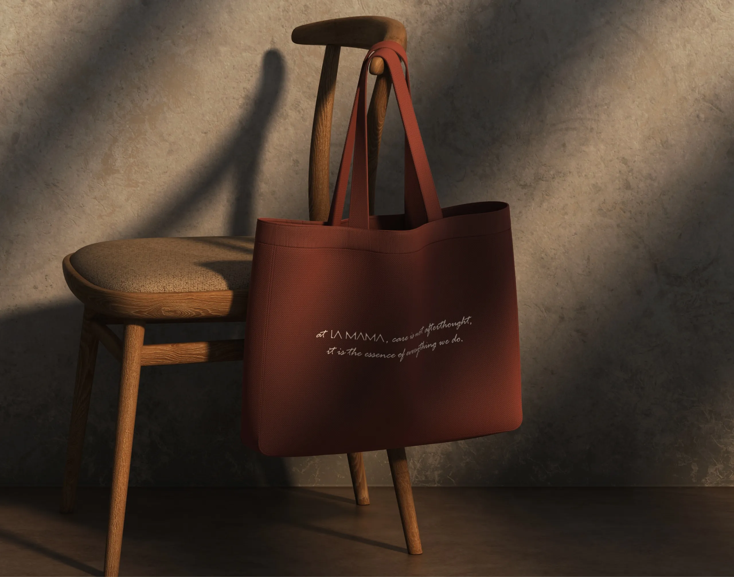
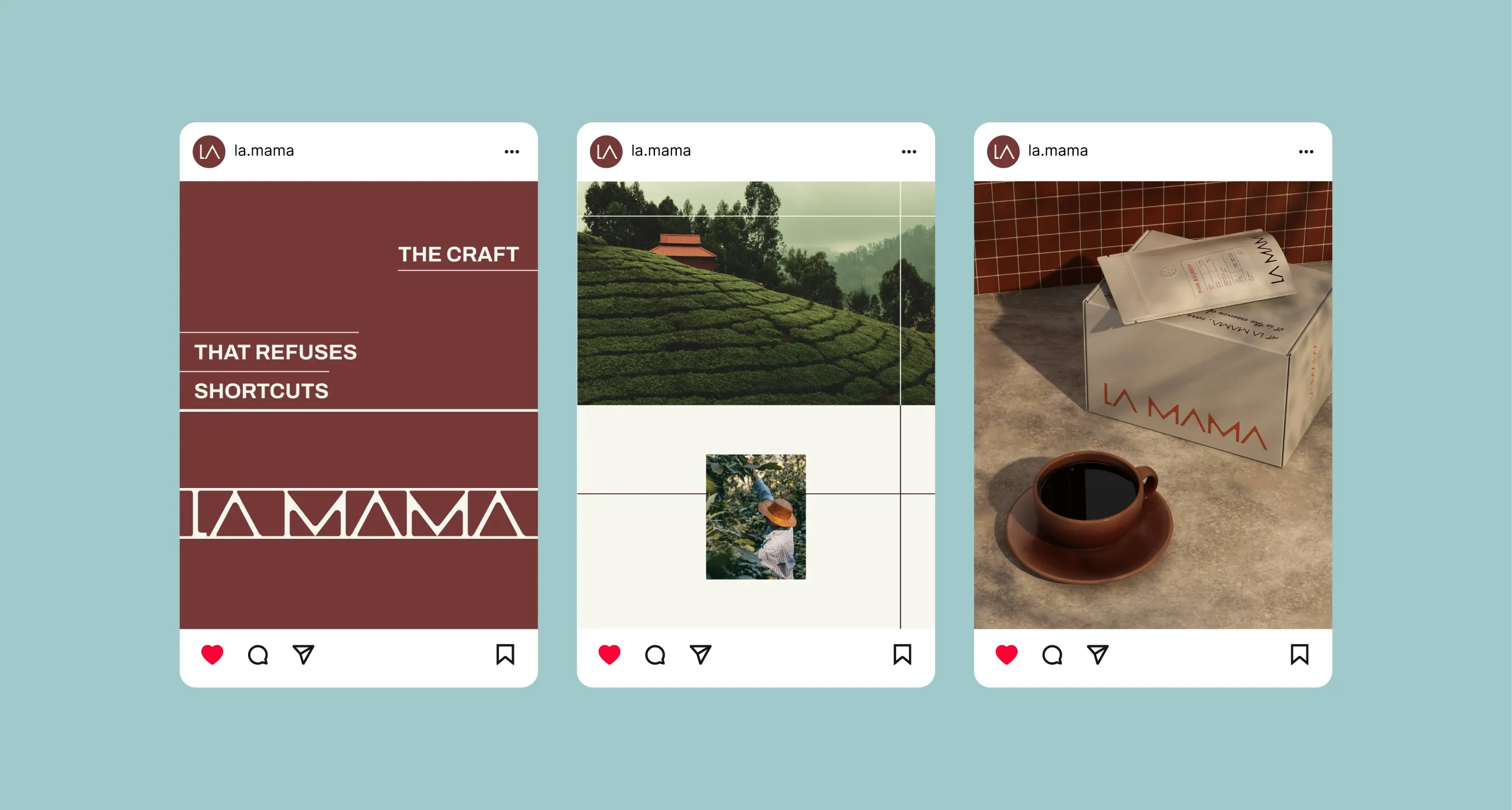
Across packaging, digital
platforms, and brand applications, the system remains consistent and understated. LA MAMA
doesn’t seek attention. It earns trust over time, through familiarity and repetition.
The identity is built to feel like
something you return to — not because it asks you to, but because it feels right to do
so.
Brand Identity & Digital
Experience by MarkaWorks.
Unique Branding Experience.
Unique Branding Experience.
Let’s make the work they’ll copy.
Talk to an expert now


