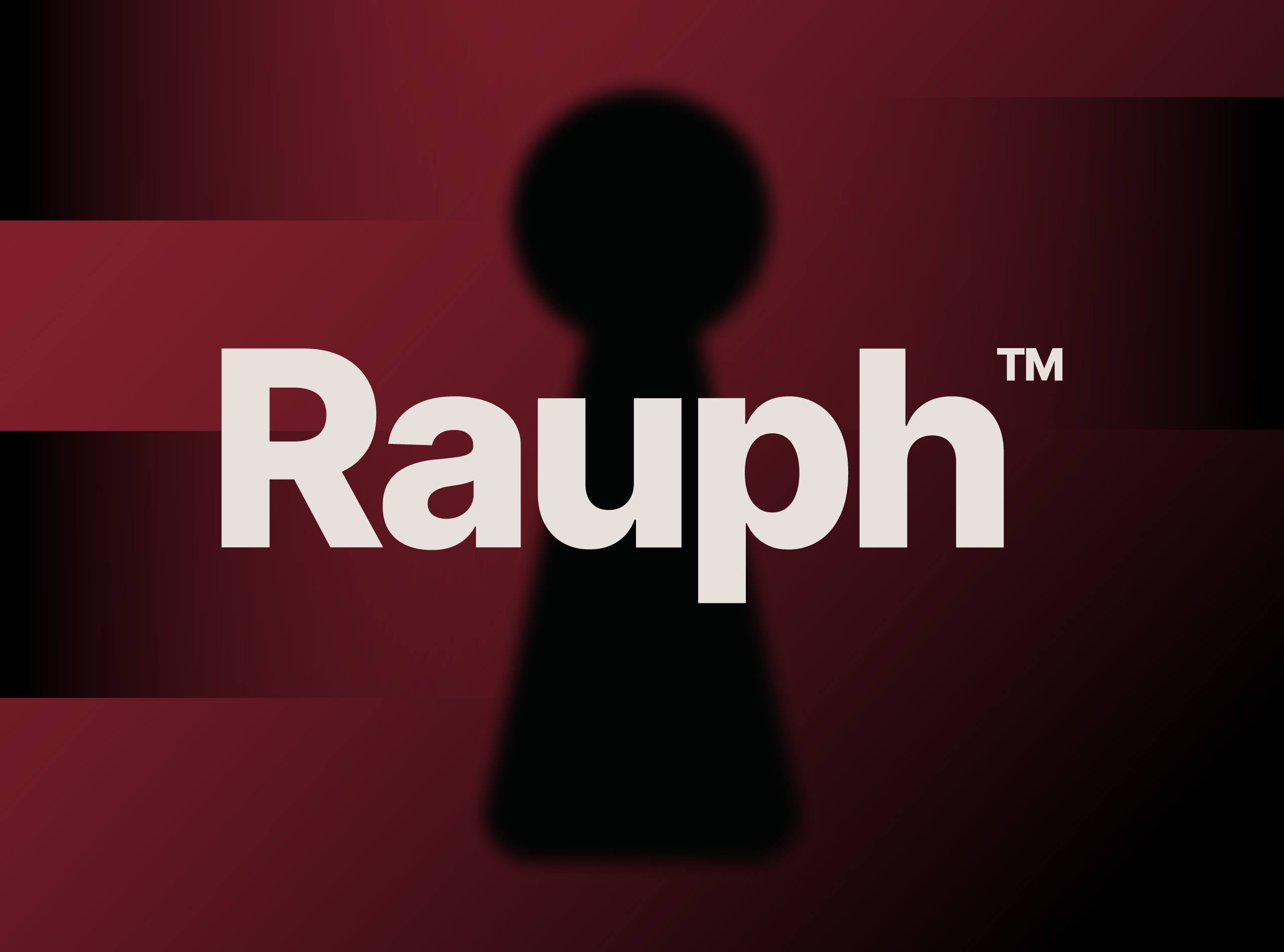
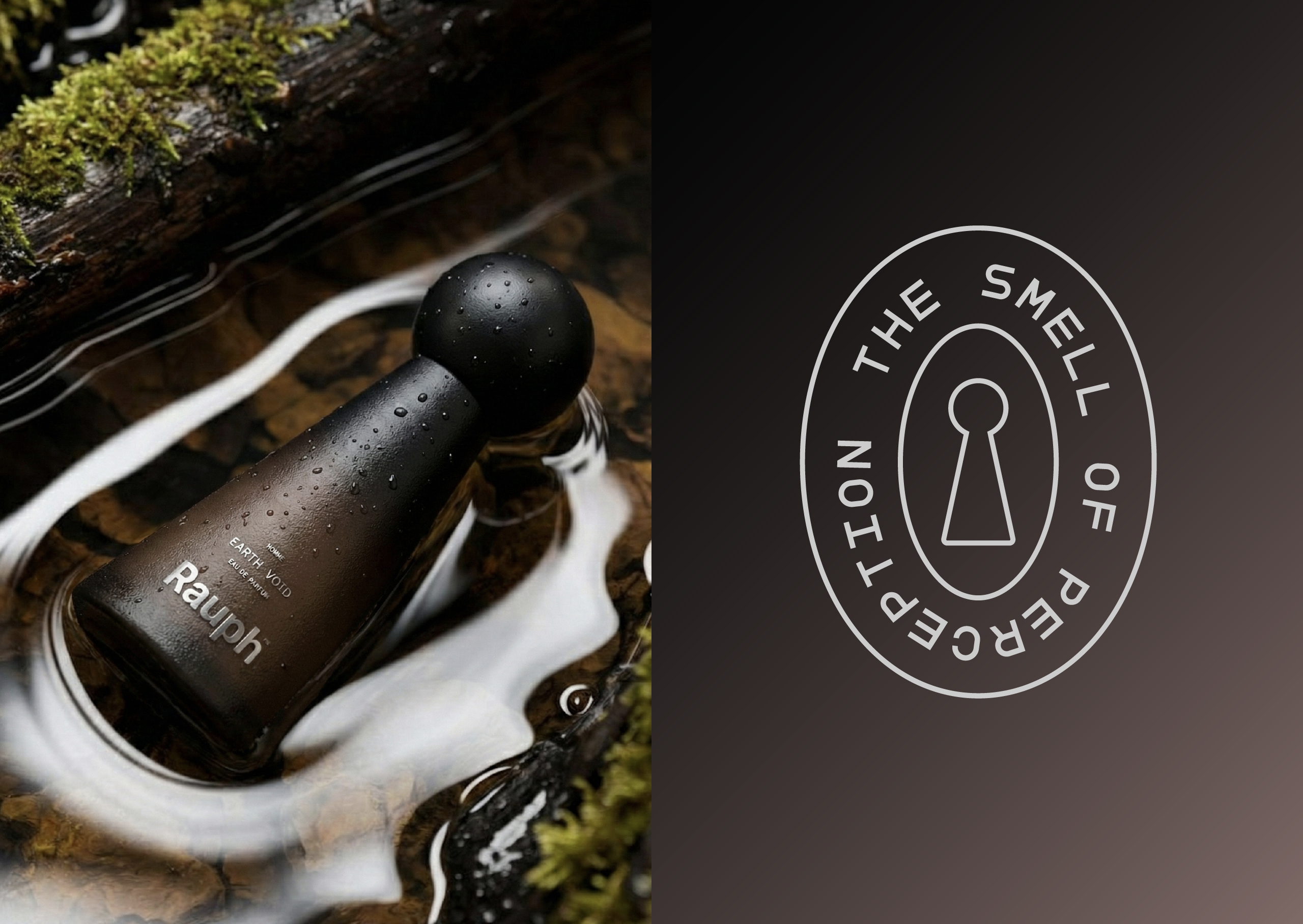
Rauph
luxury perfume house
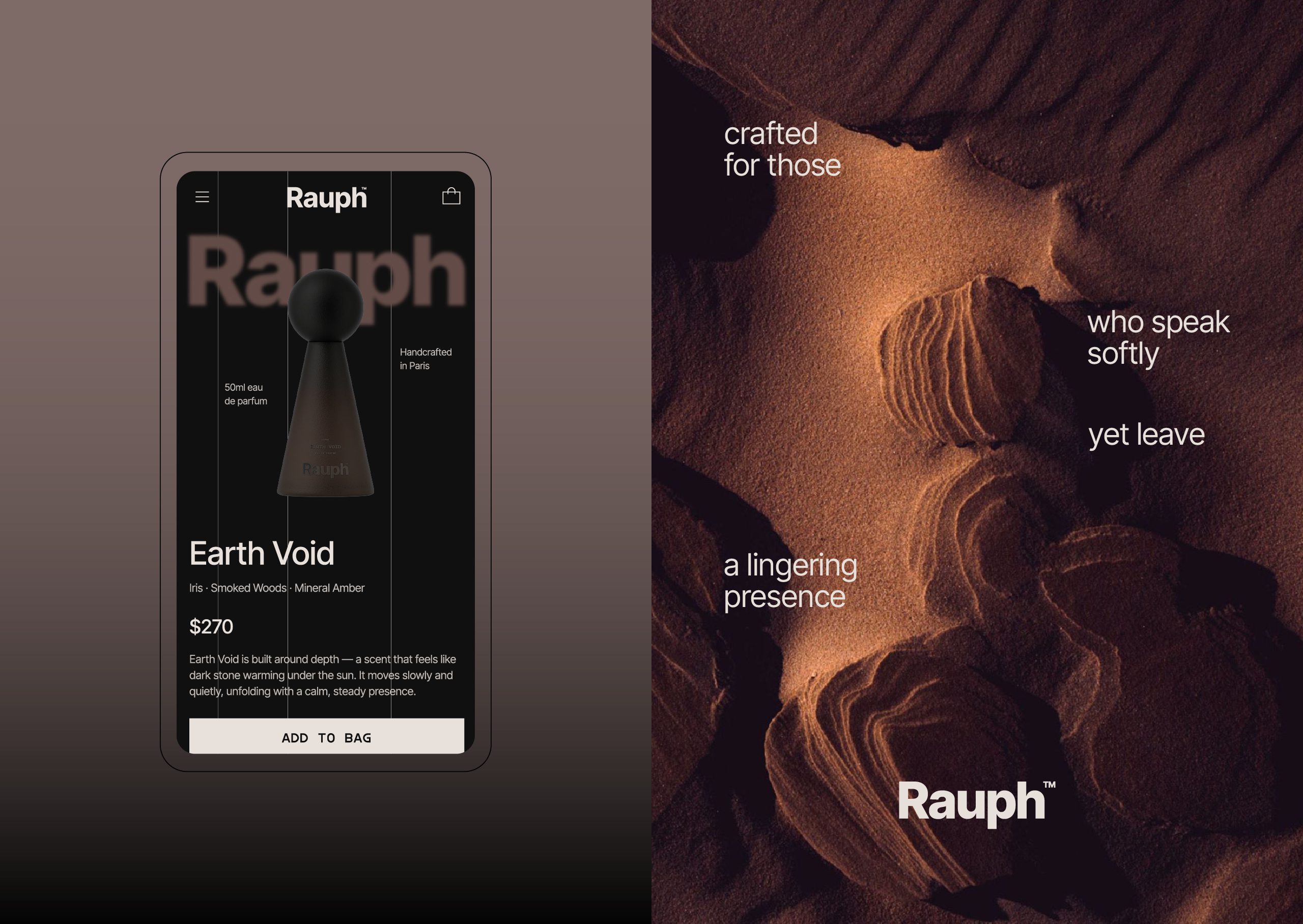
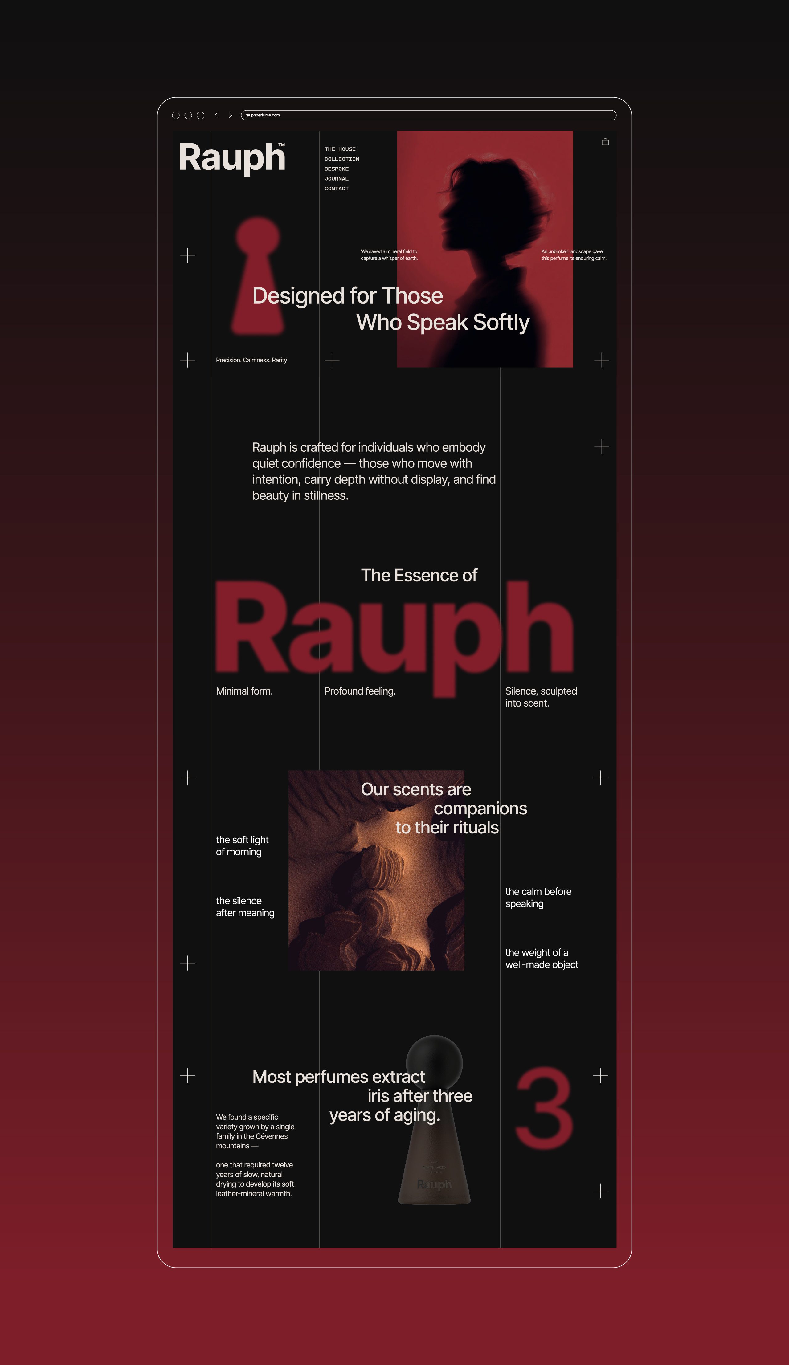
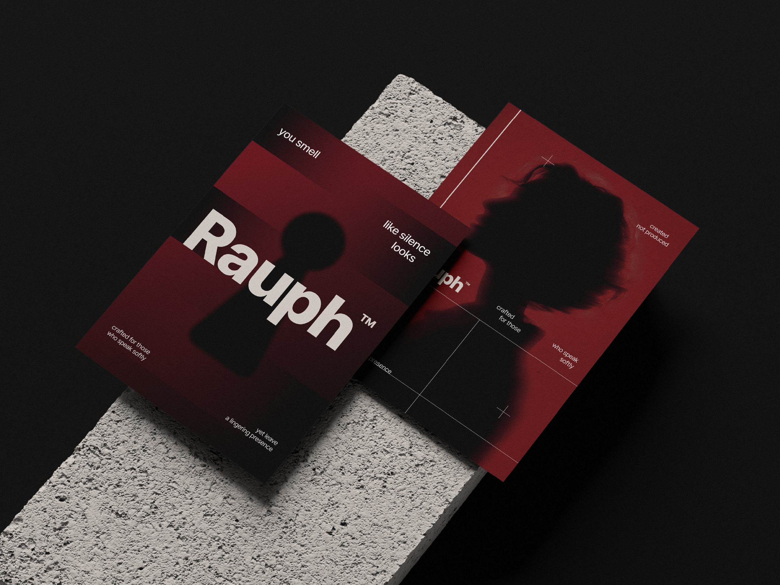
Rauph was approached as a perfume brand built on restraint, balance, and intentional simplicity. The brand language was designed to feel quiet, composed, and confident—never rushed, never loud.
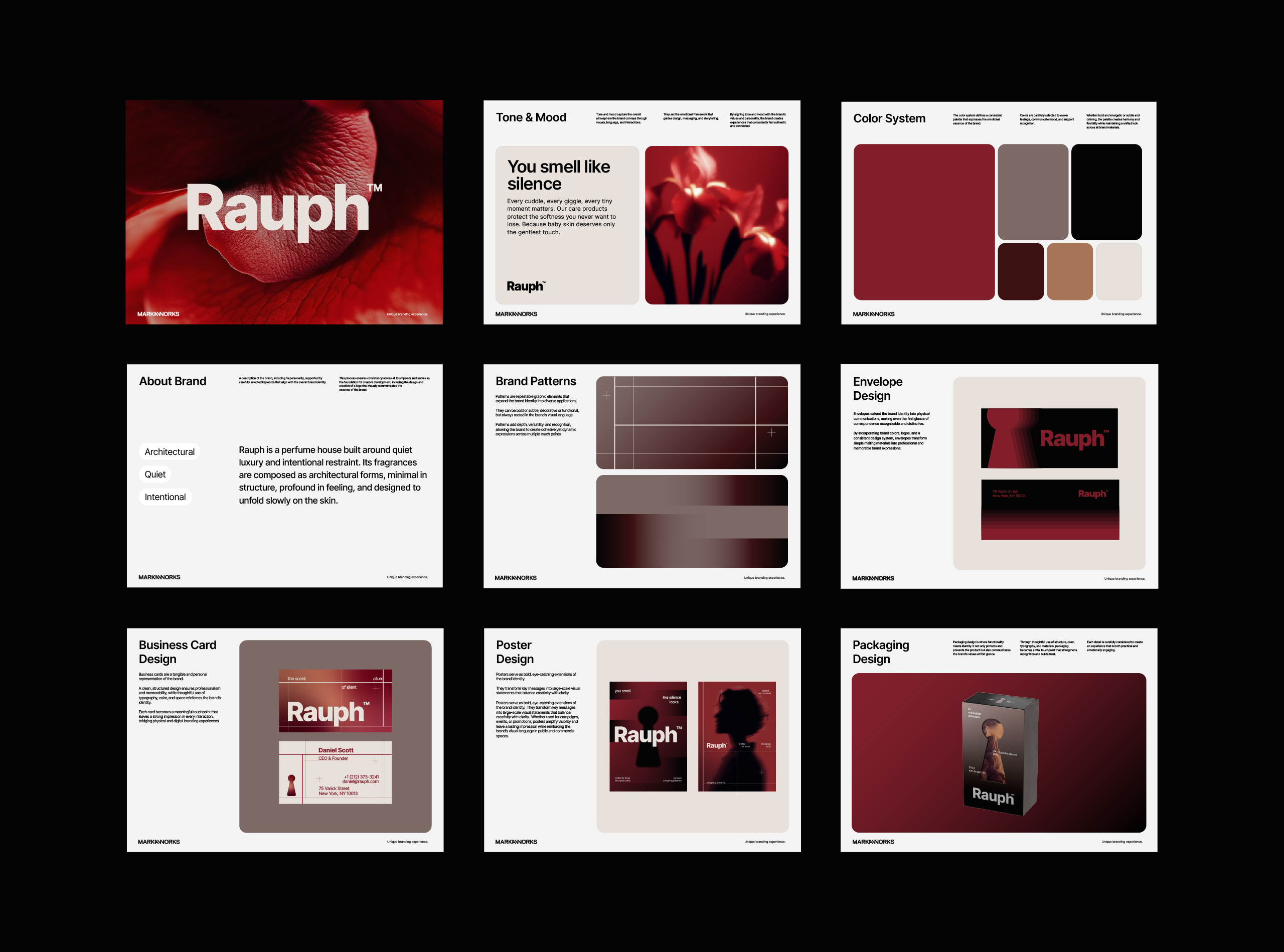
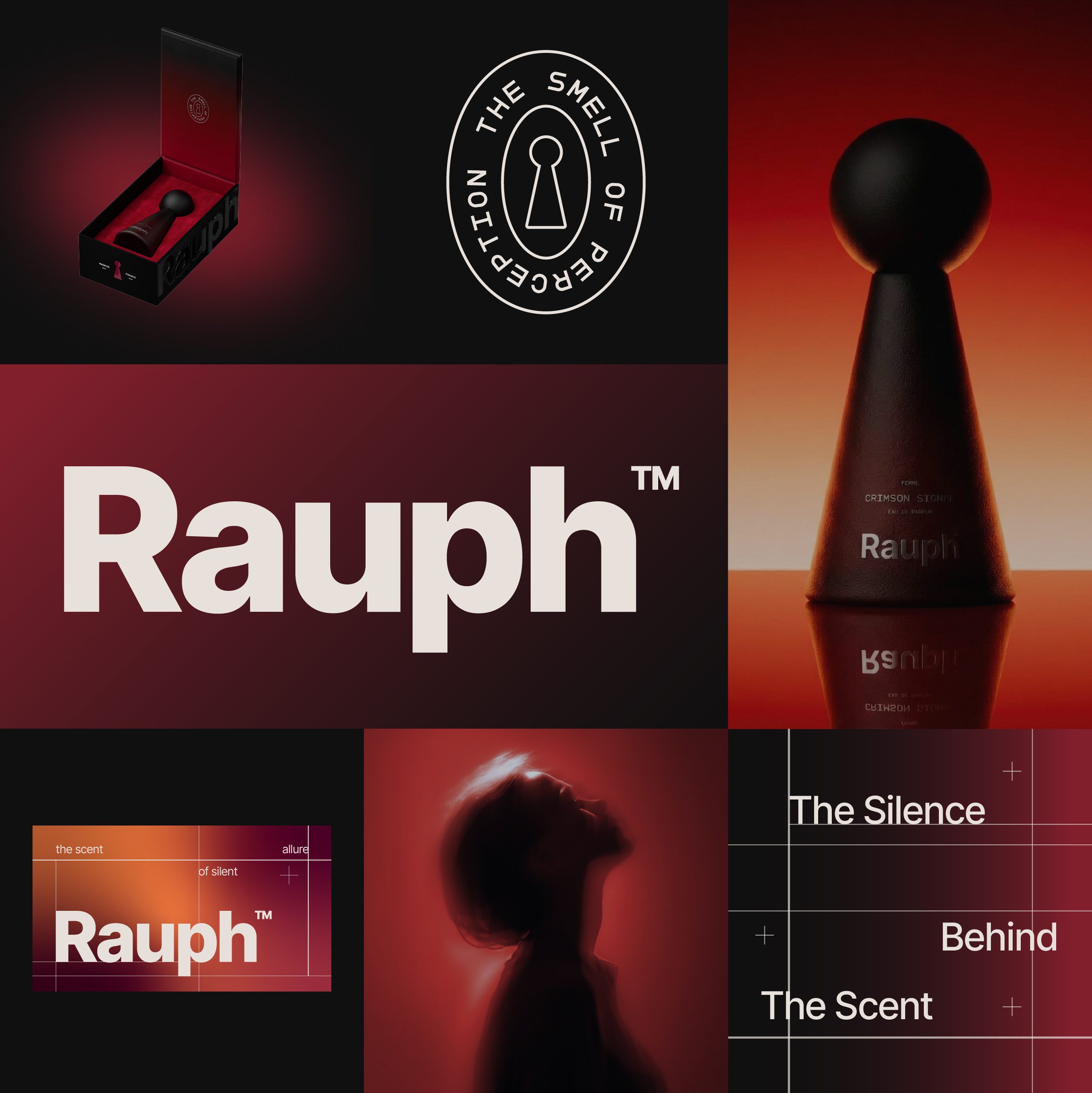
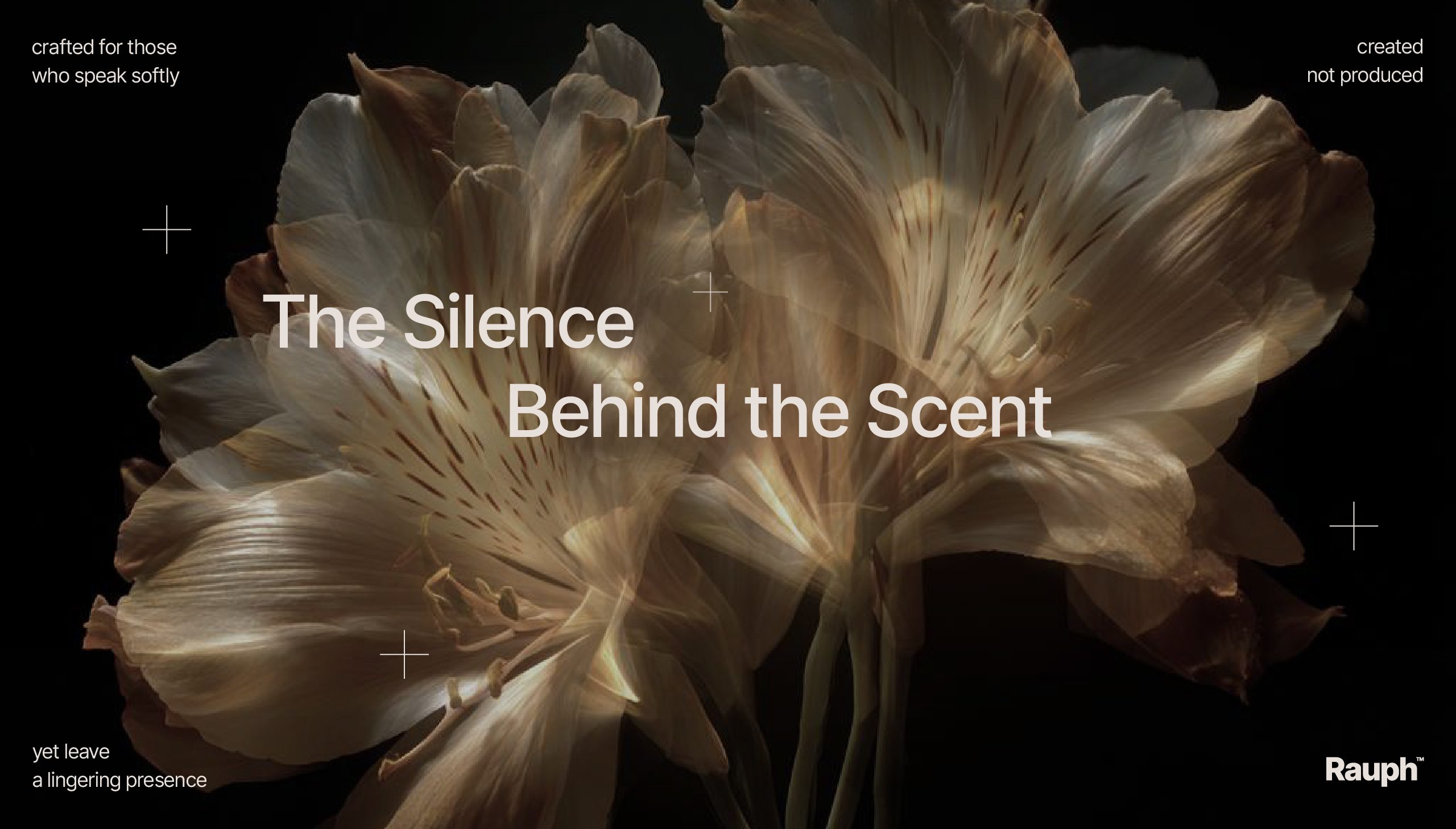
The process began with defining a clear brand positioning. The objective was to create a timeless identity, free from visual noise, where every element serves a purpose. Brand tone, verbal expression, and overall direction were established early and guided all design decisions throughout the project.
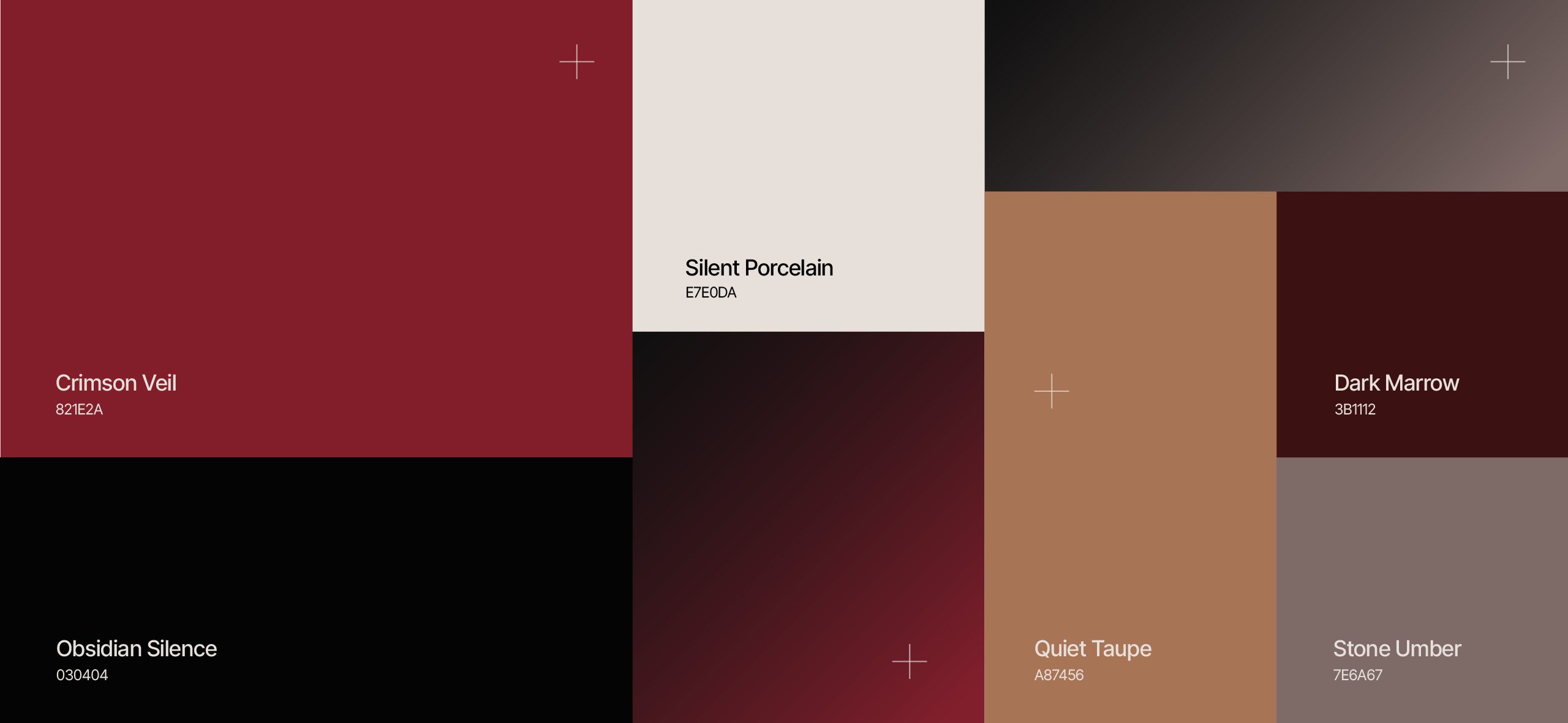
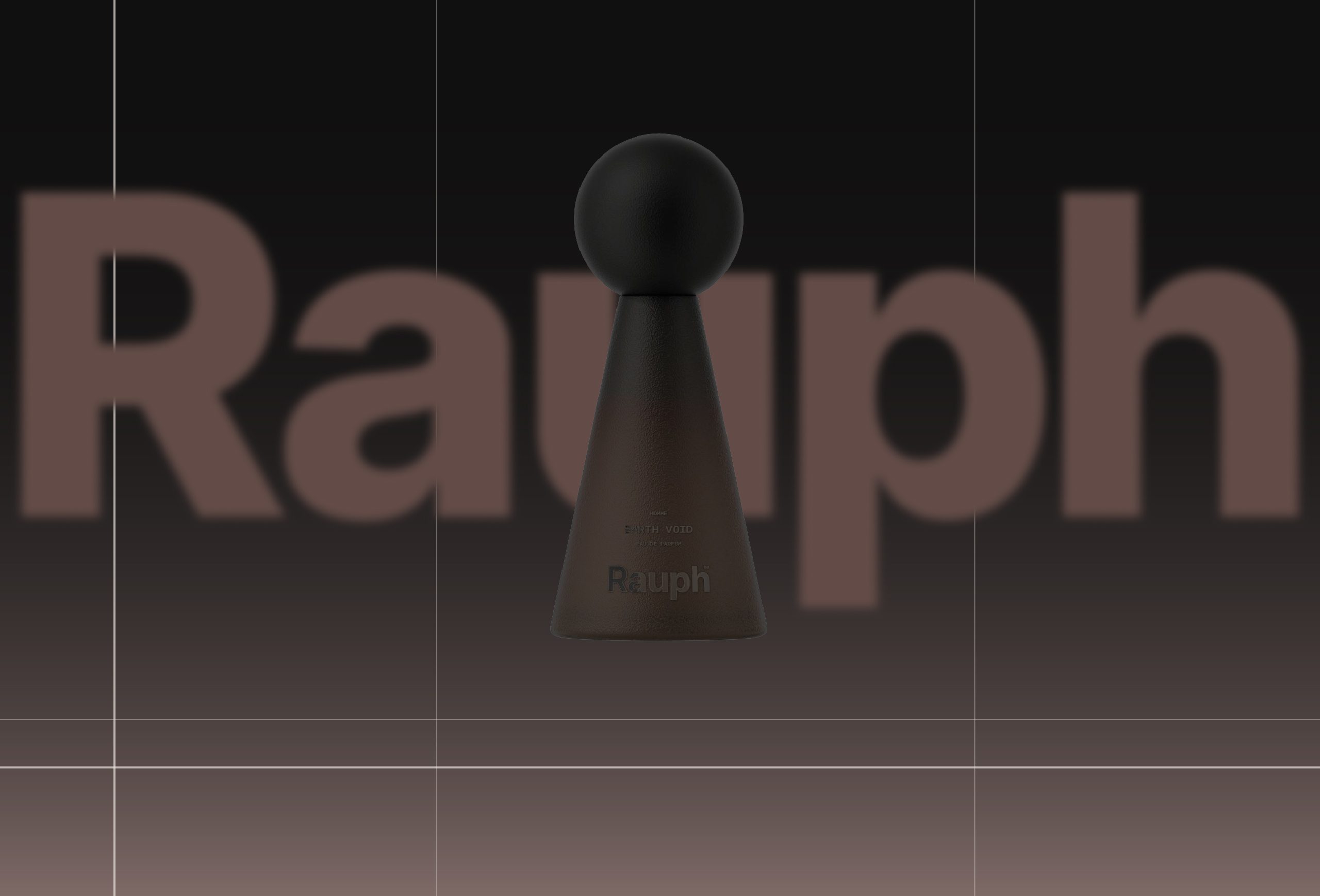
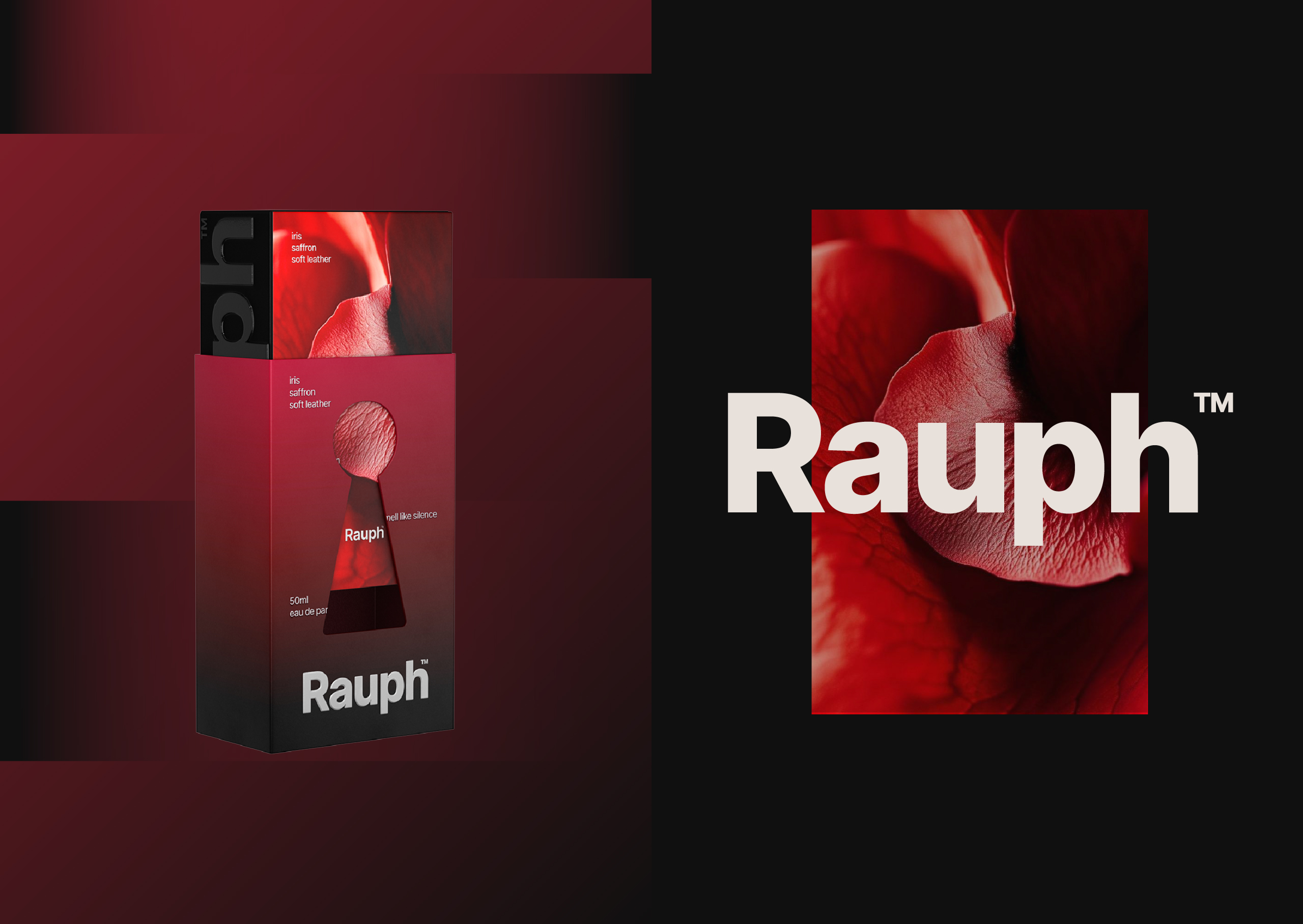
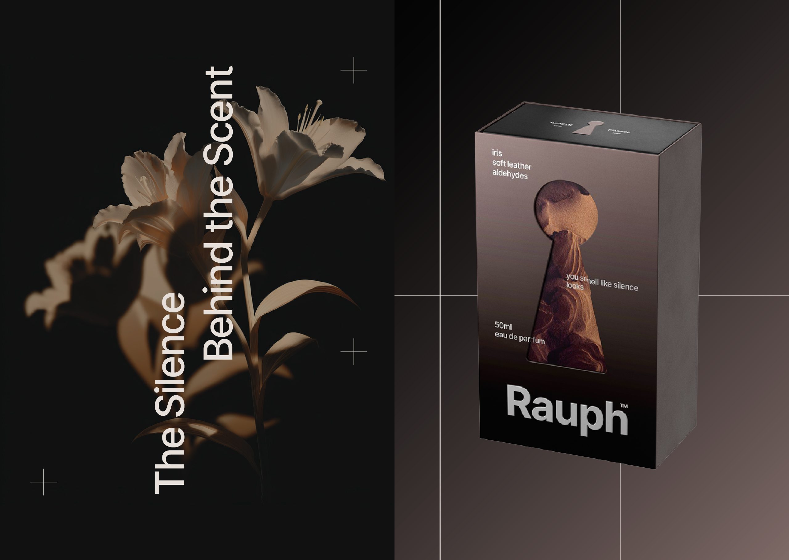
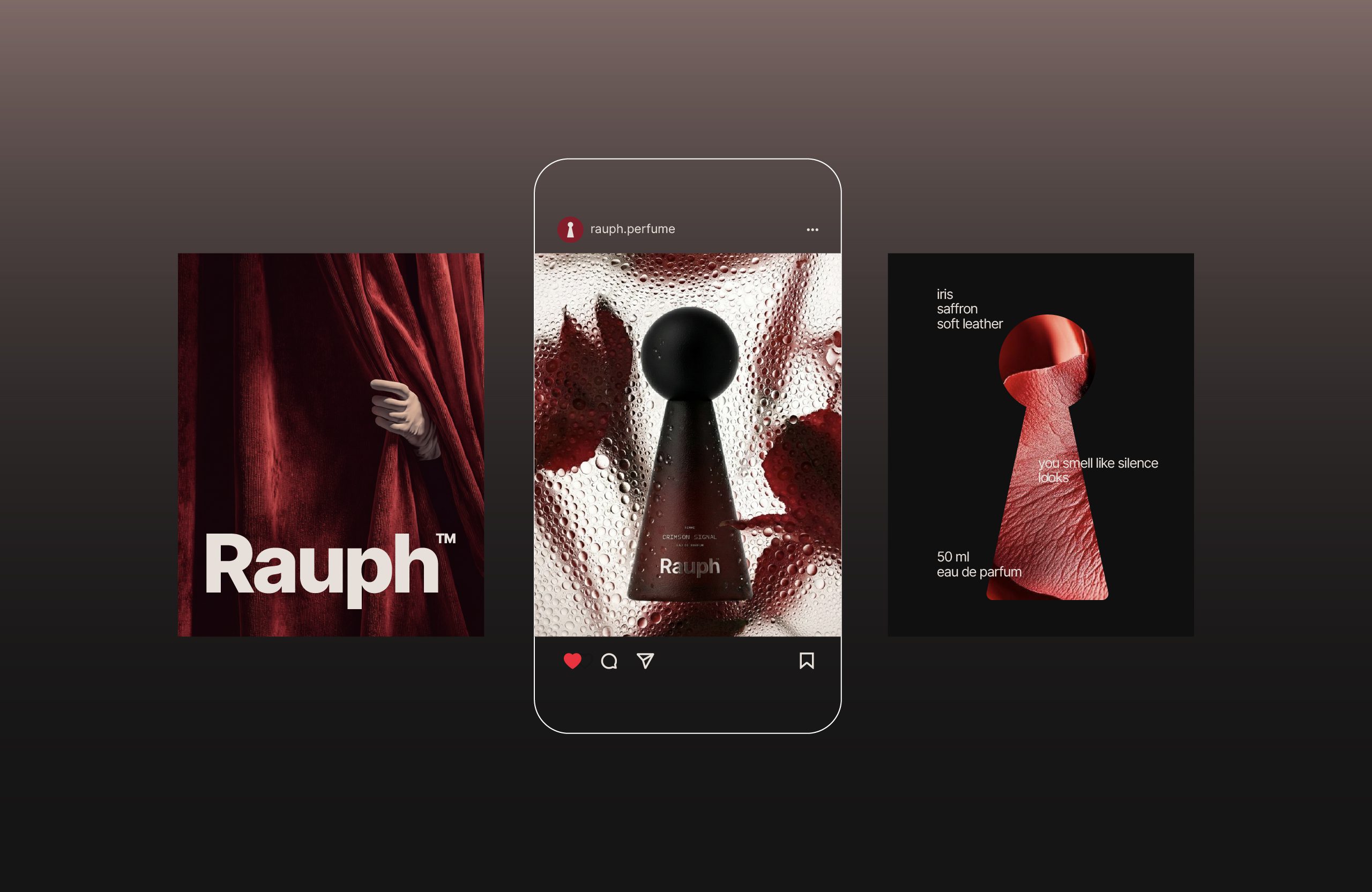
The typographic system and color palette were developed to emphasize depth and control. Strong contrasts were avoided in favor of subtle transitions, considered spacing, and balanced proportions. The visual language was shaped to feel structured and architectural rather than decorative.
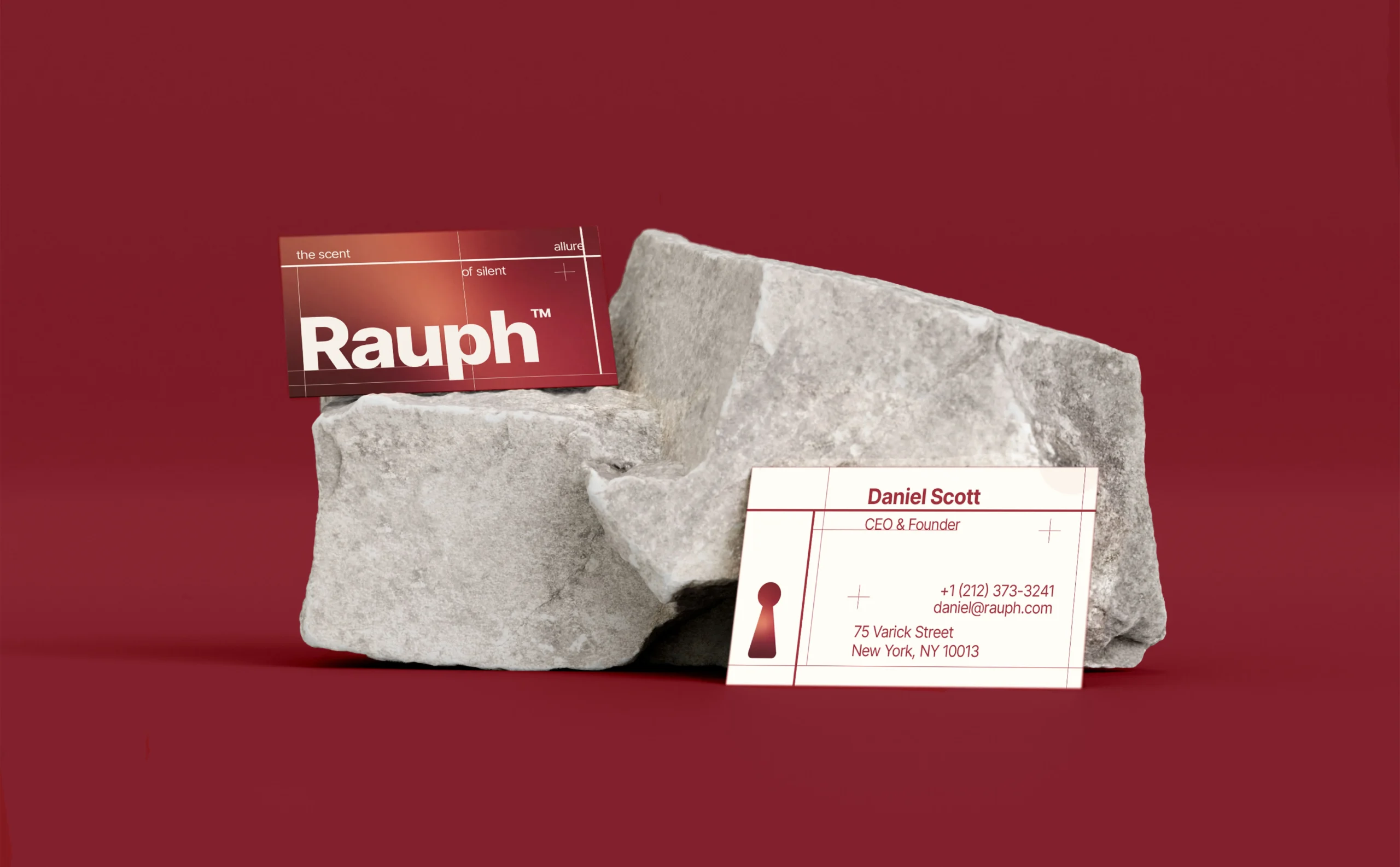
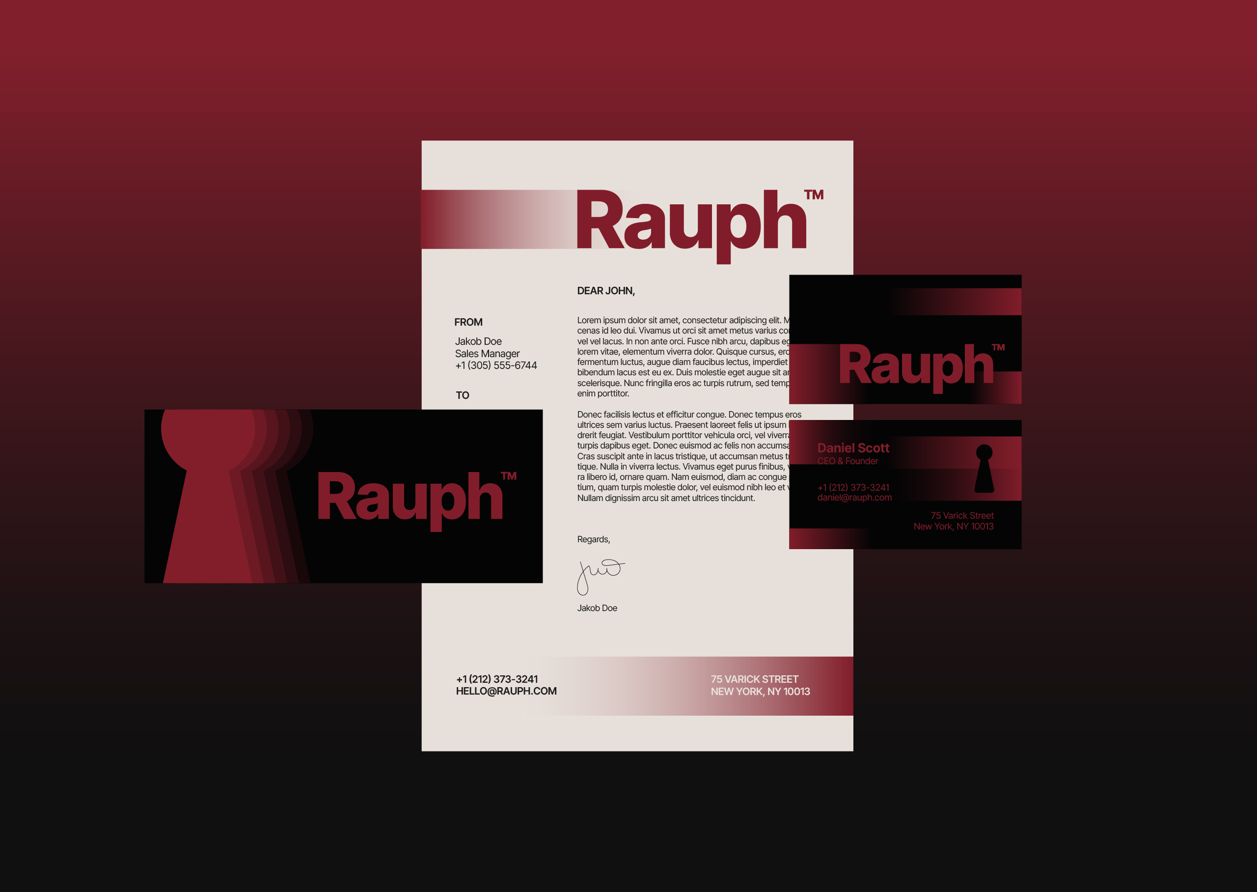
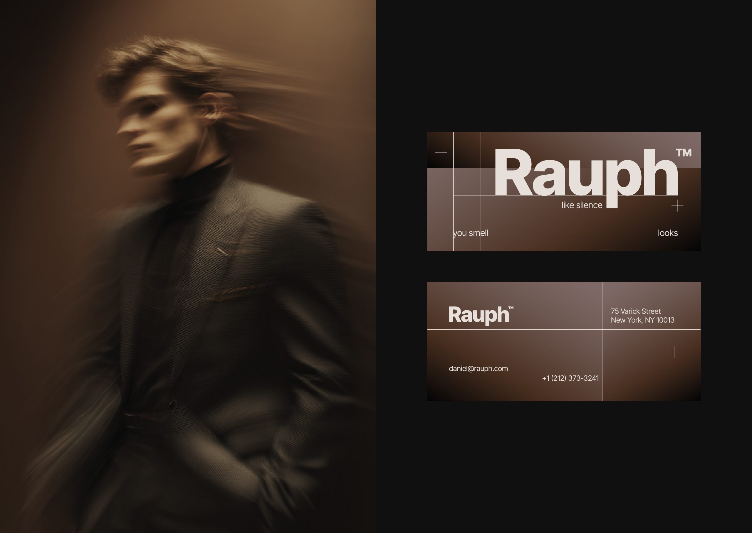
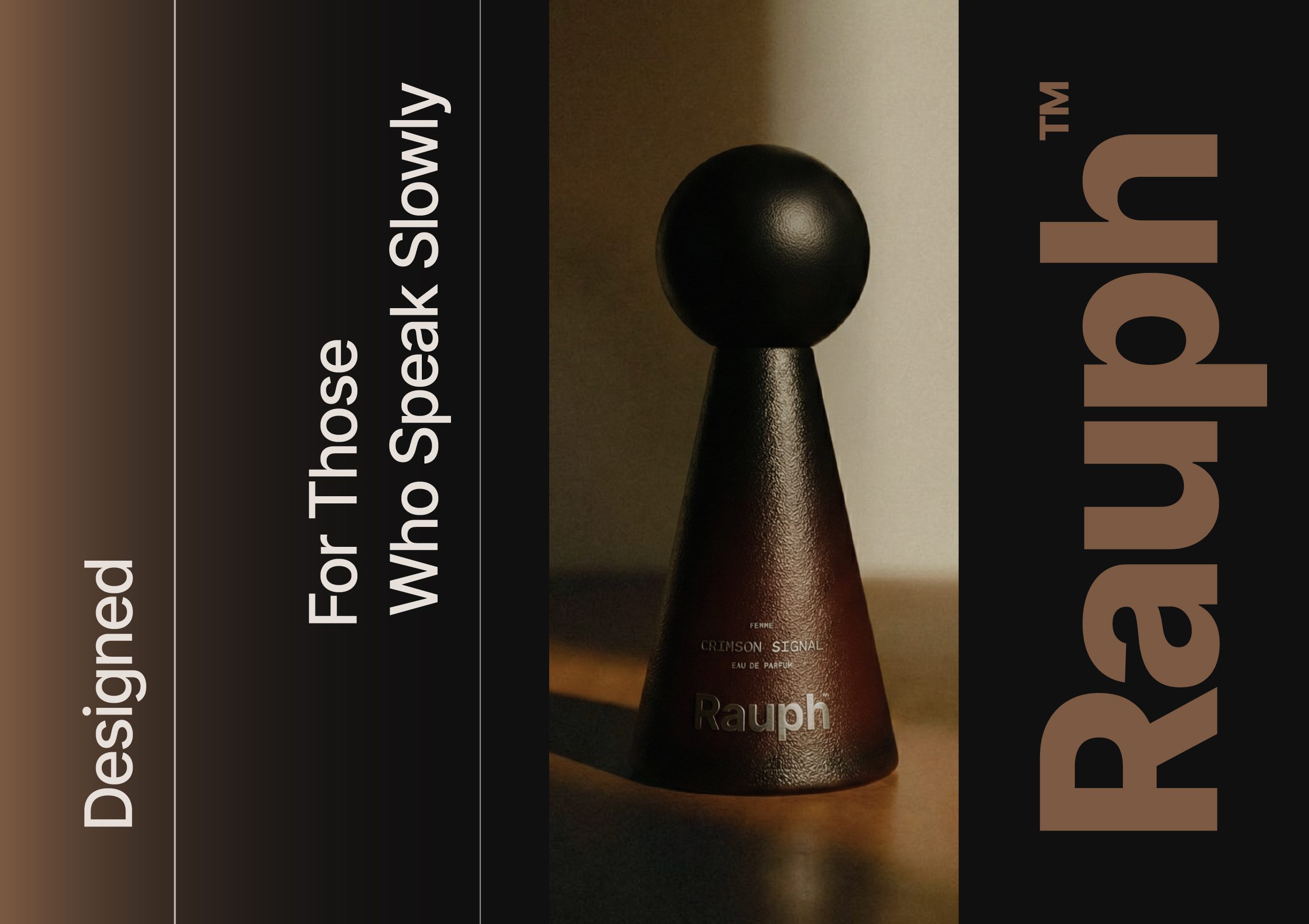
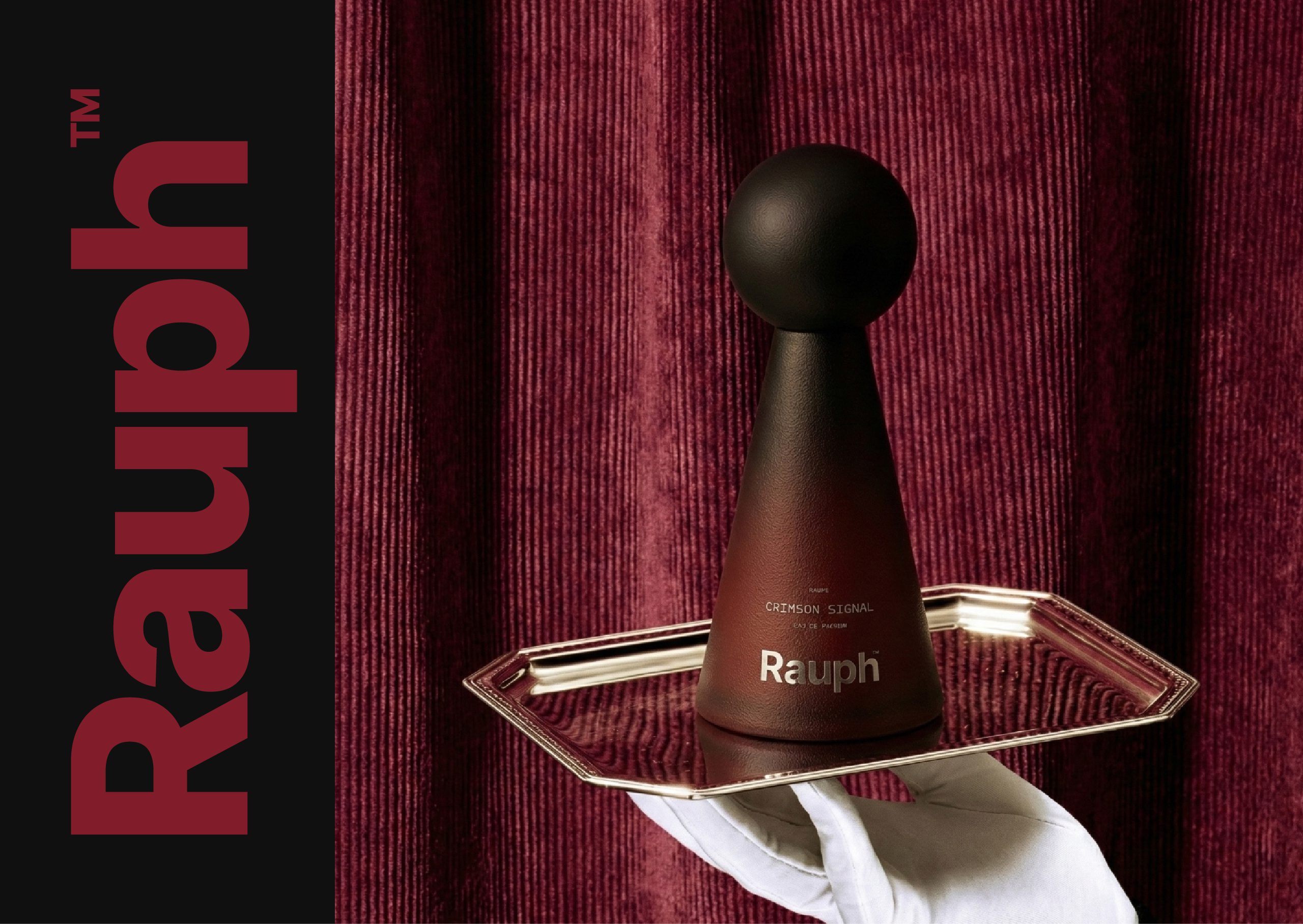
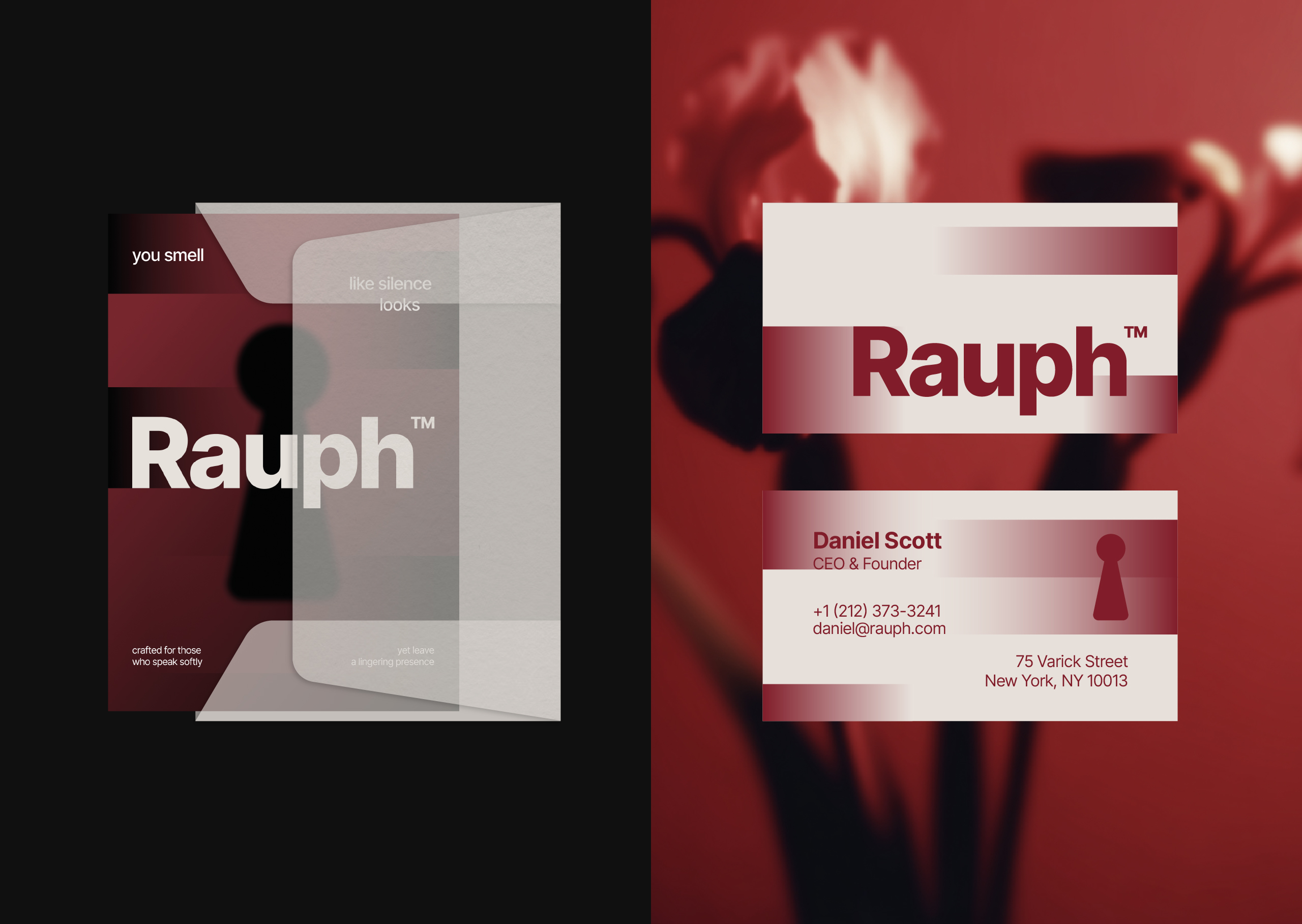
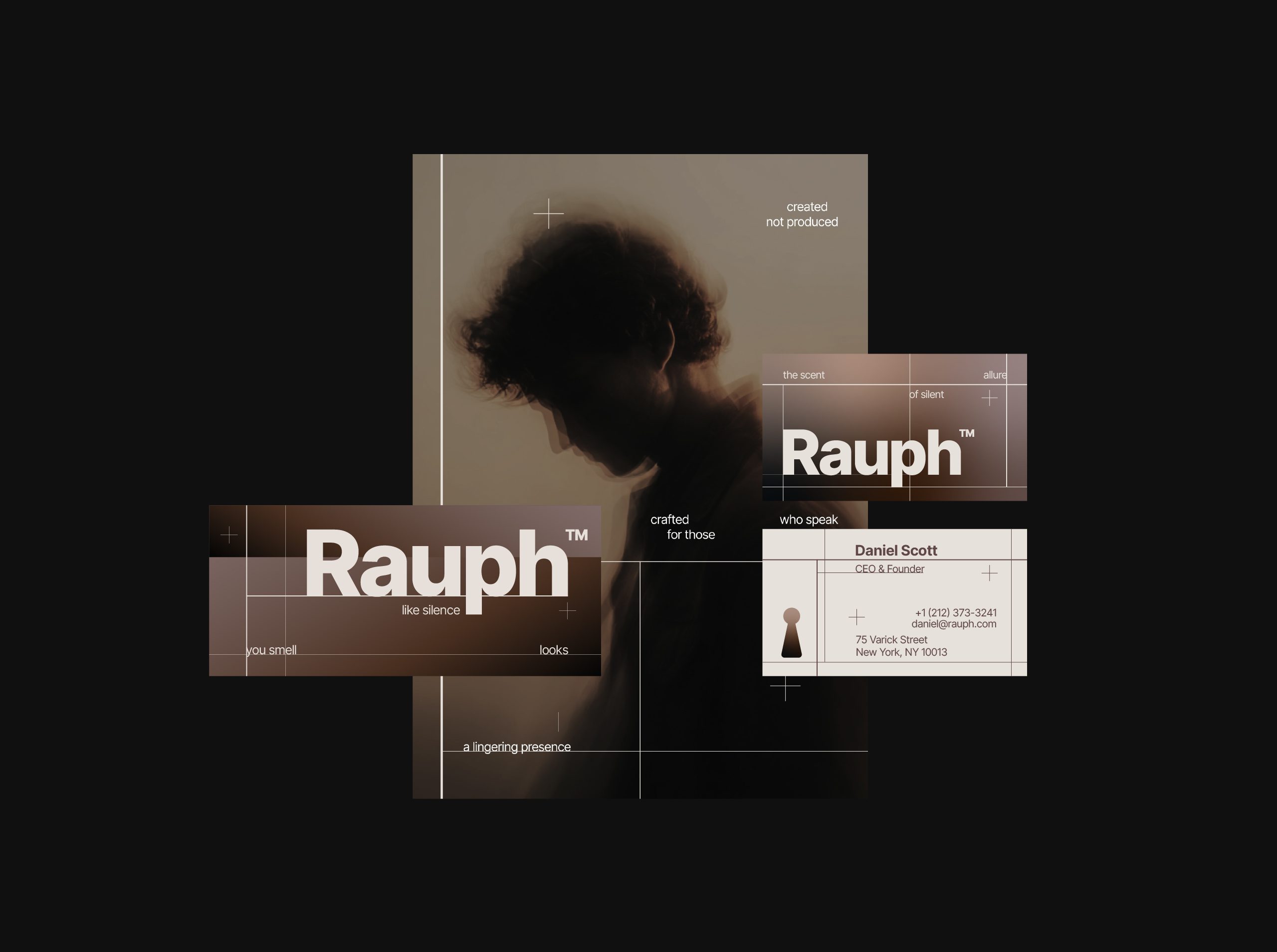
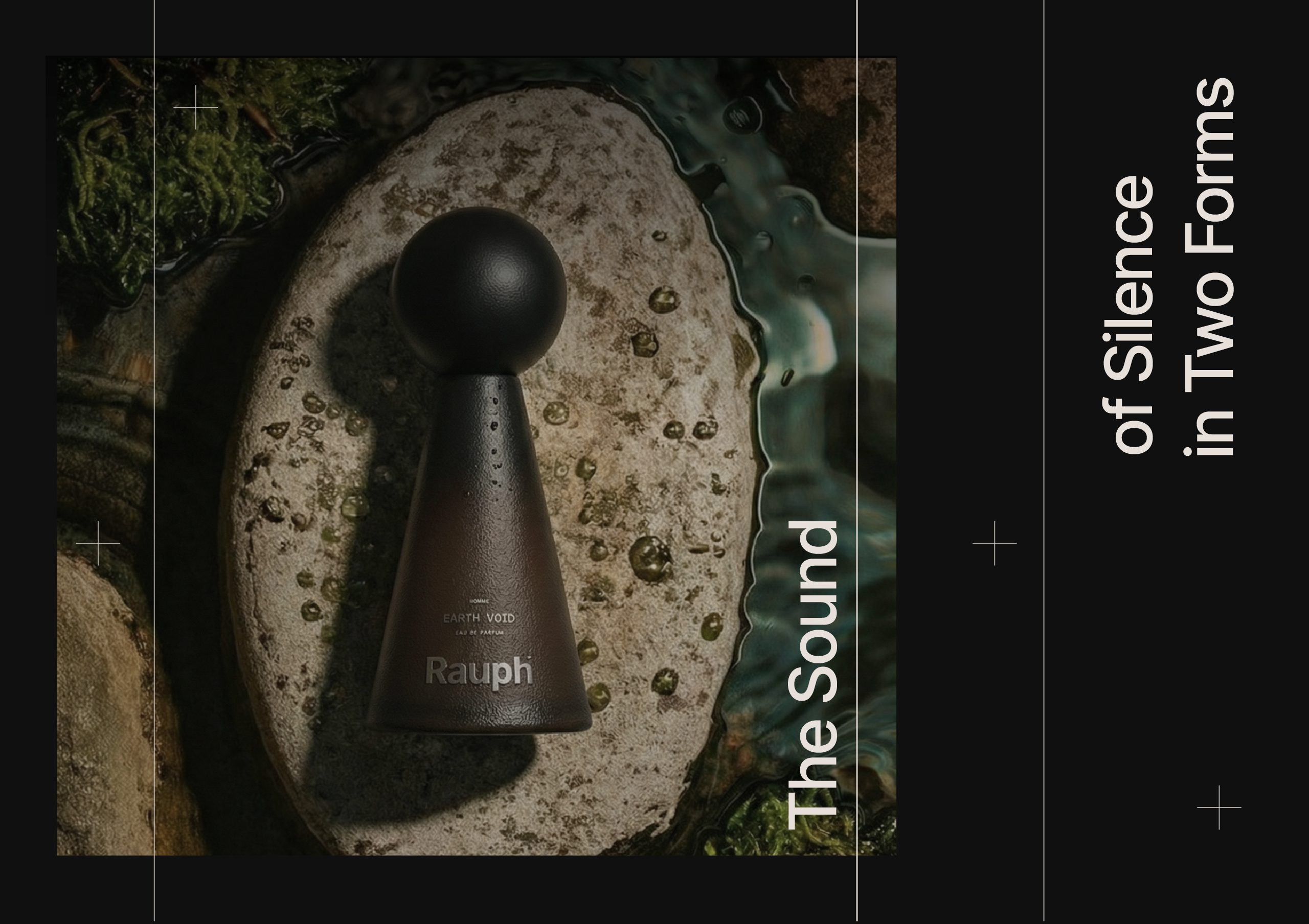
The identity system was then applied across packaging, stationery, and various brand materials, ensuring consistency at every touchpoint. Each application follows the same principle: clarity, calmness, and precision.
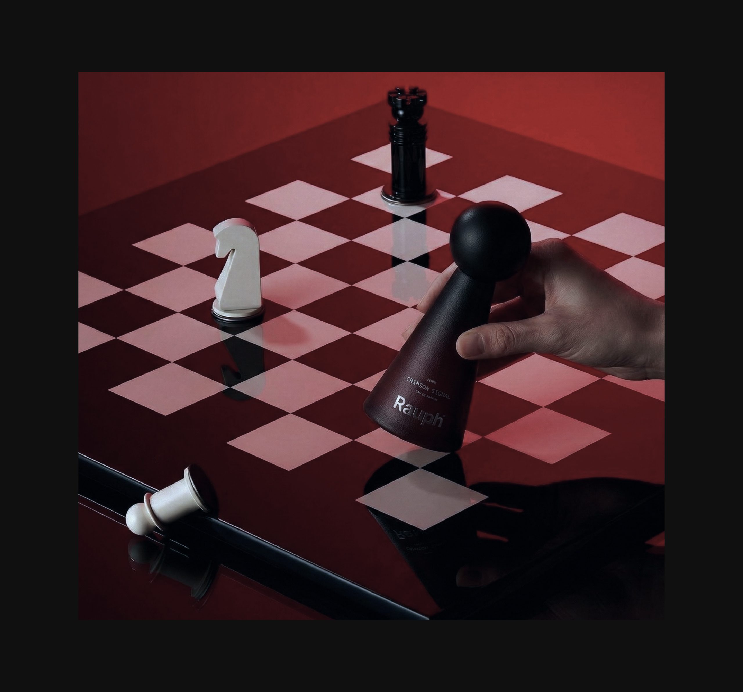
Rauph was designed to leave an impression that unfolds over time—quiet, deliberate, and lasting.
Let’s make the work they’ll copy.
Talk to an expert now


