
Skindeep
potent nature-infused skincare
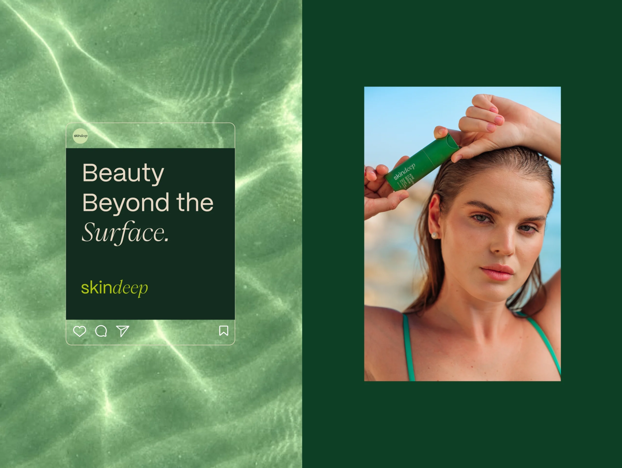
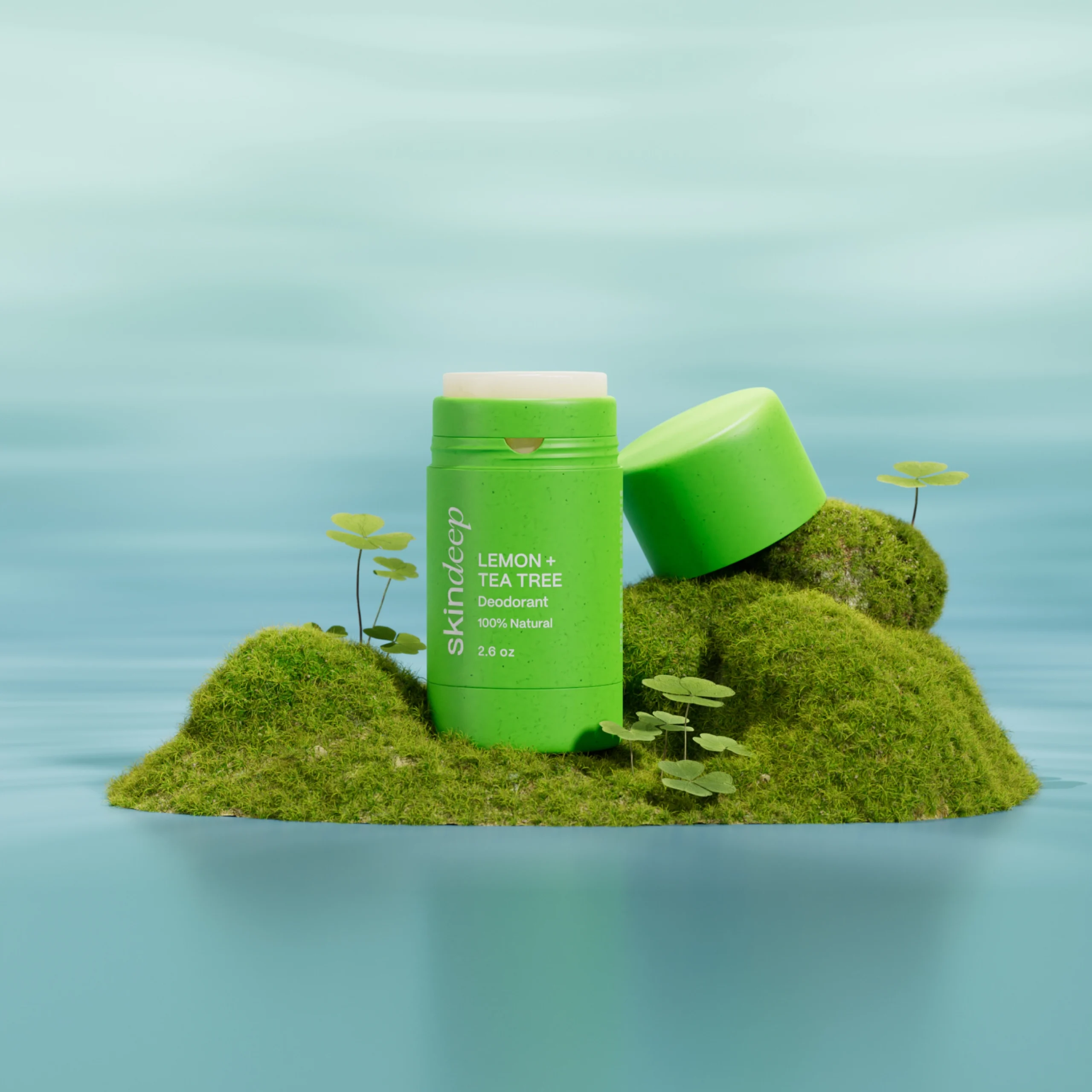
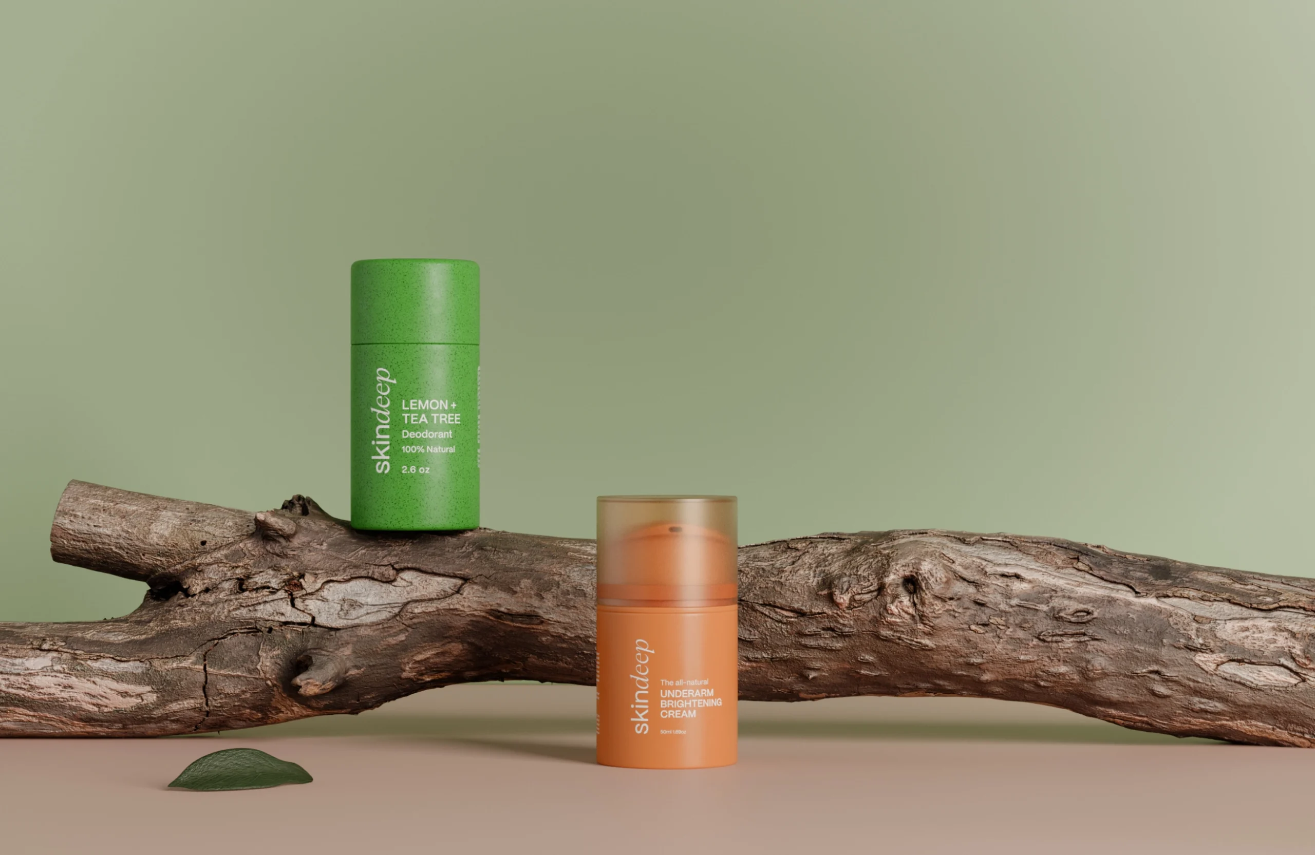
Skindeep is a luxurious skincare line that offers potent, nature-infused formulations. Through MARKAWORKS’ visual identity, it communicates purity and efficacy with a sophisticated, grounded aesthetic for discerning consumers.
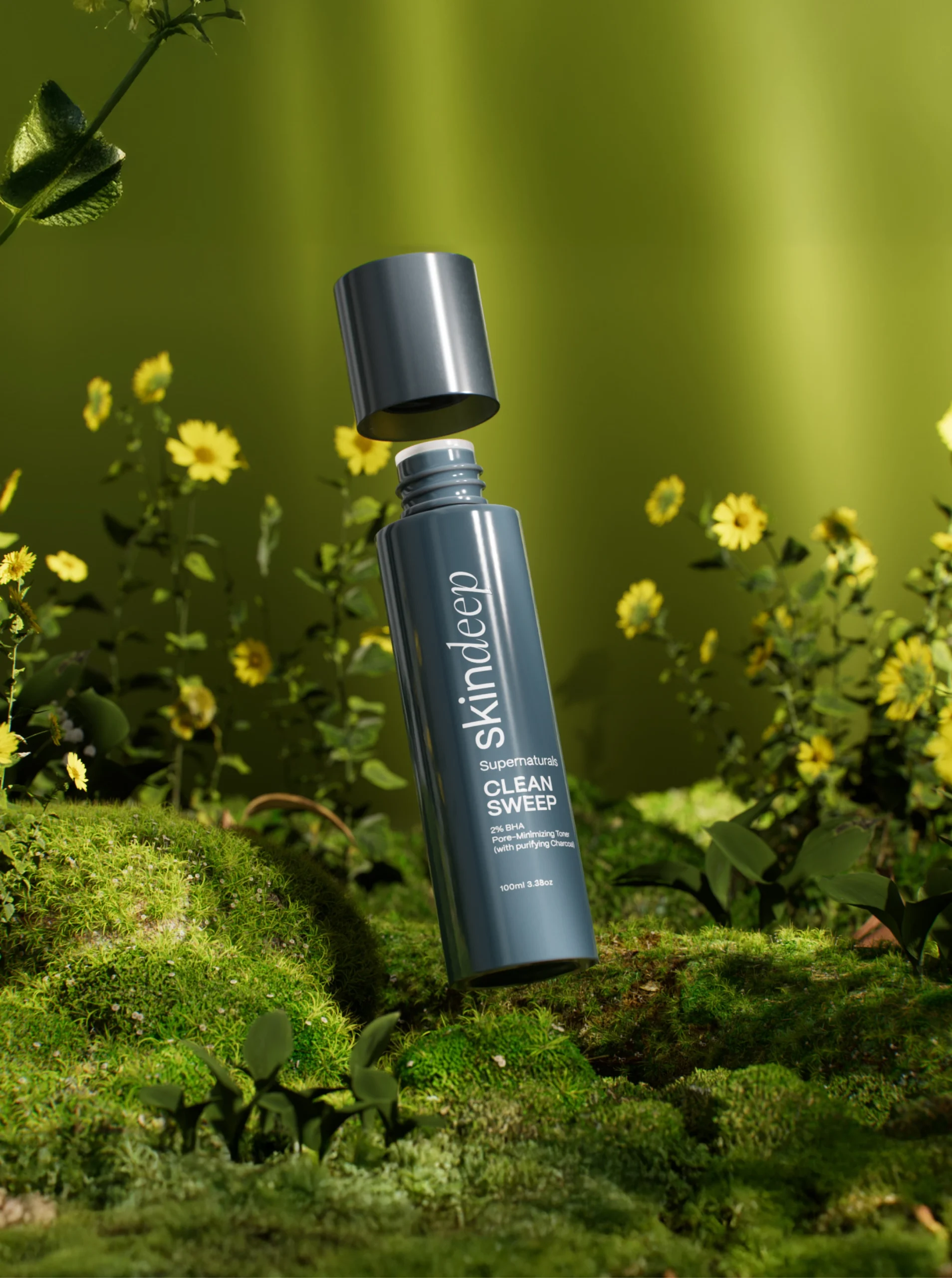
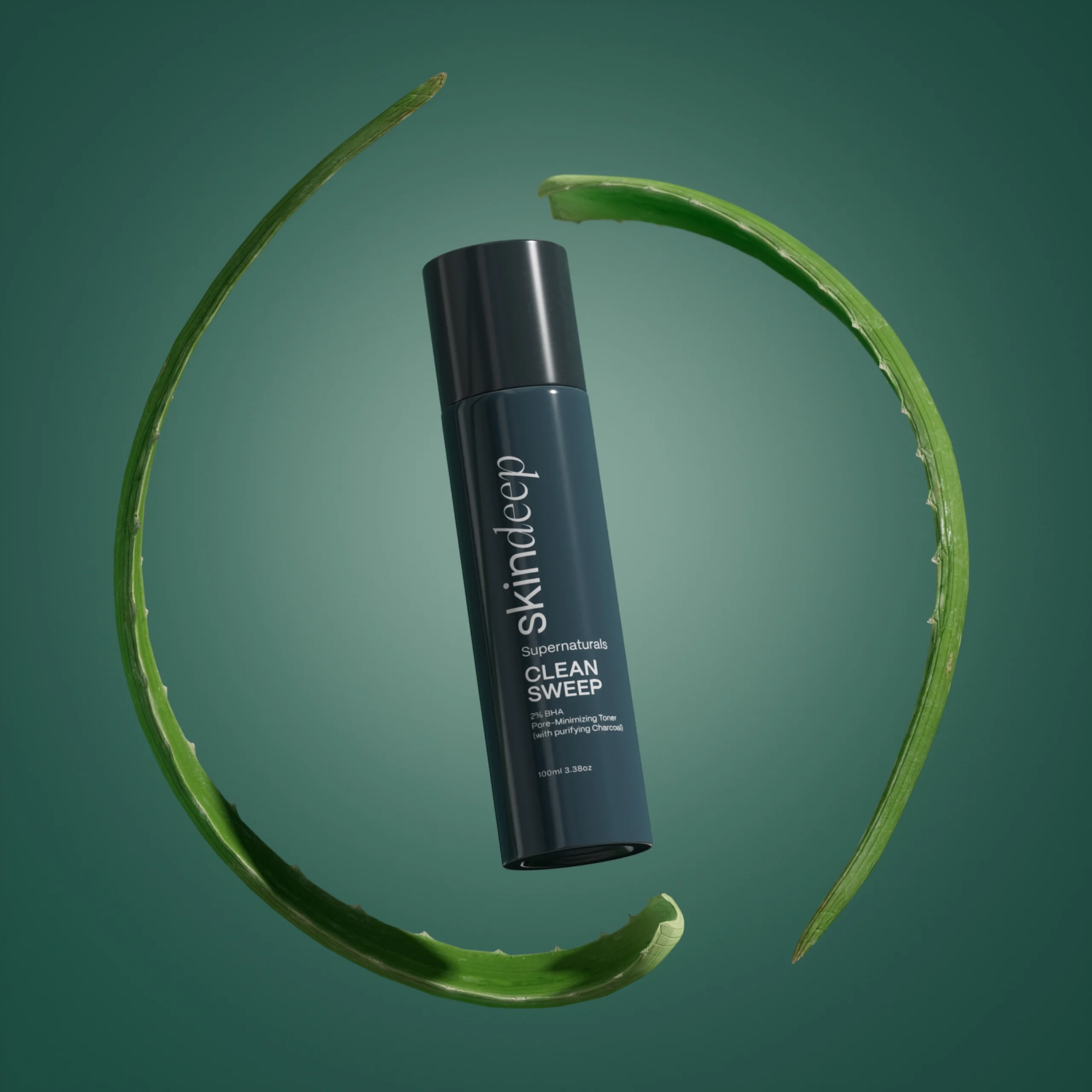
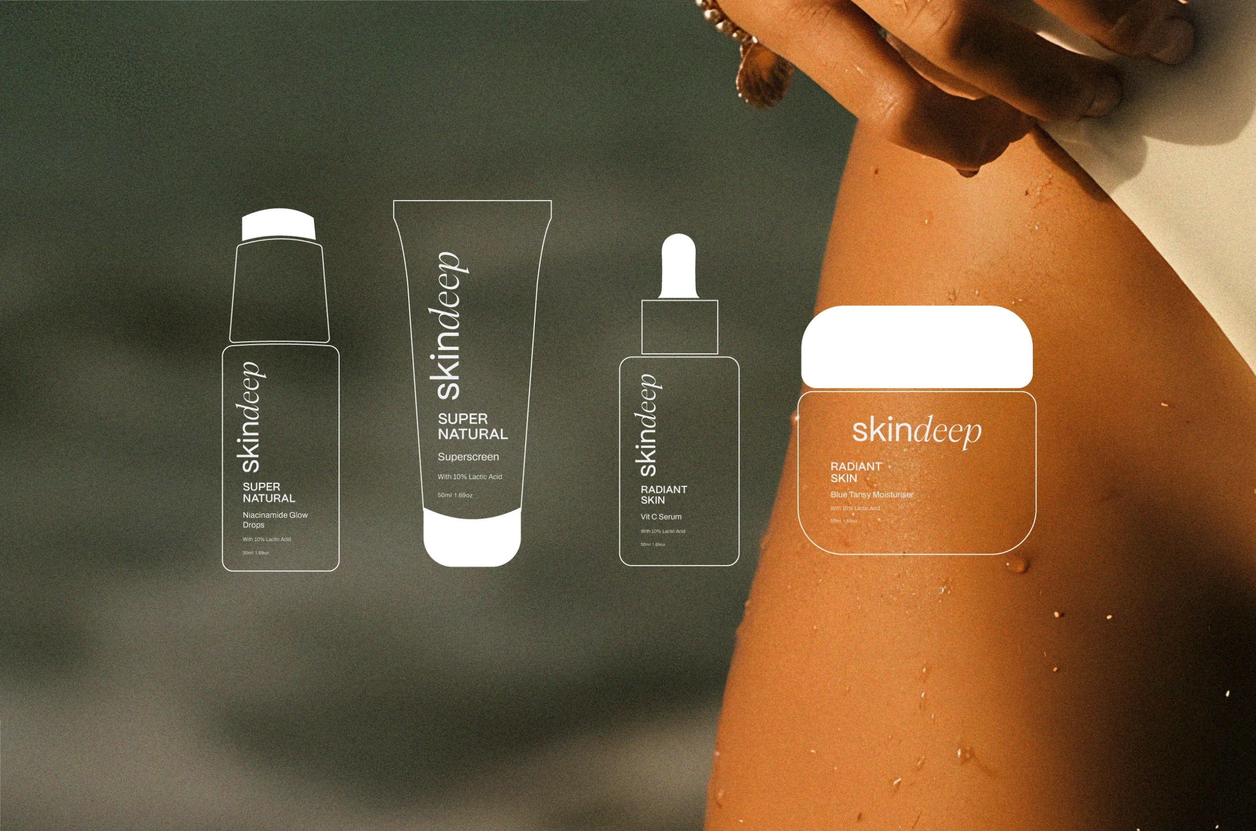
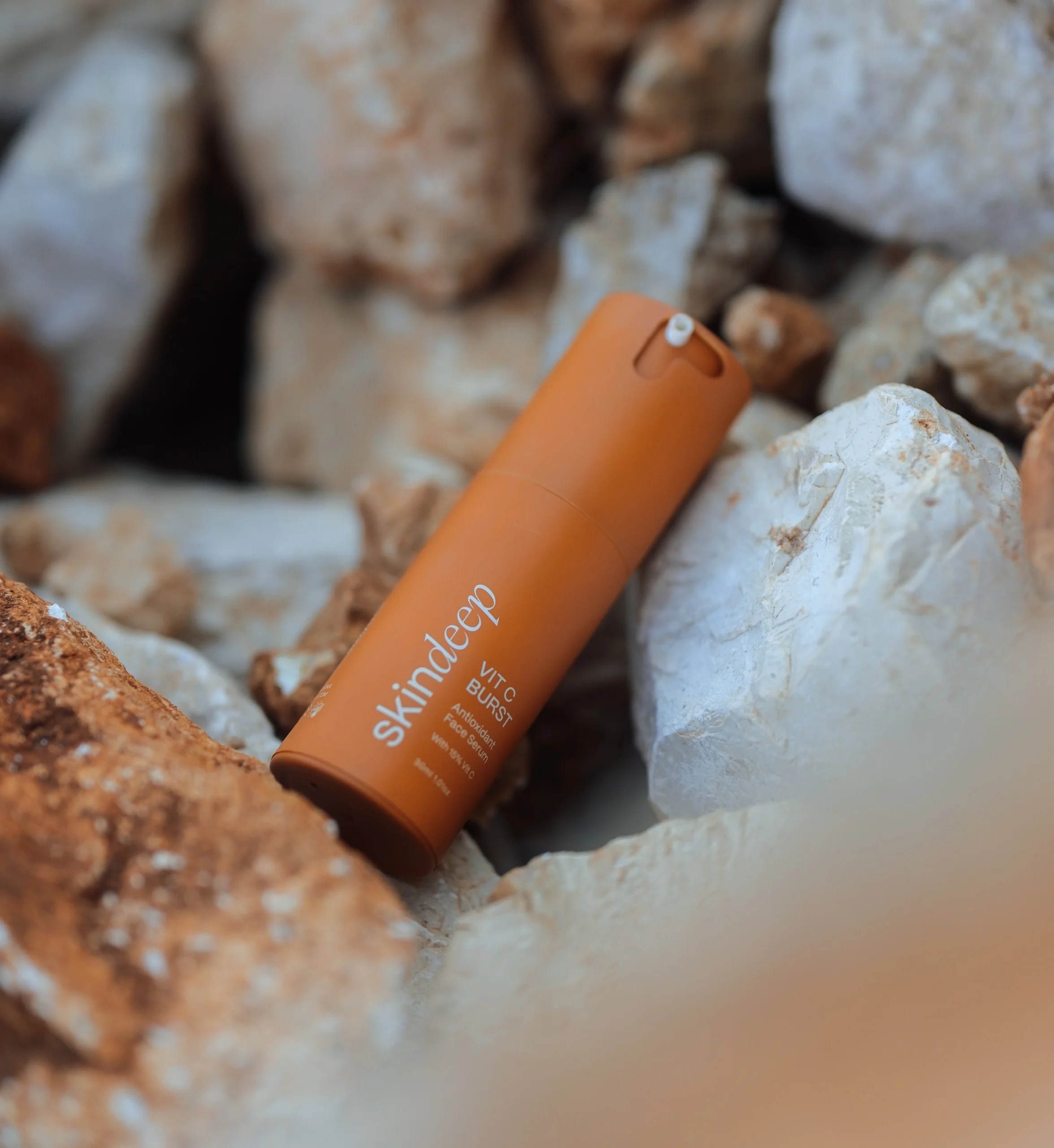
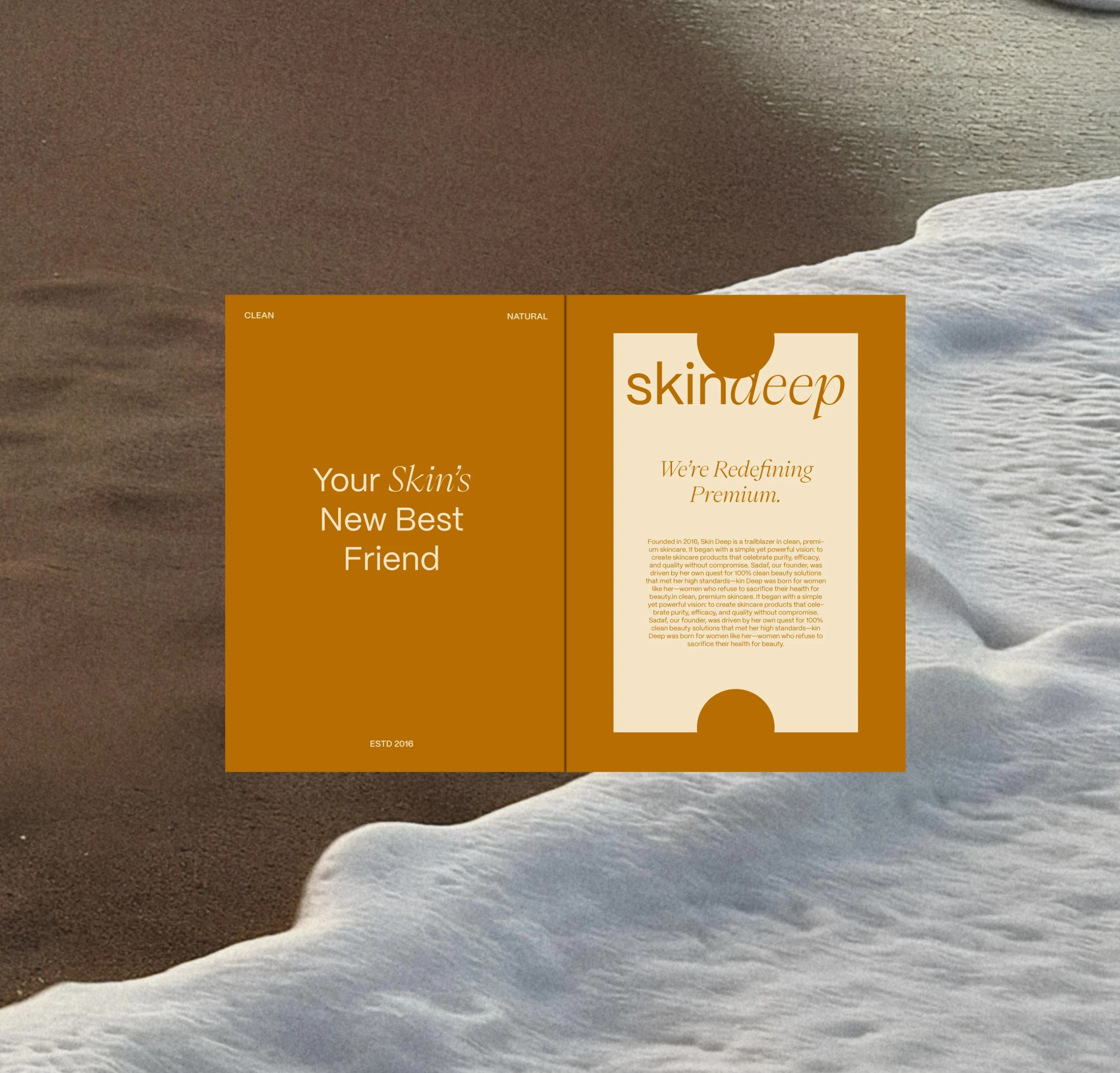
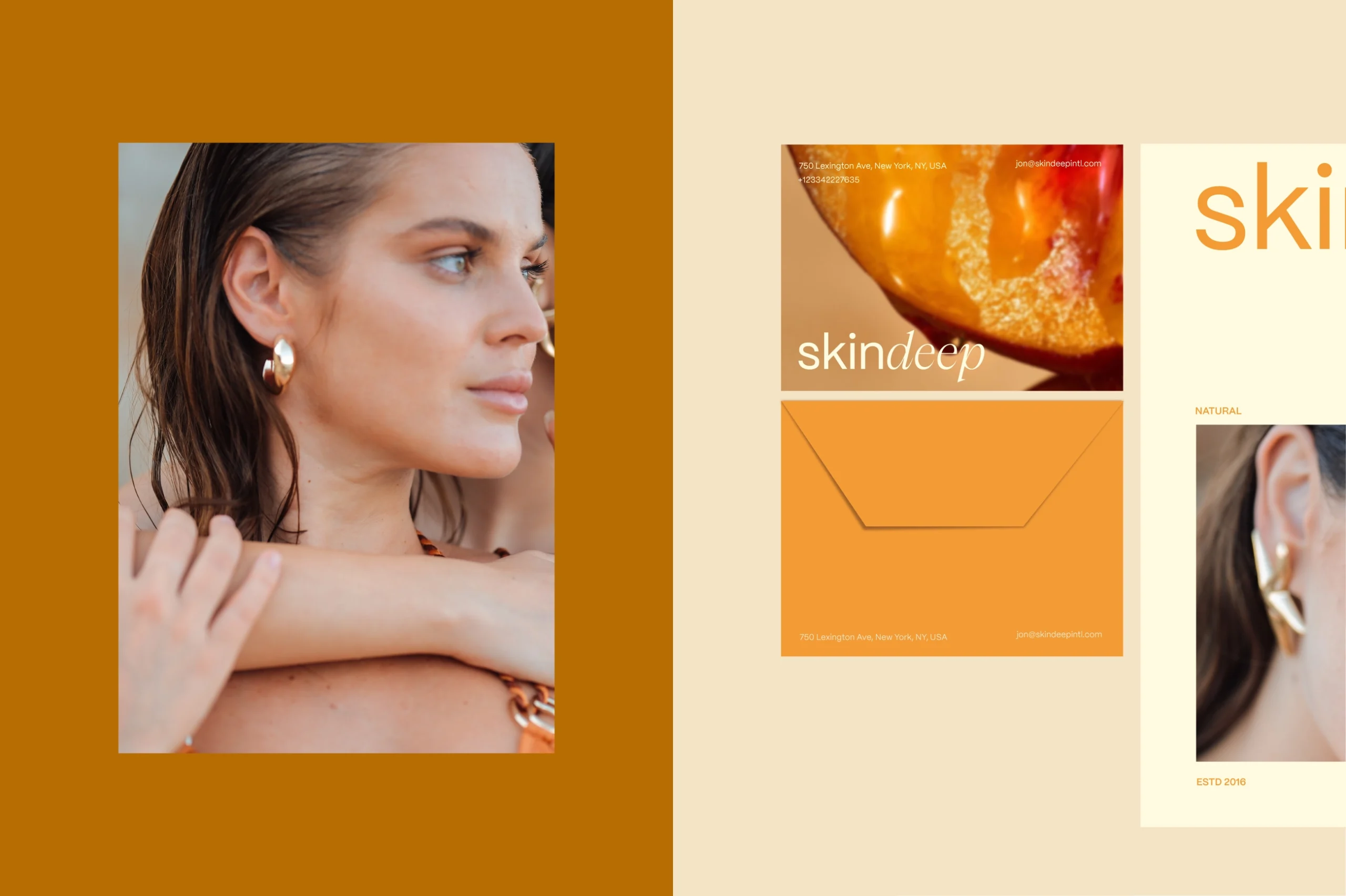
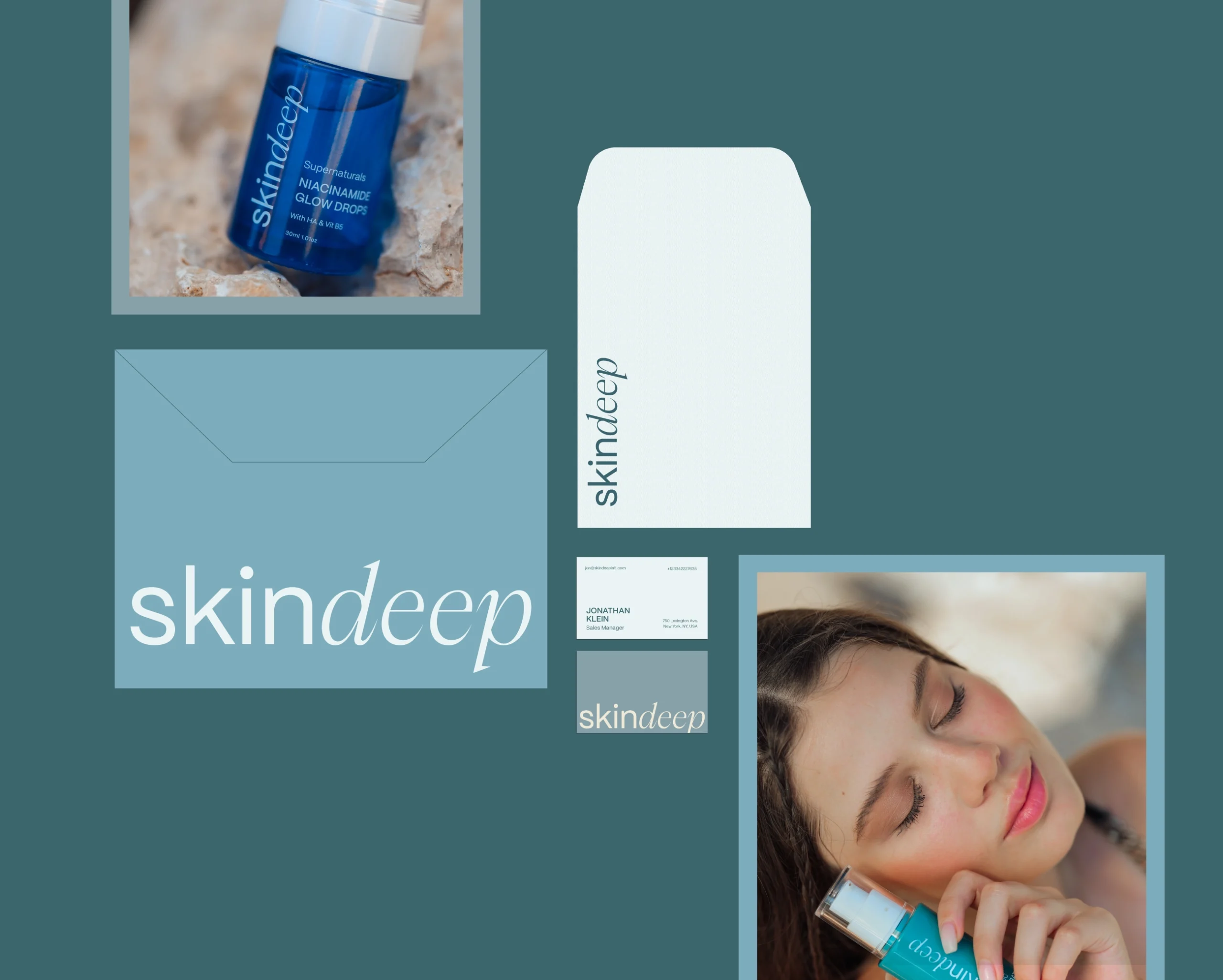
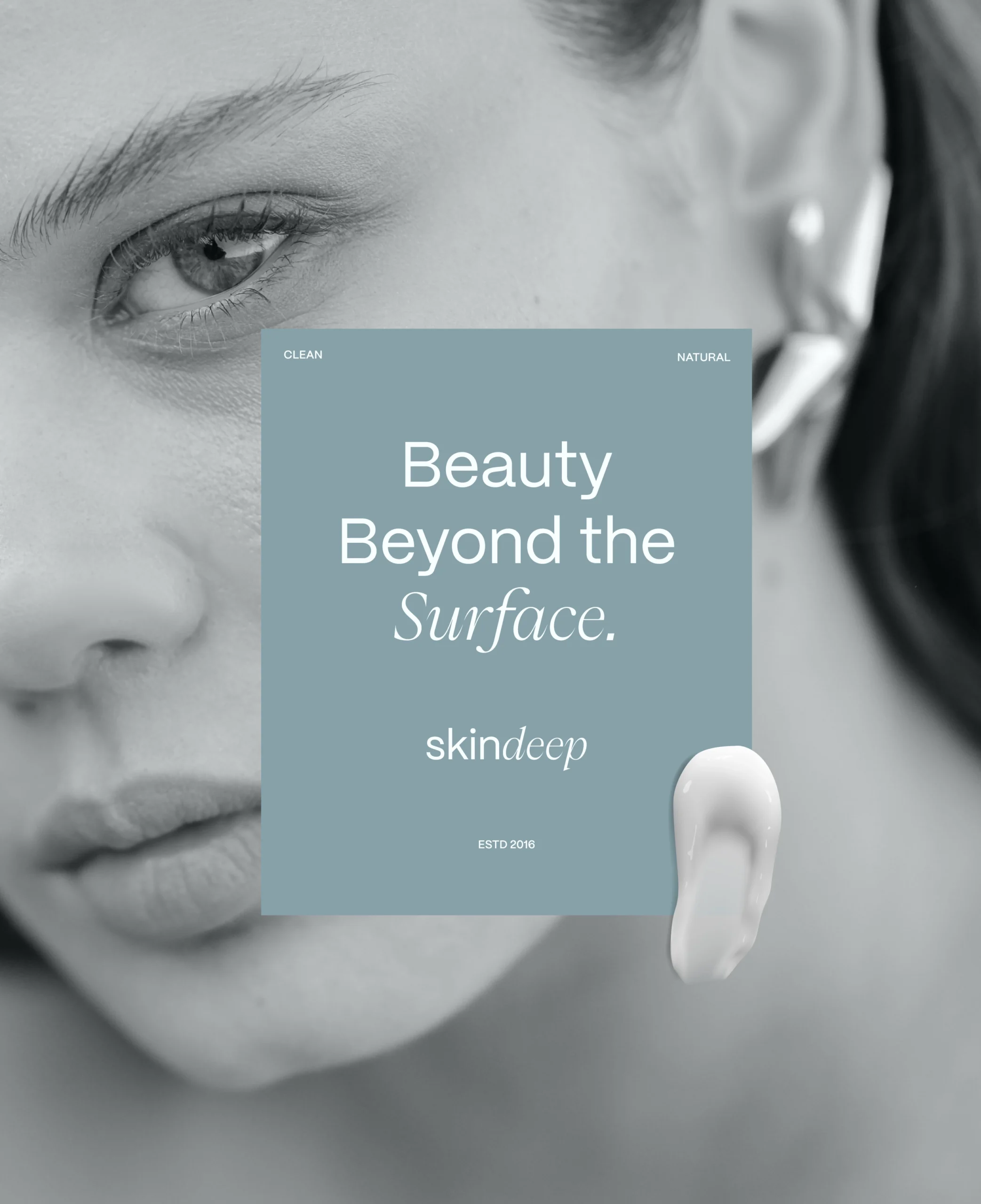
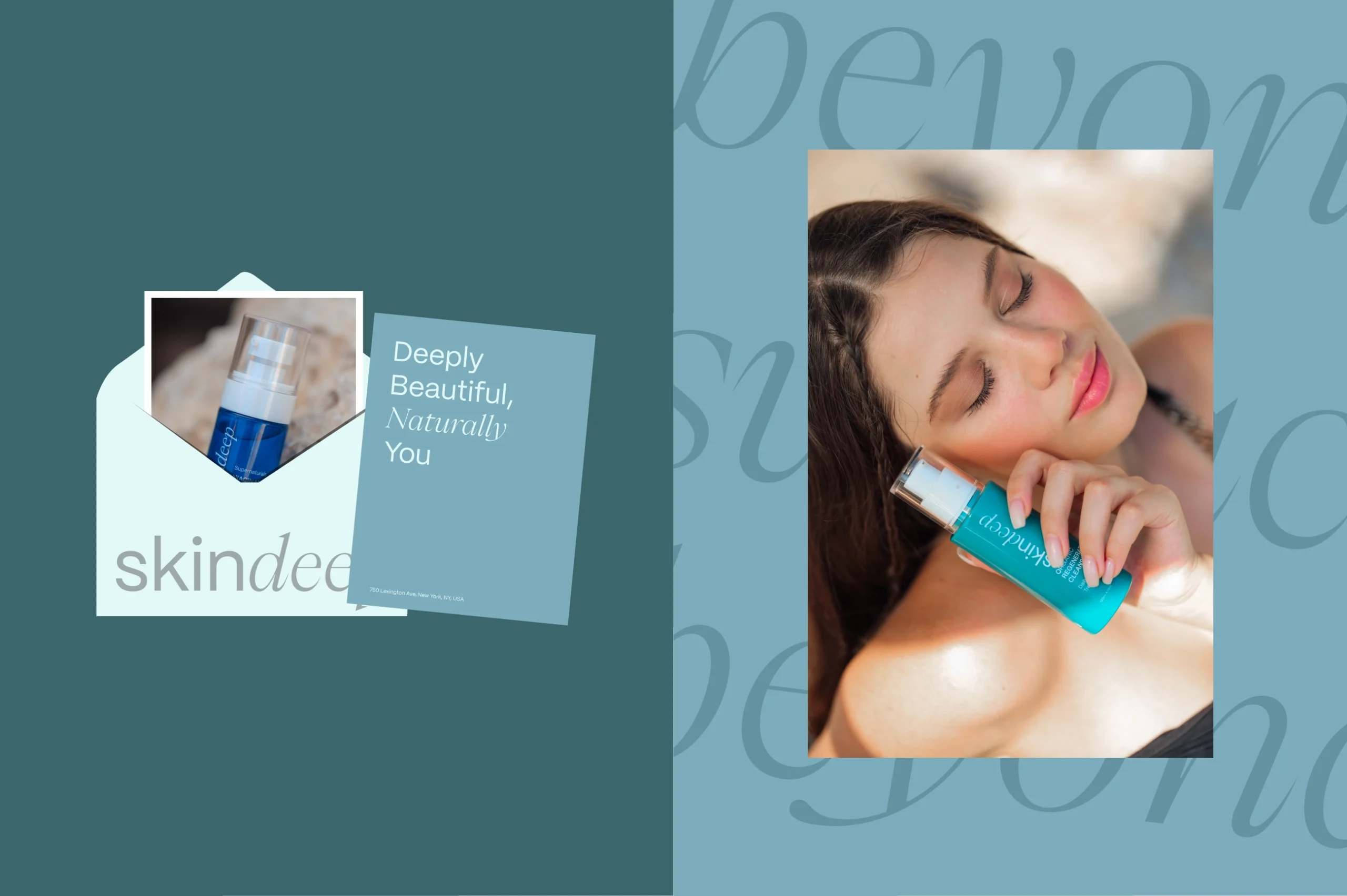
Skindeep is a premium skincare brand that embraces natural beauty and purity. Our branding and packaging design process focused on creating a visual identity that reflects the brand’s commitment to clean, effective, and nature-inspired skincare solutions.
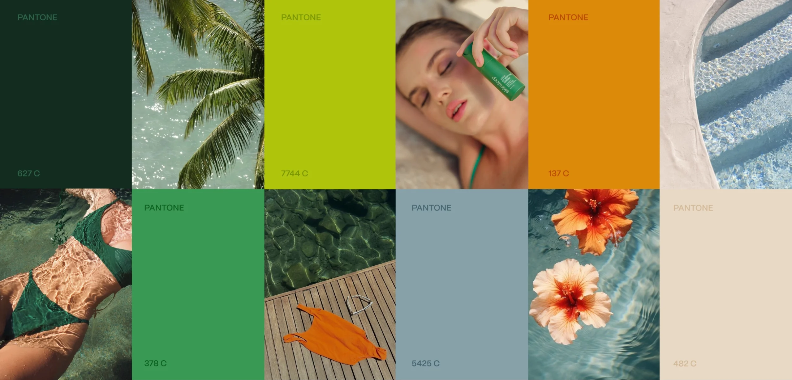
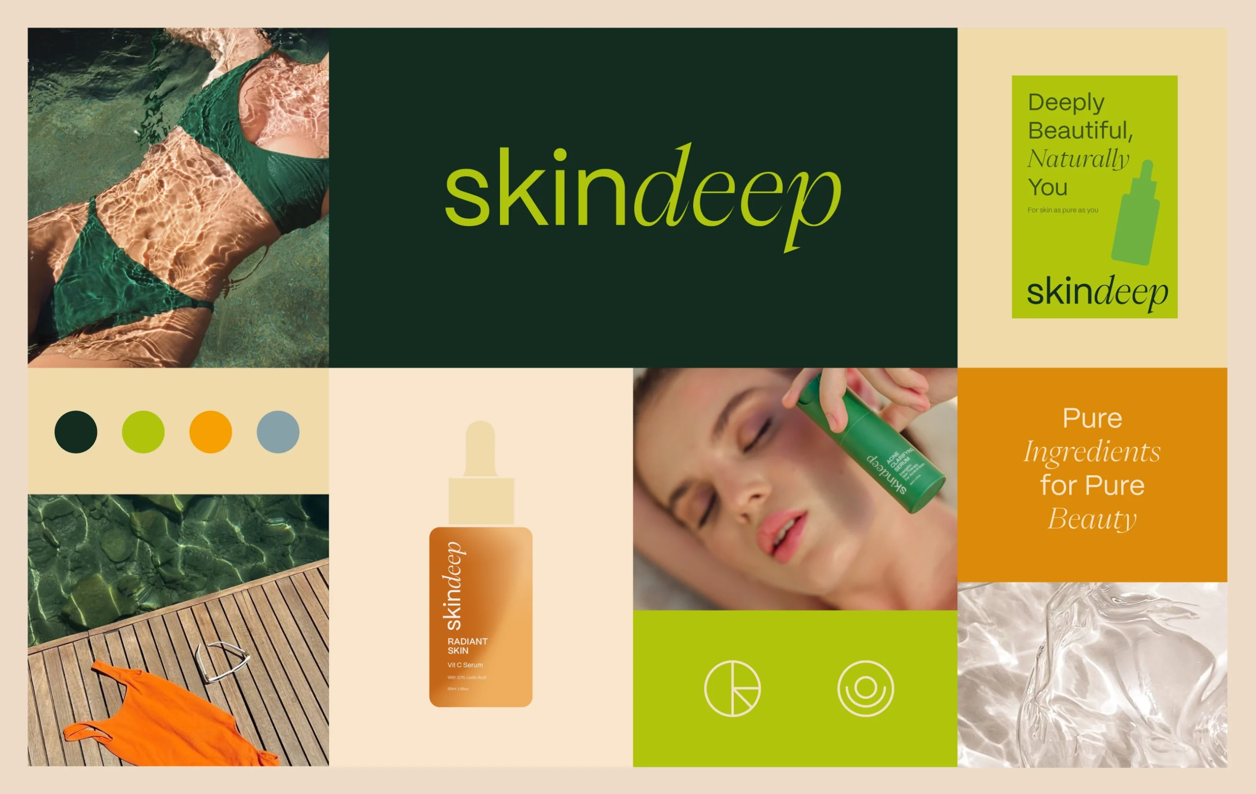
The initial phase of the project involved extensive market research, analyzing competitor brands, and identifying key differentiators for Skindeep. Our goal was to create a brand that exudes sophistication, minimalism, and a deep connection to nature. Mood boards, typography explorations, and color palettes were developed to align with Skindeep’s core values.
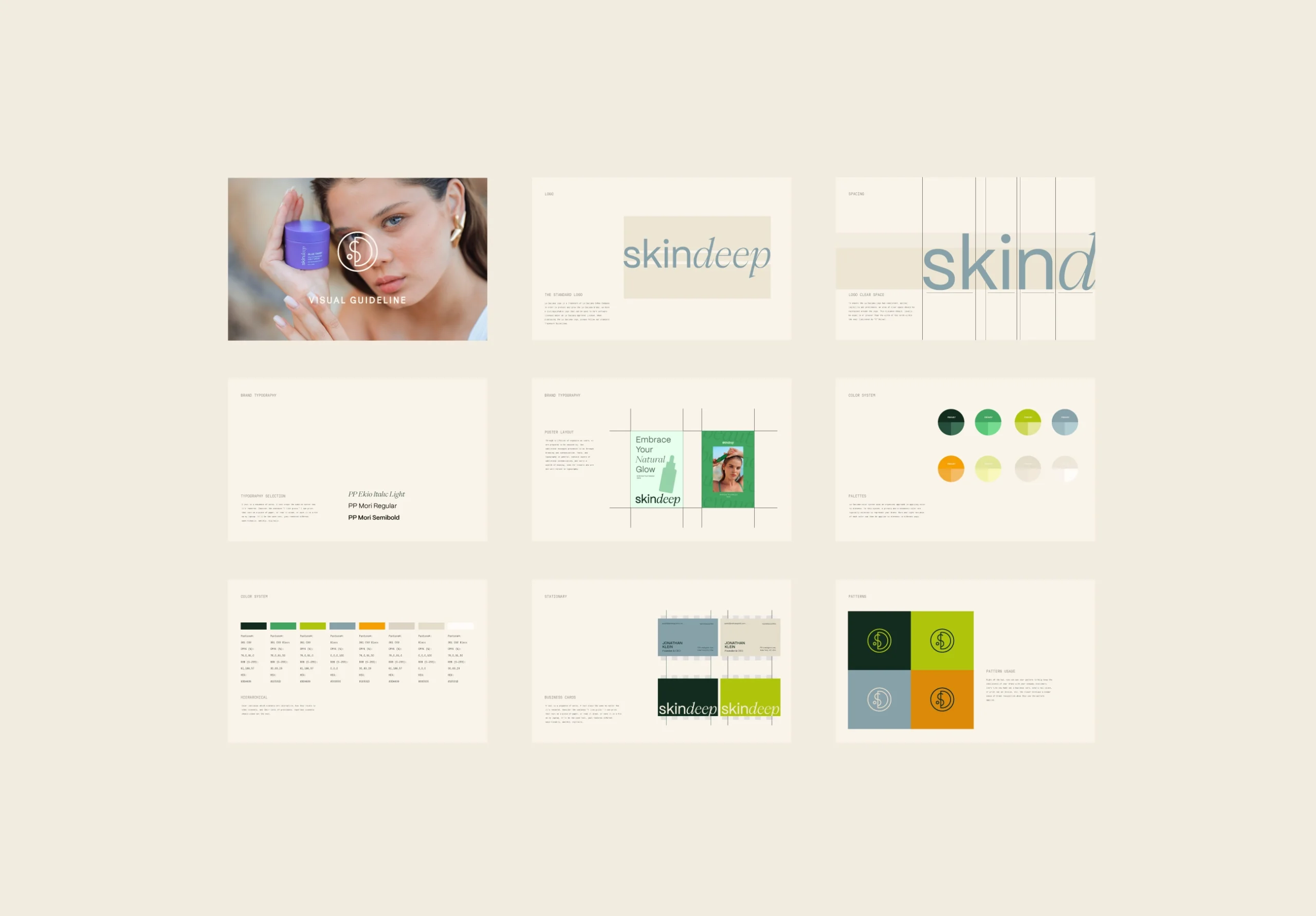
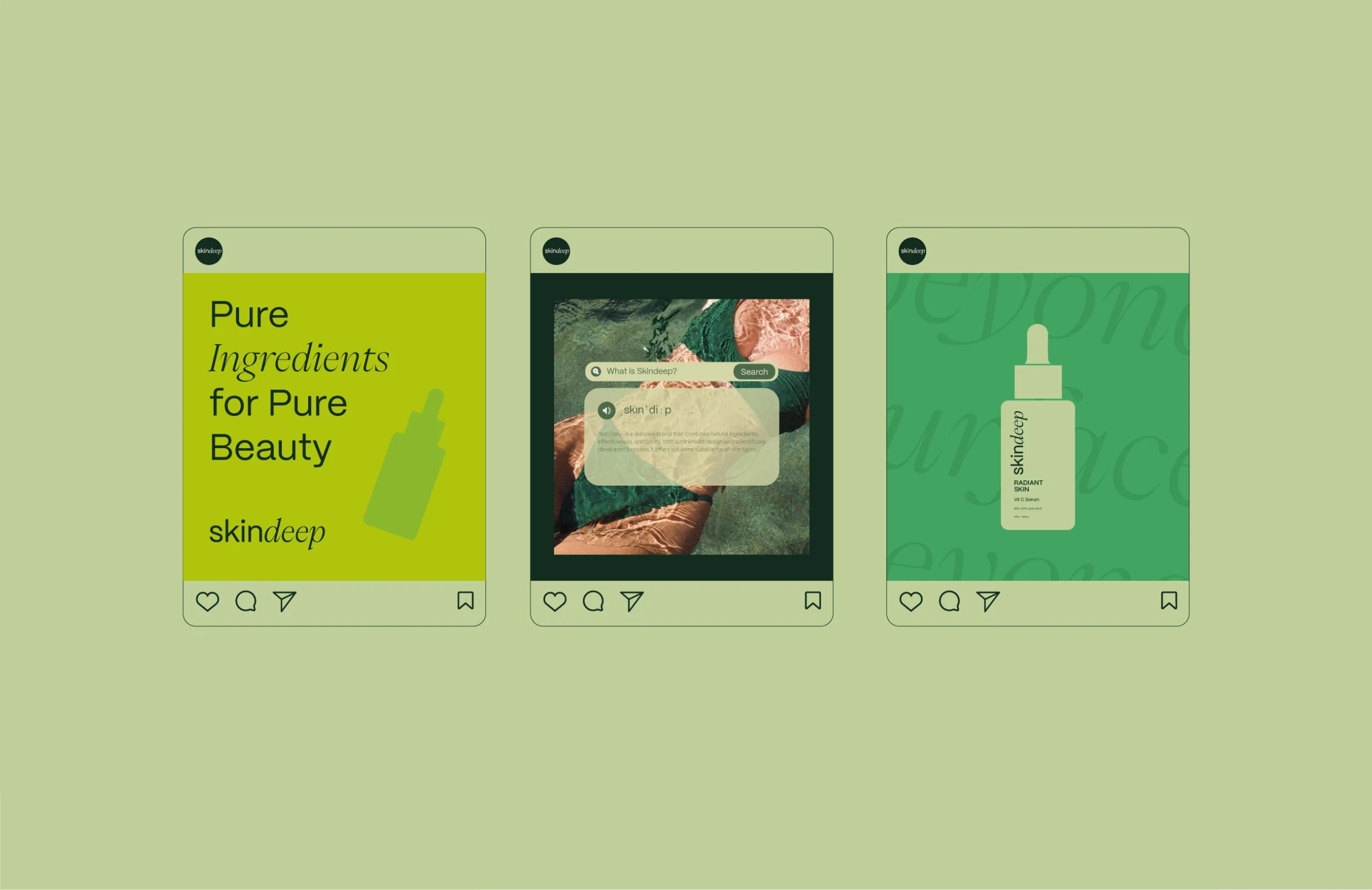
To establish a strong brand presence, we focused on the following elements:
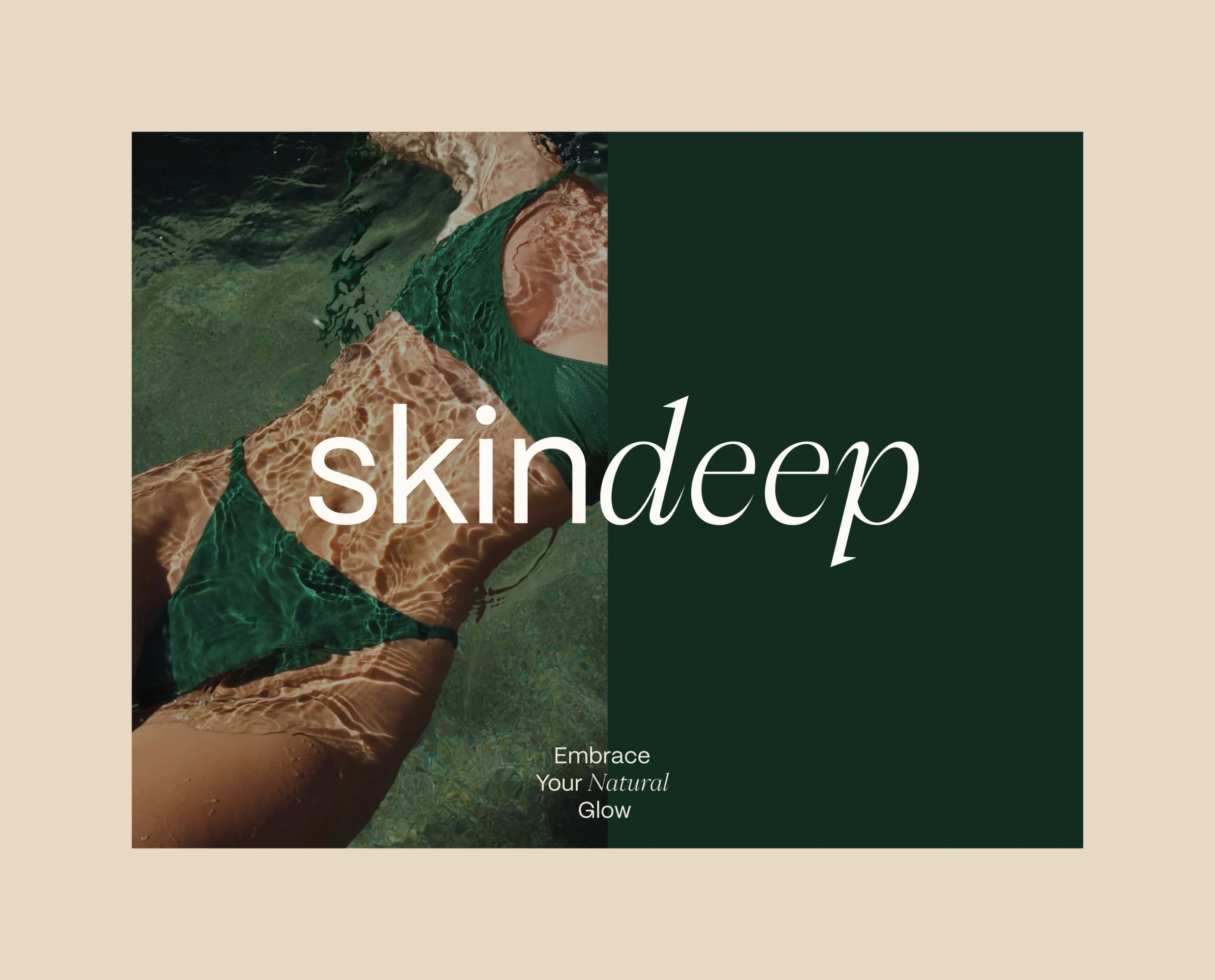
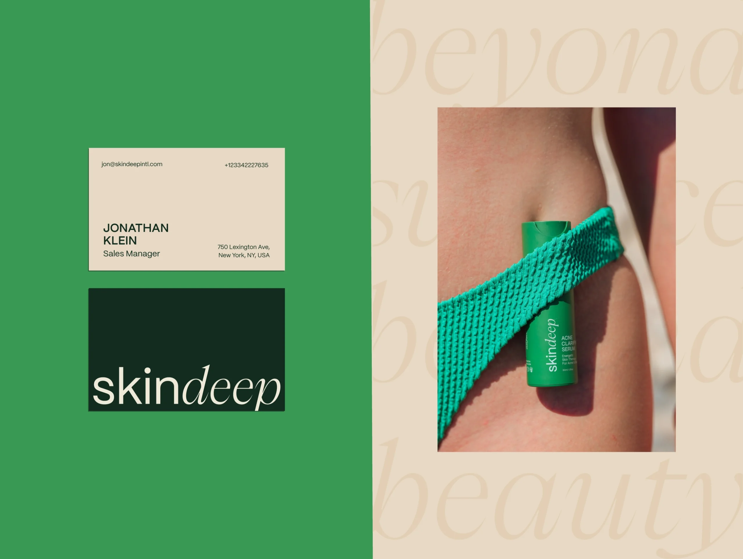
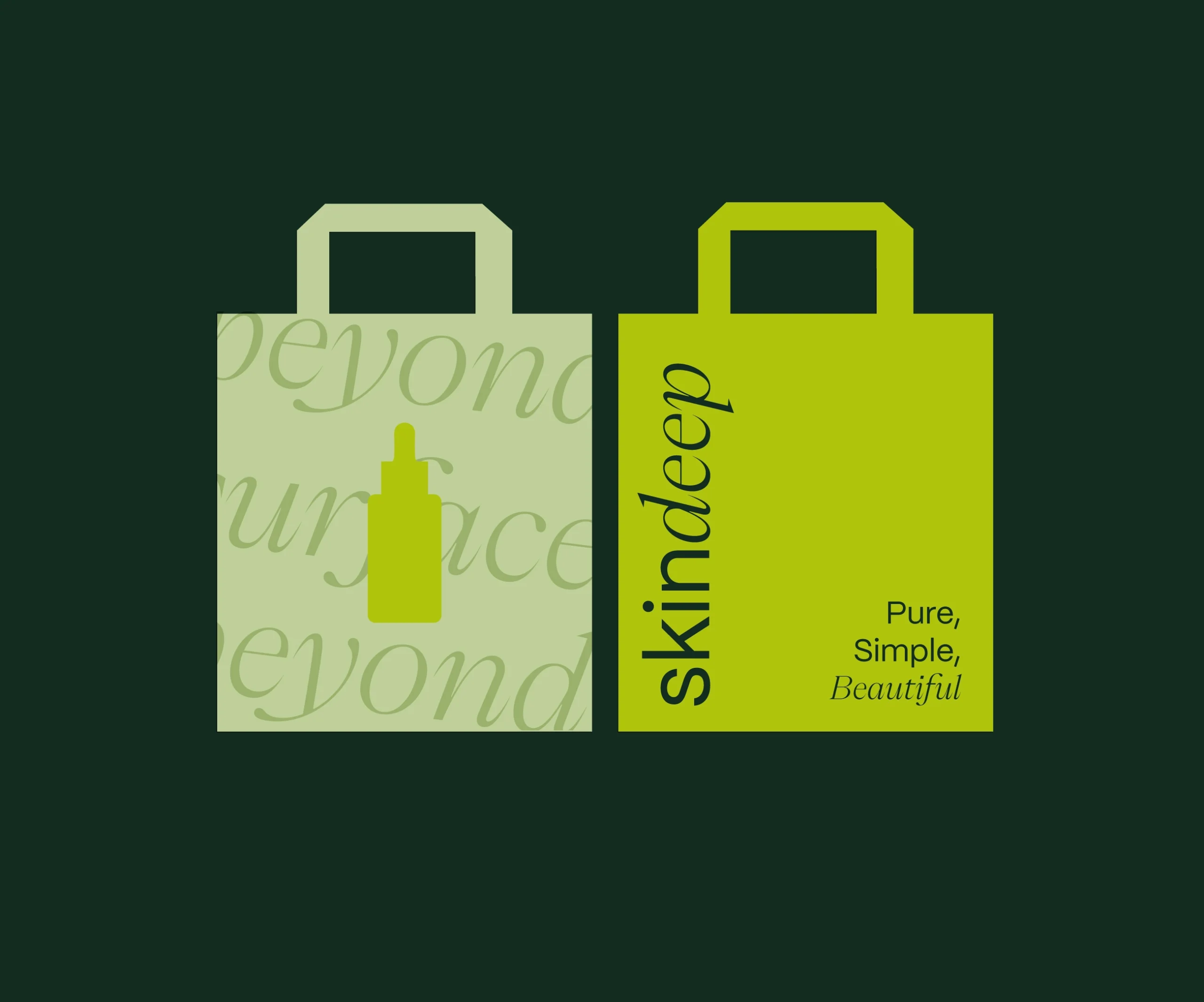
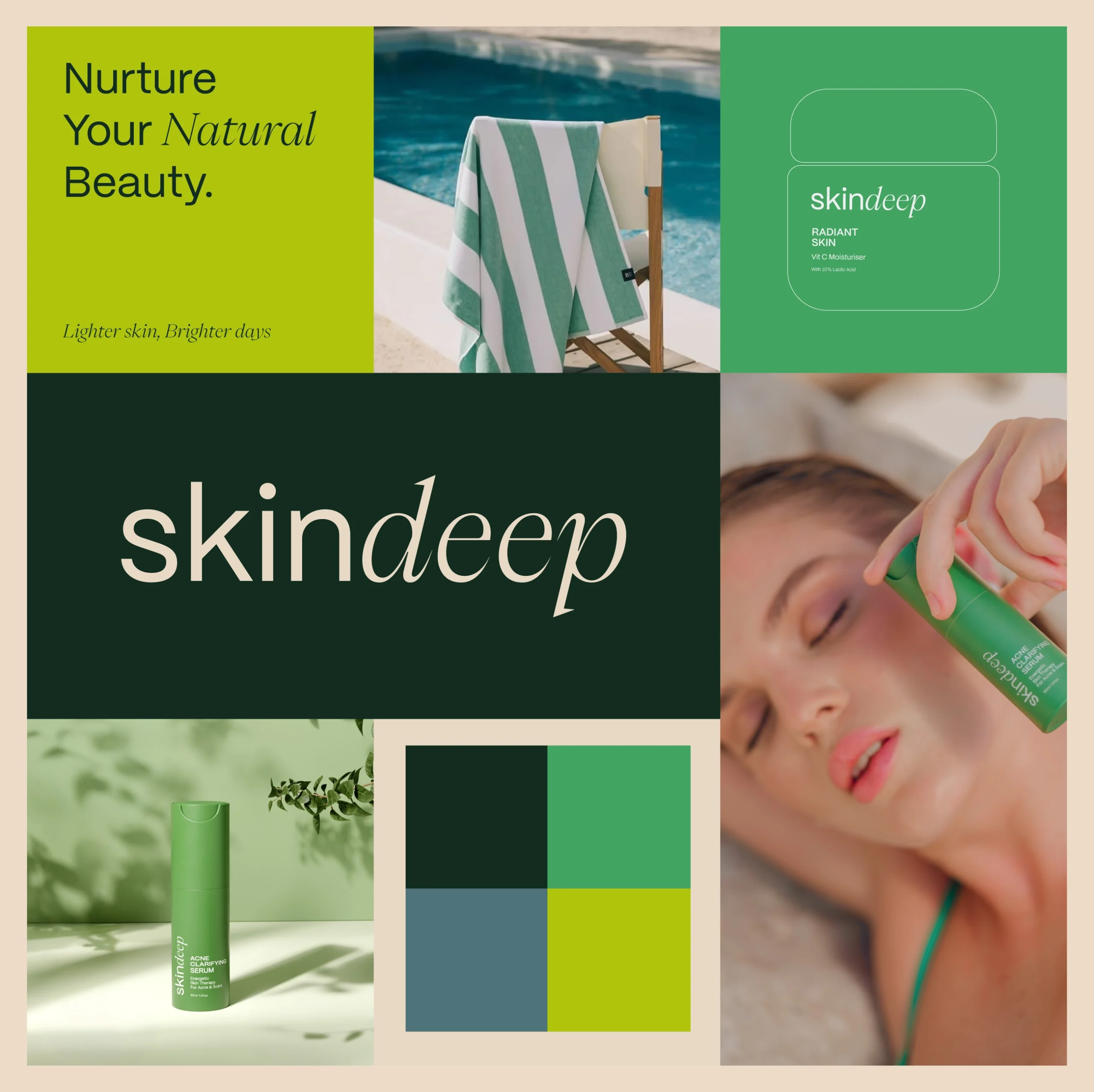
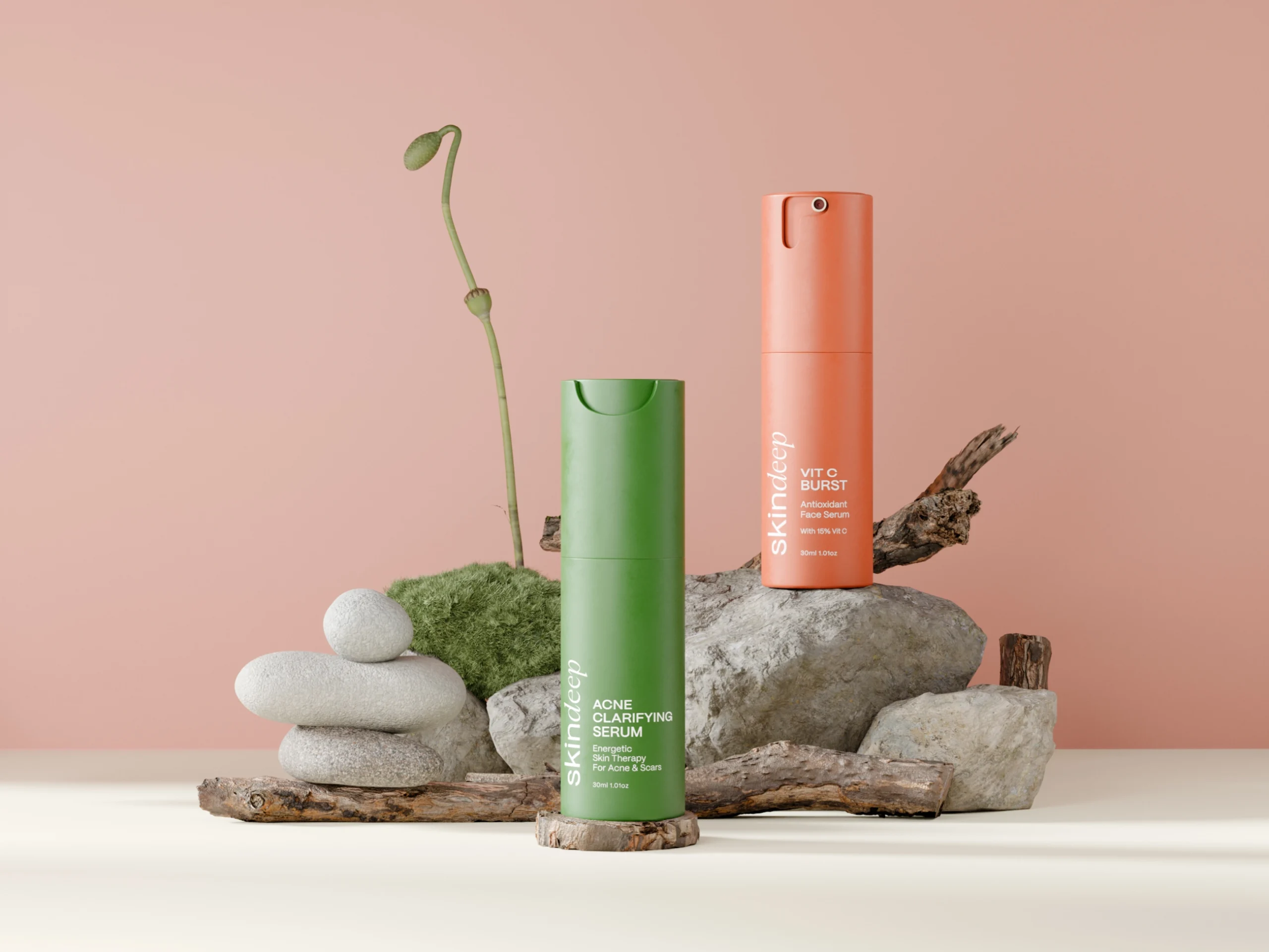
A refined serif typeface was chosen for the word “deep,” paired with a clean sans-serif for “skin,” creating a balance between elegance and modernity.
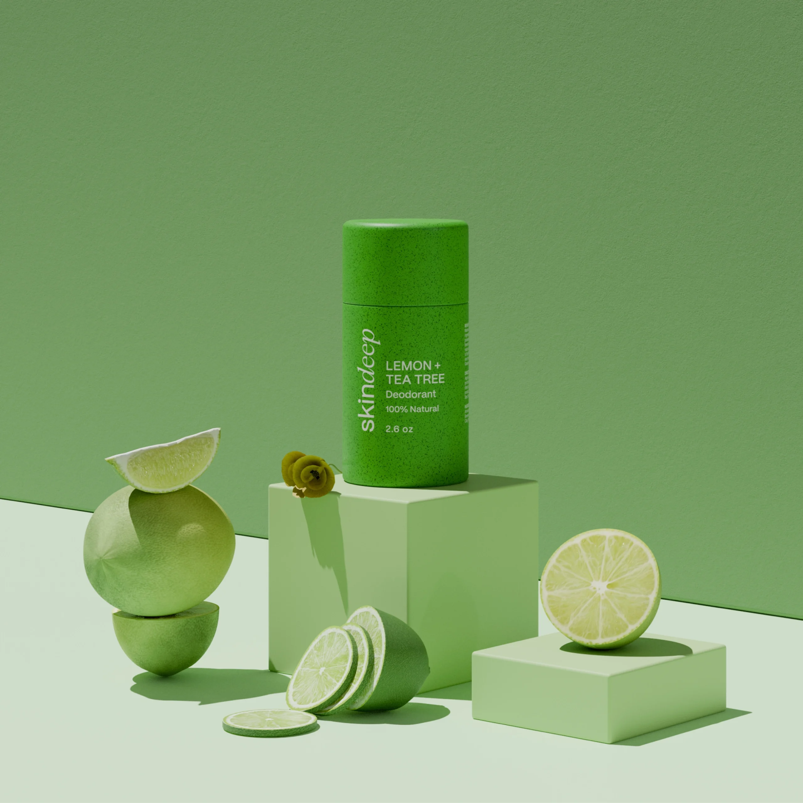
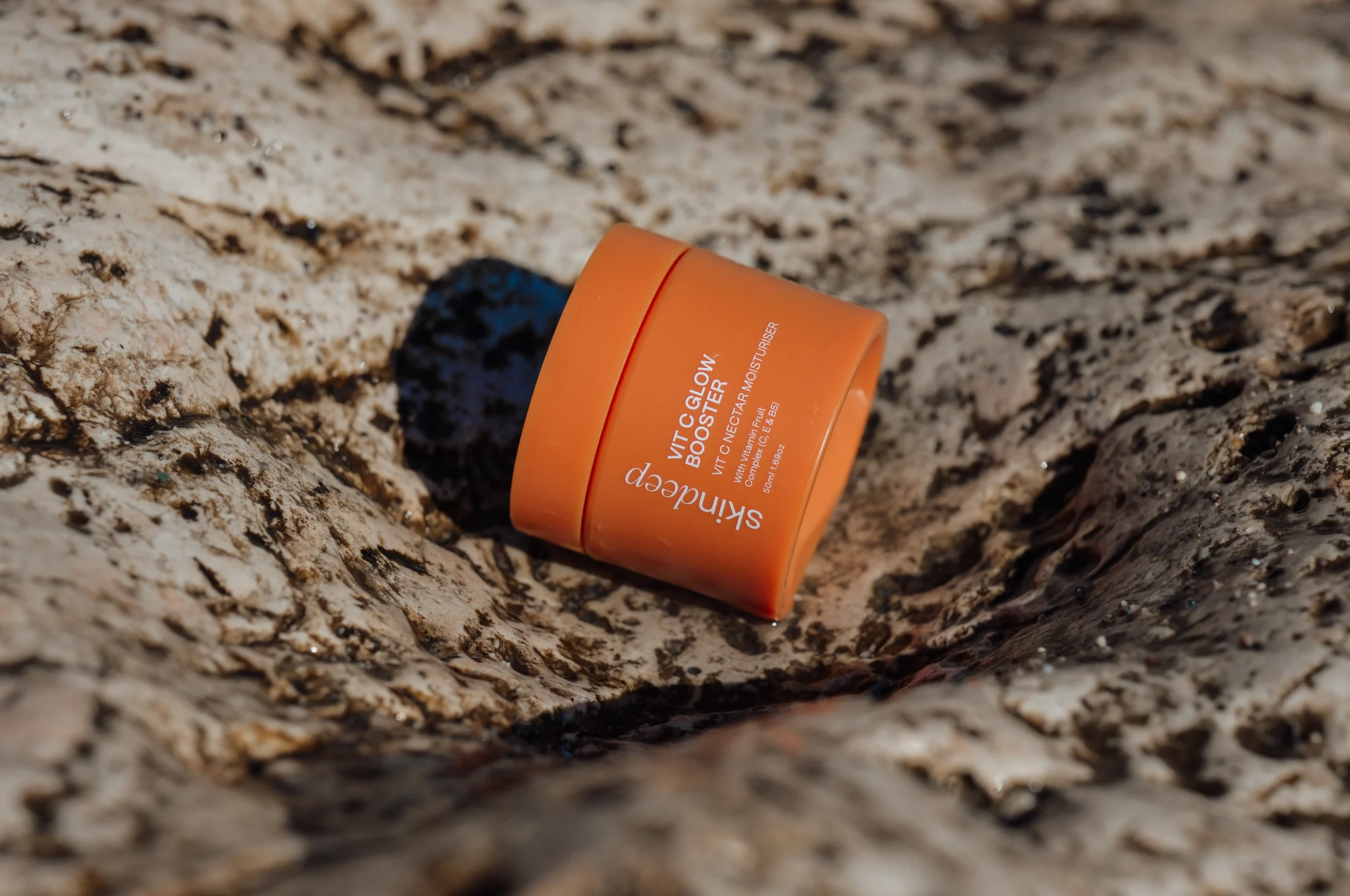
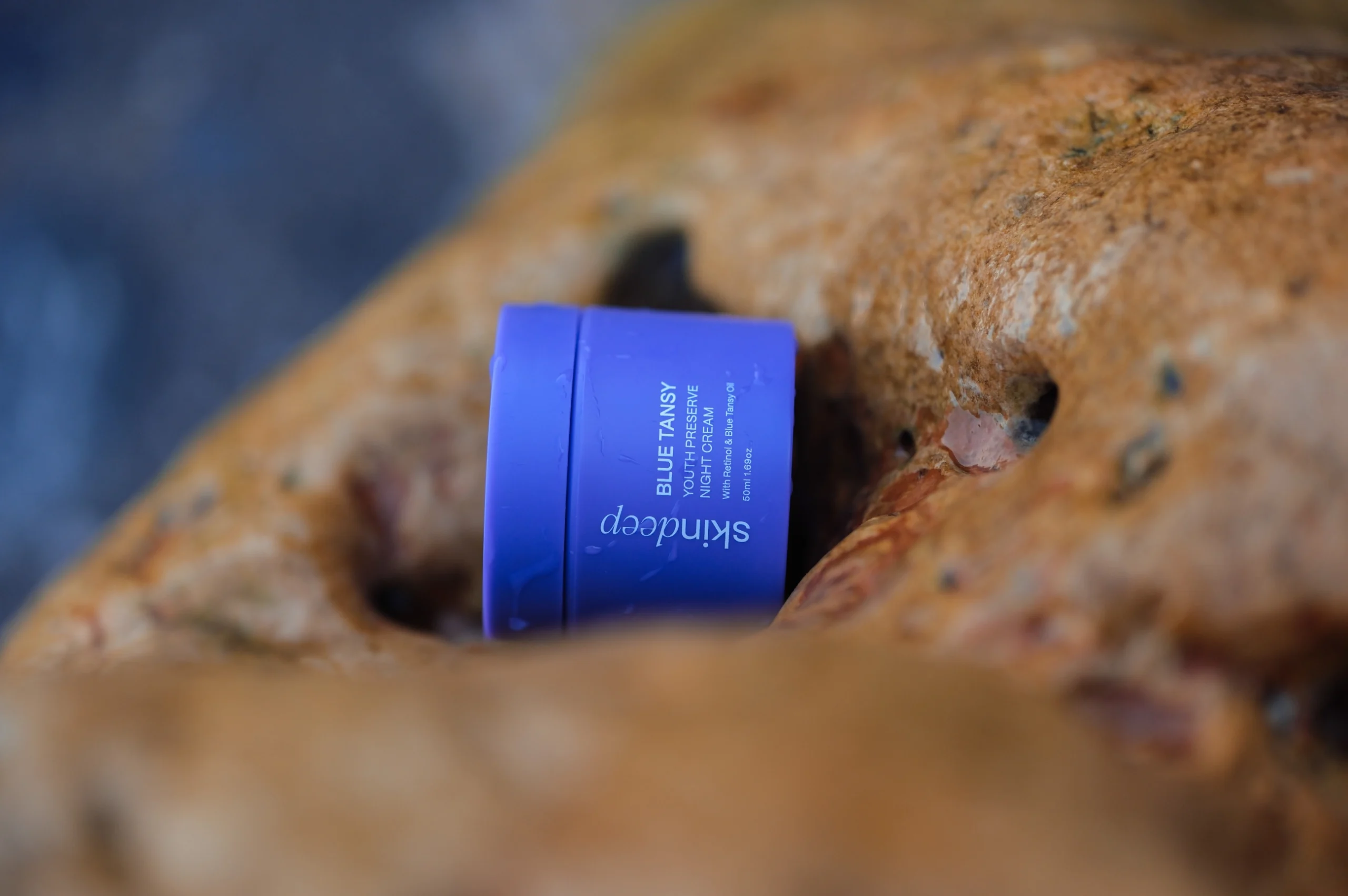
A deep green and beige color scheme was selected to reflect nature, purity, and tranquility, enhancing the brand’s organic essence.
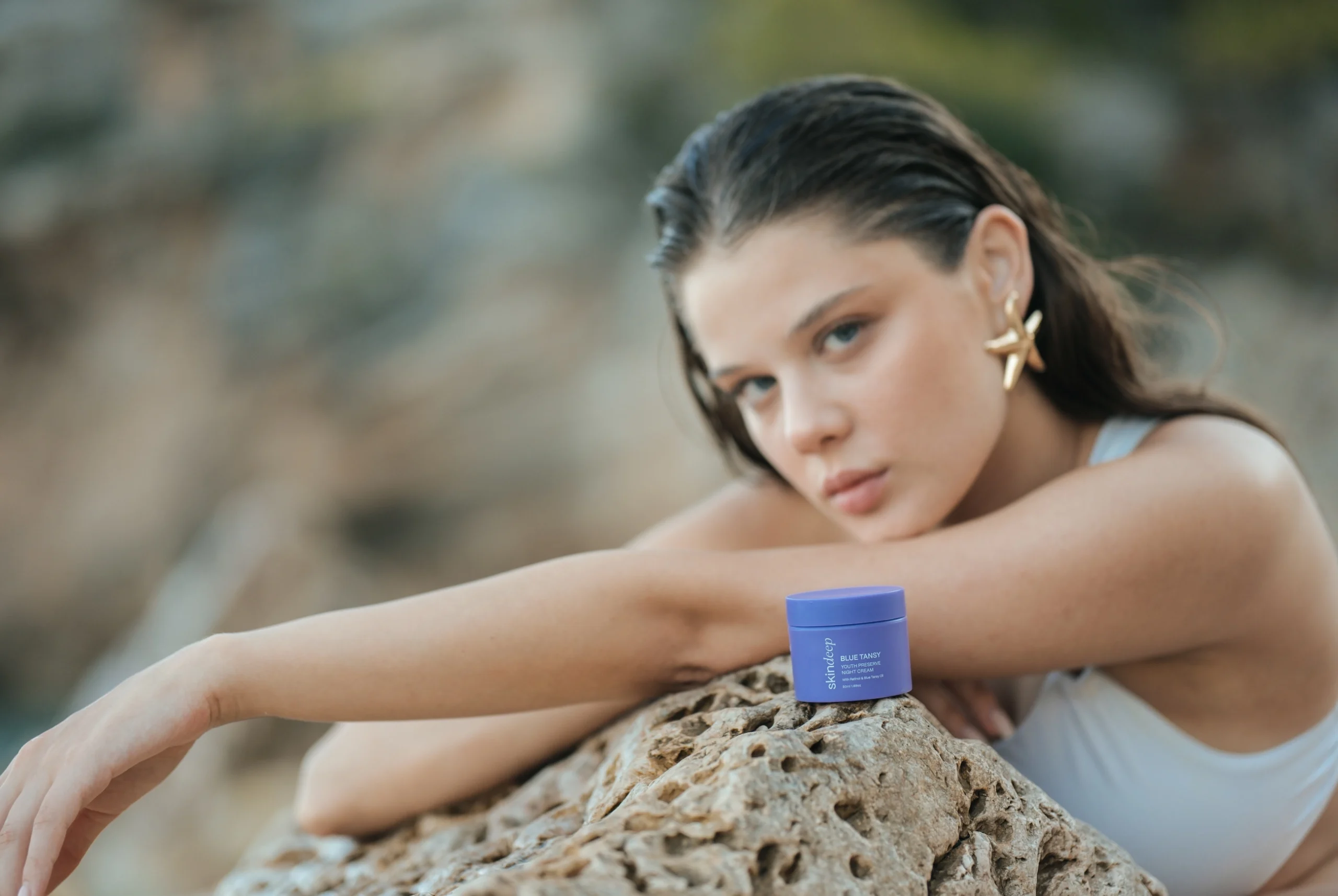
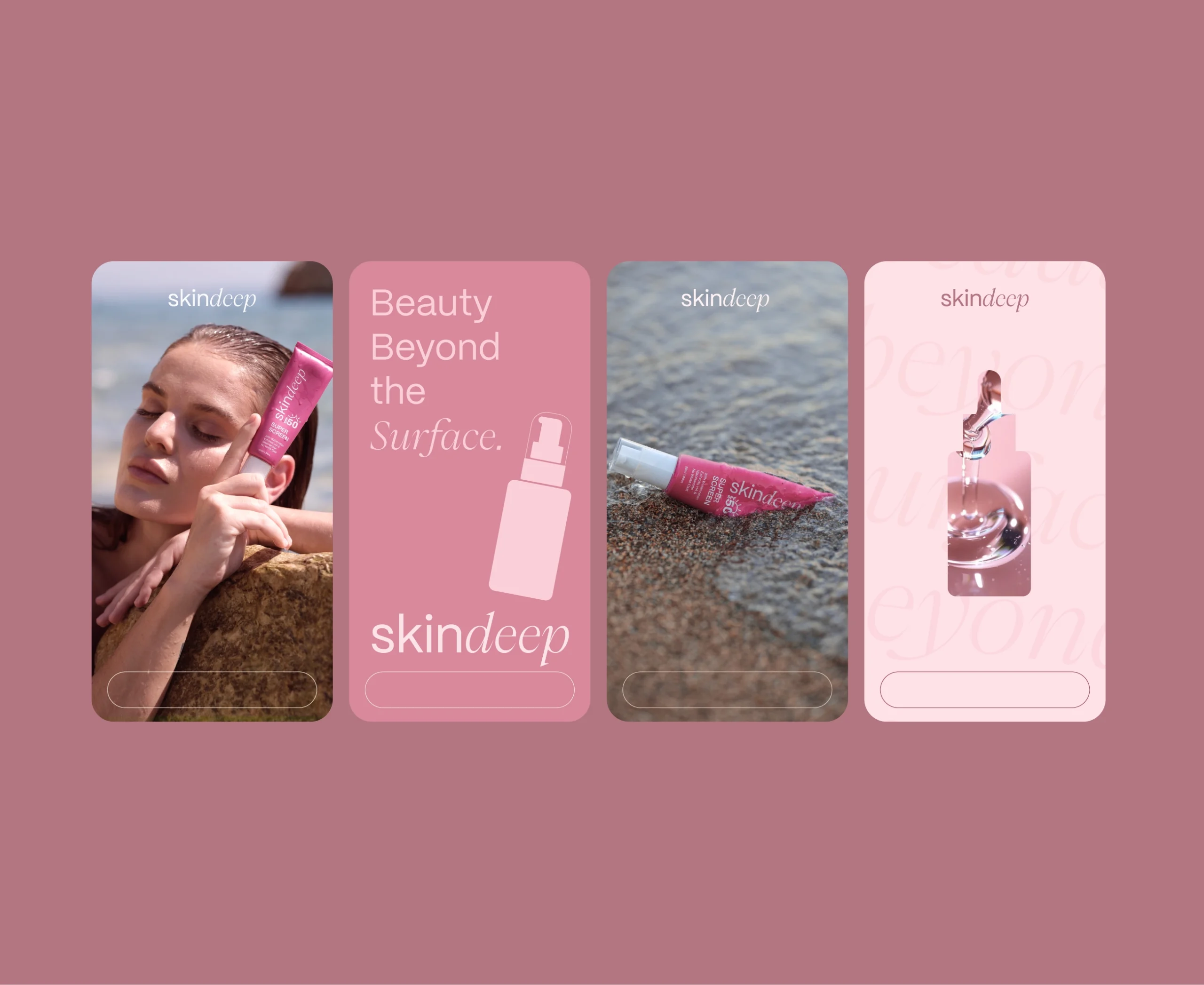
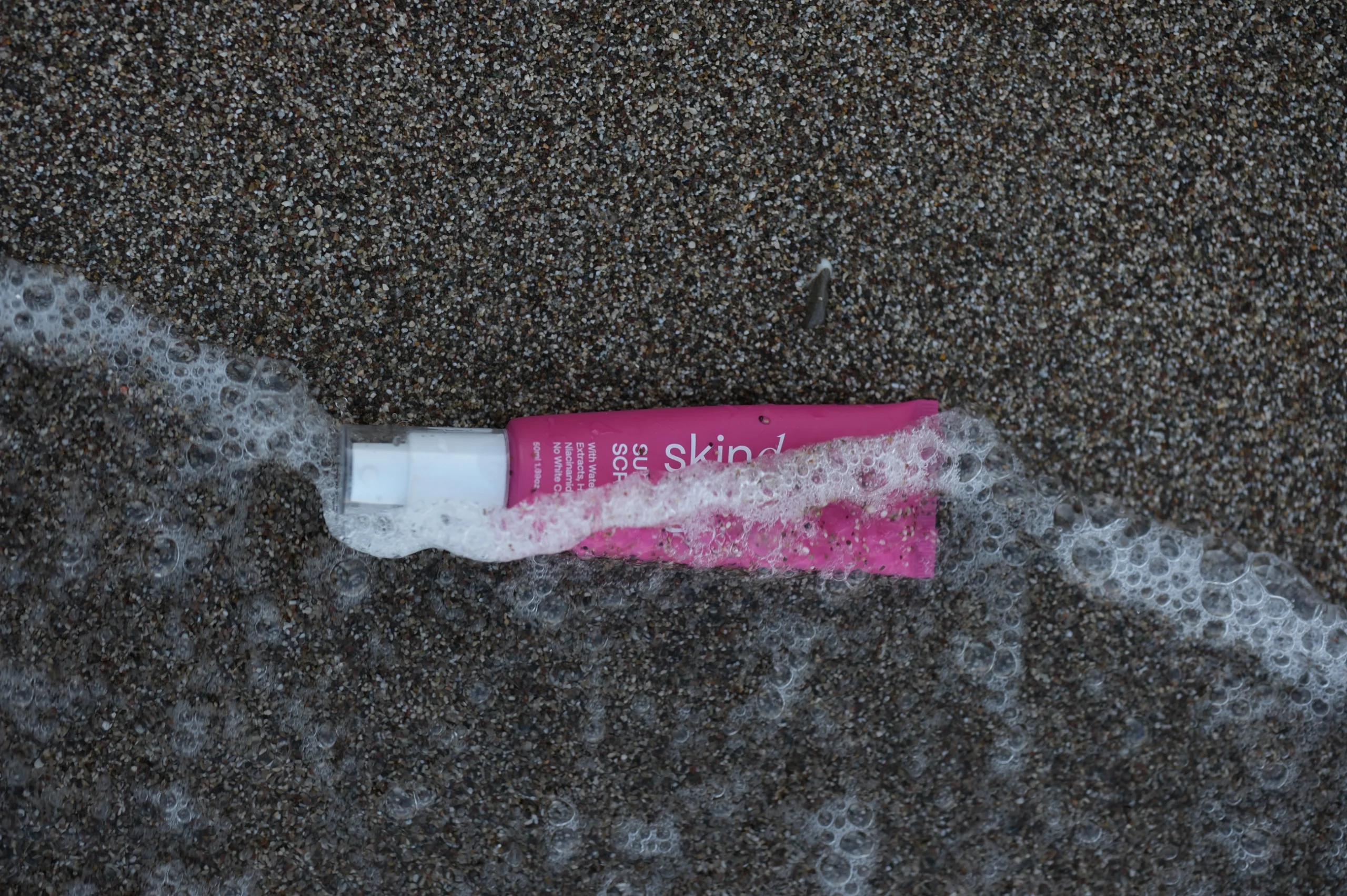
High-quality, natural imagery combined with soft lighting was incorporated to communicate a fresh and luxurious feel.


Let’s make the work they’ll copy.
Talk to an expert now
Work with a 35+ team of the
industry’s top 1% talent.


