The Supreme Roastering Co.
upscale coffee, vintage soul
The Supreme Roastering Co. is San Francisco’s newest coffee destination, offering an upscale experience that artfully blends vintage charm with modern minimalism. MARKAWORKS crafted a brand identity that speaks to discerning coffee lovers, inviting them into a world of rich flavors and captivating design.

Balancing Vintage and Minimal: A Coffee Brand Identity
Our approach for The Supreme Roastering Co. involved a careful blend of vintage and minimalist design principles. We aimed to create a brand that is both eye-catchy and upscale, resonating with its target audience through thoughtful typography, color palettes, and packaging design.
The Client & Keywords
The Supreme Roastering Co. is a coffee shop which is based in San Francisco, CA. They are targeting vintage lovers, but at the same time, they want the brand to be minimal. Keywords: Vintage / Minimal / Vivid / Eye-catchy / Upscale


The Solution: Typography and Secondary Marks
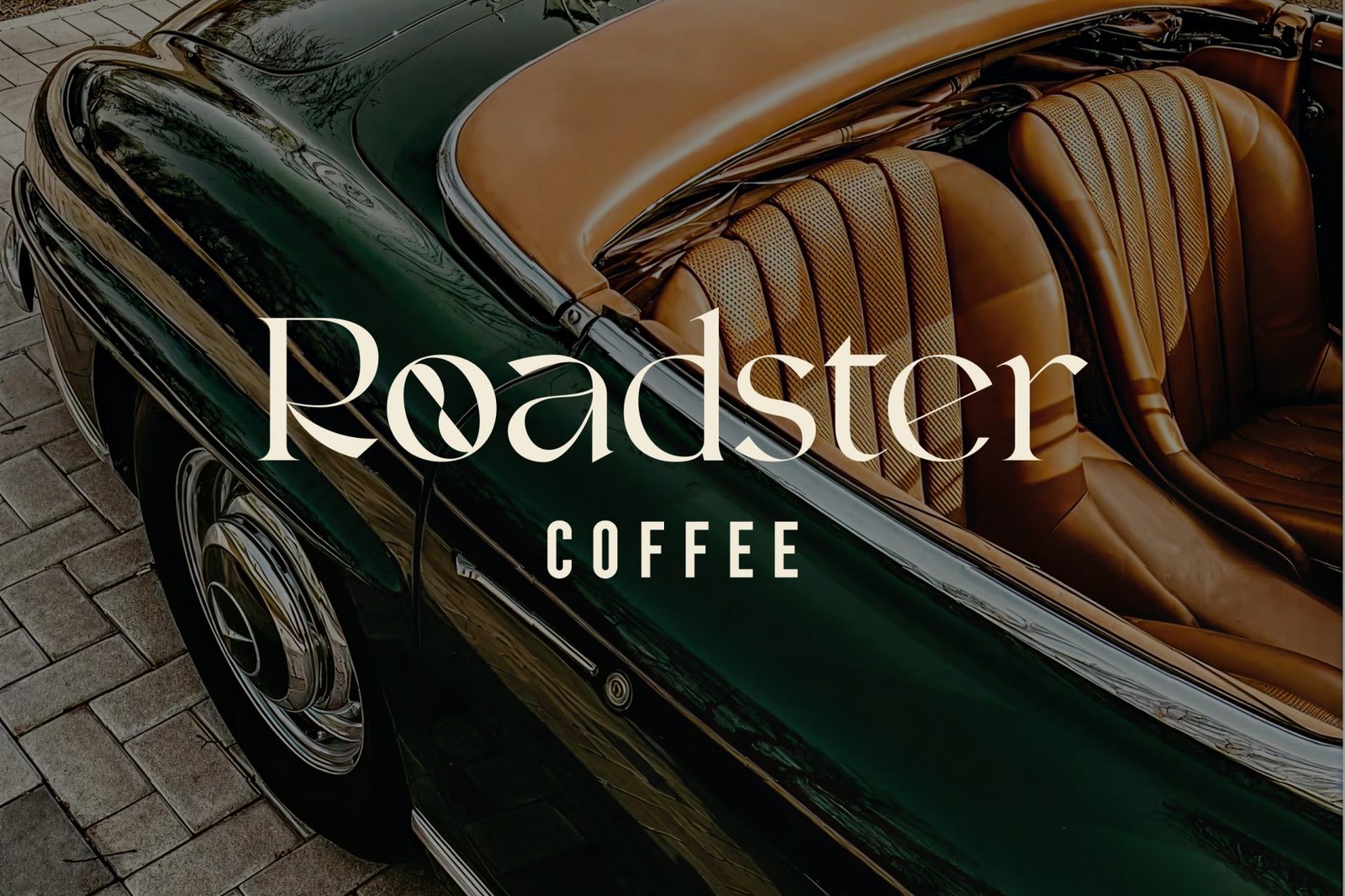
For the vintage look, we decided to go with an old-style script font for the “The Supreme” logotype. However, we picked a minimal and monospaced font type for the “Roasting Co.”. Additionally, we have also designed a multiple choice of secondary marks, which can be used and applied for any surface and purpose.


Color Palette and Patterns
The inspiration for the colour board comes from coffee beans and mainly consists of shades of green, neutral colours and orange. Also, this colour combination gives an association with the old-styled logos, which always included a shade of orange. As for the pattern, we created two different patterns. One of them is a chess-like pattern, and the second pattern is a striped design.


Coffee Package Design
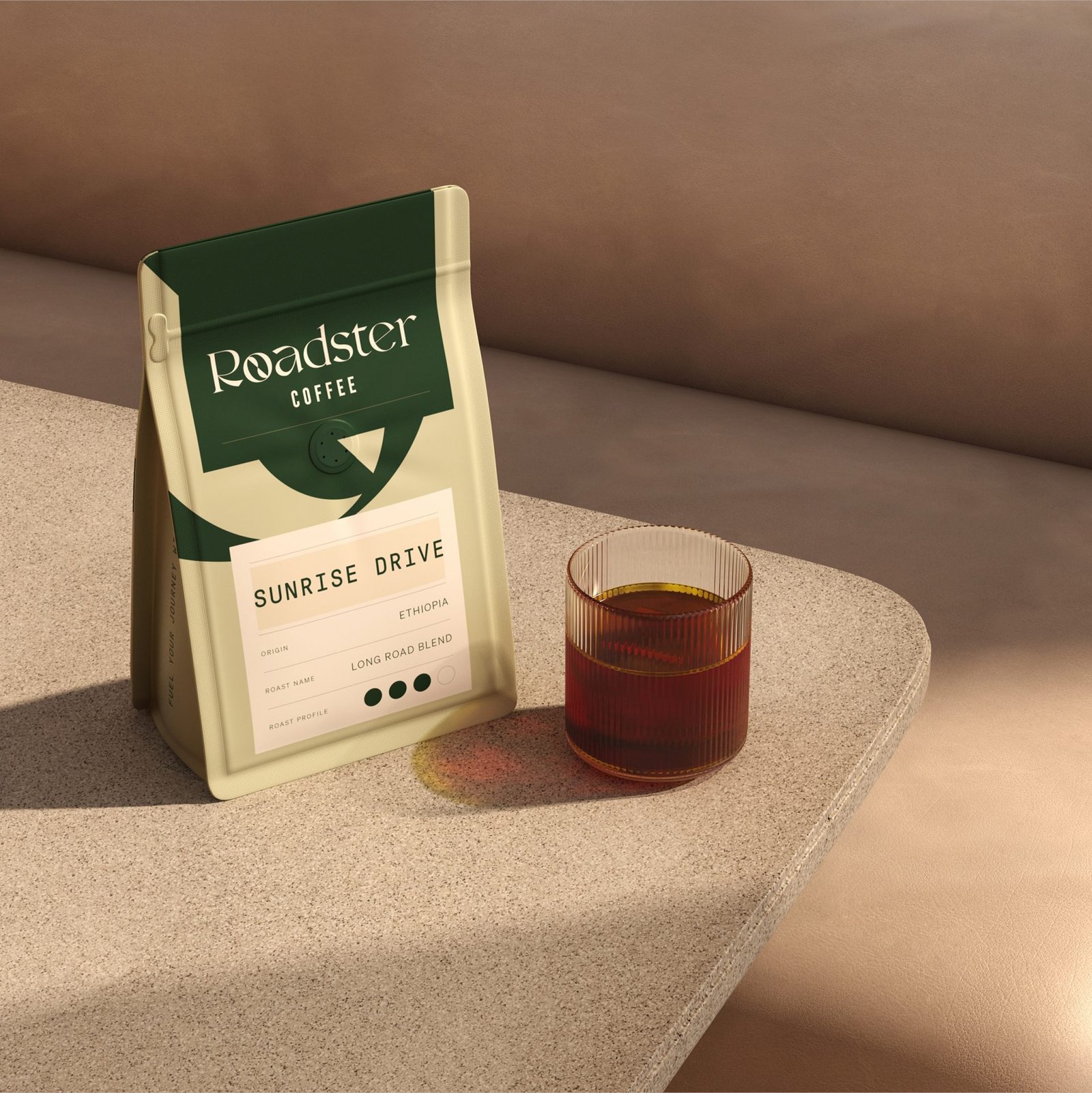
We created six coffee packages that have similar designs but different layouts. To show the difference and uniqueness of each product, we used two main patterns differently by enlarging, downsizing, and rotating them in multiple variations. The upper part is fully dark green with a logo on it, and the bottom part is patterned with a label on top of it with the flavour, name, and the rest of the information about coffee.


Cold Brew Cans and Coffee Cups
In addition to coffee packages, we have designed cold brew coffee cans and coffee cups. Cold brew cans are simpler and only come in two colors. The pattern is placed on the label as a small square with the secondary element.


Let’s make the work they’ll copy.
Talk to an expert now