Thrive
affirmative well-being through cbd
Thrive, developed by MARKAWORKS, is a CBD brand designed to instill confidence and well-being through its sophisticated, minimalist aesthetic. Its essence is captured in a visual identity that speaks volumes of class and affirmation, offering a premium and trustworthy experience.
A Holistic Approach to CBD Brand Development
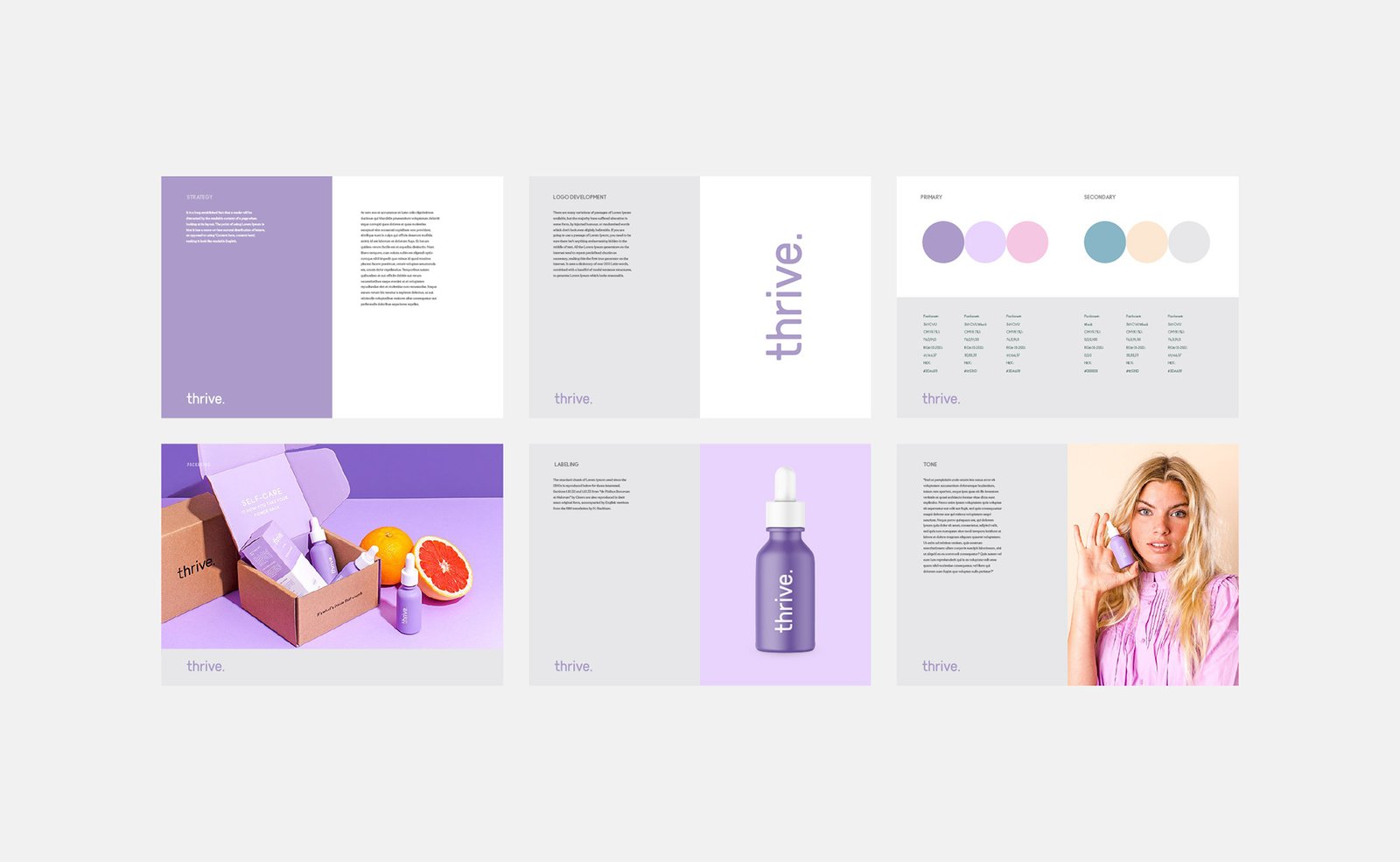
Our comprehensive branding strategy for Thrive focused on translating their core values of confidence, class, and affirmation into a minimalist and impactful visual identity.
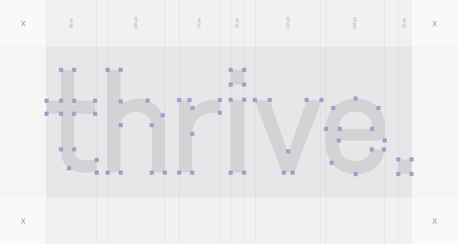
Defining the Essence: Brand Vision & Strategy
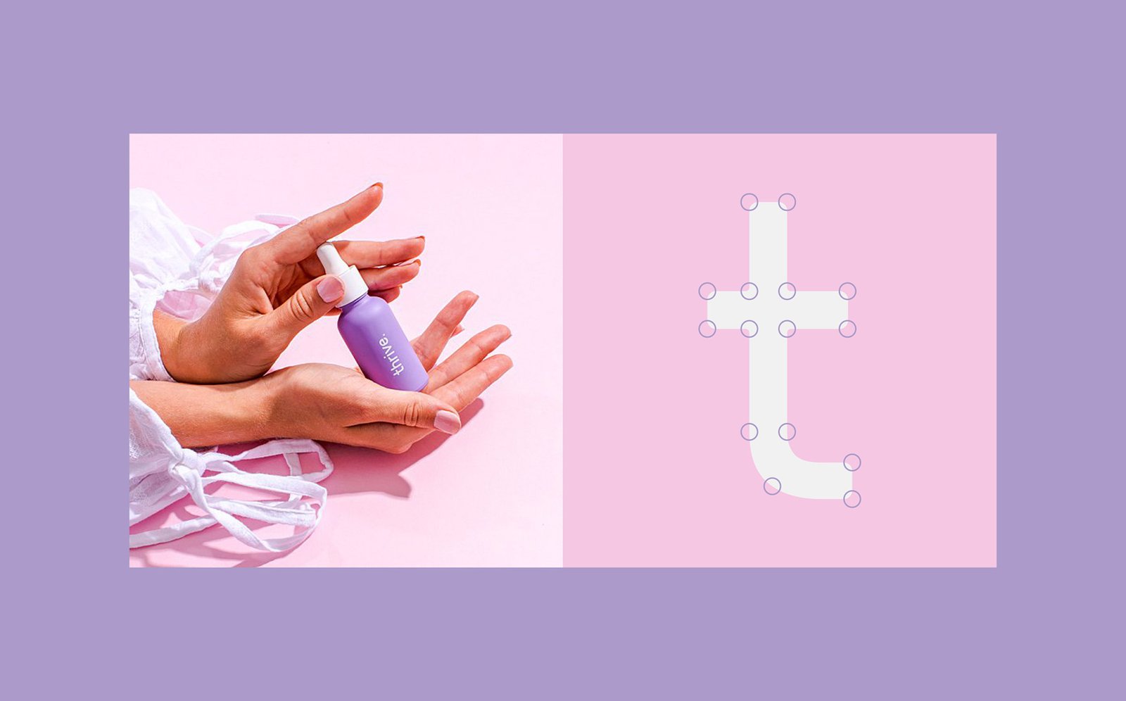
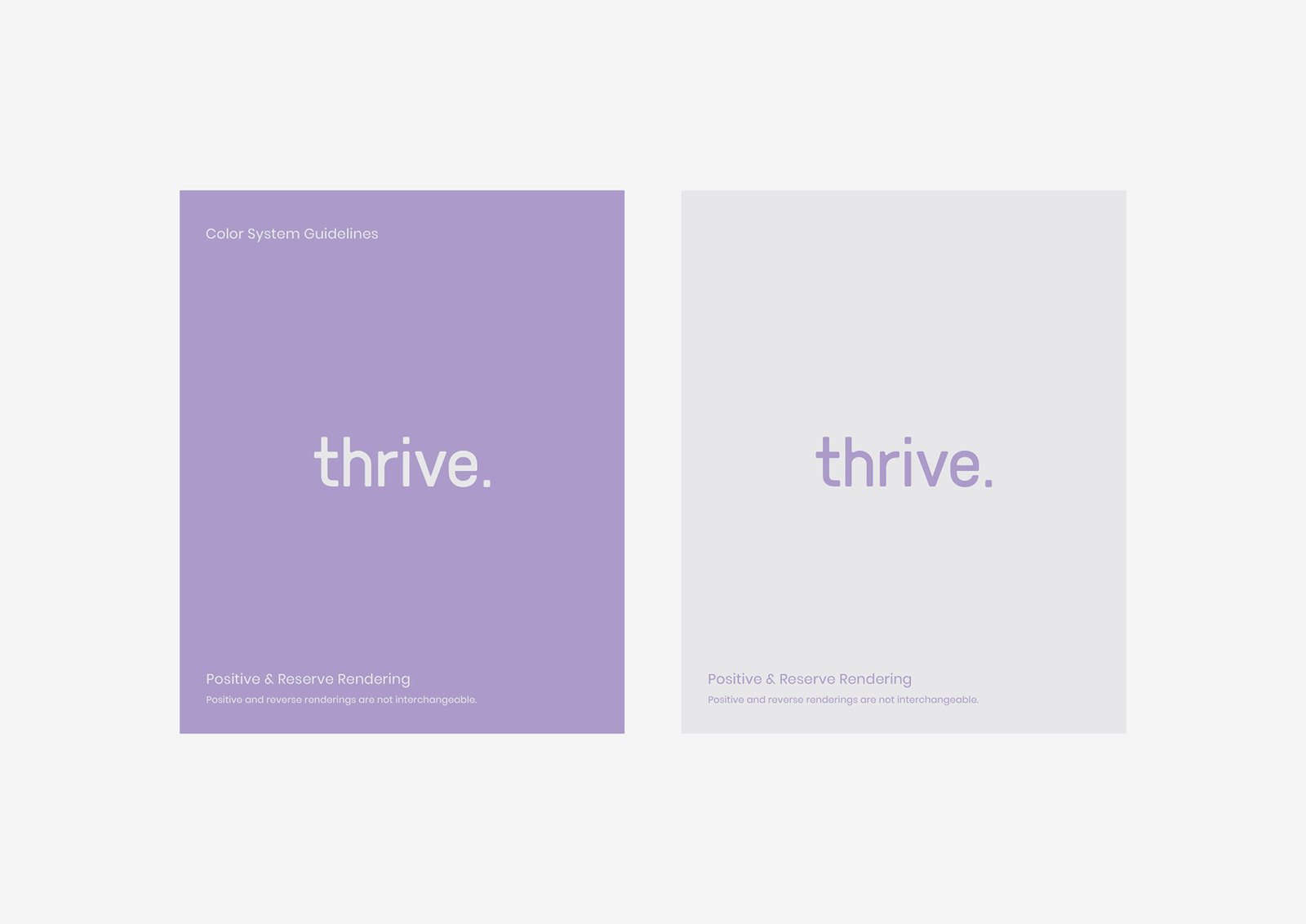
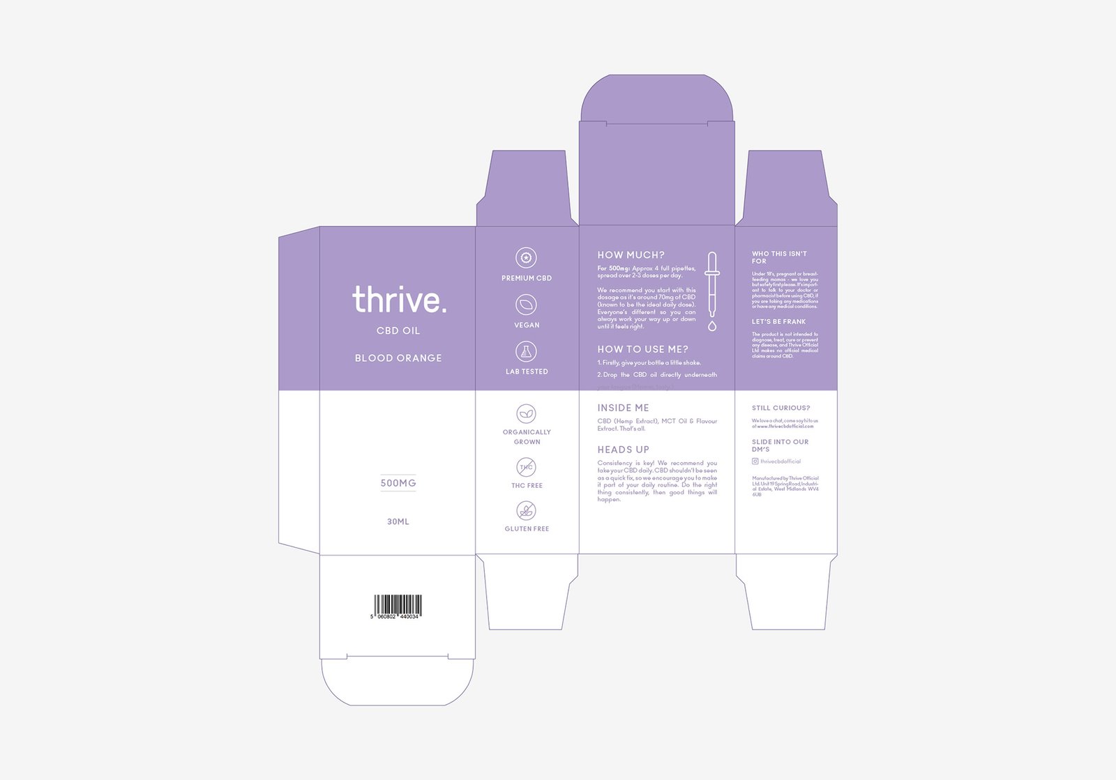
The main idea of the founders was to create classy, minimal and, at the same time, affirmative branding for their products. That’s why we decided to go with a Sans Serif font type with soft edges and put a dot at the end of the logo for a stronger affirmative feel.
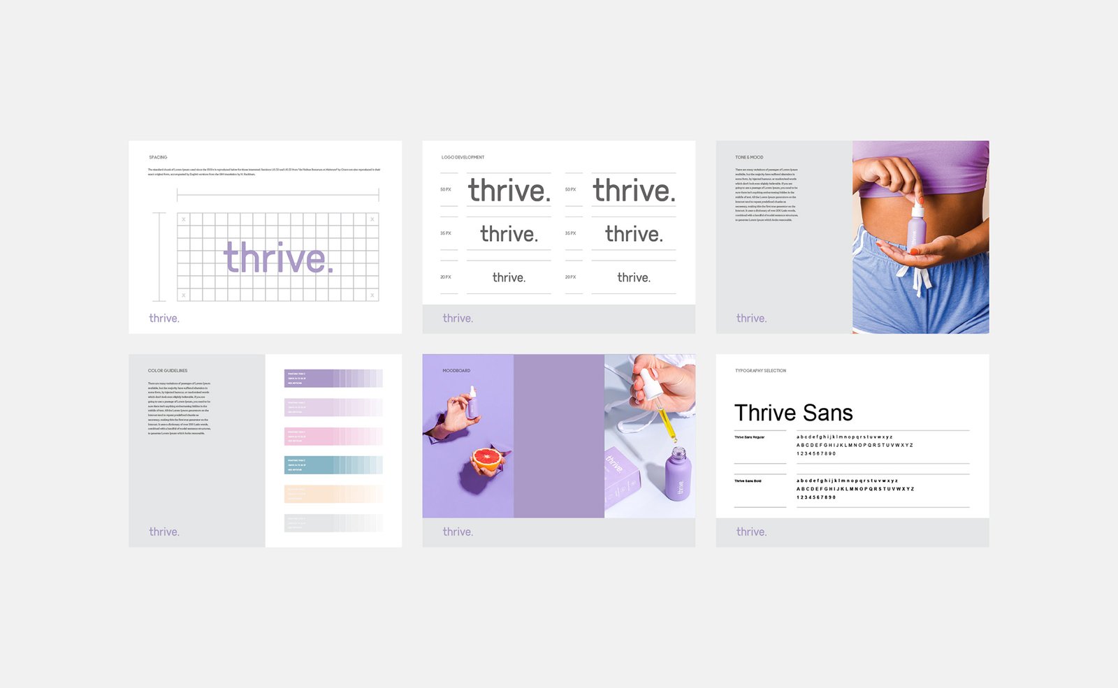
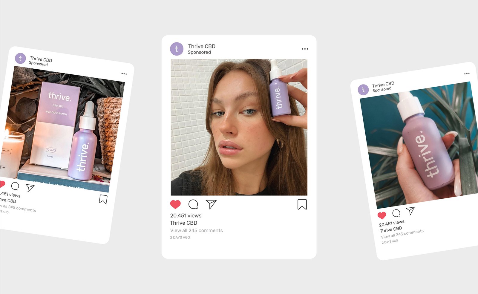
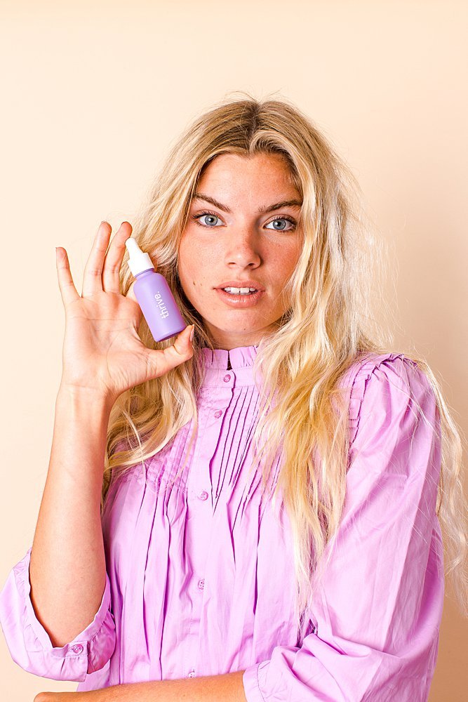
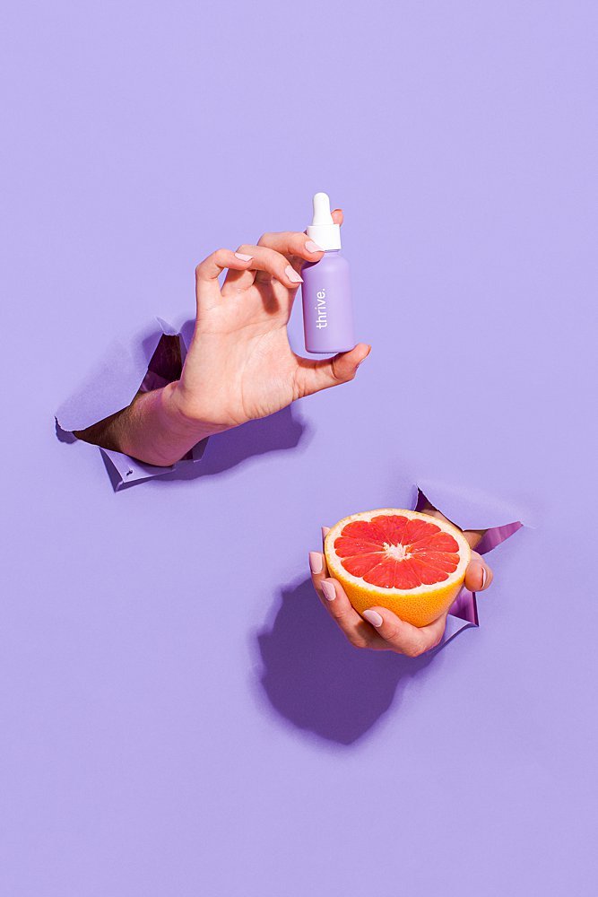
Crafting an Iconic Visual Identity
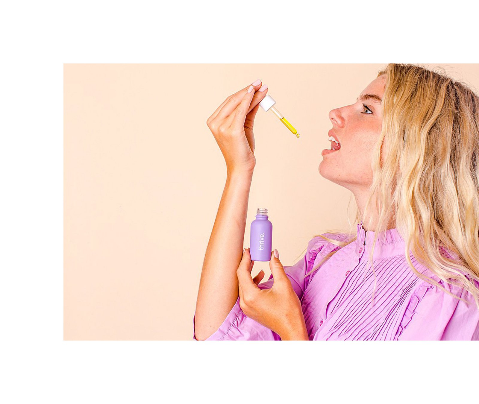
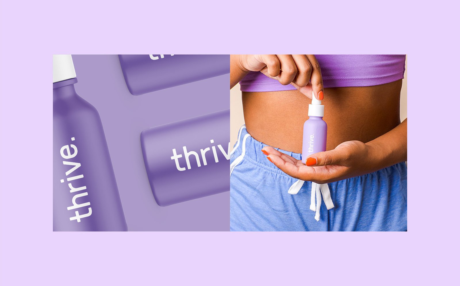
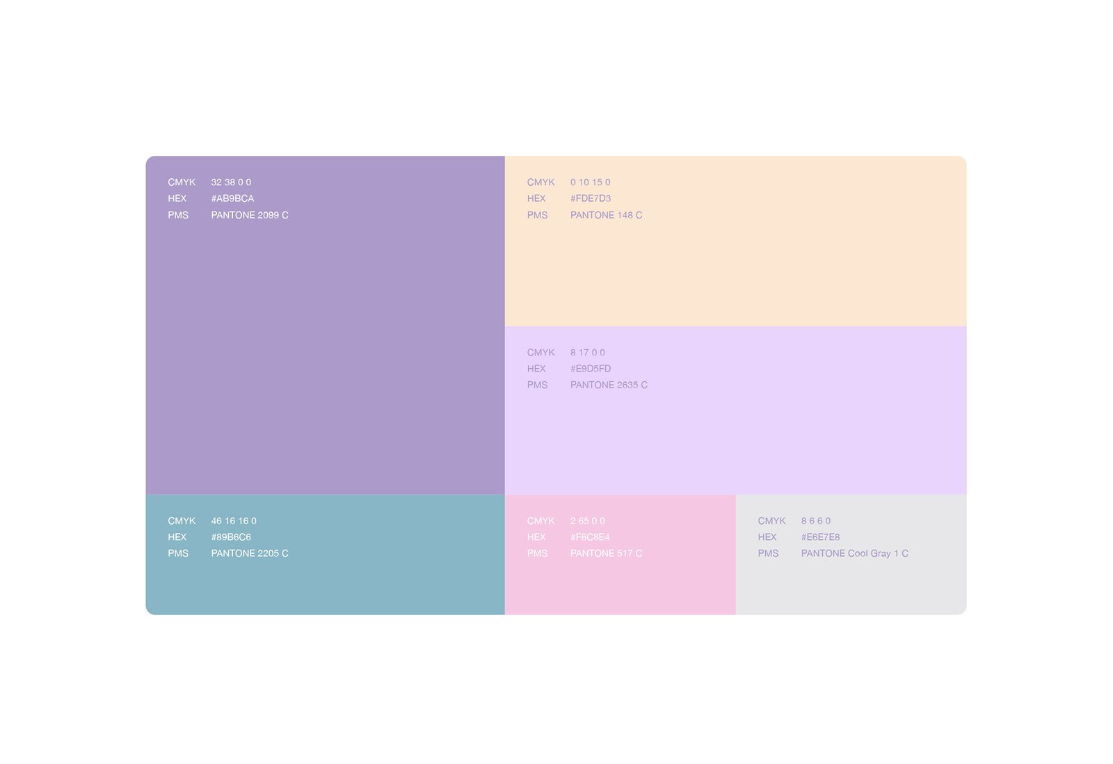
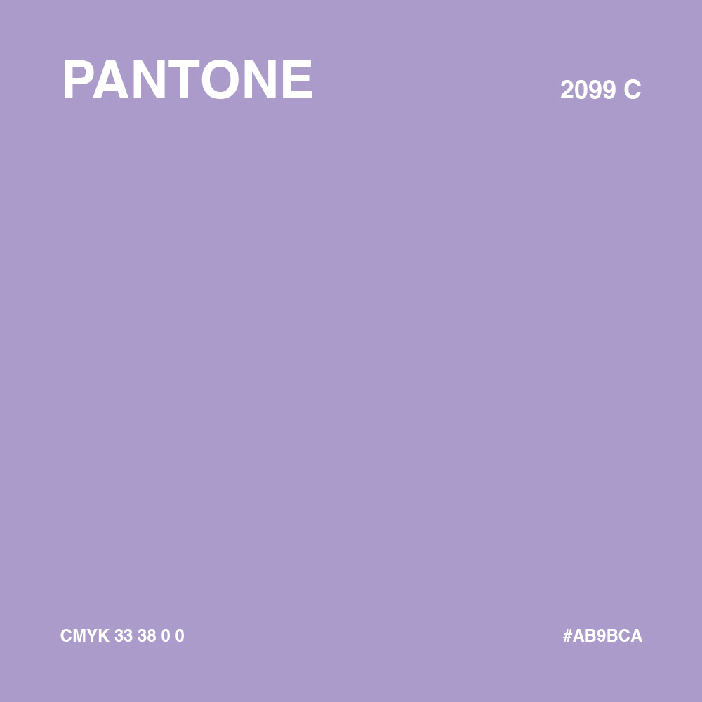
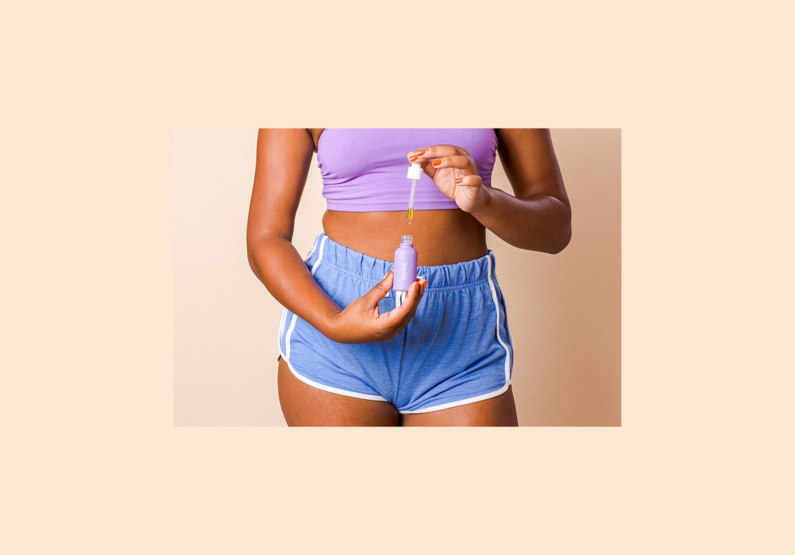
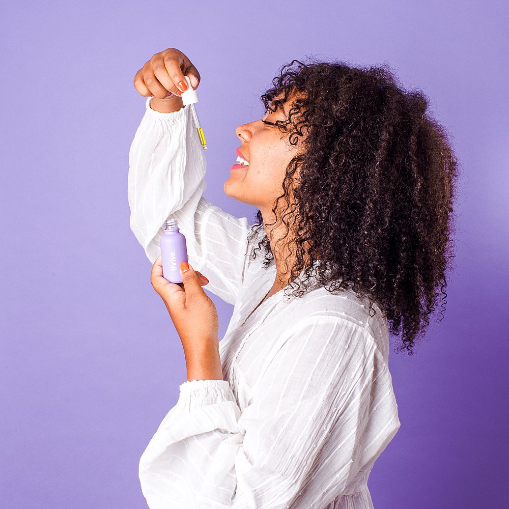
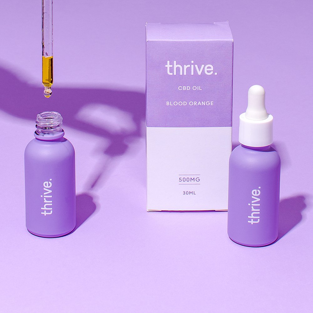
To create a friendly look, we selected soft pastel colors, which have an association with care, love, and trust.
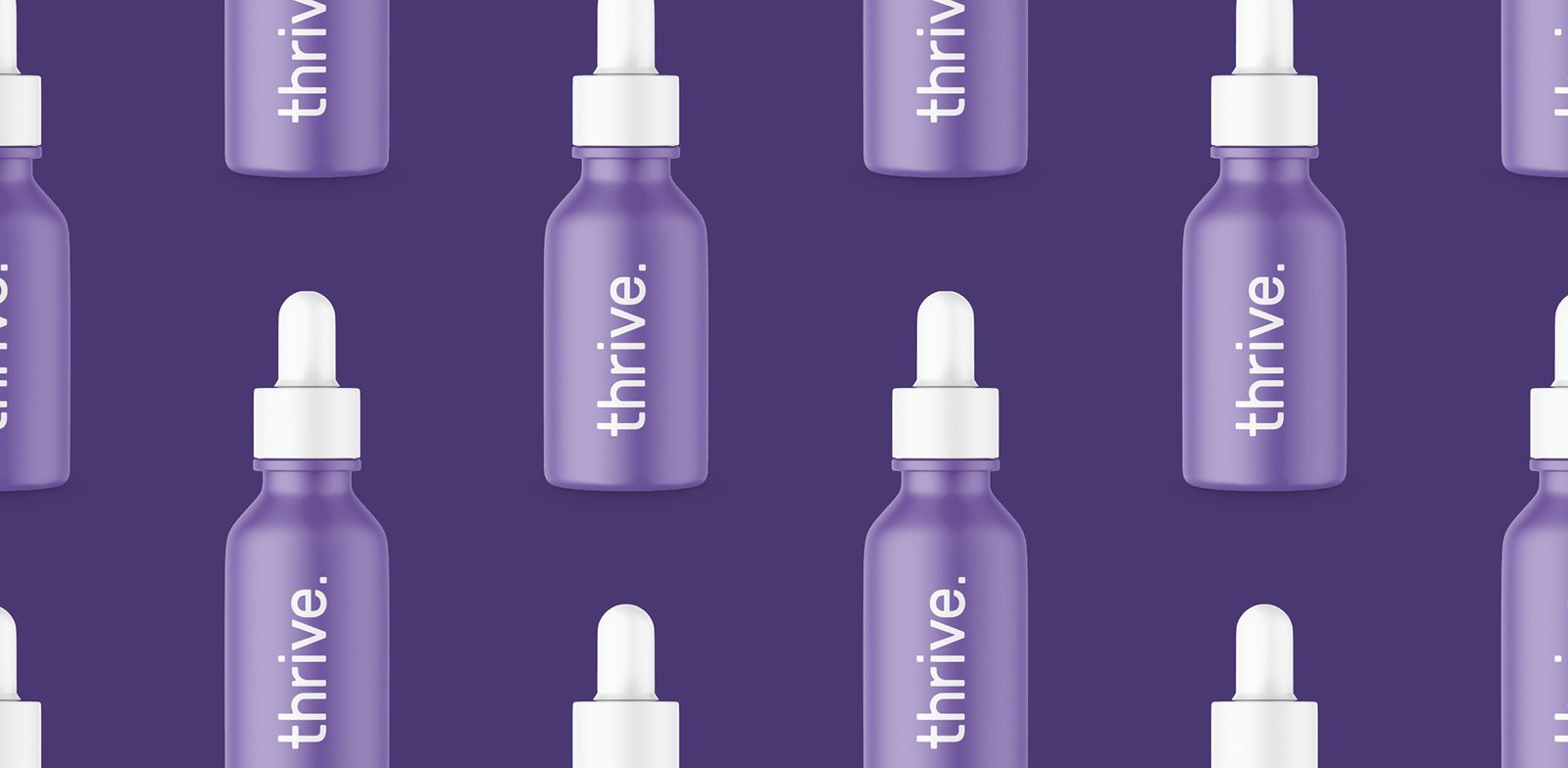
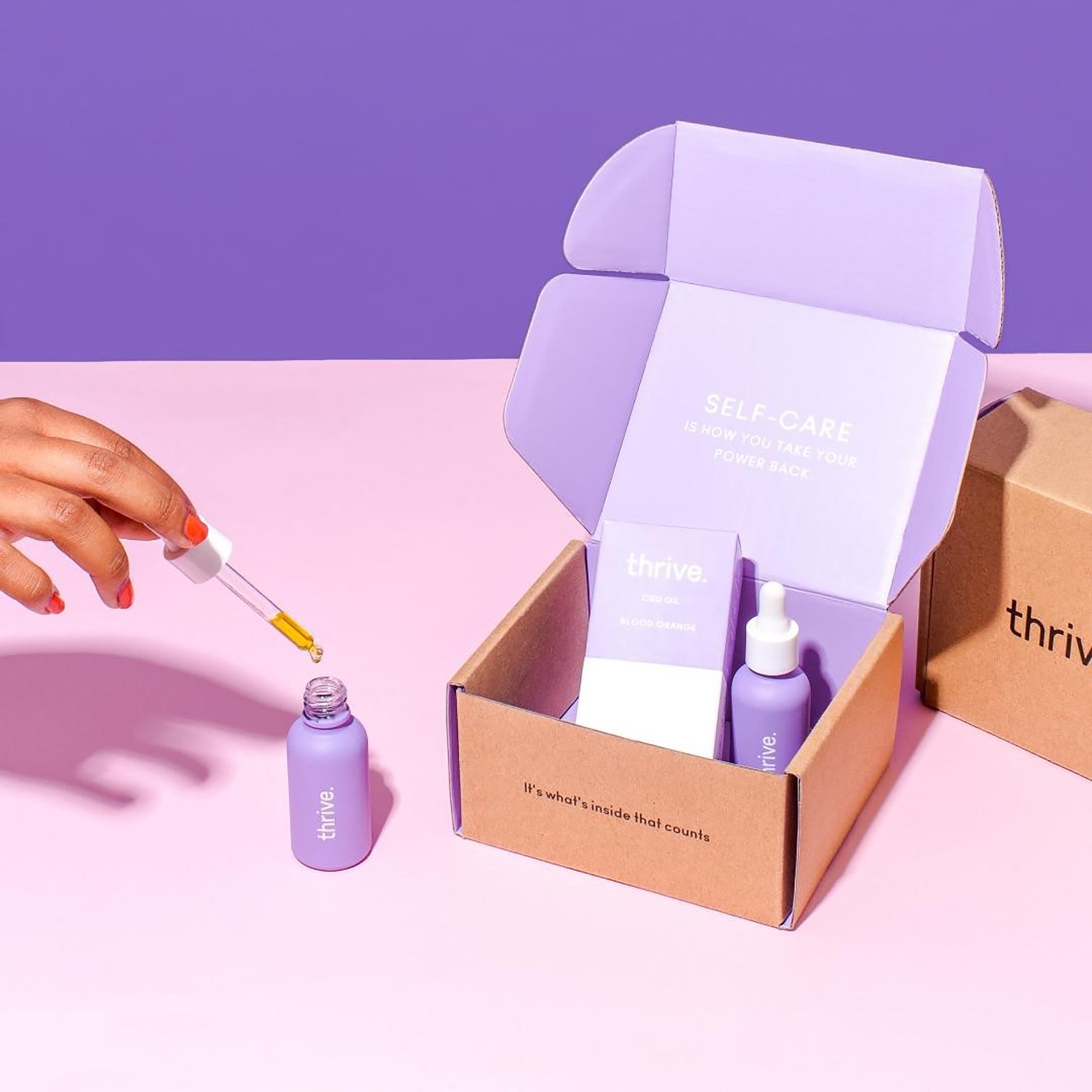
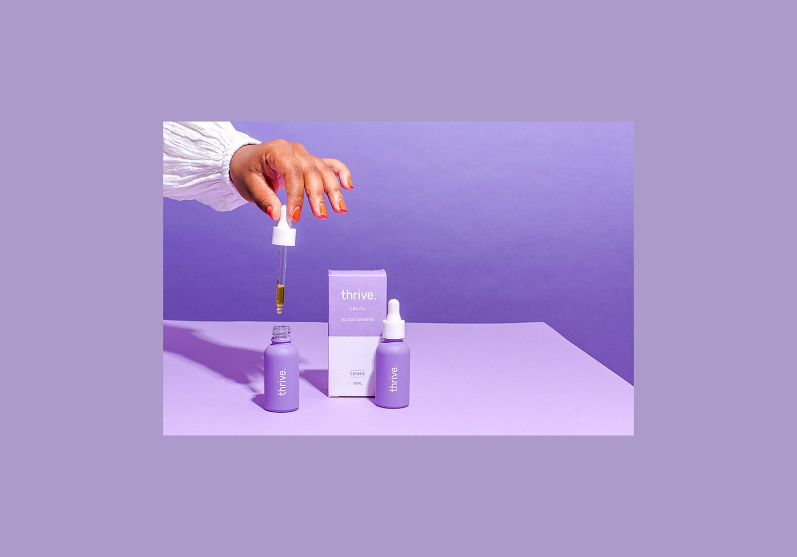
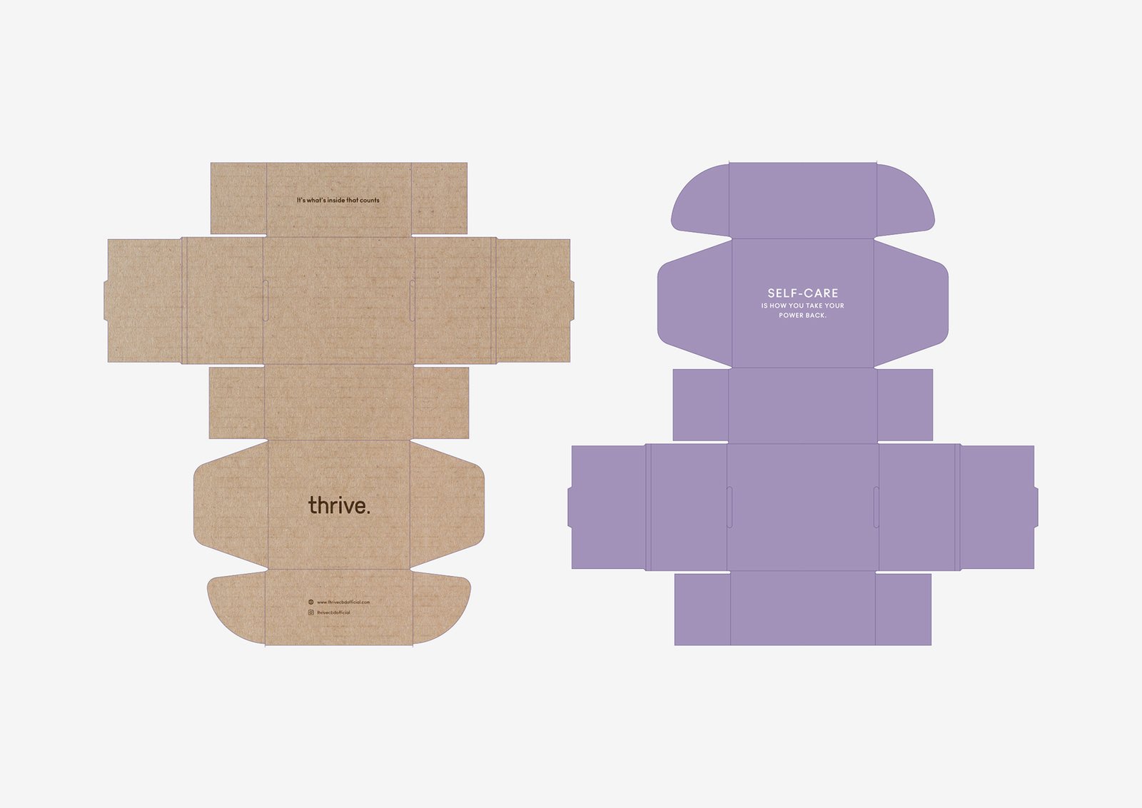
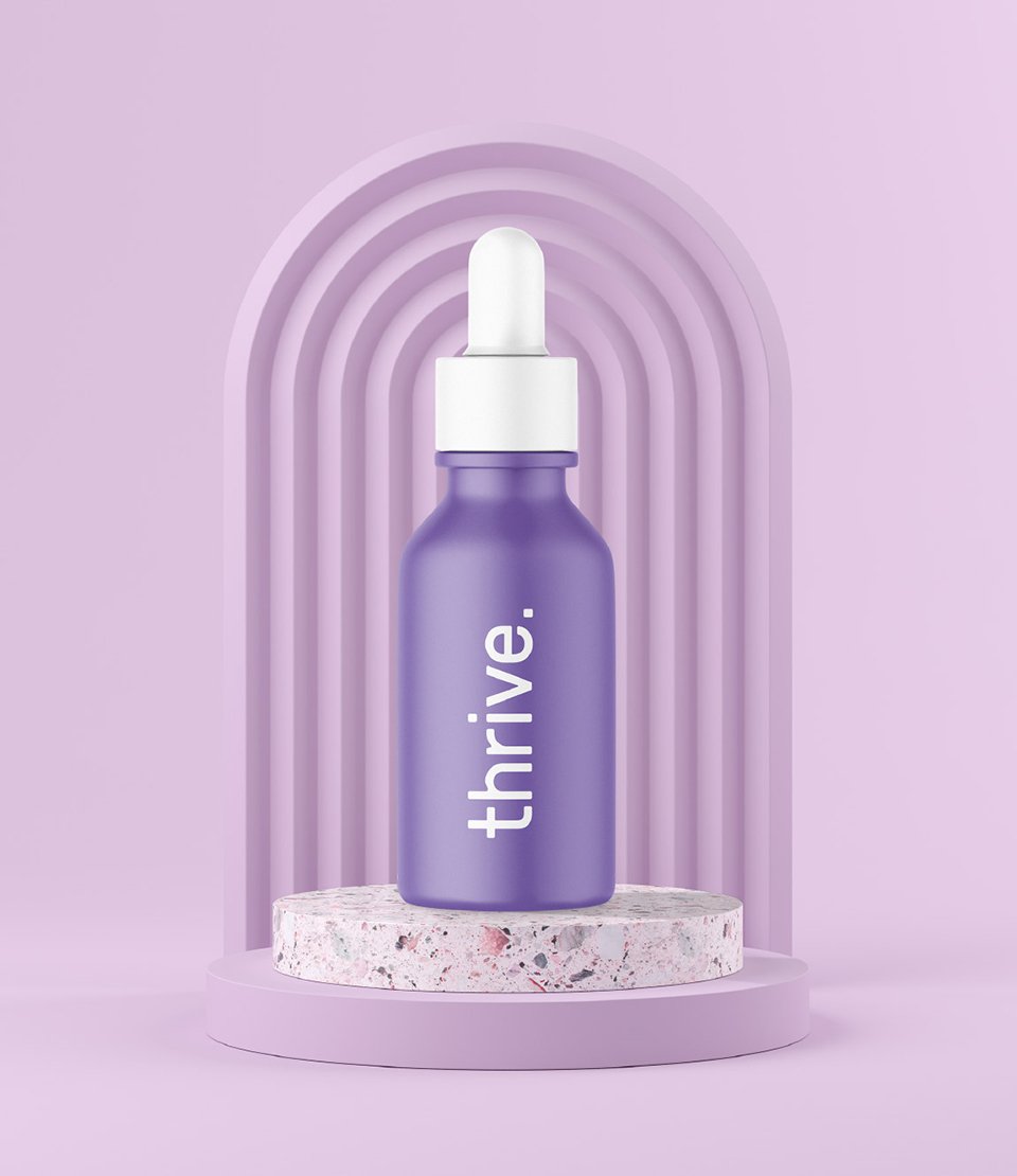
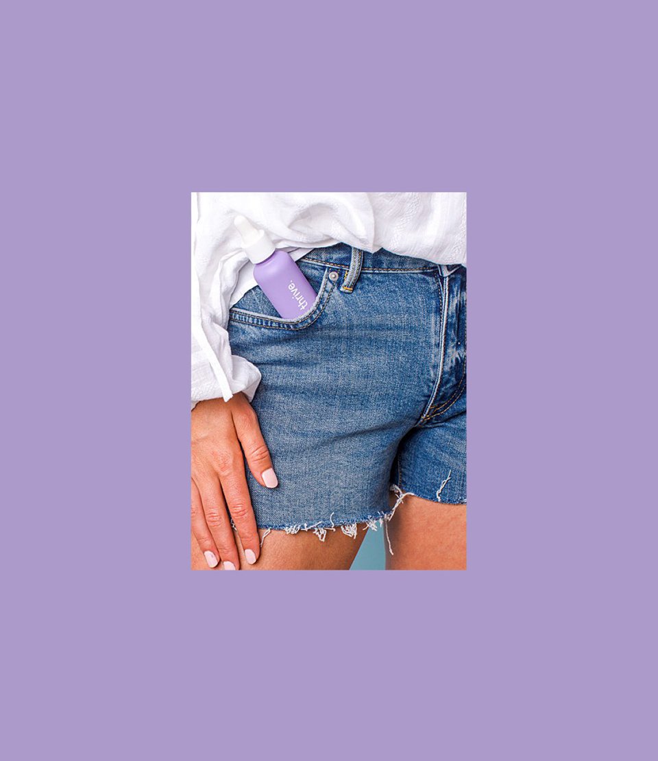
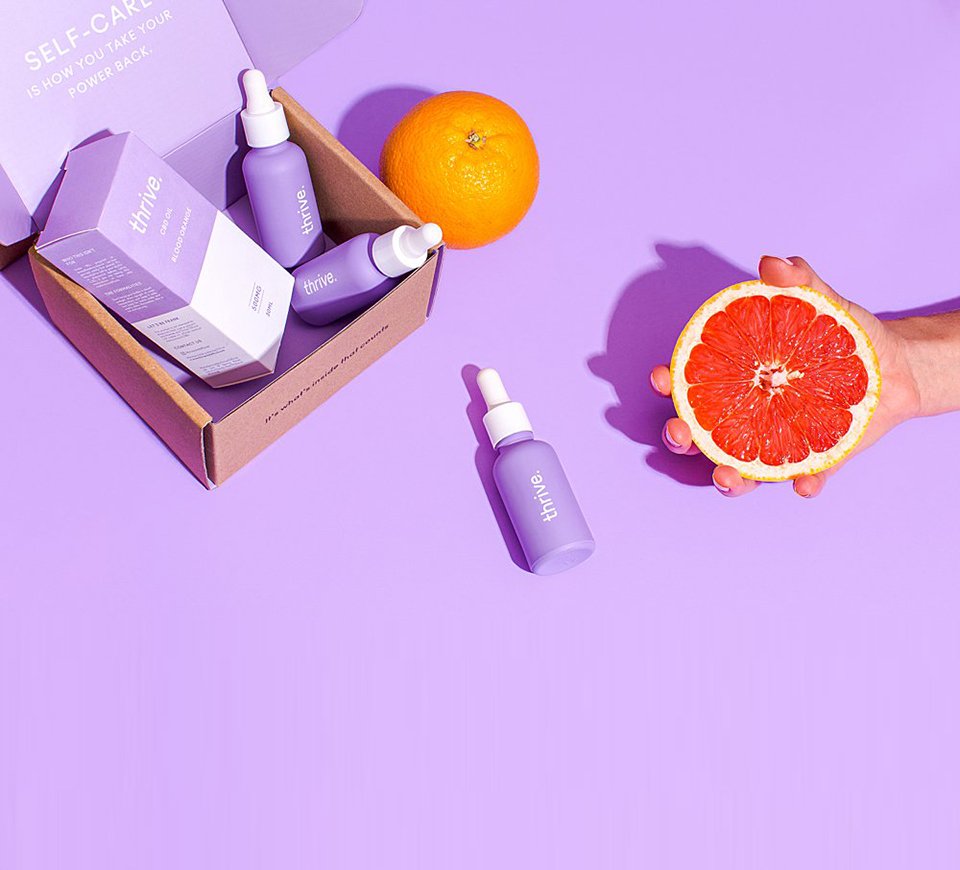
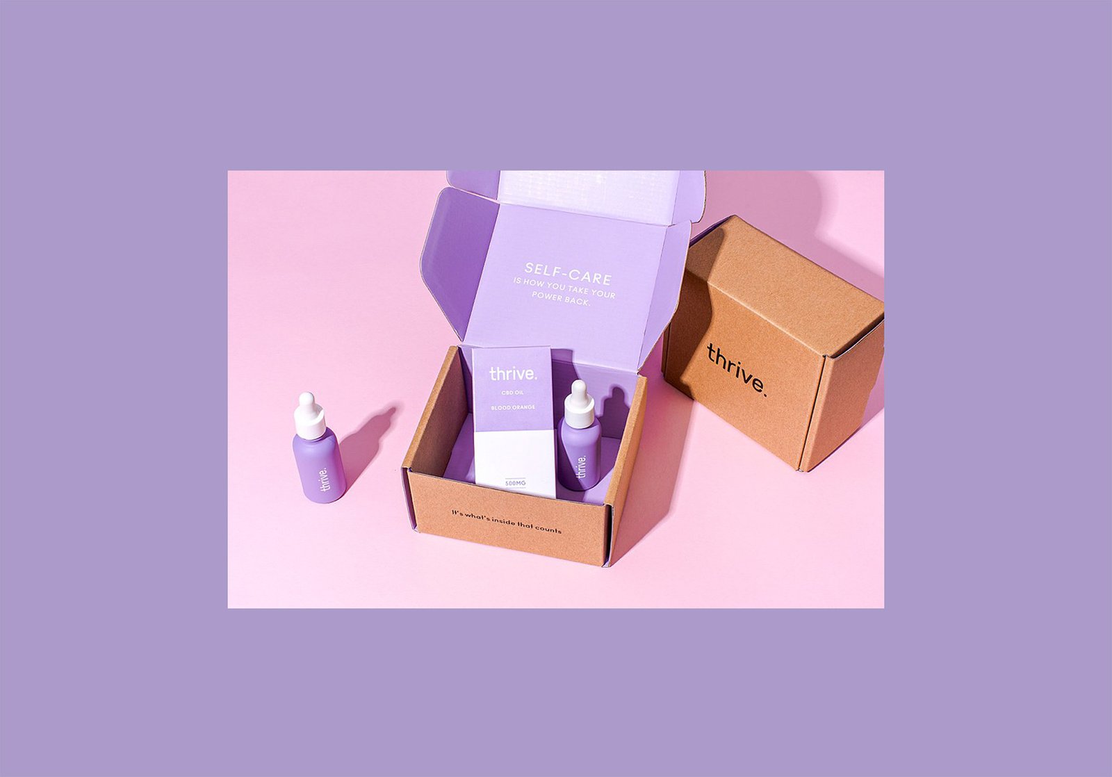
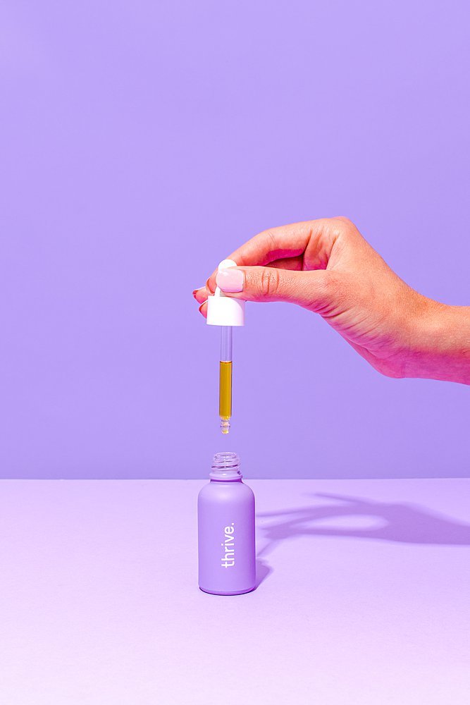
Distinctive Packaging Design
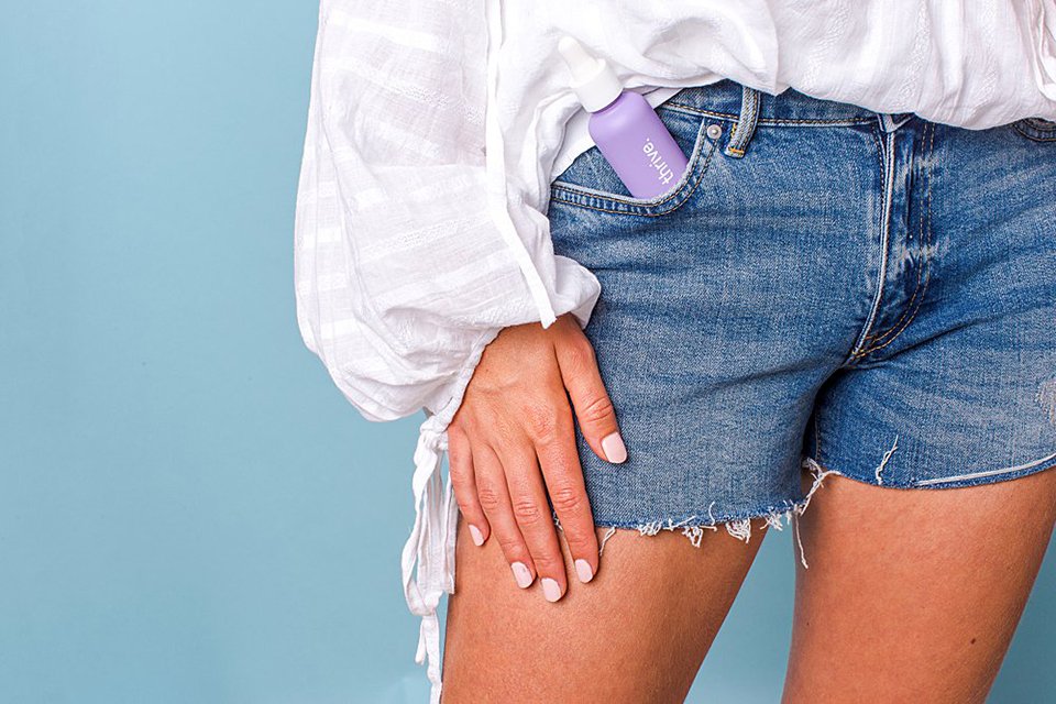
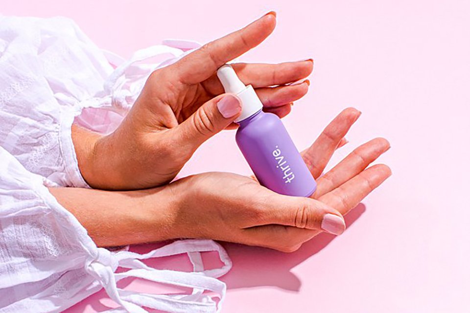
For a simple and minimal look, we created a matte bottle out of a purple pastel background with only the logo on it. The matte surface adds a prestige feel to the product and the design itself just says it all, “Thrive”, no more words or explanations needed. The product and shipping boxes are as simple as the product bottle itself, consisting of the main brand color, which is purple pastel. For the shipping box, we have included a slogan that says it all.

Let’s make the work they’ll copy.
Talk to an expert now


