Birtz
women’s wellness brand
Birtz is a Luxembourg-based wellness brand focused on women’s reproductive health. The challenge was to create a brand identity and digital presence that could balance clinical credibility with feminine warmth — offering trust, empathy, and empowerment in every touchpoint.
Client & Challenge
Birtz is a Luxembourg-based wellness brand focused on women’s reproductive health.
The challenge was to create a brand identity and digital presence that could balance clinical credibility with feminine warmth — offering trust, empathy, and empowerment in every touchpoint.
Our mission was clear:
To position Birtz as the modern companion for women navigating fertility, hormonal balance, and menopause — without falling into the clichés of wellness branding.
Brand Strategy
Our process began with an in-depth workshop exploring the emotional and functional dimensions of the brand.
The insights revealed that women seek not only solutions but also understanding — a brand that speaks to both their body and their confidence.
From this, the strategic pillars emerged:
Science meets softness.
Confidence through clarity.
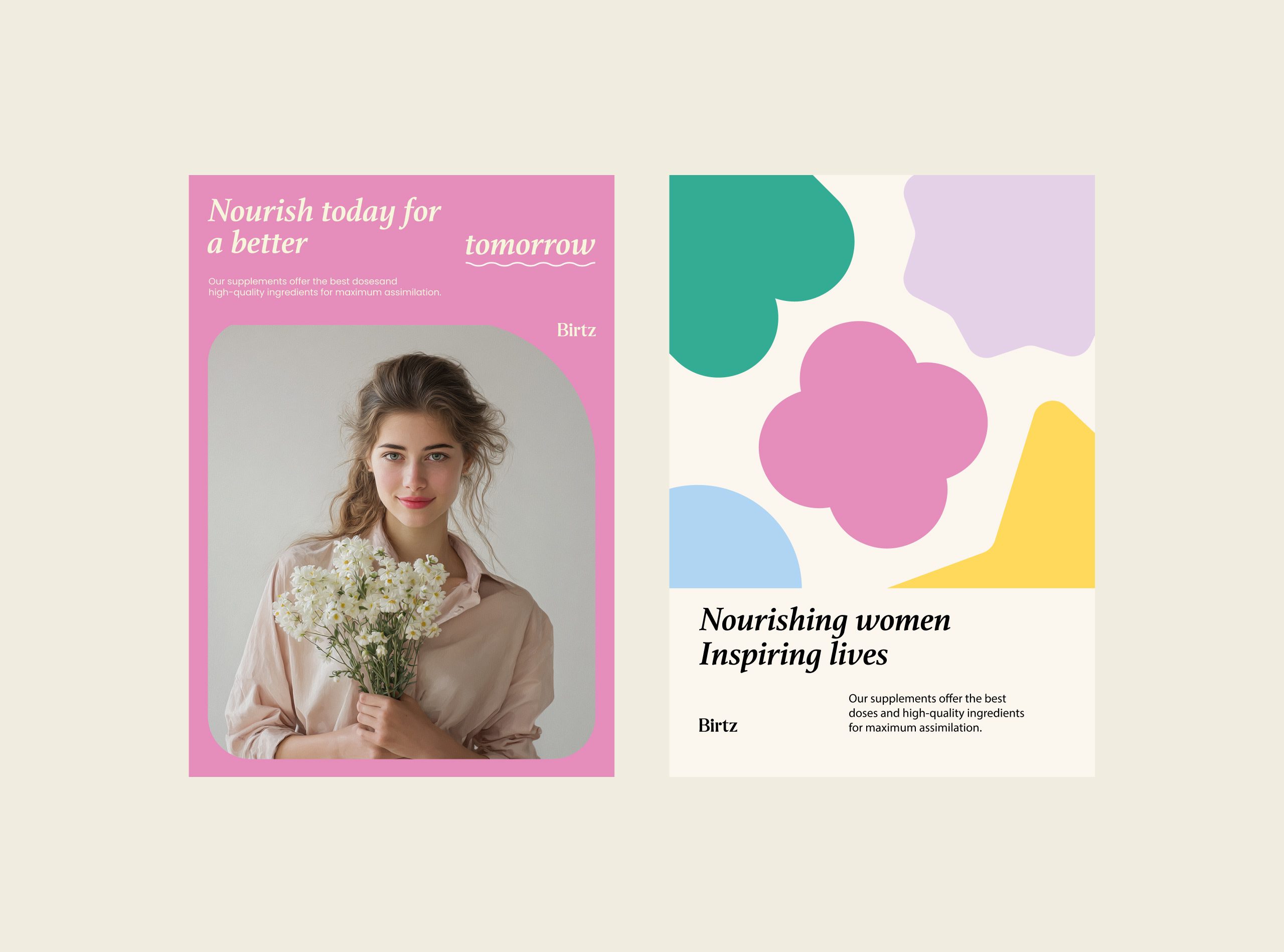
Nourishing women, inspiring lives.
These principles shaped everything from tone of voice to visual behavior, ensuring the brand remained both elegant and emotionally intelligent.
Visual Identity
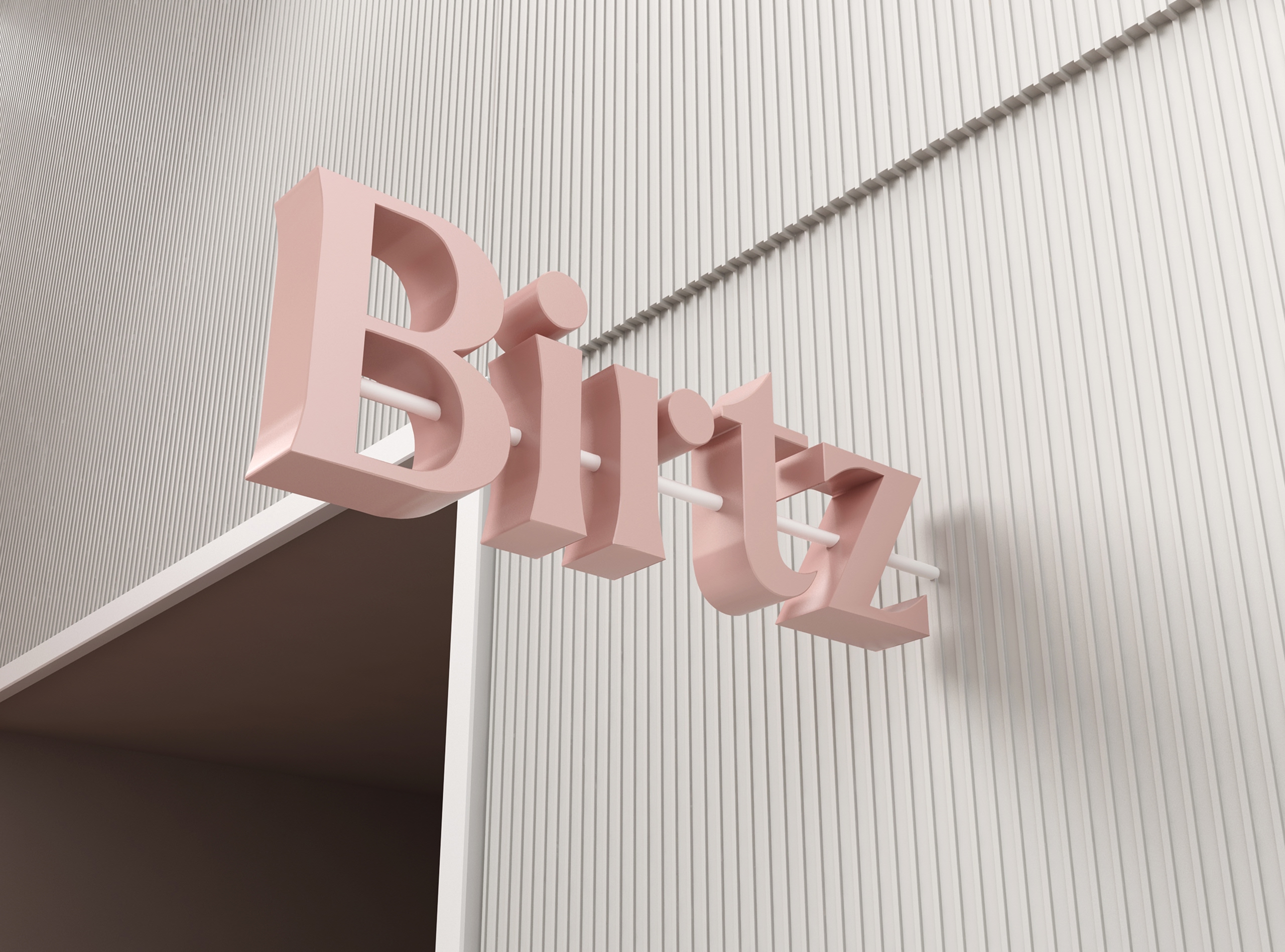
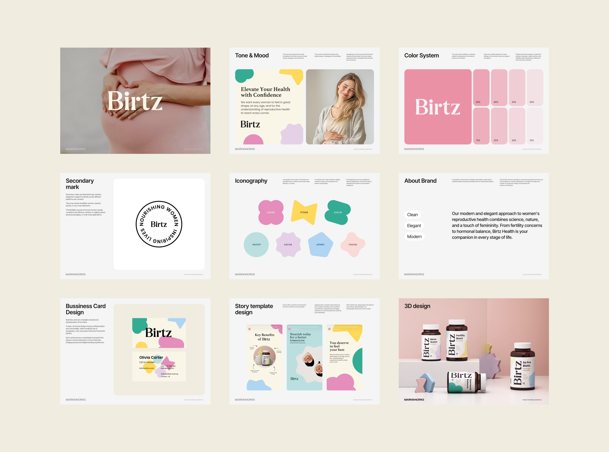
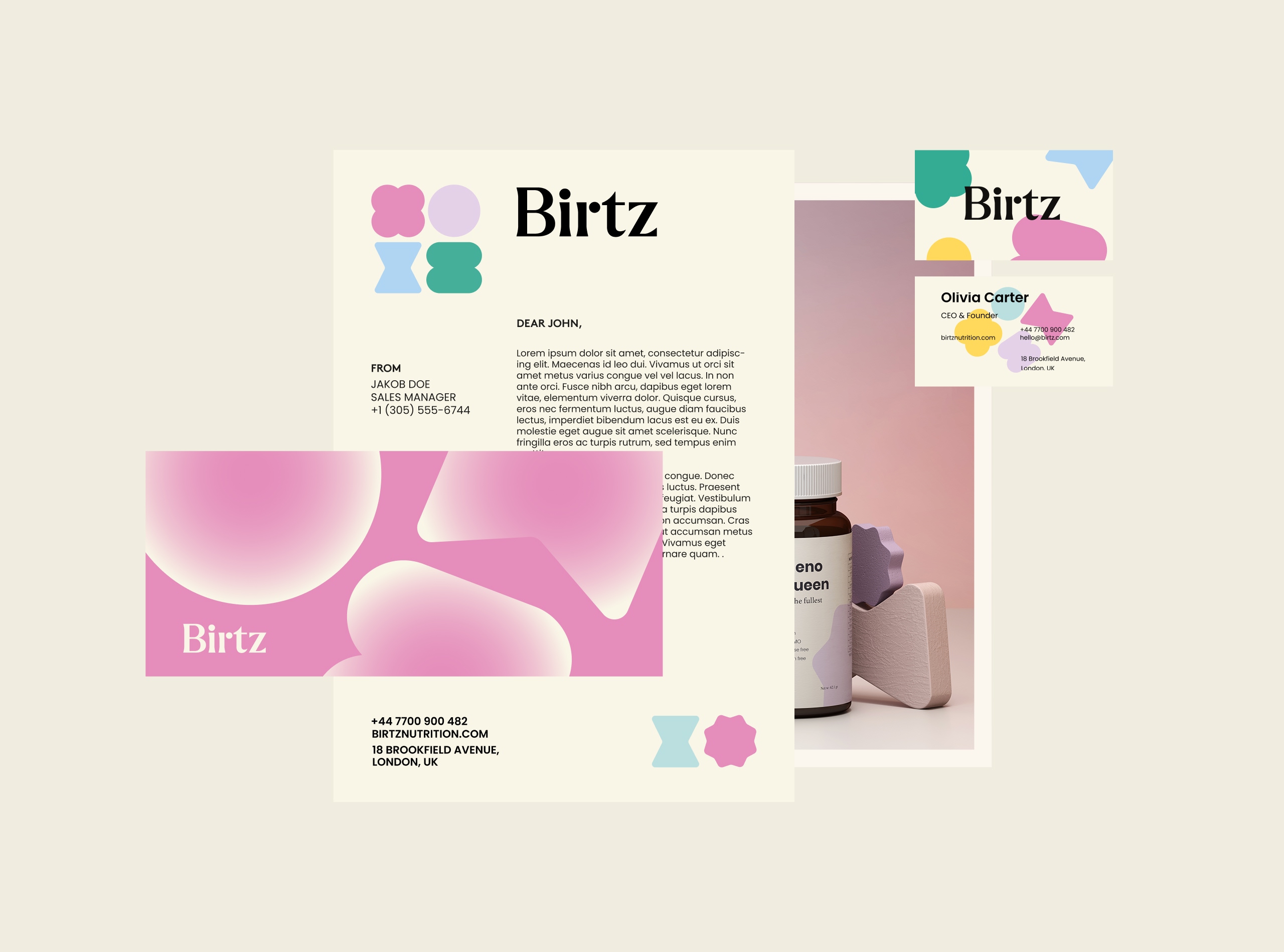
The logotype was crafted with soft yet confident letterforms — a modern serif that carries authority without losing grace.
Each curve represents care; each edge, precision.
A secondary mark, “Nourishing women, inspiring lives,” reinforces the brand’s core purpose, functioning as both a seal of trust and a message of empowerment.
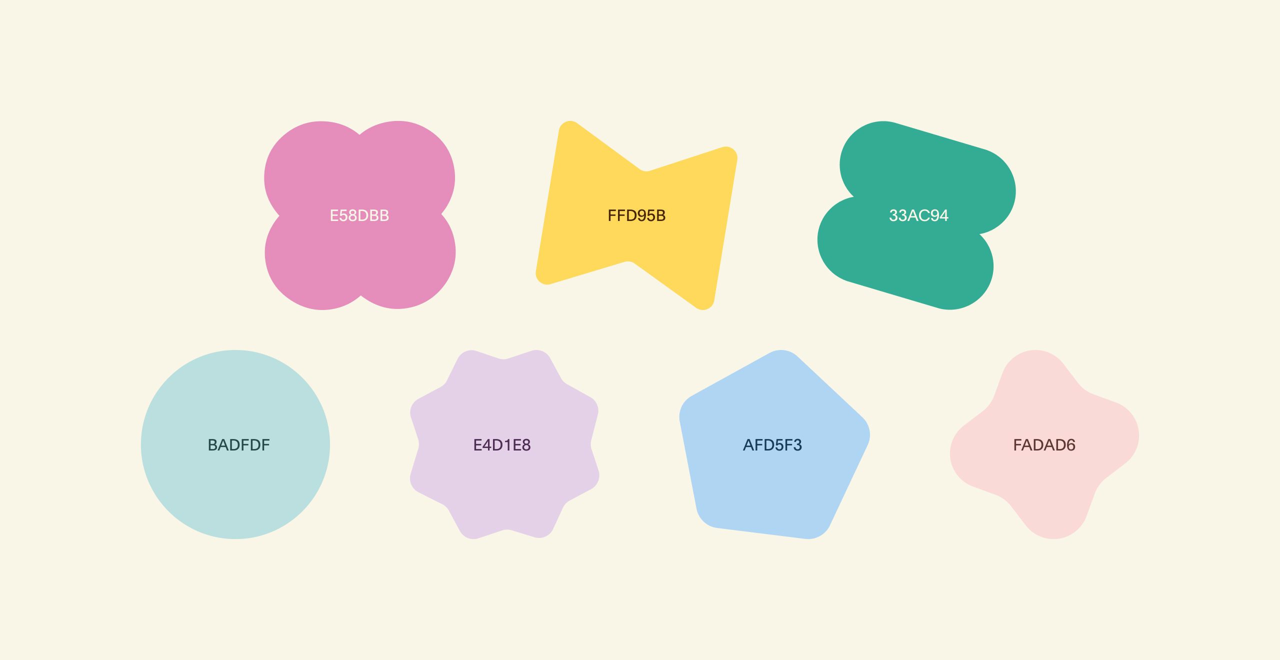
The color palette combines pastel tones with earthy neutrals to evoke comfort, safety, and natural vitality.
Custom iconography inspired by organic shapes translates the idea of life and growth into a distinct graphic language.
Design System & Applications
Every application was designed to reflect continuity and calm — from packaging to digital experience.
Packaging Design
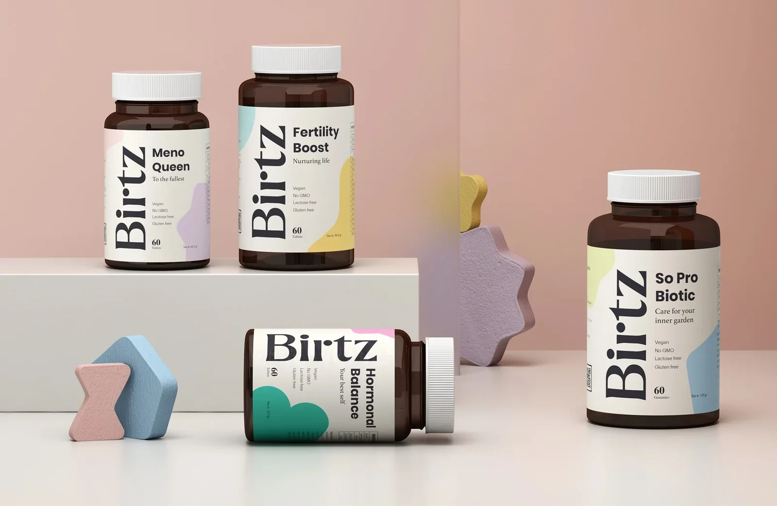
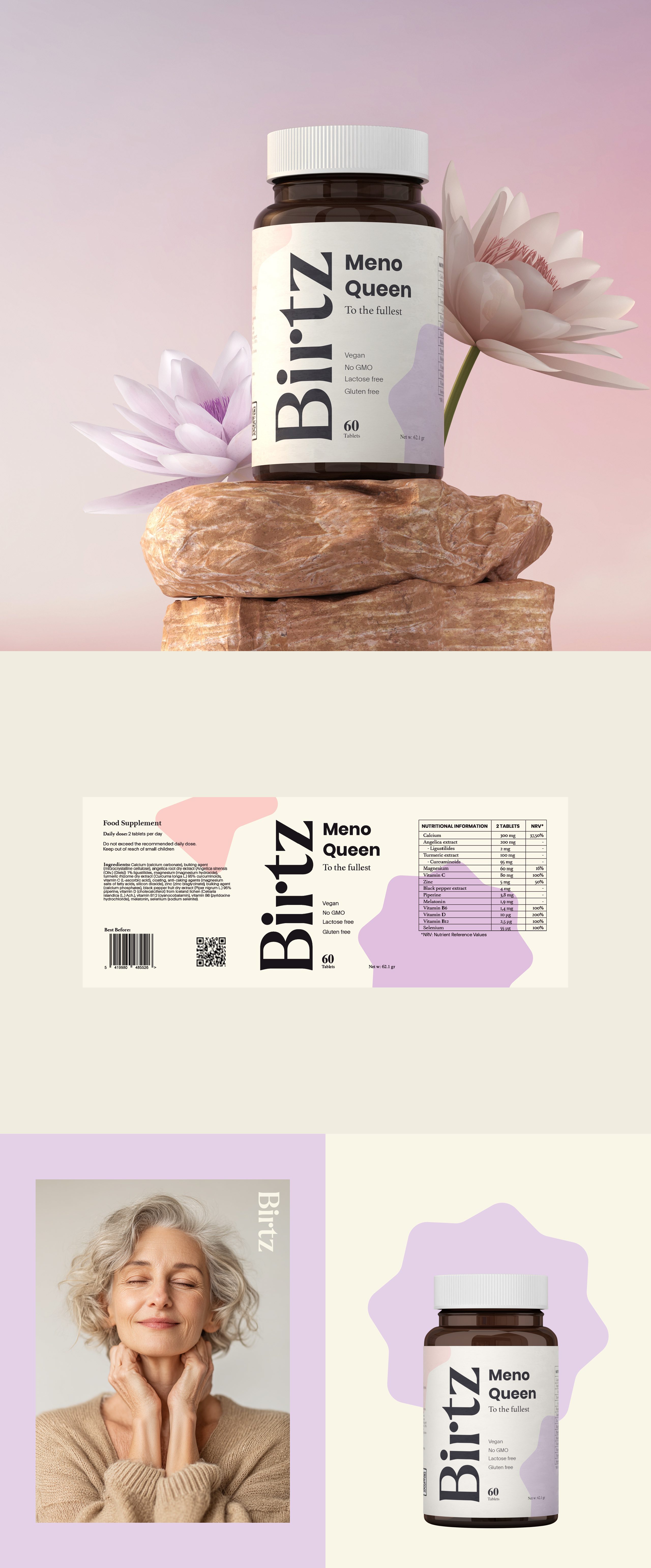
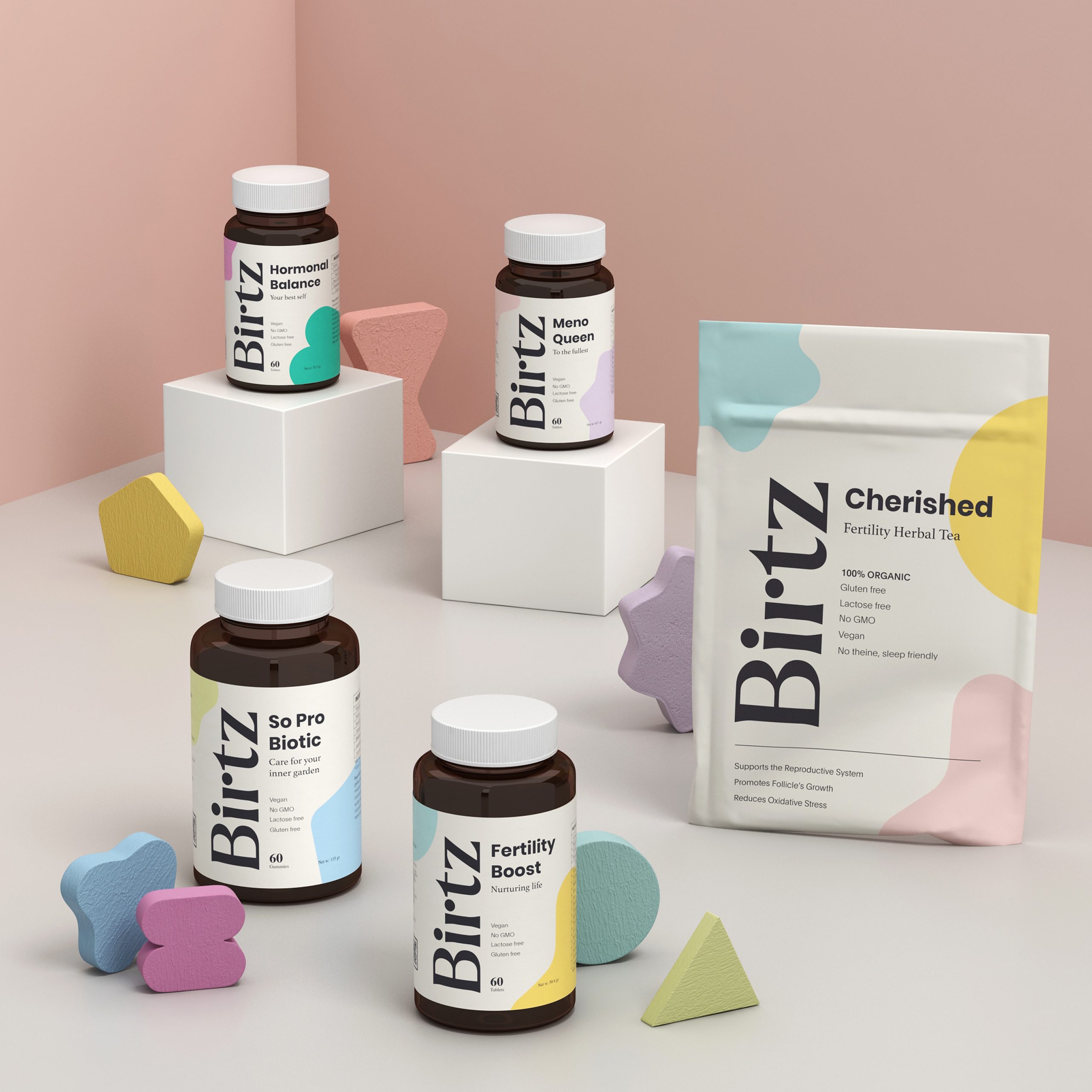
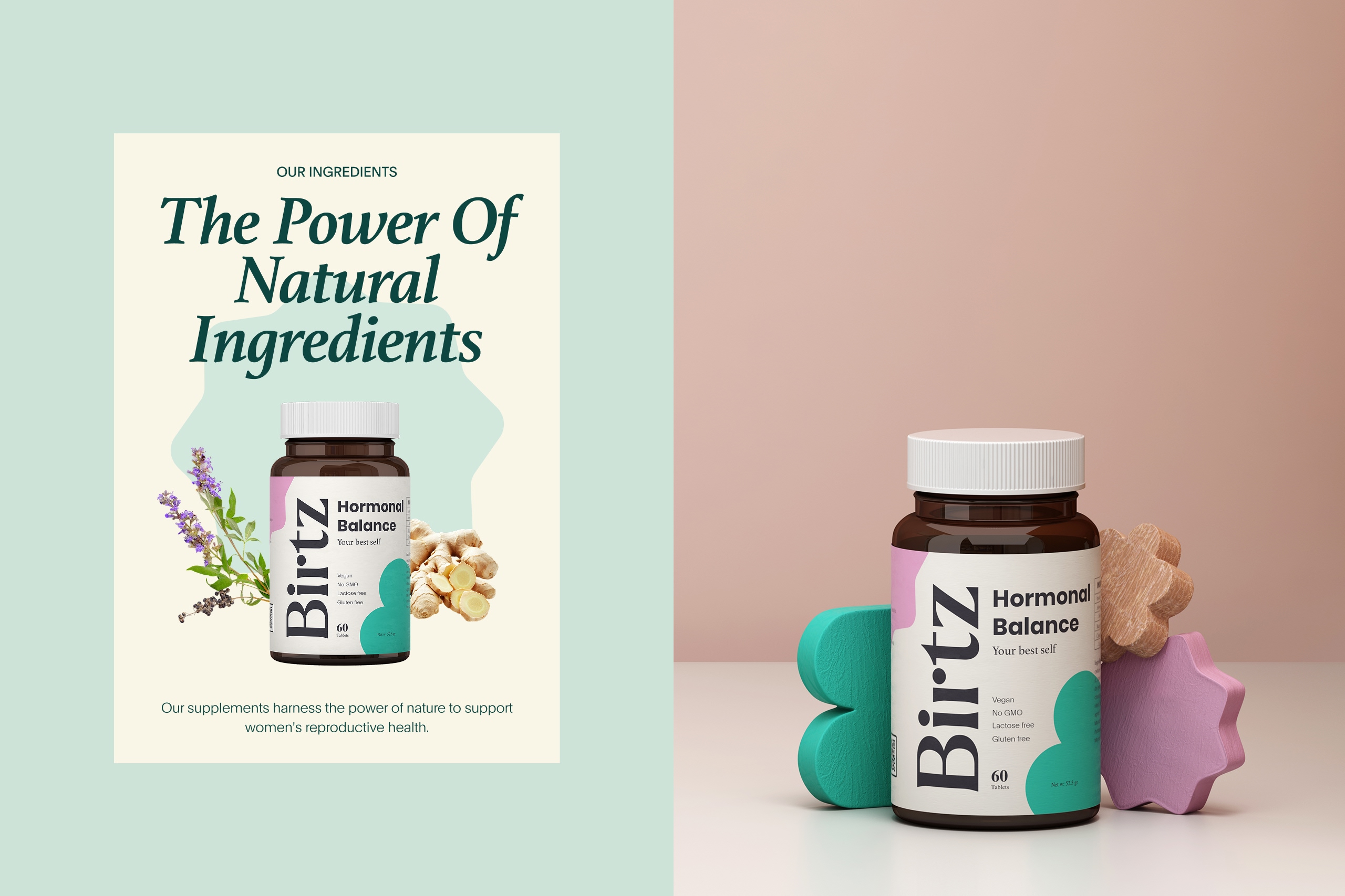
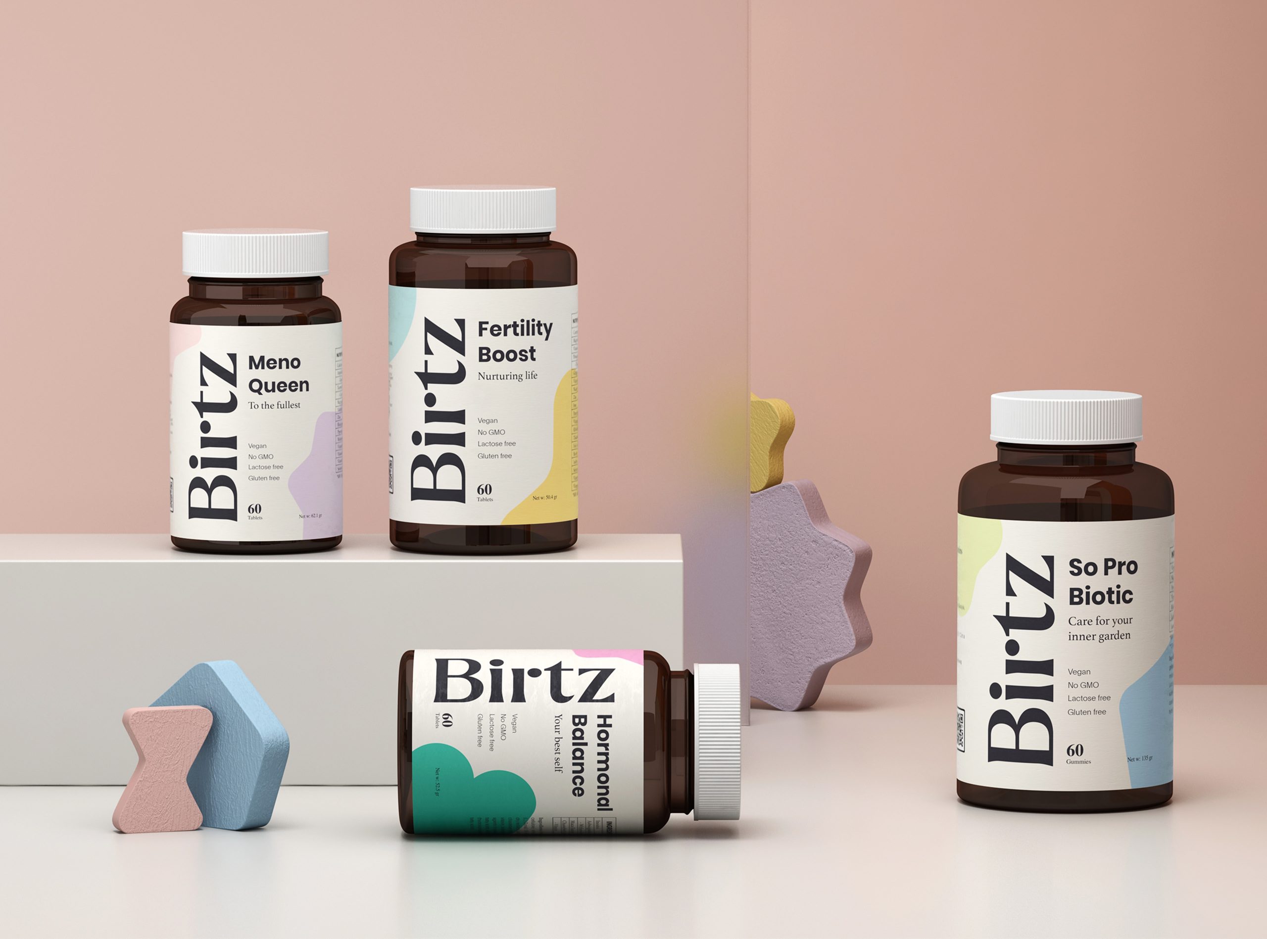
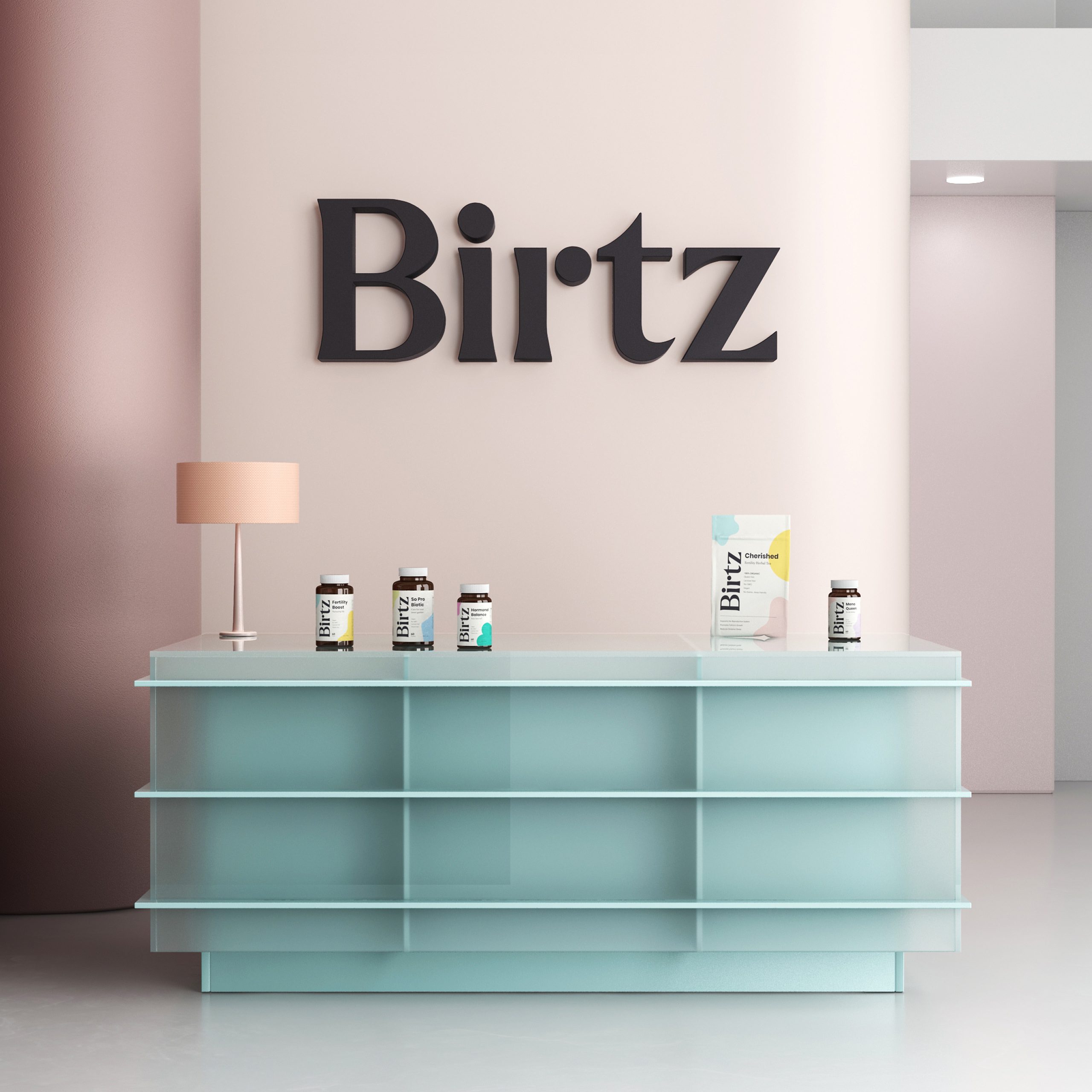
Simple, clean, and educational. The vertical logotype creates instant shelf recognition, while the color-coded system helps women navigate their specific needs effortlessly.
3D Visualization
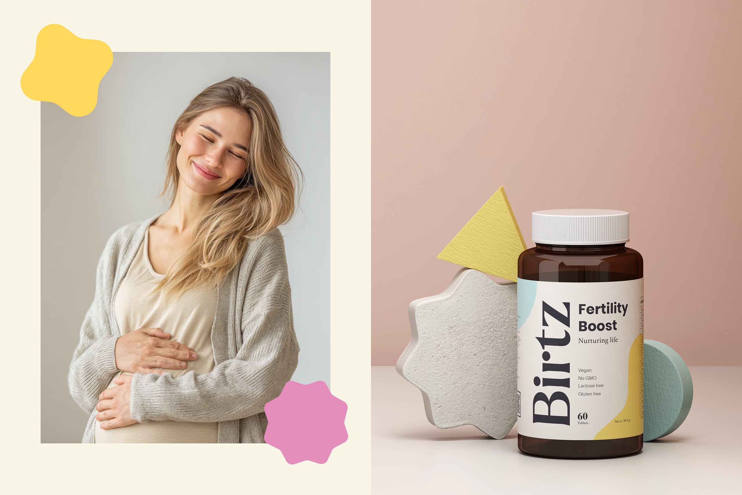
Minimal compositions and soft lighting were used to highlight purity and material honesty, positioning Birtz as a premium yet accessible product line.
Website & E-Commerce
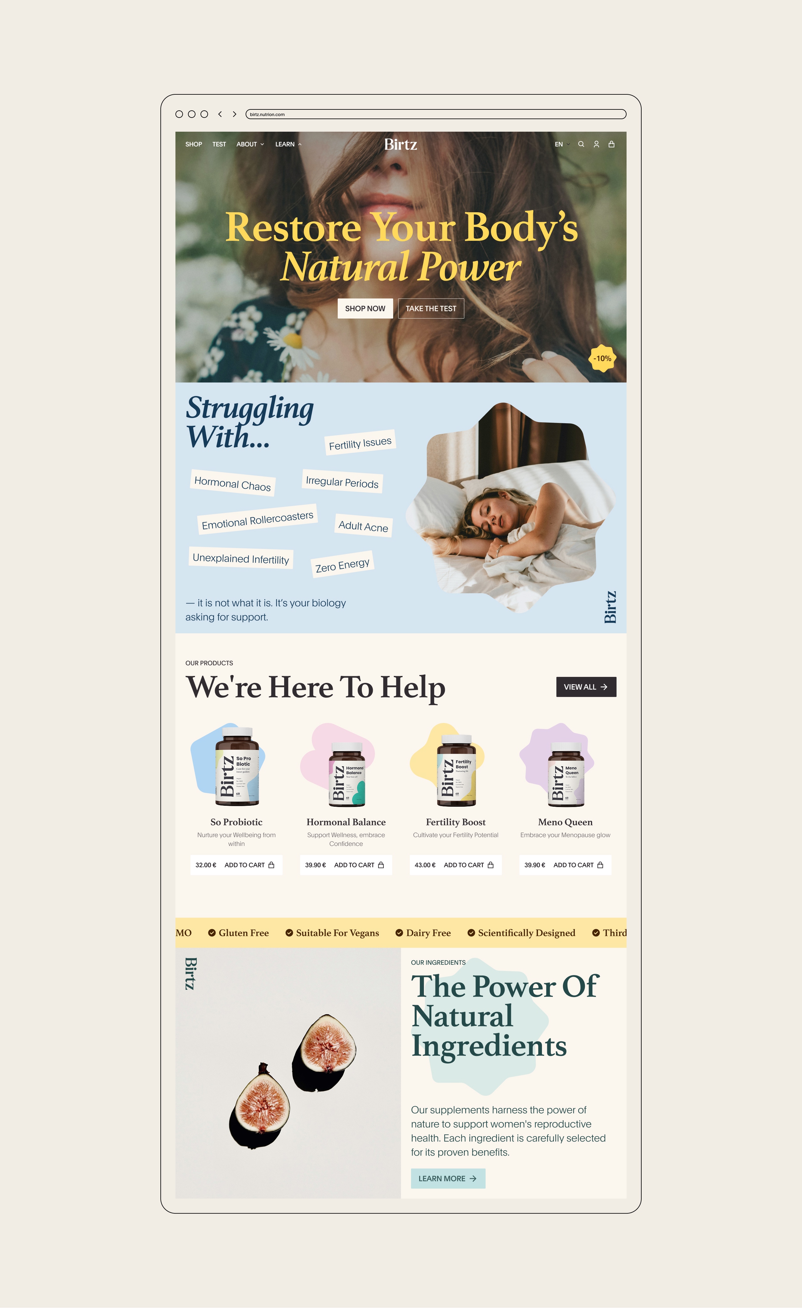
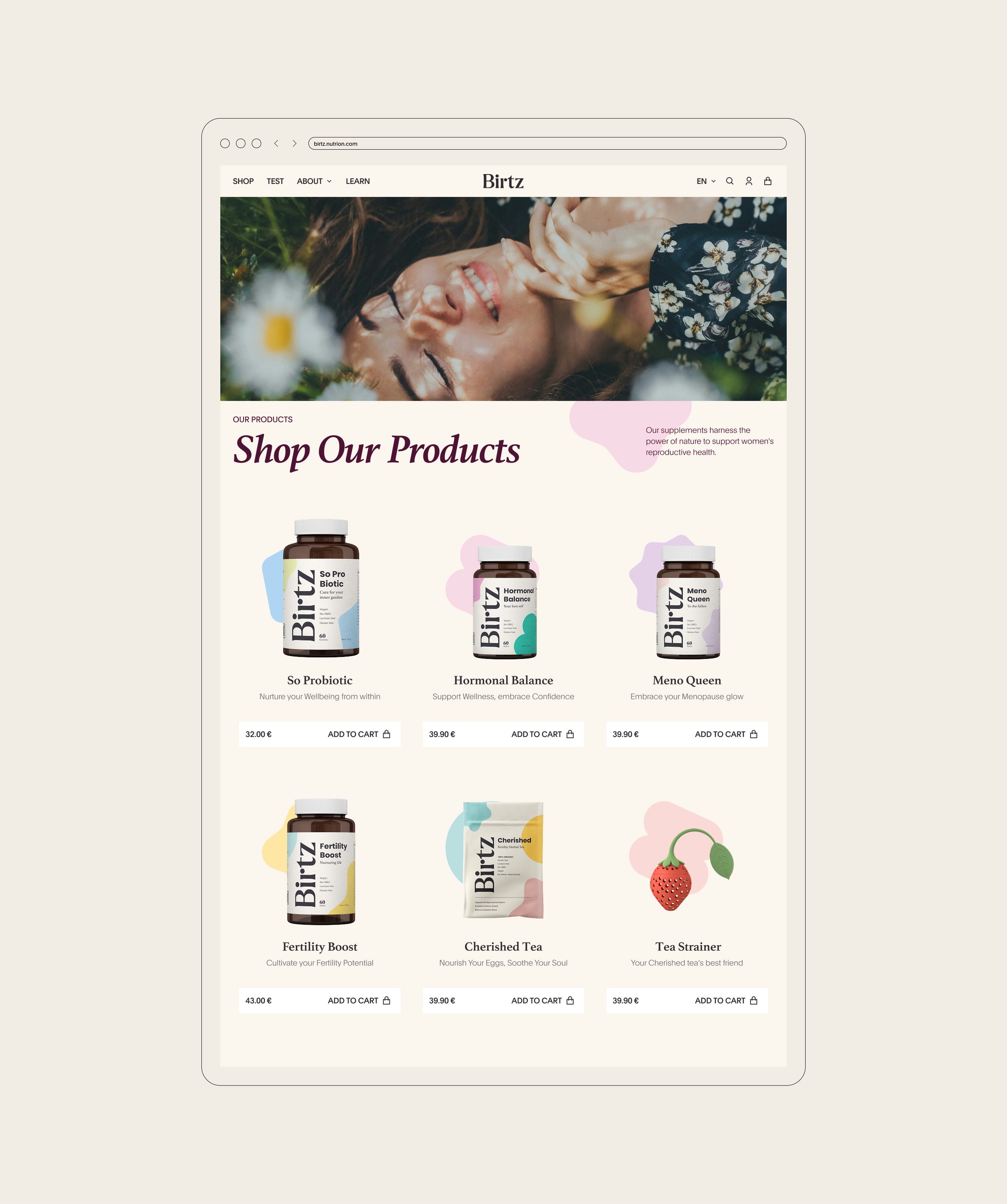
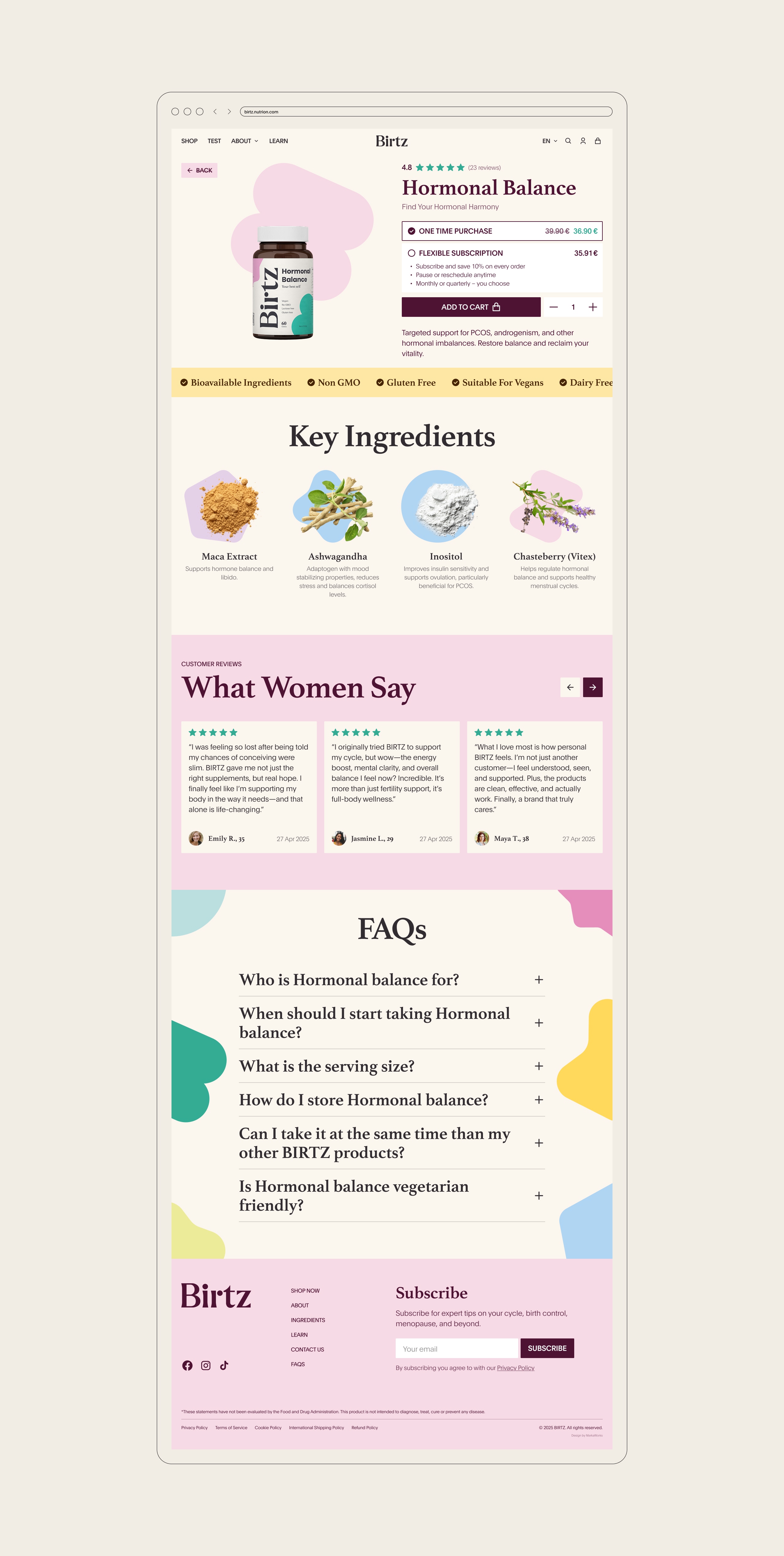
The interface prioritizes empathy and education — blending soft UI details, organic forms, and warm typography with a structured hierarchy that makes science approachable.
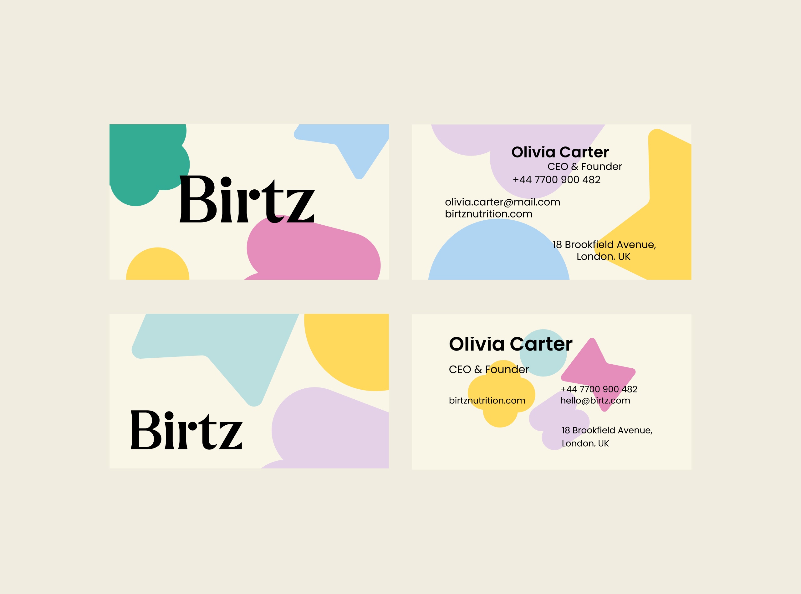
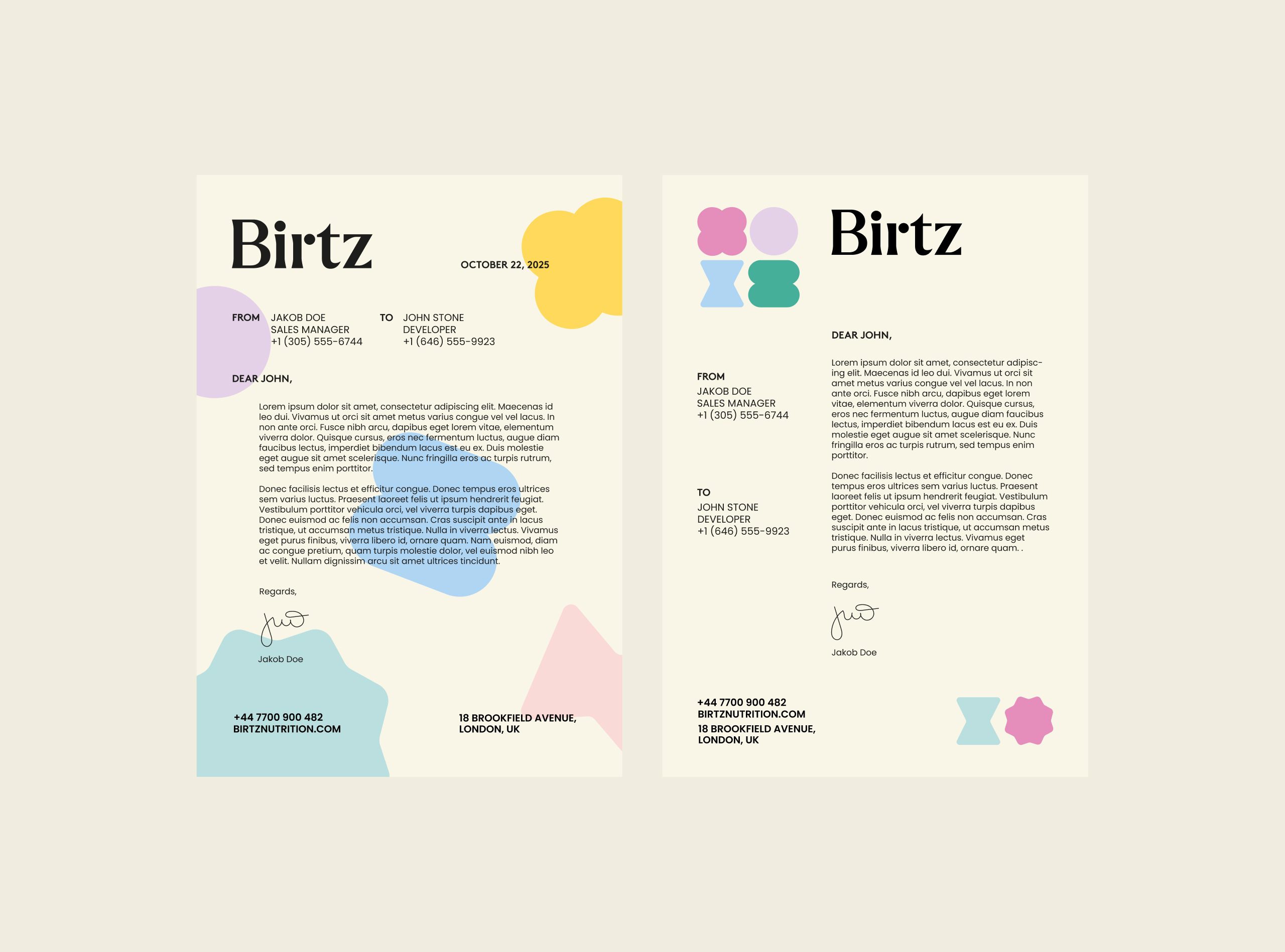
Social & Print Materials
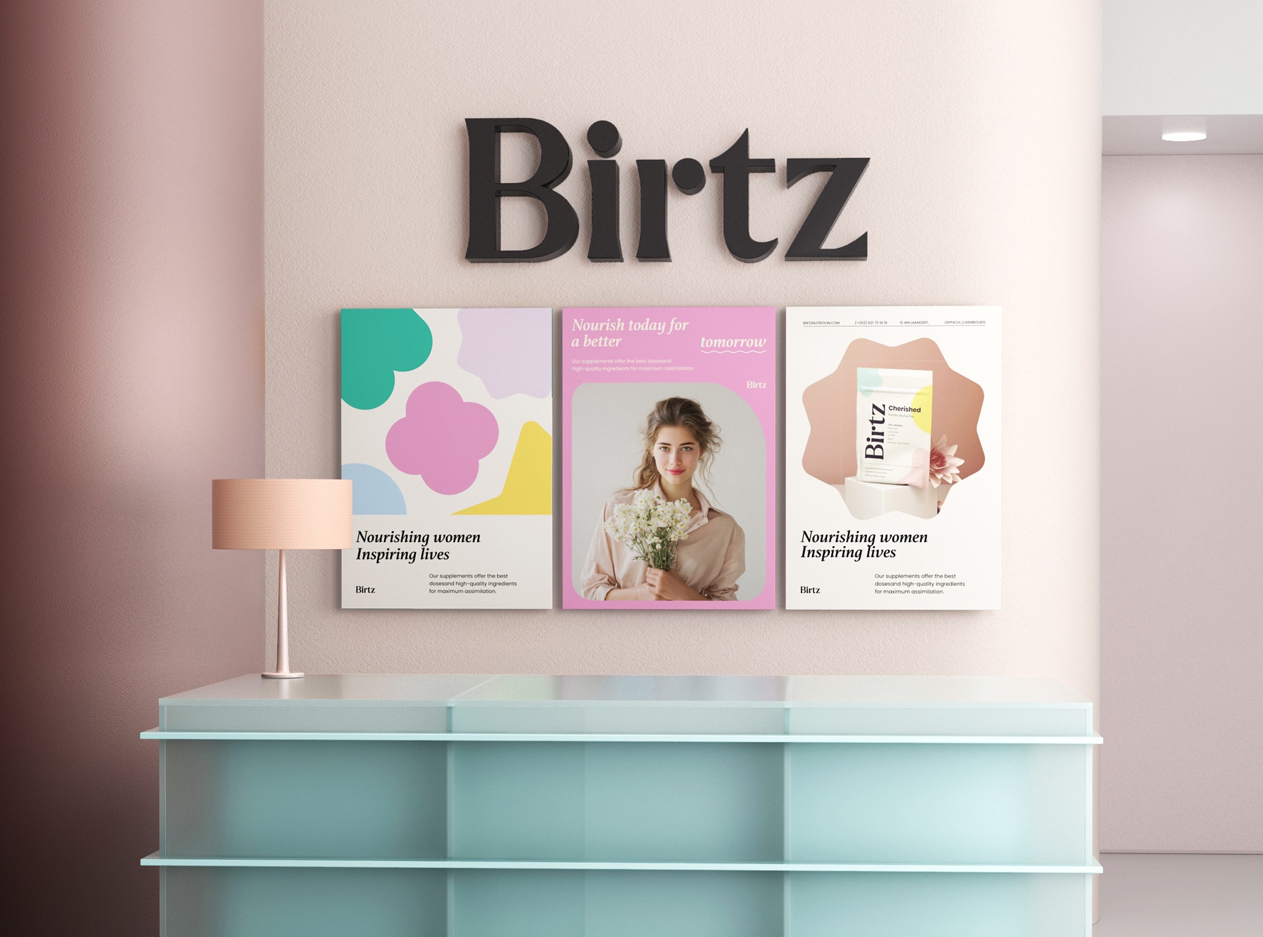
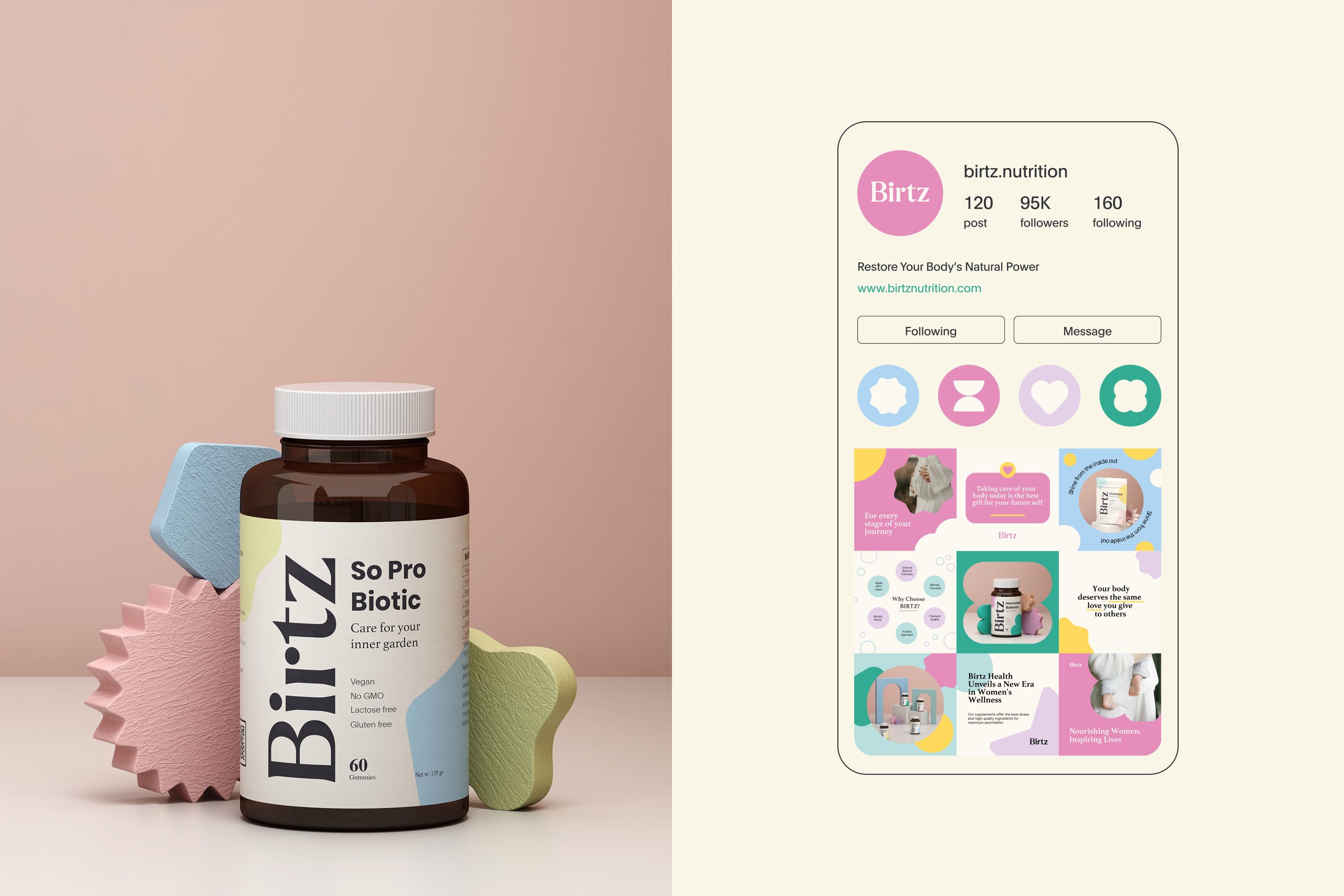
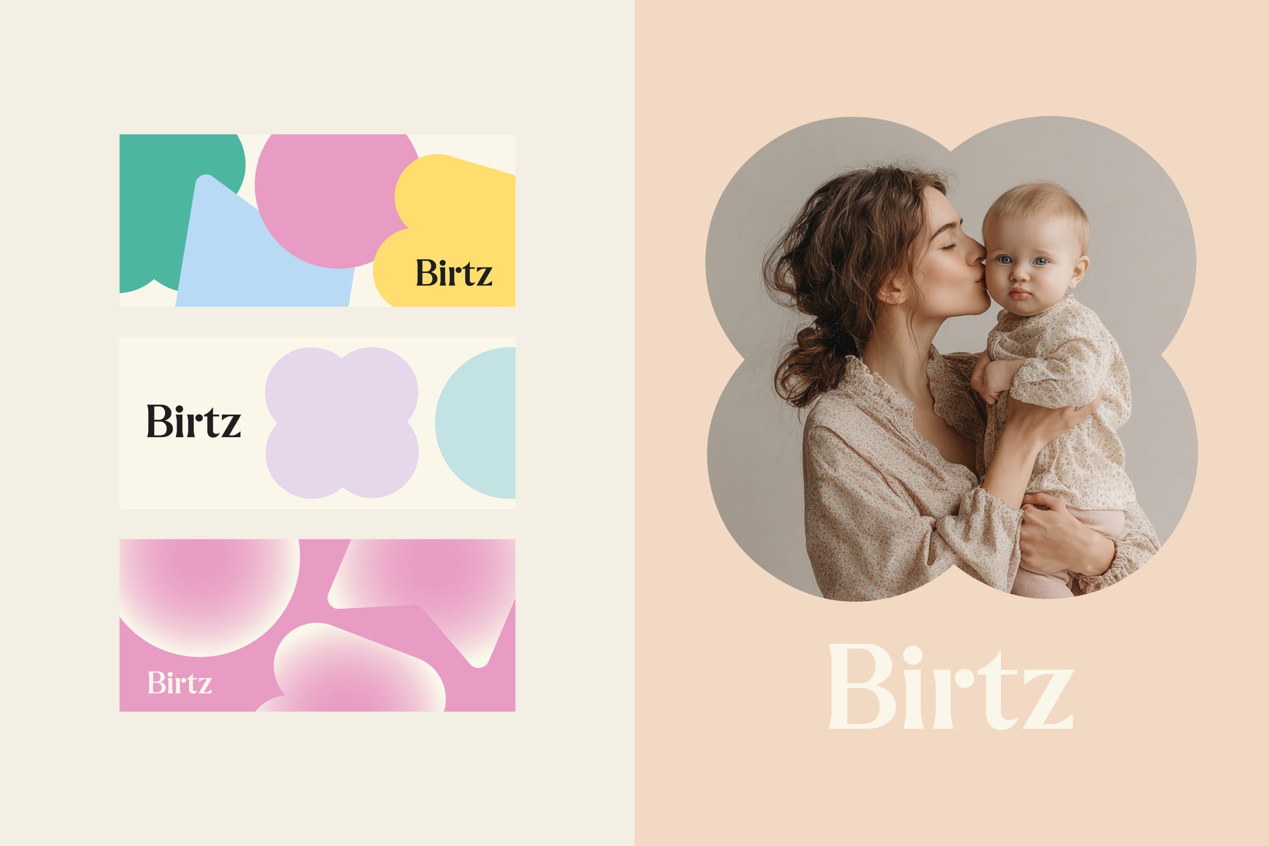
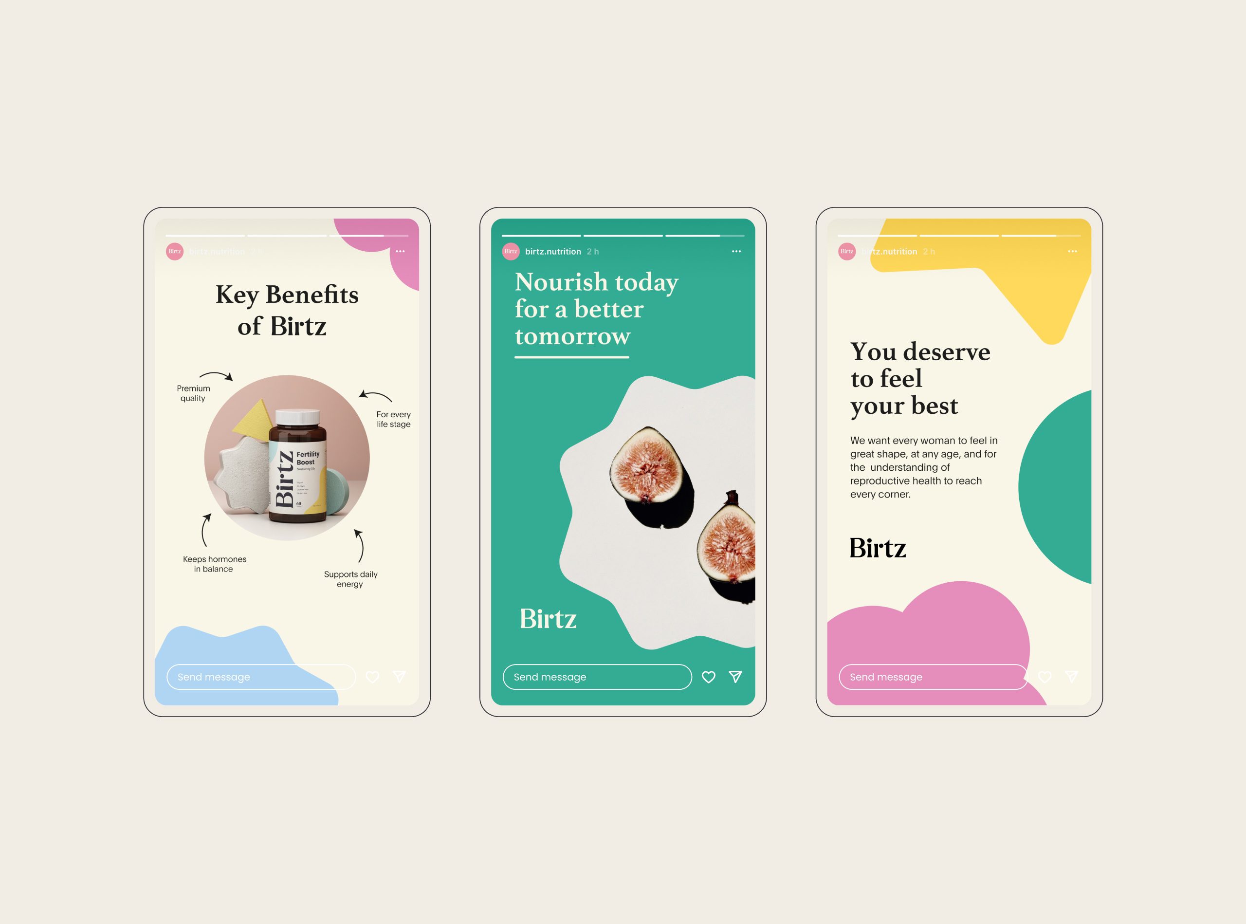
Campaign layouts use photography that captures real emotion — confidence, relief, serenity — paired with editorial typography and generous whitespace for clarity and breath.
Tone & Messaging
Birtz communicates with a calm, confident, and educational voice.
It doesn’t sell wellness — it guides it.
Copy lines such as “Nourish today for a better tomorrow” and “You deserve to feel your best” bridge emotional truth with clinical assurance.
Every sentence reinforces the brand’s mission: to elevate women’s health with confidence.
Result
The outcome is a timeless, scalable brand system — one that speaks the universal language of care while maintaining the integrity of modern design.
Birtz now stands as a benchmark in reproductive wellness branding: scientifically rooted, emotionally resonant, and visually iconic.
Let’s make the work they’ll copy.
Talk to an expert now

