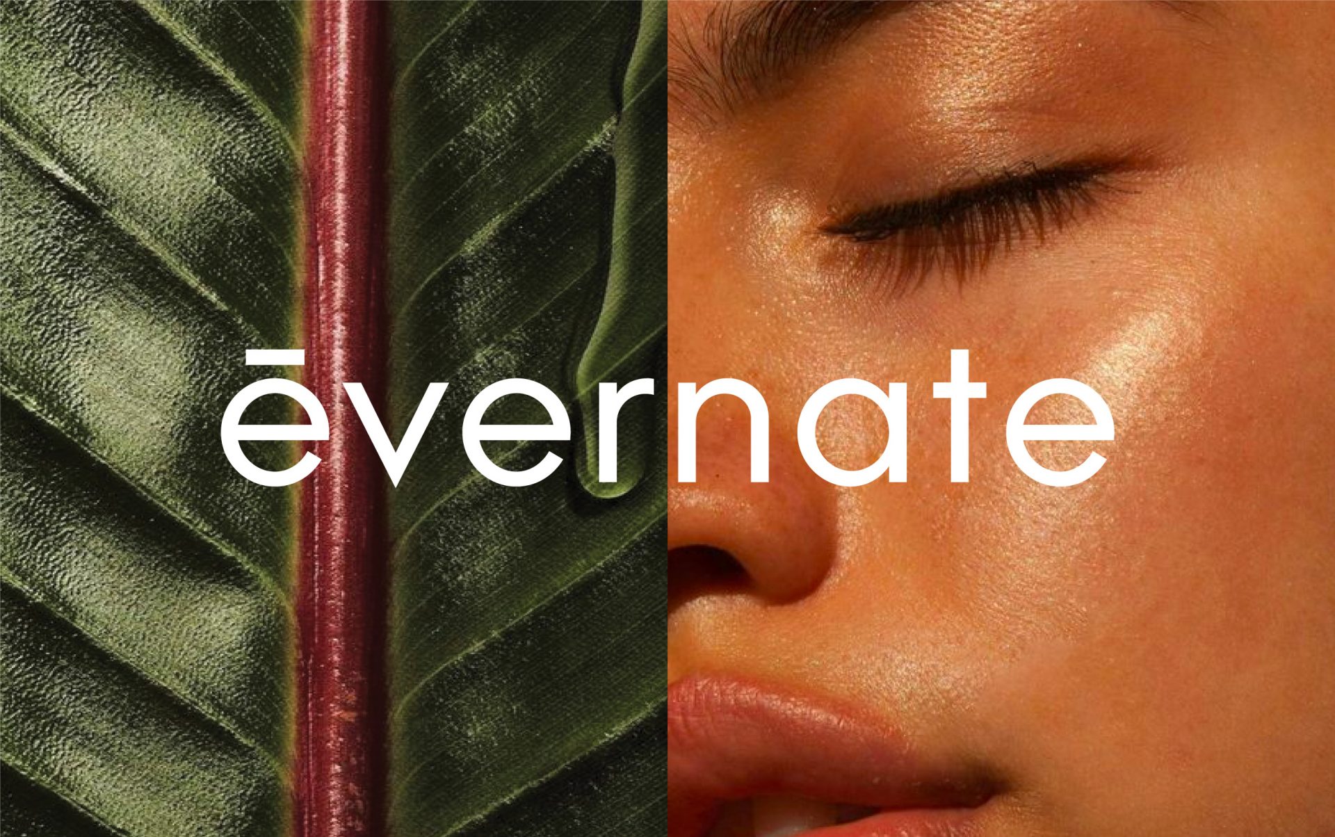
Evernate
natural supplements for balanced living
Evernate was developed as a modern supplement brand centered on clarity, balance, and everyday wellness. The identity was designed to feel grounded and reassuring, removing visual and cognitive noise from the supplement experience. Every element was crafted to support trust, transparency, and long term health.

Our approach focused on building a visual system that communicates effectiveness without excess, allowing users to engage with the brand confidently and effortlessly.
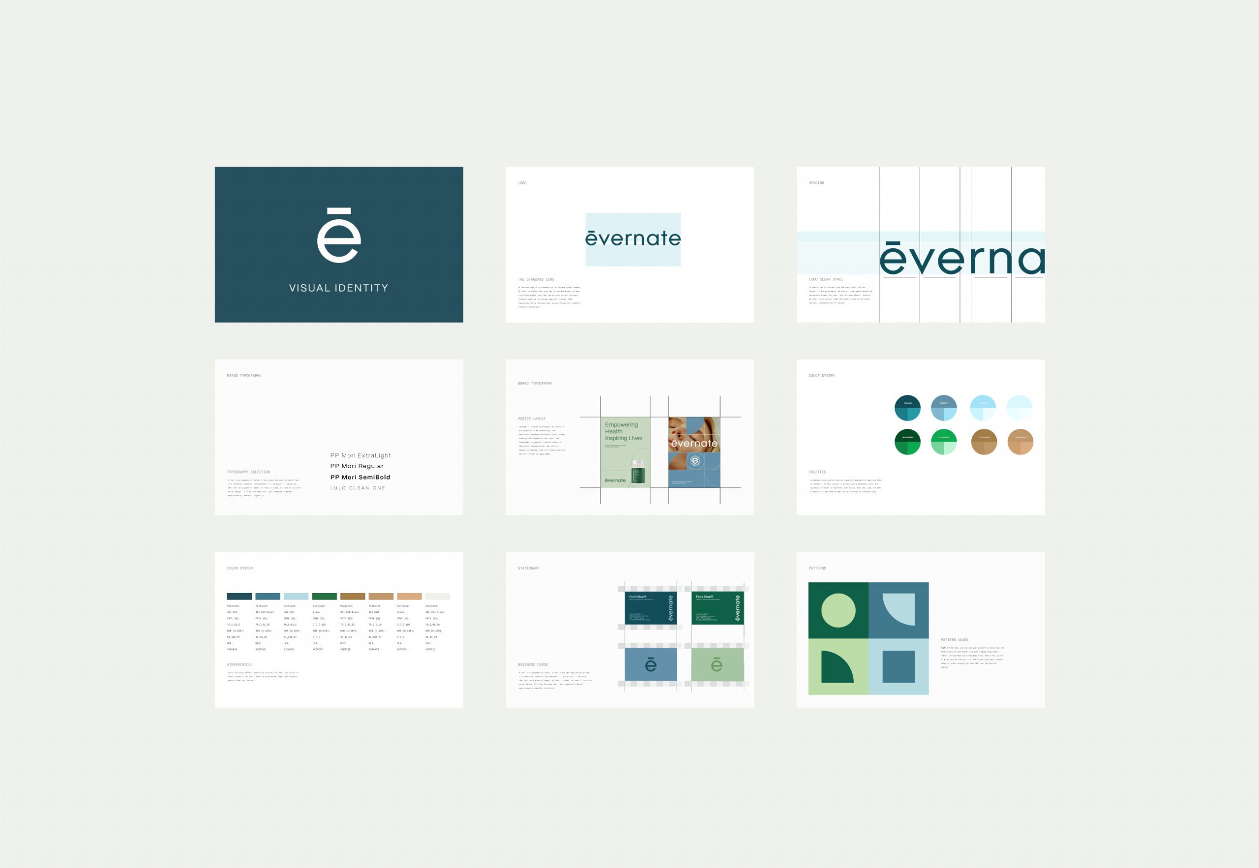
Visual Identity
Evernate’s visual identity is rooted in simplicity and structure. The logotype is clean and restrained, designed to feel contemporary while remaining neutral and timeless. The custom accent within the letterform introduces a subtle point of distinction without disrupting the overall calmness of the system.
The color palette draws from natural greens, muted blues, and soft earth tones, reflecting balance, renewal, and organic wellbeing. These tones are supported by generous white space and structured grid systems, creating a sense of order and visual clarity across all applications.
Typography prioritizes legibility and hierarchy. Clear spacing and disciplined layout rules ensure information is easy to scan and understand, reinforcing Evernate’s transparent and science driven positioning.


Packaging Design
Packaging was designed with function and clarity at its core. Each product label follows a consistent layout that highlights key benefits, ingredients, and usage information without visual clutter. The restrained use of color helps differentiate products while maintaining a cohesive family system.
Material finishes and minimal graphics support a clean, premium feel, allowing the packaging to feel both approachable and credible. The system is scalable across Evernate’s diverse product range, ensuring long term consistency as the brand grows.


Digital Presence
Evernate’s digital presence translates the physical identity into a calm and intuitive experience. Layouts are structured and breathable, guiding users naturally through content and product information. Visual elements remain minimal, allowing clarity and usability to take priority.
The tone of voice across digital touchpoints is informative and supportive, reinforcing Evernate’s role as a reliable partner in everyday health rather than a directive authority.


Let’s make the work they’ll copy.
Talk to an expert now


