GL Peptides
Setting a New Standard in Peptide Branding
GL Peptides is a research-driven peptide and performance wellness brand built on precision, transparency, and scientific integrity. Our mission in this project was to craft a visual identity that reflects the brand’s core pillars: clarity, consistency, and credibility — while elevating it beyond the typical pharmaceutical aesthetic.
GL Peptides — Setting a New Standard in Peptide Branding
Brand Identity • Packaging Design • Digital Experience
GL Peptides is a research-driven peptide and performance wellness brand built on precision, transparency, and scientific integrity.
Our mission in this project was to craft a visual identity that reflects the brand’s core pillars: clarity, consistency, and credibility — while elevating it beyond the typical pharmaceutical aesthetic.
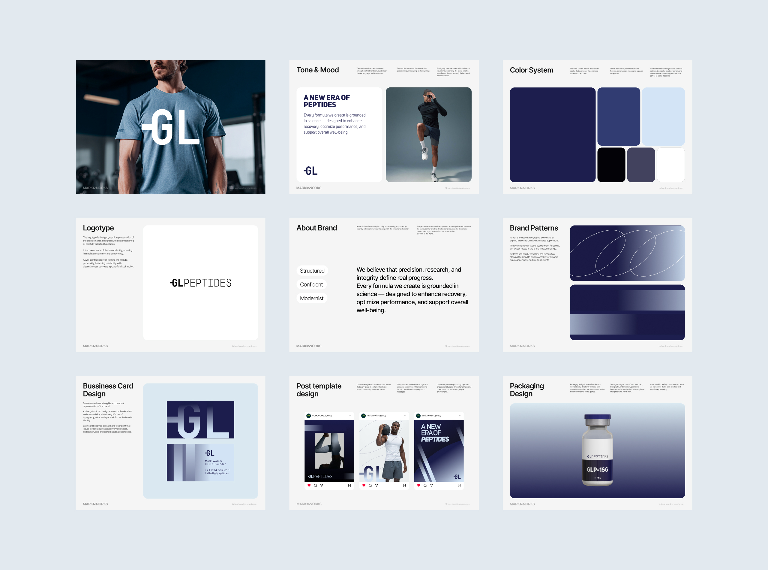
01. Brand Strategy & Positioning
The positioning is grounded in science-first thinking and athletic performance culture.
We aimed to create a visual world that seamlessly blends biotechnology with modern fitness — serious, structured, and confidently future-focused.
Brand attributes:
Structured
Confident
Modernist
Science-backed
Performance-driven
Everything from typography to color was selected to project reliability and innovation.
02. Logo & Core Identity Development
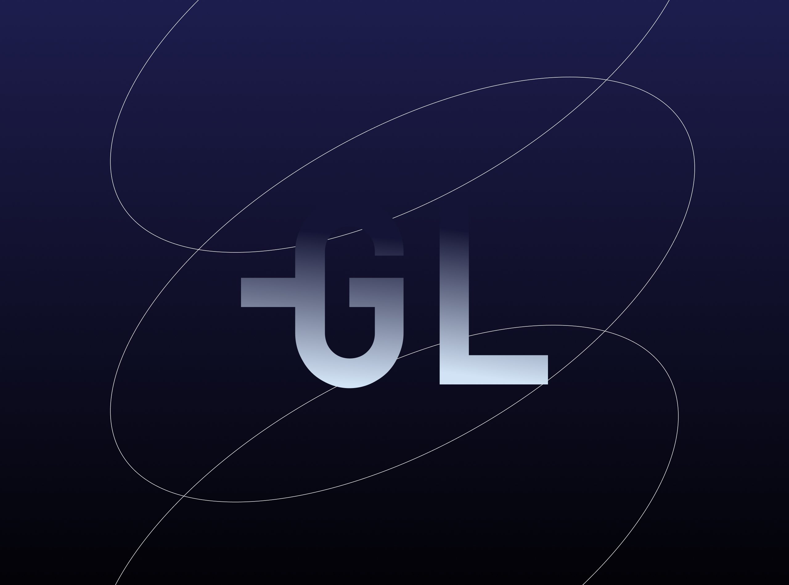
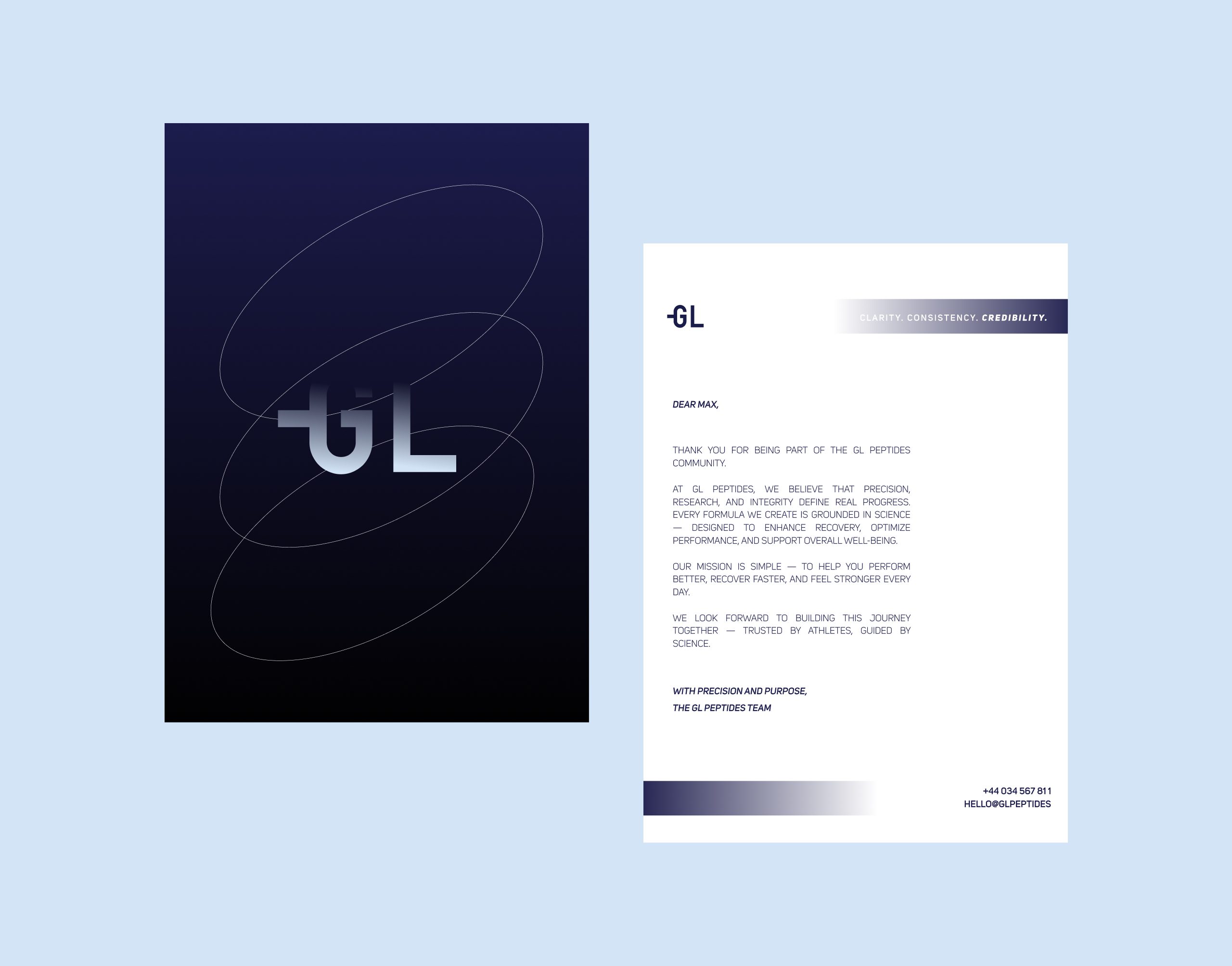
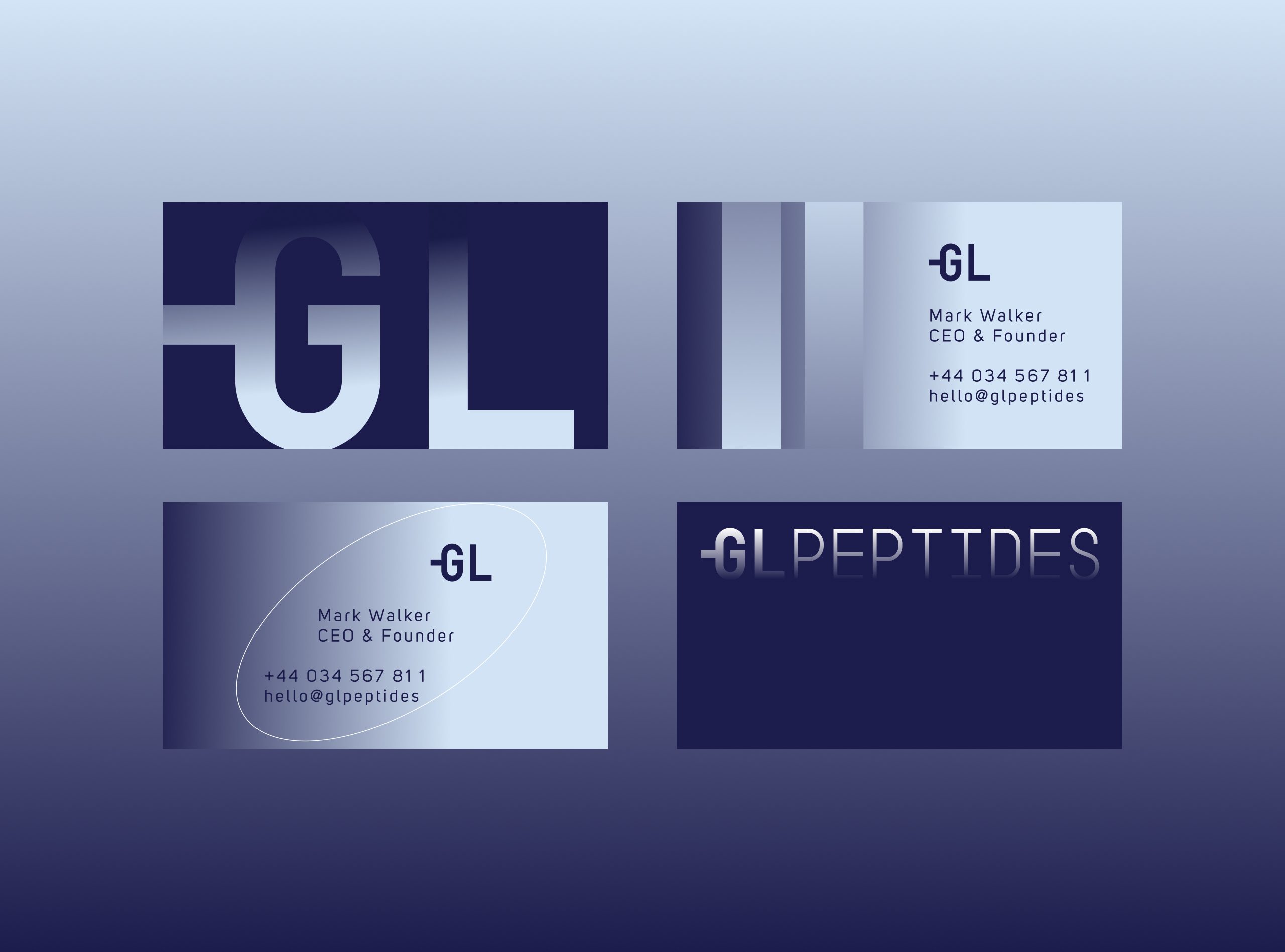
The GL monogram is designed as a bold, minimal symbol that instantly communicates precision.
The geometry is crisp and stable, echoing the brand’s commitment to exactness and scientific rigor.
The full wordmark GL PEPTIDES uses a clean, technical typographic approach — engineered for legibility, trust, and a modern pharmaceutical aesthetic.
Design decisions:
Balanced, scientific proportions
Angular, confident letterforms
A monogram that scales effortlessly across digital, packaging, and apparel
A modular construction suitable for lab-grade branding
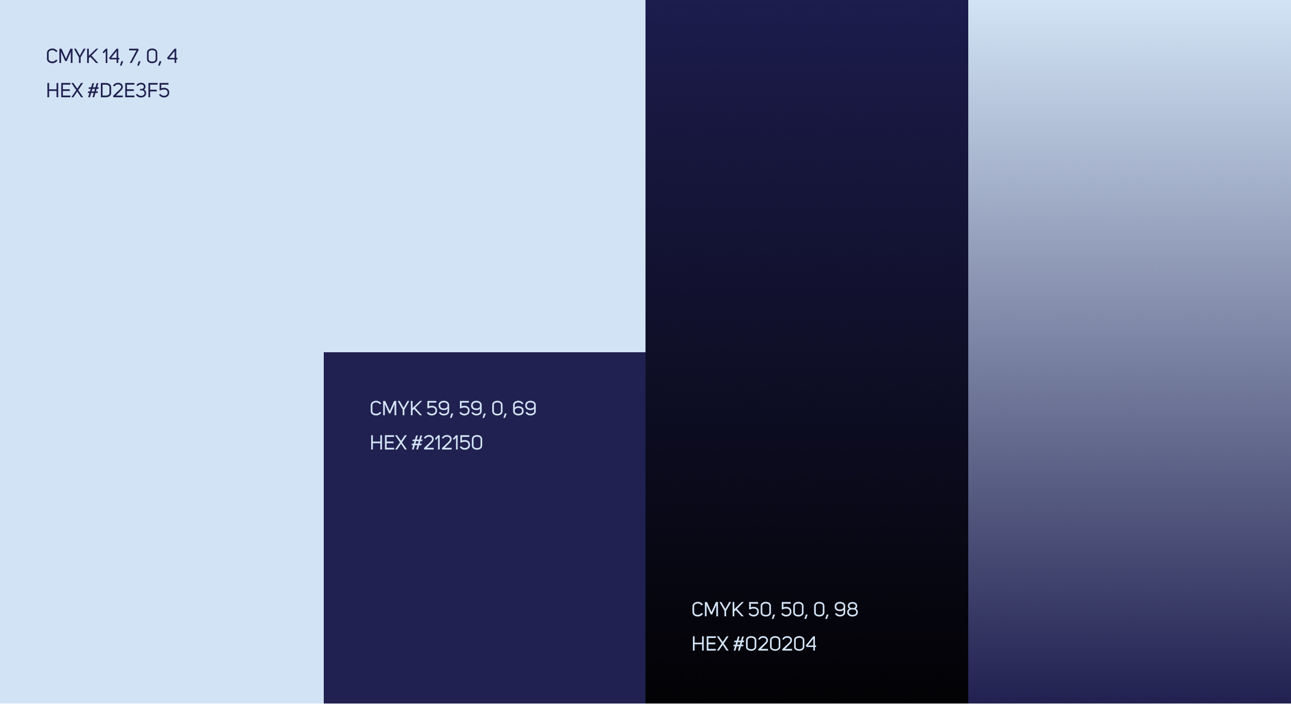
03. Color System
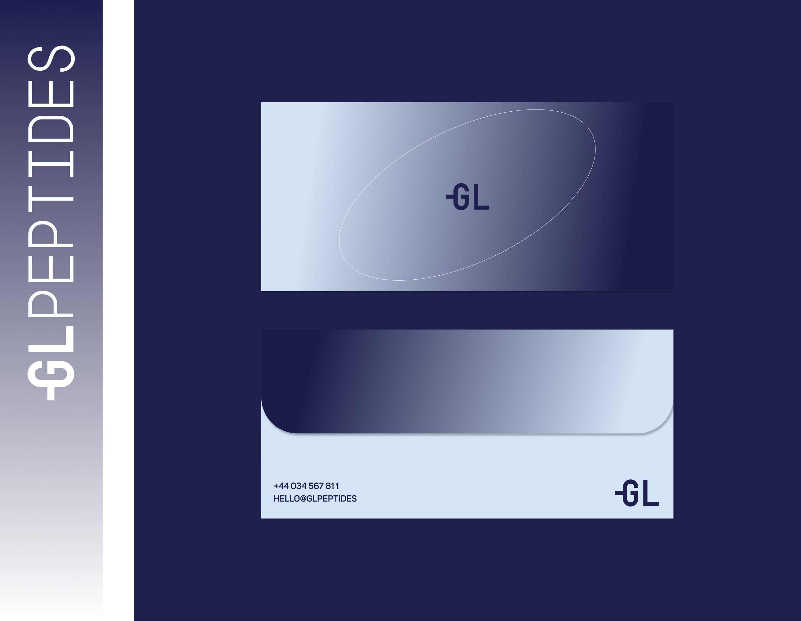
The palette is built around deep scientific blues and cool-spectrum gradients, emphasizing both trust and high performance.
Primary tones:
Midnight Blue → science, depth, authority
Ice Blue → clarity, purity
Graphite Black → precision, structure
Steel Gradient → innovation, modernity
The palette supports a clean, clinical look while still feeling bold and athletic.
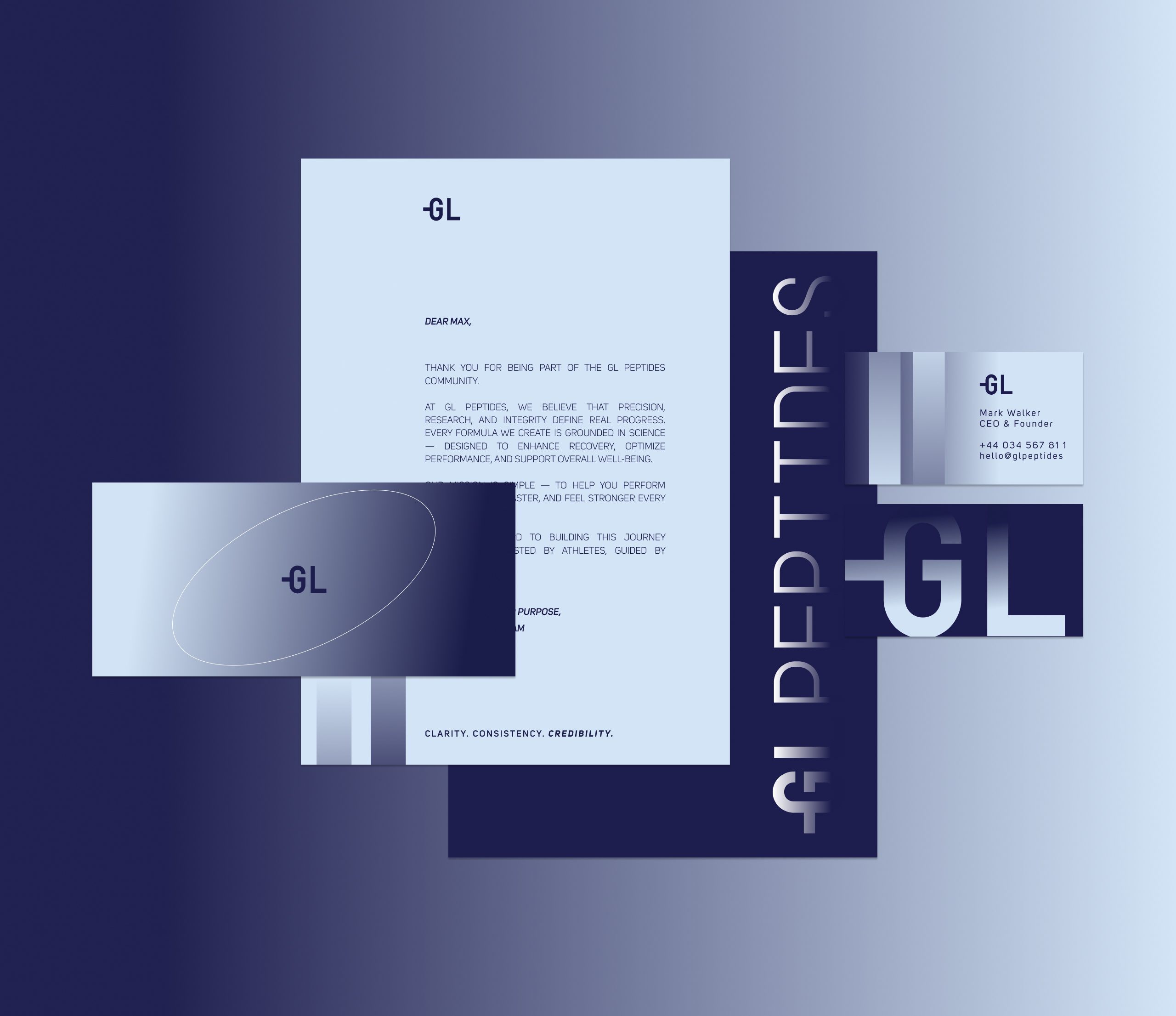
04. Brand Patterns & Graphic World
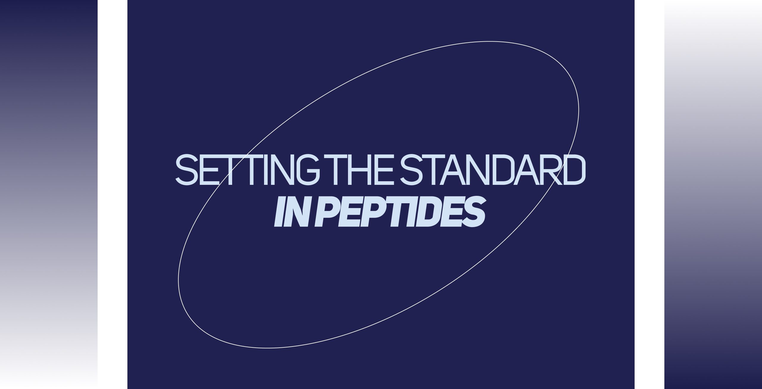
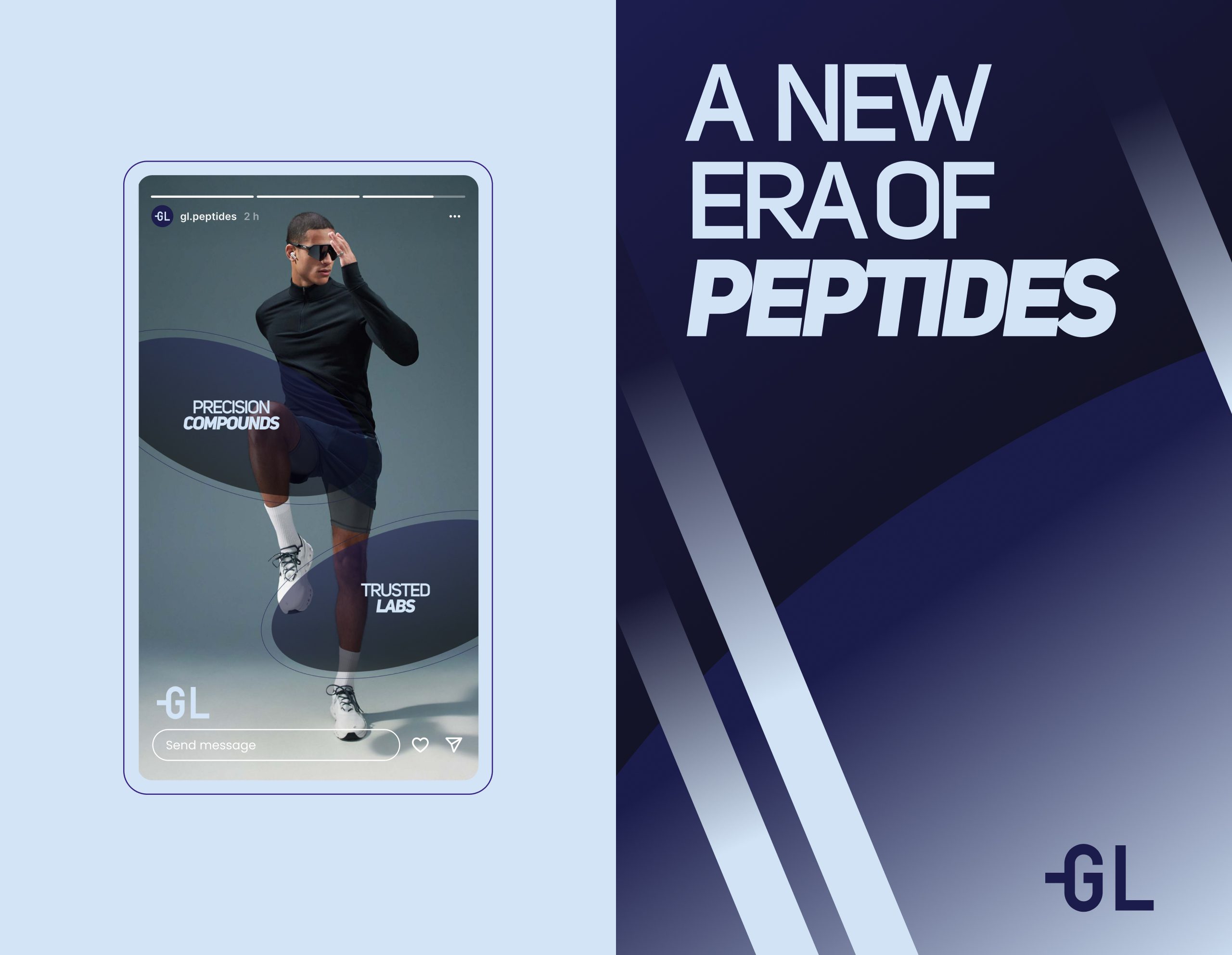
To elevate the brand beyond standard pharmaceutical visuals, we developed dynamic elliptical line patterns inspired by molecular trajectories and orbital movements.
These patterns:
introduce energy and motion,
symbolize molecular dynamics,
create a signature visual system recognizable across platforms.
They become a key asset in social media, packaging accents, and website UI.
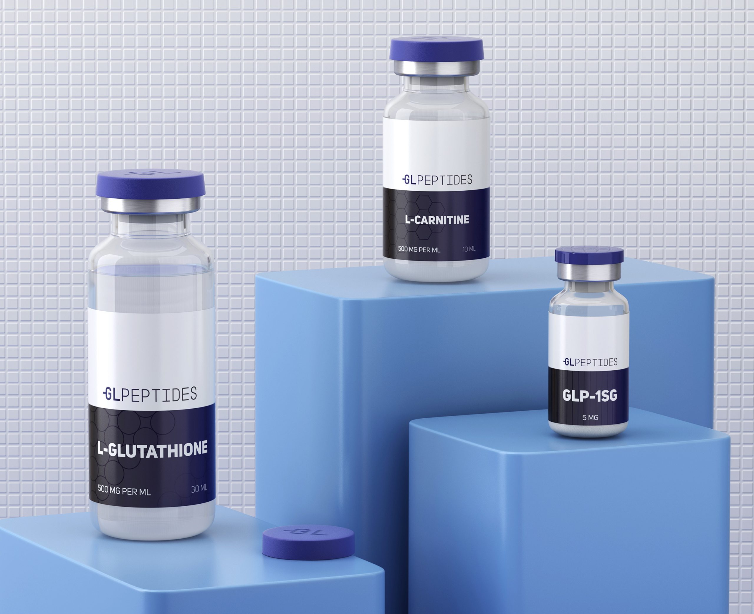
05. Packaging Design
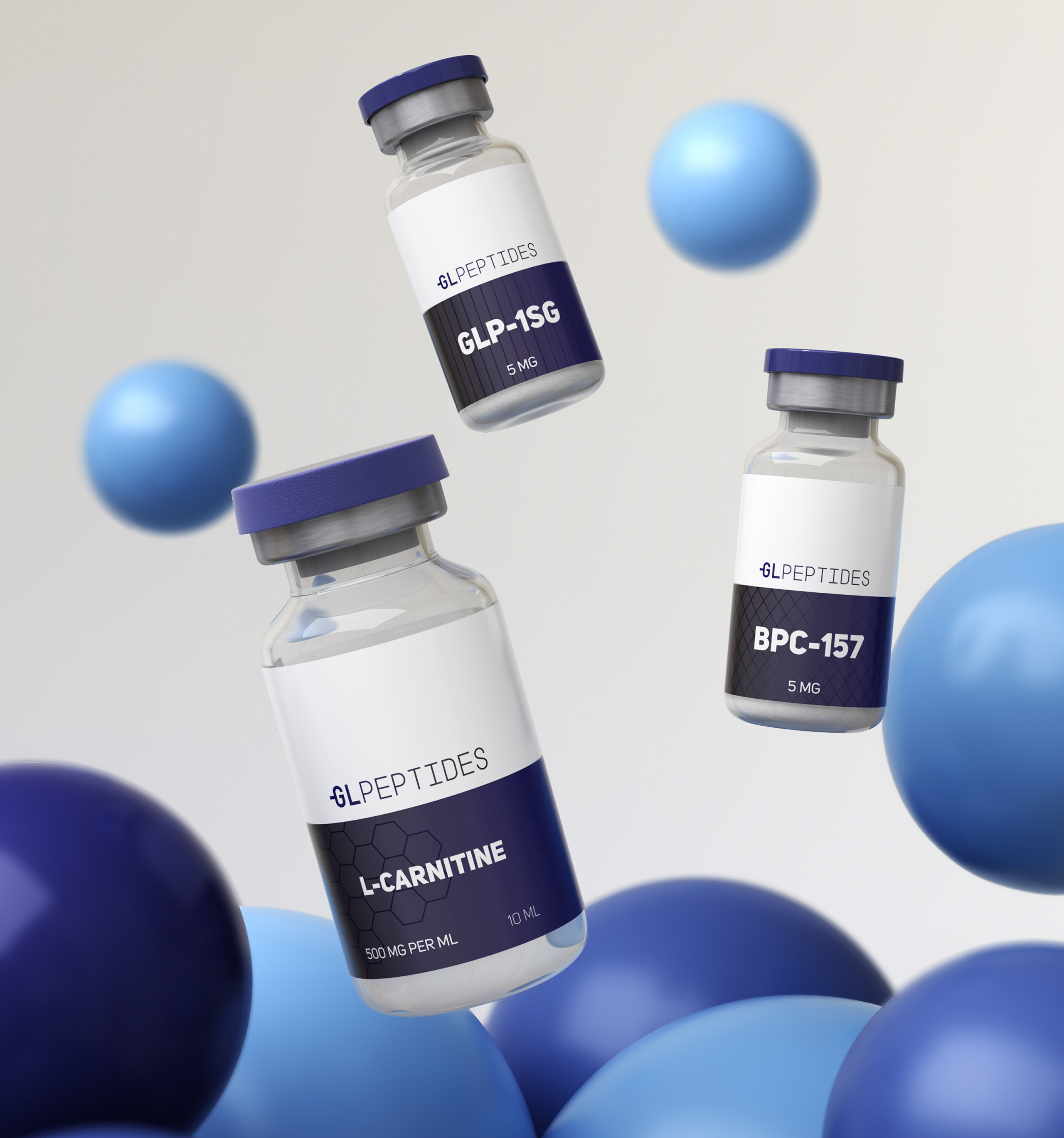
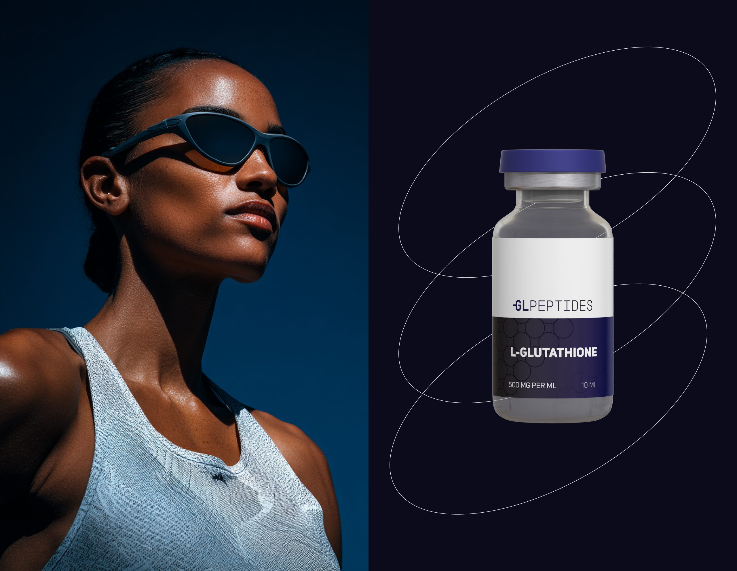
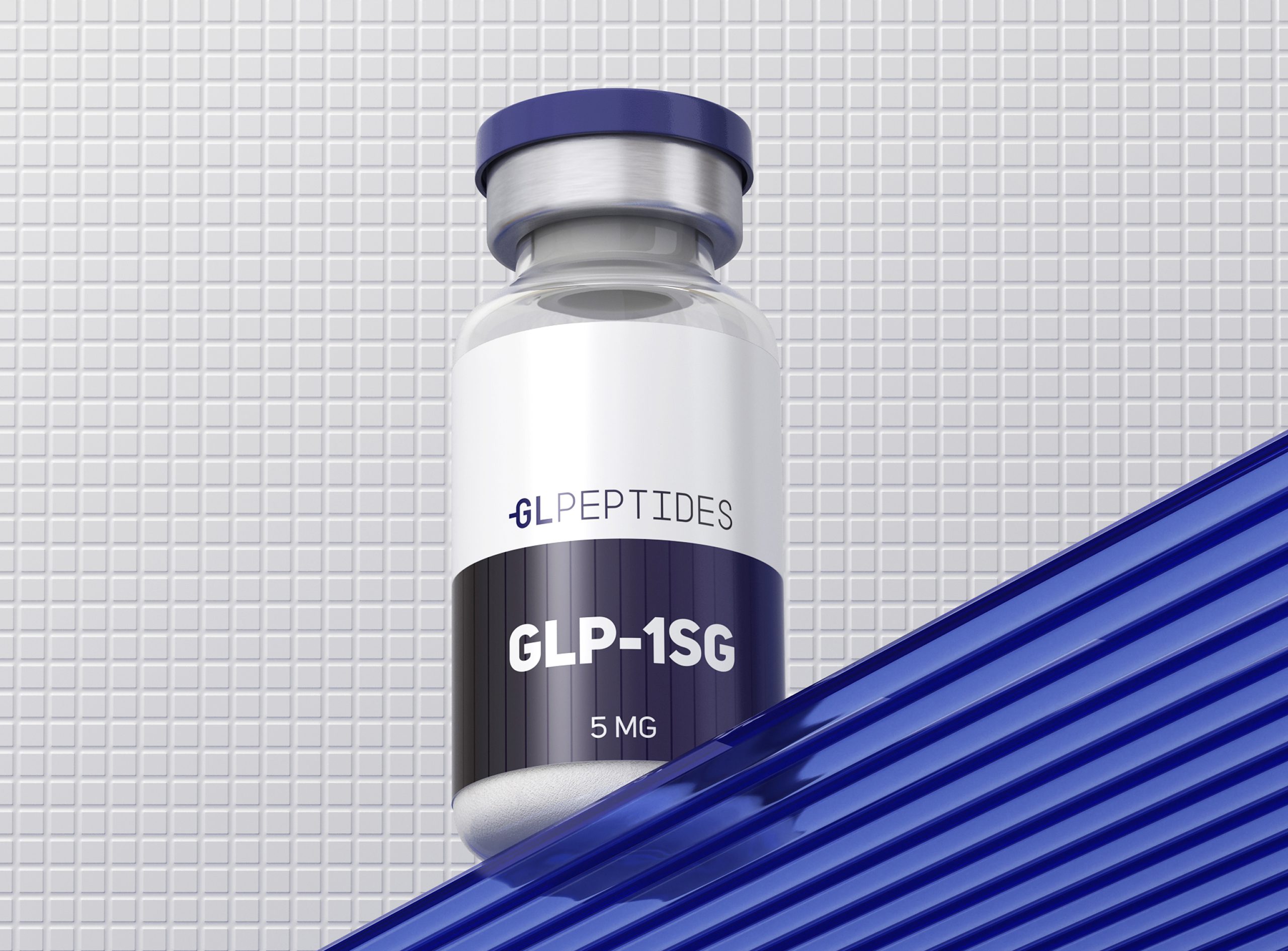
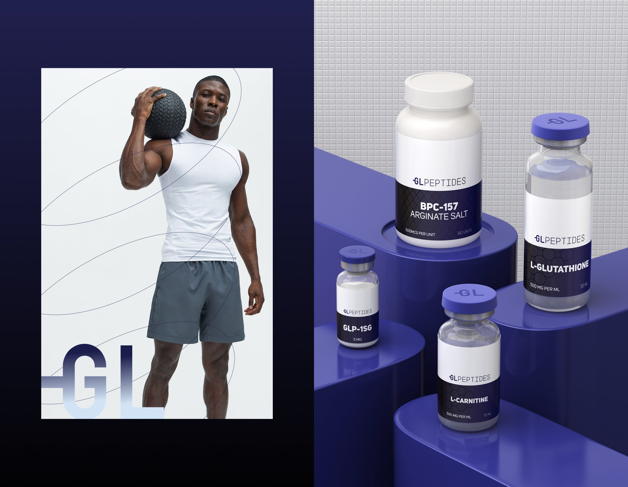
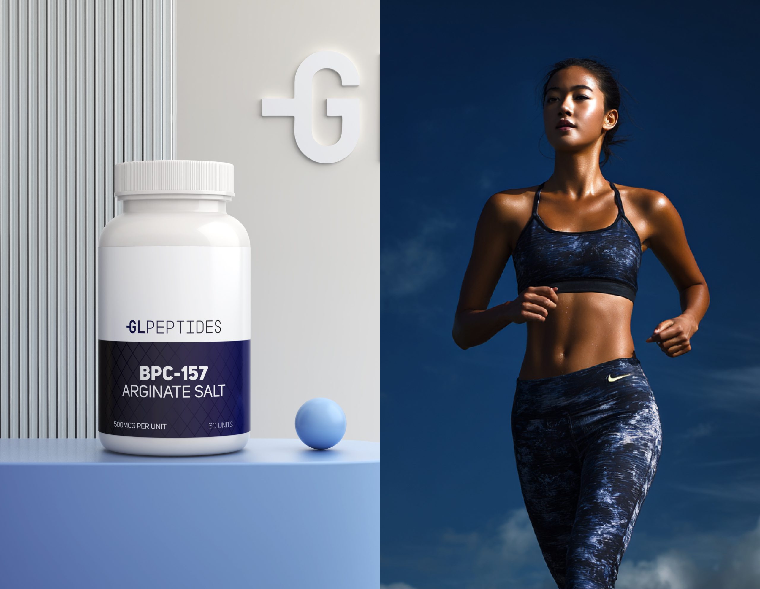
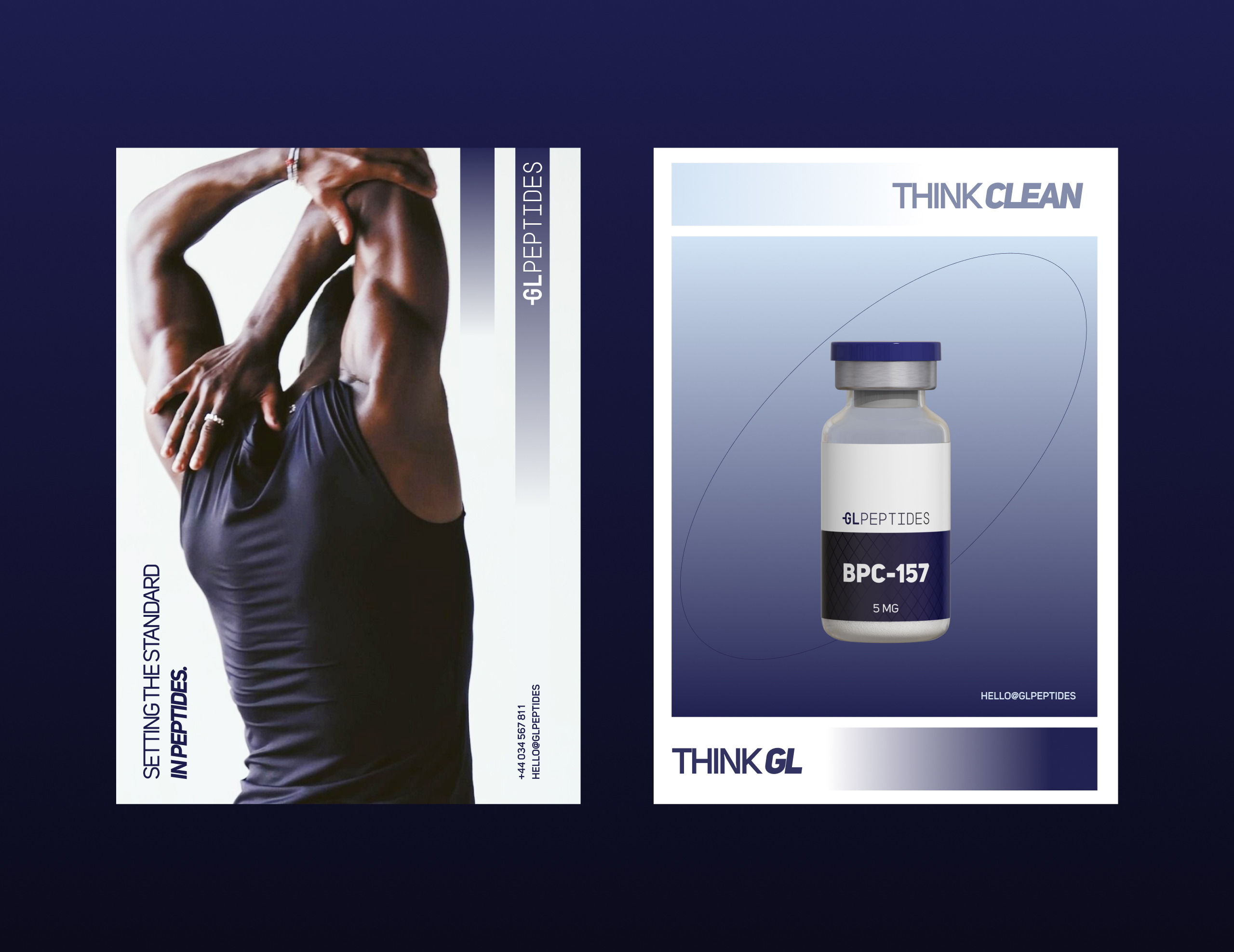
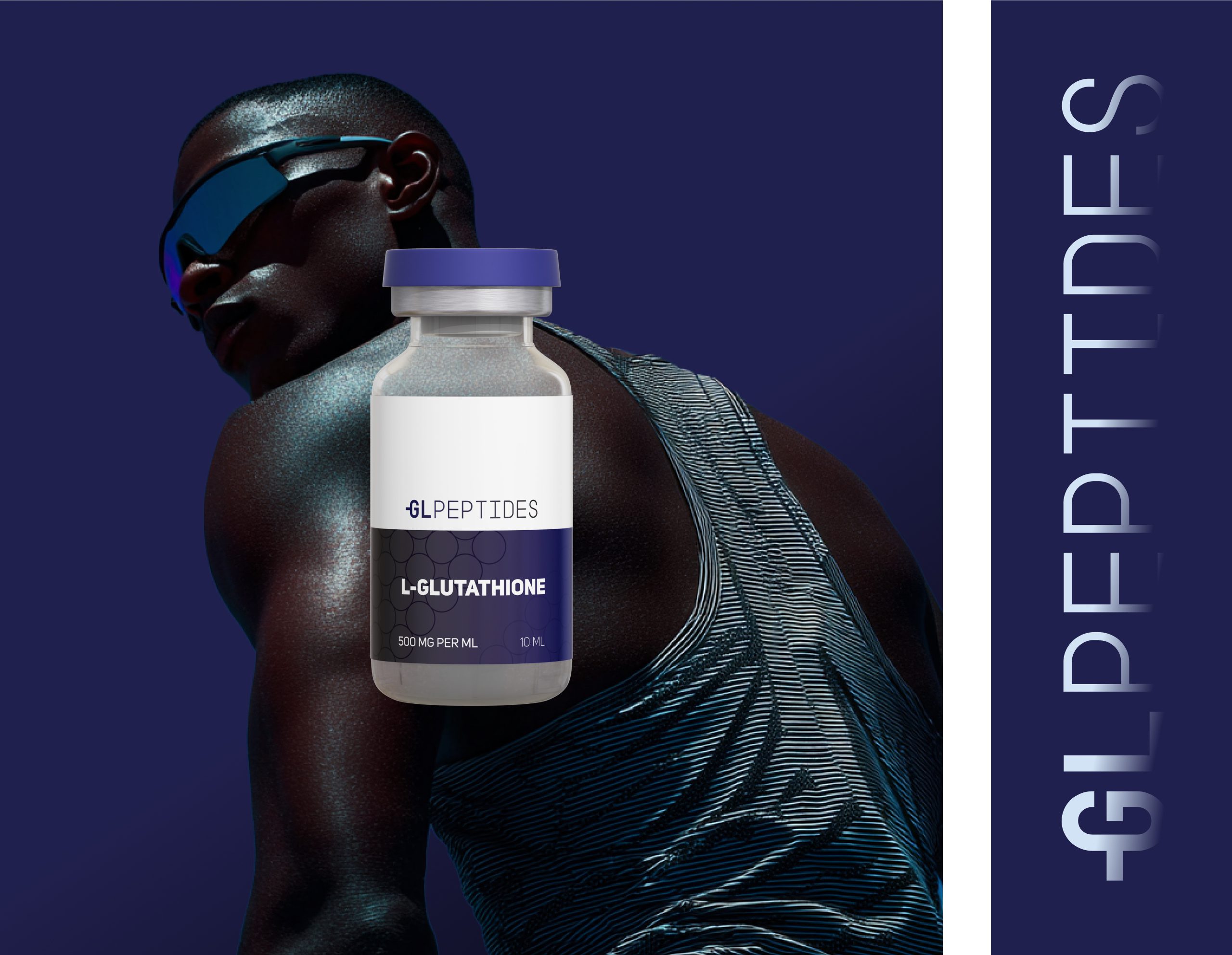
The packaging direction combines clinical simplicity with premium product clarity.
Each vial design follows a strict visual hierarchy to ensure instant readability and a professional, research-grade appearance.
Key elements:
Precise label grids
High-contrast typography
Minimal, lab-clean layouts
Molecular patterns for subtle scientific cues
A bold color block system to differentiate compounds
The result: packaging that feels trustworthy, modern, and ready for both lab environments and direct-to-consumer markets.
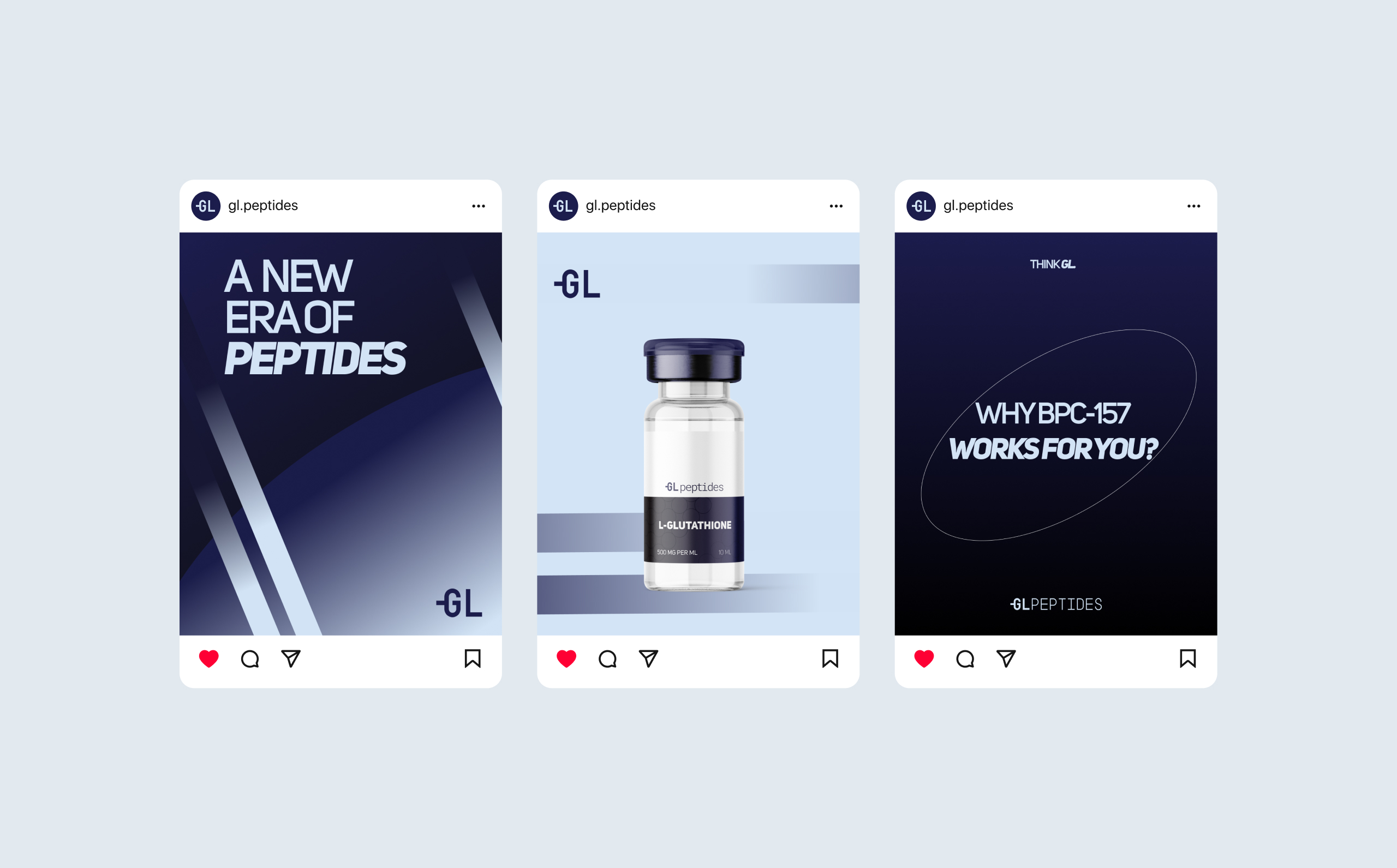
06. Social Media System
We built a digital system capable of educating, inspiring, and converting high-intent audiences — athletes, researchers, and wellness professionals.
Content structure includes:
High-contrast monochrome layouts
Hero product showcases
Molecular-inspired graphic accents
Key scientific statements
Modern performance photography
Everything is designed to build authority and emphasize the brand’s science-first commitment.
07. Web Experience
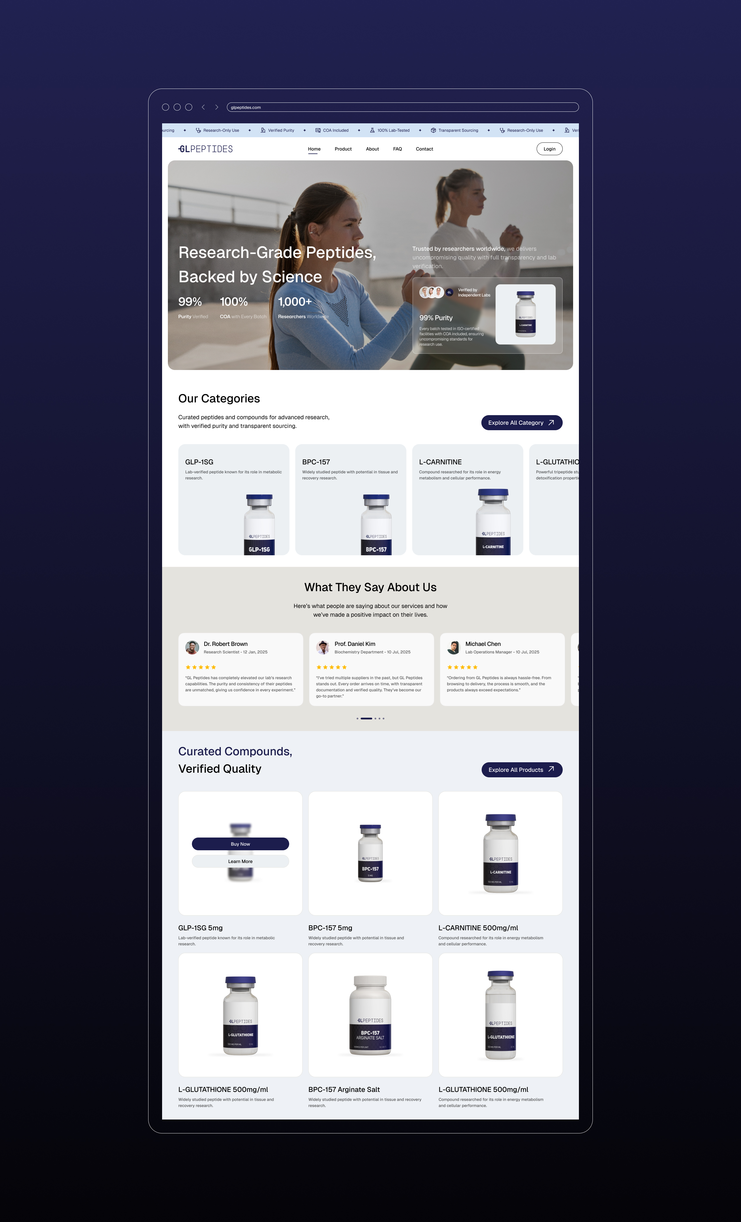
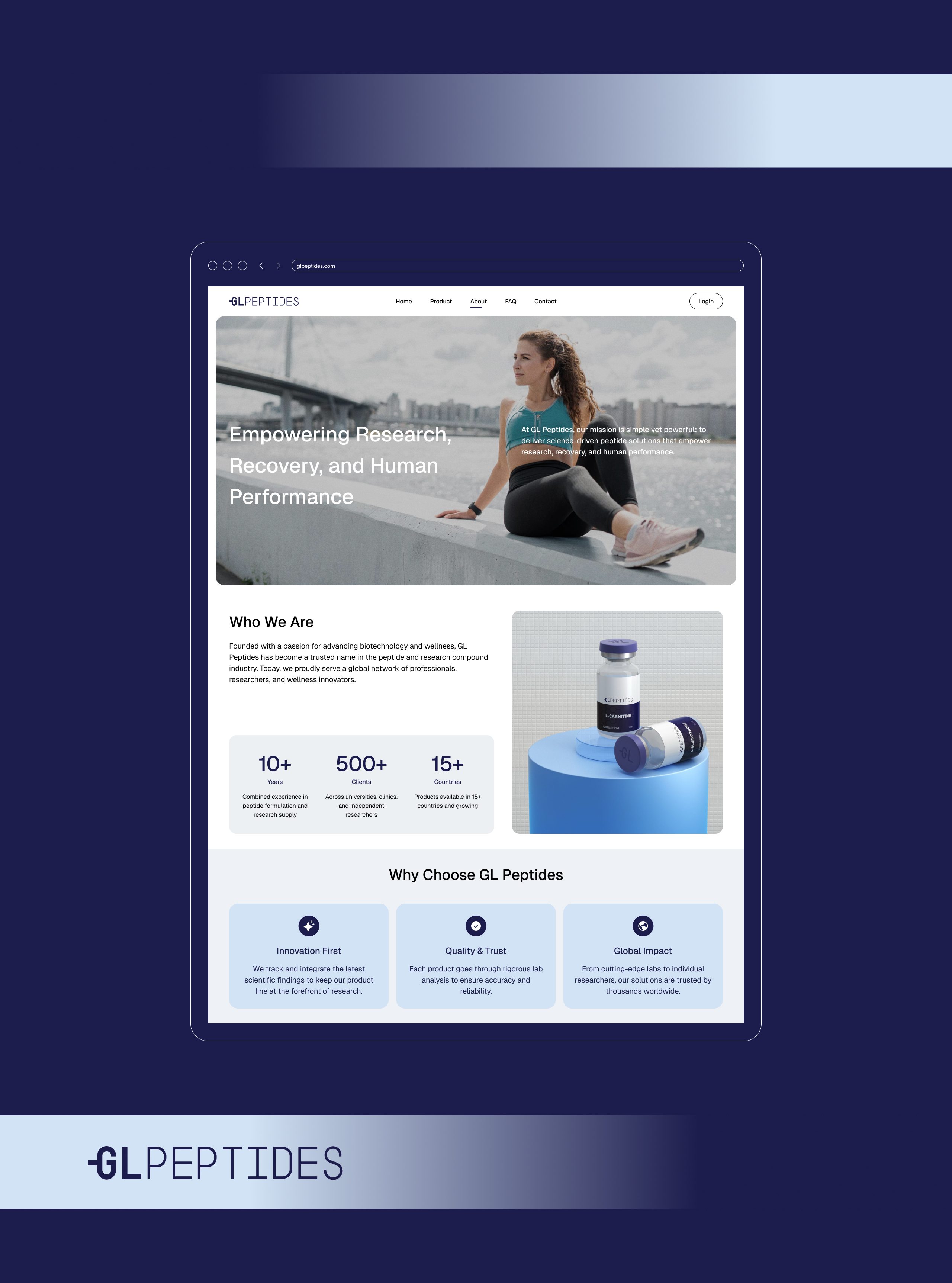
The GL Peptides website mirrors the brand’s clarity and credibility.
Clean UI, intuitive navigation, and data-forward structure support a strong first impression.
Highlights:
High-trust hero sections
Lab-grade product presentation
COA-focused transparency messaging
Multi-category product grids
Customer testimonials from researchers and professionals
Soft micro-animations and gradient transitions
The digital presence positions GL Peptides as a benchmark in peptide research and performance supplementation.




08. Final Outcome
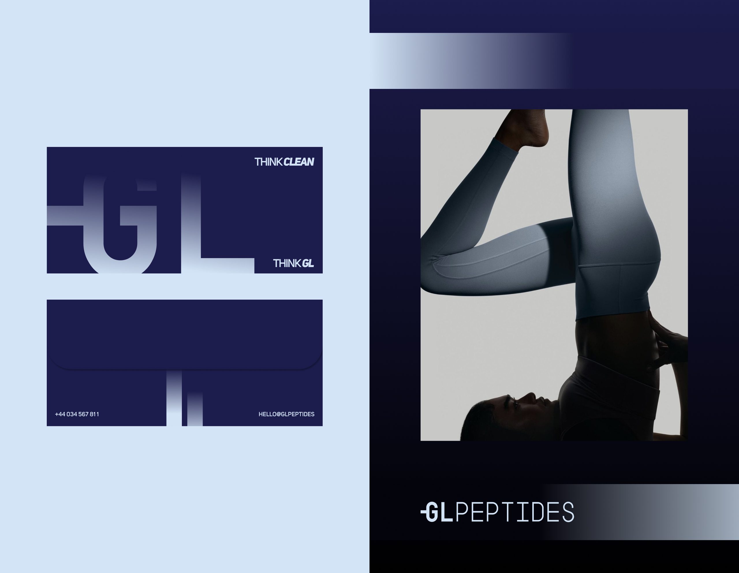
Through a cohesive identity system — monogram, typography, patterns, packaging, and digital design — GL Peptides now stands as a modern, authoritative, and globally scalable peptide brand.
This identity elevates the brand from a typical supplement look into a scientific performance powerhouse with clarity, structure, and unmistakable presence.
Let’s make the work they’ll copy.
Talk to an expert now

