
Herboil
pure hemp for natural well-being
Herboil is a premium organic hemp oil blend meticulously formulated by MARKAWORKS to elevate quality of life. It offers a natural, prestigious, and eye-catching solution for relief from pain, stress, and anxiety.
A Comprehensive Approach to Herboil Branding
Our branding strategy for Herboil focused on conveying its natural, prestigious, and eye-catchy qualities through a minimalist and classic design aesthetic. We developed a logo, emblem, color palette, and packaging that all work together to create a cohesive and professional brand identity.
The Client: Herboil – Enhancing Quality of Life
Herboil is an organic hemp oil blend that helps people increase the quality of their lives by relieving pain, stress, and anxiety.


The Keywords: Comprehensive / Natural / Prestigious / Eye-catchy
These keywords guided our design process, ensuring that the final brand identity accurately reflected the product’s benefits and market positioning.


The Solution: Logo and Emblem Design
We designed a logo out of a sans serif font, which gives a feeling of simplicity and a timeless look. To add more understanding to the brand, we created an emblem, which is a vectored illustration of hemp. For an additional appliance variant, we designed an icon as well.

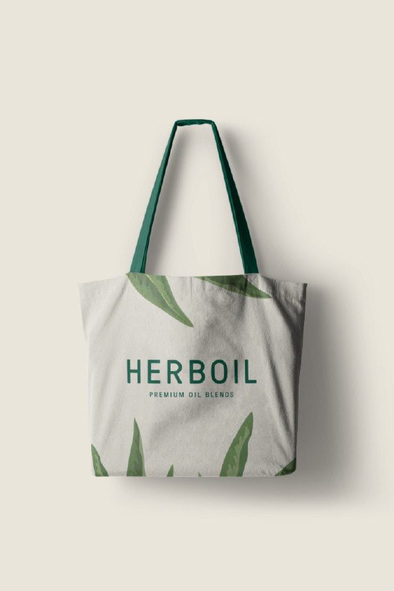
The Solution: Color Palette and Pattern
The colour palette consists of green shades and neutral, creamy colours. This way, colour spectre creates a minimal and classic look and feel, at the same time giving professional energy. In addition, we designed a pattern that includes natural patterns, which include hemp illustrations.
The Solution: Packaging Design
As for the packaging, we created a bottle and box design. The box design is made up of a creamy background and green font colour. We thought of a simple and minimal layout, including only important information at the front and back of the box. On the sides of the box, we included a general description of the product. The bottle design includes the natural hemp leaf pattern with minimal label layout. The difference between the box and the bottle is that the logo and emblem are placed at the bottom of the bottle.
Let’s make the work they’ll copy.
Talk to an expert now


