Rootine
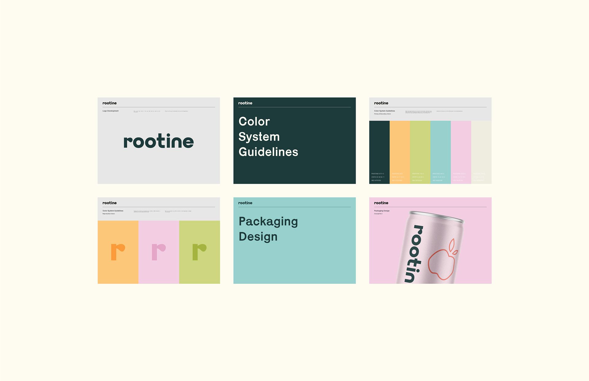
Rootine Brand Identity and Packaging Design
Rootine is a CBD infused sparkling water brand designed to support everyday wellbeing and relaxation without unnecessary complexity. The design project focused on creating a brand identity and packaging system that communicates the product’s function and flavor range with clarity, softness, and visual distinction.

Brand Strategy and Visual Identity
The visual identity for Rootine was developed around a balance of minimal structure and visual presence. The brand language supports clear communication of product type and taste profile while reinforcing a calm and inviting aesthetic.
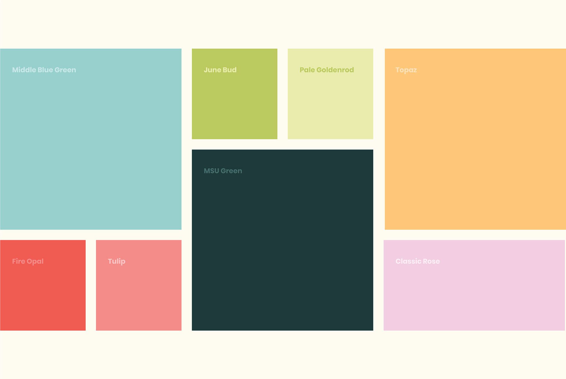
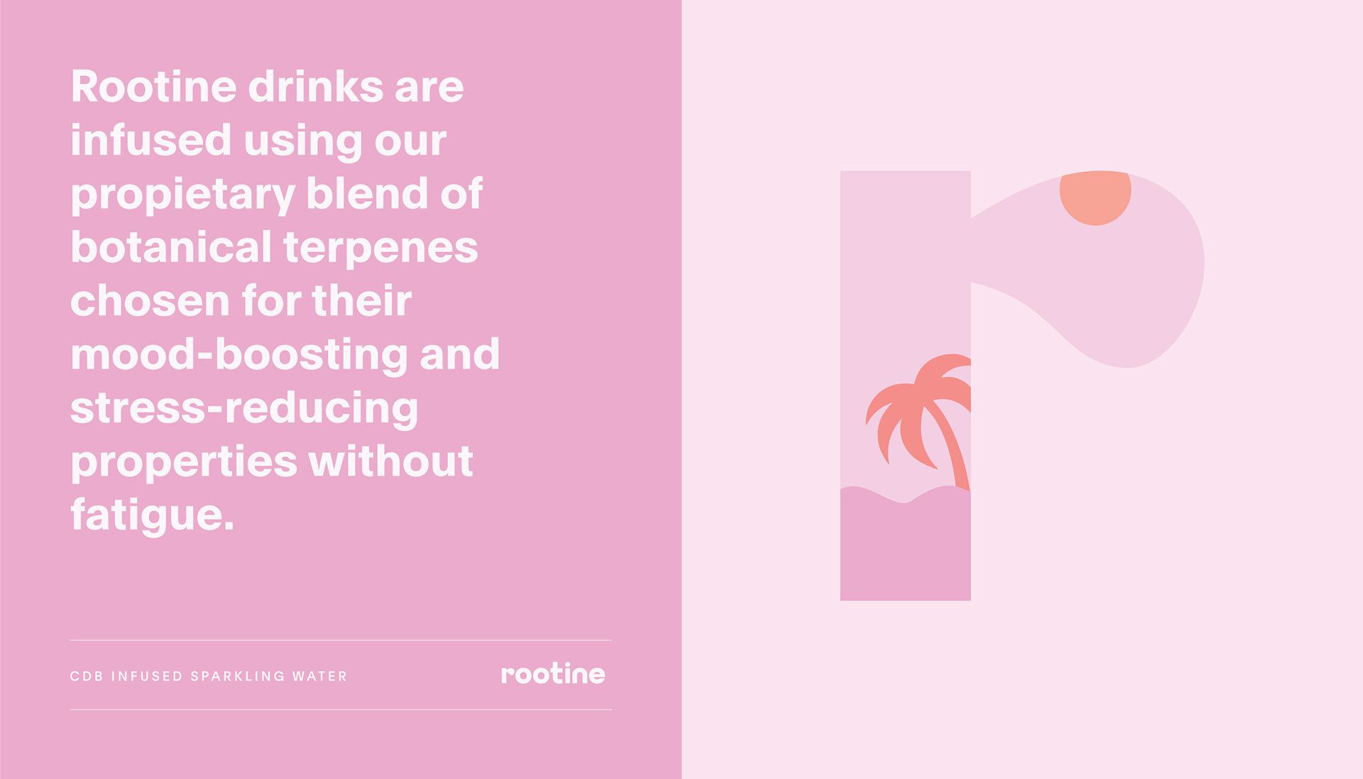
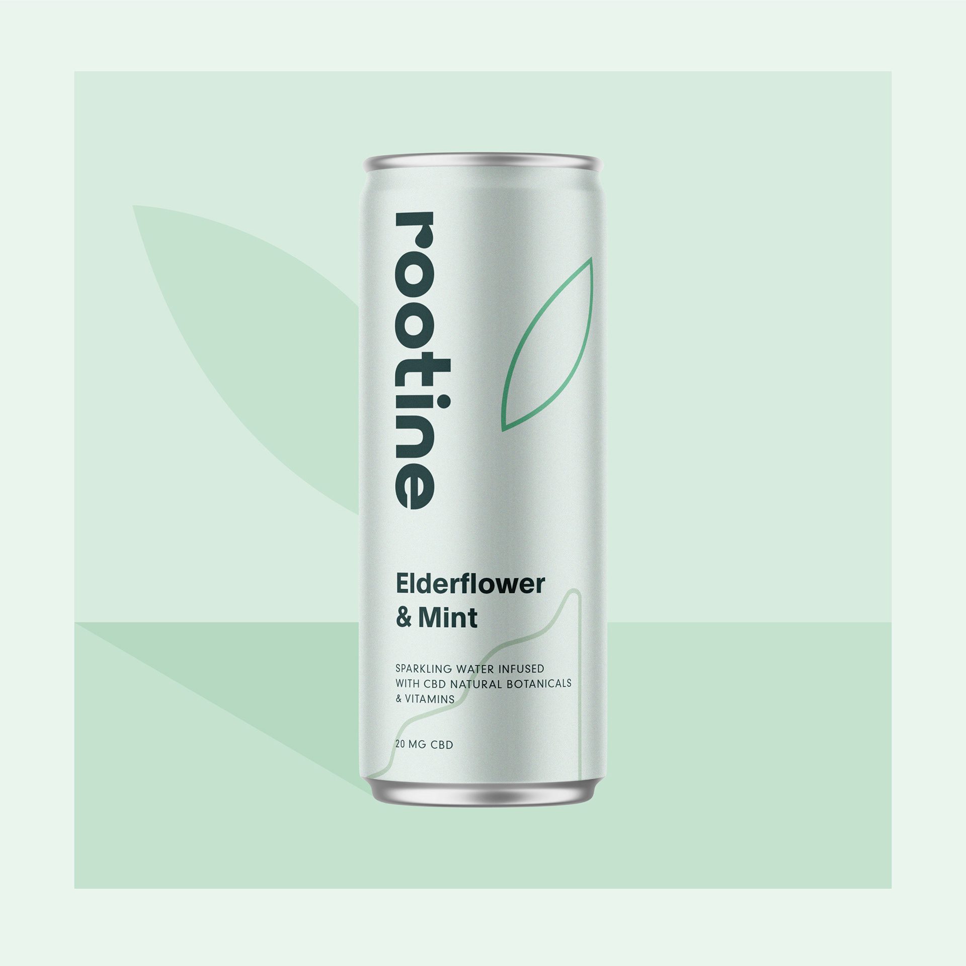
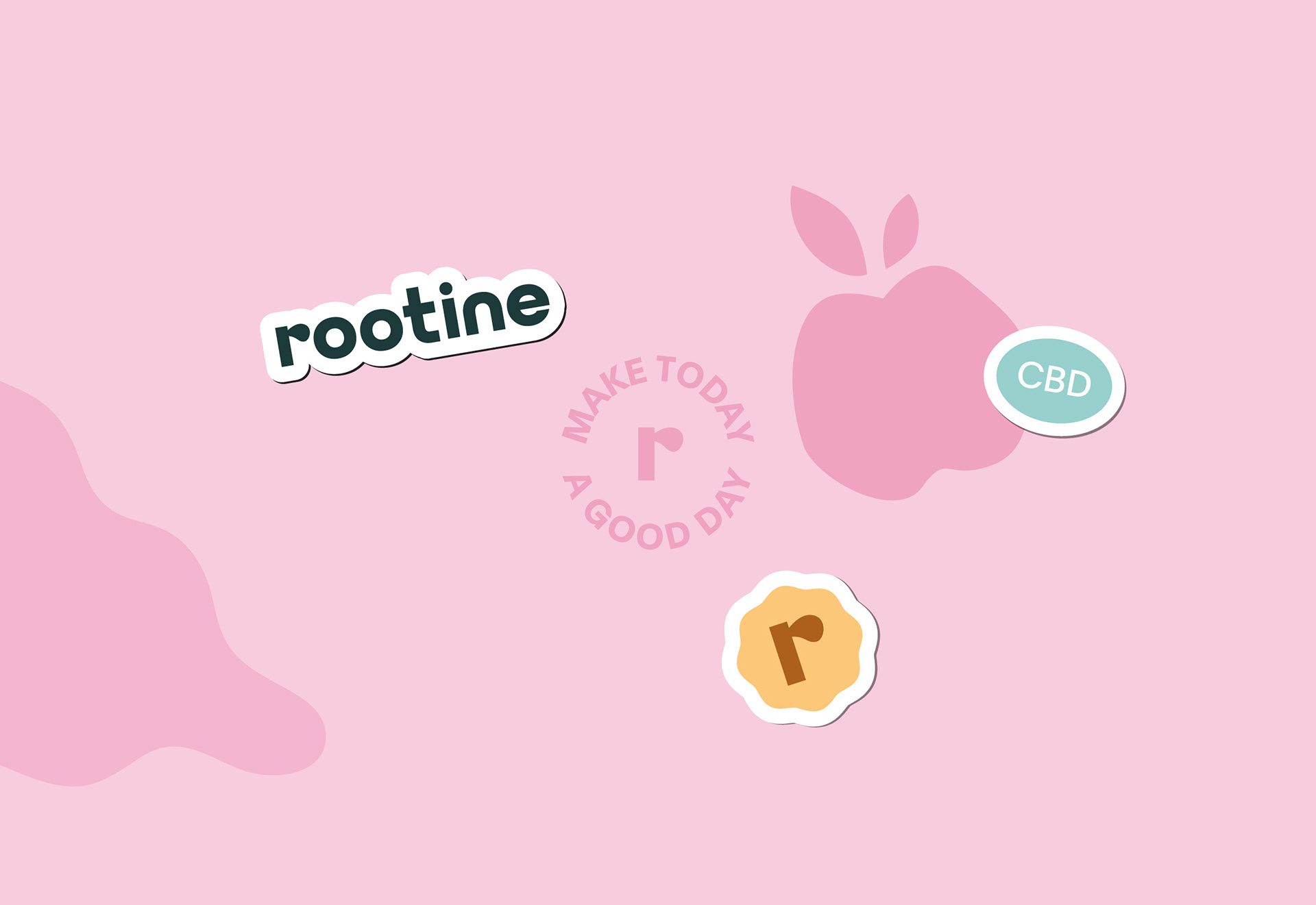
The logo is bold in contrast but softened through the use of a sans serif typeface with rounded edges, creating a visual presence that feels approachable and intentional. A restrained colour palette was selected, pairing soft pastel tones with a deep green used consistently for the logo, helping the brand to communicate calmness and care.
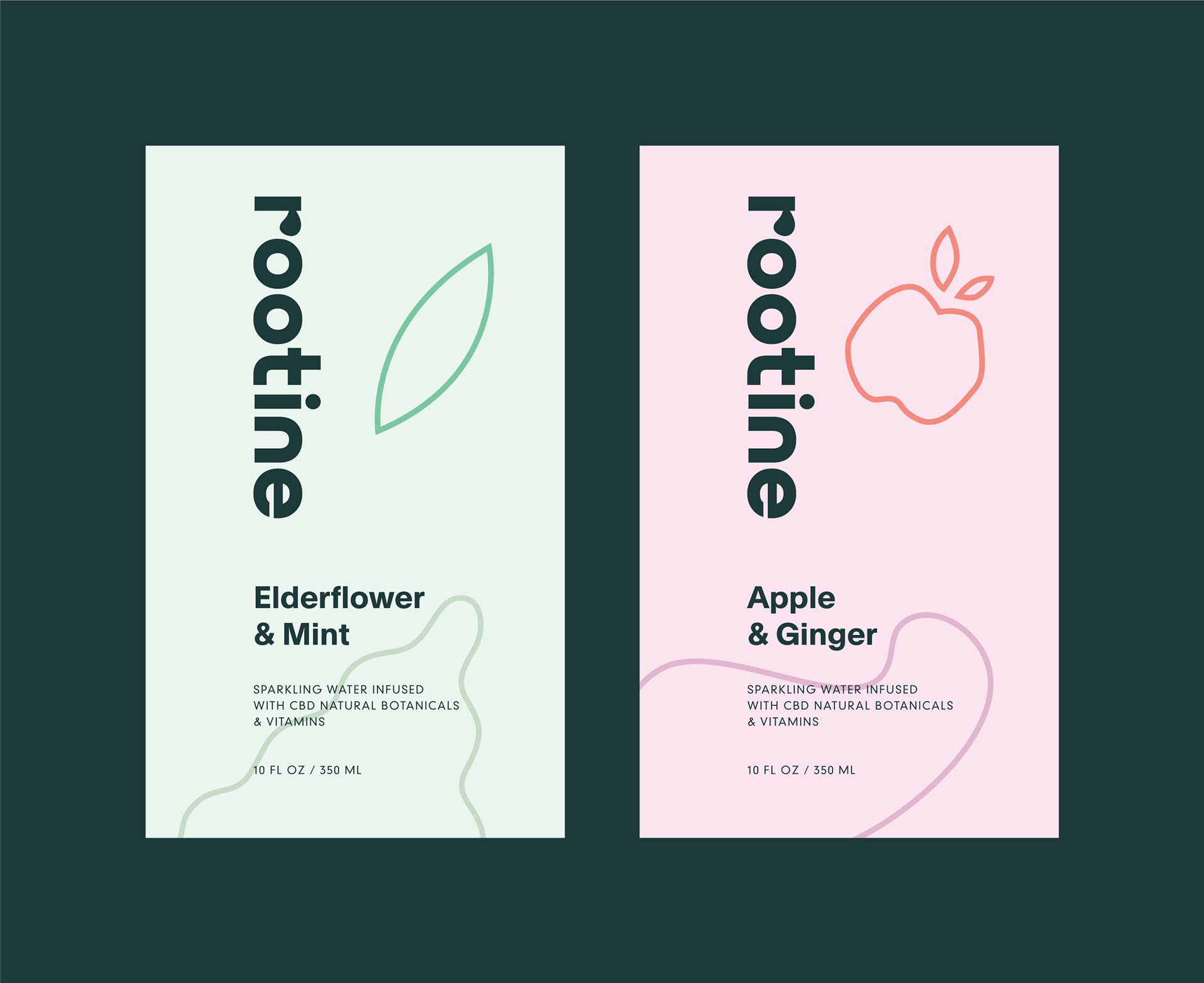
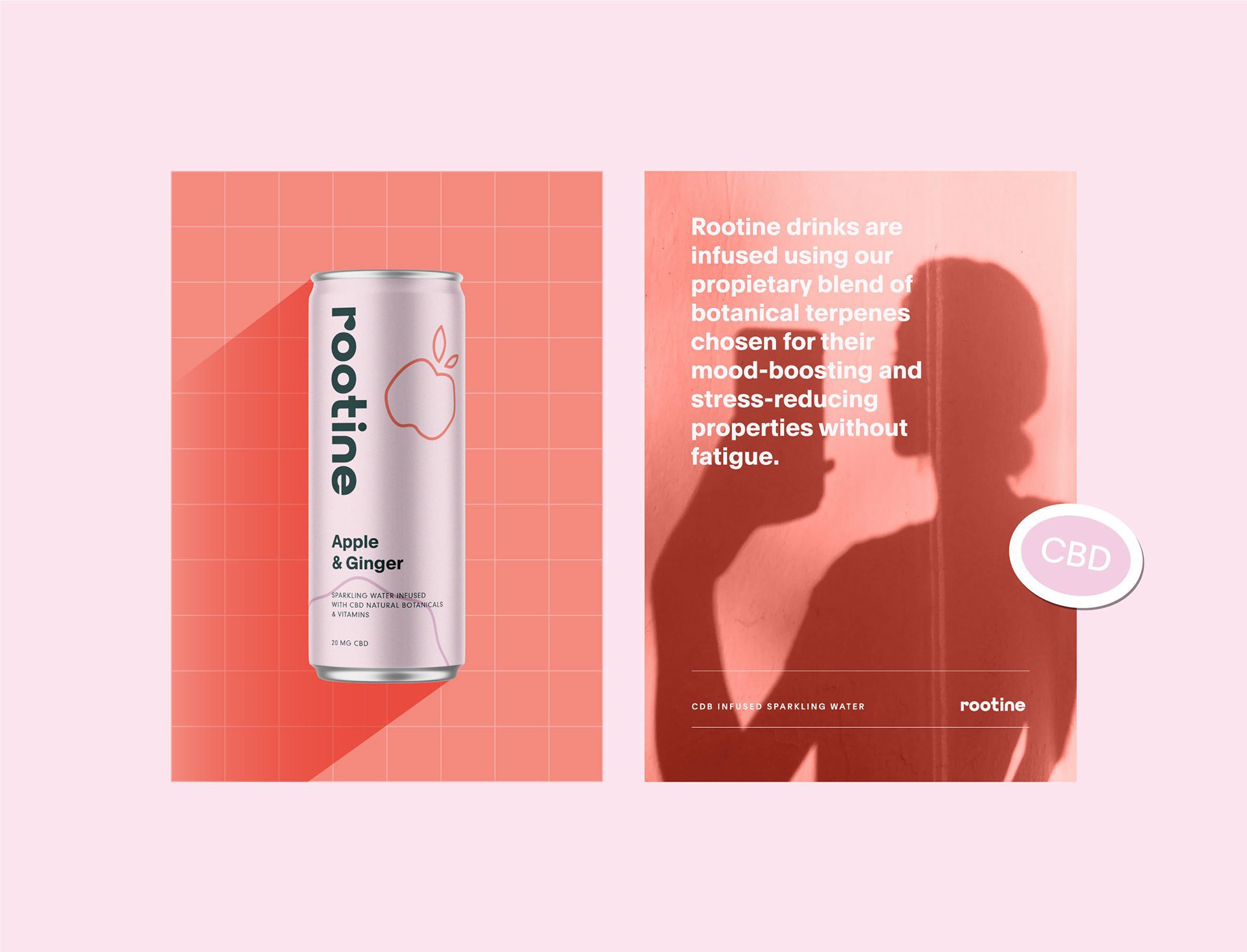
Soft pastel colours were chosen for their calming qualities and ability to support easy recognition of individual flavours. Each variant’s colour scheme corresponds directly with the flavour and plant-based ingredients, helping consumers identify taste profiles quickly while maintaining a unified visual system.
Packaging Design and Product Expression
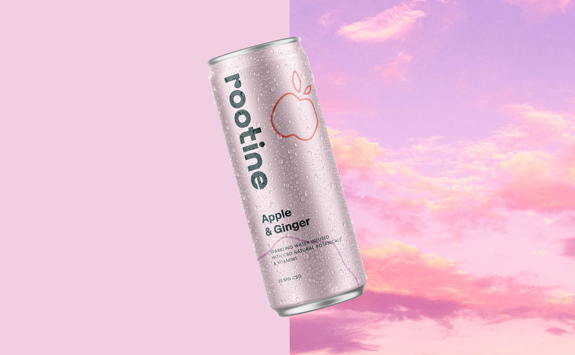
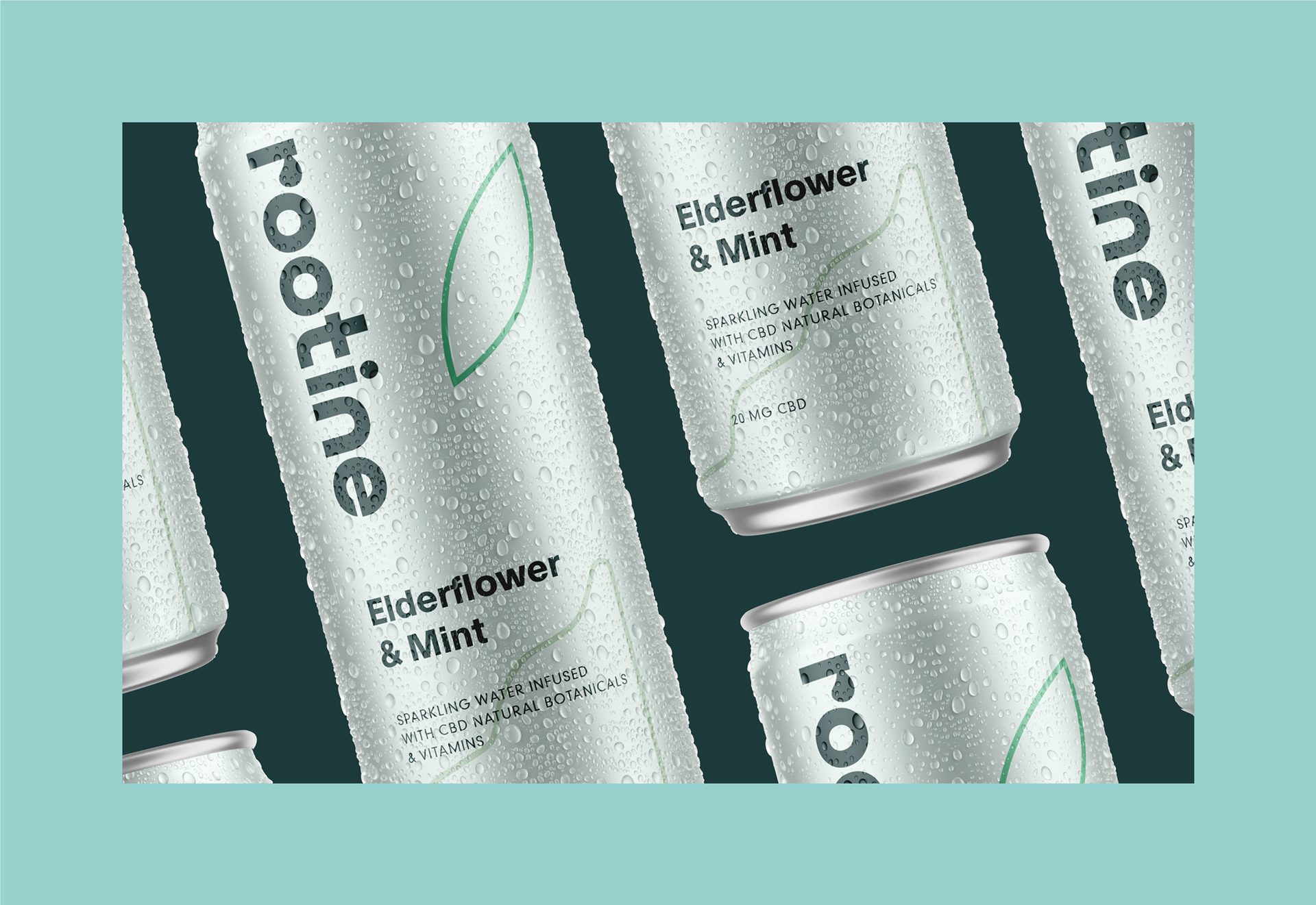
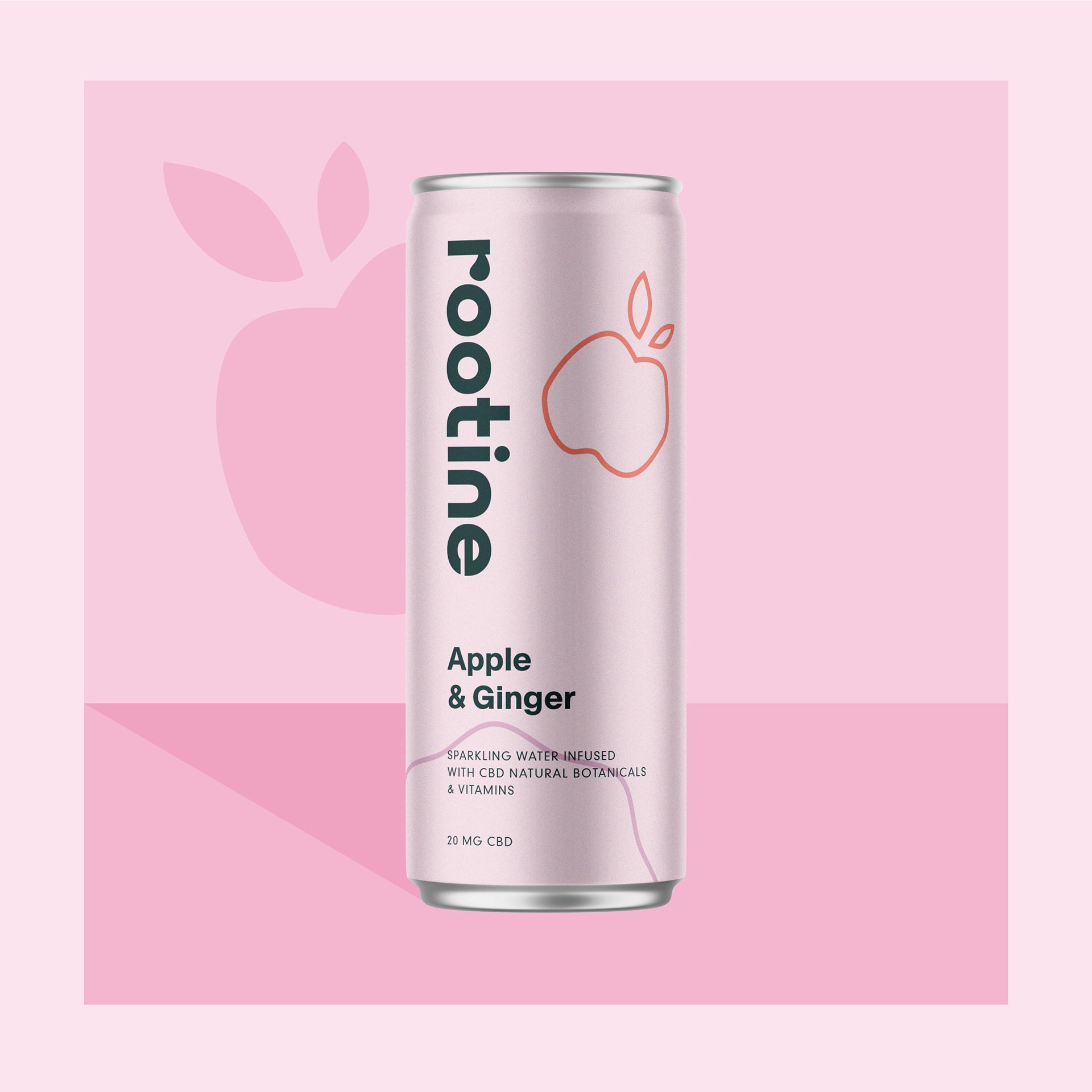
Packaging design for Rootine centres on clarity and ease of understanding. Label layouts are structured to include only the essential elements — the logo, flavour name, weight, and product type, in a format that reduces visual noise and supports quick decision making on shelf.
Minimal illustrations of the main ingredients appear on each can, reinforcing flavour recognition while supporting visual hierarchy. These illustrations work with the pastel colour schemes to make each variant identifiable at a glance.
This approach delivers a packaging system that feels composed and accessible, reflecting the product’s emphasis on calmness, natural flavour cues, and functional refreshment.
Brand Application and Market Positioning
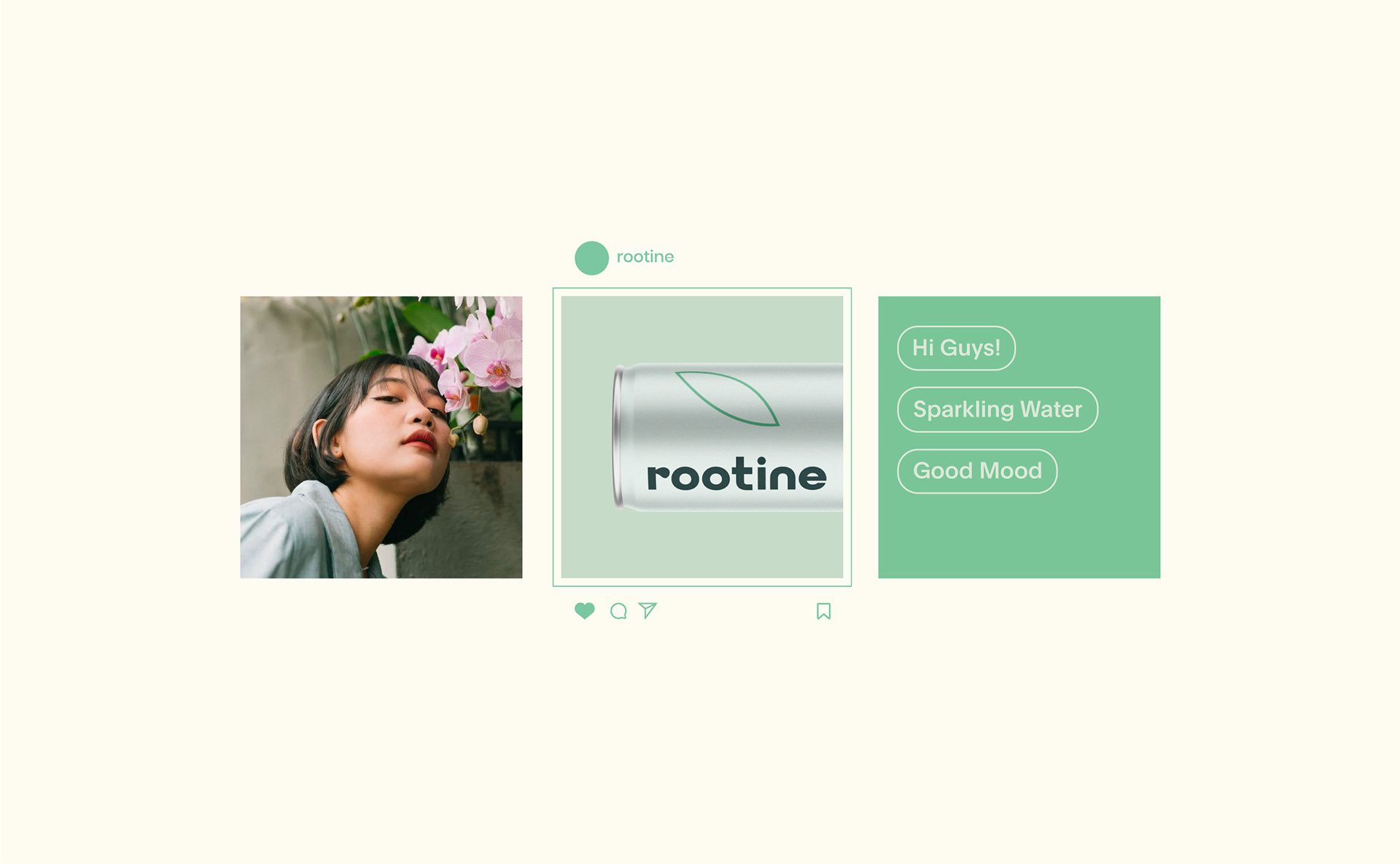
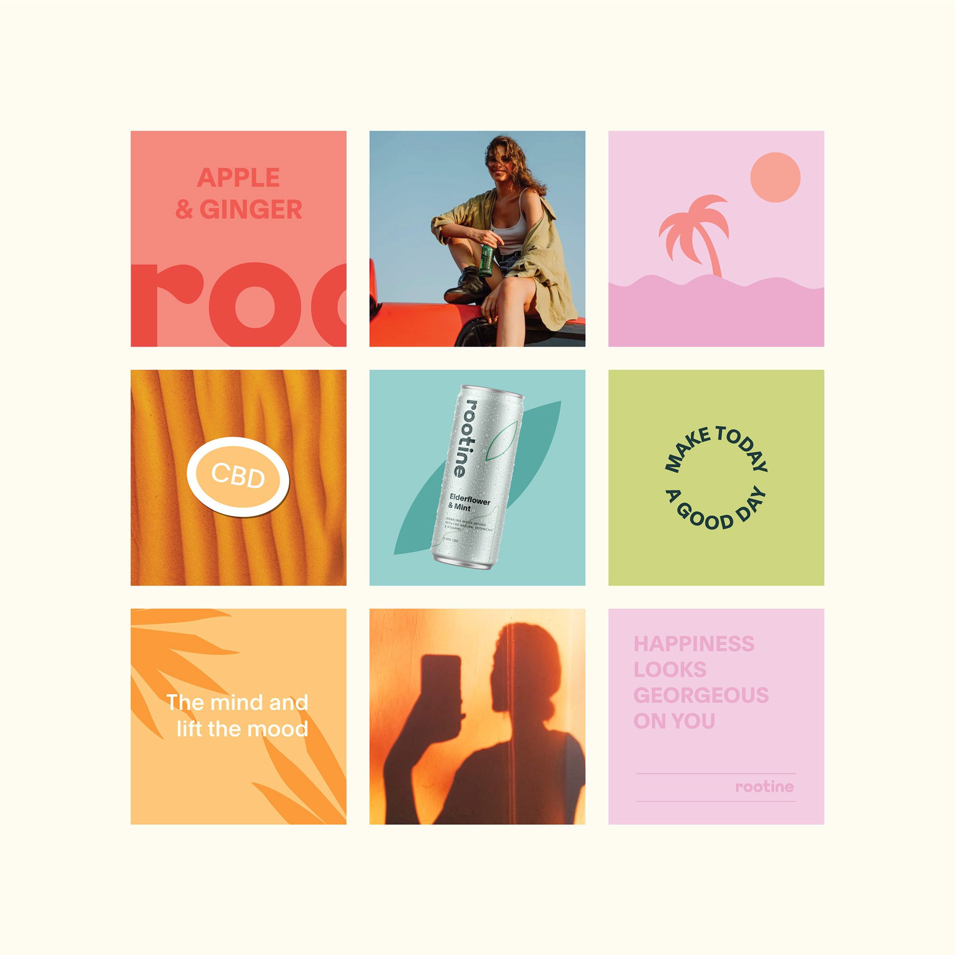
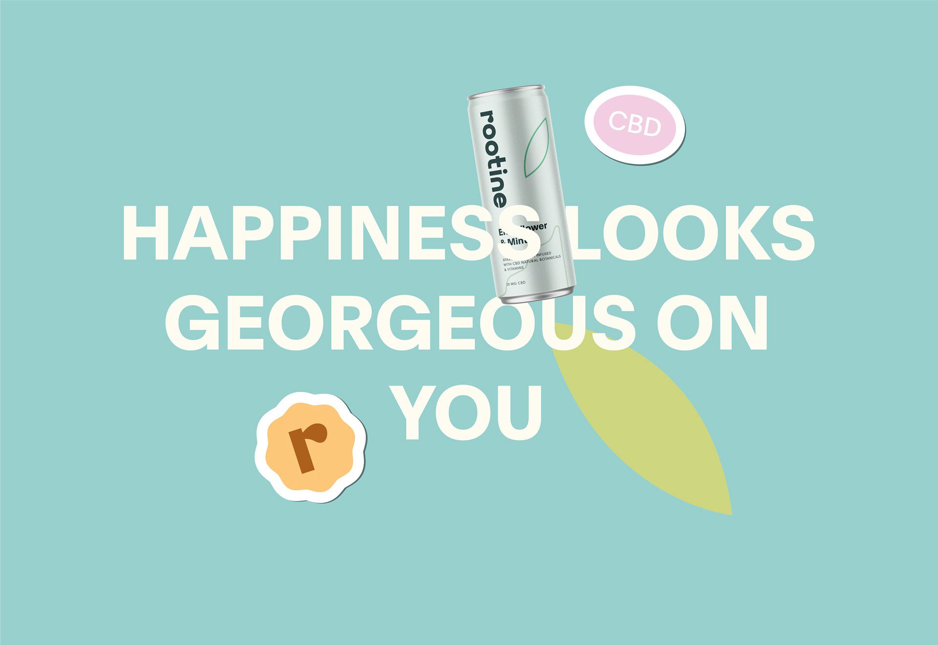
The Rootine identity extends into digital and marketing environments with visuals that reflect the same structured simplicity found in the packaging. This consistency supports recognition and strengthens brand presentation across channels.
Rootine positions itself as a CBD infused beverage option that emphasises calm and clear communication of flavour and product type. The visual system helps the brand maintain presence in a developing beverage category while making product choice intuitive and approachable for consumers.

Let’s make the work they’ll copy.
Talk to an expert now


