
Scoop & Cones Ice Cream
nostalgic ice cream, modern flavors
Scoop & Cones is an ice cream brand that masterfully blends nostalgic charm with modern appeal, offering unique flavor combinations. MARKAWORKS crafted a brand identity that visually communicates its friendly personality and delicious offerings through distinctive packaging and a memorable logotype.
A Sweet Blend of Classic and Contemporary
Our approach for Scoop & Cones focused on creating a brand identity that balances nostalgic charm with modern appeal. We designed a logo, color palettes, and packaging that reflect the brand’s unique flavor combinations and friendly personality.
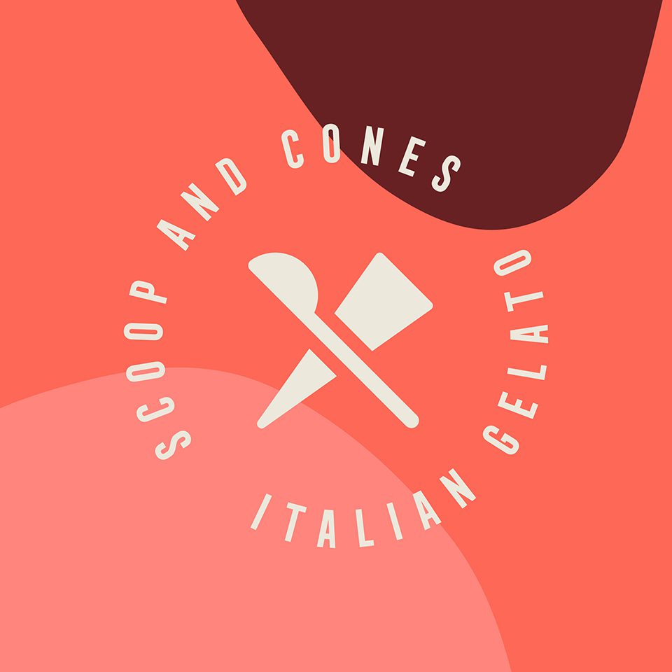
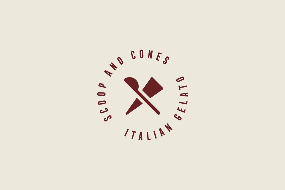
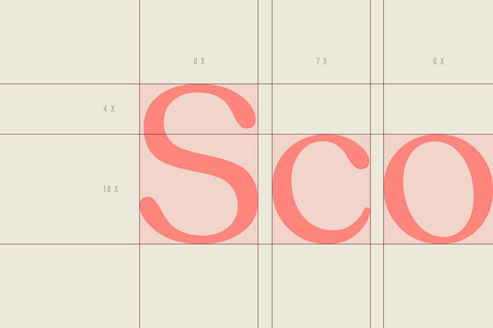
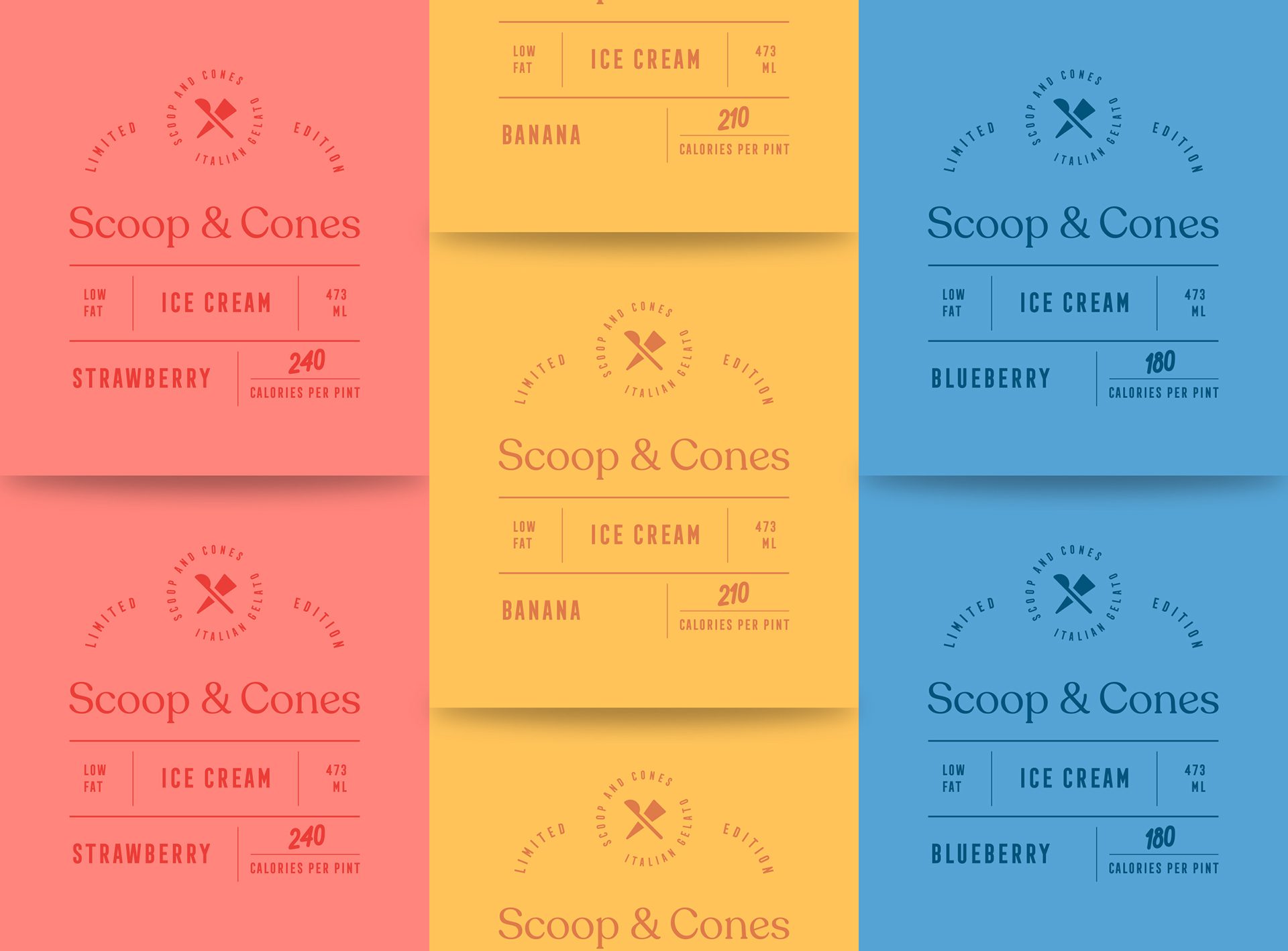
The Logotype: Simplicity Meets Vintage Charm
The logotype’s font choice fell on the sans serif type. Due to its simplicity and the brand’s vibrant branding, we wanted to create a balance by choosing a minimal font. We created a vintage-style secondary mark with spoons and cones colliding as classic and new flavours do in this brand.
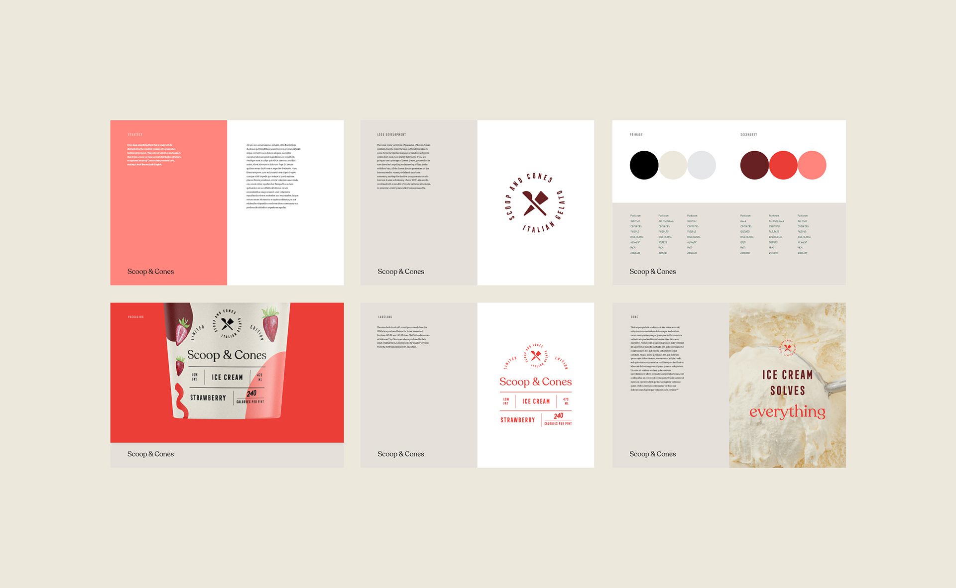
Color Palettes: Harmonious Combinations
The colours we have selected are divided into two sets of colours. The first set is a neutral combination of black and grey shades, and the second set consists of red, peach, and maroon shades. This way, colour combinations are easier and more harmonised. However, for some flavours’ packaging, we have included additional colours connected to their ingredients.
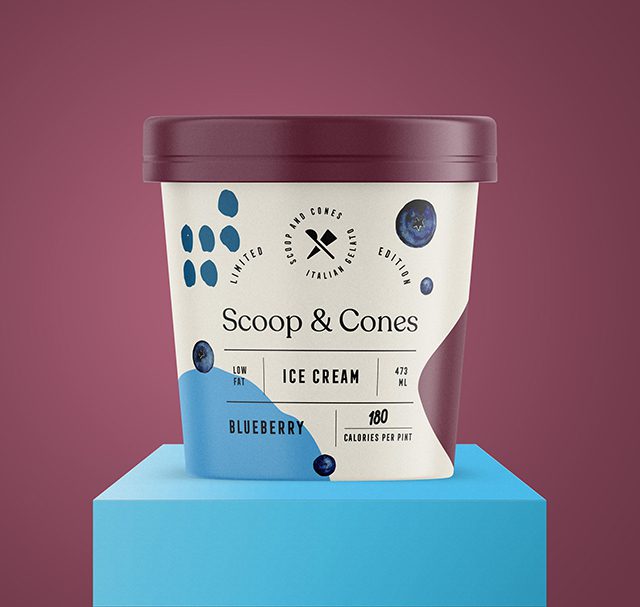
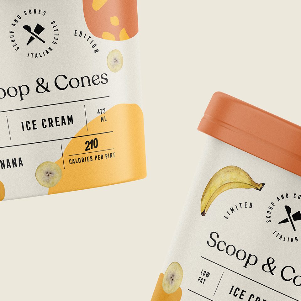

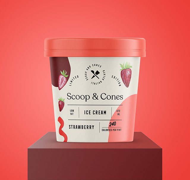
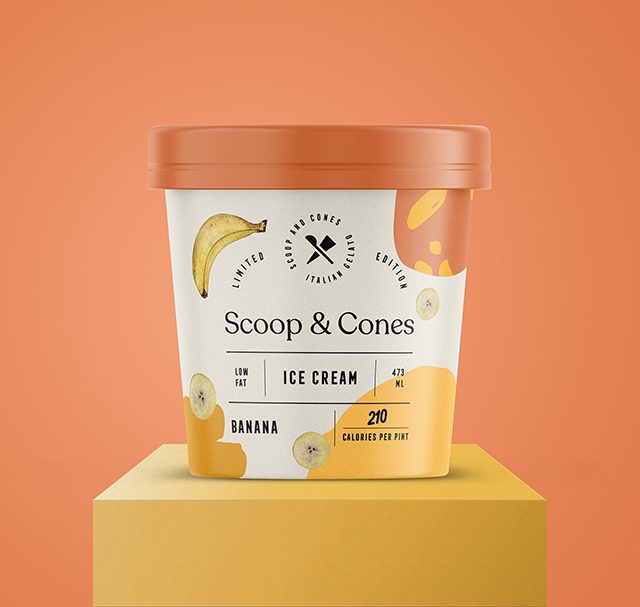
Packaging Design: Visual Comprehension and Flair
For the ice-cream packaging, we created separate patterns, including illustrations of the main ingredients for visual comprehension of the flavour. The caps of the packaging are also connected with the pattern’s special colour, i.e., the colours chosen for the colour pattern.
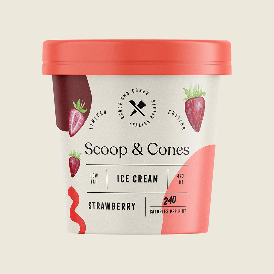

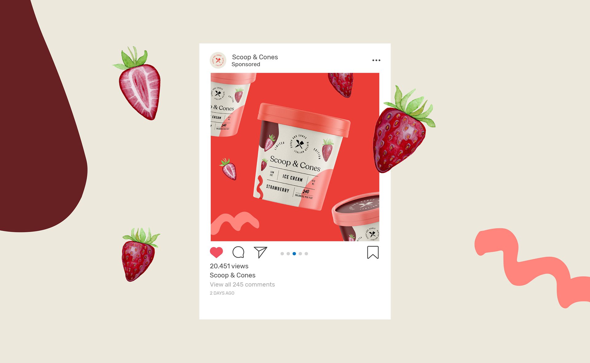

Label Layout: Informative and Prestigious
The packaging’s label layout we designed is comprehensive and includes important information such as “Low fat” and “Calories per pint” in front. To add a prestigious look and feel, we have included the “Limited Edition” phrase.
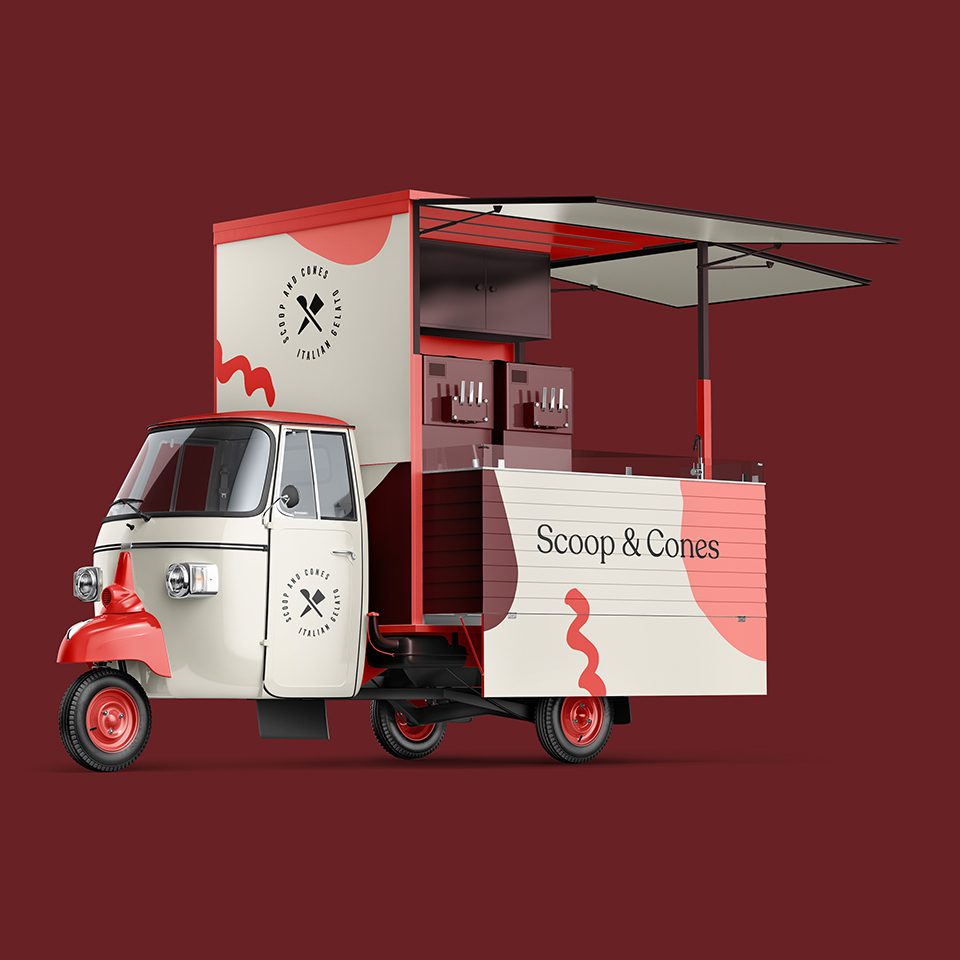
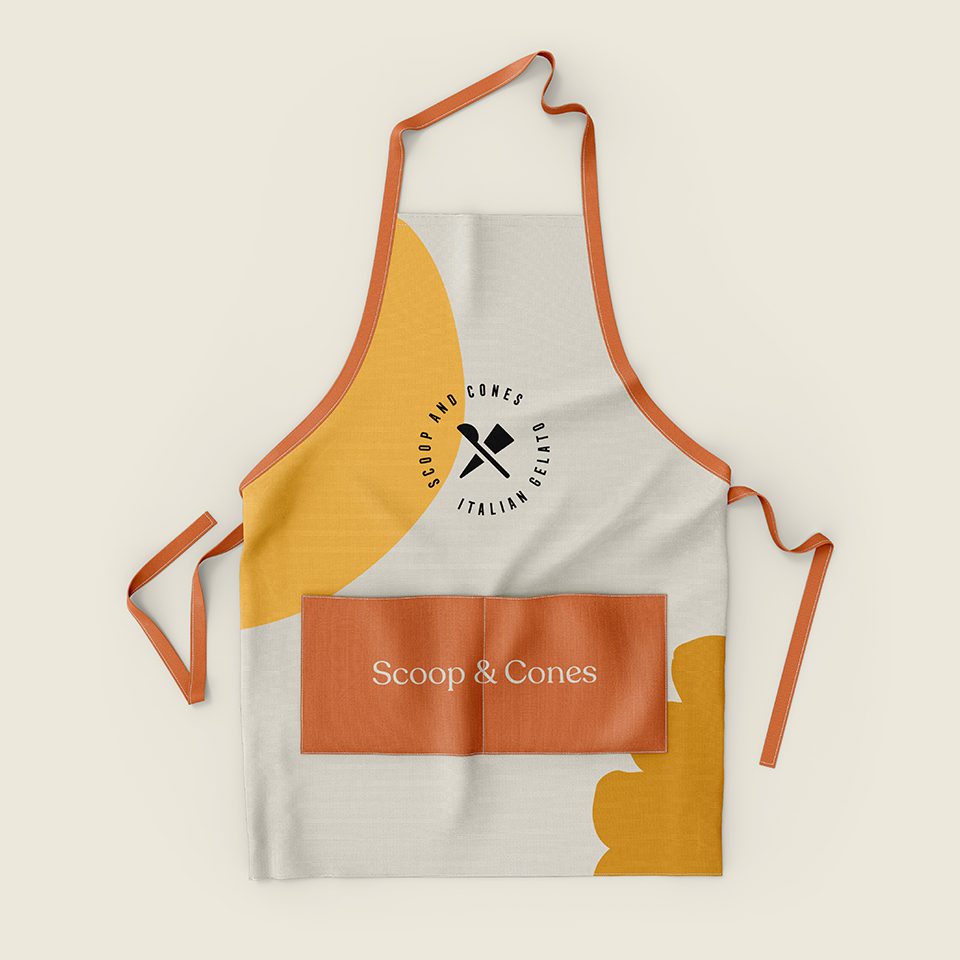
Beyond Packaging: Apron and Mini Truck Design
We have also created an apron similar to the packaging design for the apron. Since the Scoop & Cones have a classic and vintage feel, we have also designed a mini ice-cream truck.
Let’s make the work they’ll copy.
Talk to an expert now


