
Thompson Liquid Dietary Supplement
organic california hemp wellness
Thompson Liquid Dietary Supplement, expertly branded by MARKAWORKS, is a comprehensive, full-spectrum hemp oil crafted from organic California hemp. This Canadian-made supplement embodies strength and professionalism, offering a timeless approach to wellness with distinct flavour profiles that are both understandable and appealing to consumers.
A Comprehensive Approach to Dietary Supplement Branding
Our branding strategy for Thompson focused on creating a visual identity that communicates strength, professionalism, and comprehensiveness, ensuring the product is understandable and appealing to consumers.
Defining the Brand Essence: Strong, Professional, Comprehensive, Timeless
Thompson is a liquid dietary supplement brand based in Canada. It’s a full-spectrum hemp oil made from organically grown California hemp. The core values we aimed to embody were Strong / Professional / Comprehensive / Timeless.


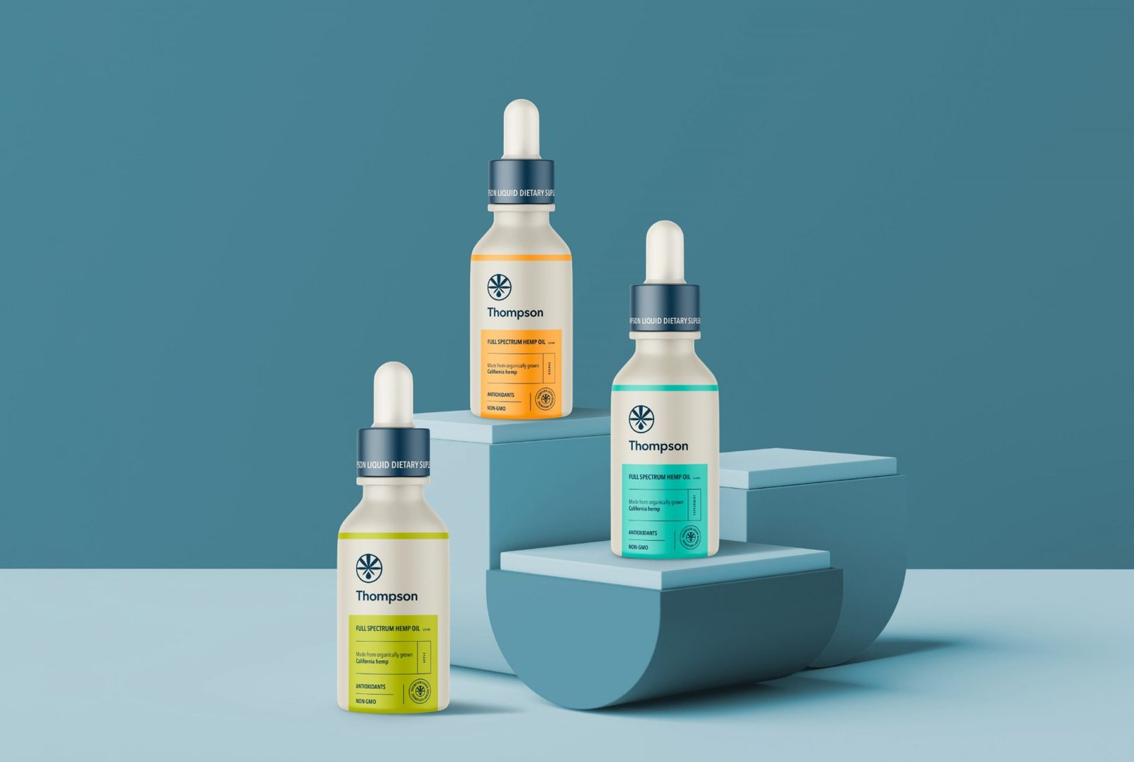
Crafting a Classic Logo and Illustrated Emblem
As a solution for the Thompson’s branding, we came up with a classic font for the logo and a hemp illustrated emblem. This way, the supplementary type becomes more understandable for viewers.


Strategic Color Palette and Packaging Layout
There are four main colours for the flavour types, and two other colours were selected for the packaging background and typography. For example, the orange colour goes for the orange flavour, green for the apple, mint flavour for the peppermint, and violet for the blueberry flavour. Meanwhile, the whole label’s layout was meant to look professional. For this reason, we placed the logo and the emblem at the top of the label. All the important information for the packaging was placed at the front, separated by the specific lines and their specific colours. The rest of the background is a matte transparent bottle.


Let’s make the work they’ll copy.
Talk to an expert now


