
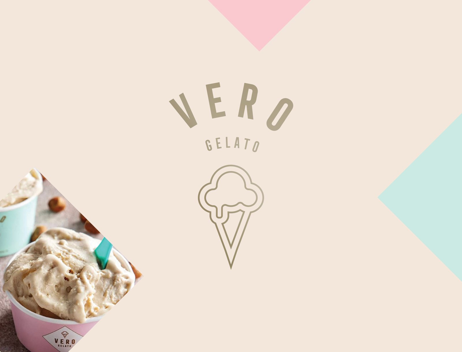
Vero Gelato Branding
Vero Gelato Brand Identity and Packaging Design
Vero Gelato is a premium gelato brand that celebrates authenticity, craftsmanship, and sensory experience. The project focused on creating a brand identity and packaging system that reflects the quality of the product while supporting clear communication of flavour profiles and product characteristics.

The design approach was developed to convey a sense of quality and freshness while maintaining a visual language that feels structured, approachable, and memorable in a competitive dessert category.
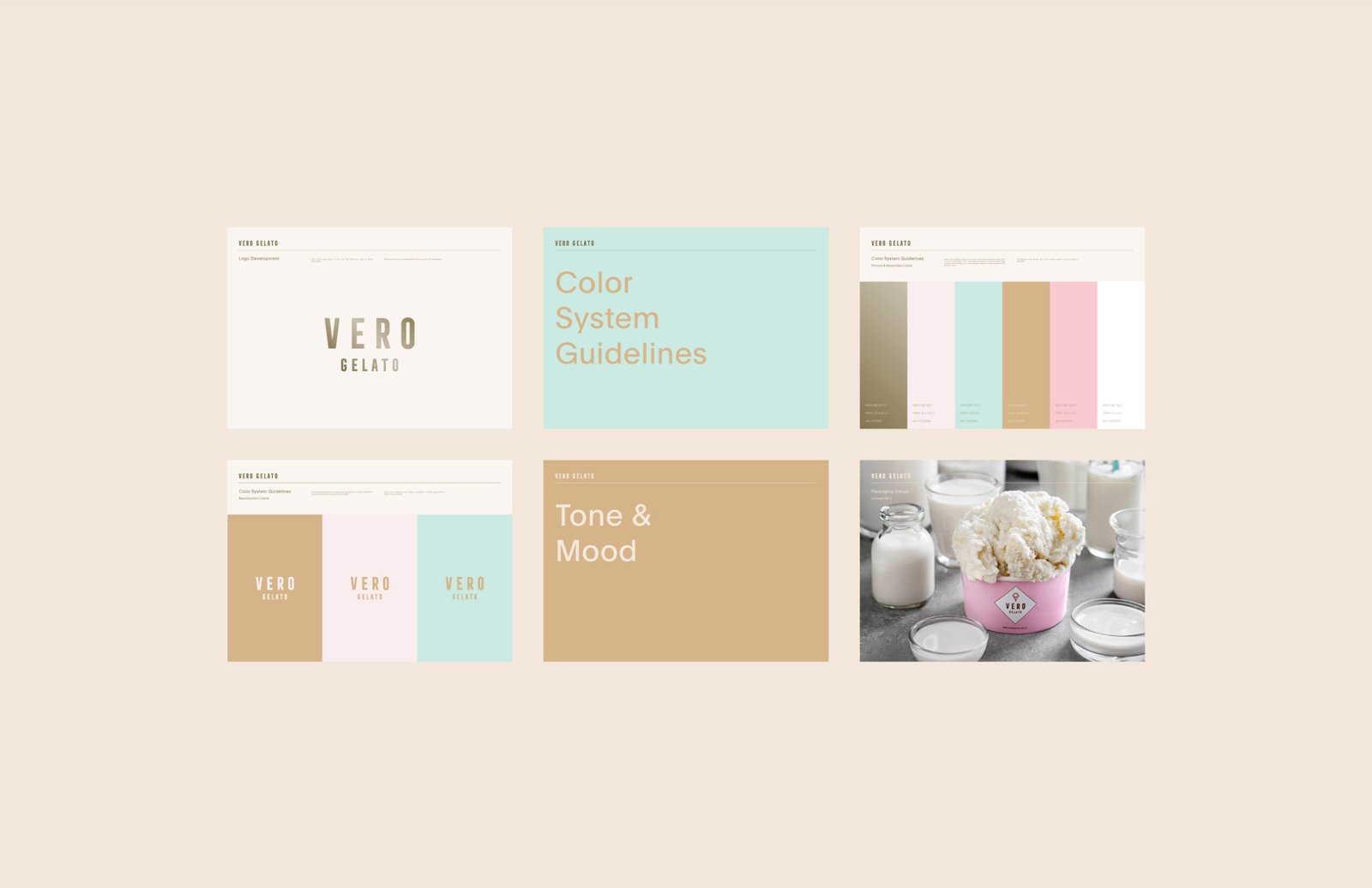
Brand Strategy and Visual Identity
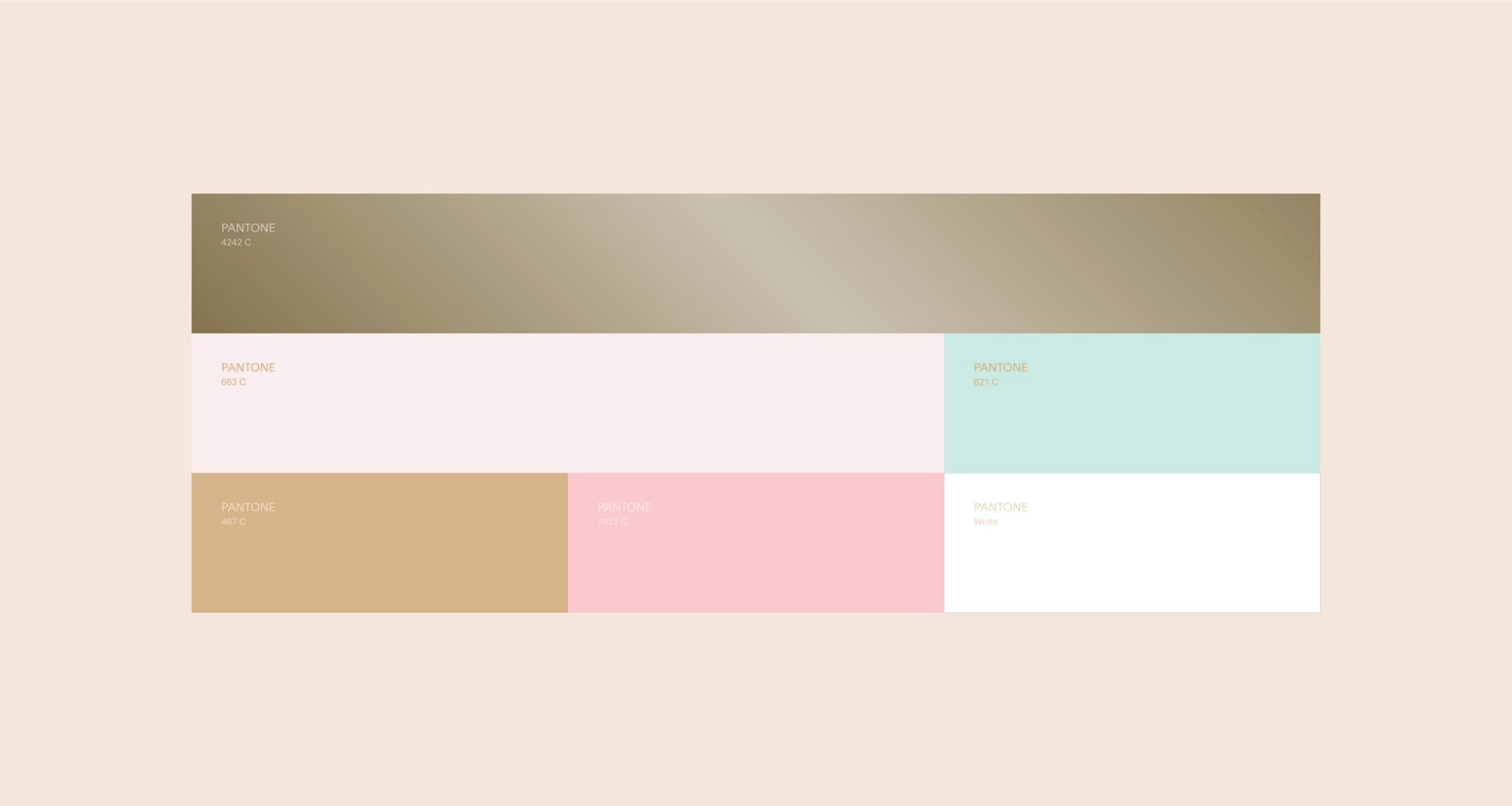
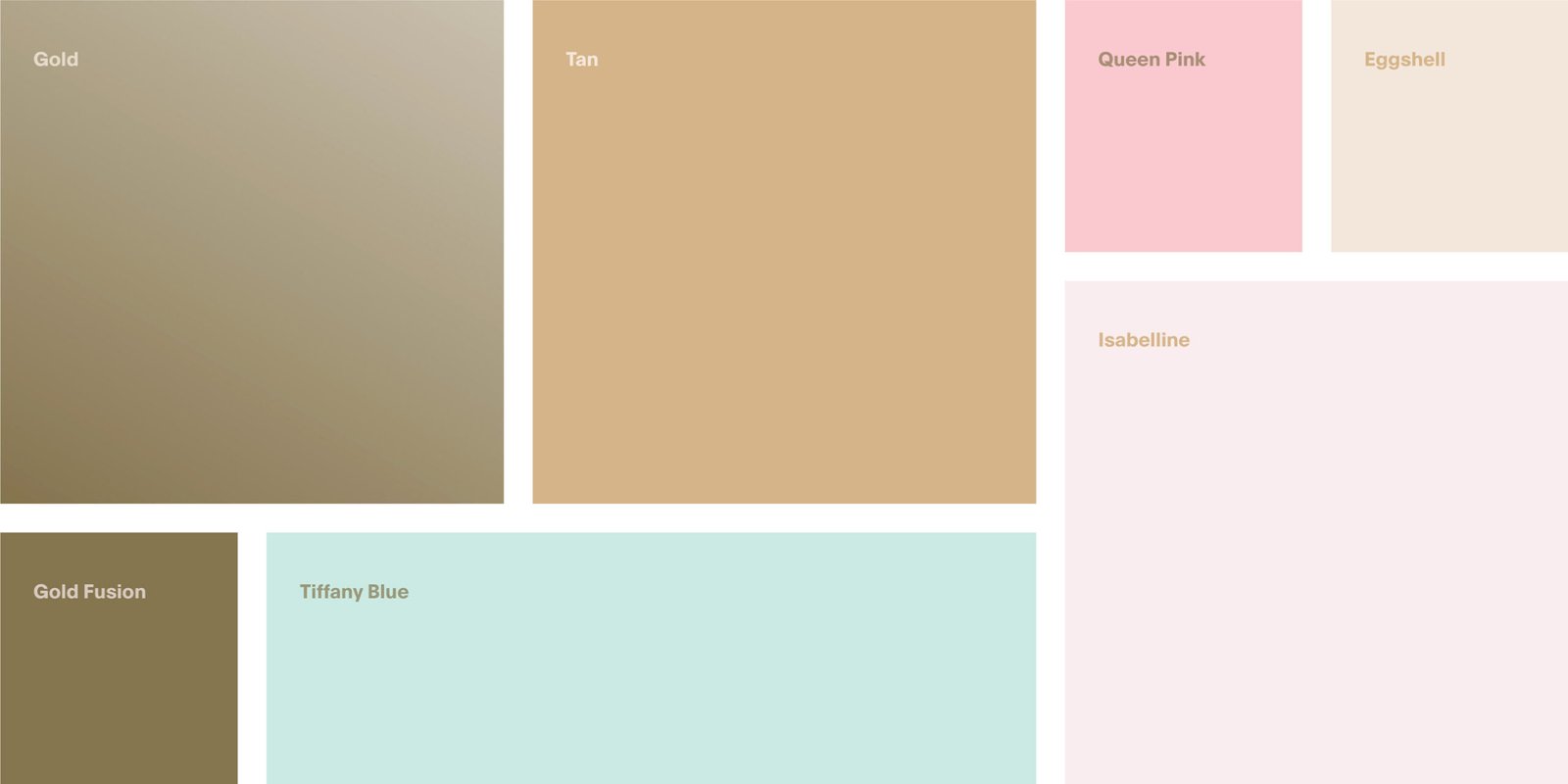
The visual identity for Vero Gelato was created to support clarity and product legibility while reinforcing the brand’s refined character. We established a design language grounded in balanced typography, considered layout, and purposeful use of colour.
Typography was selected to provide structure and readability across applications, enabling product names, flavour profiles, and key details to be presented clearly on packaging and in supporting materials. The colour palette was developed to support the natural mood and sensory appeal of the gelato range, with distinct tones that correspond to specific flavours while maintaining coherence across the system.
Graphic elements were used to guide visual hierarchy and support distinction between product variants without unnecessary decoration. This approach strengthens navigability and reinforces brand consistency.

Packaging Design and Product Expression
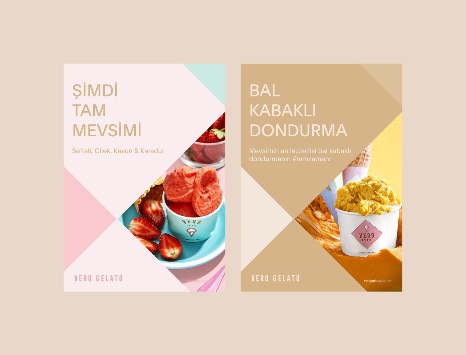
Packaging design for Vero Gelato focuses on presenting essential product information while enhancing shelf presence and user engagement. Labels prioritise key details such as flavour name, ingredient cues, and product variant in a format that supports quick recognition at a glance.
Each flavour variant uses defined visual cues within the shared design system, allowing consumers to recognise differences between offerings easily. Material choices and finishing selections align with expected standards for premium dessert products, giving packaging a visual and tactile quality that complements the product.
The overall packaging strategy reinforces the sensory nature of gelato while supporting consumer confidence through clear and structured presentation.


Brand Application and Market Presence
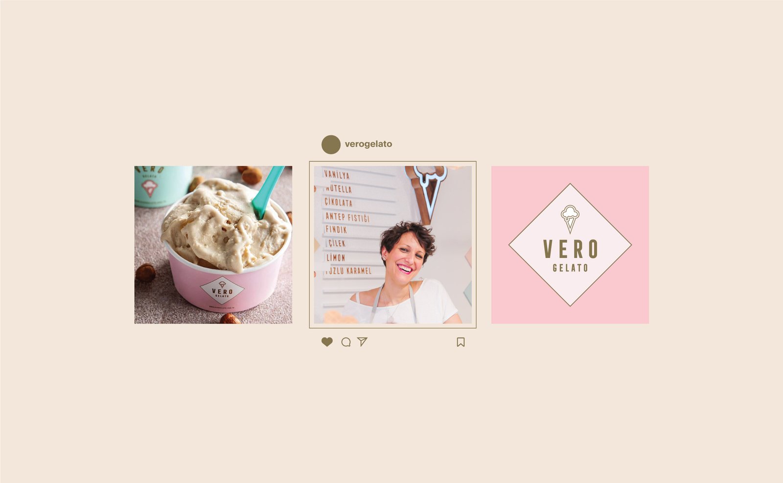
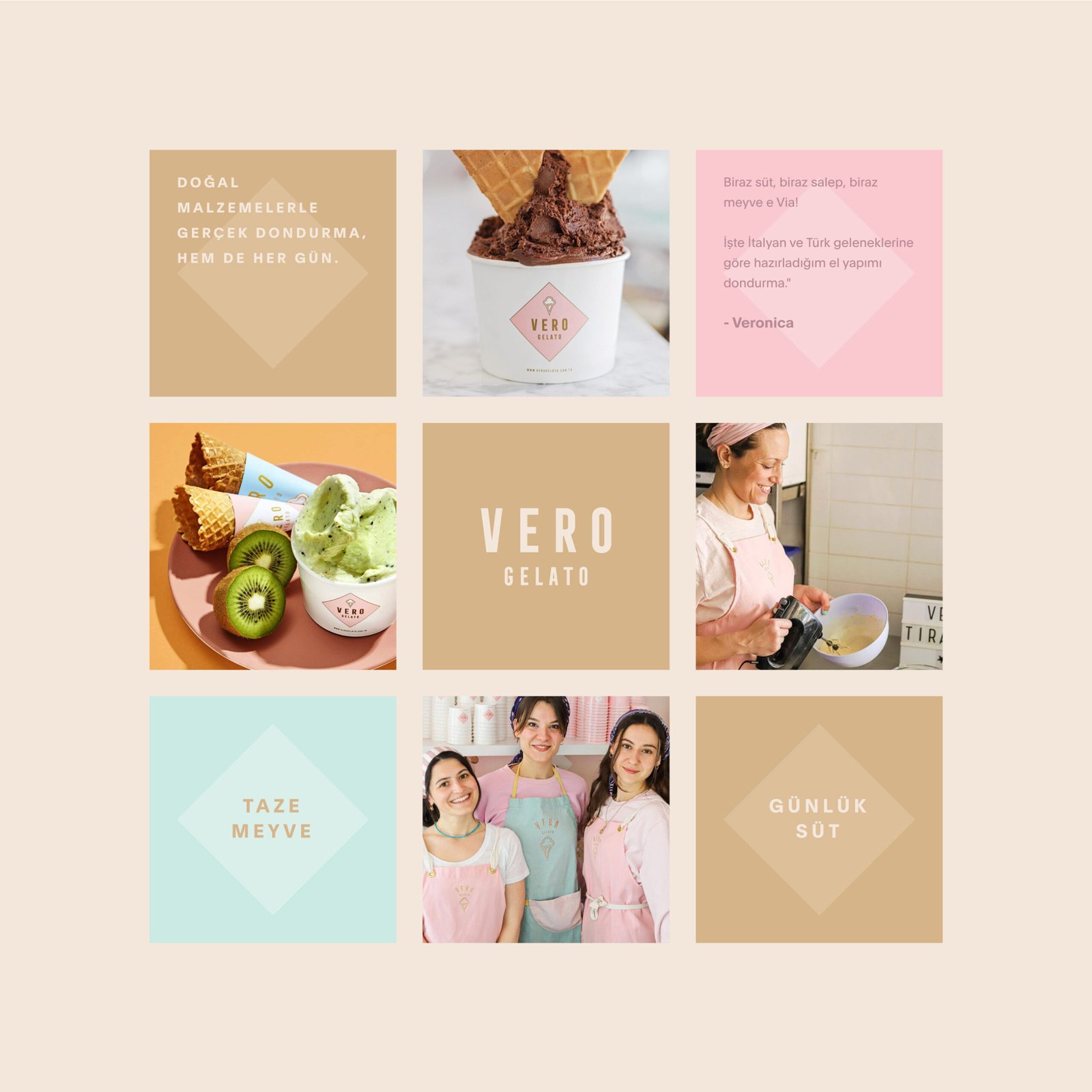
The Vero Gelato identity extends into digital and social touchpoints with visual assets that reflect the same design principles found in packaging. Online presentation maintains consistency in colour, hierarchy, and visual distinction, enhancing recognition across platforms.
Through this design system, Vero Gelato positions itself as a premium gelato brand that values clear communication, product distinction, and cohesive brand experience. The identity supports consumer engagement, stronger product navigation, and visual presence across physical and digital environments.
Let’s make the work they’ll copy.
Talk to an expert now


