
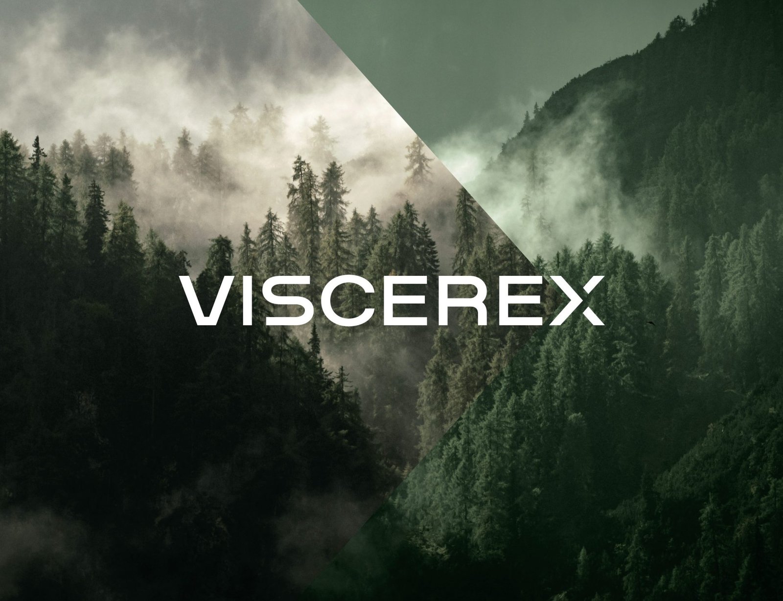
Viscerex
natural heart support supplement
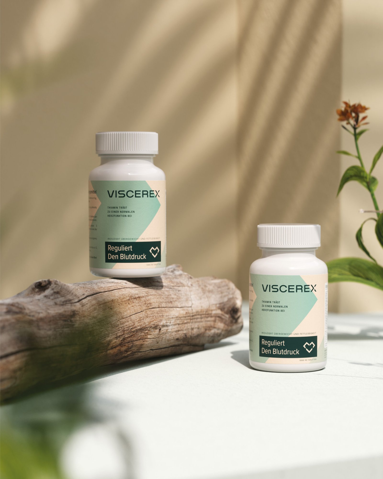
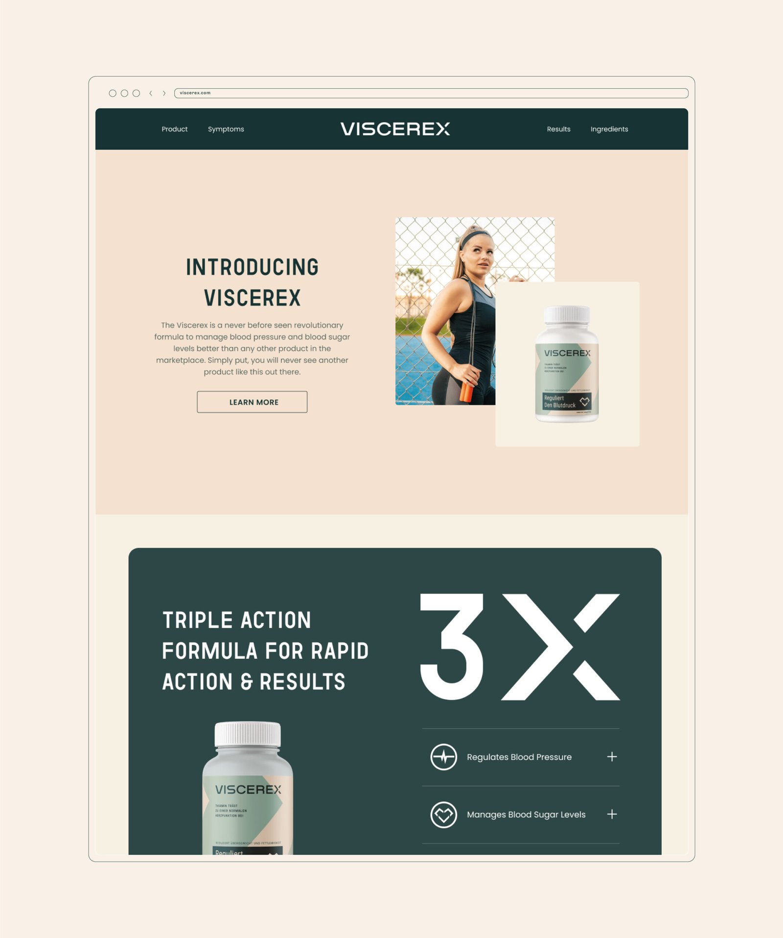
Viscerex by MARKAWORKS is a wellness supplement designed to naturally support cardiovascular health and blood pressure regulation. Its tranquil branding, featuring clean lines and a soothing color palette, communicates simplicity and effectiveness for a discerning demographic.
A Design Focused on Wellness and Tranquility
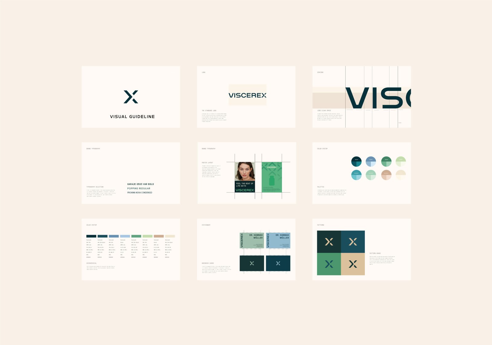
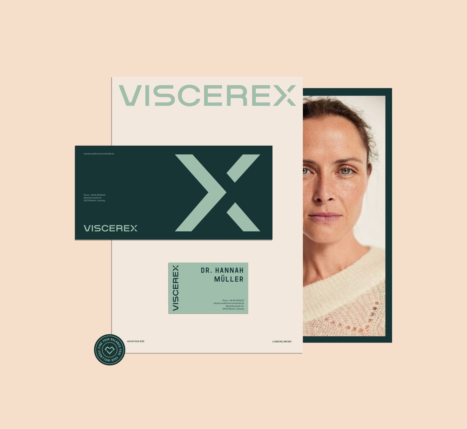
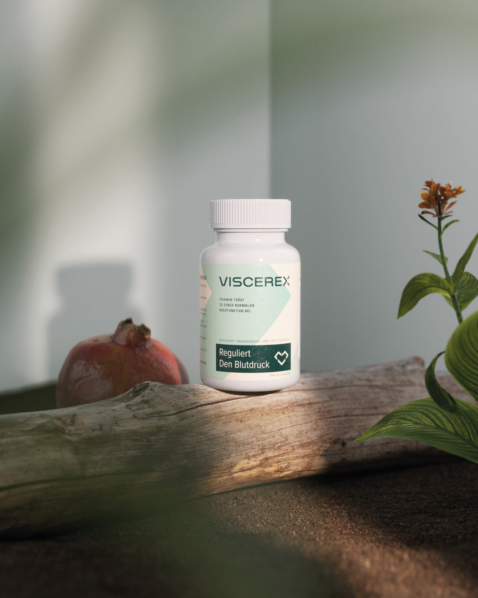
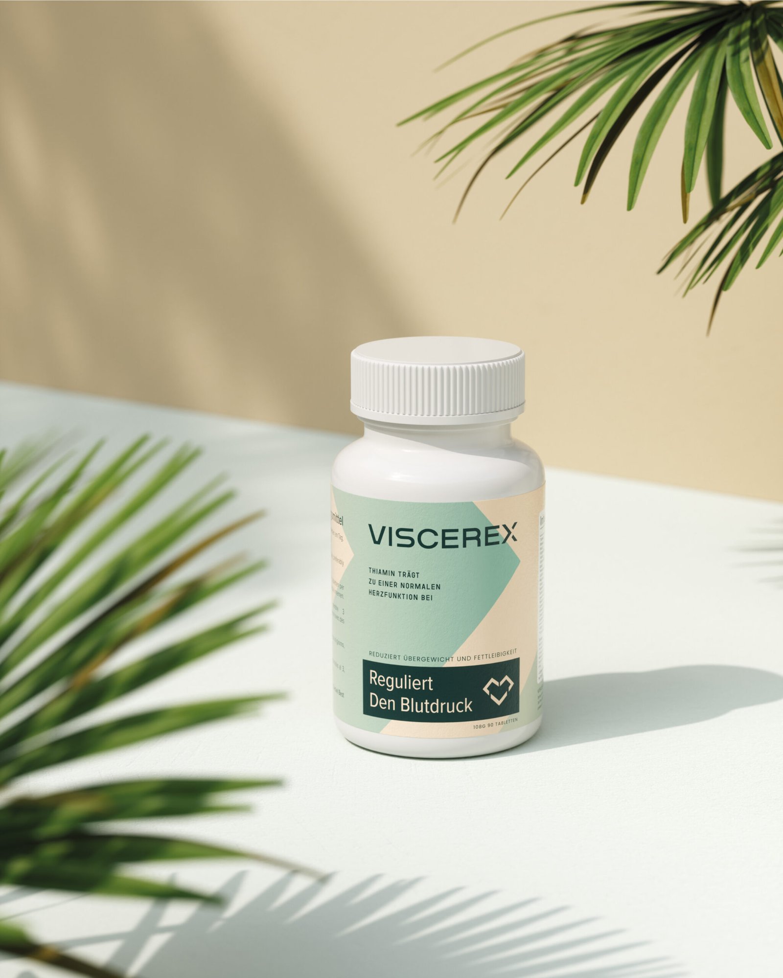
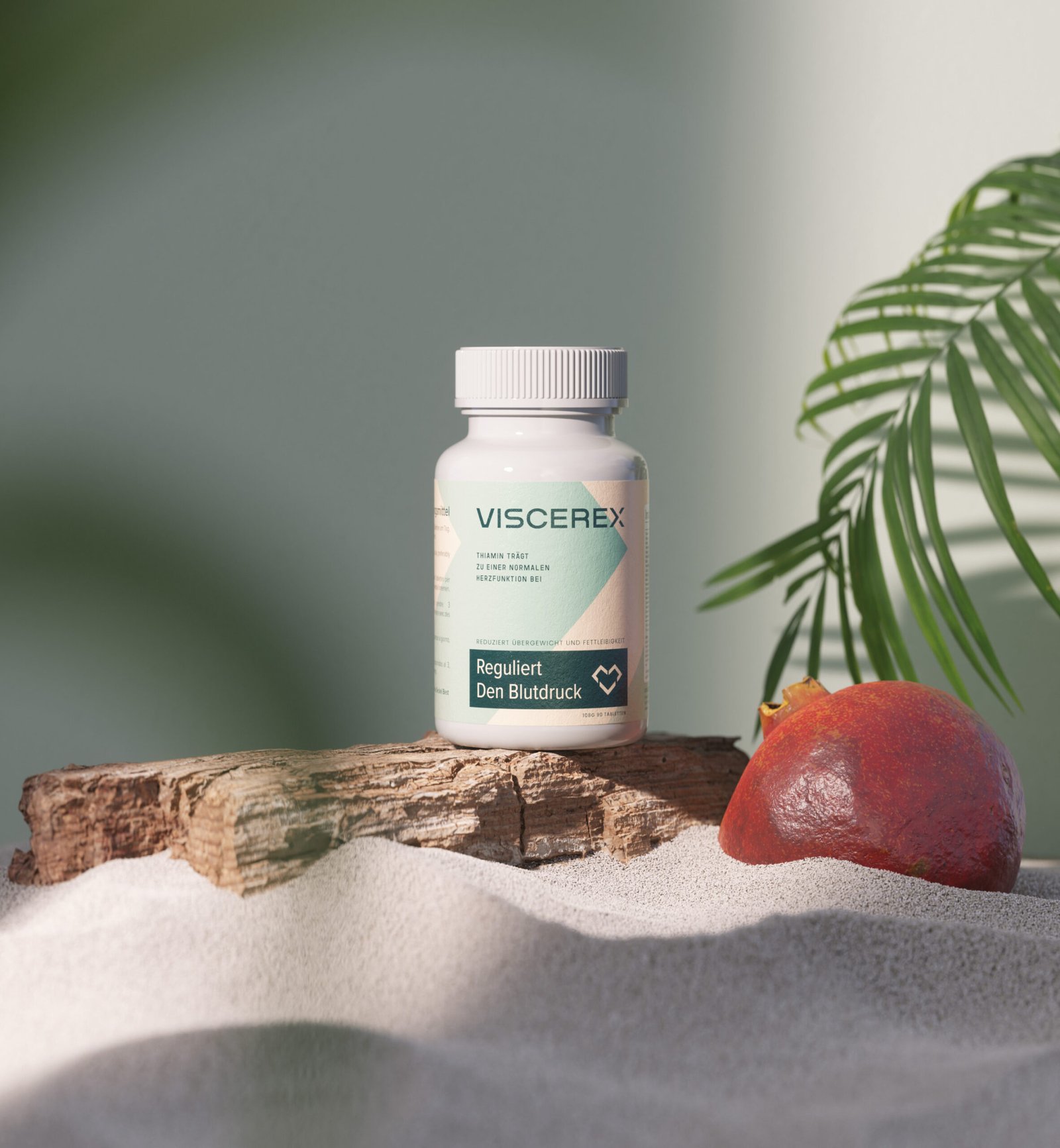
The design team at MarkaWorks has effectively utilized clean lines and uncluttered layouts to communicate the product’s simplicity and effectiveness. The packaging design is straightforward, featuring clear labeling and easy-to-read fonts that prioritize user-friendliness for a middle-aged to senior demographic.
Calm and Soothing Color Palette
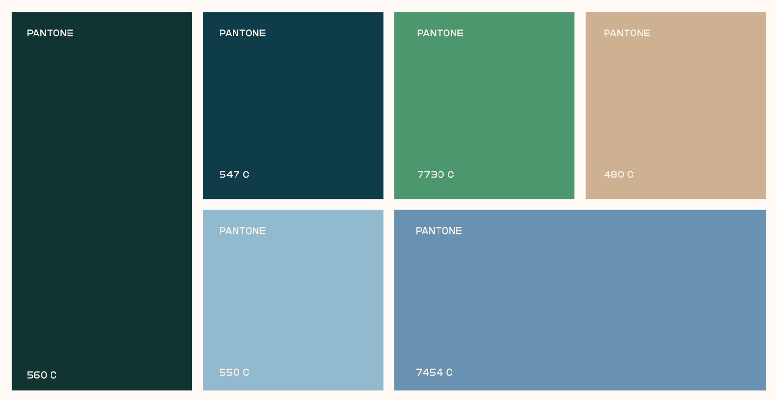
The branding utilizes a calm and soothing color palette, combining soft greens and neutrals to evoke a sense of wellness and tranquility. This choice reflects the product’s aim to regulate blood pressure and support cardiovascular functions in a natural way.
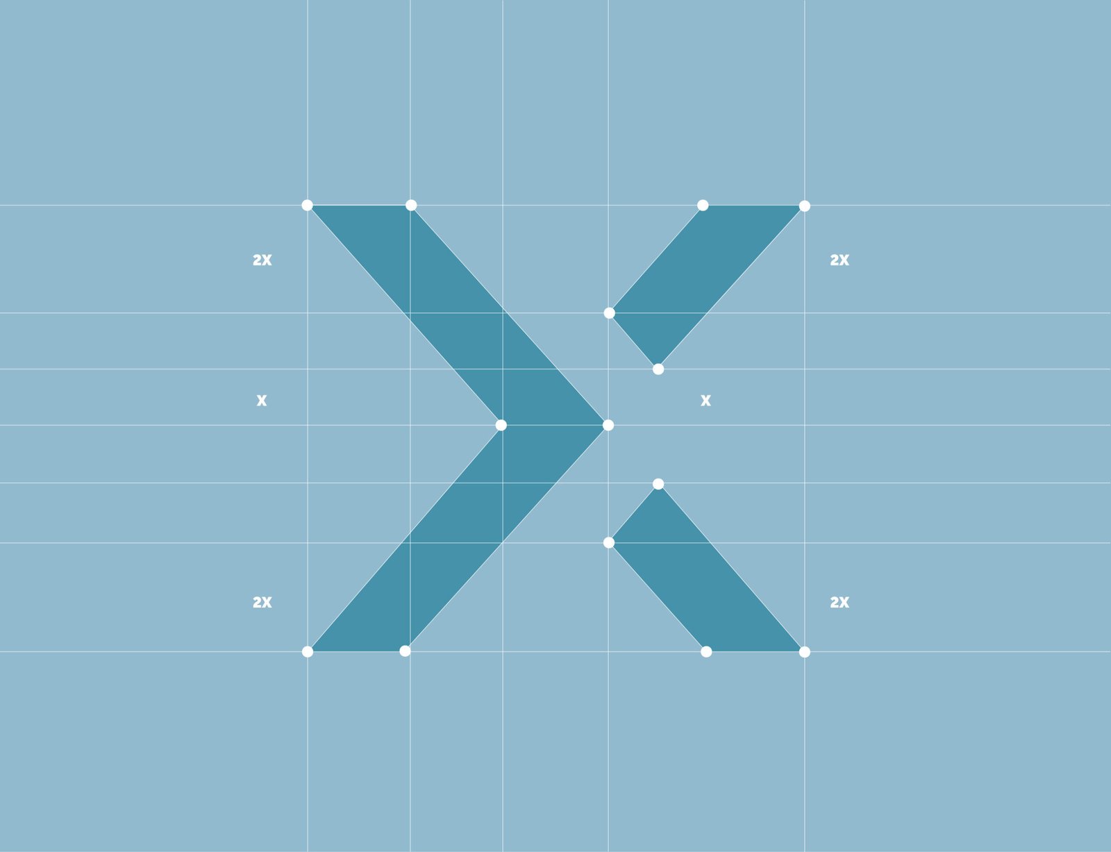
Clean Lines and Uncluttered Layouts
The design team at MarkaWorks has effectively utilized clean lines and uncluttered layouts to communicate the product’s simplicity and effectiveness. The packaging design is straightforward, featuring clear labeling and easy-to-read fonts that prioritize user-friendliness for a middle-aged to senior demographic.


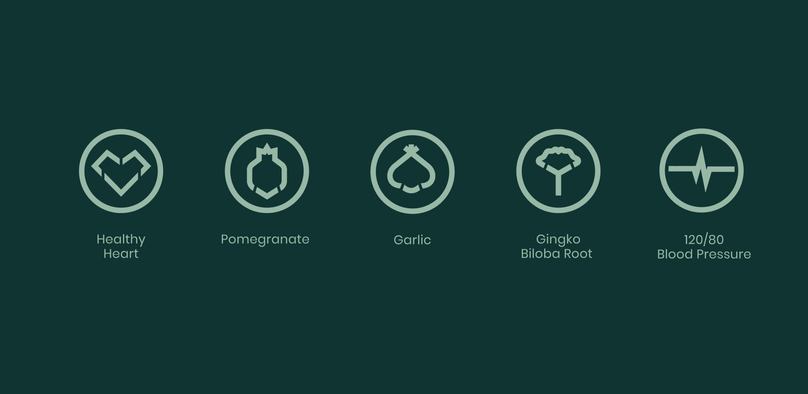
Accessible Information Design
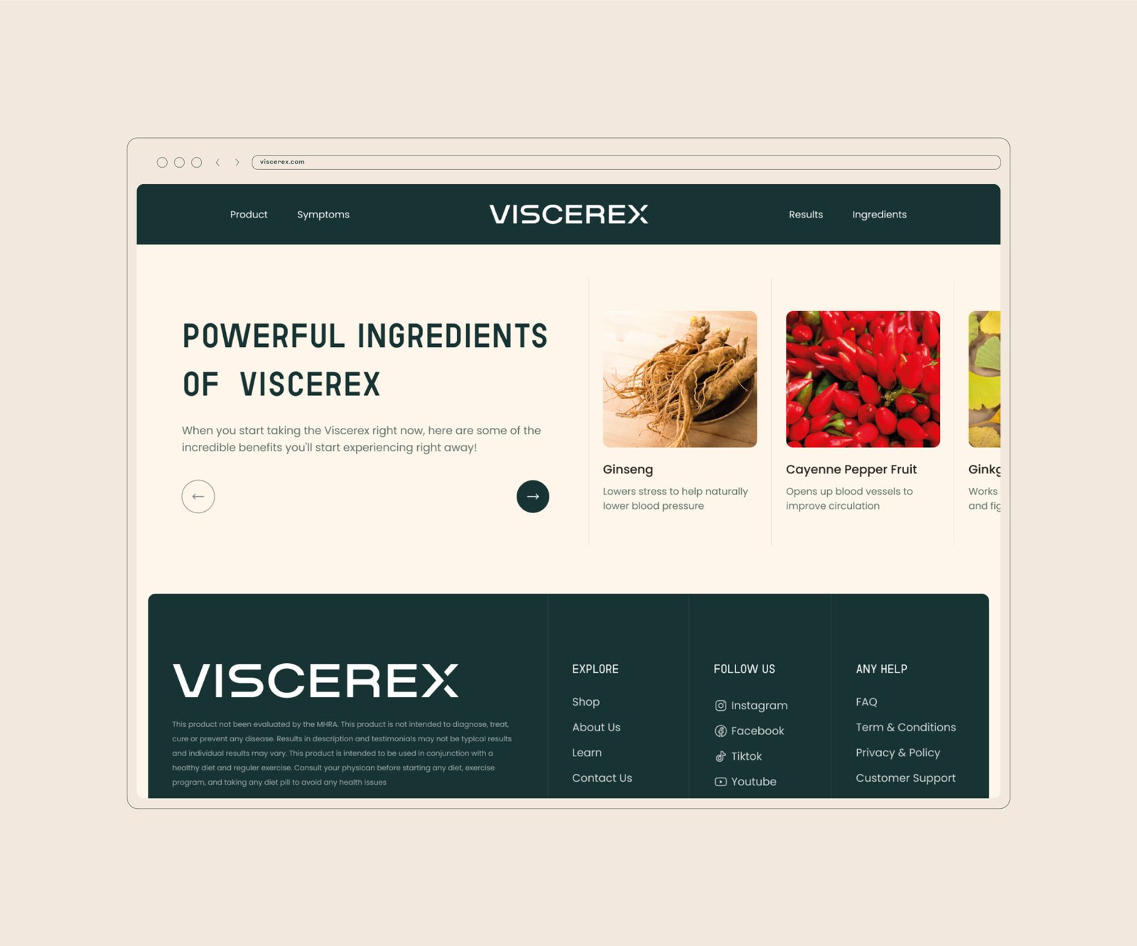
Icons and infographics are sparingly used to highlight key benefits and ingredients, making the information accessible at a glance without overwhelming the consumer.

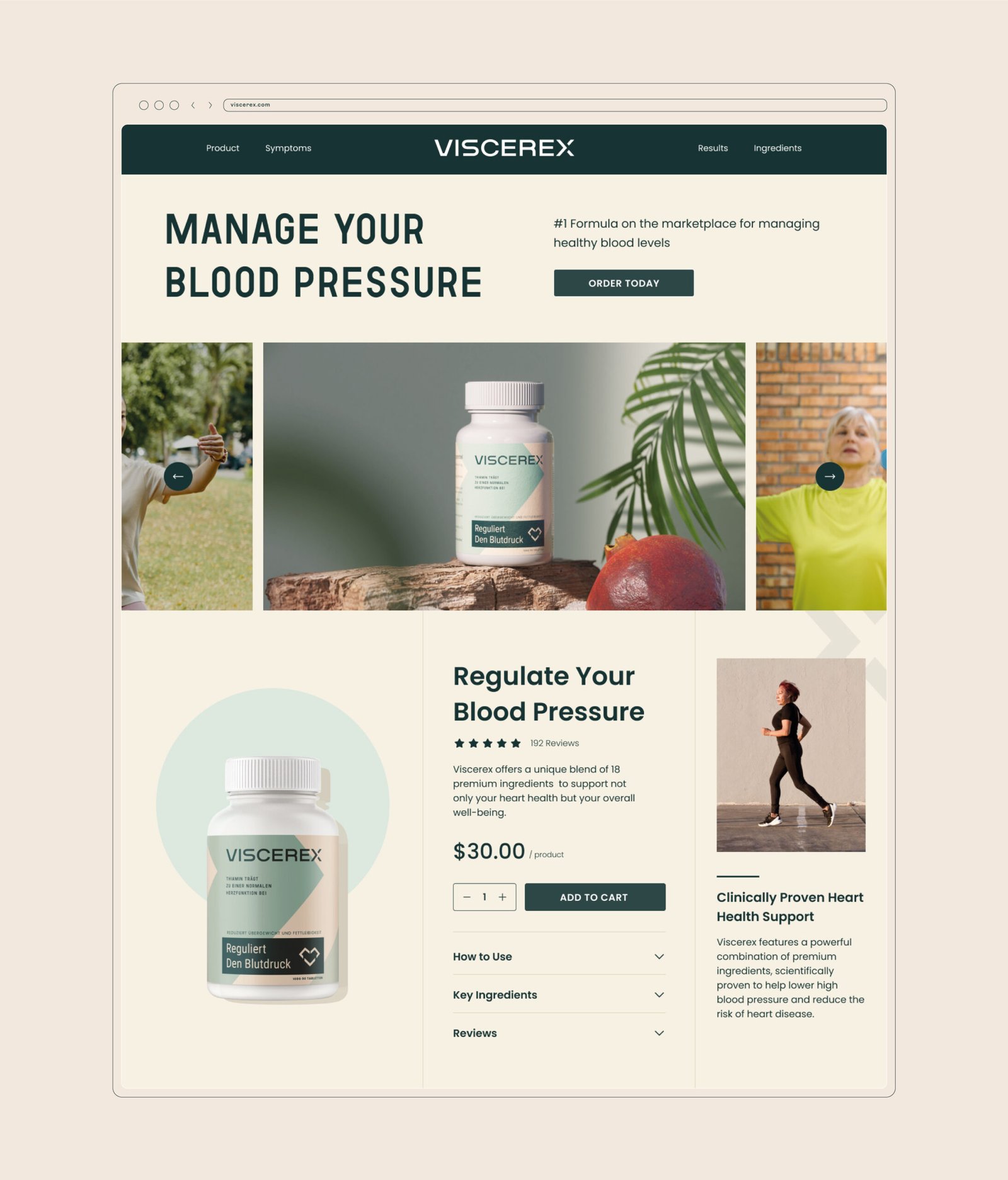
Coherent Digital and Physical Presence
The visual identity extends to the digital space where the website mirrors the packaging’s clarity and ease of navigation. This coherent design strategy across all platforms ensures that Viscerex is perceived as a dependable and professional brand.
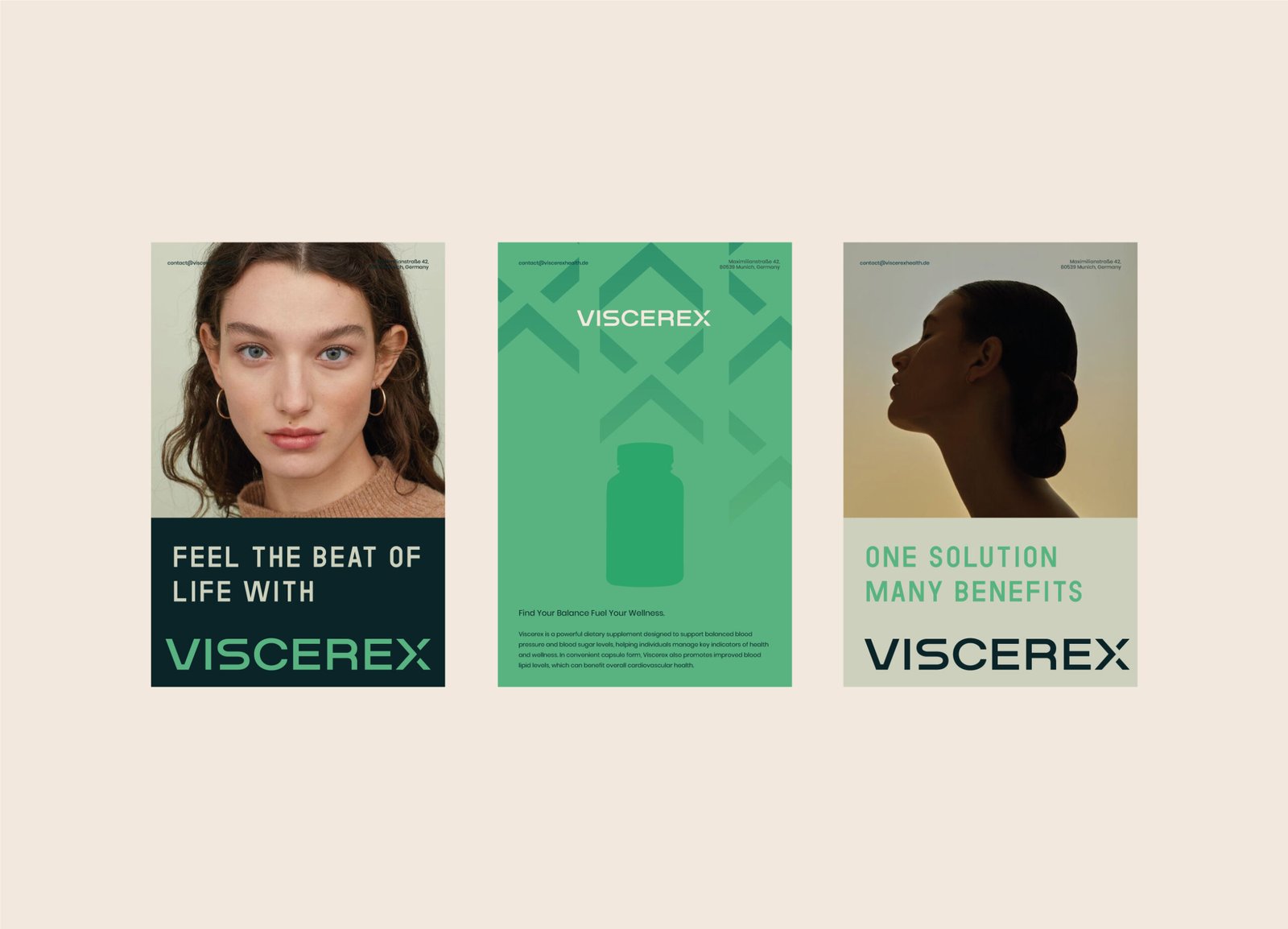
Enhancing Brand Recognition and Credibility
MarkaWorks’ meticulous attention to design details not only enhances brand recognition but also reinforces the product’s credibility in the health supplement market.
Let’s make the work they’ll copy.
Talk to an expert now


