LVL-UP
Peptide and Performance Brand Identity & Packaging Design
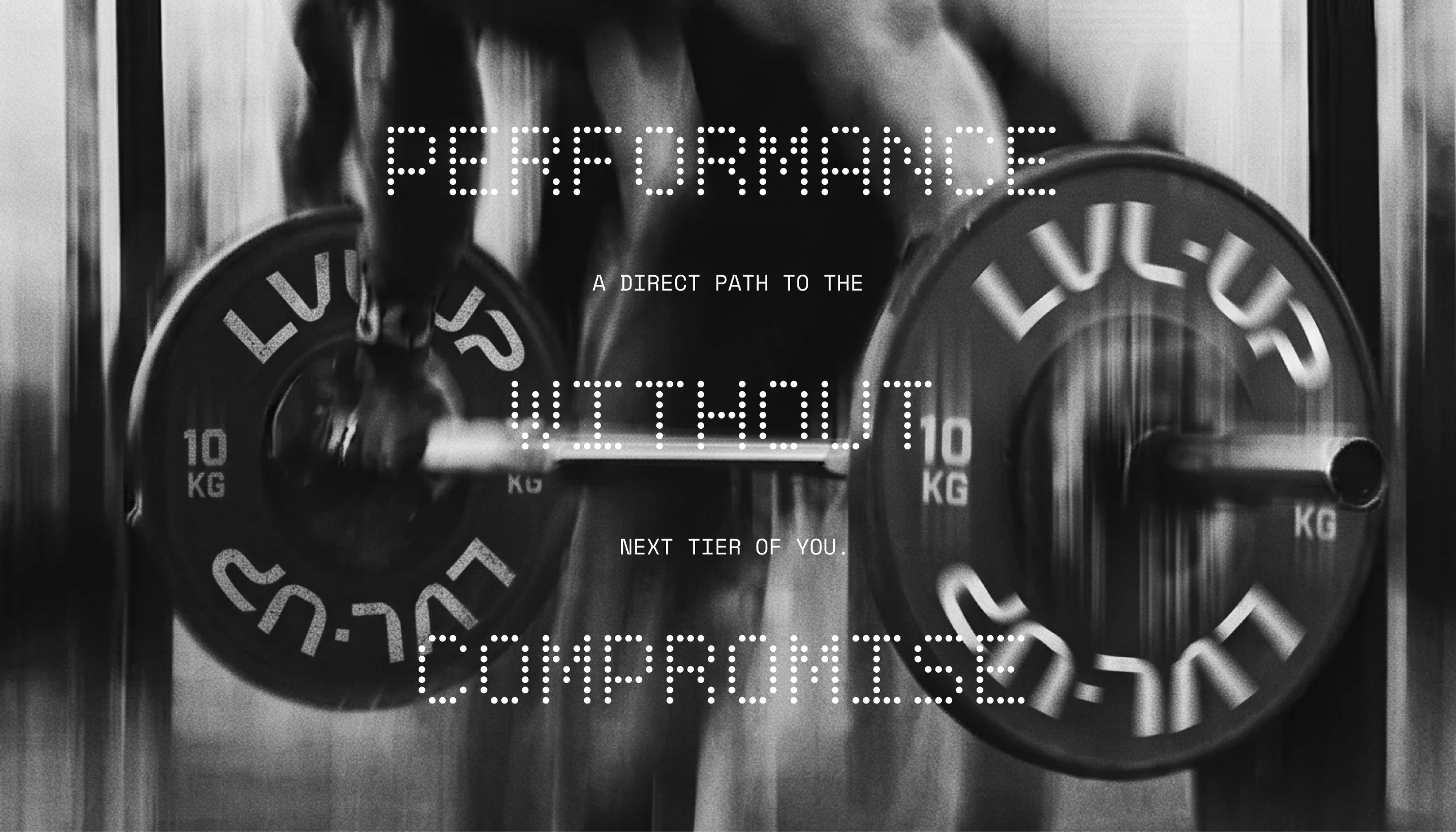
Performance without compromise.
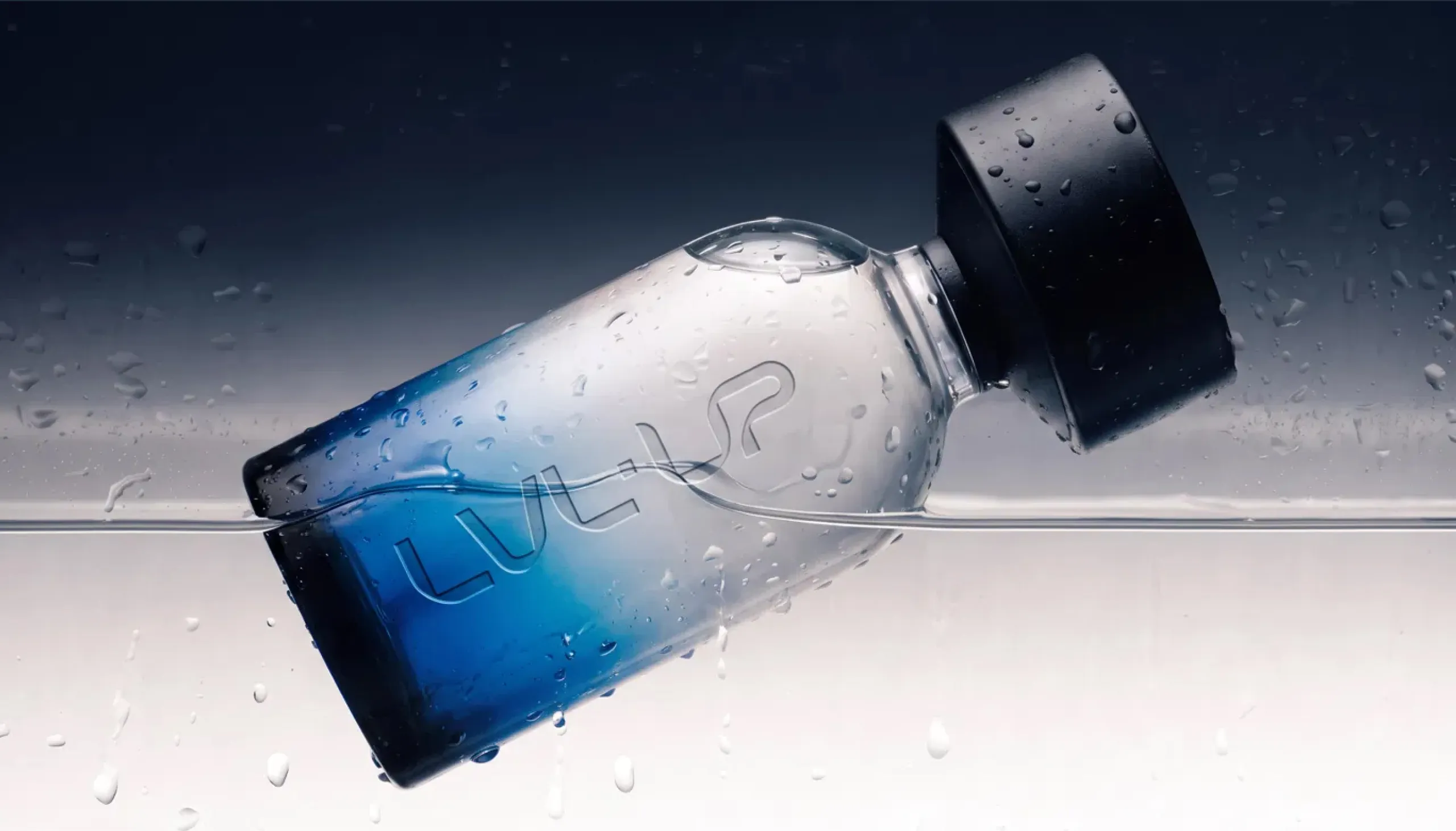
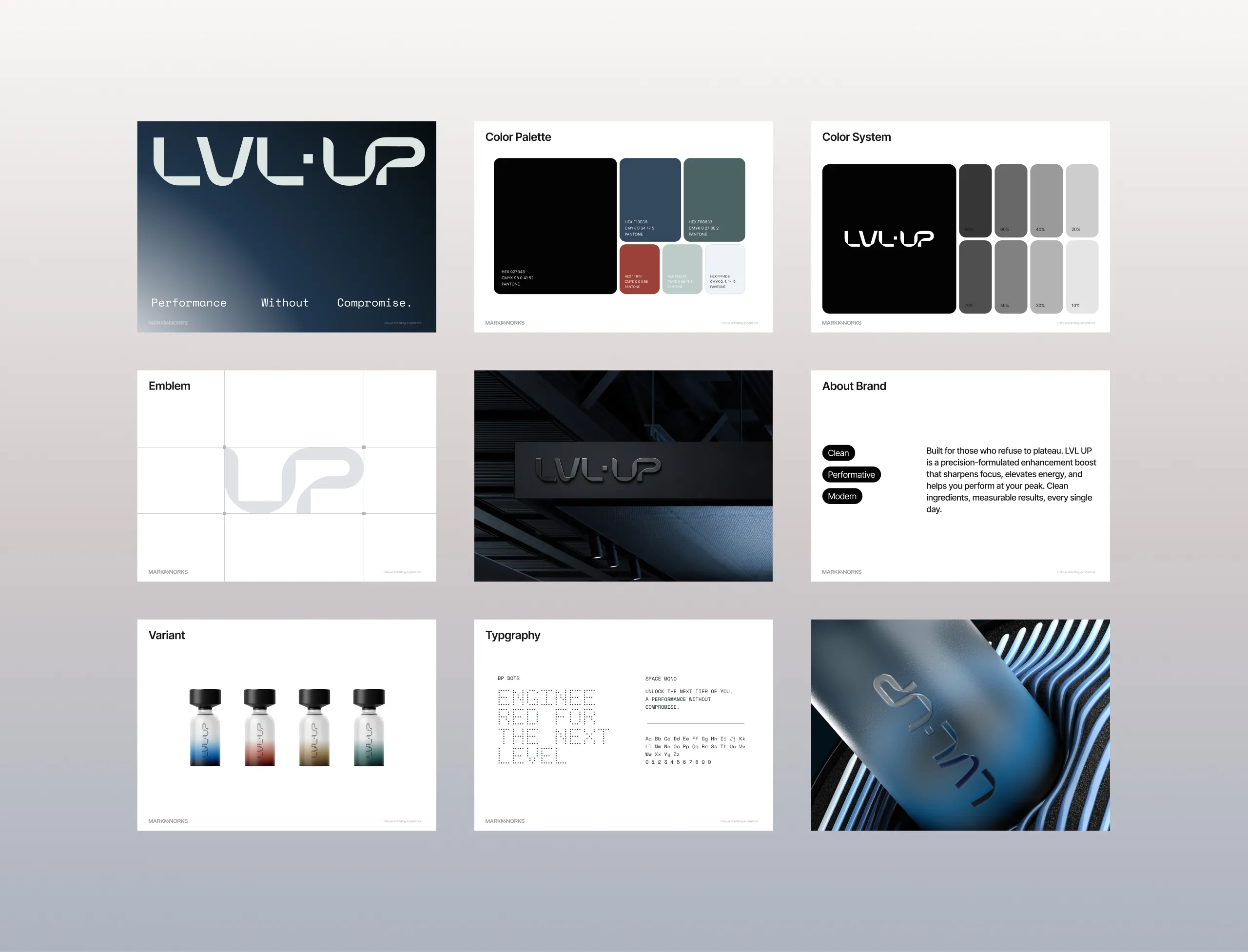
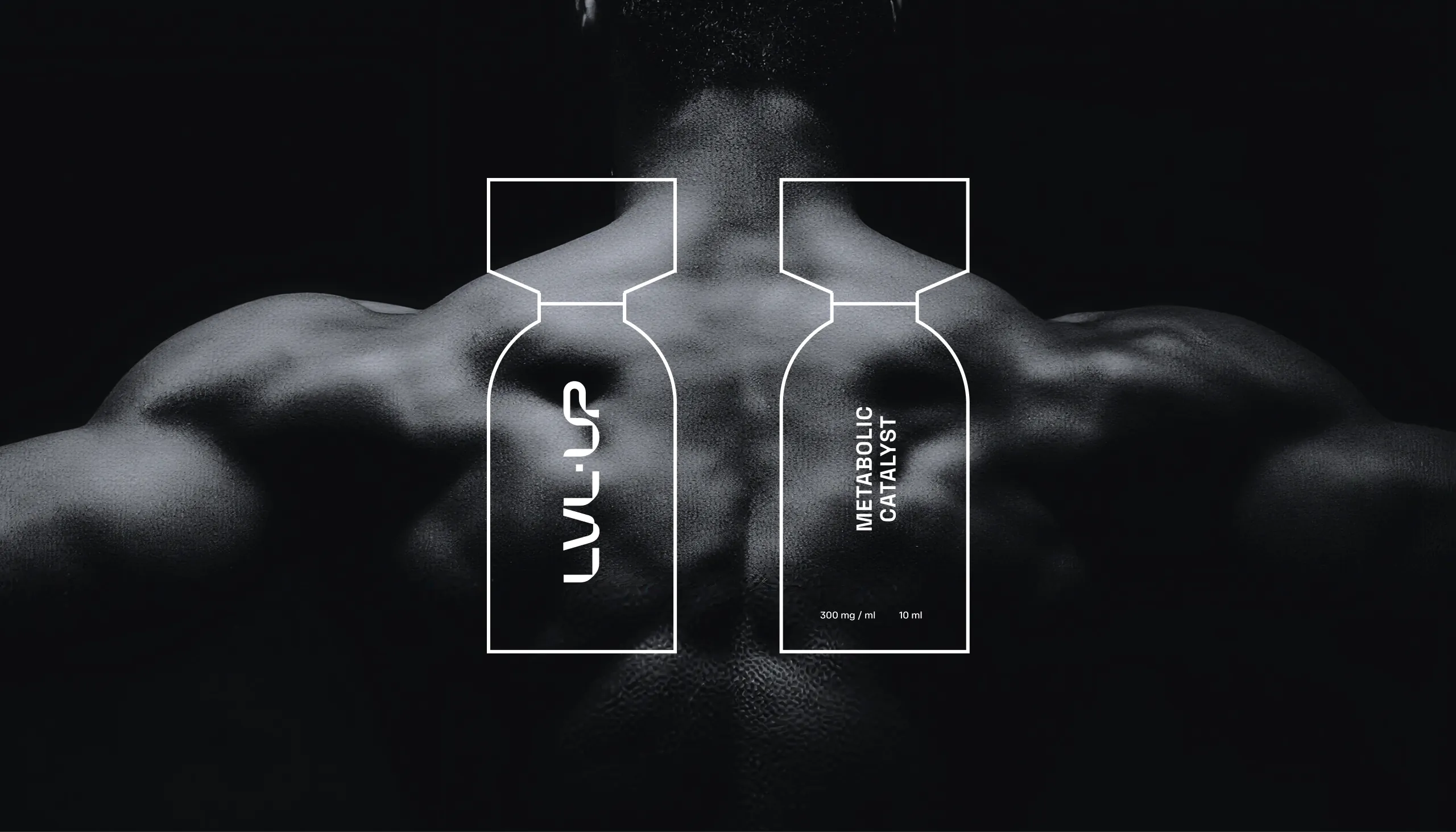
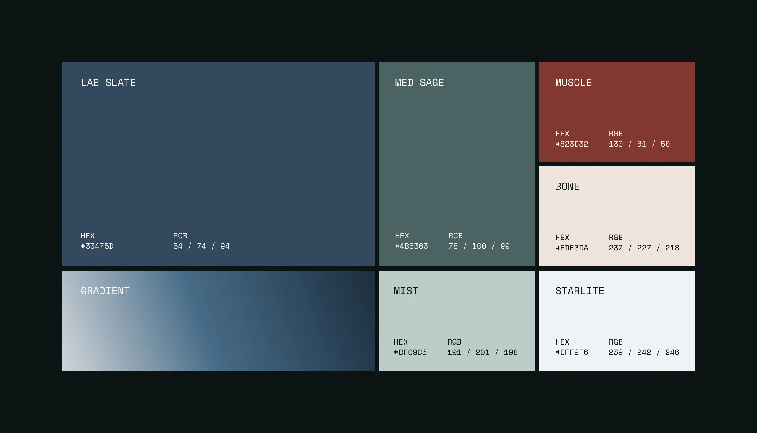
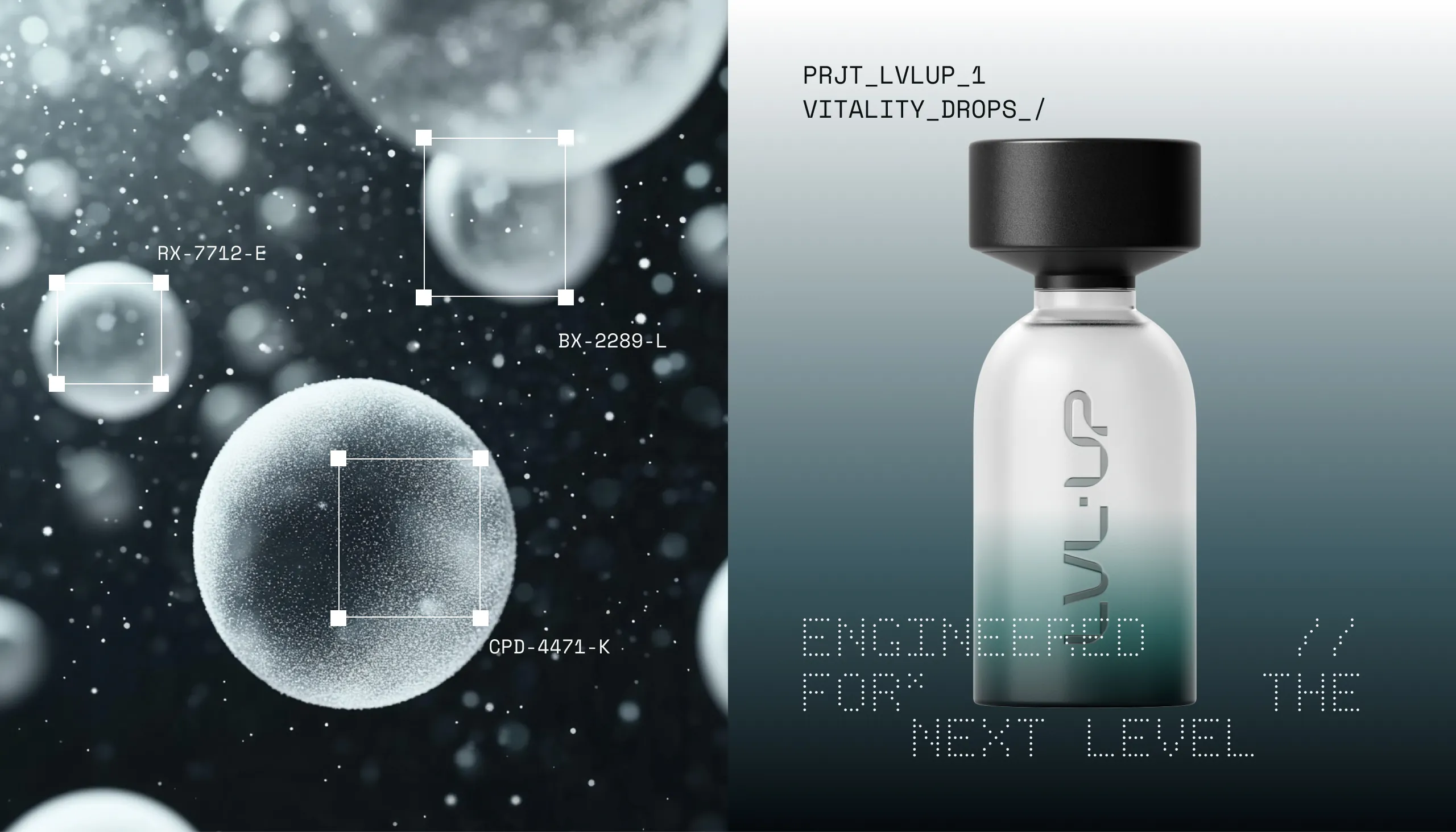
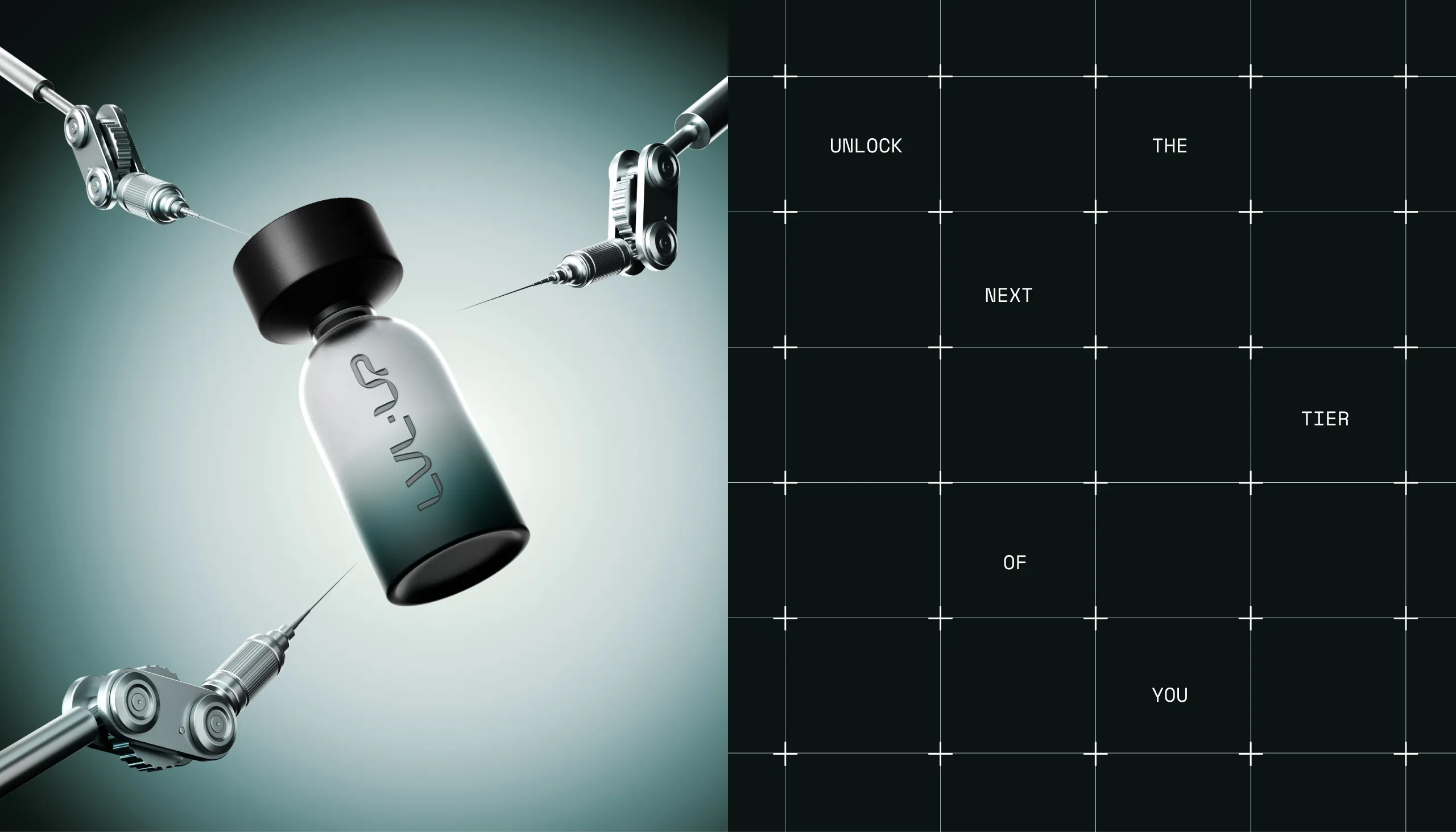
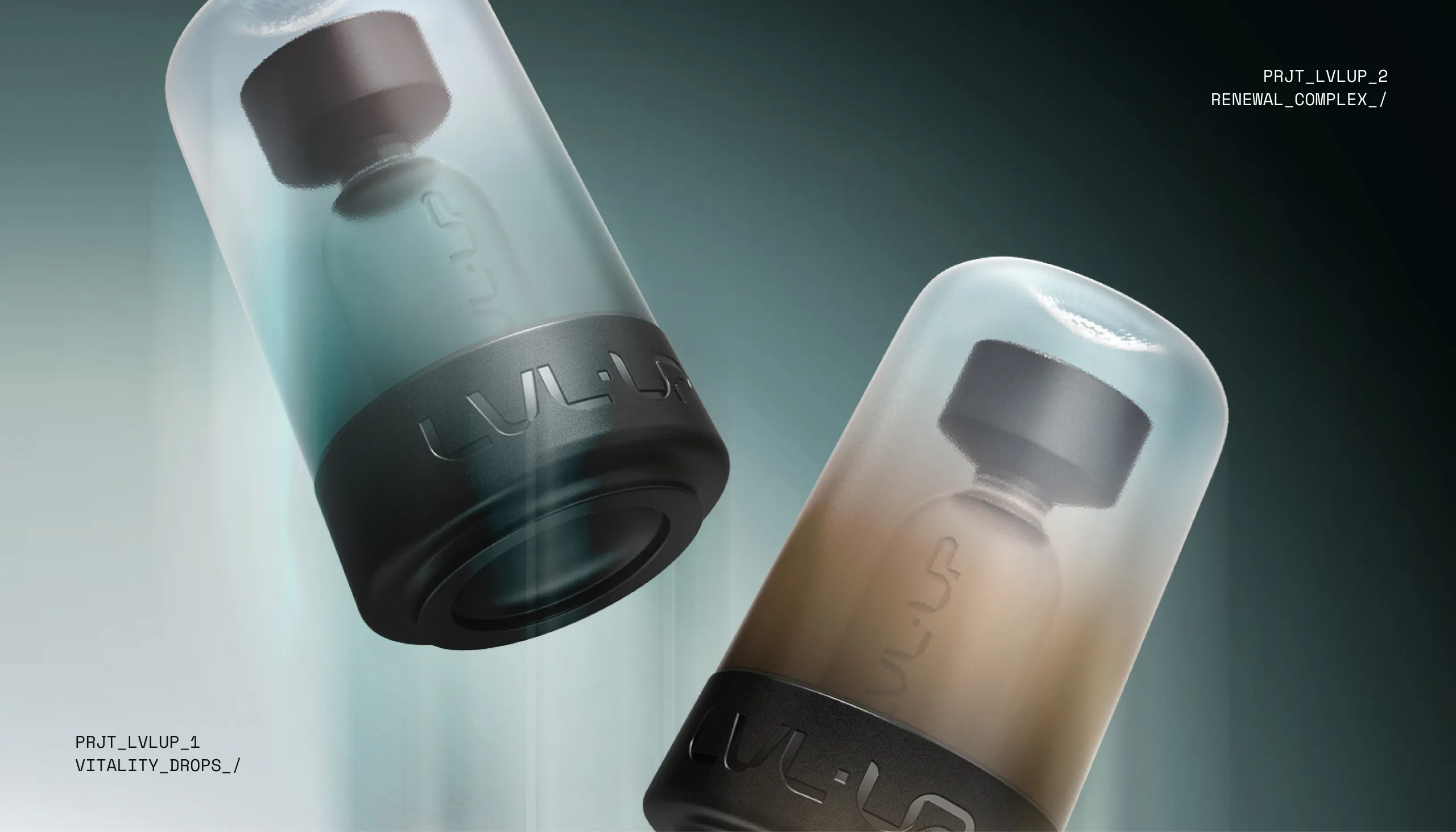
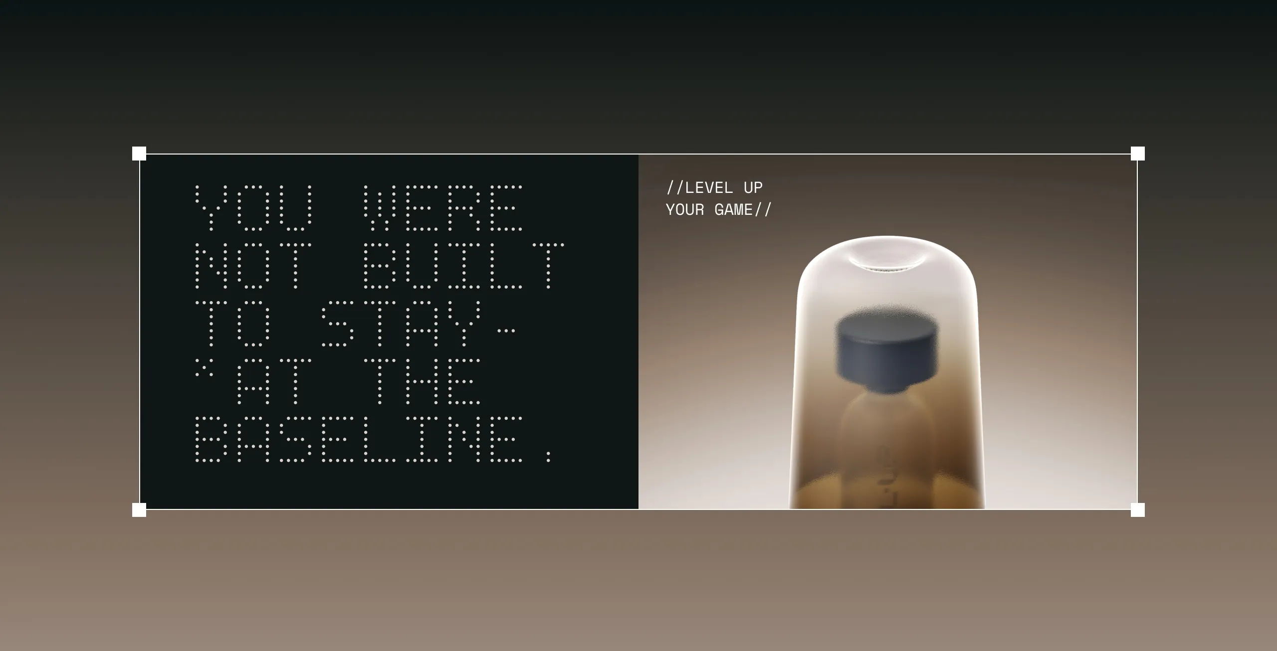
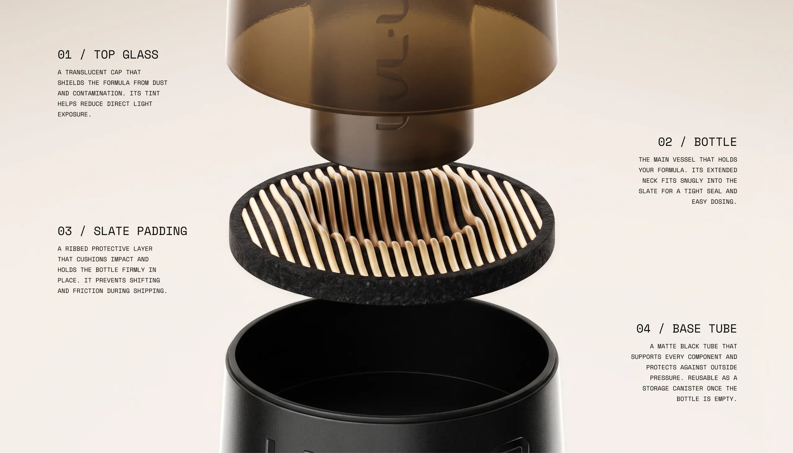
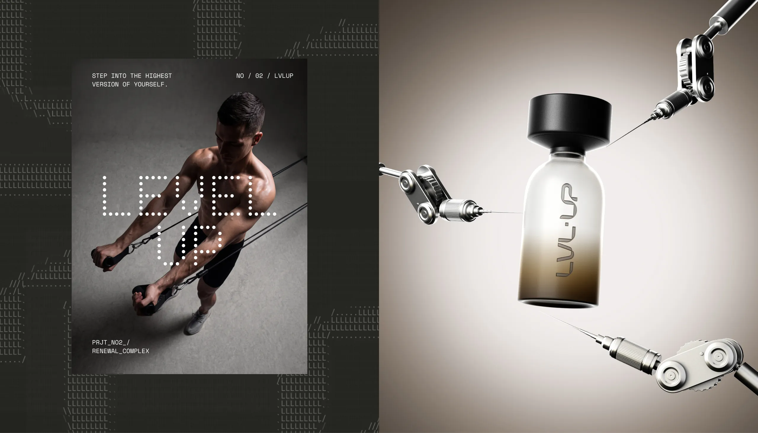
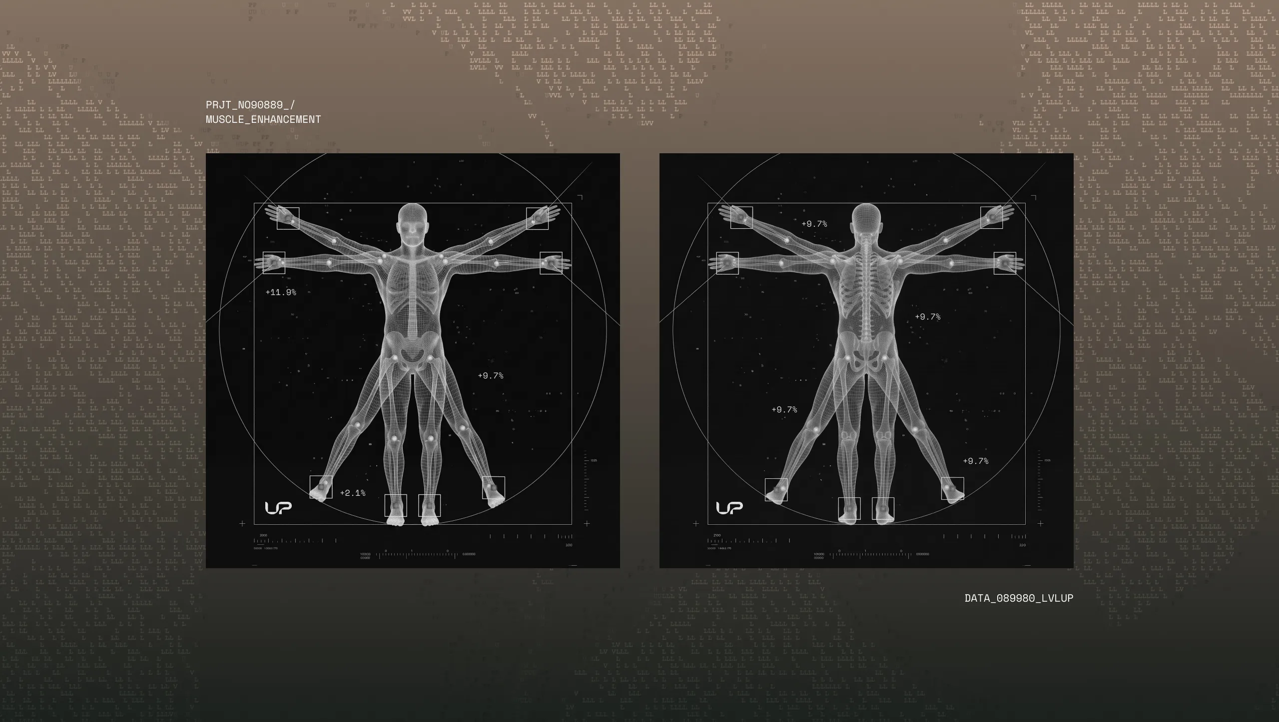
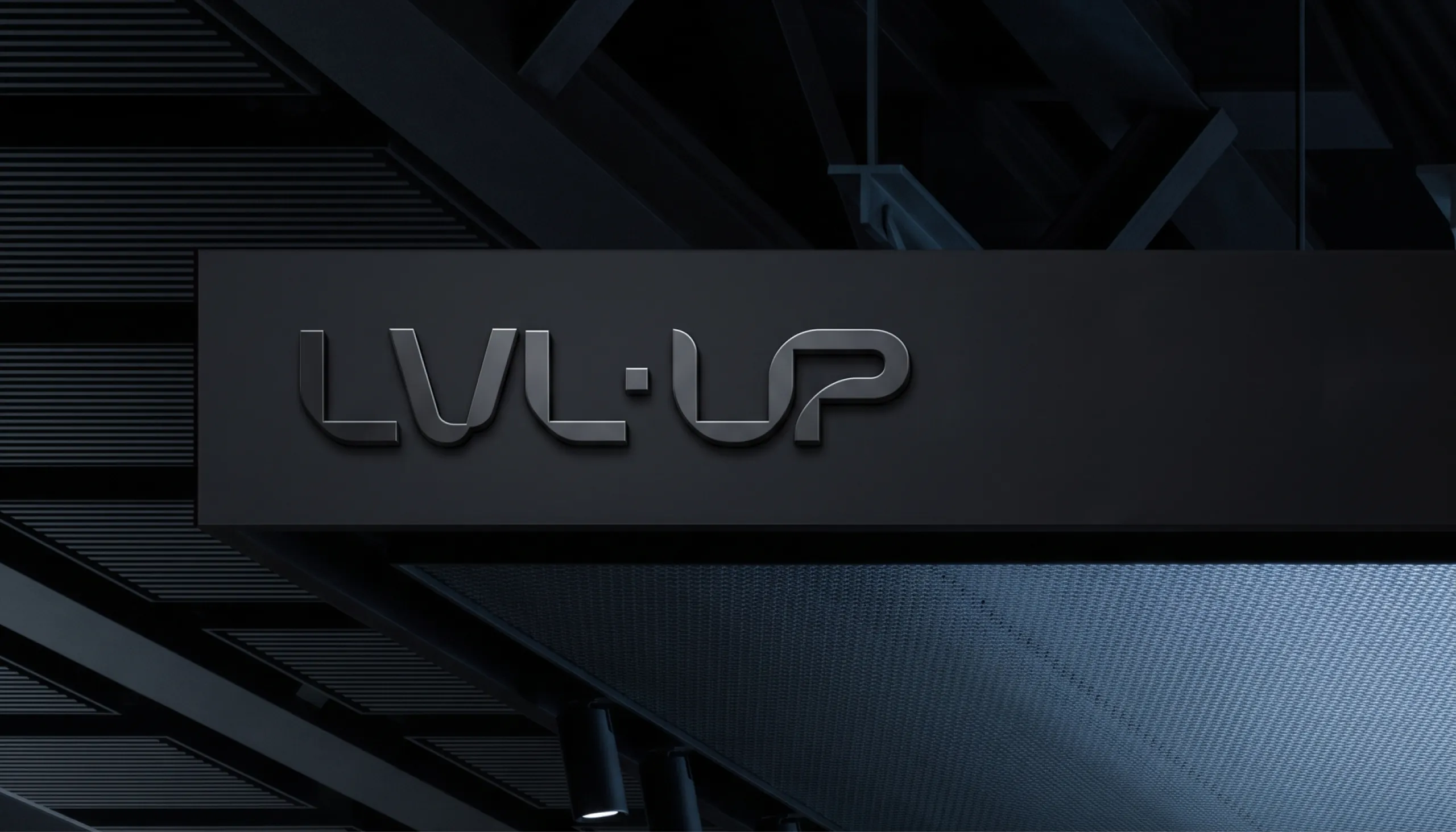
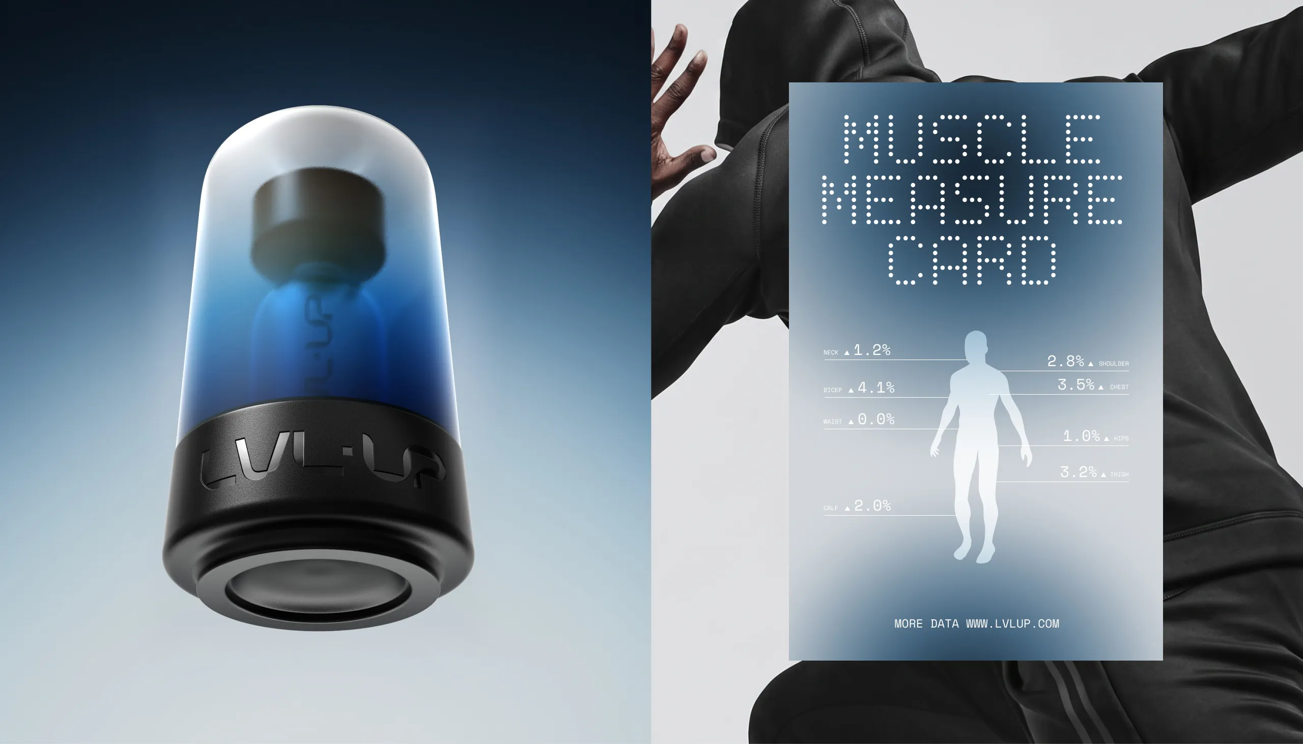
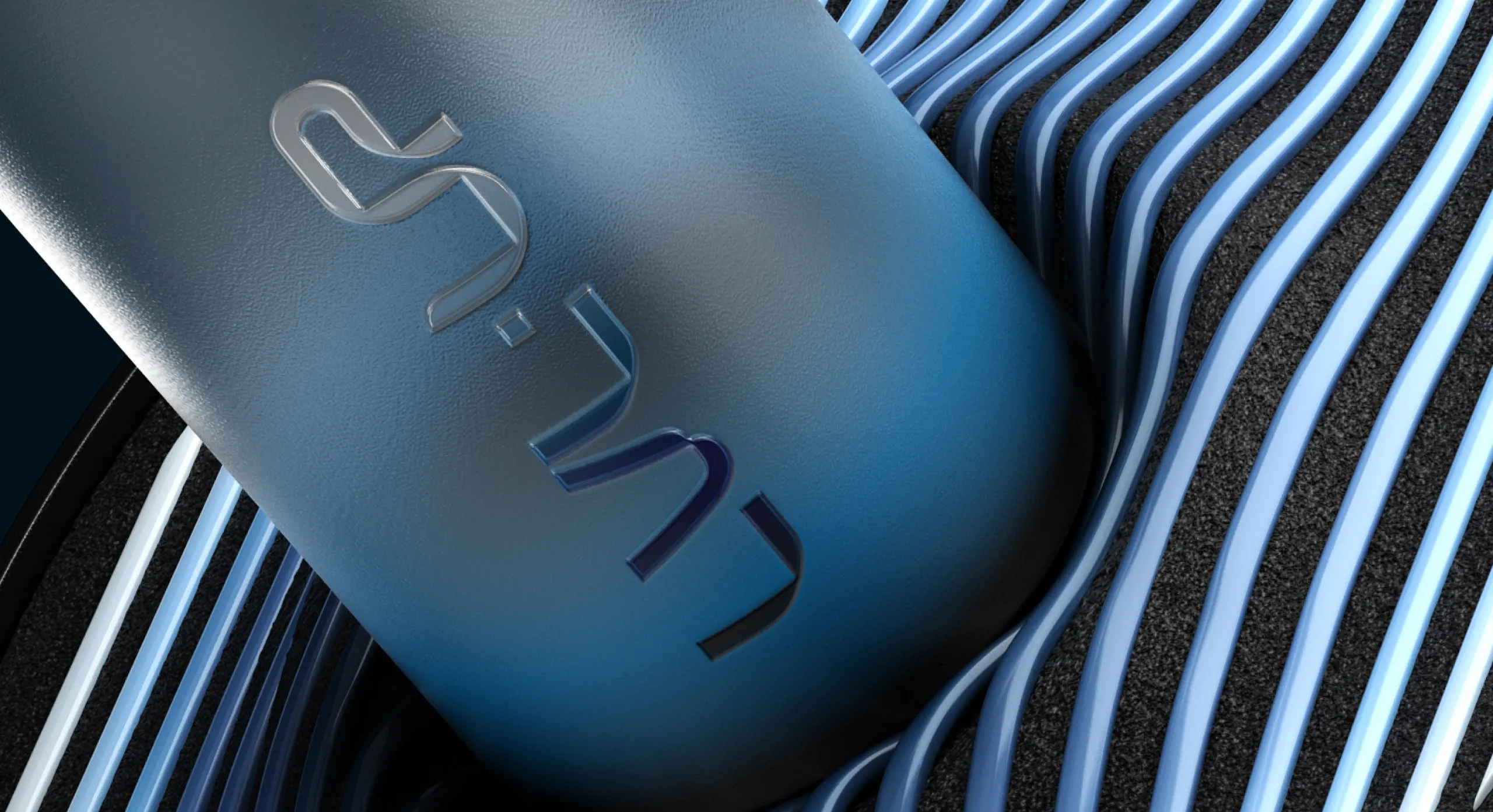
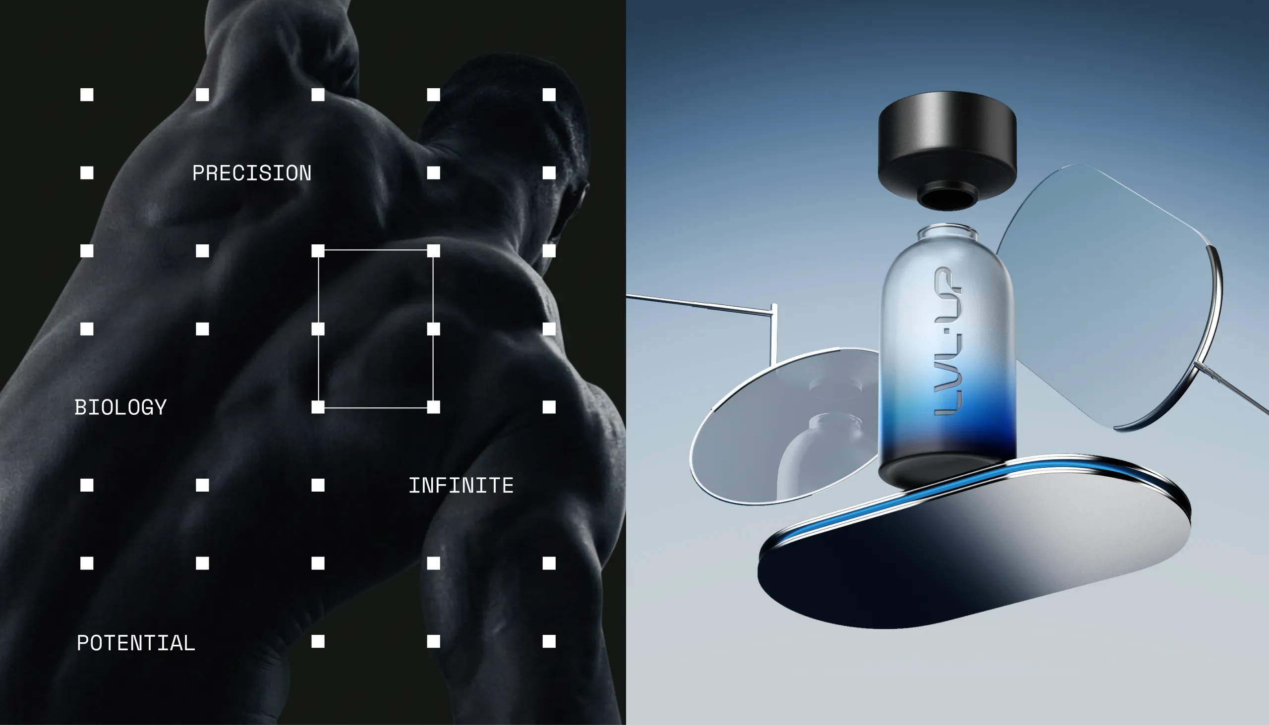
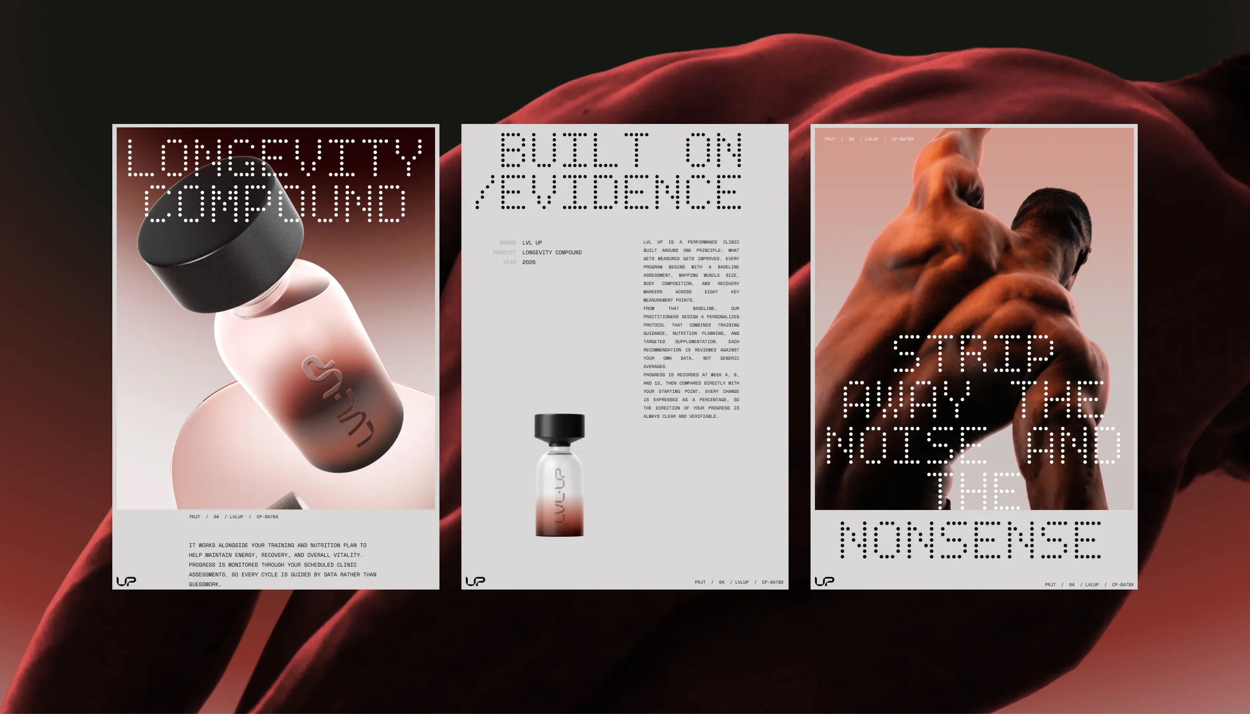
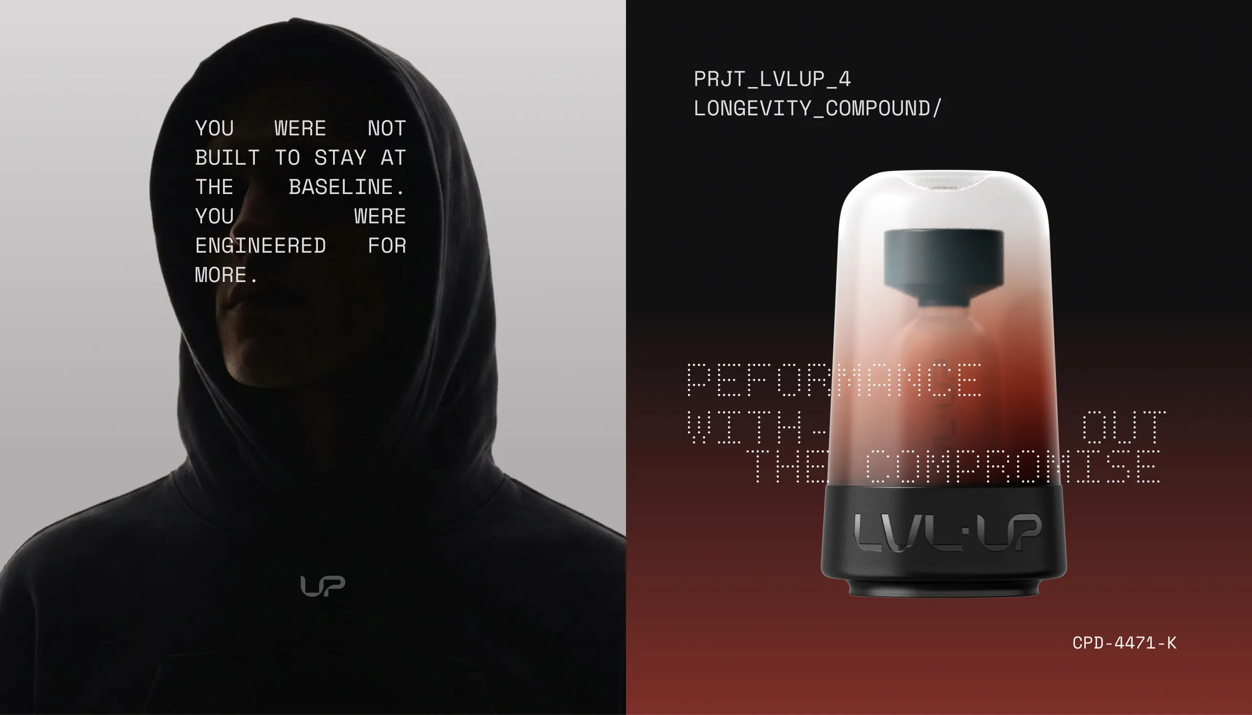
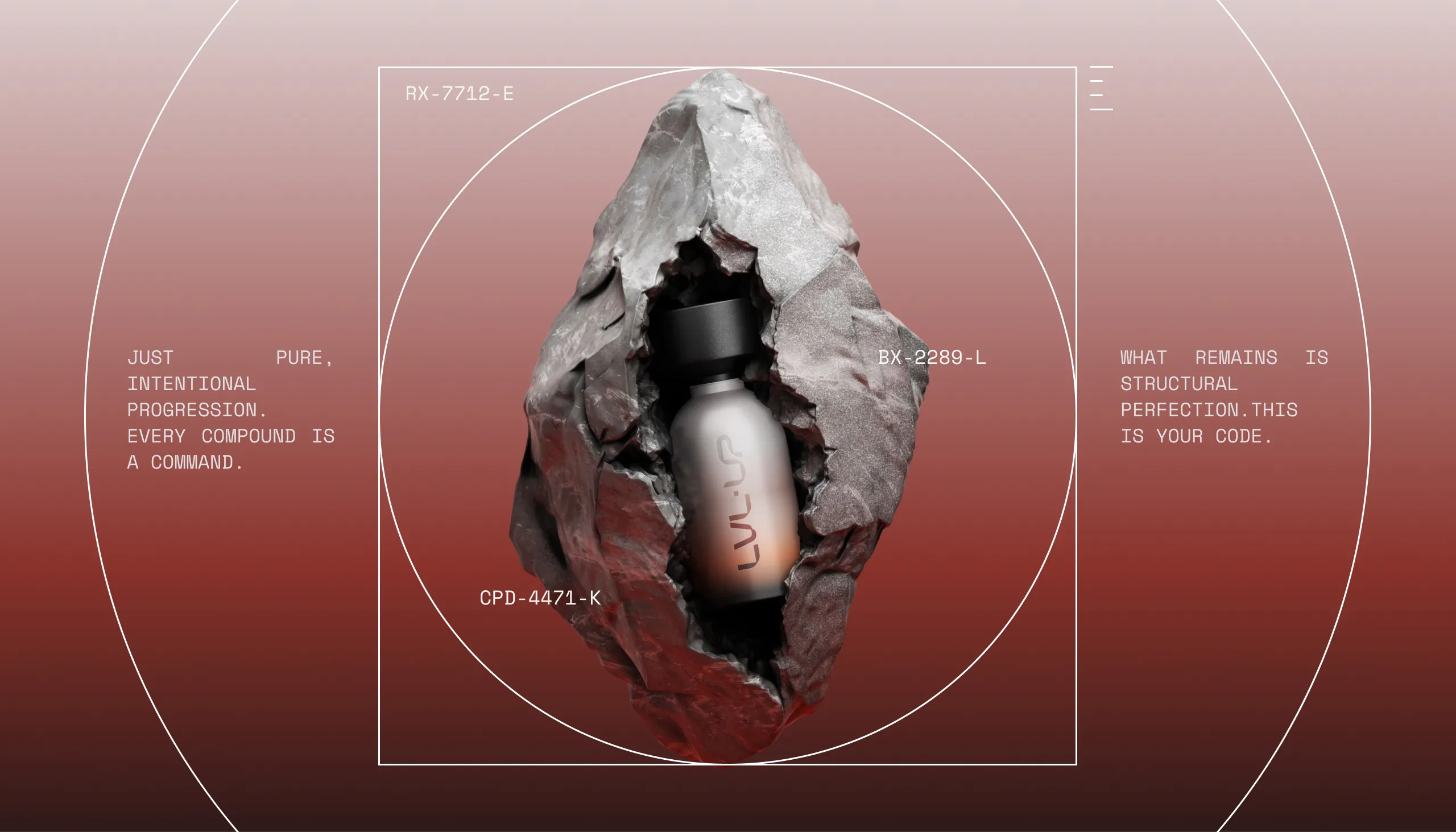
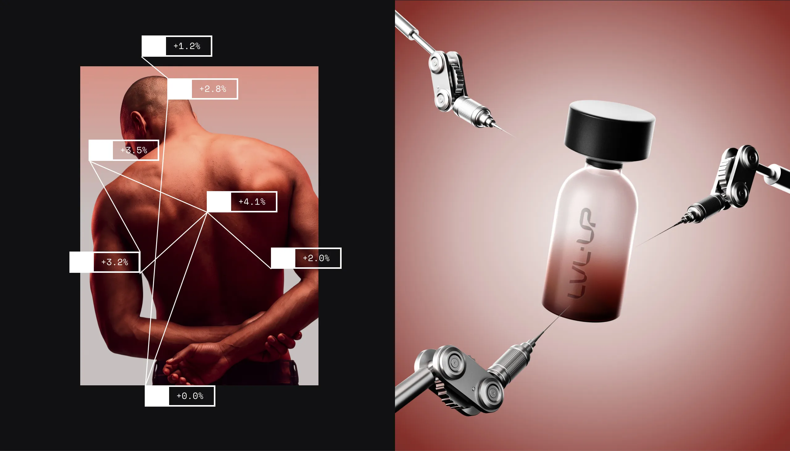
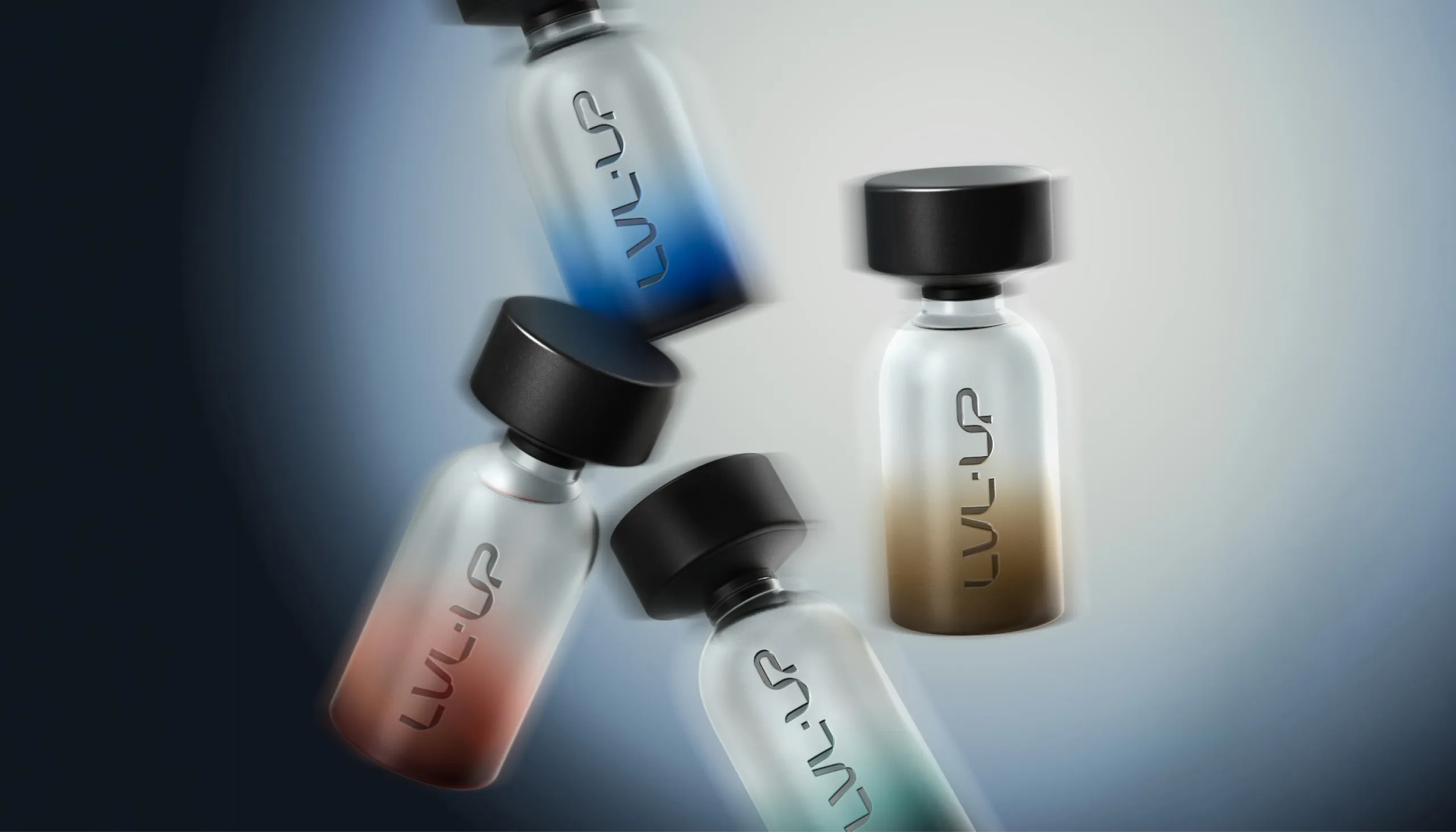
LVL-UP is a US-based peptide and performance brand named after the idea of levelling up, and we built its identity on that idea reduced to its essentials. The structural LVL-UP logotype comes with an interlocking UP emblem, dot-matrix headlines and technical monospaced type. A restrained palette runs from Lab Slate to Starlite, and the glass bottles are colour-coded in blue, red, gold and green. Each bottle sits in a four-part pack: a tinted top glass, the bottle, ribbed padding and a matte black base tube embossed with the logotype. Posters, a measure card, metal signage and scientific imagery complete the system.
See more nutrition and wellness branding case studies.
The Identity
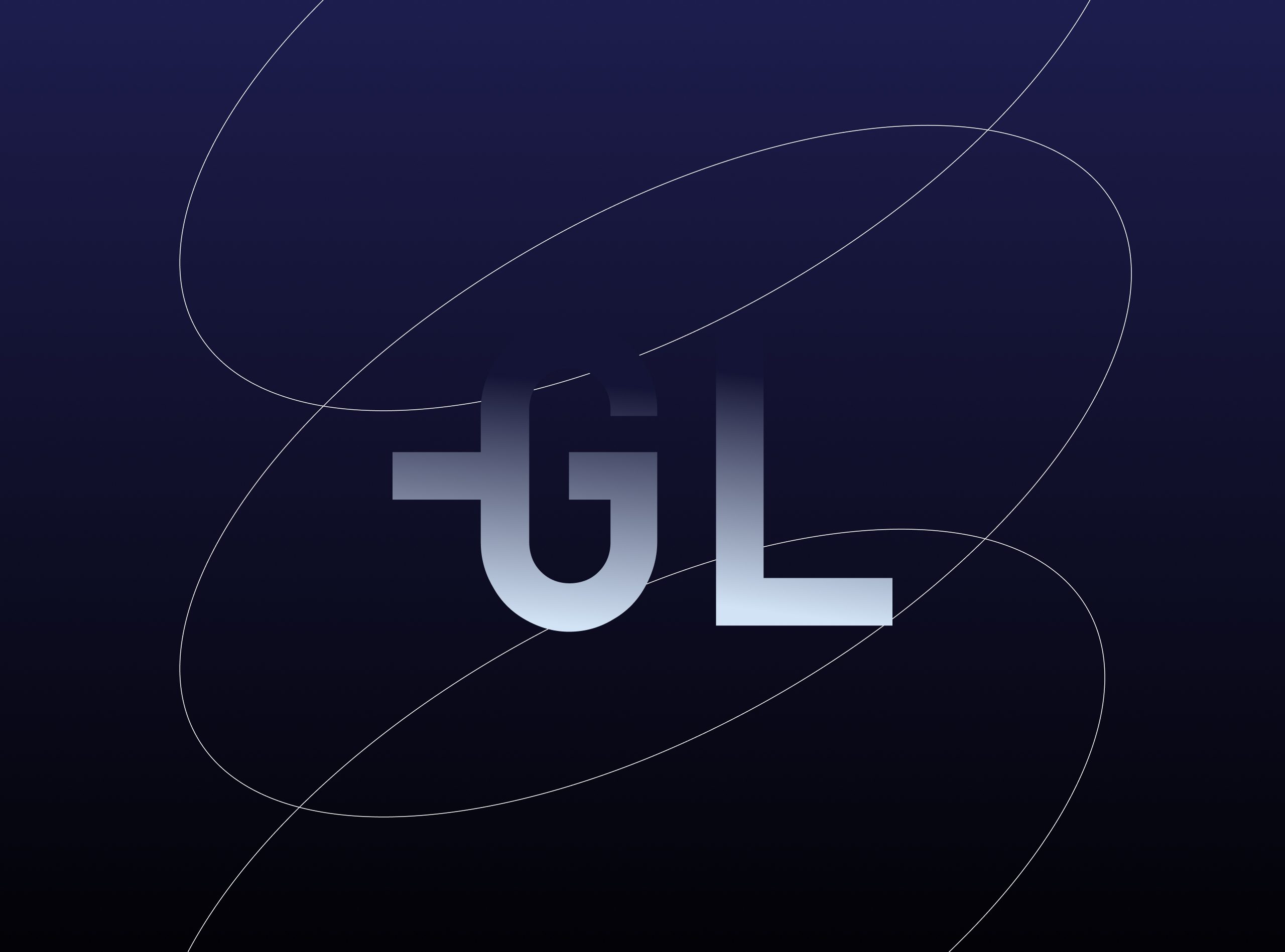
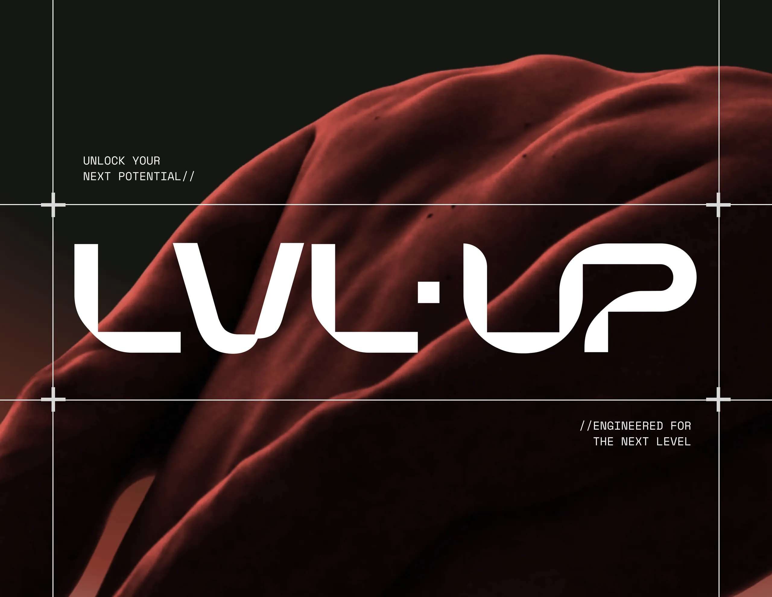
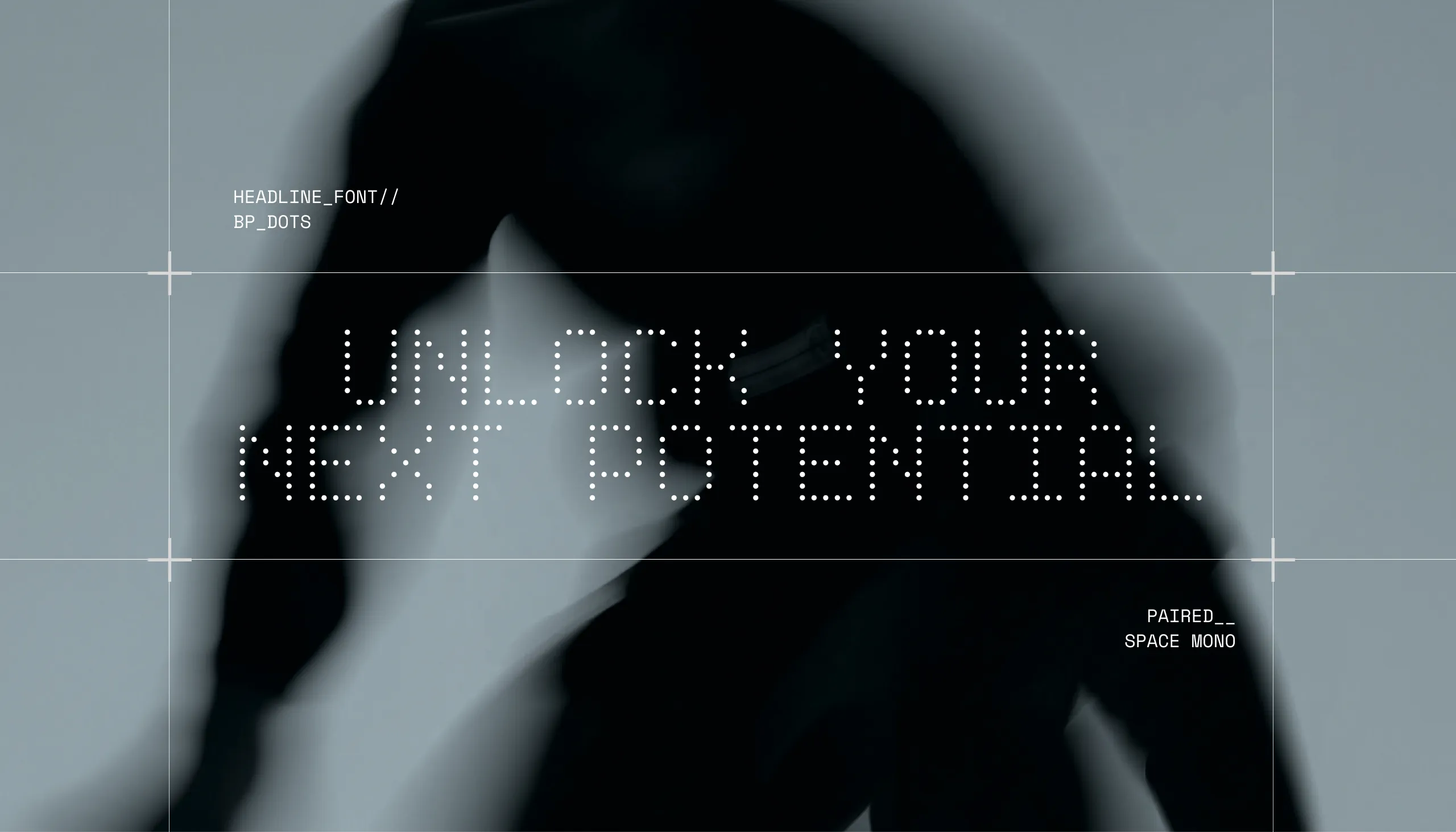
The LVL-UP logotype is built from straight strokes and rounded corners, with a single dot set between LVL and UP. The UP emblem is drawn from the same letterforms, so it can stand on its own and still read as part of the name. The brand guideline describes the character in three words: clean, performative and modern.
Typography and Colour
Headlines are set in BP Dots, a dot-matrix typeface, paired with Space Mono for supporting text. Lines such as Unlock Your Next Potential and Engineered for the Next Level carry the brand voice across posters and product imagery. The palette has six named colours, Lab Slate, Med Sage, Muscle, Bone, Mist and Starlite, plus a grey-to-blue gradient.
Packaging and Applications
The four bottle variants in blue, red, gold and green tell the products in the range apart, while frosted covers, metallic details and an embossed base keep them recognisable as one family. MarkaWorks carried the system through to posters, metal signage and the brand guideline.

Let’s make the work they’ll copy.
Talk to an expert now
Work with a 22 team of the
industry’s top 1% talent.