Updated October 2026
Supplement Branding & Packaging Design
MarkaWorks is a product branding agency, and for supplement companies it designs the brand identity, the packaging, or both. The nutrition and wellness category on this site has 25 published case studies, each counted from its live case page. Supplement packaging is regulated work, so our layouts are built around the label rules first and the shelf impact second.
Branding for a regulated product
A supplement label is not a free canvas. The panel rule is written as a typographic instruction, not as a preference: 21 CFR 101.36(e)(1) states that “The title, ‘Supplement Facts,’ shall be set in a type size larger than all other print size in the nutrition label and, unless impractical, shall be set full width of the nutrition label.” In the US market, five mandatory statements have to appear on the label, and the FDA sets exact minimums for how they appear: body text in the Supplement Facts panel cannot drop below 8 points, column headings and footnotes cannot drop below 6, and every piece of mandatory text has an absolute floor of 1/16 inch letter height. The “Supplement Facts” heading must be the largest type in the panel and span its full width.
A layout that breaks these rules has to be corrected before the product can be sold legally. Design that treats them as the grid usually ends up cleaner, because the mandatory panel anchors the layout and the brand elements are placed around it deliberately.
The same discipline applies outside the US. UK rules require the legal sales name “food supplement”, a minimum x-height of 1.2 mm for mandatory text, and health claims chosen from a closed list. When we design a supplement brand for more than one market, the label system is planned for the strictest market it will enter.
What the FDA requires on a US supplement label
| Requirement | Rule |
|---|---|
| Mandatory statements | 5 statements required on every label |
| Supplement Facts body text | 8 pt minimum |
| Column headings and footnotes | 6 pt minimum |
| All mandatory text | 1/16 inch minimum letter height |
| Small packages | Floor drops to 4.5 pt, capitals permitted |
| Panel format | Boxed with hairlines, single color |
| DSHEA disclaimer | Fixed wording, bold, 1/16 inch minimum |
| Structure/function claims | FDA notification within 30 days |
These are label-design constraints, not legal advice. The full regulatory picture belongs to your compliance counsel; our job is to make sure the design never becomes the compliance problem.
Choosing an agency for a supplement brand

Hire the agency that can show you supplement work it has actually shipped, category by category. Supplement branding has its own traps: labels carry more mandatory information than most food packaging, ranges grow fast, and the design has to feel trustworthy without drifting into a clinical, pharmaceutical look. At MarkaWorks this is the portfolio’s center of gravity: GreenWhey, Hyfuel, Nutrio, GL Peptides, Serenique, Milksta and Goodie are all supplement and nutrition brands we have designed, each with its own identity and packaging system. Look at how an agency handles a full product range rather than a single hero pack.
Specialization in supplement label systems
Specialization shows in the label system rather than in the logo. A supplement pack has to order a lot of content: product name, function, ingredients, usage, warnings, and it has to do that across every variant of a growing range. Our packaging design work in this category is built on exactly that discipline: Better runs distinct yet unified packaging across proteins and amino acid blends, so a buyer recognizes the range and still tells the products apart, and BARS uses a deliberately minimal pouch so the wordmark and the product information stand on their own.
Range architecture before the individual pack
Start with the system before the individual pack. A supplement range needs one shared architecture, where the logo sits, how the label blocks stack, what stays constant, and then a coding layer that separates the variants: Bulkform does it with a clean, data led layout that stays consistent from pack to retail to digital, Awelly with clean layouts and restrained color so each product keeps its own identity inside one cohesive system, Serenique by giving every product its own name and visual treatment inside one family look. Design the range logic first, so a tenth product can join the family without a redesign.
The premium read, and what undercuts it
Restraint, mostly. Premium supplement packaging almost always does less: a controlled palette instead of a loud one, typography with a clear hierarchy, materials and finishes chosen deliberately, and generous space around the information. On Goodie we used warm tones drawn from sand, linen, stone and dark wood, and let amber bottles carry the product presence. On P01 the same restraint runs technical: a palette held to deep petroleum tones, metallic surfaces and soft neutrals, and a modular layout that keeps every pack in the range structured and controlled. What undercuts a premium read is noise: too many claims, too many colors, too many typefaces. A premium pack keeps the emphasis on the information that matters.
Identity work for nutraceutical brands
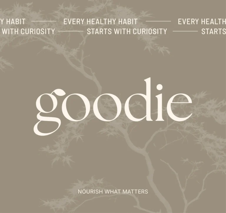
Nutraceutical brands sit between two worlds: the seriousness of pharma and the warmth of food. The branding answer is to pick a side deliberately. Our own stance in this category is documented on the Goodie case: wellness presented as a positive daily habit rather than a response to a problem, with a palette and typography that feel warm instead of clinical. MarkaWorks designs nutraceutical identities with that balance in mind, and the supplement cases across this page show how it plays out pack by pack.
Wellness identities without the usual cliches
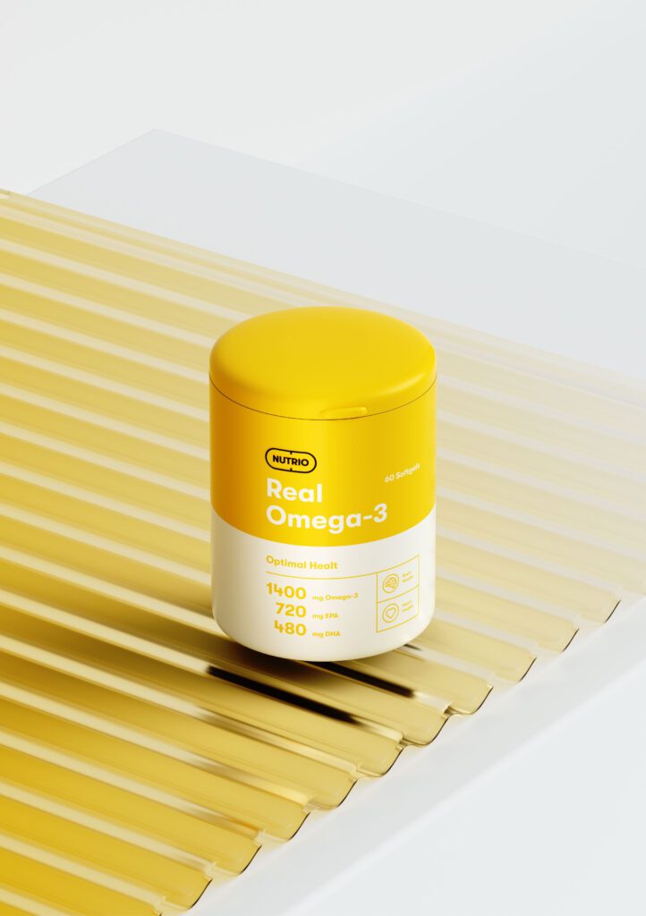
Wellness is where identity work most easily slides into cliche, the same greens, the same leaves. Our wellness identities are built against that: Goodie’s palette comes from sand, linen, stone and dark wood instead of conventional wellness greens, and Nutrio’s whole system grew from the brand’s own manifesto of nourishing body, mind and soul.
Work you can inspect

Recommendations mean little without work you can inspect, so here is ours: the health and wellness cases on this page, from Serenique’s nature and science identity to Goodie’s wellness world and Nutrio’s supplement system, are all our own projects. Read them the way you would vet any agency: does the identity survive across the whole range, does the packaging stay readable, does the brand feel trustworthy without going clinical.
How the work runs
The work runs in four steps. If the brand already has an identity, the second step reviews that identity for the pack.
- The product and its market: who picks it up, where it sits, and what has to be on the label in that market.
- The identity.
- The packaging system.
- The label layouts, with the mandatory panels placed first.
If a project includes 3D visuals, we show the client a 3D render of the pack ahead of printing.


Frequently asked questions
Five mandatory statements, a Supplement Facts panel with fixed minimum type sizes, and the DSHEA disclaimer in its exact wording. Structure/function claims also require an FDA notification within 30 days of first use.
Yes. Protein powder sits at the core of our sports nutrition work: GreenWhey's plant based protein range and Hyfuel's performance line were both branded at MarkaWorks, with color coded labels that make protein type and use readable at a glance. AKME Performance is a newer example: its creatine, protein and pre-workout products share matte-black packs and are told apart by fine color accents.
Protein bars live on the same shelf logic as powders, only faster: the wrapper has seconds to say flavor, function and brand. We design bar packaging inside the wider sports nutrition system, so a full bar range stays readable and unmistakably one brand.
Nutrio is our reference here: brand strategy, visual identity, packaging design, digital experience and 3D visualization, delivered as one project for a wellness supplement brand. Vitamin ranges get that same treatment, a calm system where every product stays clearly part of the family.
From Serenique's identity rooted in nature and supported by science to Goodie's warm wellness world, nutritional supplement brands are the center of our portfolio: we design the identity, the packaging system and the digital side so a range can grow without losing its face.
A nutrition bar rarely launches alone; it lands next to powders and drinks. So we treat bar packaging as part of that wider family, and the wrapper speaks the same identity the rest of the range already carries.


Let's make the work they'll copy.
Request a proposal for your supplement brand.
Talk to an expert now