EllaVita
Designing a Harmonious and Empowering Women’s Wellness Brand
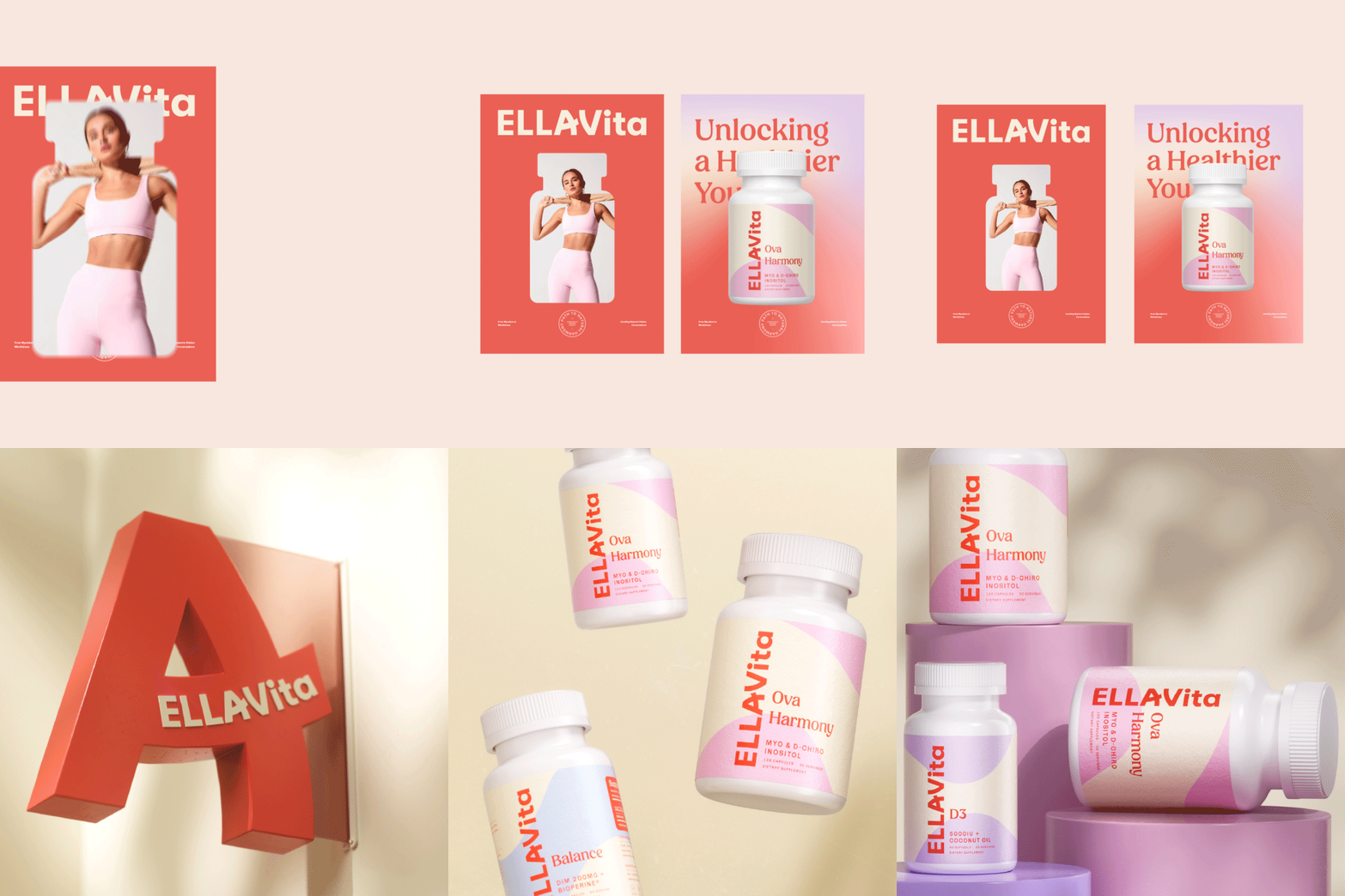
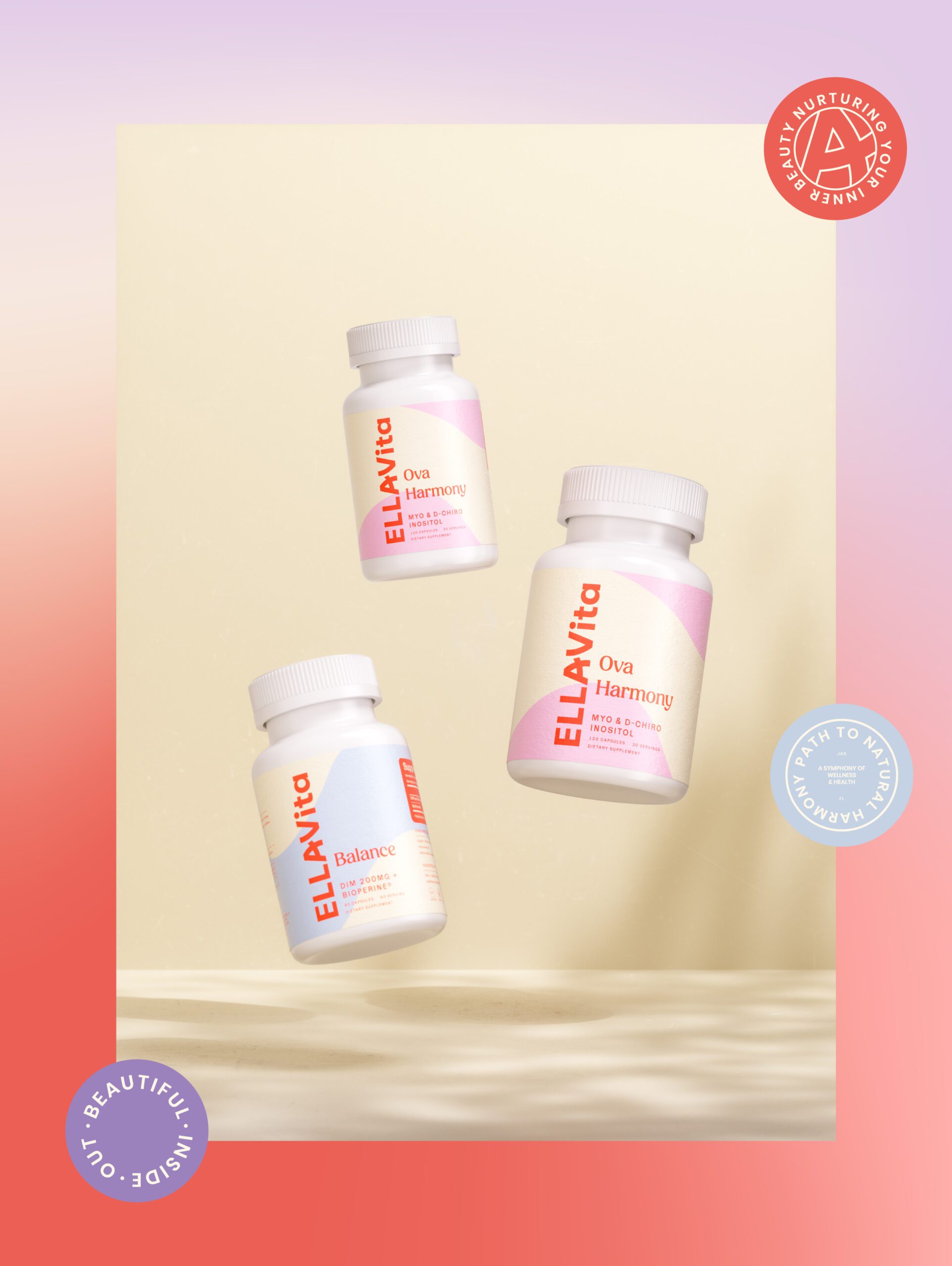
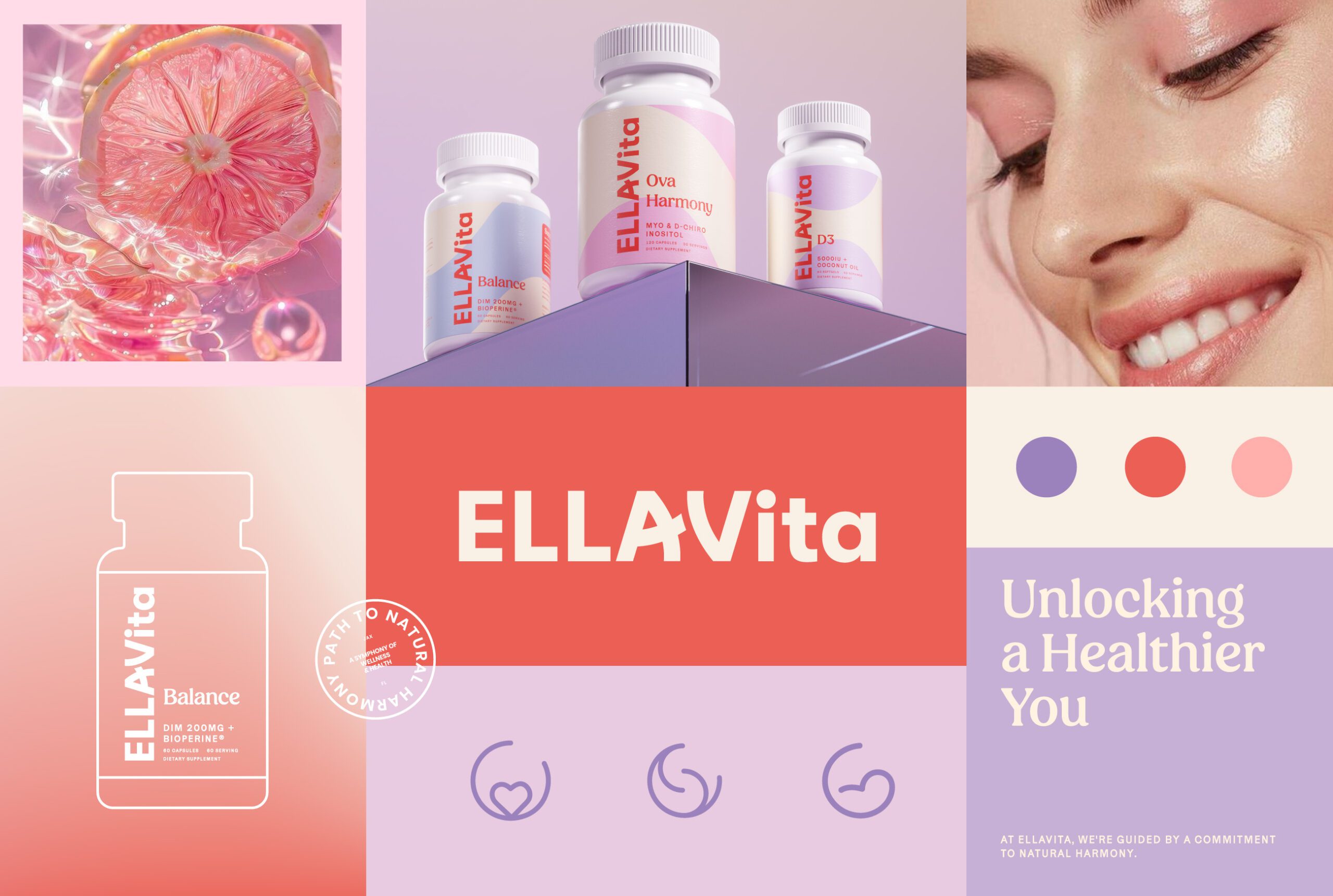
EllaVita is a women focused supplement brand offering fertility and wellness products designed to support balance, vitality, and long term health. The brand was created to feel nurturing yet confident, combining scientific credibility with emotional warmth. MarkaWorks developed an identity that reflects care, clarity, and accessibility, positioning EllaVita as a trusted companion in women’s wellness journeys.
Our approach centered on translating complex health topics into a visual and verbal language that feels calm, reassuring, and easy to understand.

EllaVita is a women’s supplement brand covering fertility and long term wellness. The brief asked for two things that usually pull against each other: scientific credibility and emotional warmth. A fertility product has to look like it knows what it is doing, and it has to be something a person can keep in daily view for months without it feeling like medication.
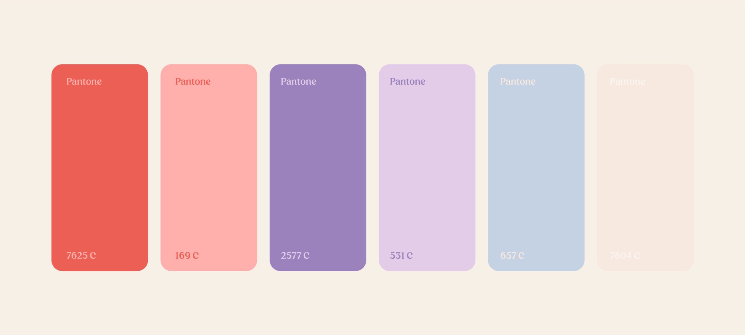
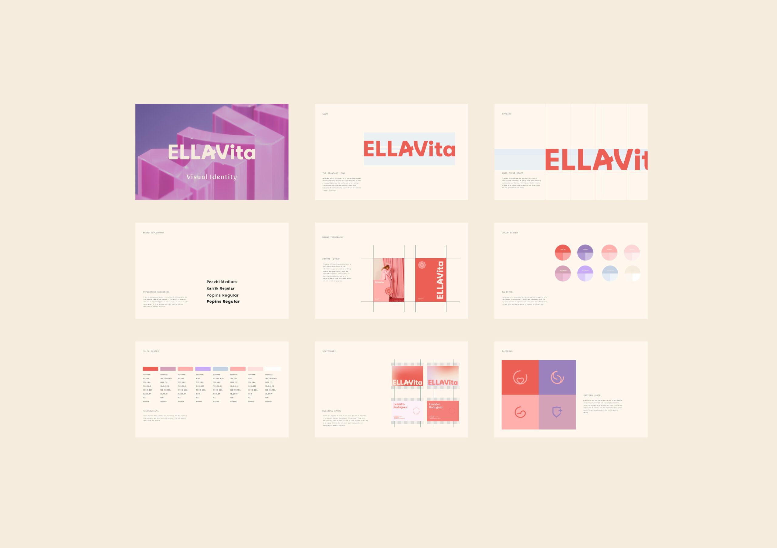
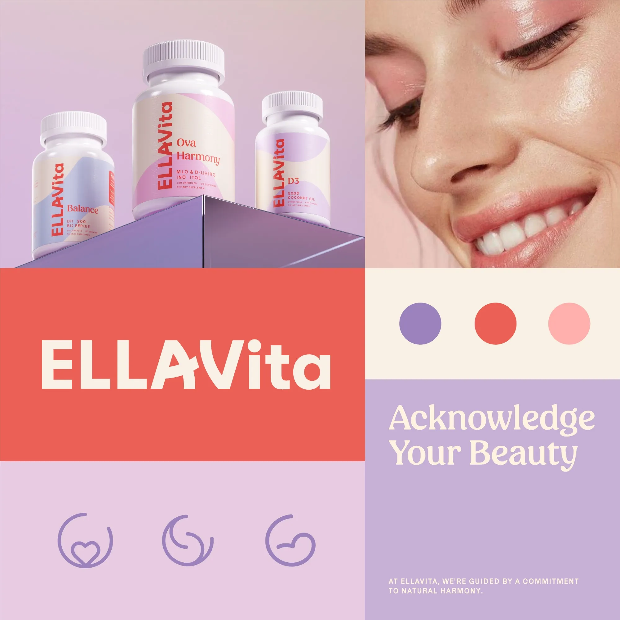
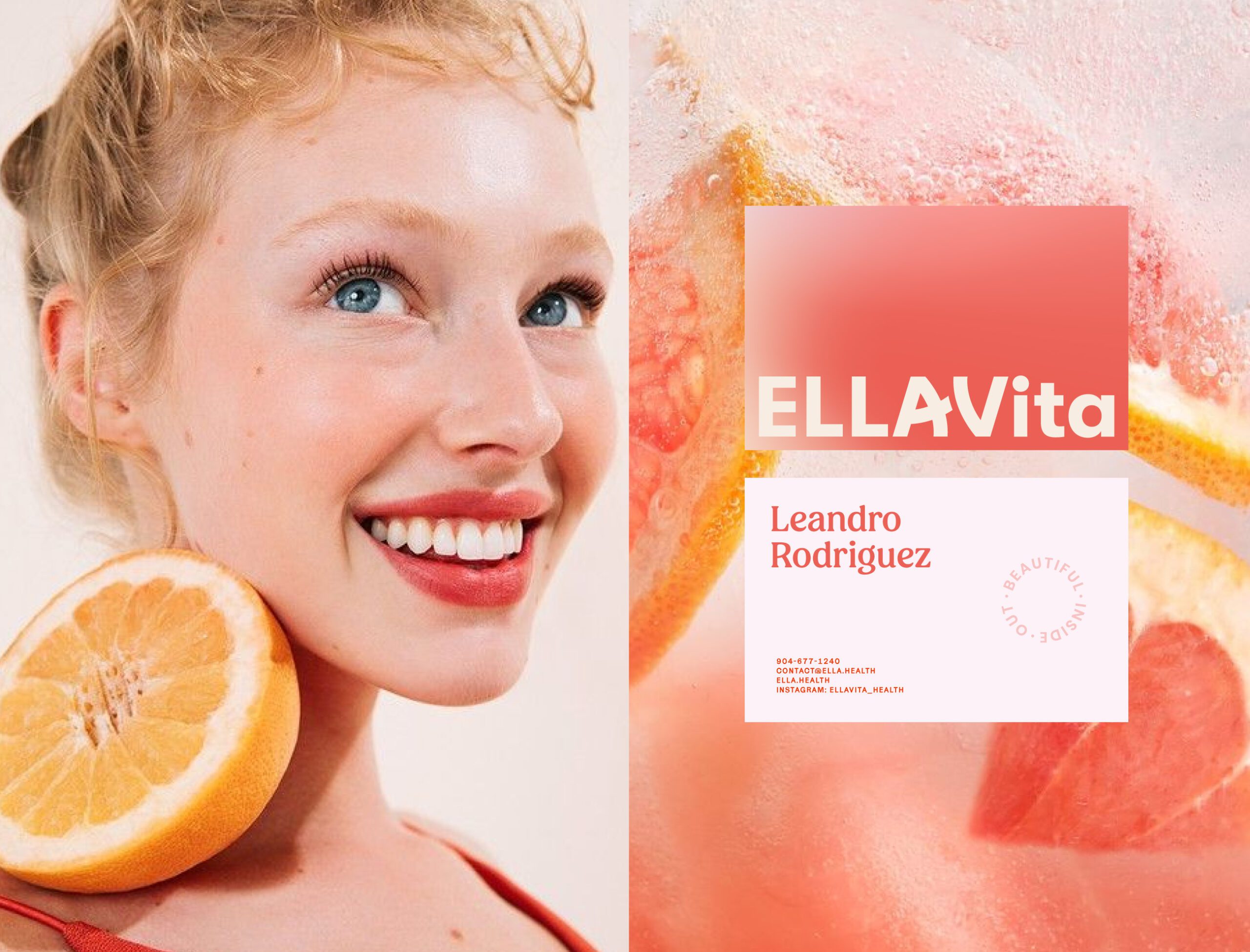
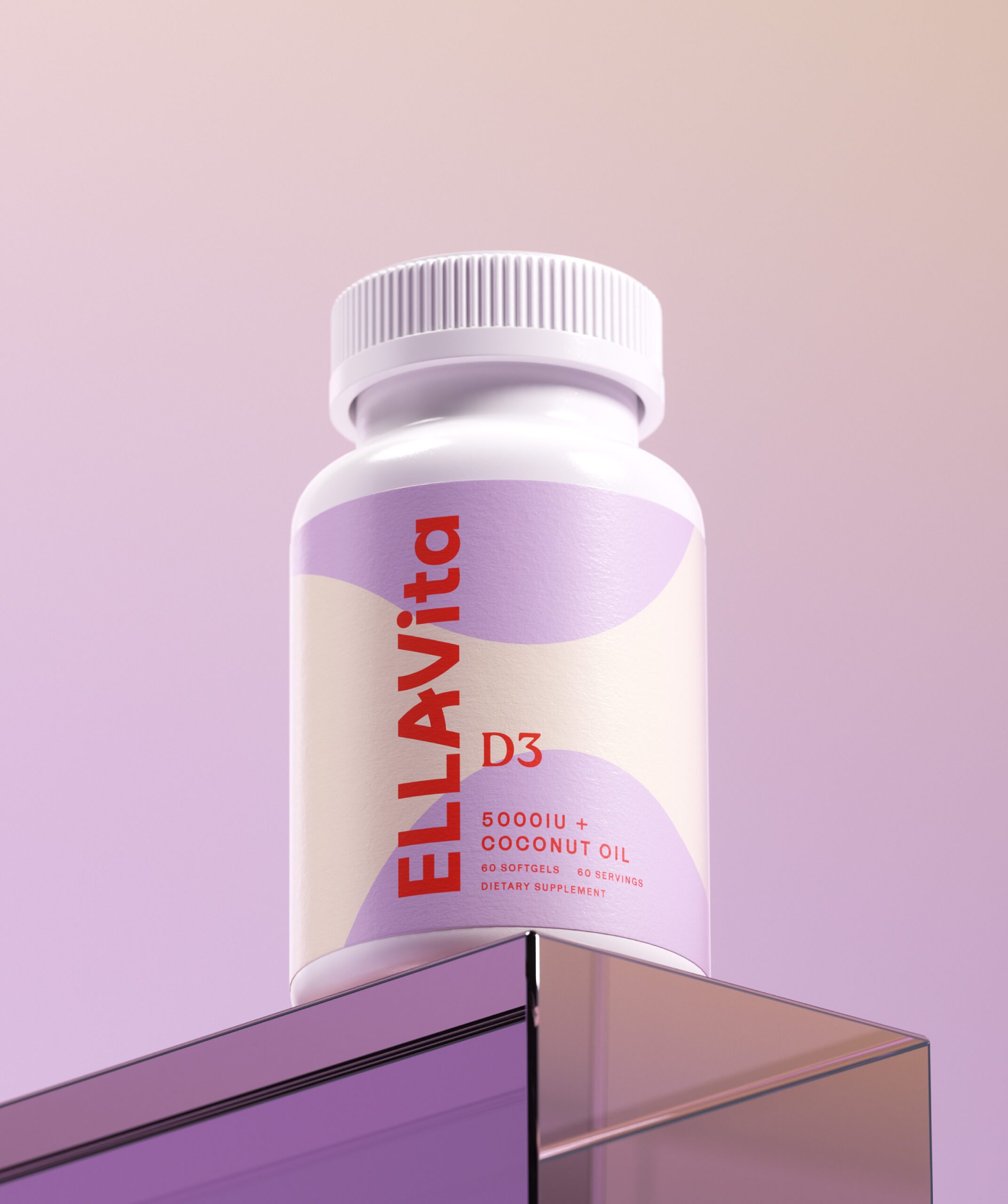
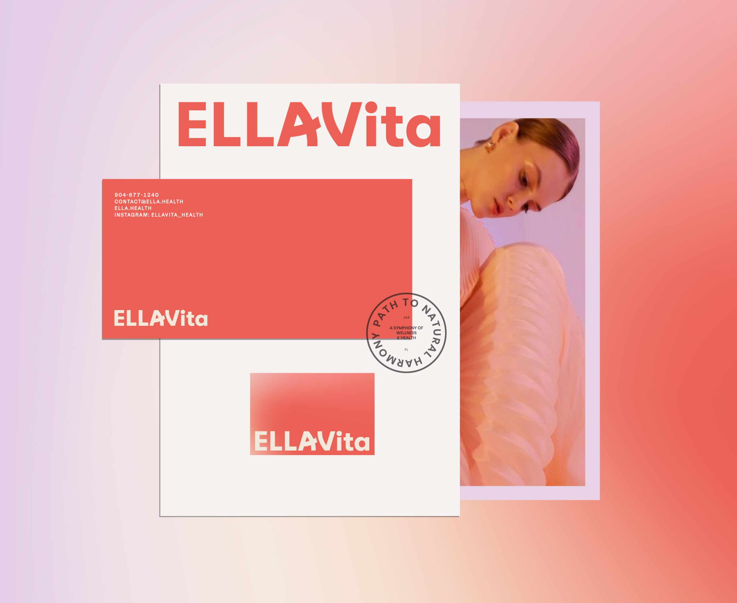
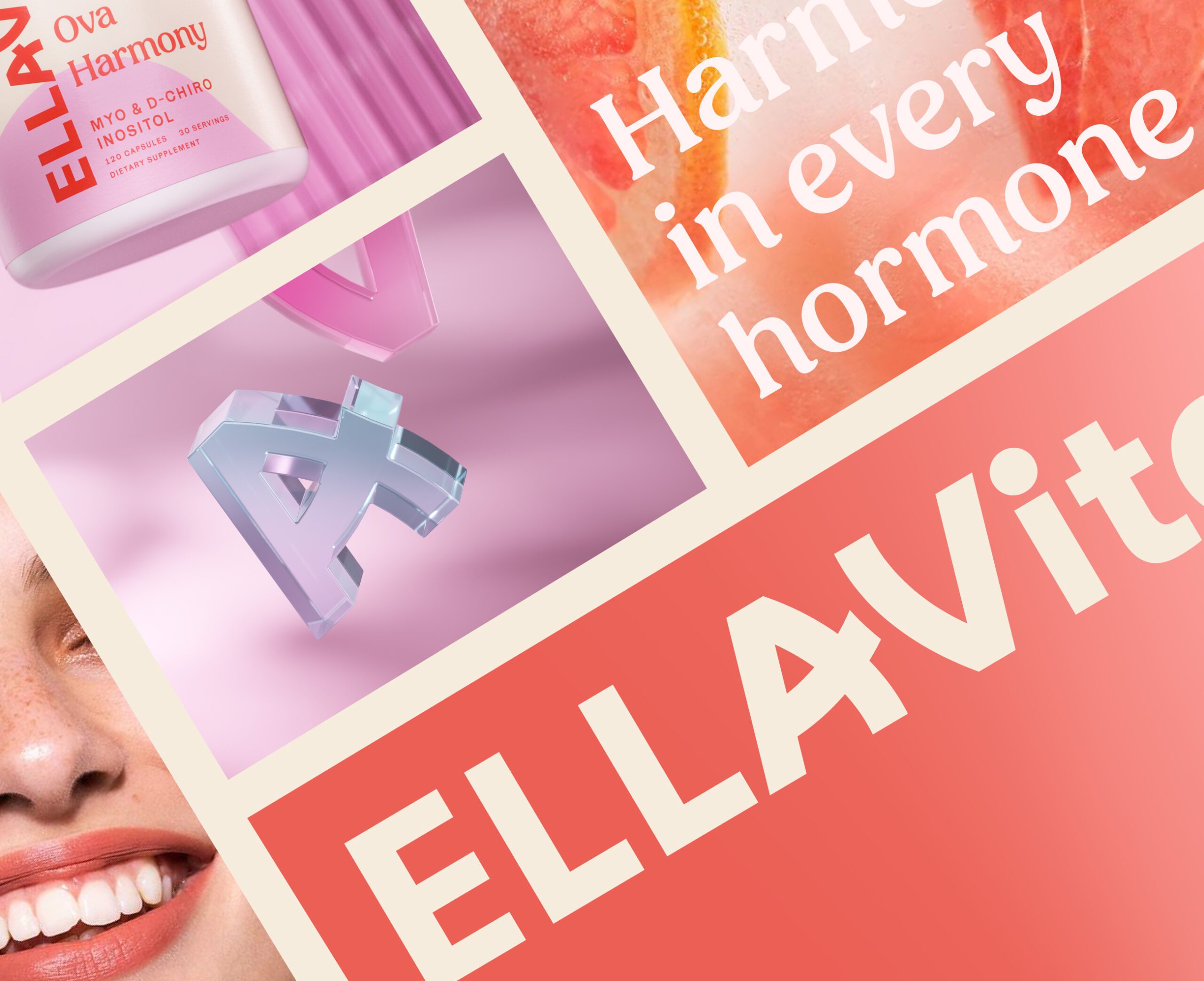
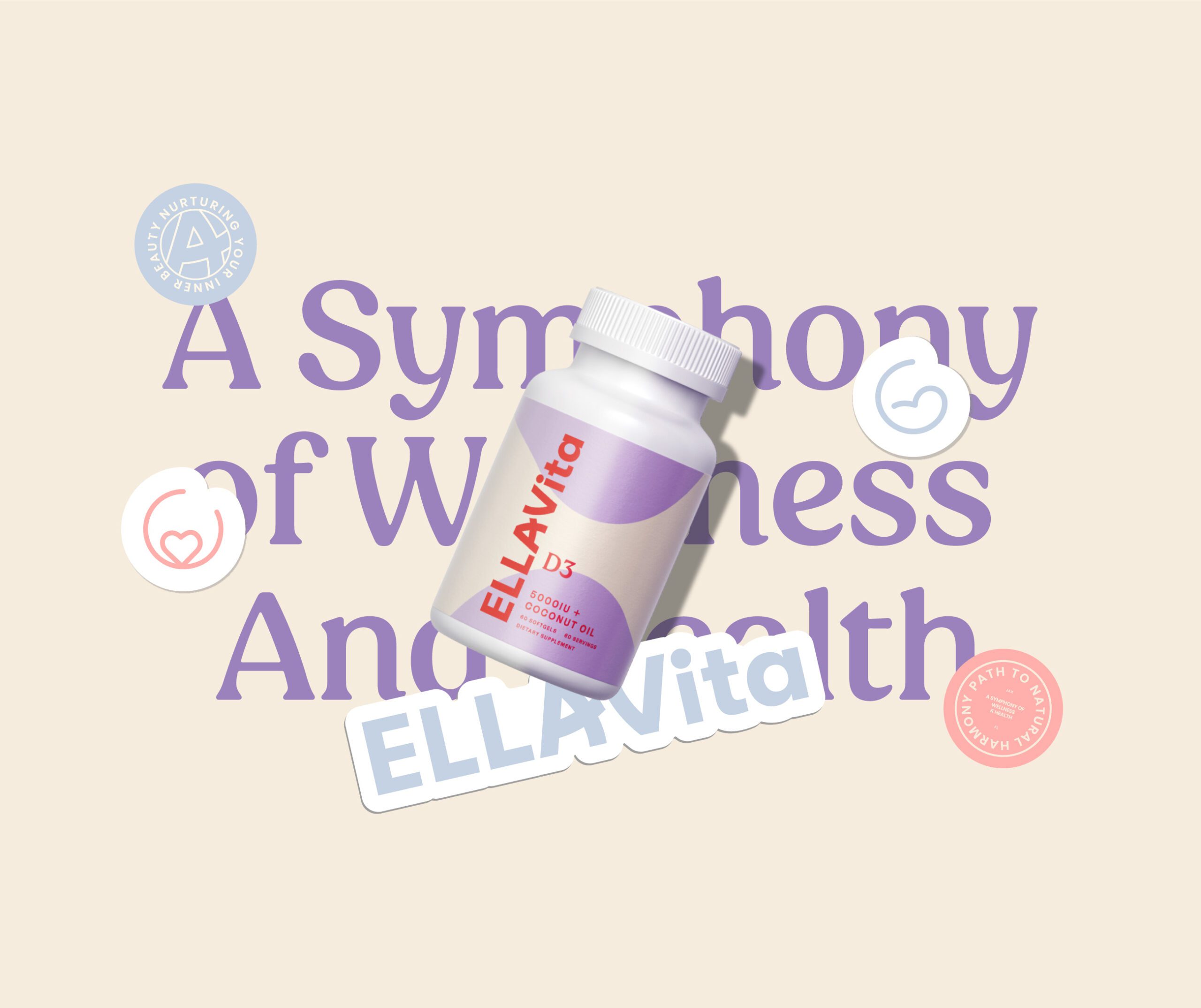
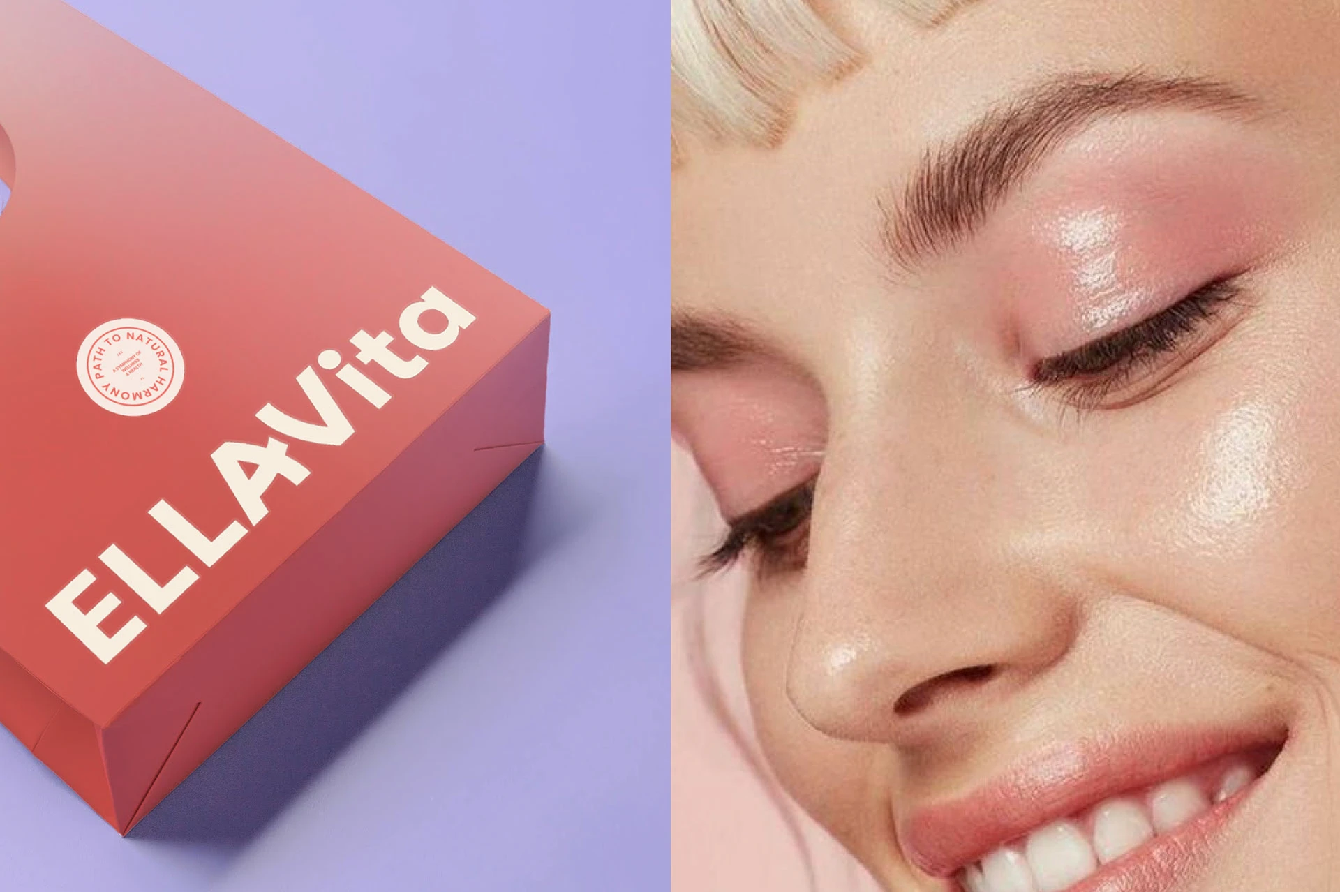
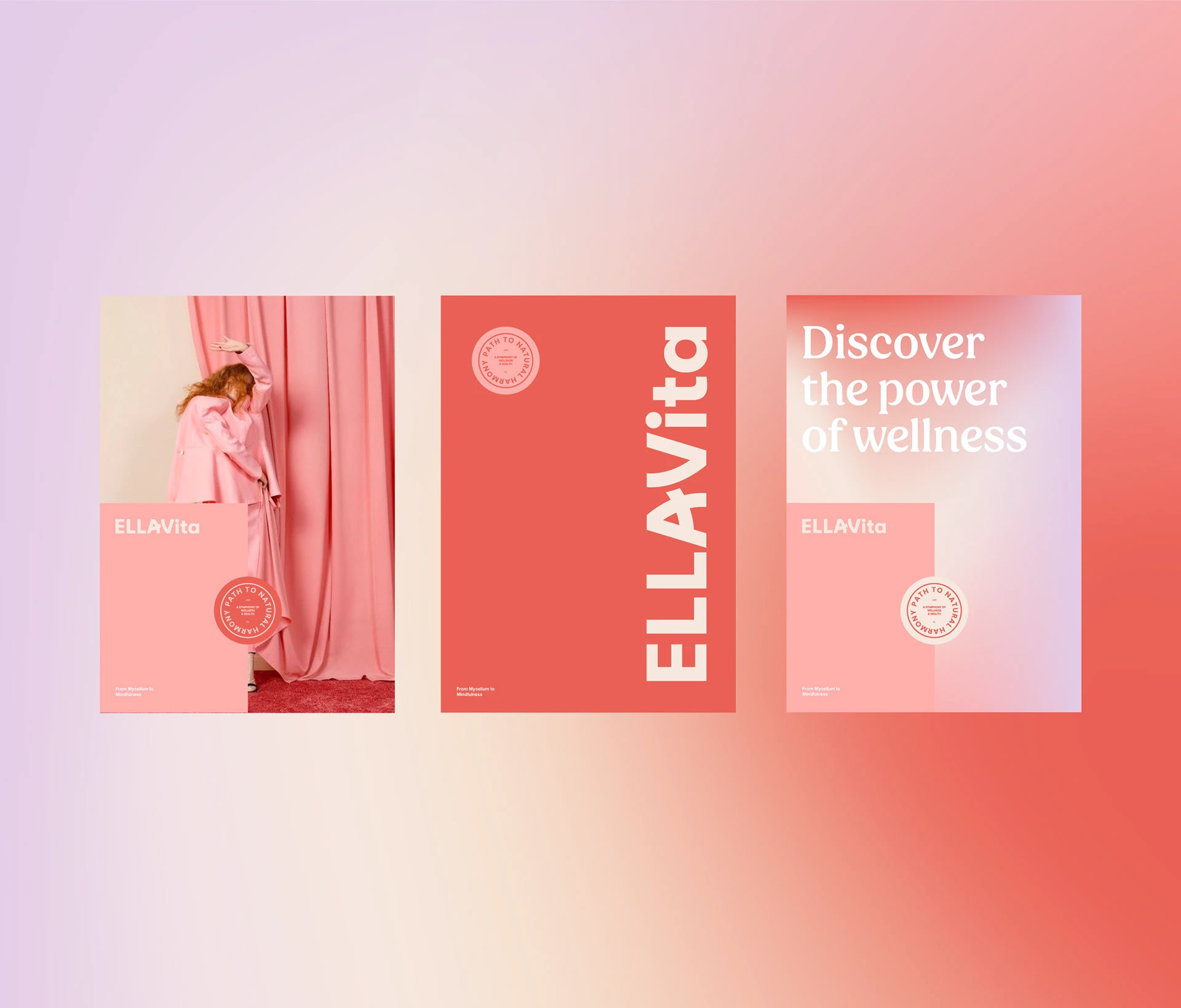
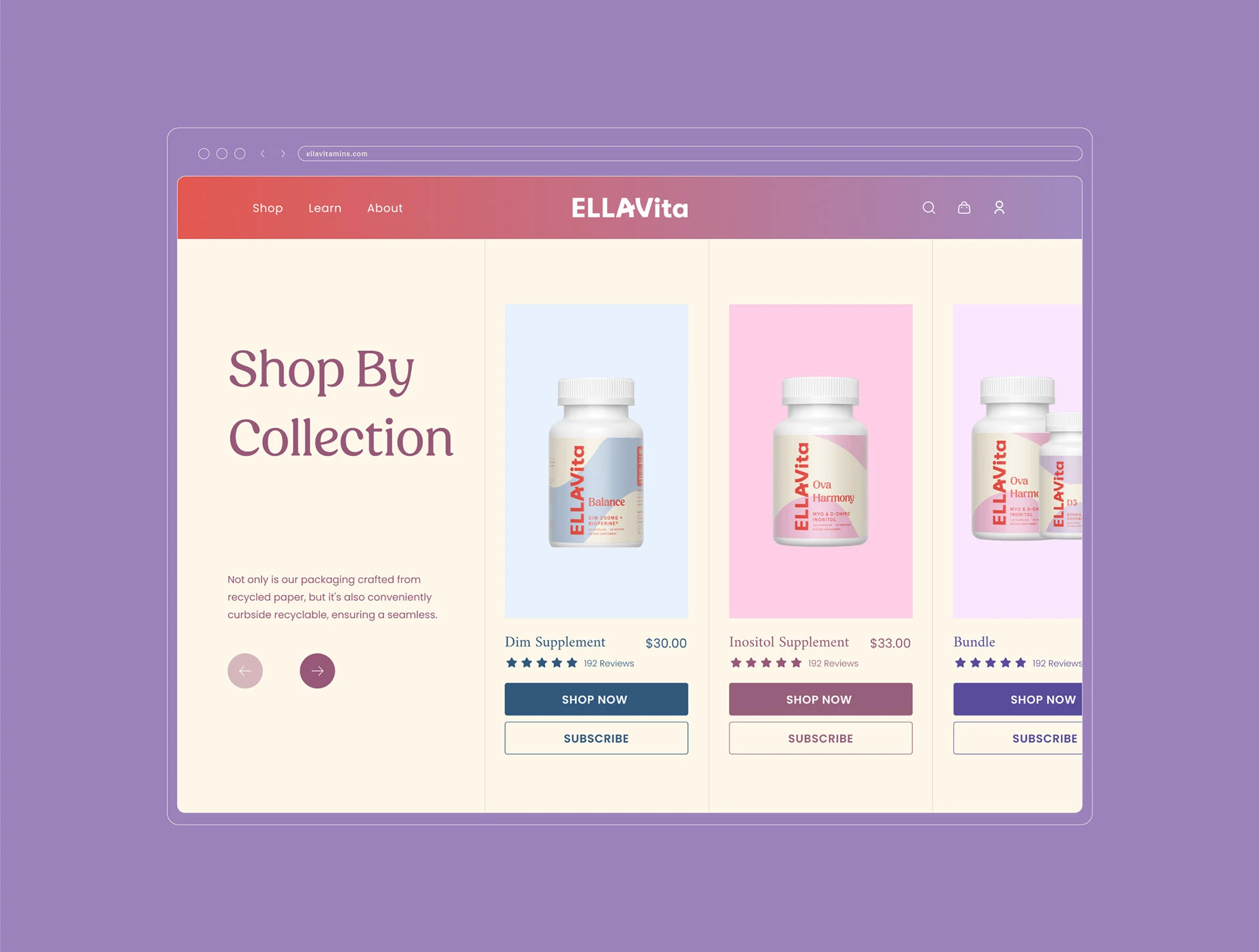
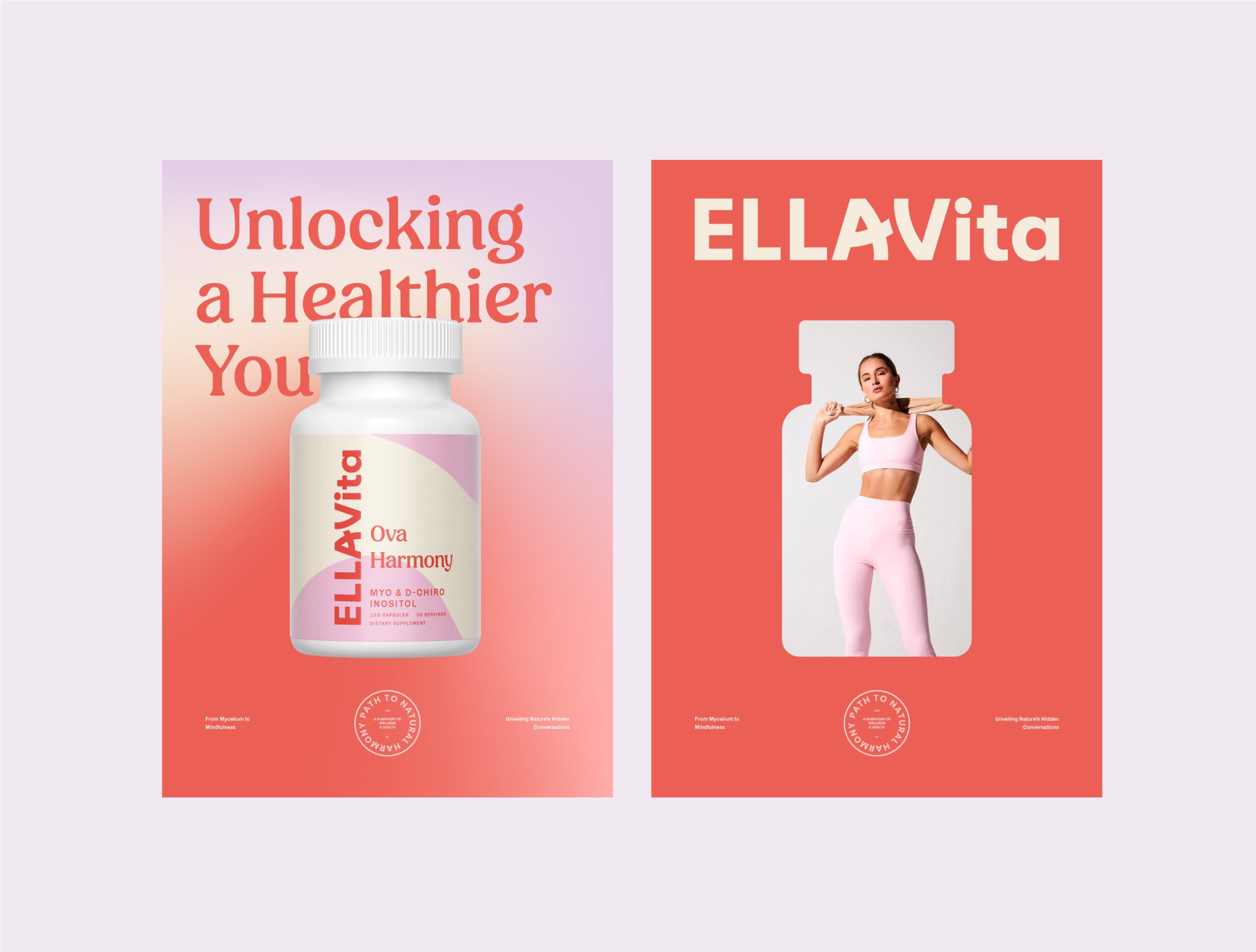
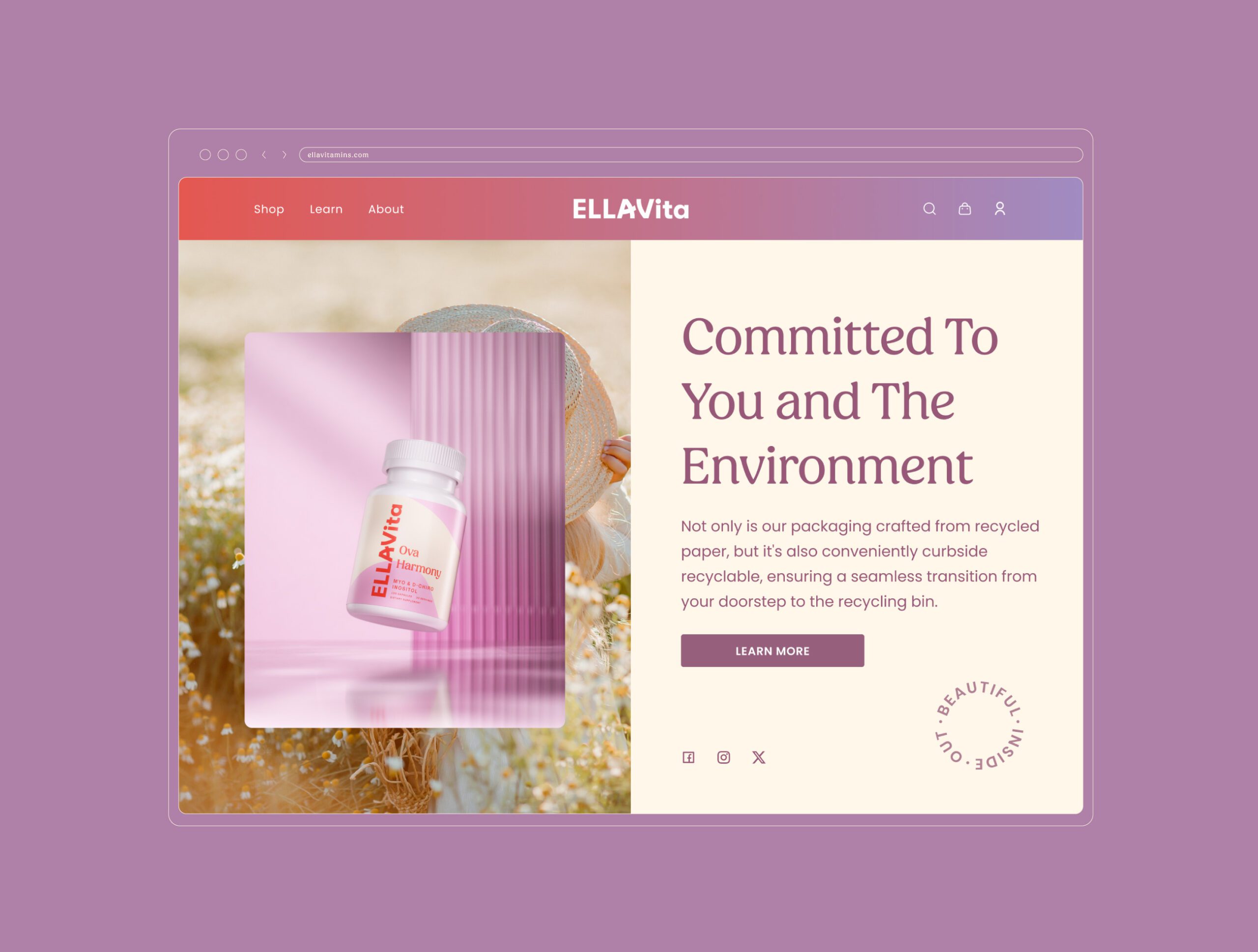
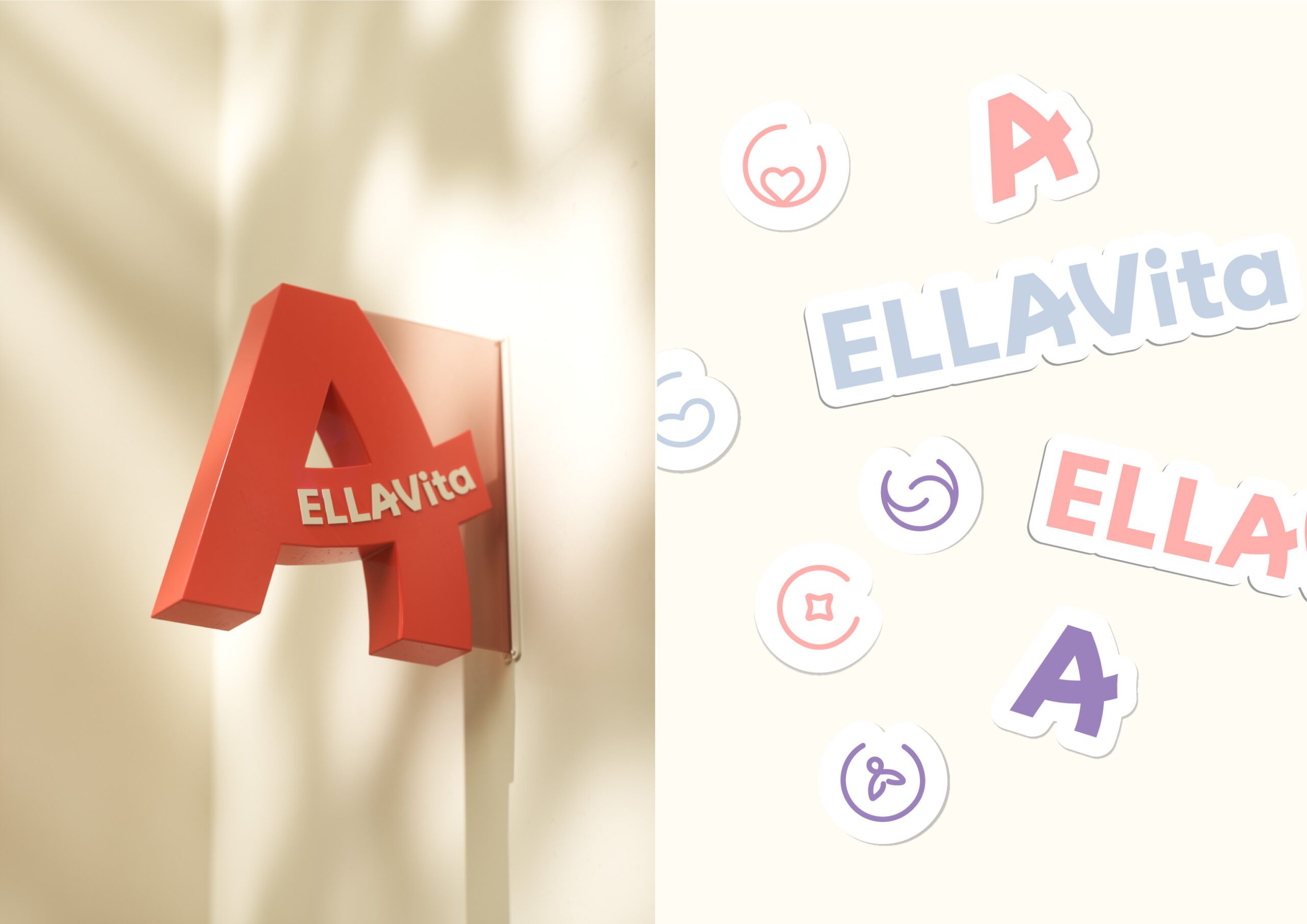
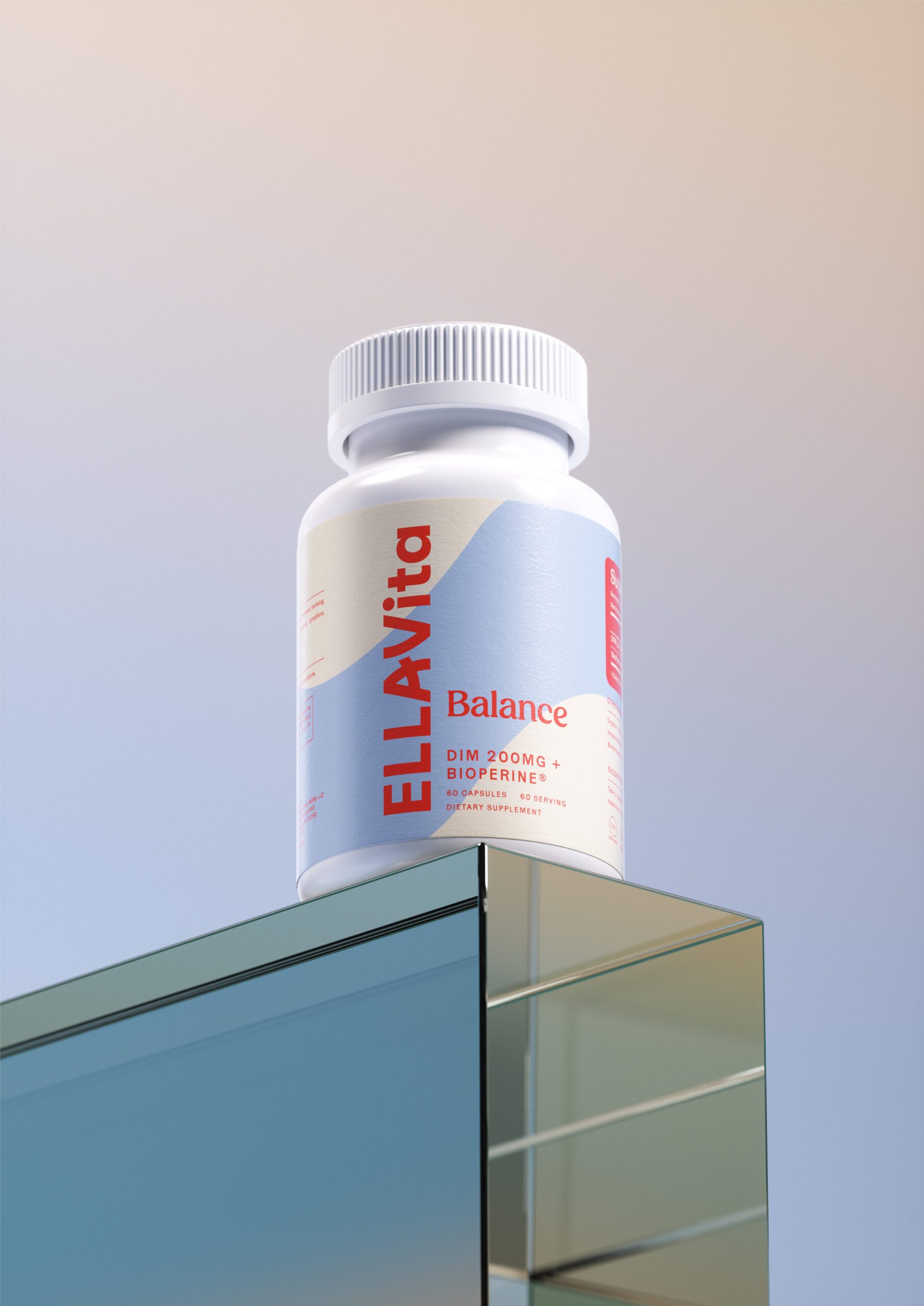
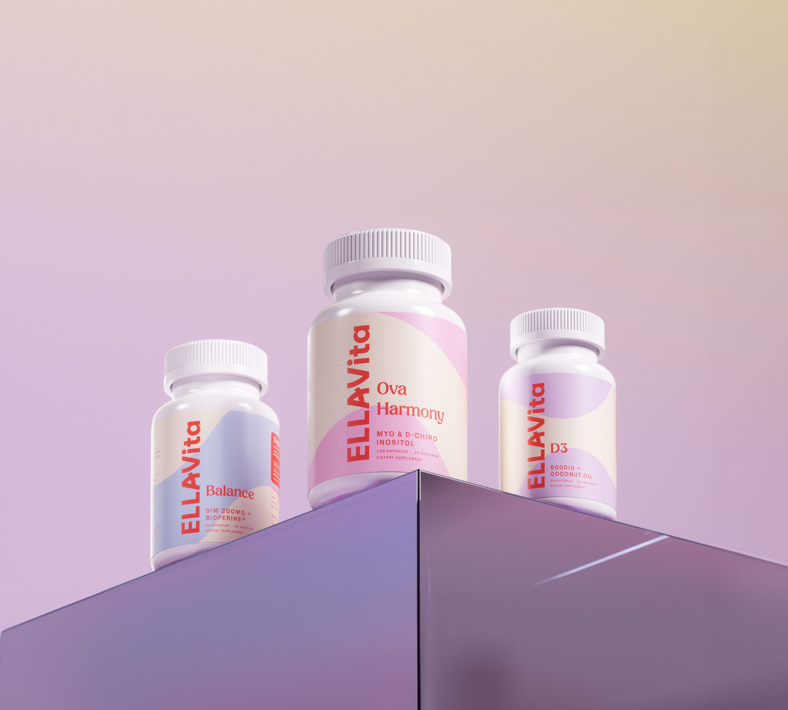
At MarkaWorks we built the brand identity around that tension rather than resolving it in one direction. The palette uses soft pink, lavender, and coral with subtle gradients. Those are warm, approachable tones, and in a category that defaults to clinical white they do the positioning work on their own. The typography pulls the other way: clean, modern sans serif letterforms with slight curves, so the type stays authoritative while the color stays soft.
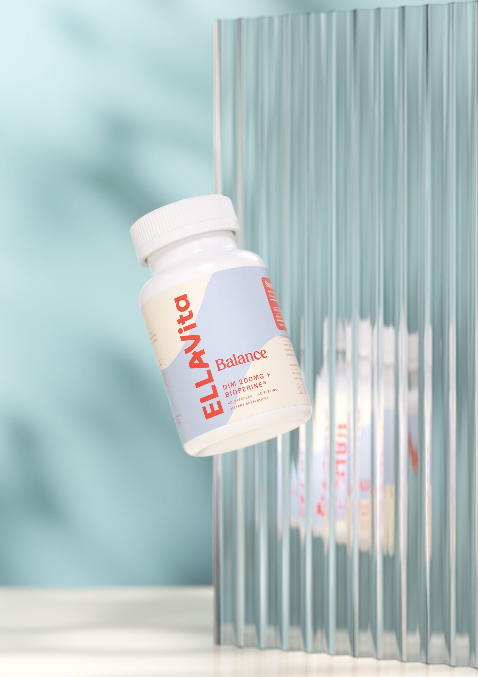
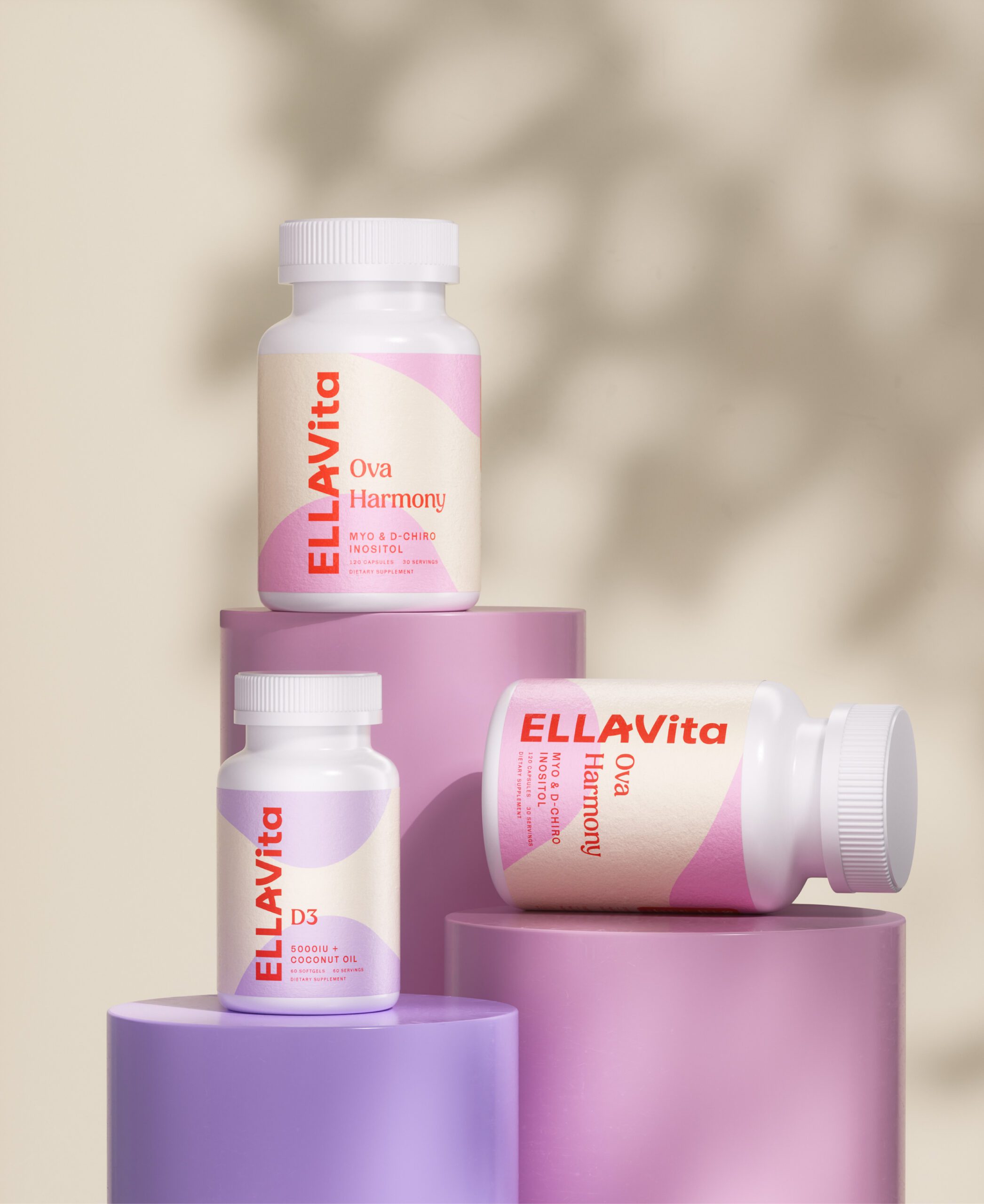
Supplement packaging has a constraint that shapes every layout decision here. A US supplement label carries a fixed set of mandatory statements, and the facts panel has its own rules for size, ruling, and hierarchy that no design can override. The mandatory block is not negotiable, so the brand’s own voice has to work in the space that remains. That is why the EllaVita system leans on color and proportion rather than on ornament: the decorative budget is small, and it is spent where it changes how the pack feels in the hand.
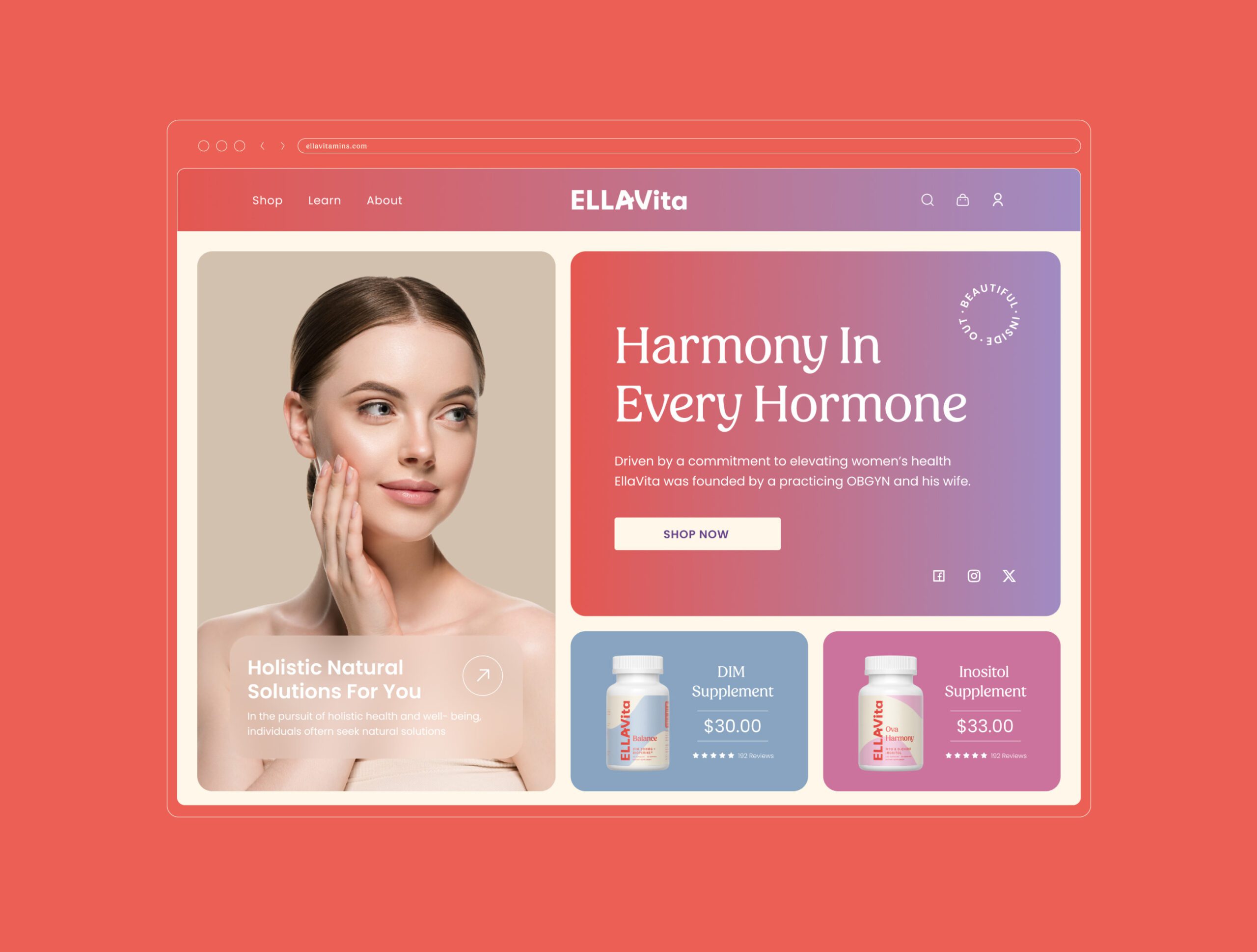
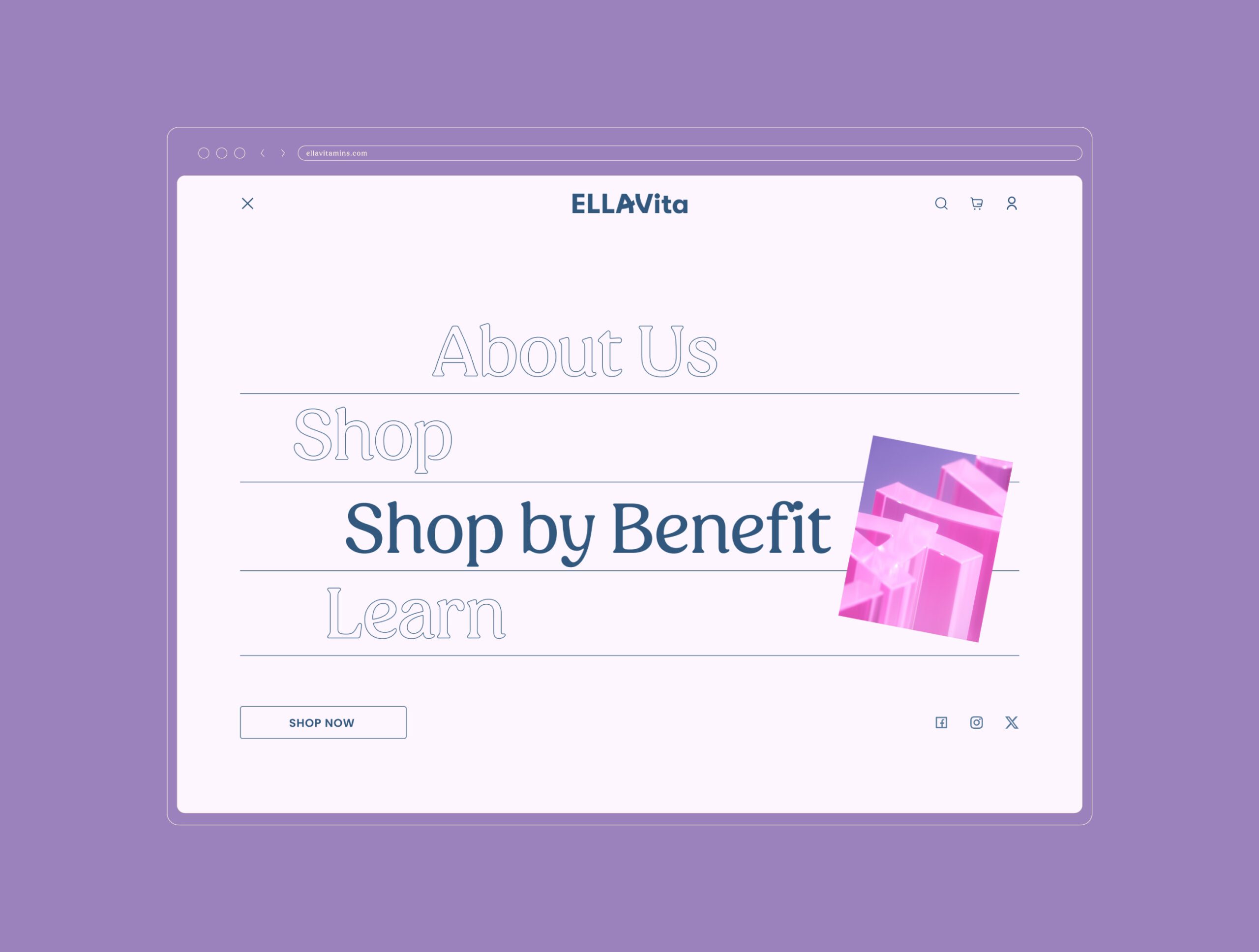
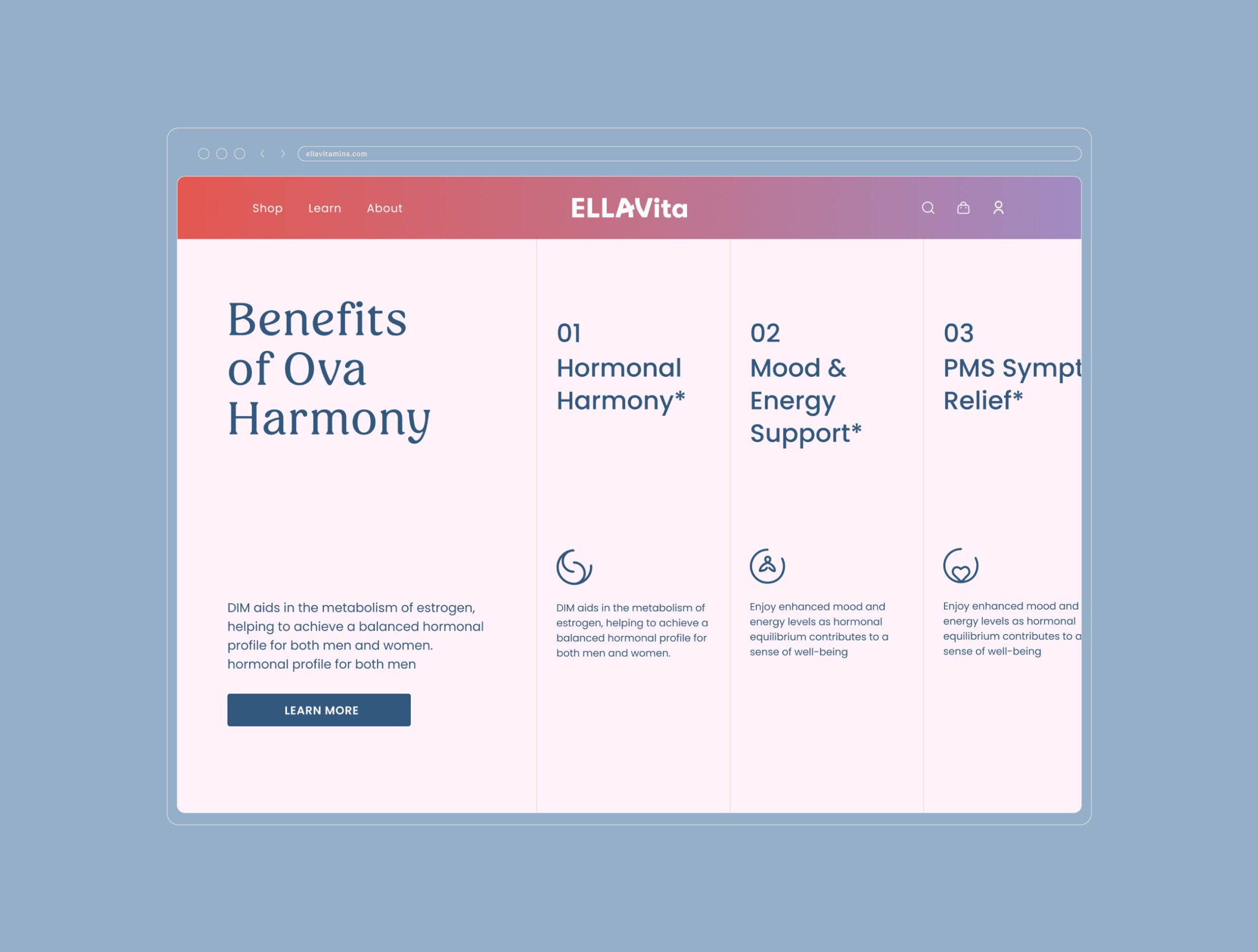
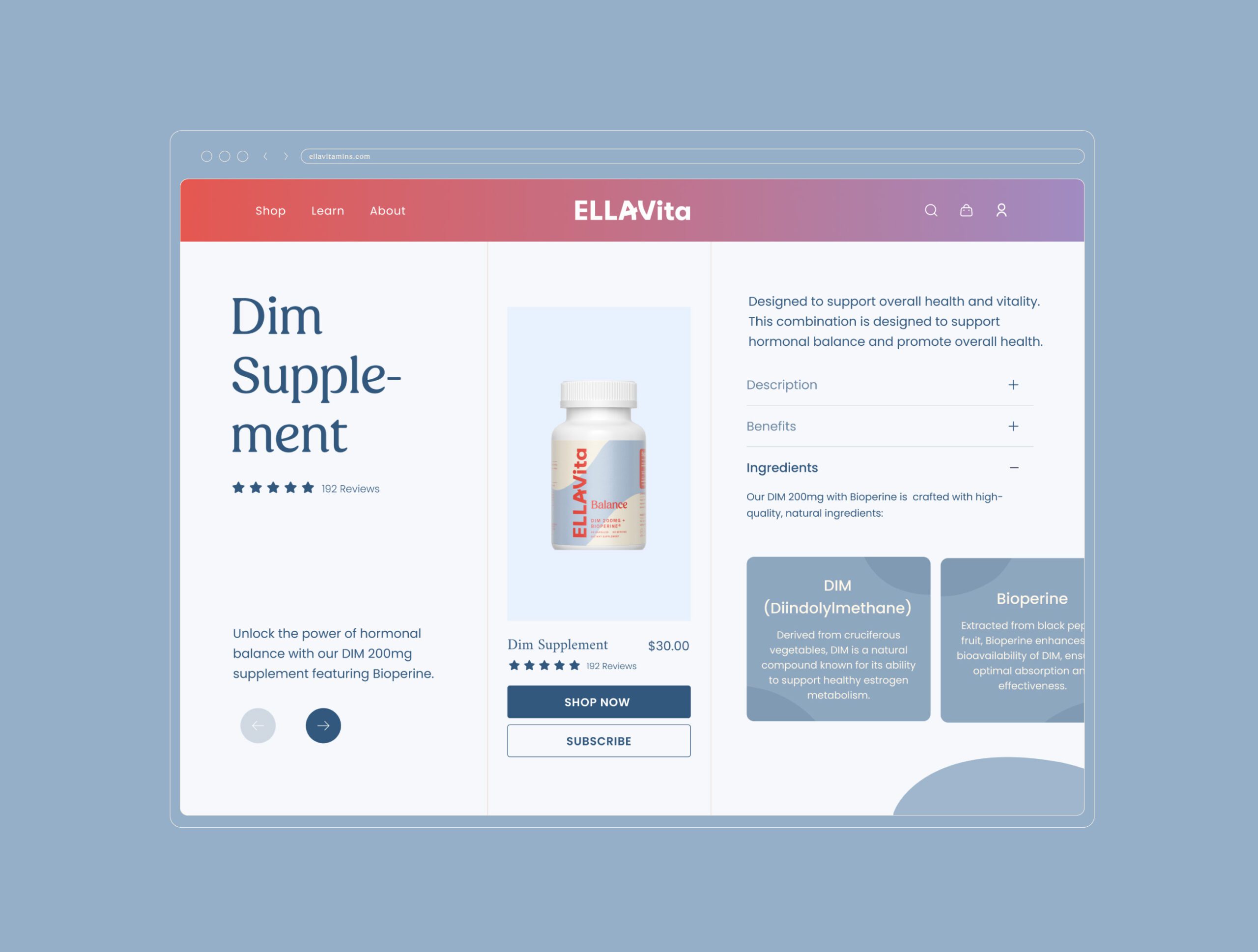
We treated language as part of the design. Fertility and hormonal health are subjects where a buyer arrives already anxious and often already overloaded with conflicting information. The brand language was written to be calm, plain, and readable at a glance, so that a person scanning a shelf or a product page is not asked to decode a claim before they understand what the product is for.
Together these choices position EllaVita as a companion product rather than an intervention: elegant enough to sit out in the open, clear enough to be trusted on a first read.





Let’s make the work they’ll copy.
Talk to an expert now
Work with a 38 team of the
industry’s top 1% talent.