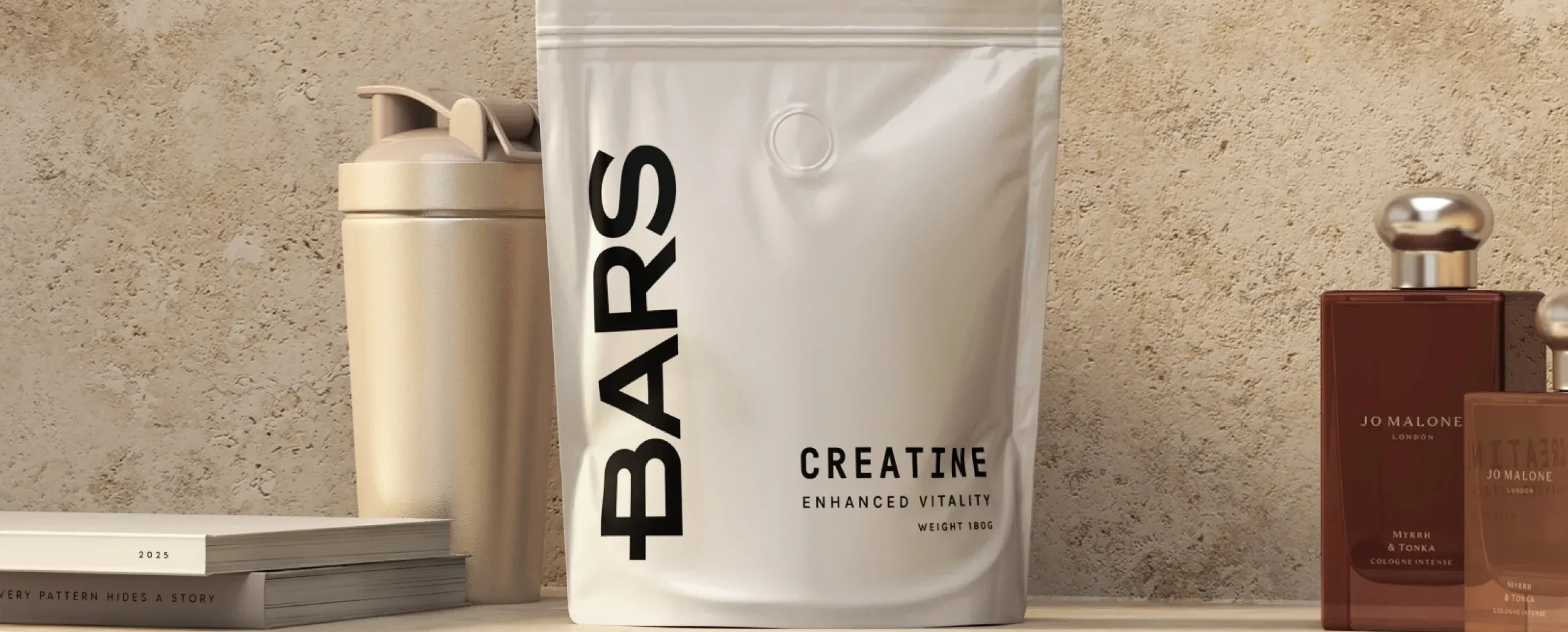
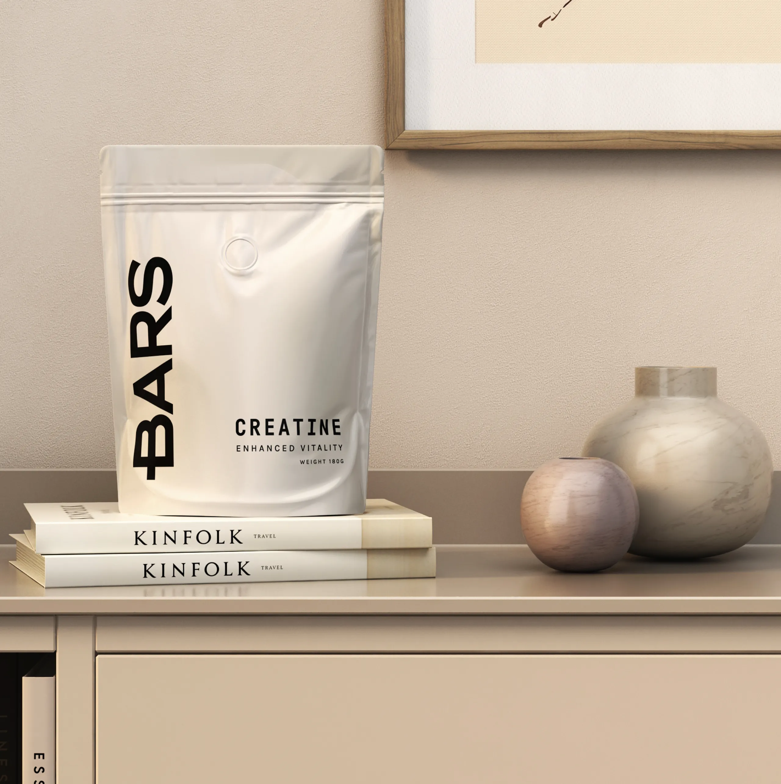
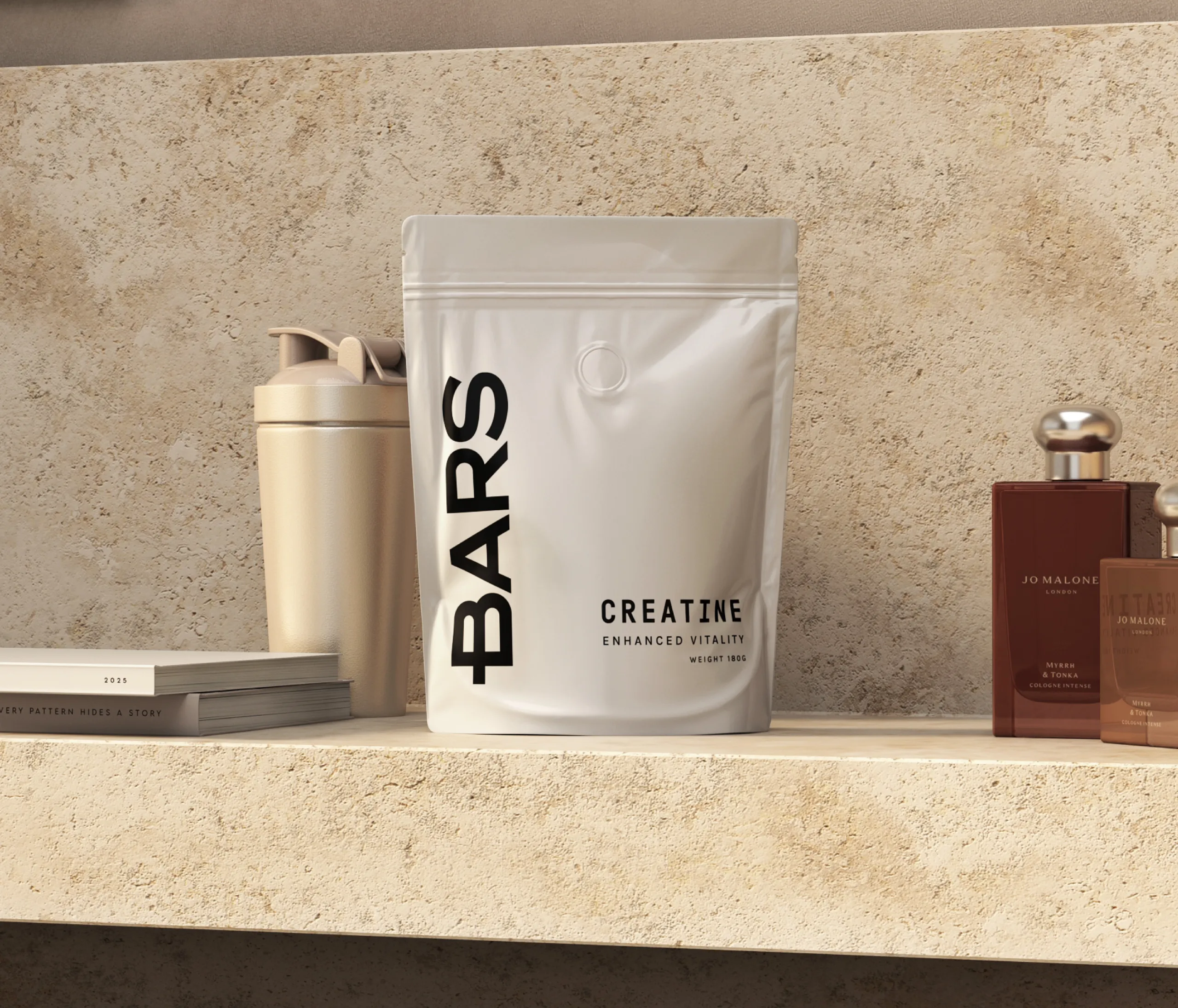
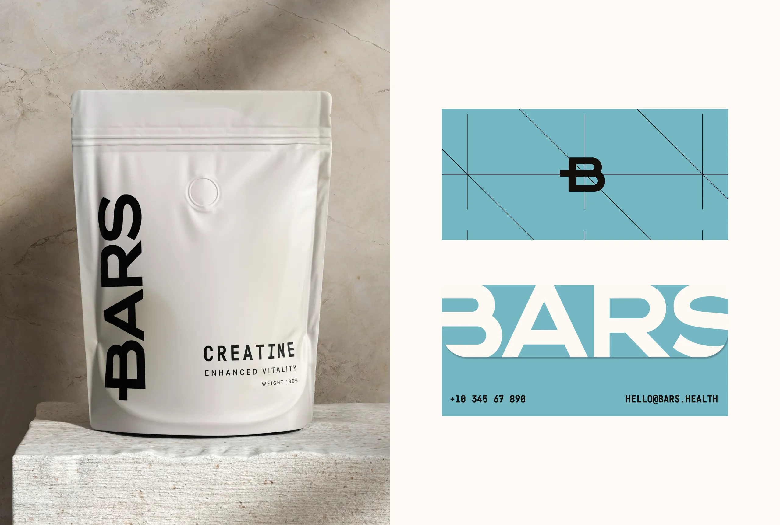
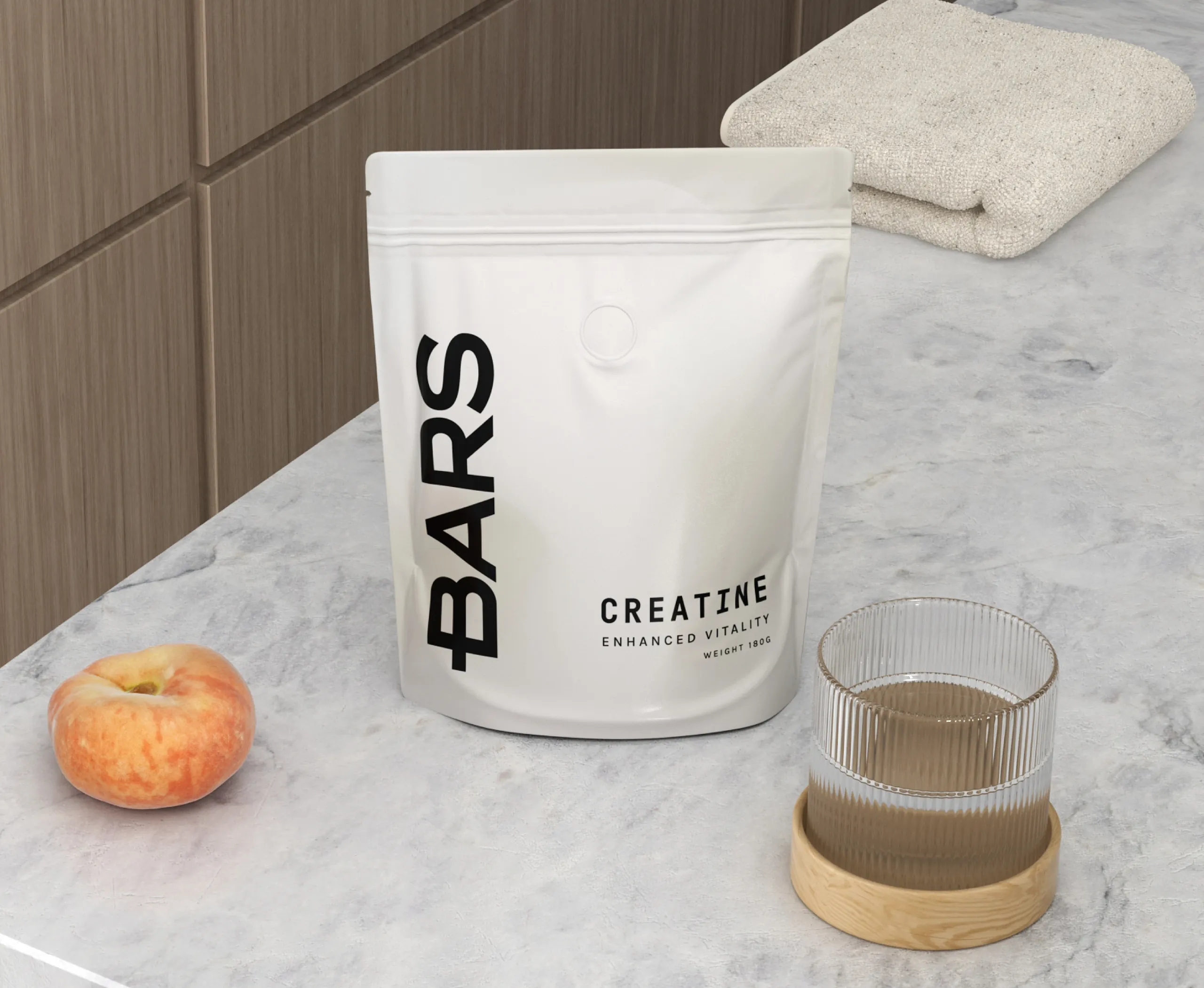
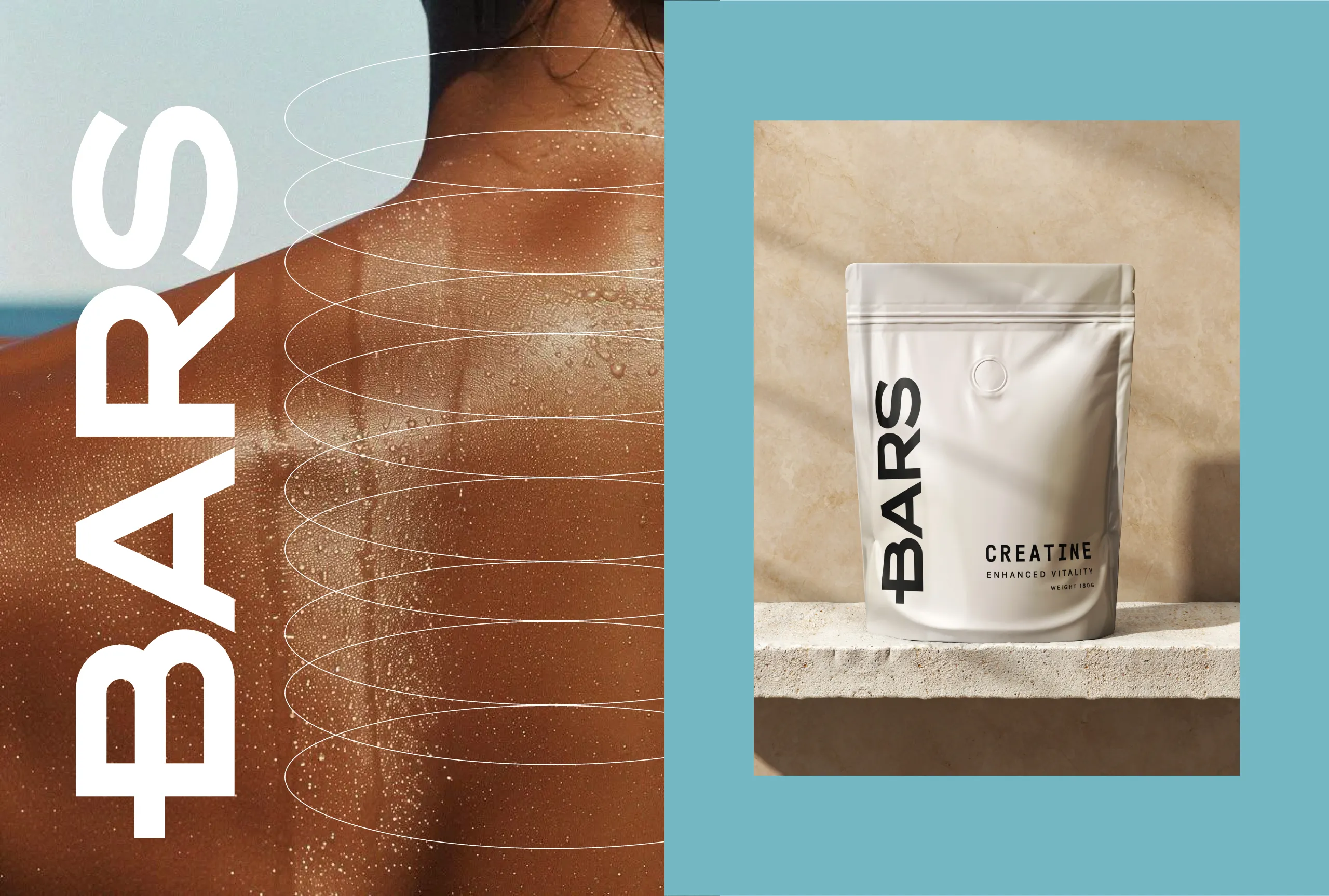
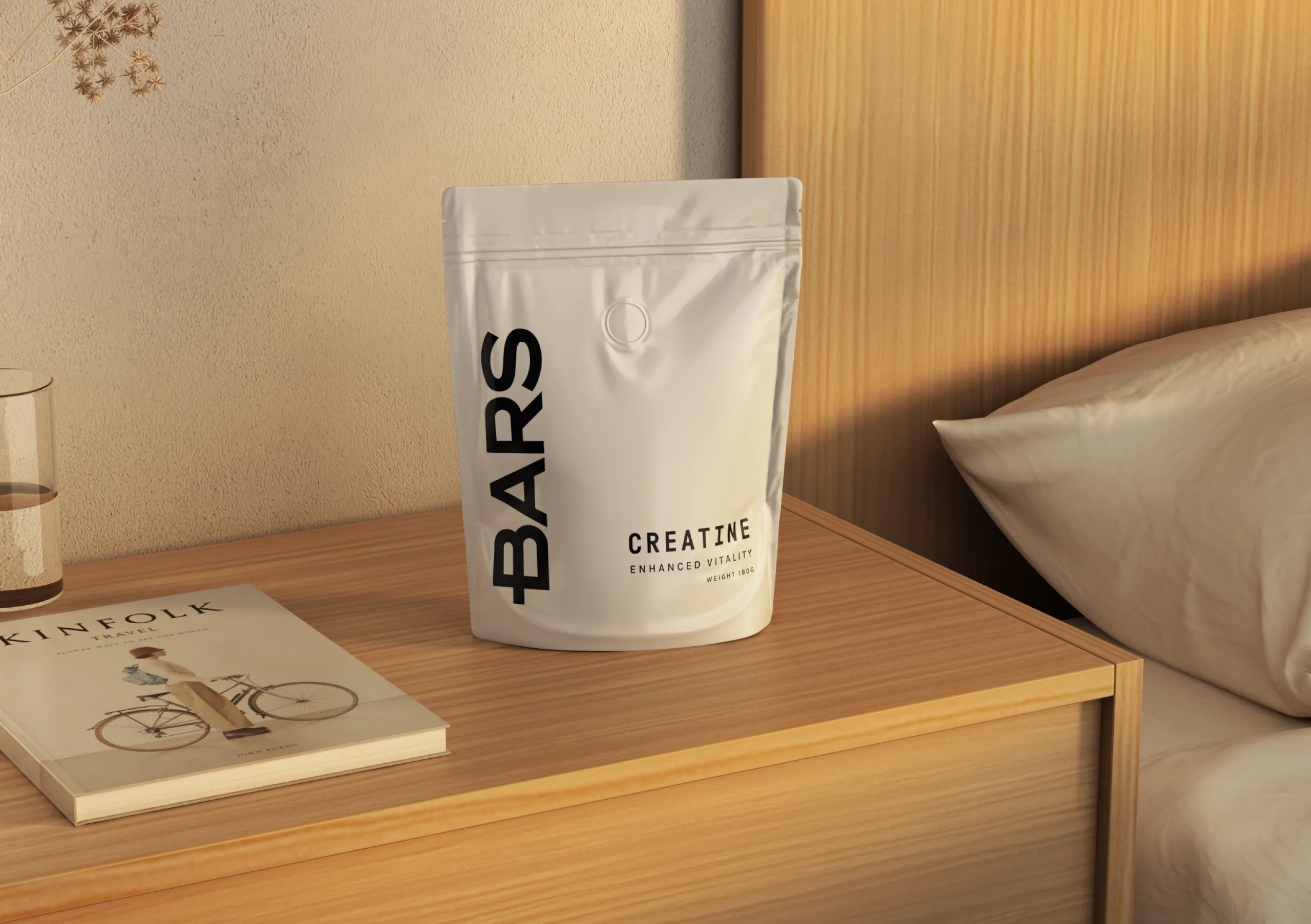
A pouch gives you one flat surface and no second chance, which is why pouch packaging design rewards subtraction. MarkaWorks kept the format deliberately minimal so the wordmark and the product information stand on their own, with no supporting graphics competing for the same glance. The disciplined typographic structure we set carries the hierarchy, soft neutrals and controlled blue hold the tone, and black appears only as an anchor. Everything the pack does not do is a decision, not an omission.
See more nutrition and wellness branding case studies.
BARS was
conceived as a next-generation performance supplement brand built on precision, restraint, and
trust.
The challenge was to create a visual system that communicates scientific credibility
and physical performance without relying on aggressive fitness clichés or exaggerated
claims.
From the beginning, the focus was
clear: reduce visual noise, elevate material presence, and let clarity become the brand’s
strongest asset.
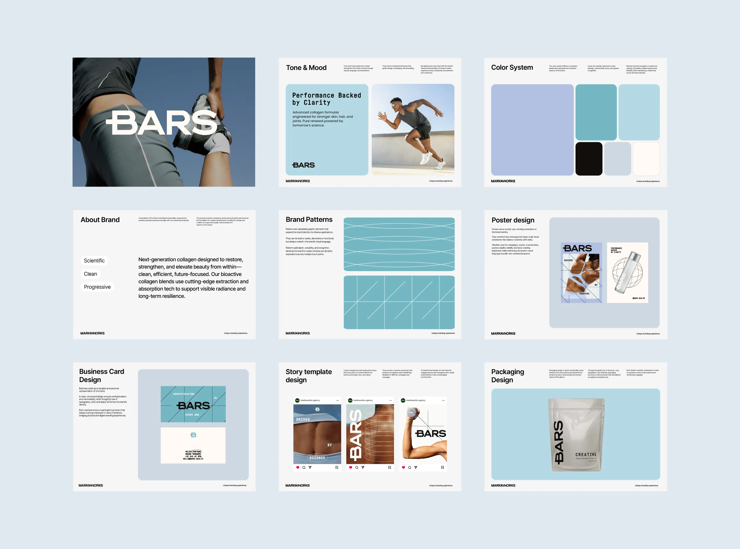
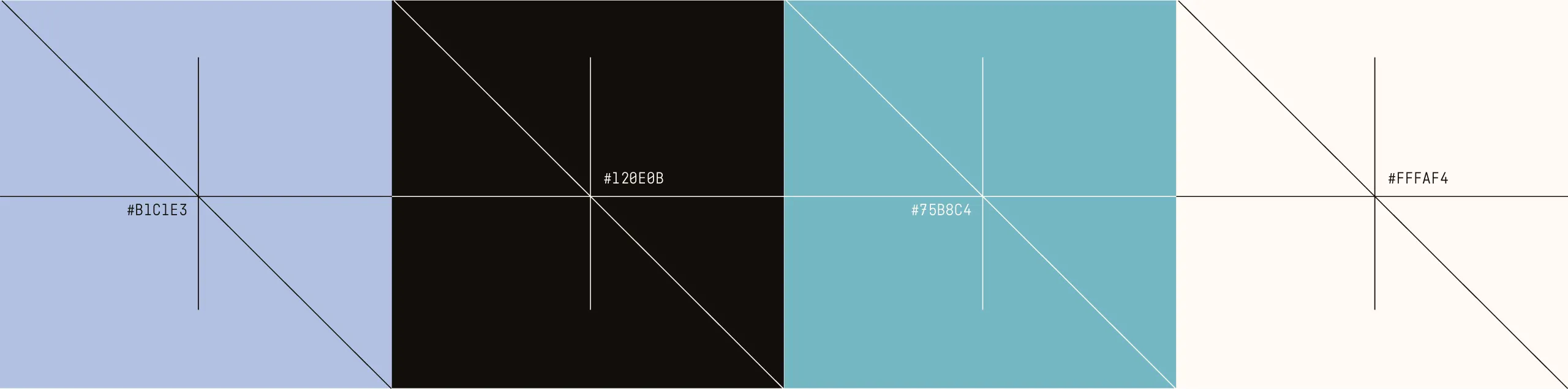
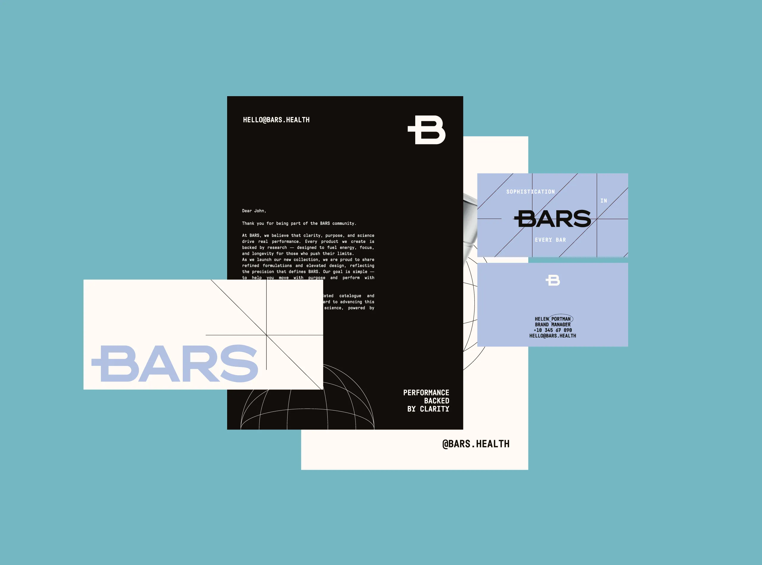
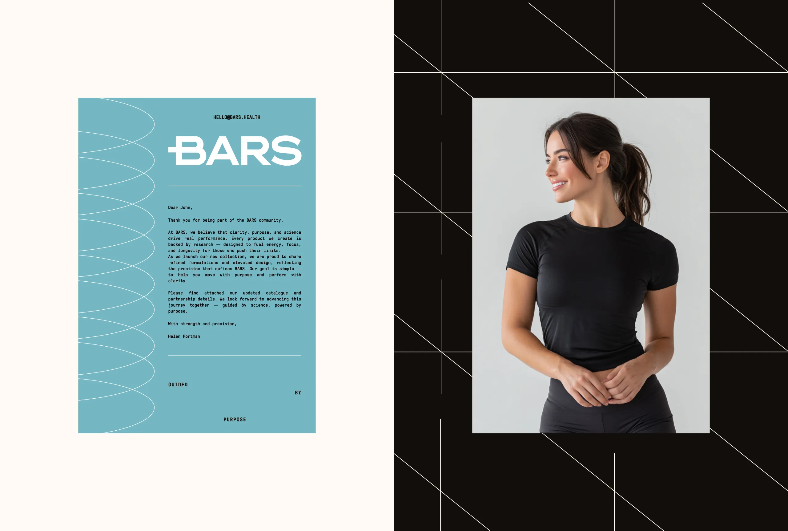
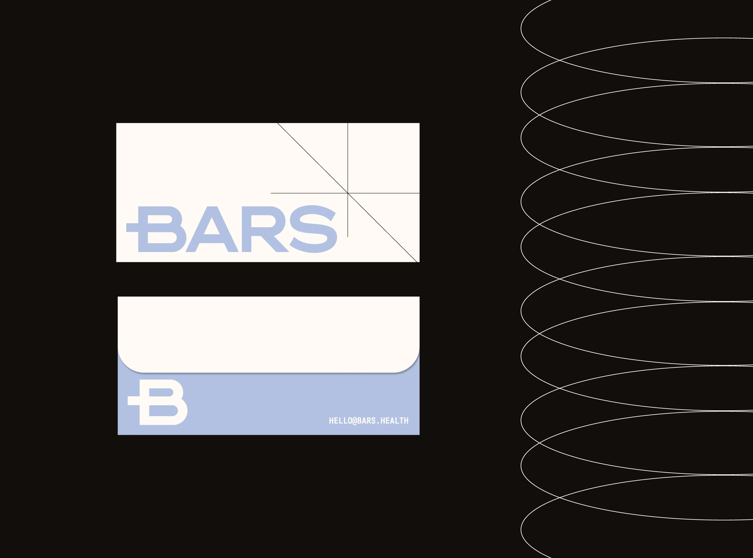
The identity is rooted in a
disciplined typographic structure and a restrained color system. Soft neutrals are paired with
controlled blue tones to create a calm yet confident atmosphere, one that feels equally at home
in a performance context and a modern lifestyle setting. Black is used sparingly, functioning as
an anchor rather than a dominant force.
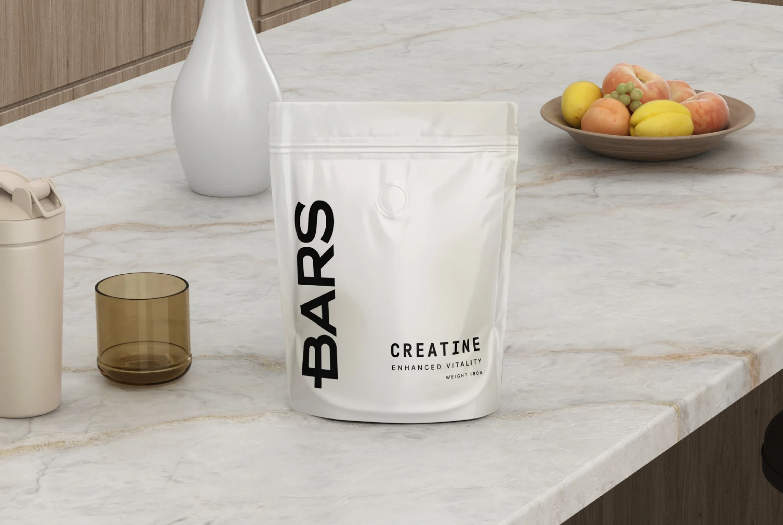
Packaging design was approached
with the same philosophy. The pouch format is intentionally minimal, allowing the BARS wordmark
and product information to stand on their own. No unnecessary graphics, no distractions: just
clarity, balance, and confidence. The result is a product that feels considered, premium, and
trustworthy at first glance.
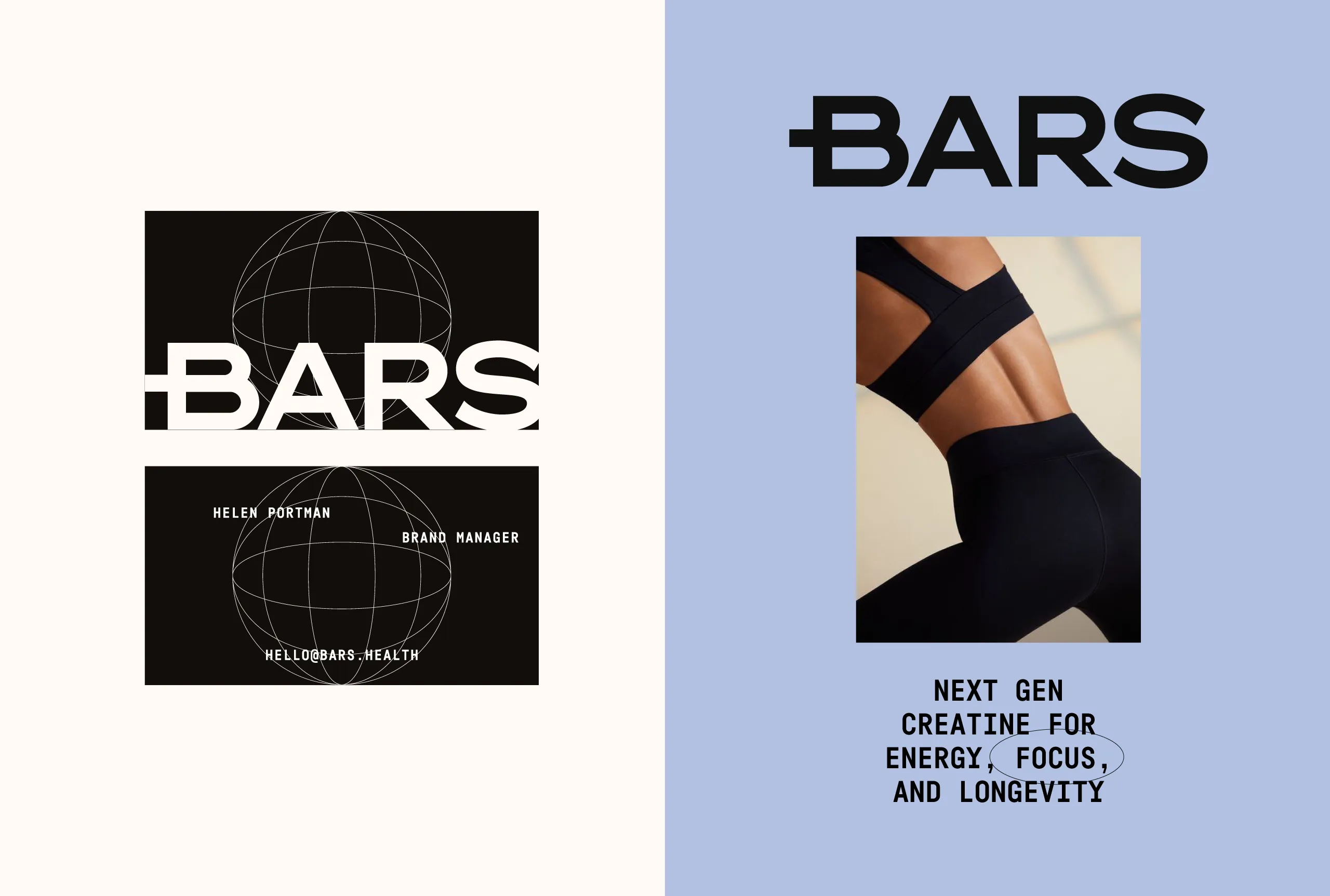
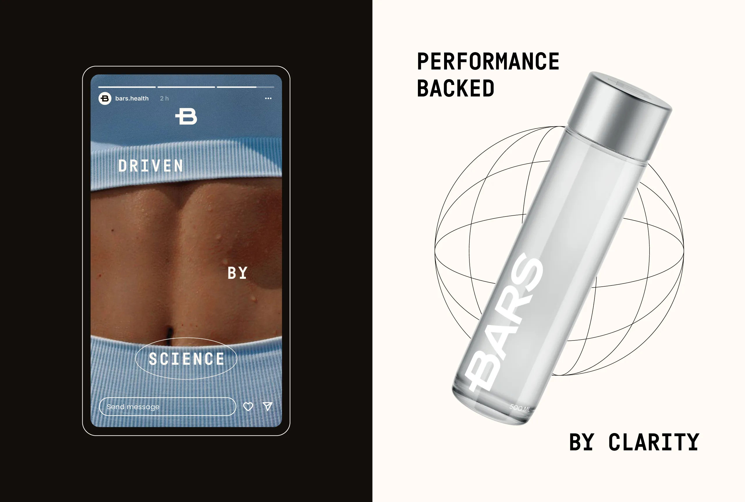
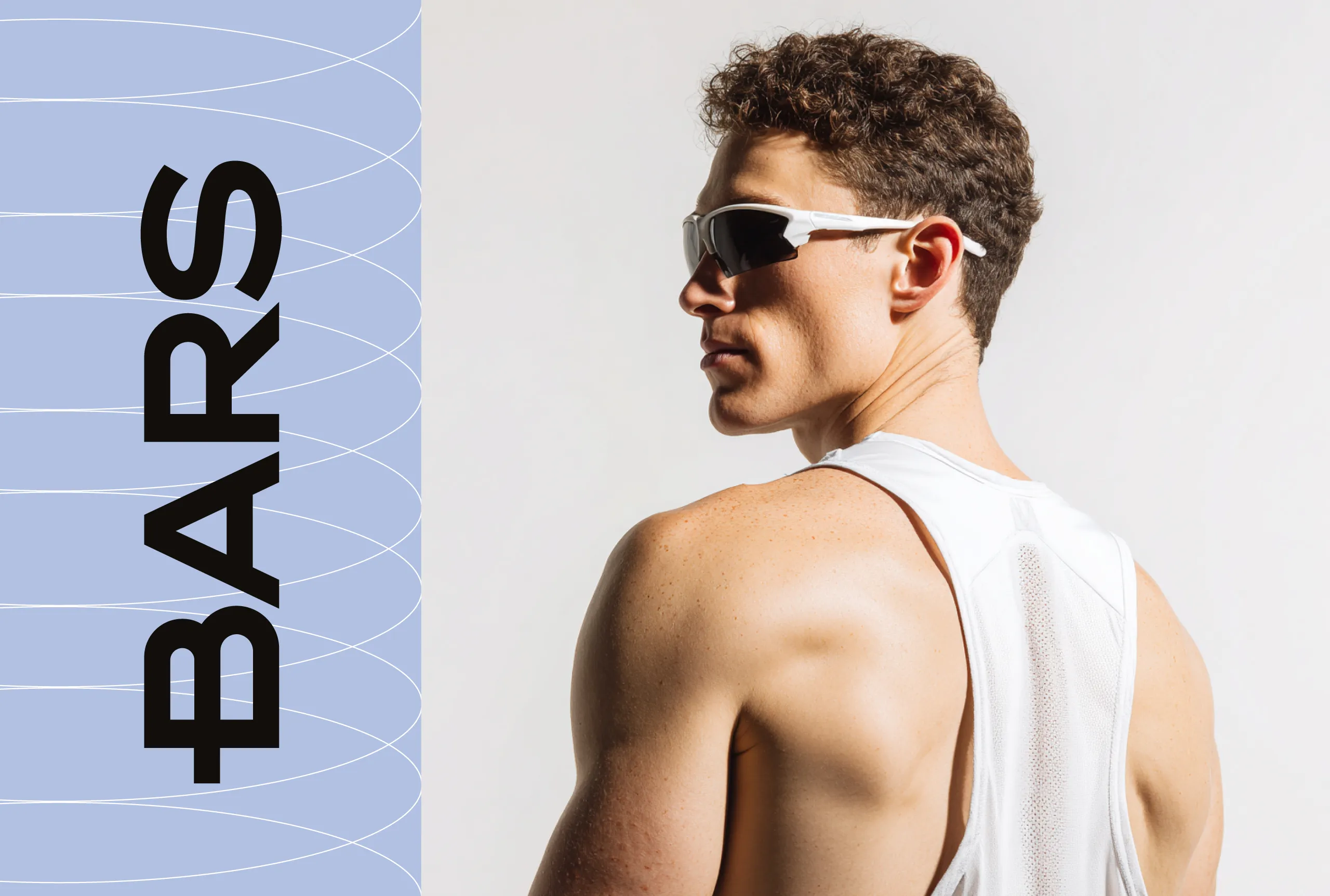
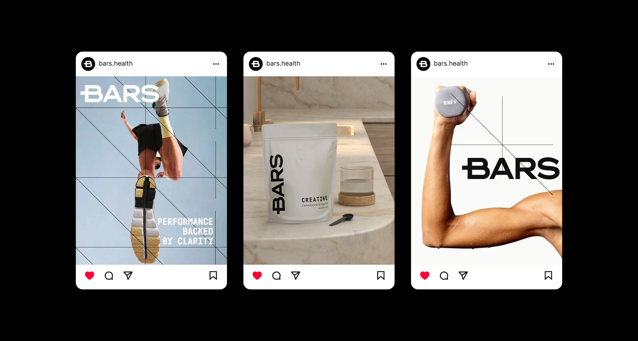
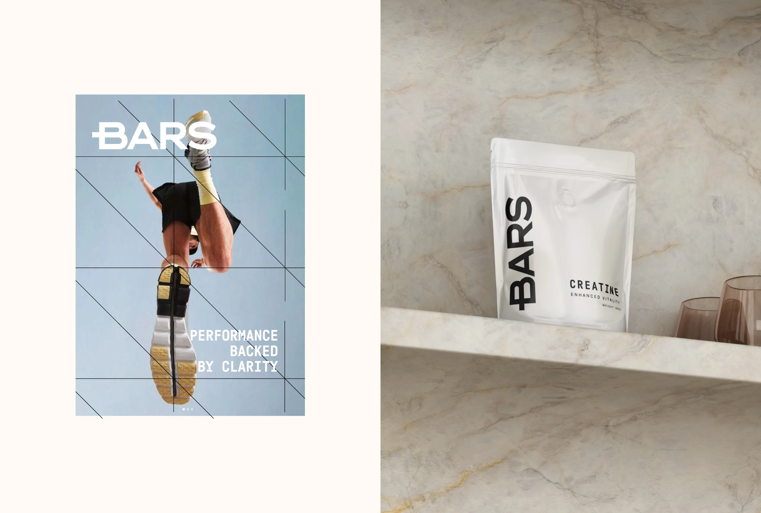
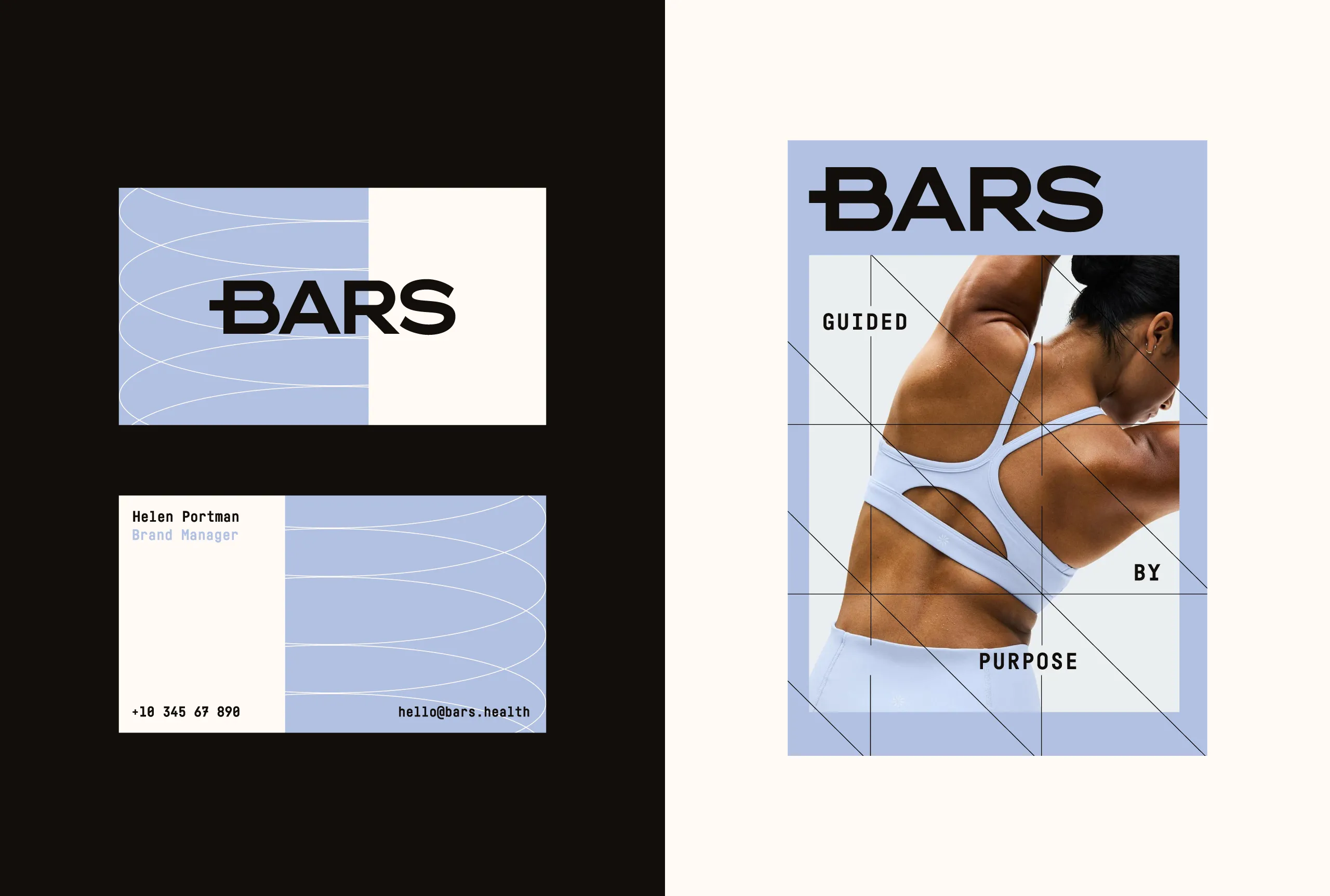
The visual language extends
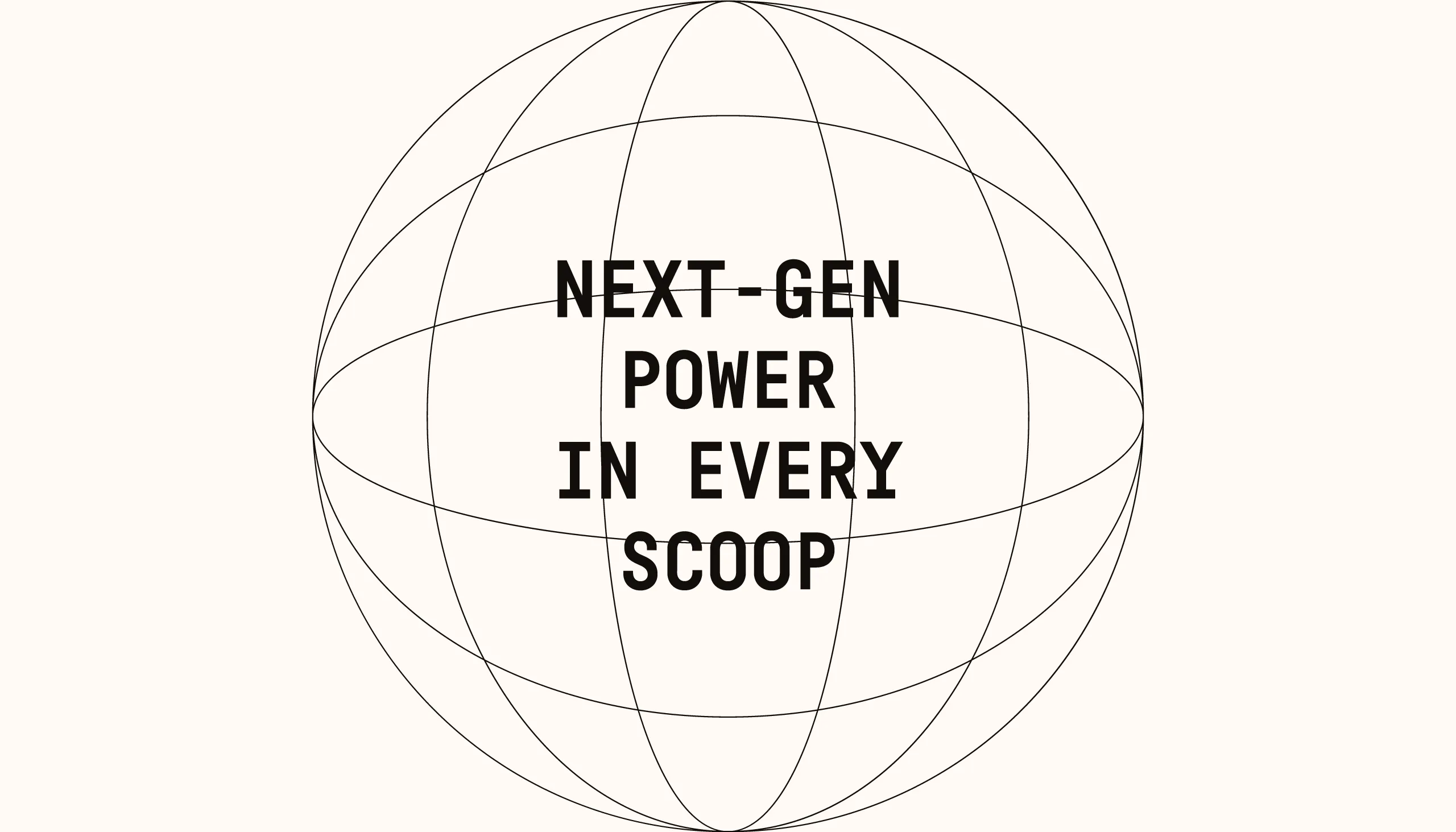
seamlessly into digital touchpoints. Social content, posters, and web layouts follow a modular
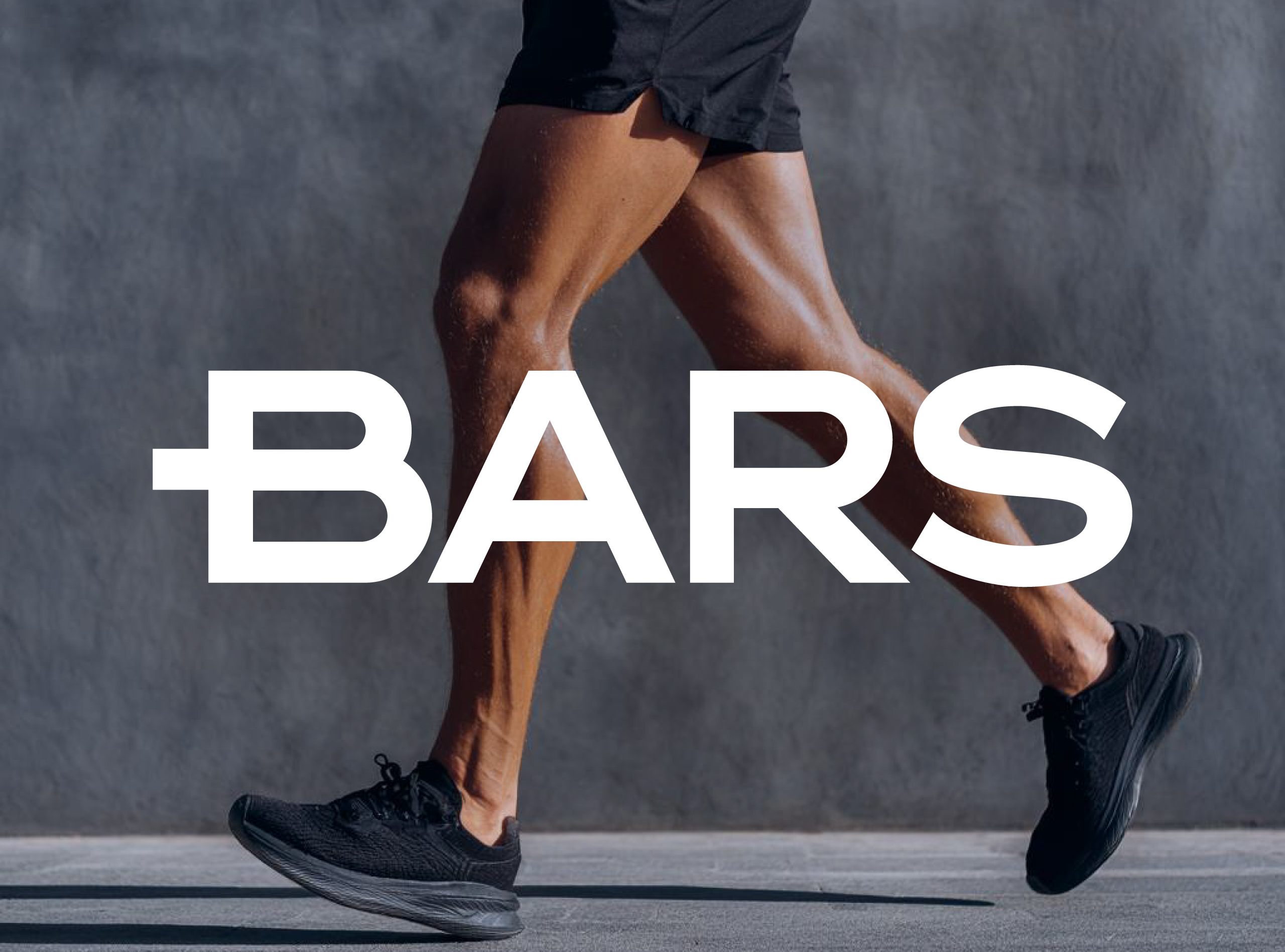
grid system that reinforces consistency and structure across all platforms. Product photography
balances physical strength with refinement, positioning BARS not as a loud fitness brand, but as
a composed performance companion.
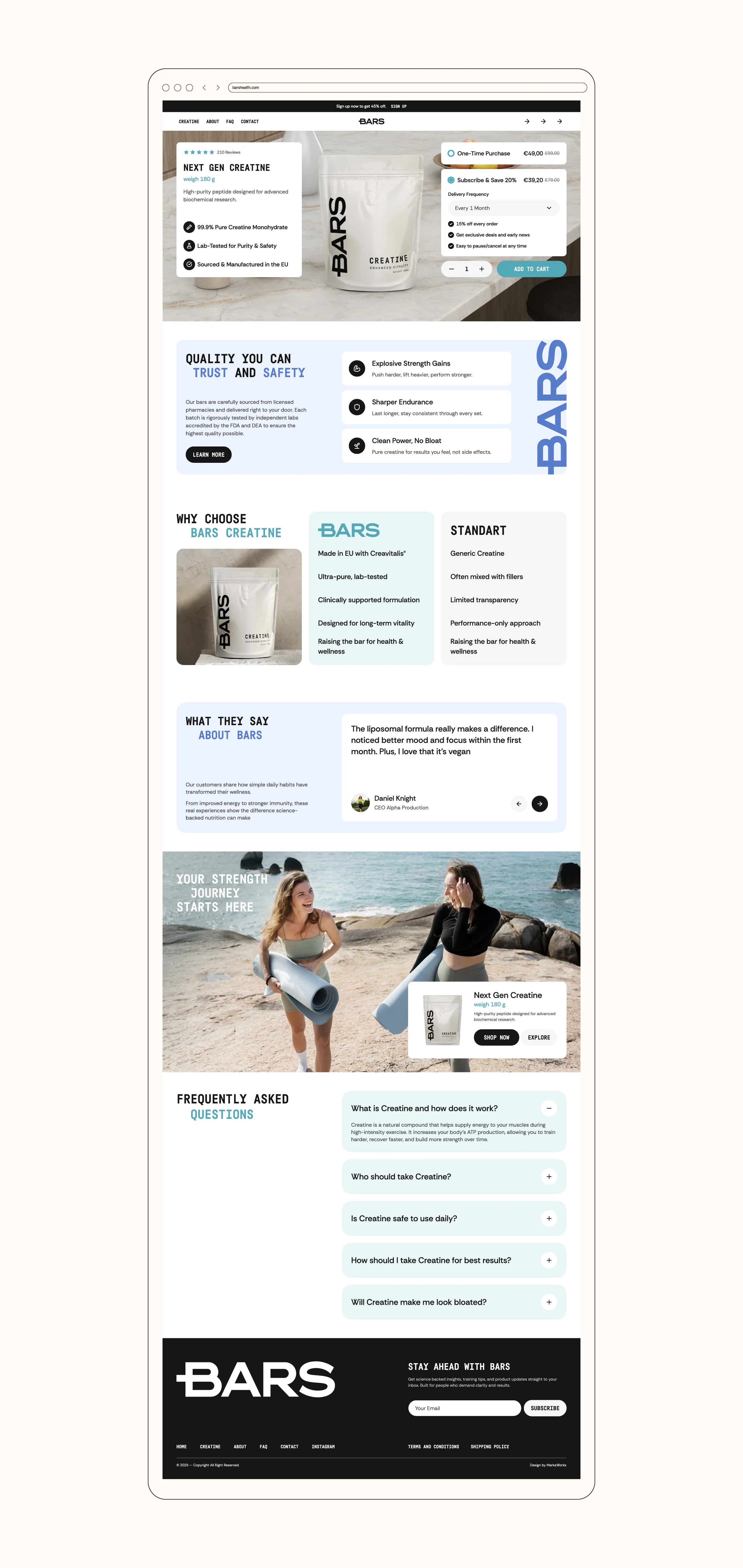
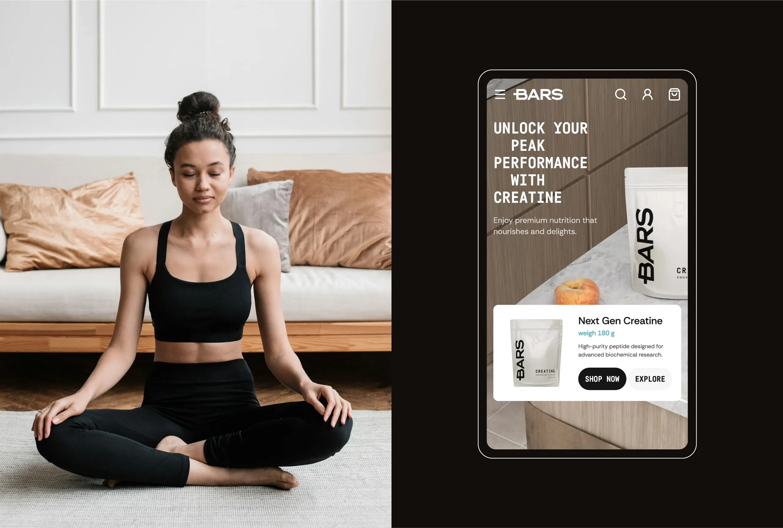
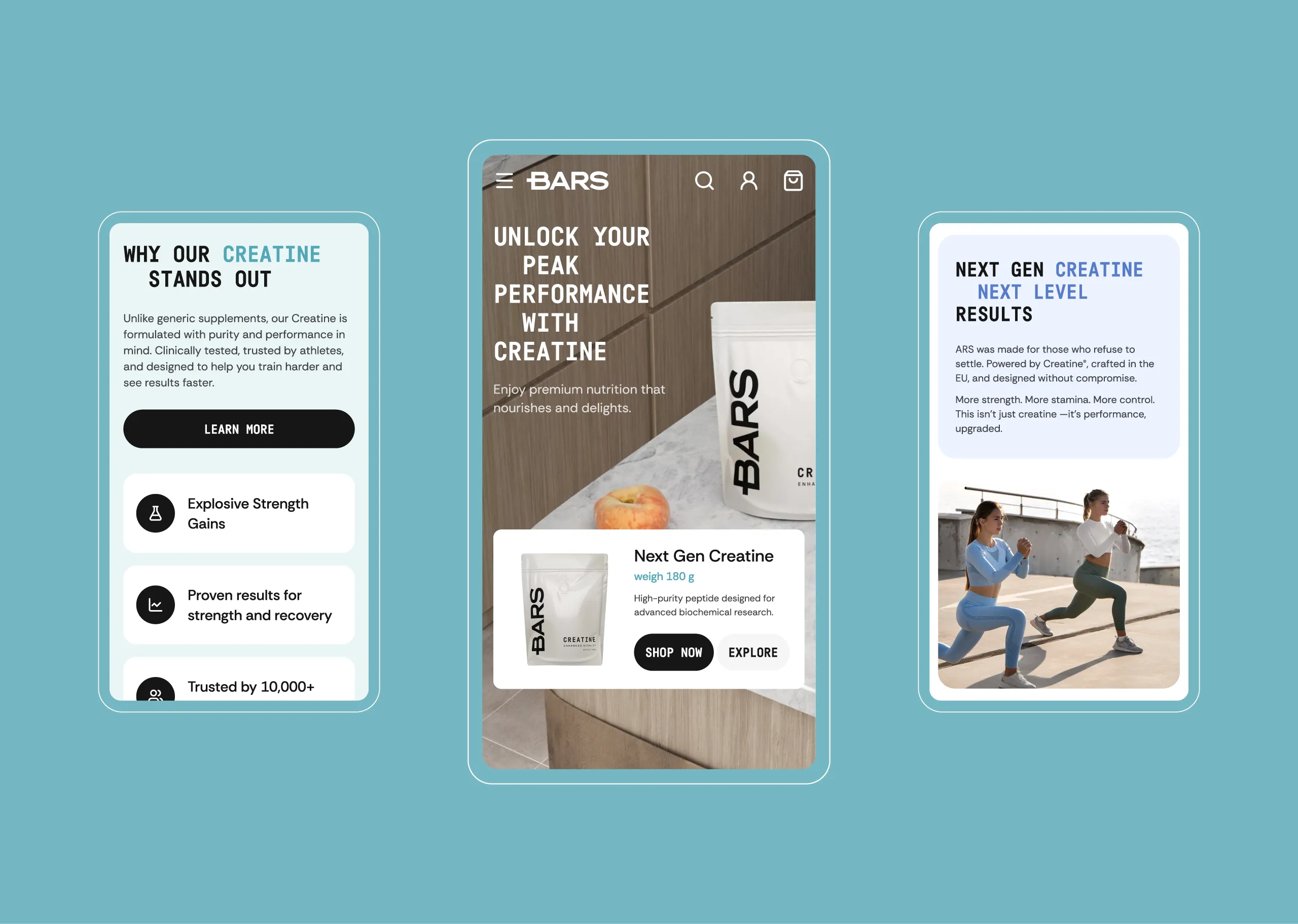
For the website, usability and
clarity guided every decision. Information hierarchy, spacing, and interaction design were
carefully crafted to support conversion without pressure. The experience feels direct, honest,
and controlled, reflecting the brand’s core promise.
BARS is not about pushing harder
visuals.
It’s about setting a higher
standard through restraint, precision, and intention.
Brand identity, packaging, and
digital experience by MarkaWorks.
Unique
branding experience.