Better
peak performance fuel, scientifically
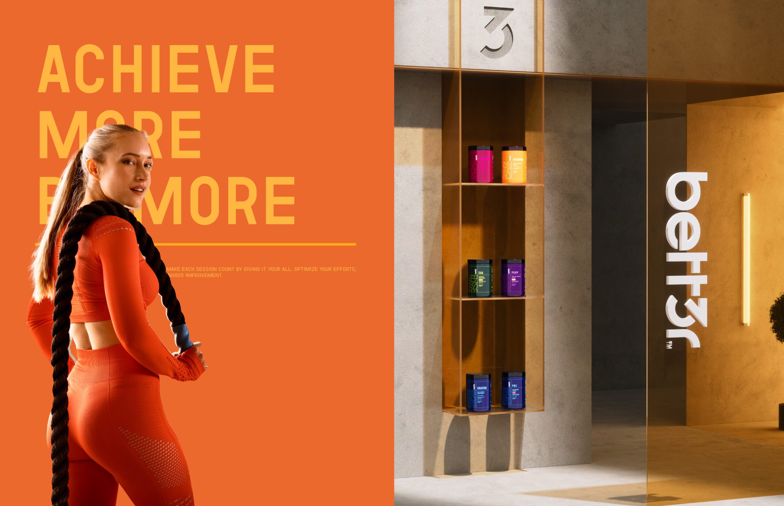
Better, by MARKAWORKS, is a premium sports nutrition brand designed to empower athletes with scientifically-backed supplements for peak performance and superior health. Its identity champions clarity and efficacy, resonating with those who demand the best from their fuel.

Better is a sports nutrition brand covering a full range of proteins and amino acids. The positioning claim is scientific backing, and that claim had to be visible before a label is read, because in this category everyone says it and almost no pack shows it.
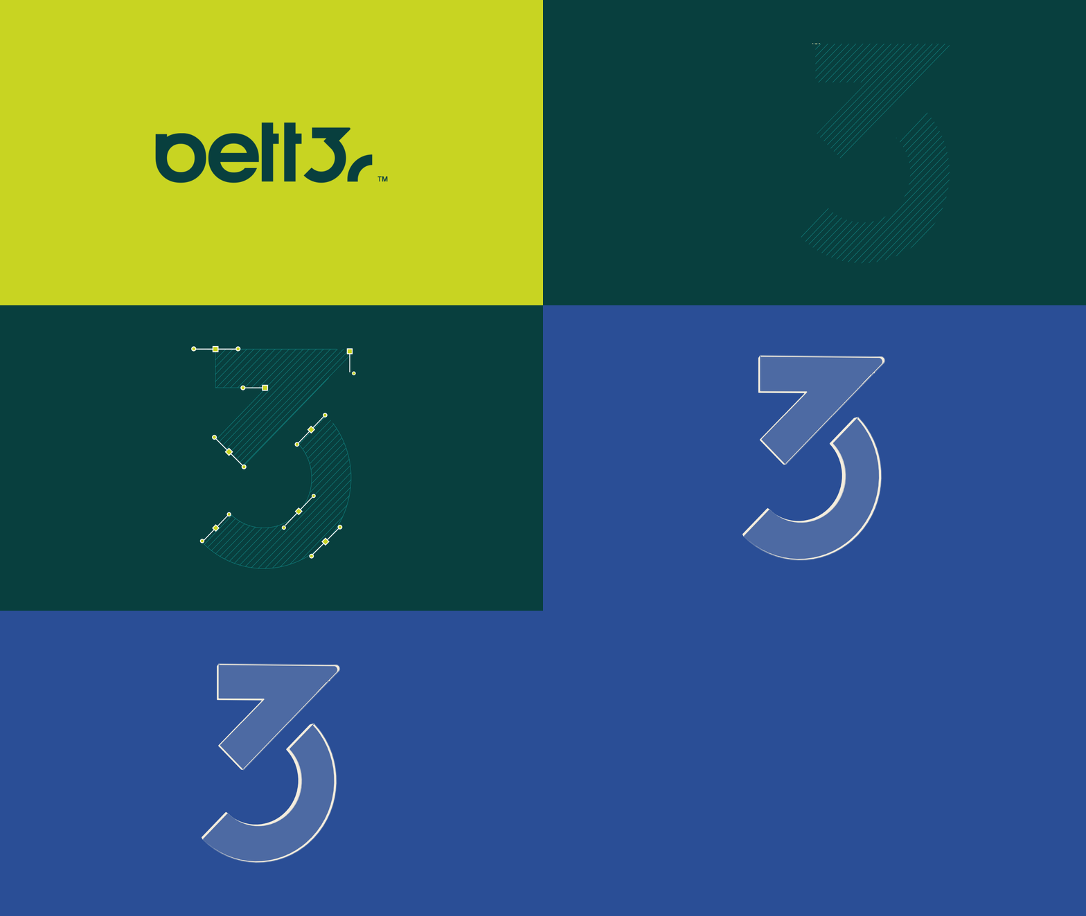
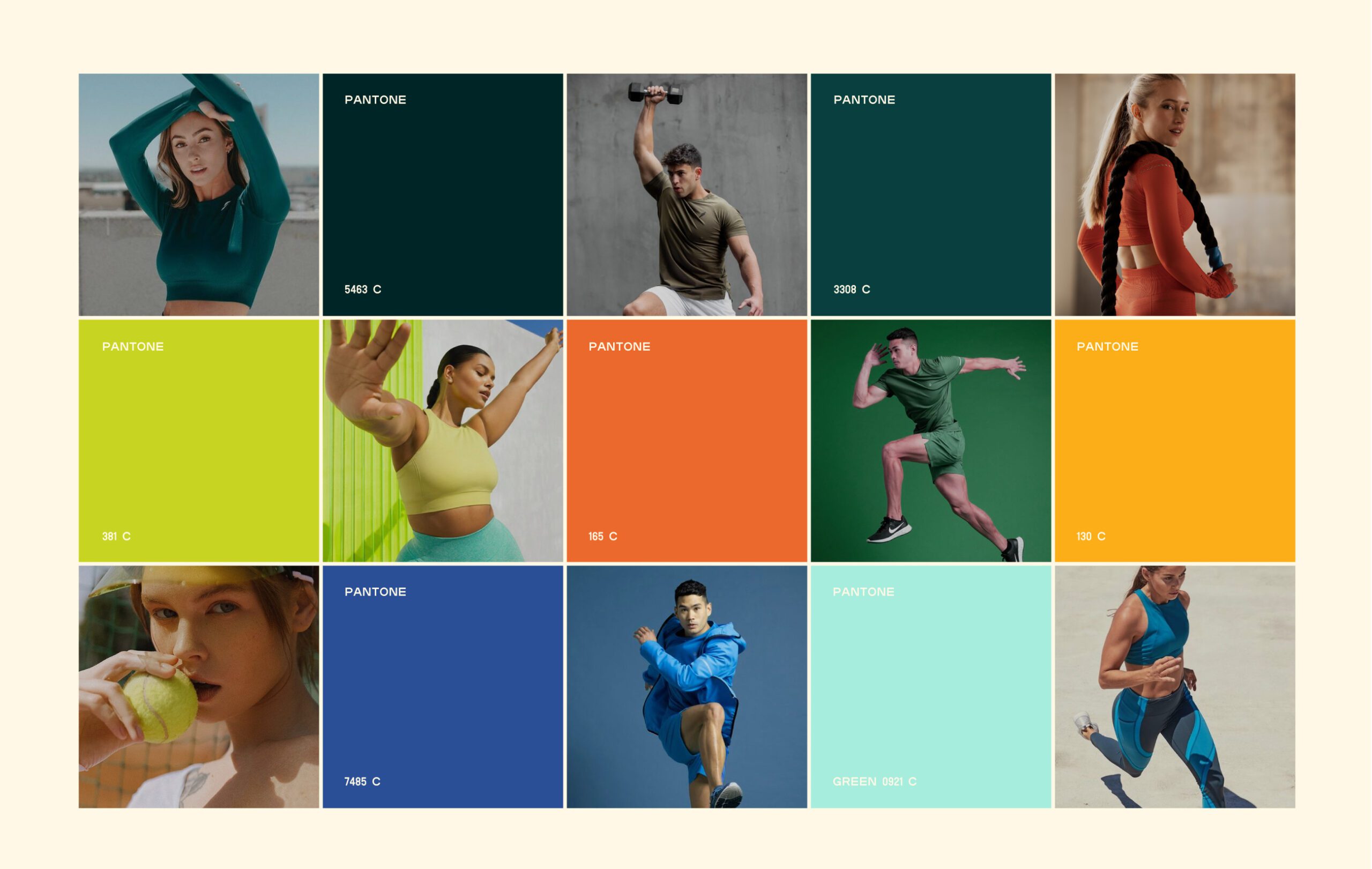
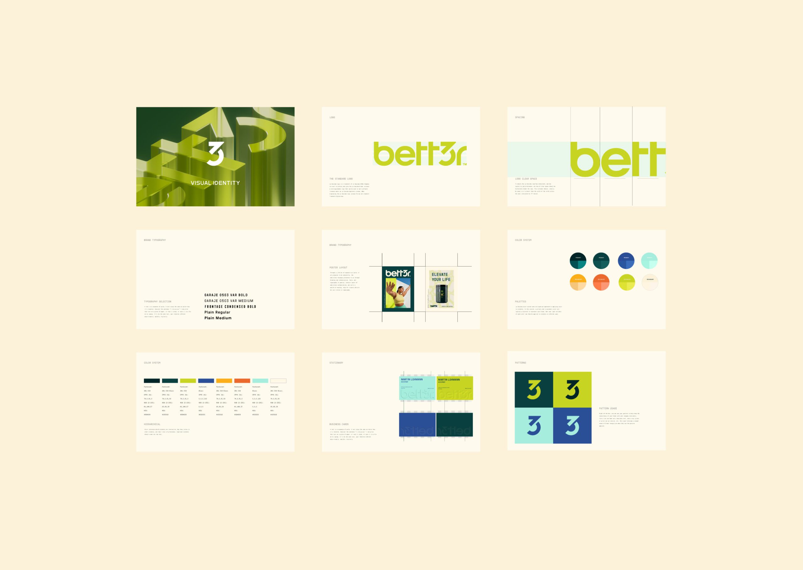
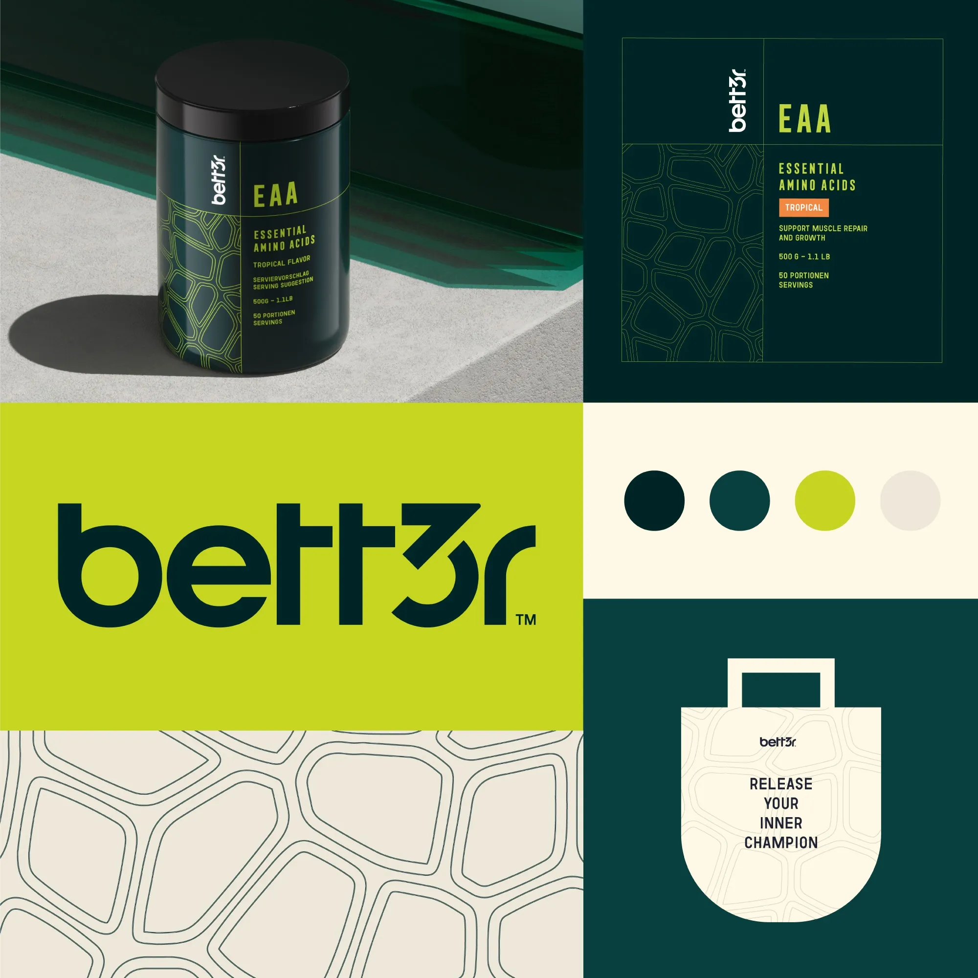
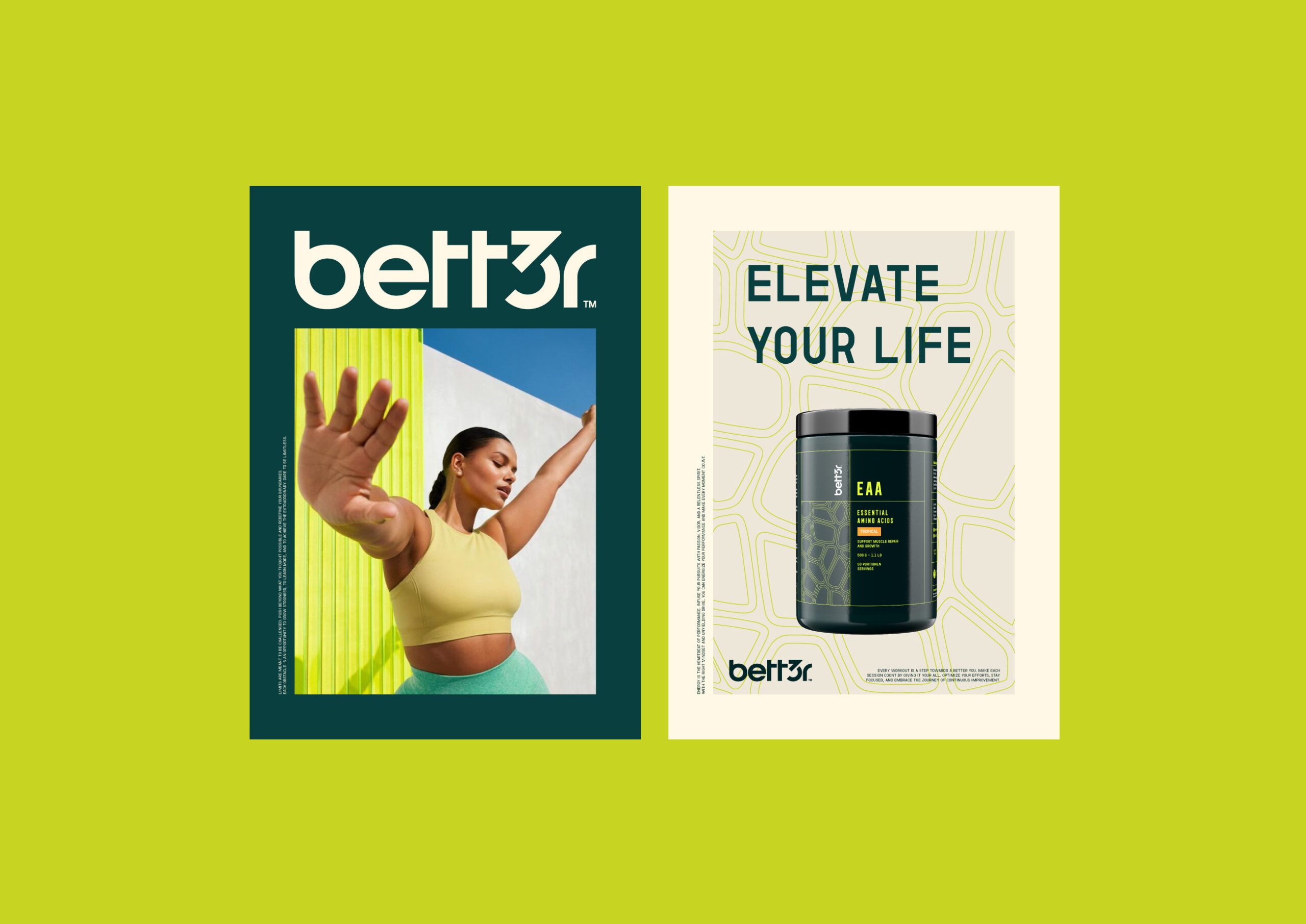
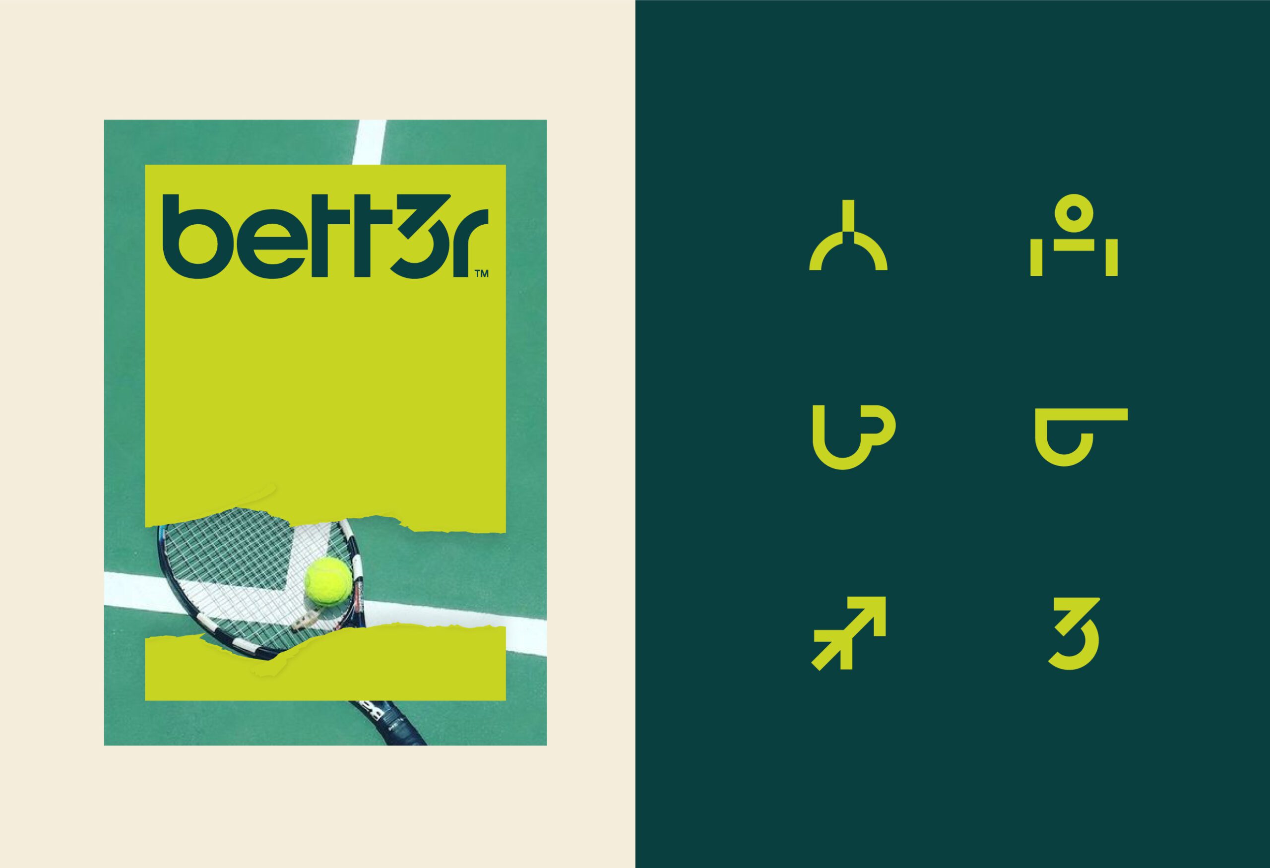
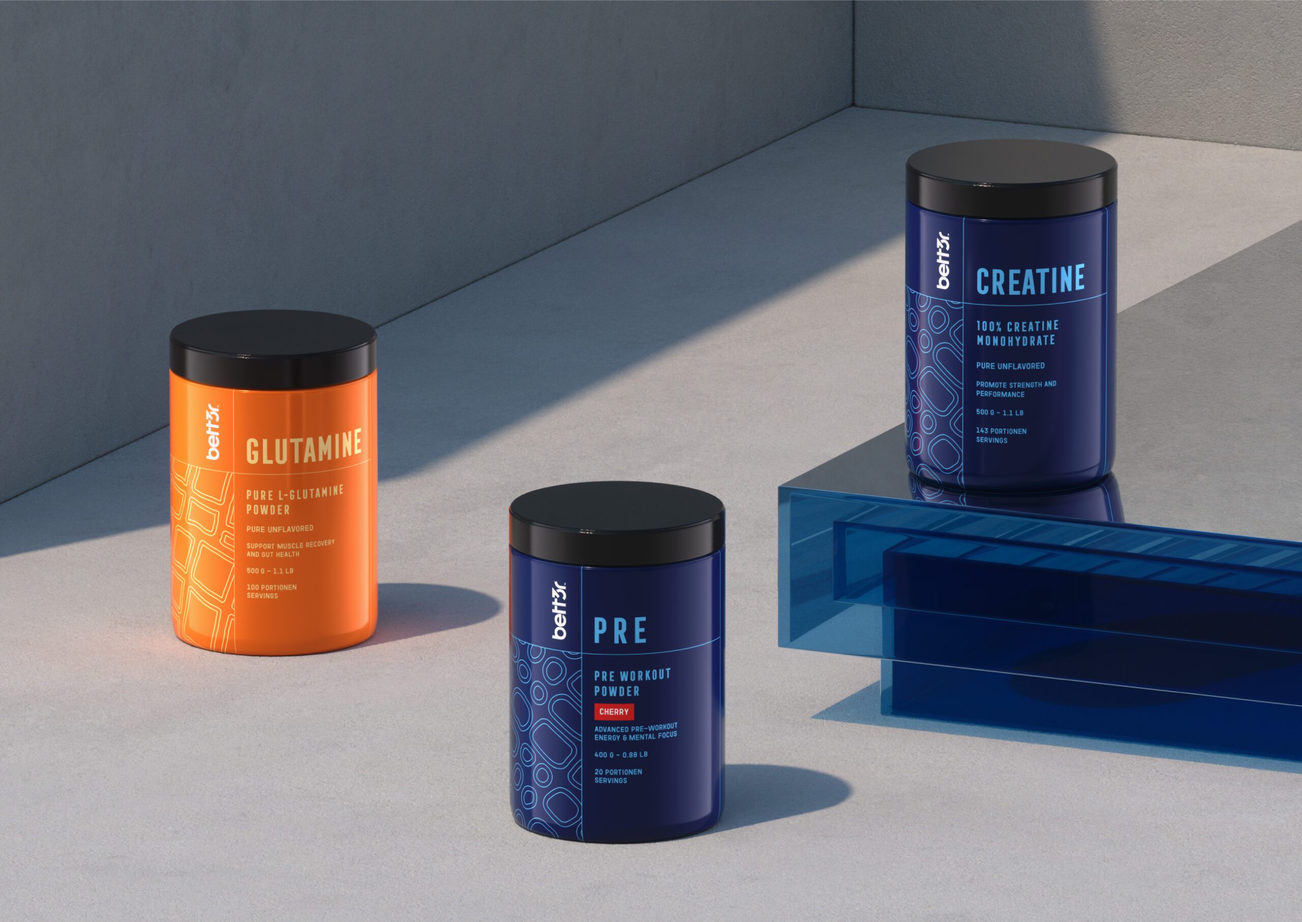
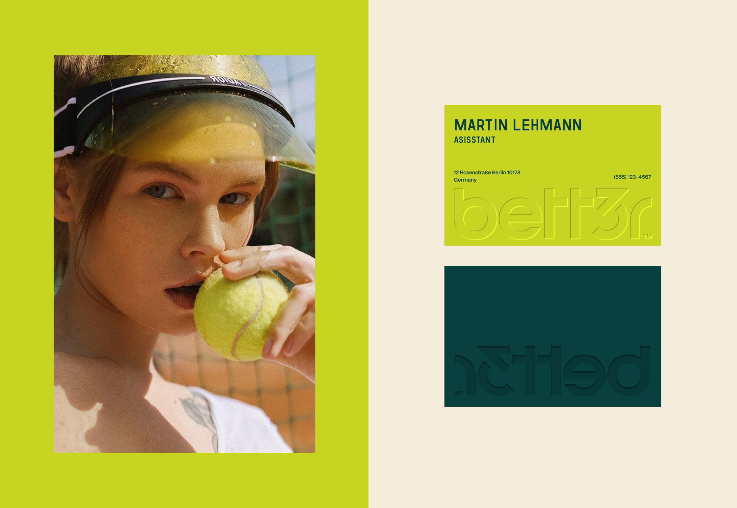
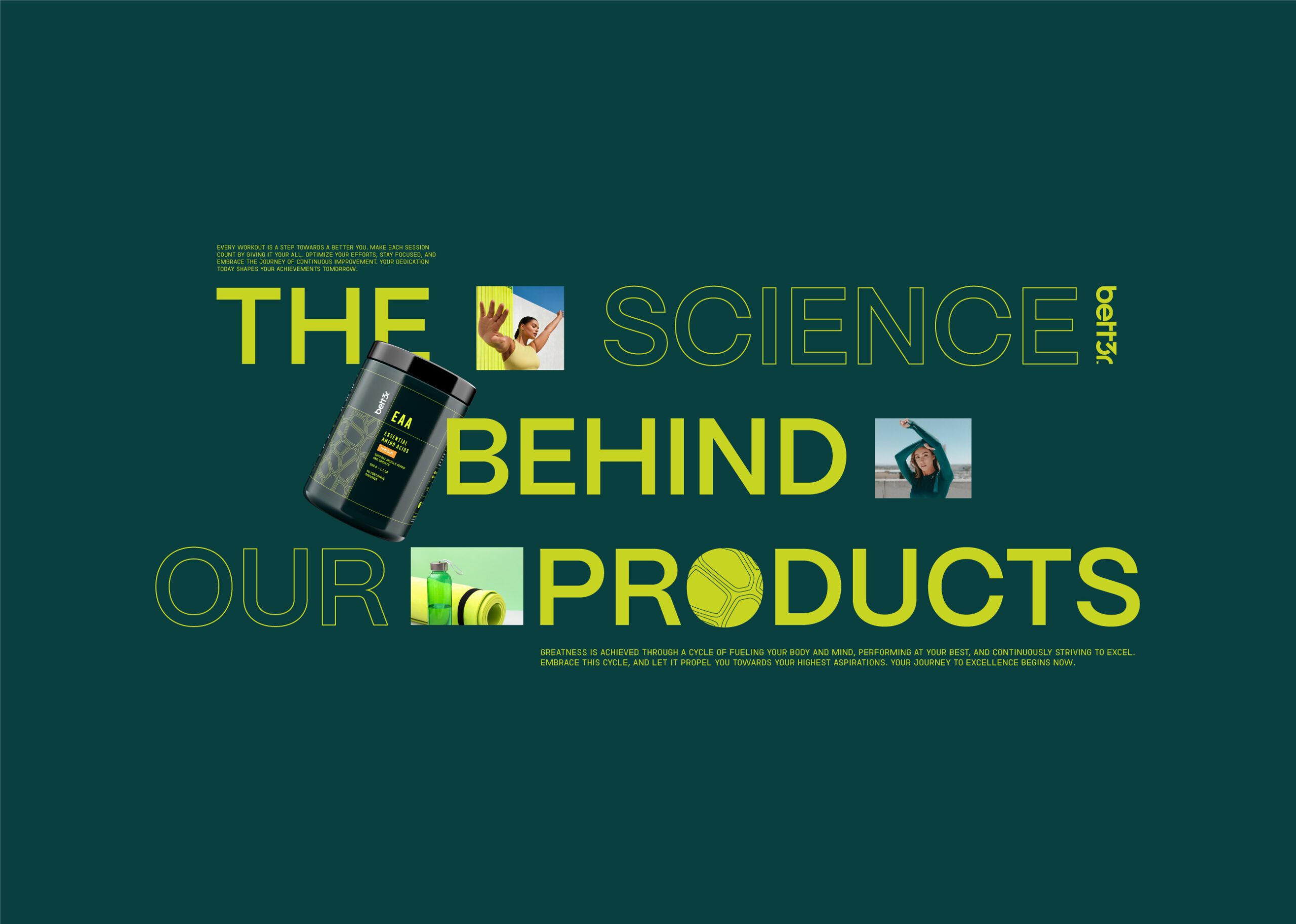
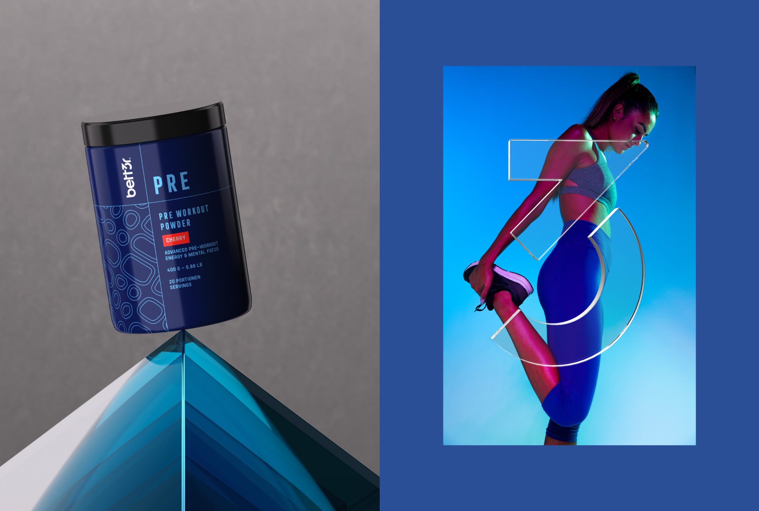
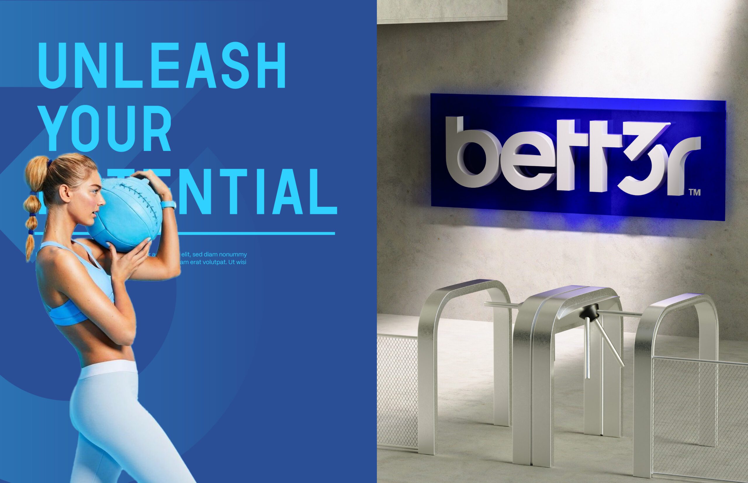
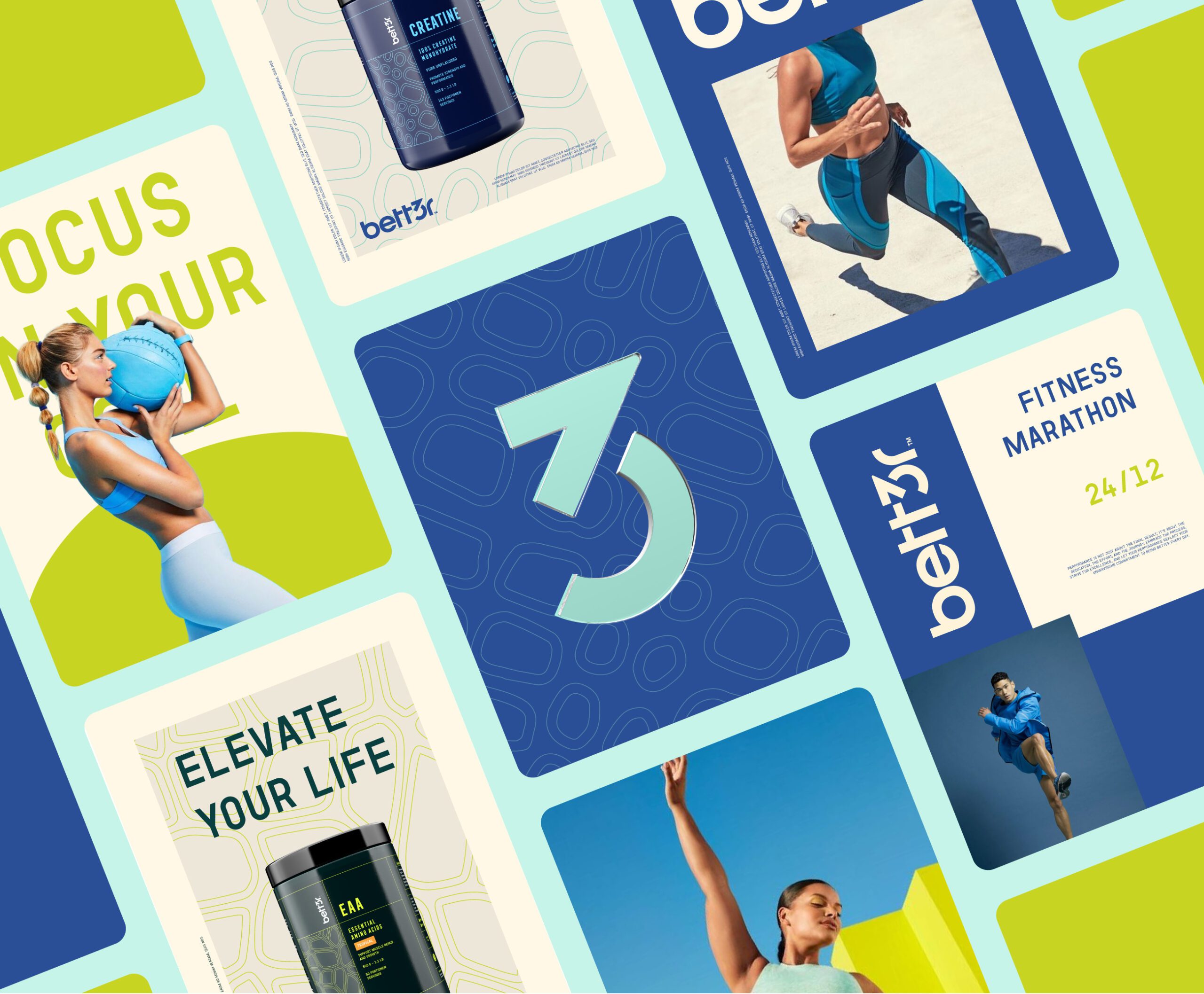
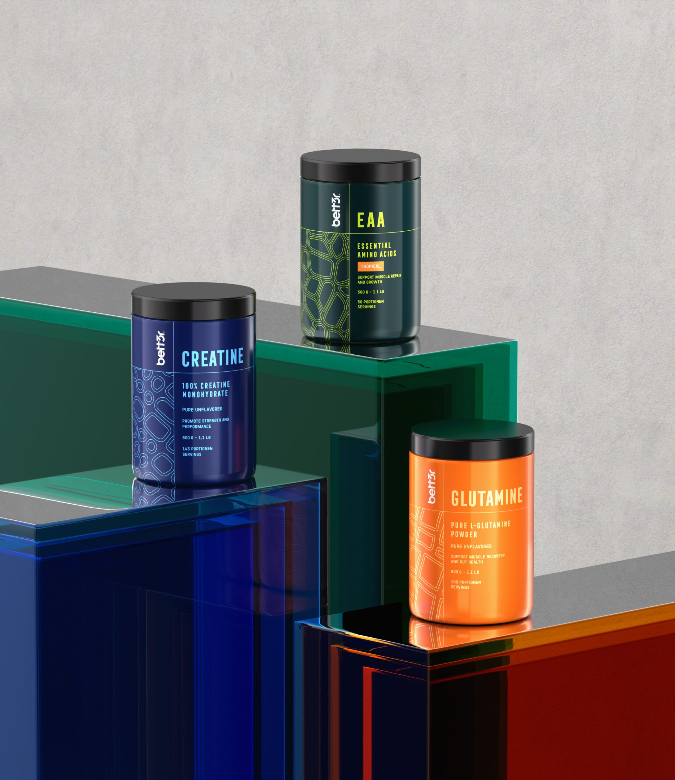
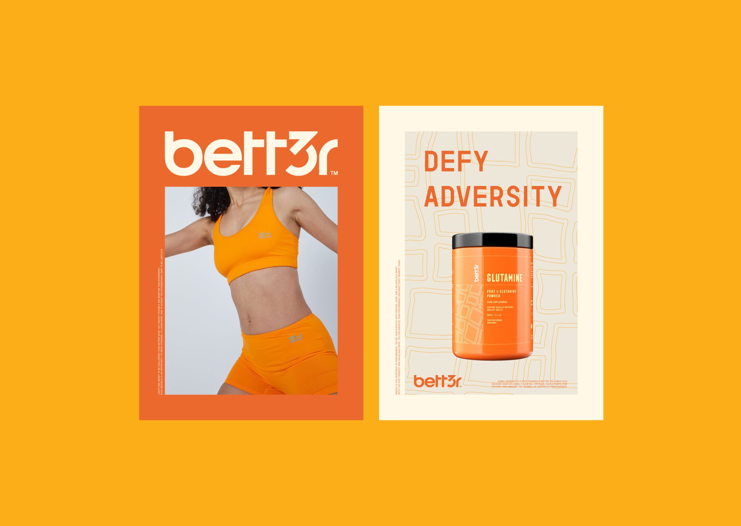
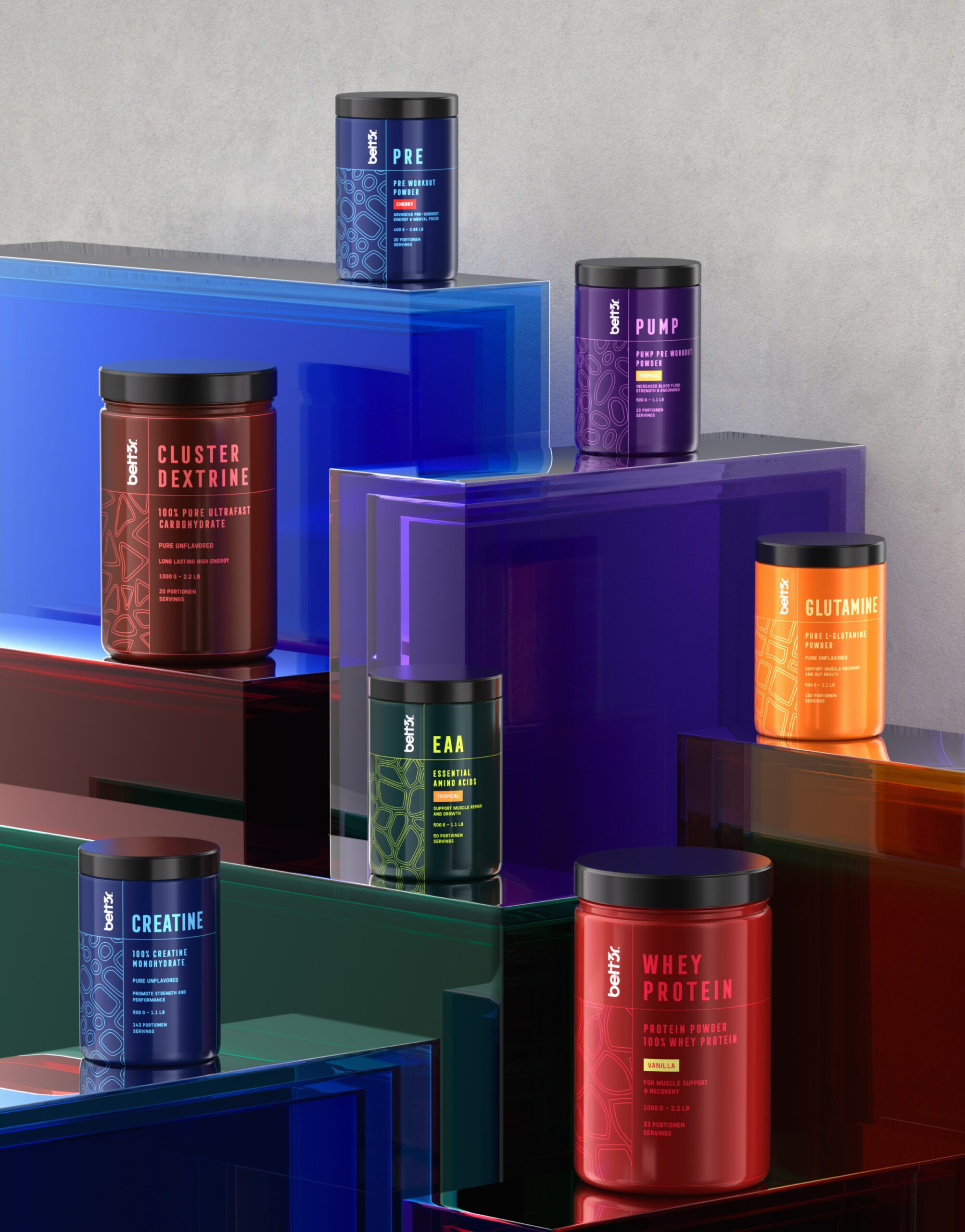
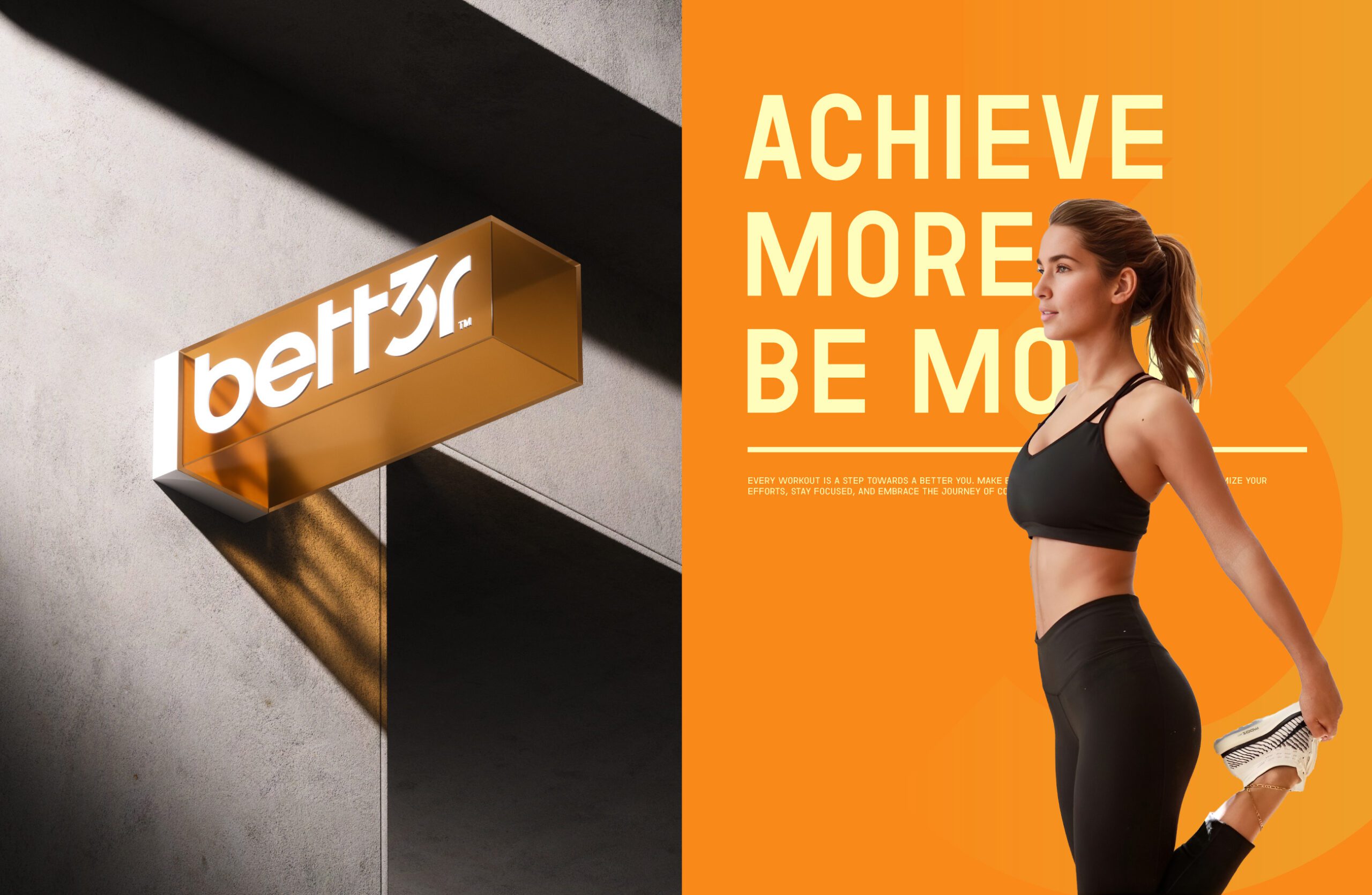
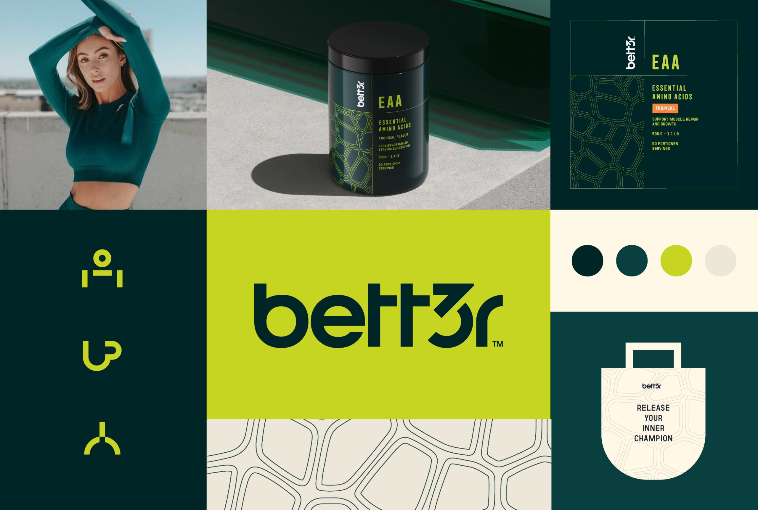
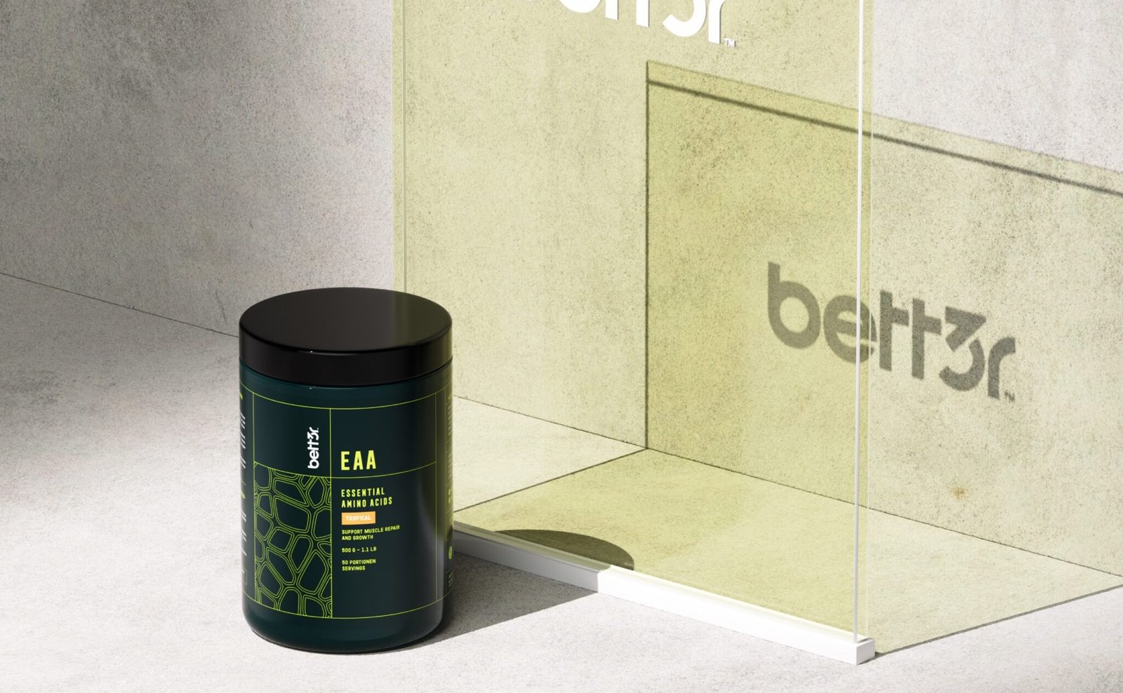
At MarkaWorks we built the brand identity on a clean, scientific aesthetic. Sharp modern typography sets the register, and a palette of greens and blues separates Better from a shelf that defaults to black, red, and metallic. Those two colors are unusual in sports nutrition precisely because they read as clinical rather than aggressive, which is the argument the brand is making.
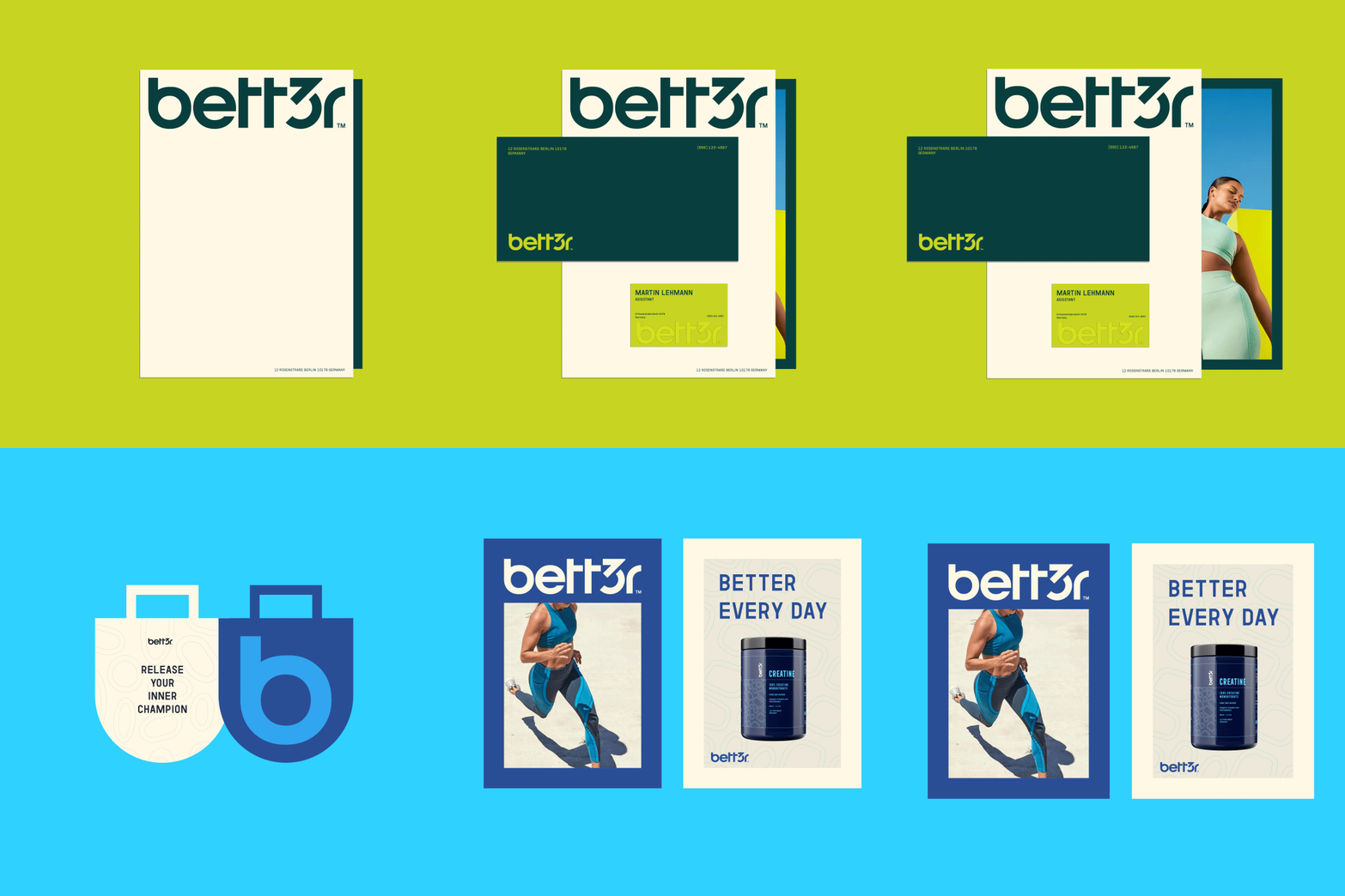
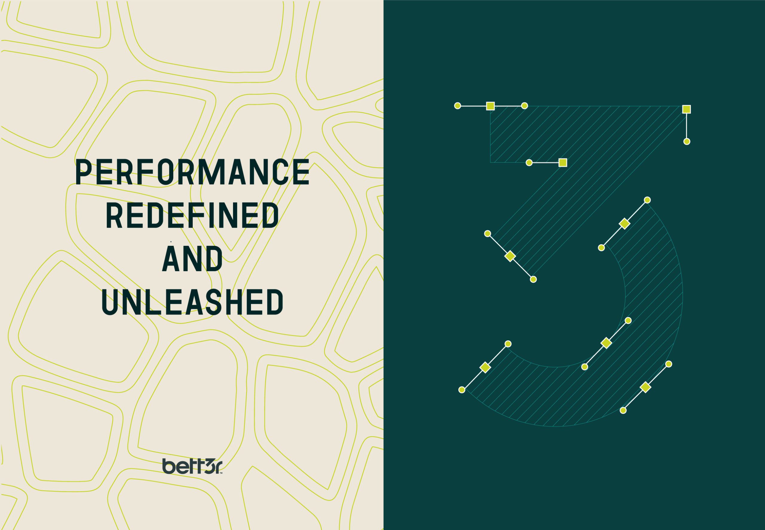
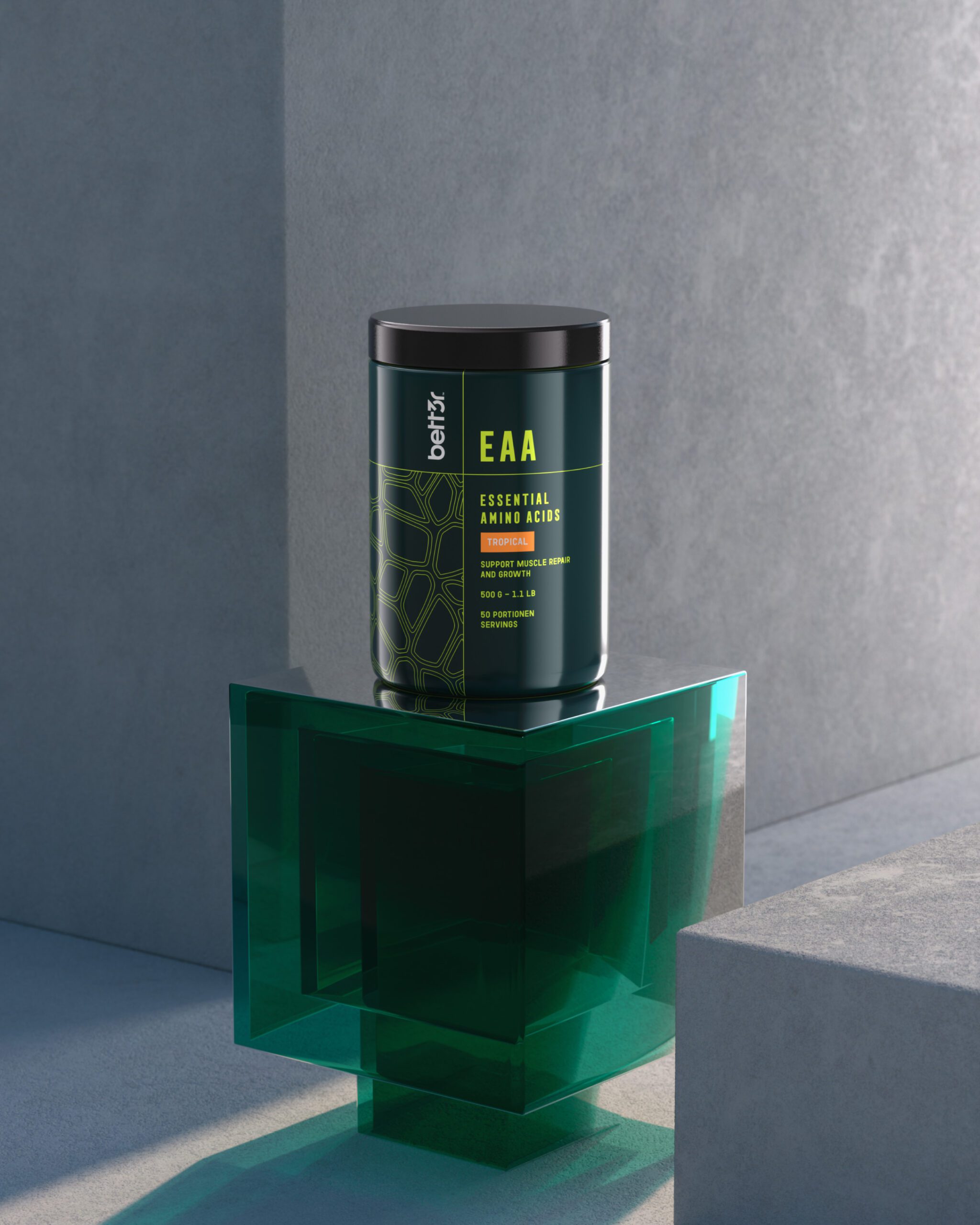
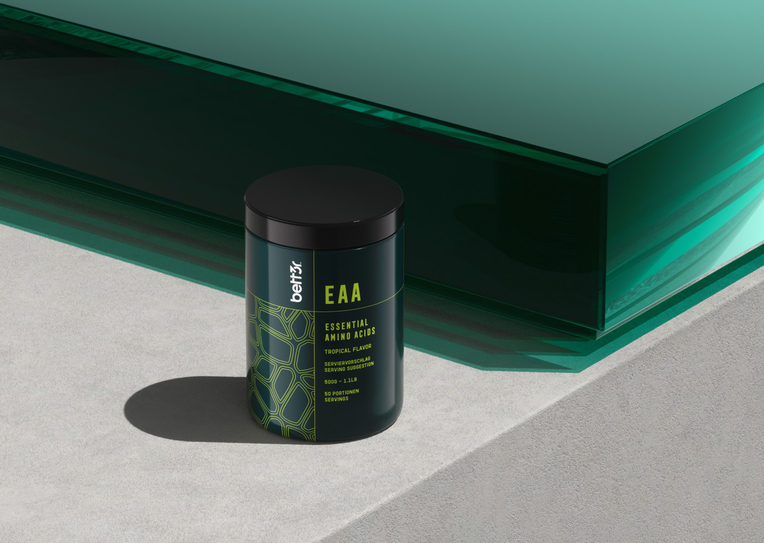
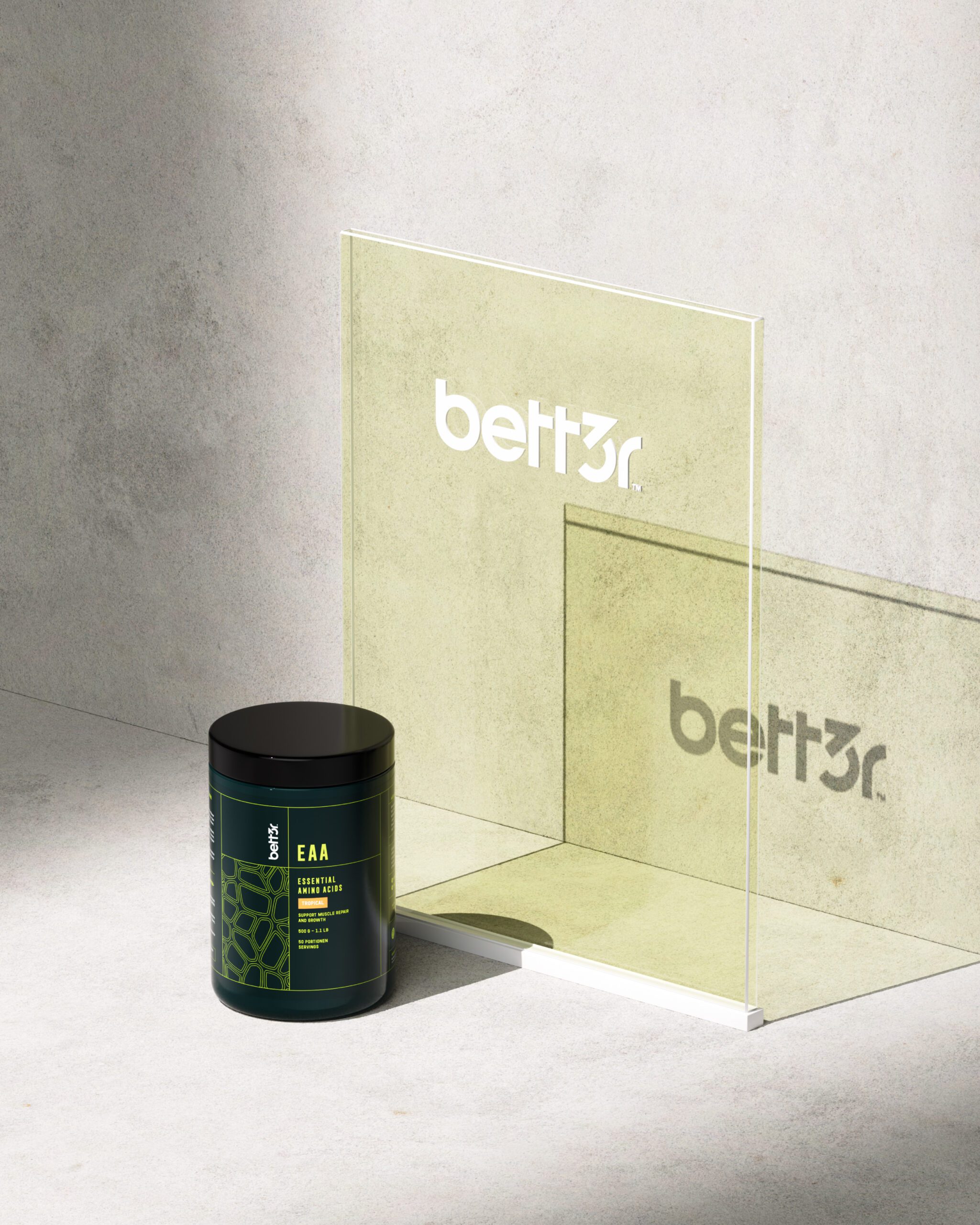
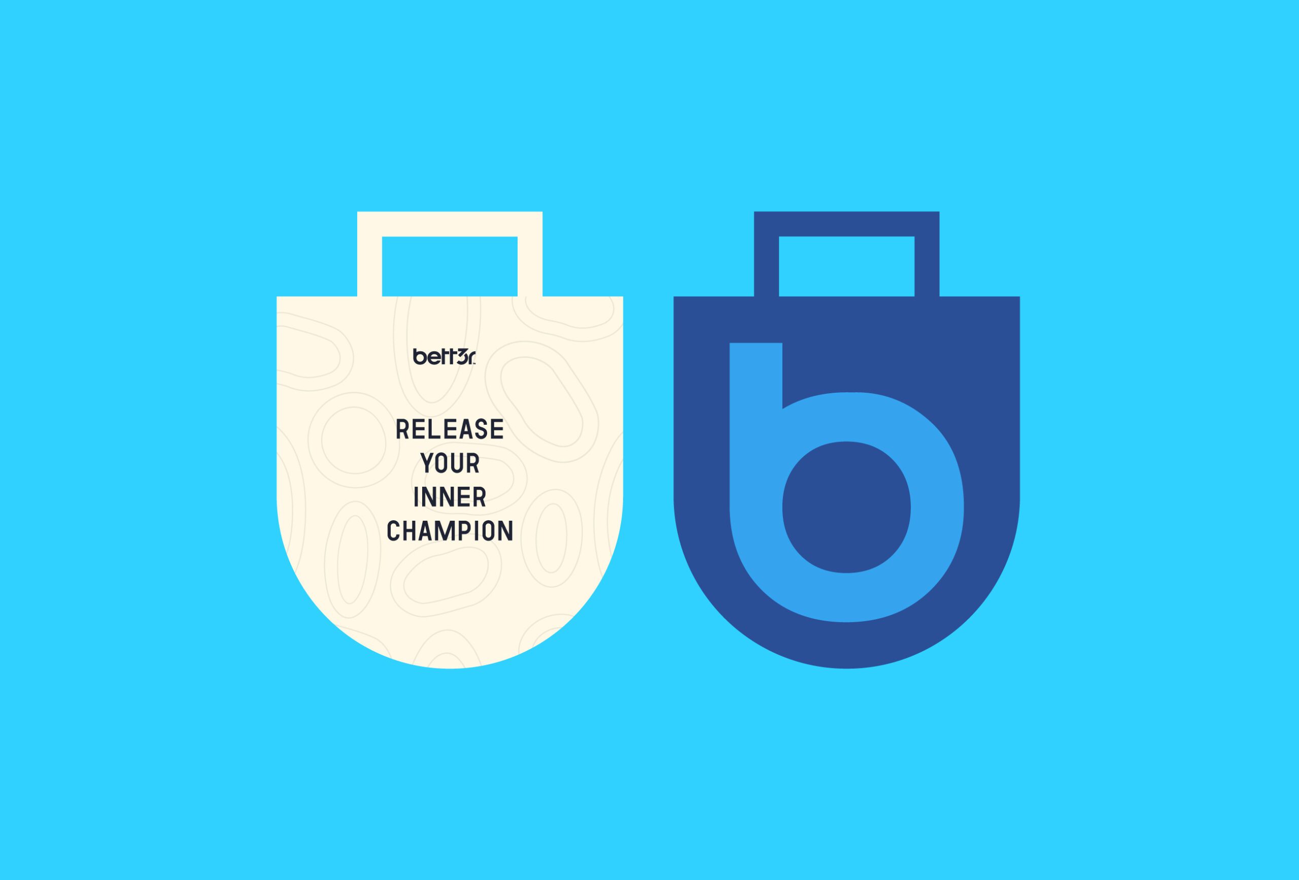
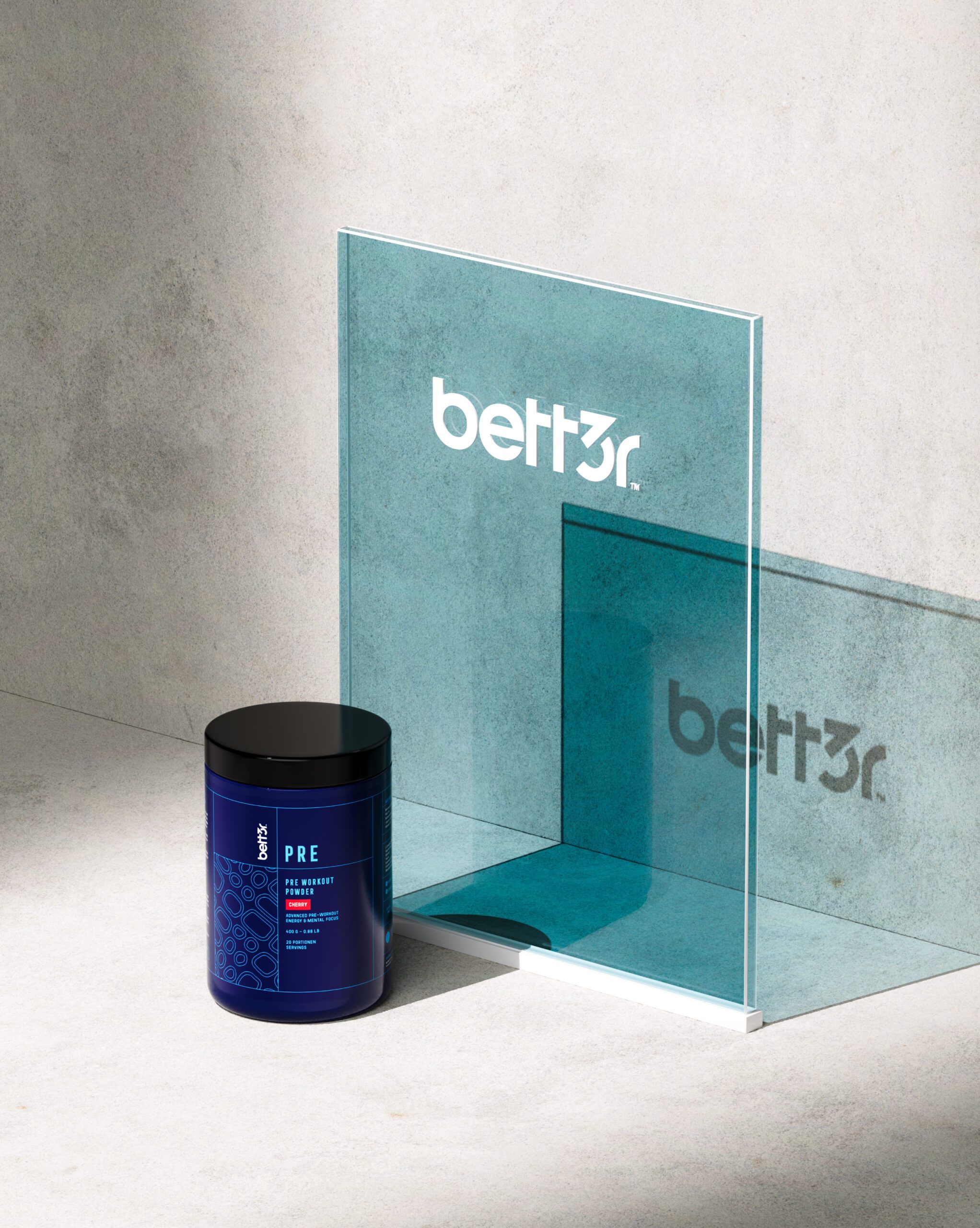
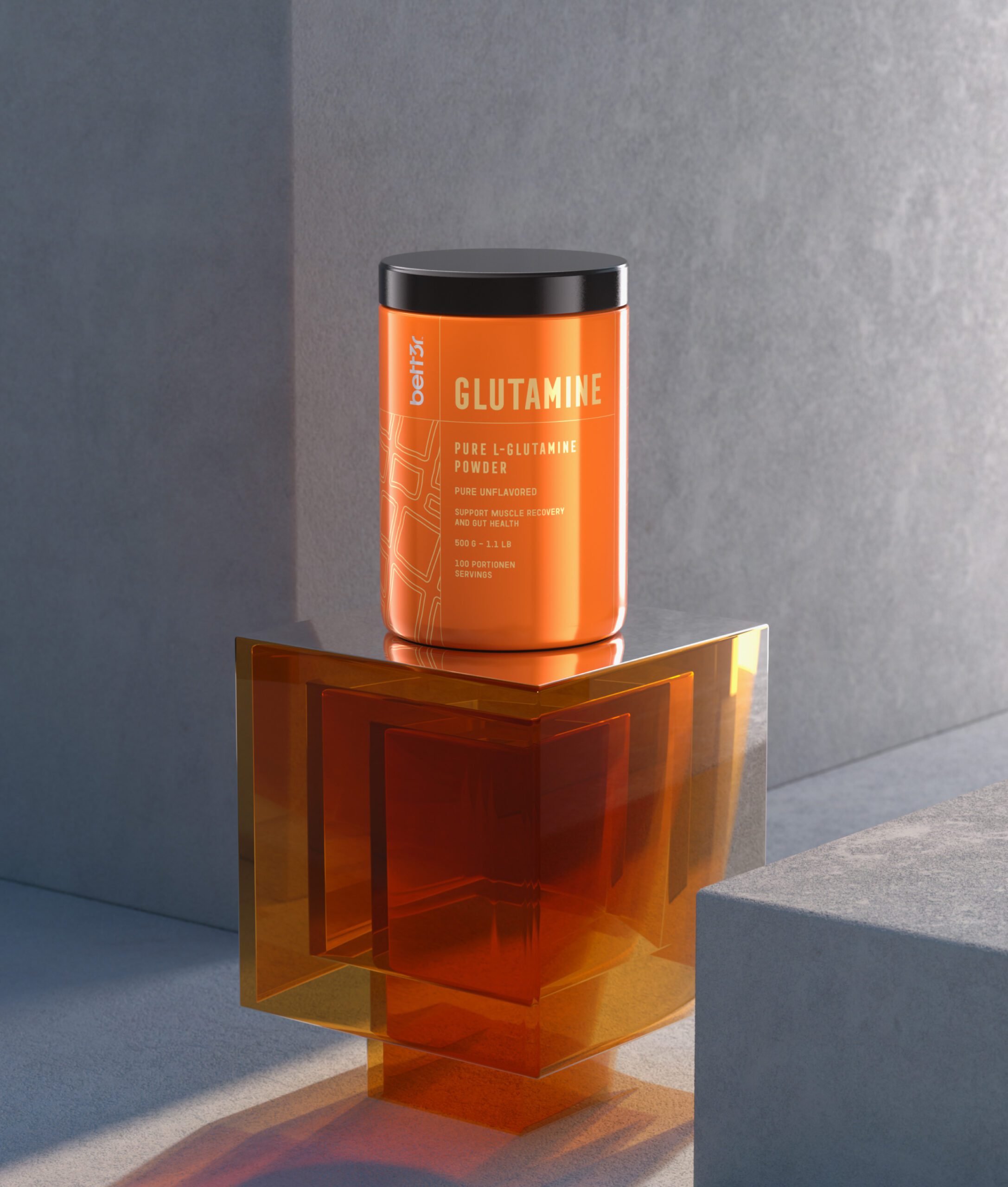
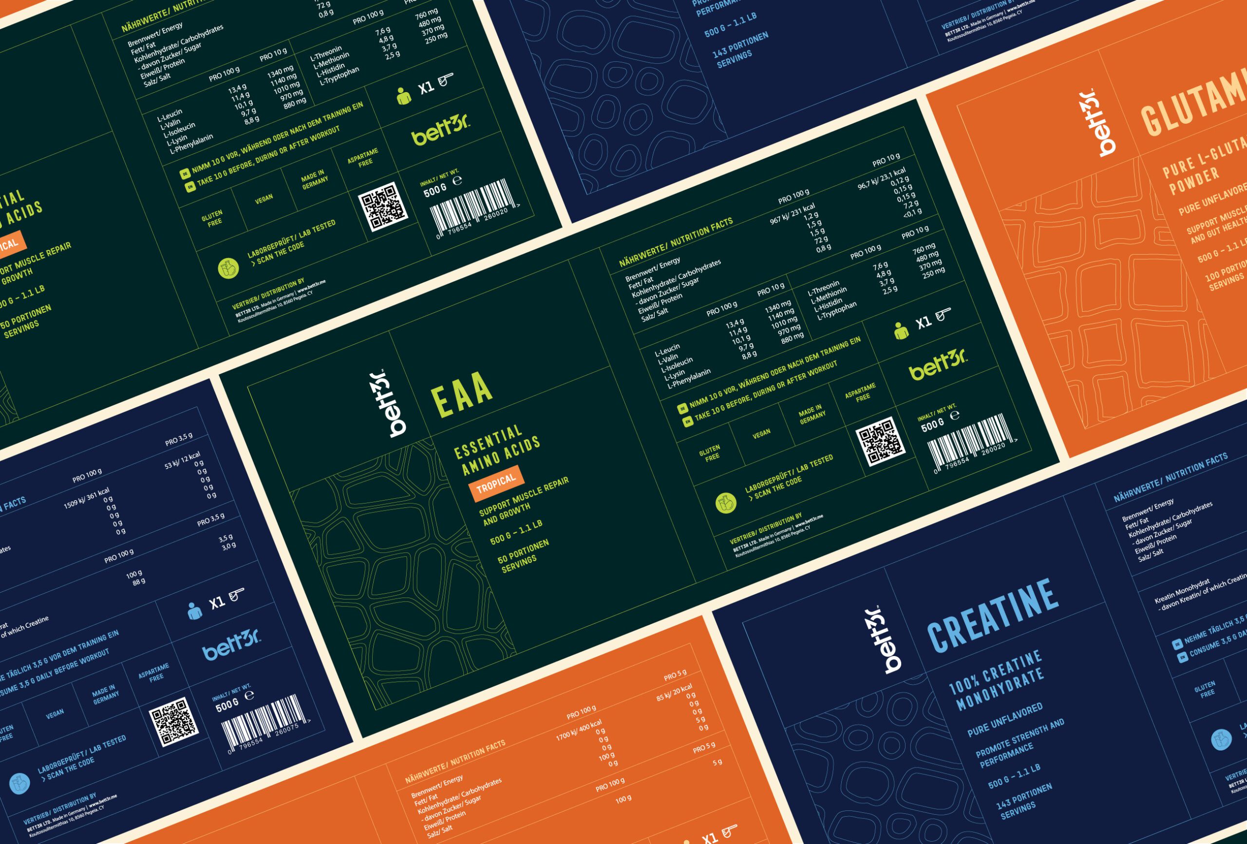
Each product carries distinct artwork within one system, so a protein powder and an amino blend are recognizable as the same brand and still tell each other apart. Geometric patterns and bold color blocks carry that separation. The pattern work is doing a second job: it gives the range a structural, measured look that supports the scientific positioning without any claim being printed.
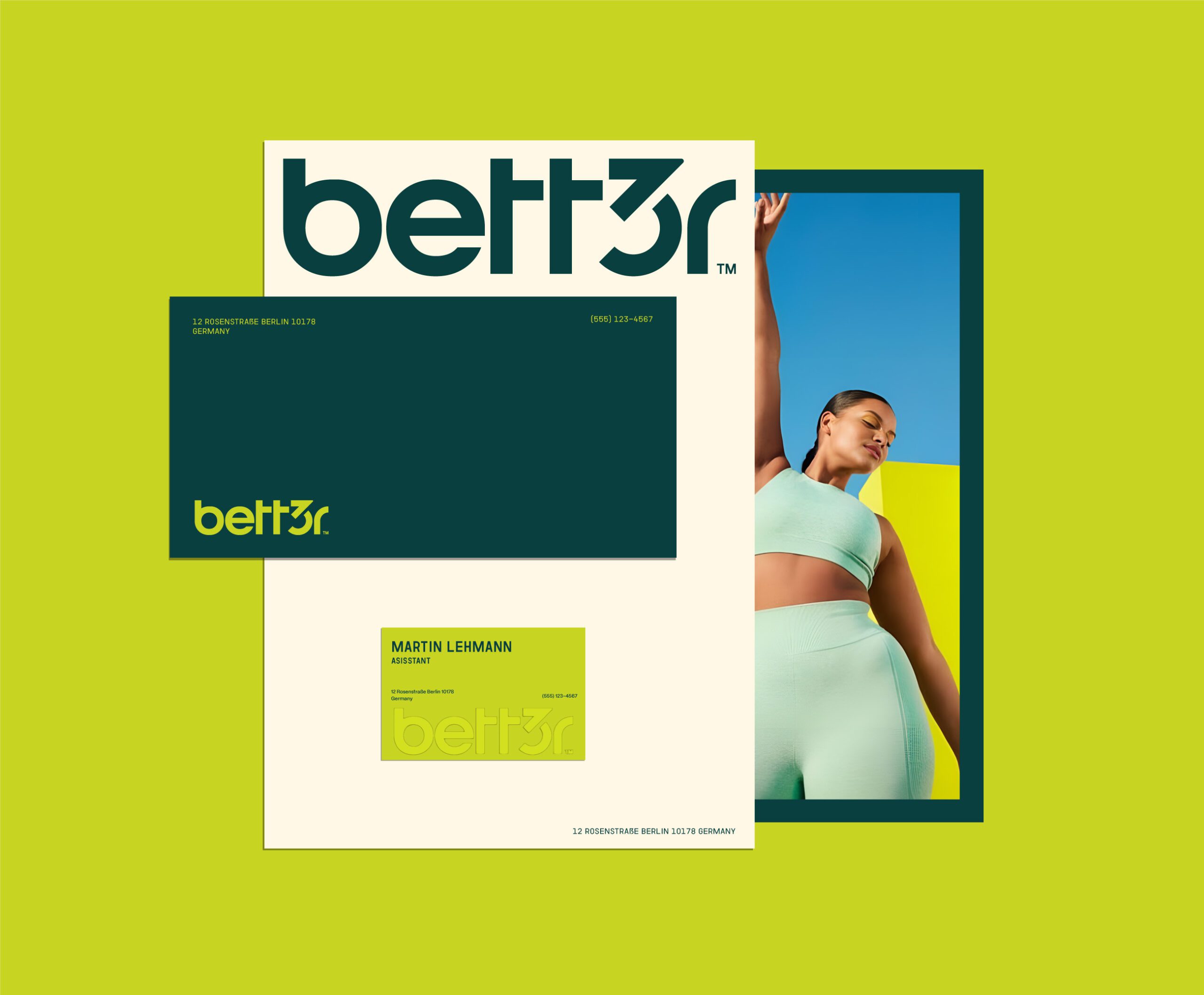
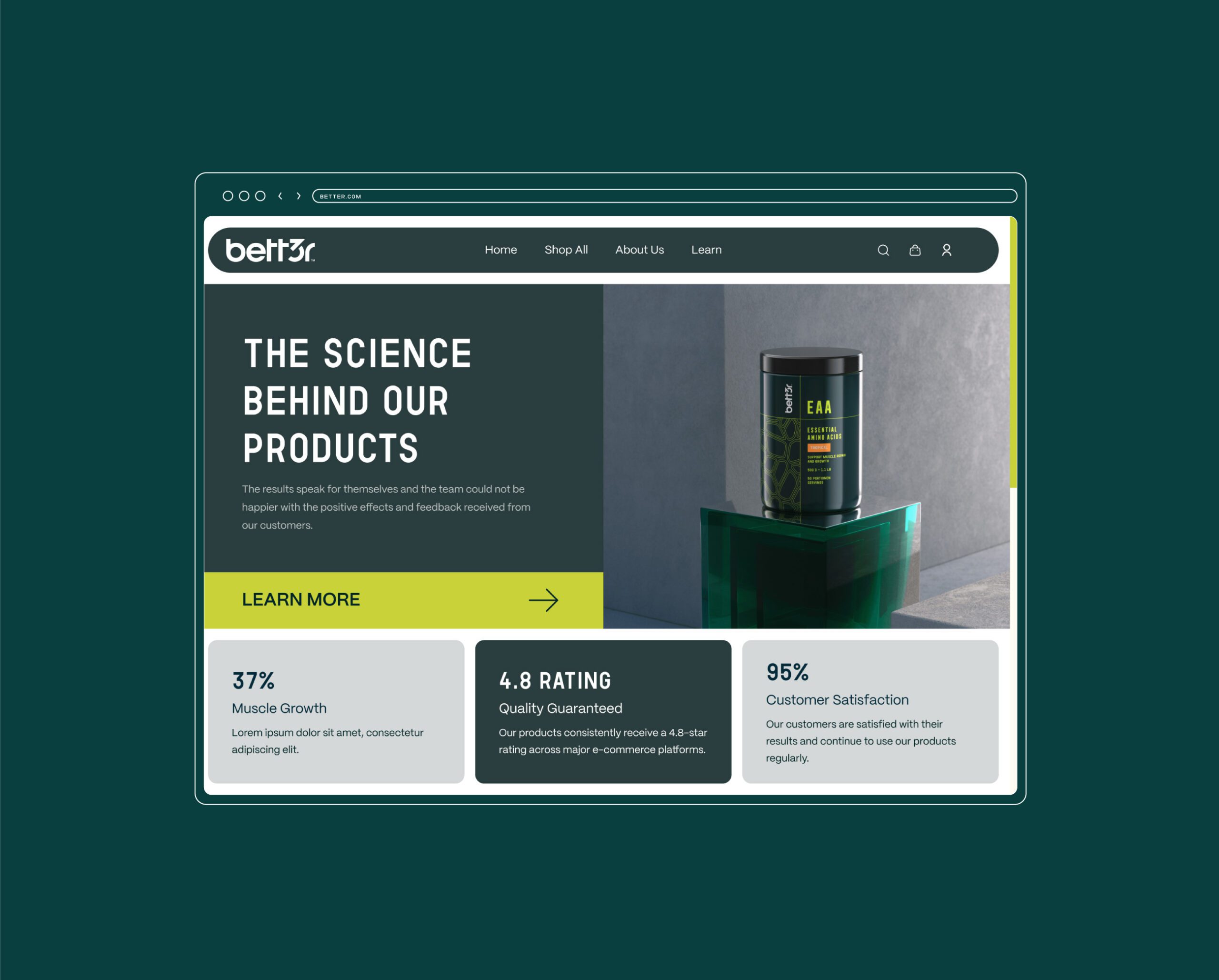
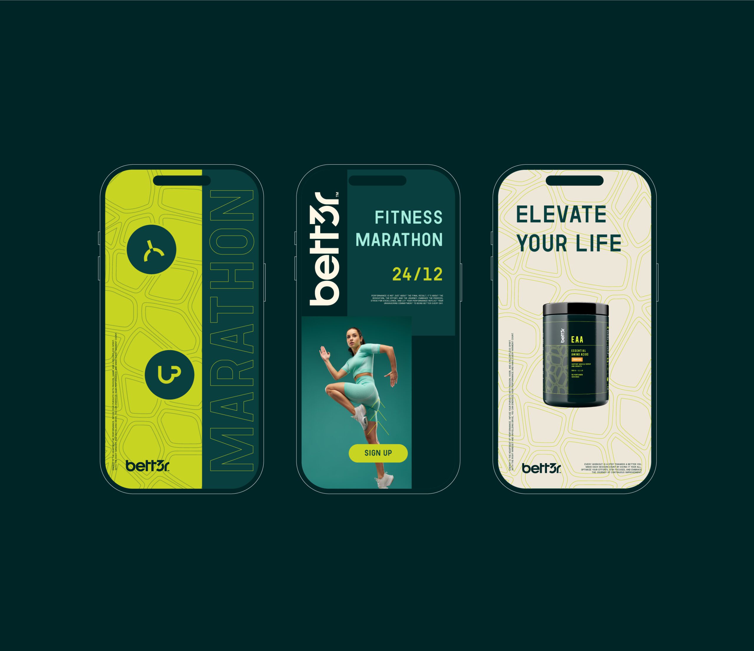
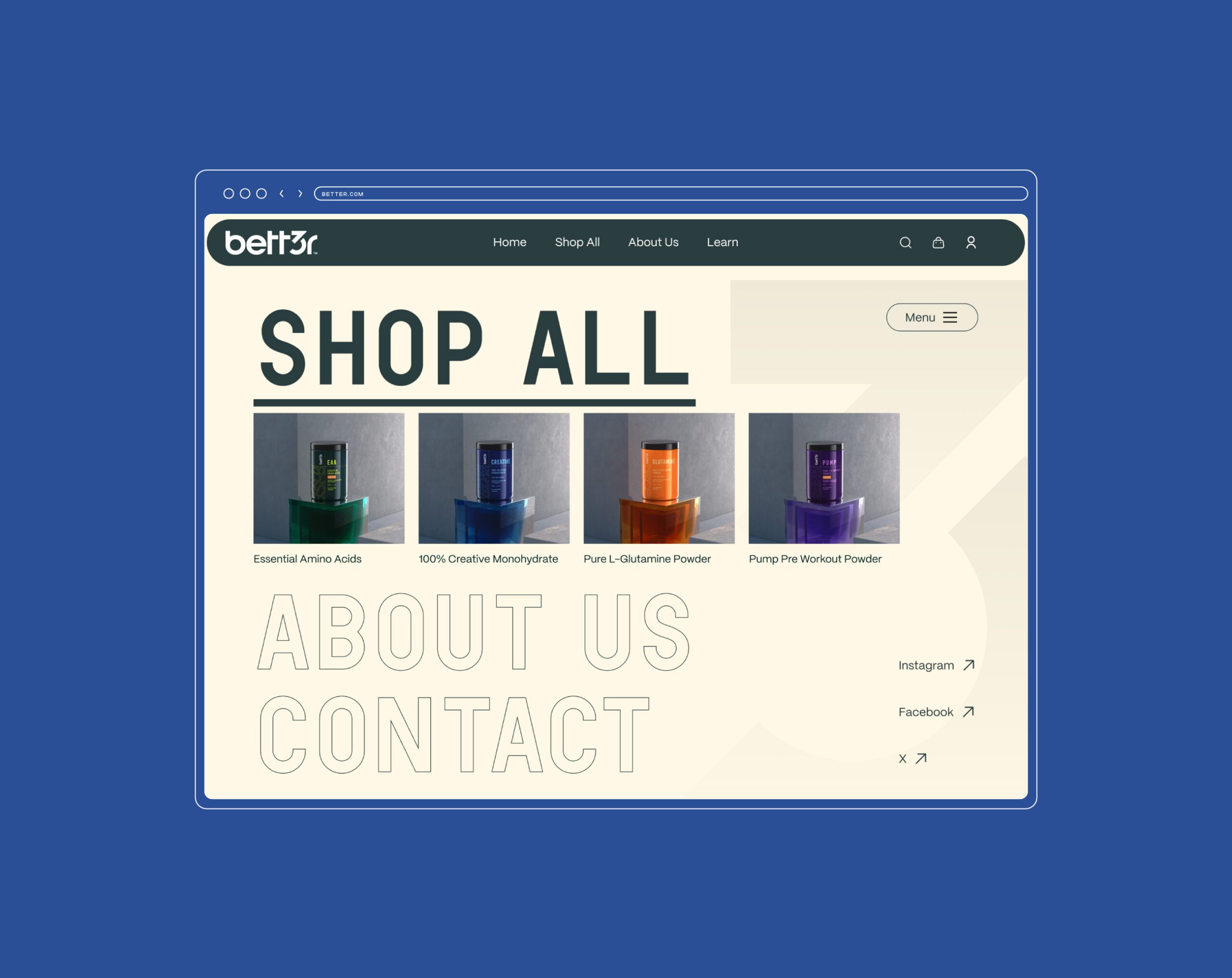
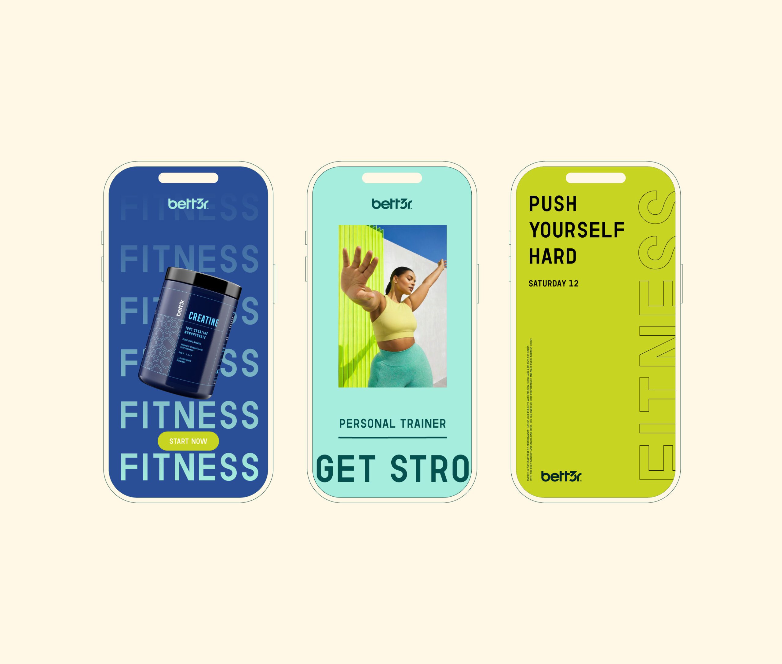
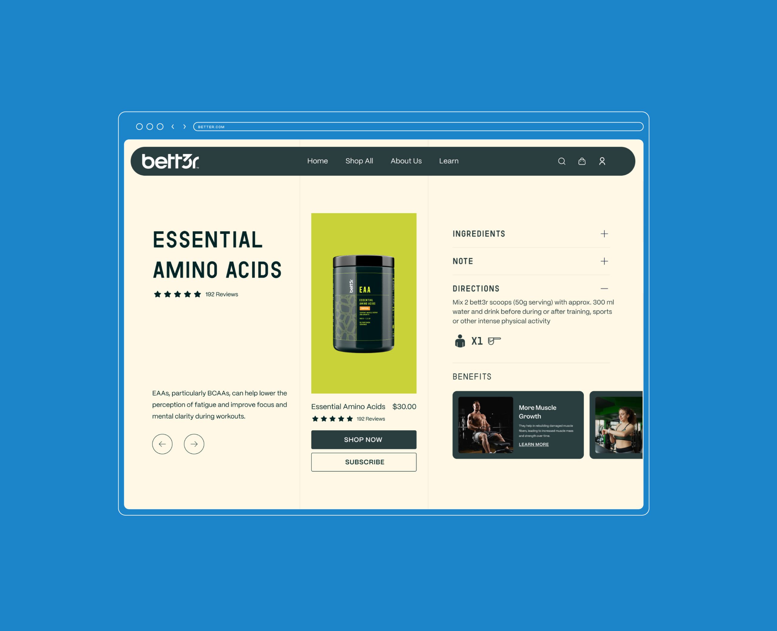
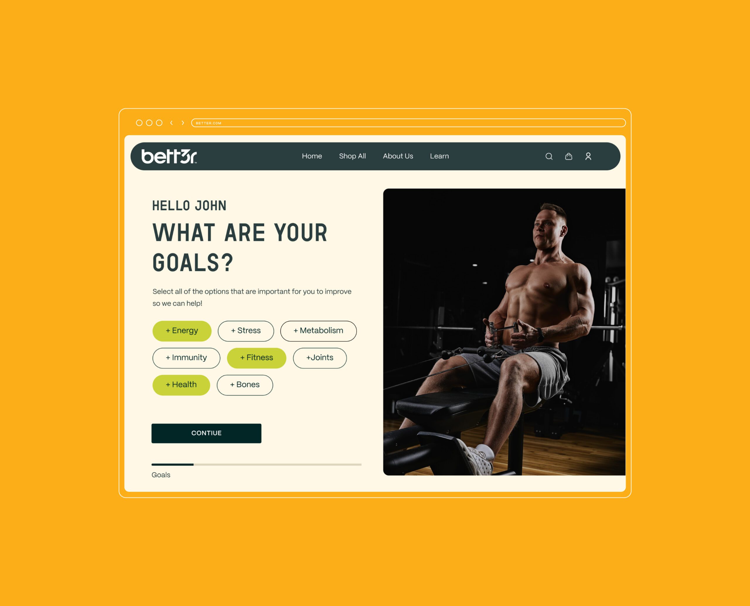
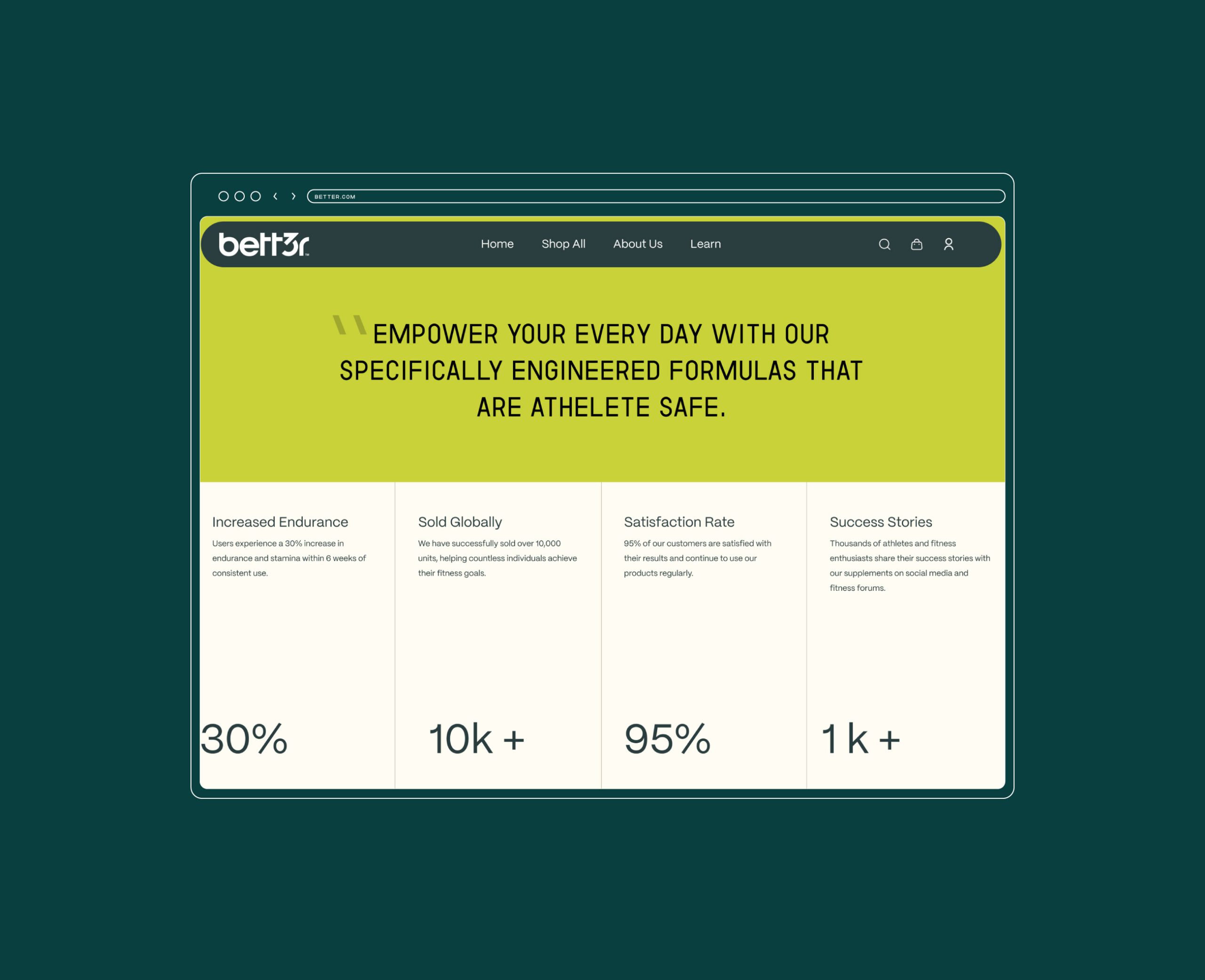
The system extends from packaging to digital marketing surfaces. On the website, we structured the layout to walk a visitor through product benefits in order rather than presenting the range as a catalog, which matters for a category where the buyer is comparing formulations and needs the same information in the same place on every product.
See more web and digital design and nutrition and wellness branding case studies.