Updated October 2026
Web and digital design: 13 case studies
13 websites, ecommerce stores and interfaces are collected here, among them a Dubai real estate developer’s website and a daily use application. The rule across all of them: a digital experience that changes character from the rest of the brand makes the brand feel less reliable than it is.
Branding and the store as one job
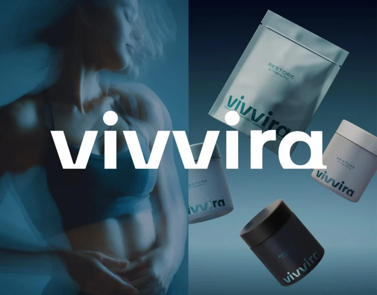
Web design for a brand is the site, store or interface built on the same identity as the rest of the brand; for a product brand that includes the pack, so the path from discovery to purchase keeps the character a buyer met on the shelf. Glowie’s store runs on Shopify, and the 3D product models we made are used twice, as interactive elements on the site and as source material for content, which keeps the product identical wherever a buyer meets it. On MUUM the path from discovery to purchase was shortened rather than decorated, with benefits at first glance, ingredient blocks shown plainly and a mobile first structure arranged for one handed use. BARS’ interface moves someone through the product story in a fixed order, and the same hierarchy holds on desktop and mobile. Birtz’s website and ecommerce flow follow the pack, with soft interface details over a structured hierarchy so the science stays approachable. Better’s site walks a visitor through product benefits in order rather than presenting a catalog. Vivvira’s packaging, digital experiences, social content and brand applications were designed as one ecosystem, so every touchpoint behaves the same way.
Interfaces that keep the brand’s pace
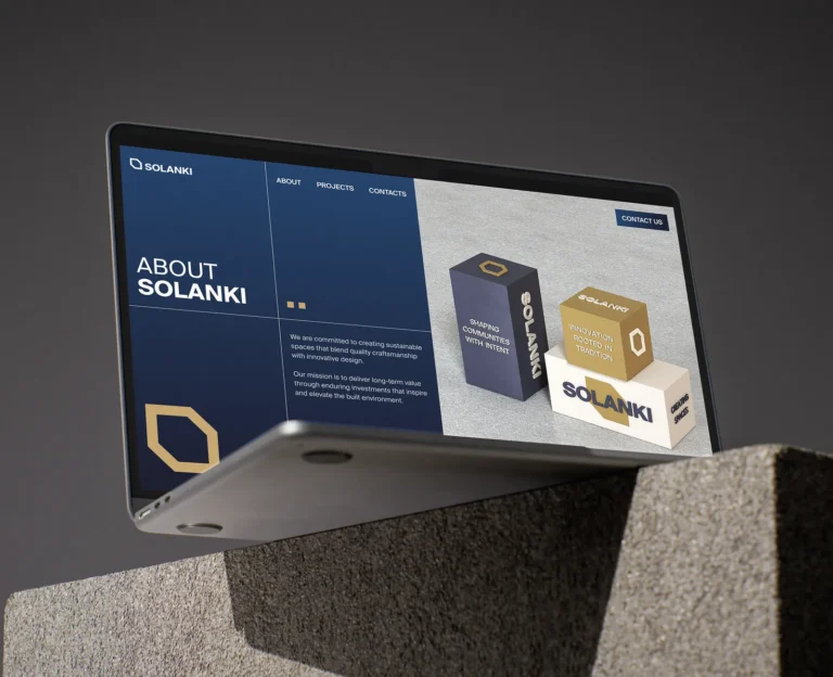
A calm brand cannot be introduced through a fast interface. Holme’s site gives each product its own visual space and keeps the navigation deliberately slow. Rauph carries its architectural structure into the digital experience, with the logomark and keyhole motif as elements of that structure. Awelly’s interface keeps the supportive tone inside the product, so a brand that reads as a partner on the pack does not read as a form on the site. Pilky’s daily use application started from user research, interviews and personas before any screen was drawn. SOLANKI’s site holds the identity’s authority with a structured grid, deep navy and warm gold, and keeps projects, company heritage and investment opportunities separable at every width.
Cases by type
| Type | Cases on this page | Examples |
|---|---|---|
| Ecommerce stores and brand websites | 5 | Glowie, MUUM UI, BARS UI, Better, Birtz |
| Product and brand interfaces | 5 | Holme UI, Rauph UI, Awelly UI, Pilky UI, Solanki UI |
| Digital as part of a packaging system | 3 | Roadster Coffee, La Mama, Vivvira |
The cases on this page
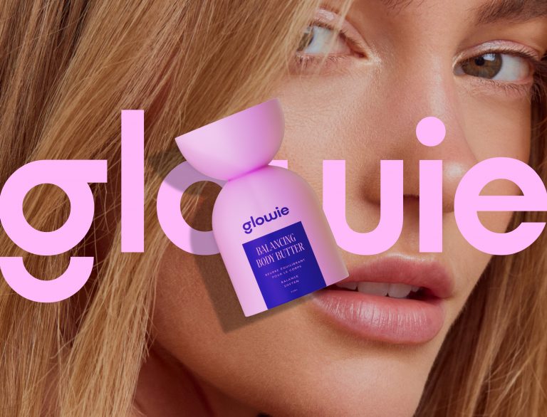
Glowie: a Shopify store built with 3D product models used on the site and in content.
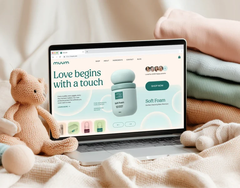
MUUM UI: a soft brand world turned into a structured, mobile first shopping experience, with a modular UI system underneath.
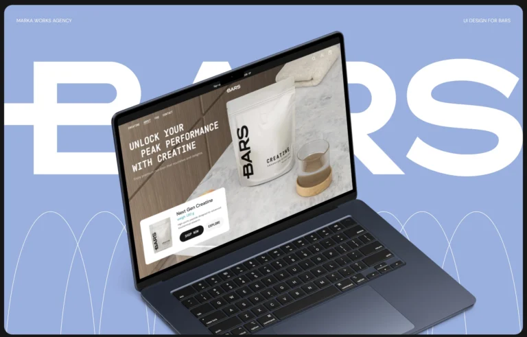
BARS UI: clarity and restraint, one uninterrupted flow from homepage to product page, accessibility settled at the structural stage.
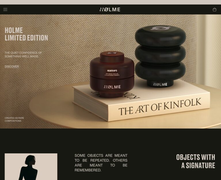
Holme UI: each product with its own visual space, deliberately slow navigation.
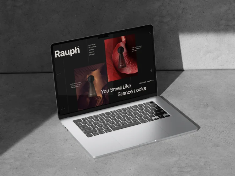
Rauph UI: architectural structure carried into the digital experience.
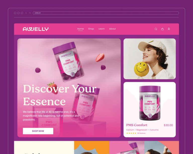
Awelly UI: structured layouts and generous spacing that guide rather than push.
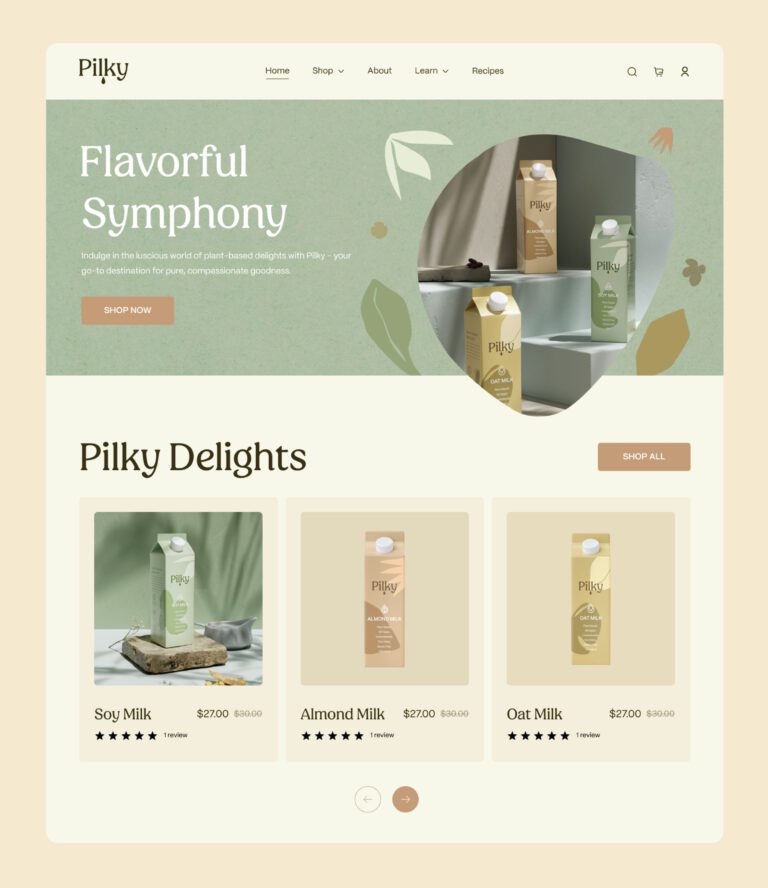
Pilky UI: user research, interviews and personas before the first screen.
Solanki UI: a structured grid, deep navy and warm gold, responsive at every width.
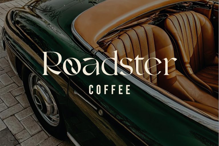
Roadster Coffee: an ecommerce build that keeps the buying path short.
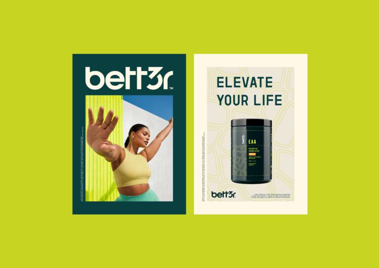
Better: a website structured to walk through product benefits in order.
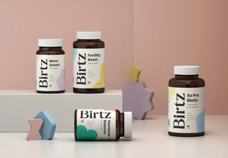
Birtz: website and ecommerce flow built on the same principles as the pack.
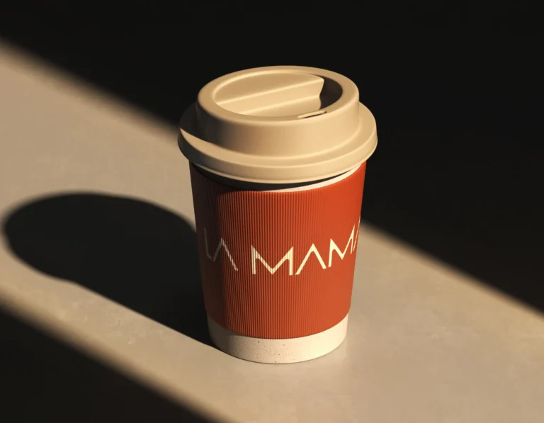
La Mama: packaging and digital held to one hierarchy.
Vivvira: packaging, digital experiences and social content designed as one ecosystem, the soft blue system carried to every touchpoint.


Questions product brands ask us about the website
We built Glowie's store on Shopify, with product 3D models used both for interactive browsing and for the brand's wider visual content. The identity and the storefront were designed together rather than handed between two teams, and the same rule runs through the digital experiences we designed for Slumber, Vivvira, MUUM, Rauph and Holme.
For an ecommerce brand, use a web design agency that starts from the brand rather than the template, and ask to see stores it has built. On MUUM we shortened the path from discovery to purchase and built transparent ingredient blocks into the flow; on BARS we kept the interface calm so the product story carries the sale.
You need a web design agency unless your packaging designer builds interfaces; one partner covering both is the simpler route. Packaging is read on a shelf and a website has to guide a purchase, so packaging skill alone does not carry the store. We design both in house: the Holme website keeps the brand's restraint and the MUUM store keeps the softness of the packaging.