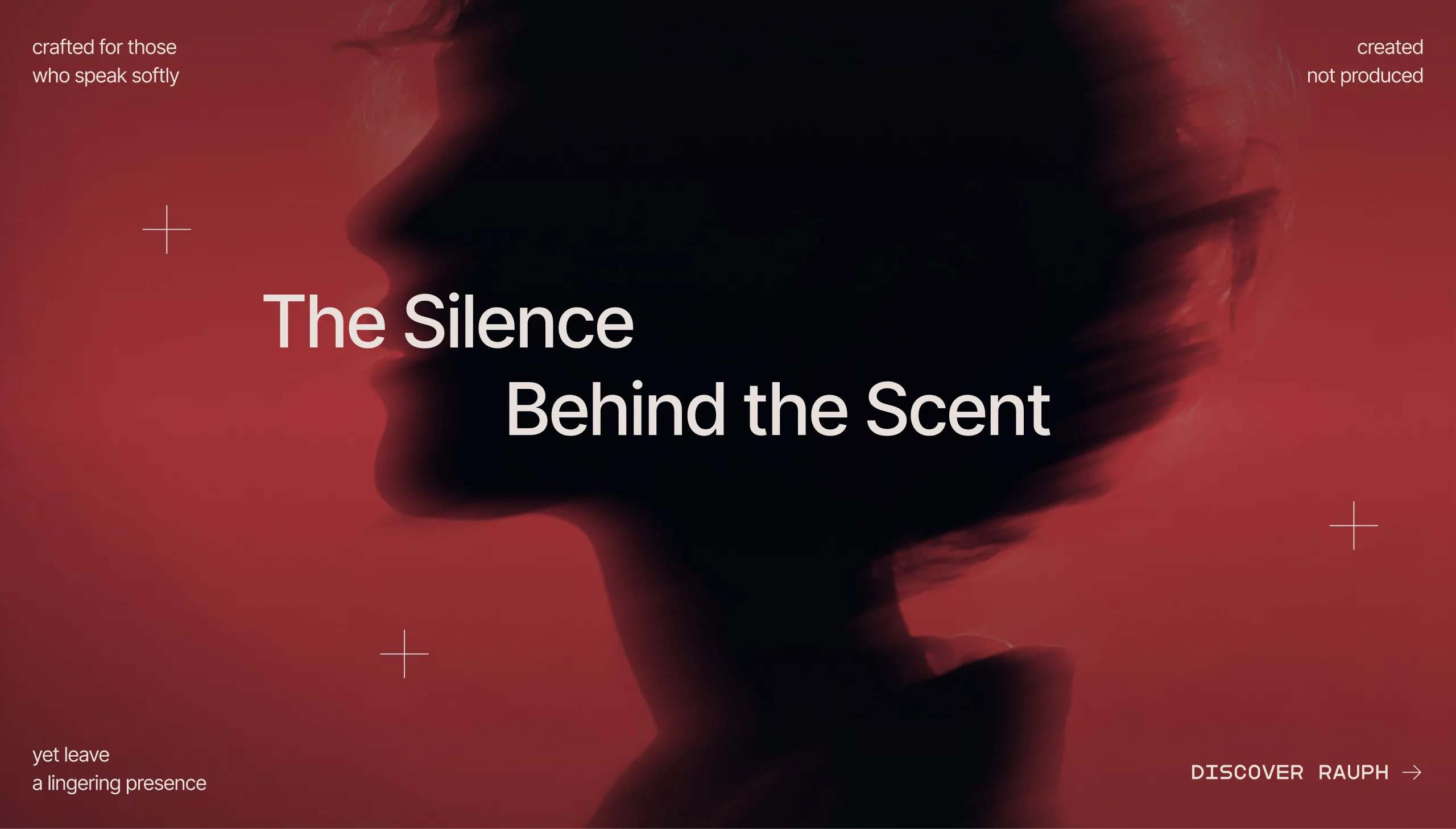
Rauph UI
luxury perfume house
Rauph™ was conceived as a perfume house built on quiet luxury, architectural minimalism, and intentional design. The project aimed to transform scent into a sculptural form and use silence as a core design material.
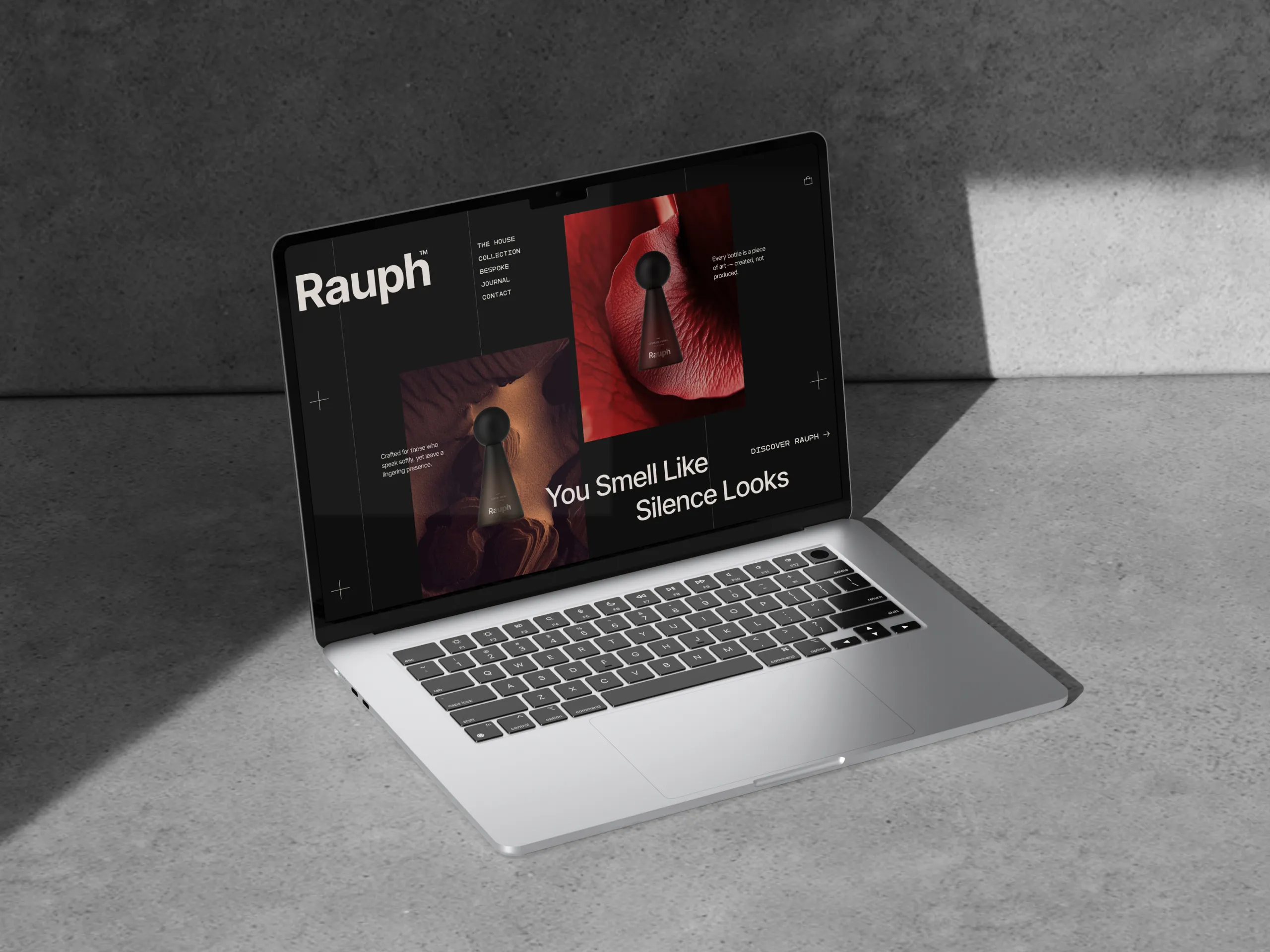
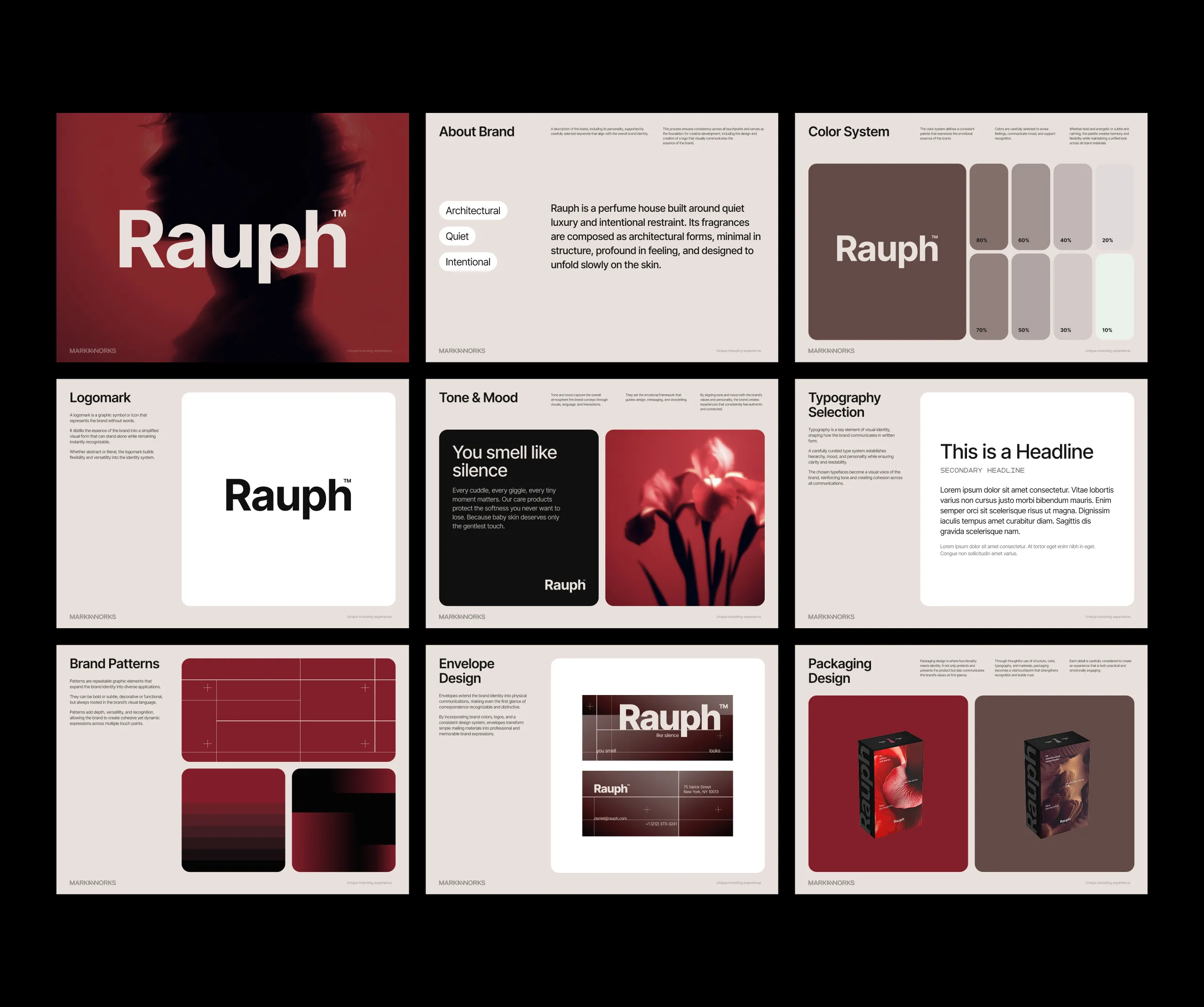
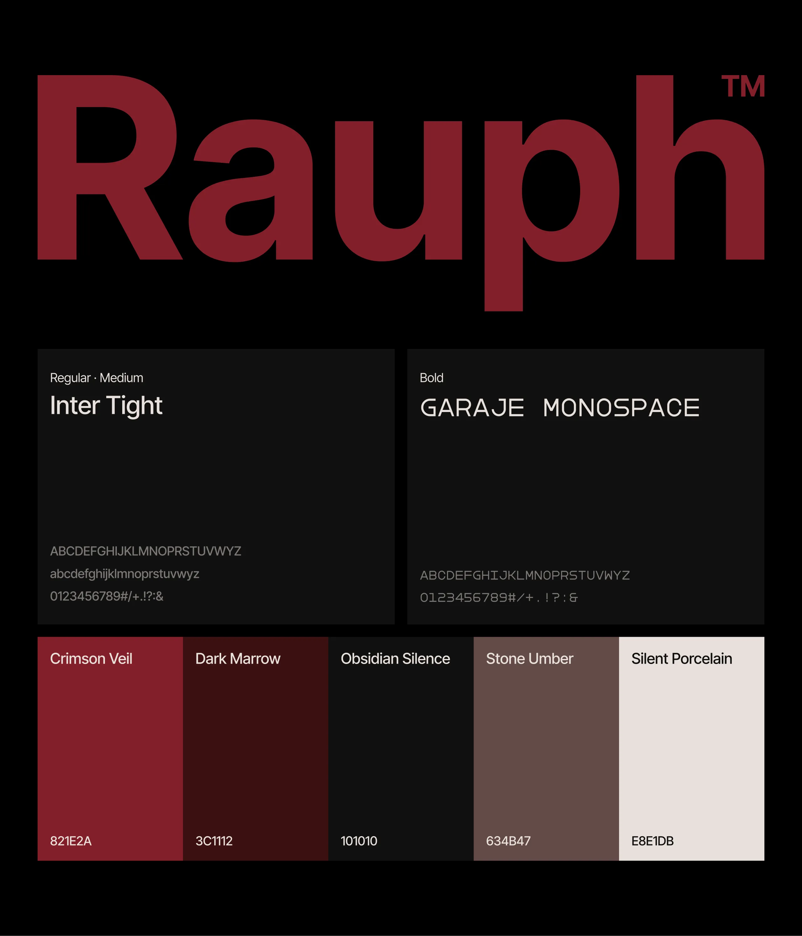
Rauph™ was conceived as a perfume house built on quiet luxury, architectural minimalism, and intentional design. The project aimed to transform scent into a sculptural form and use silence as a core design material.
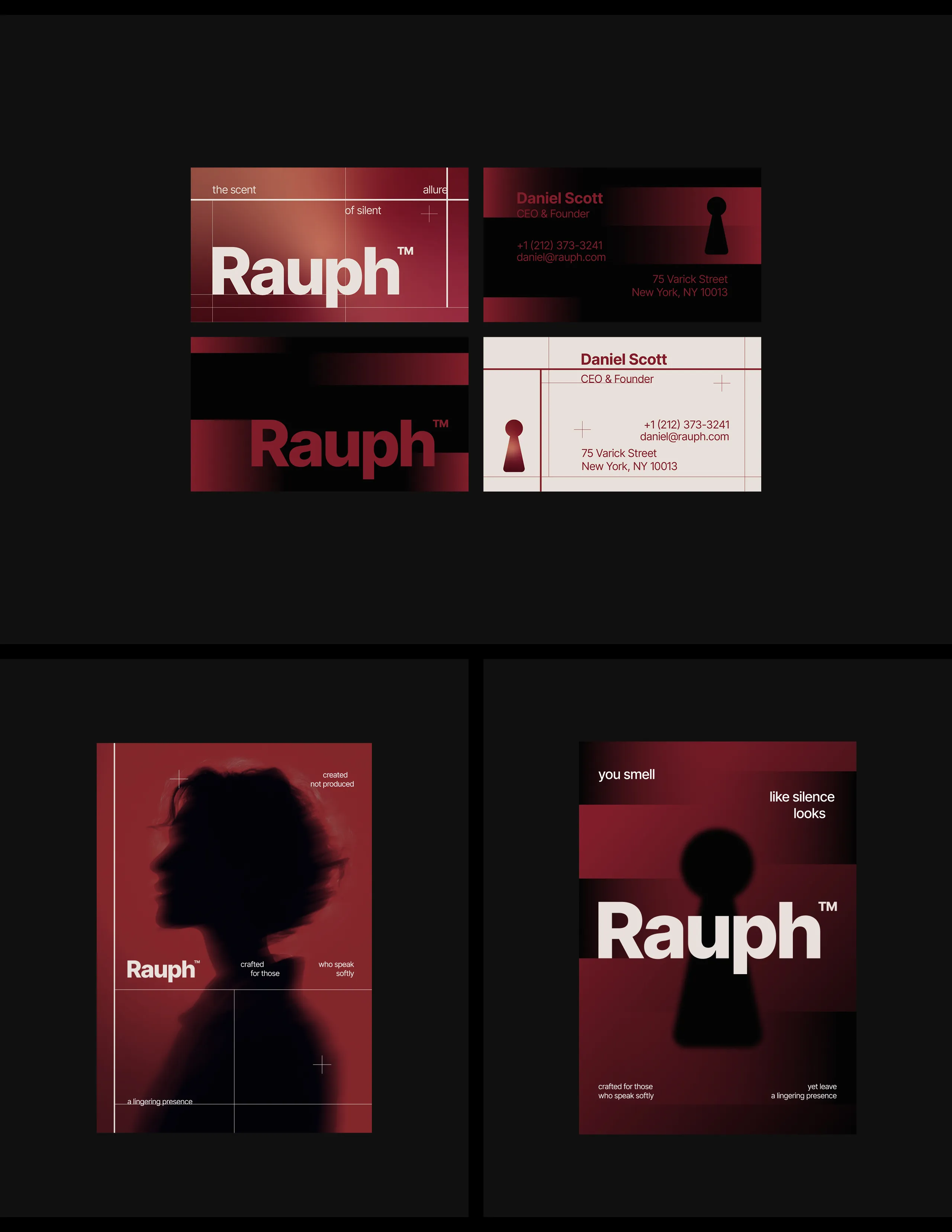
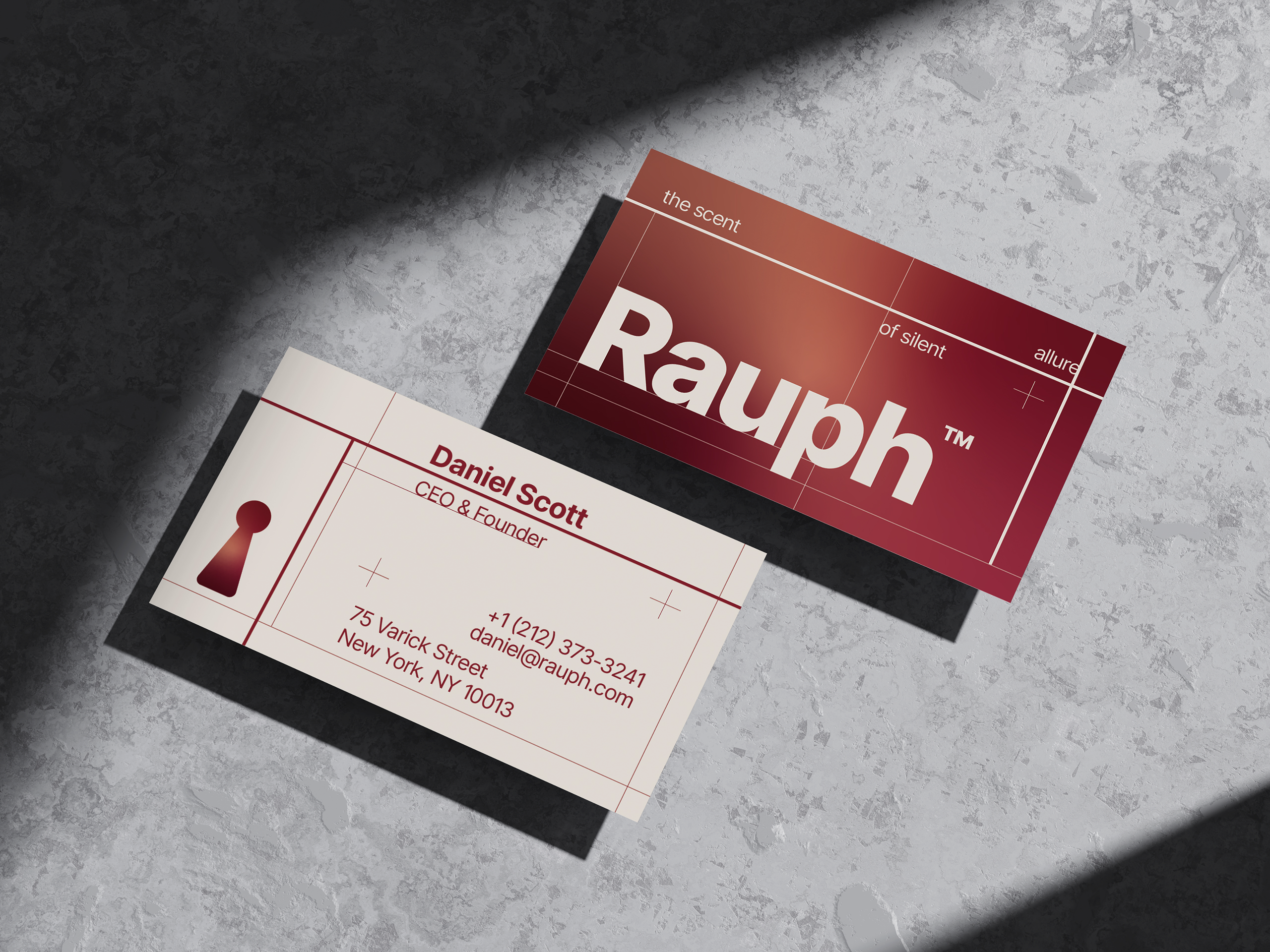
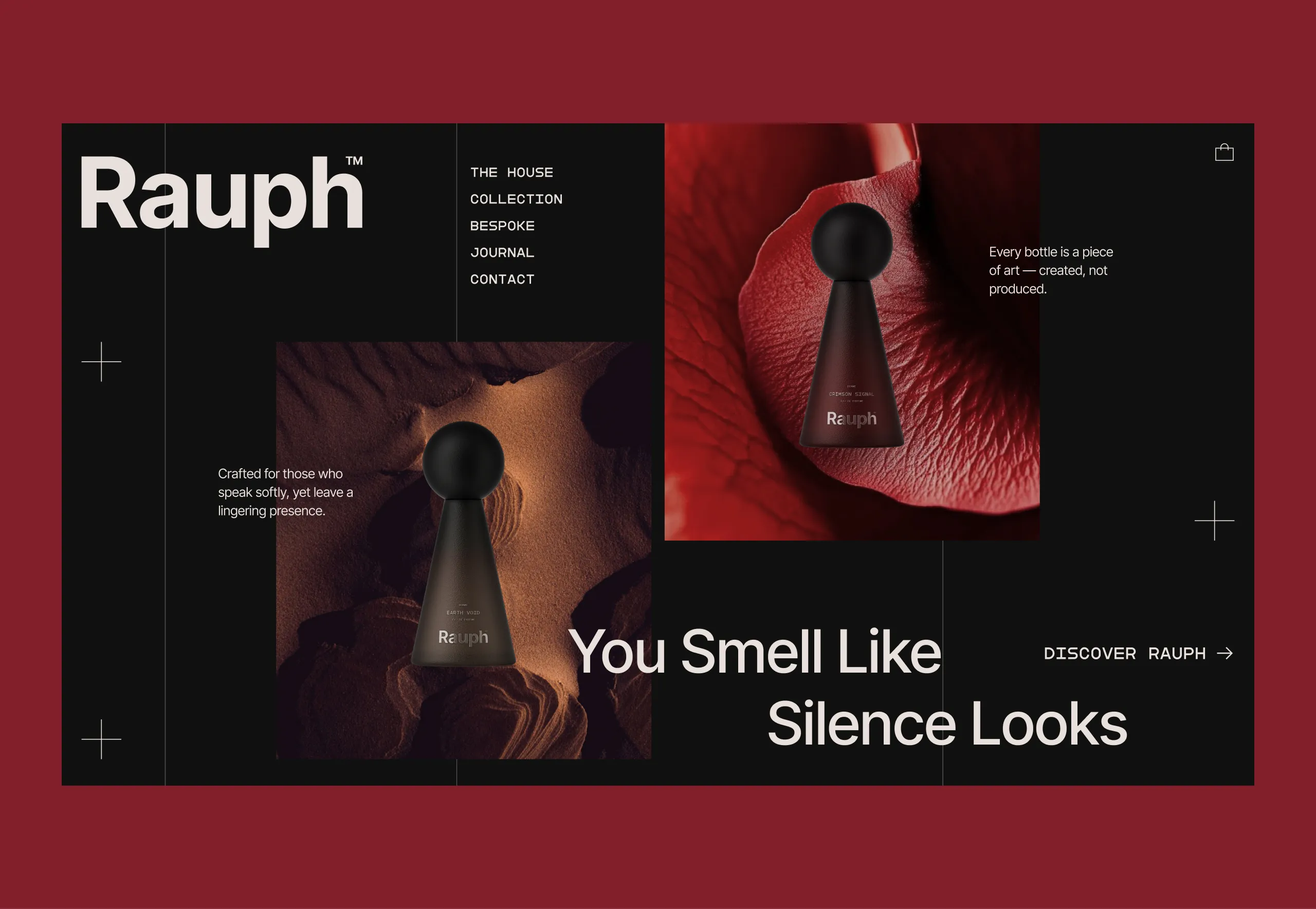
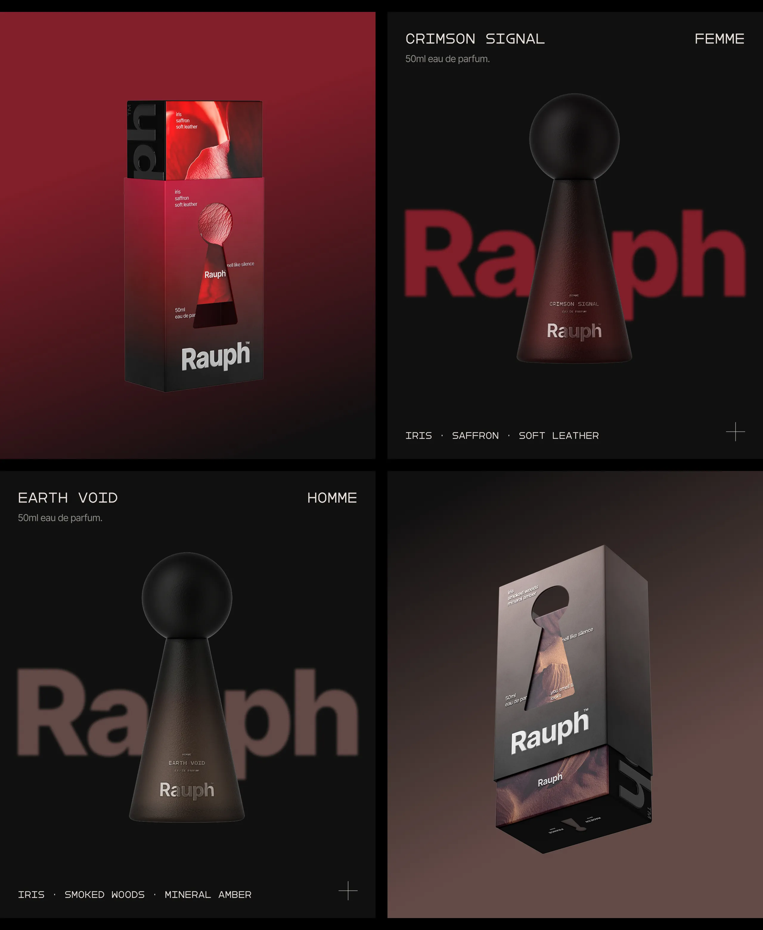
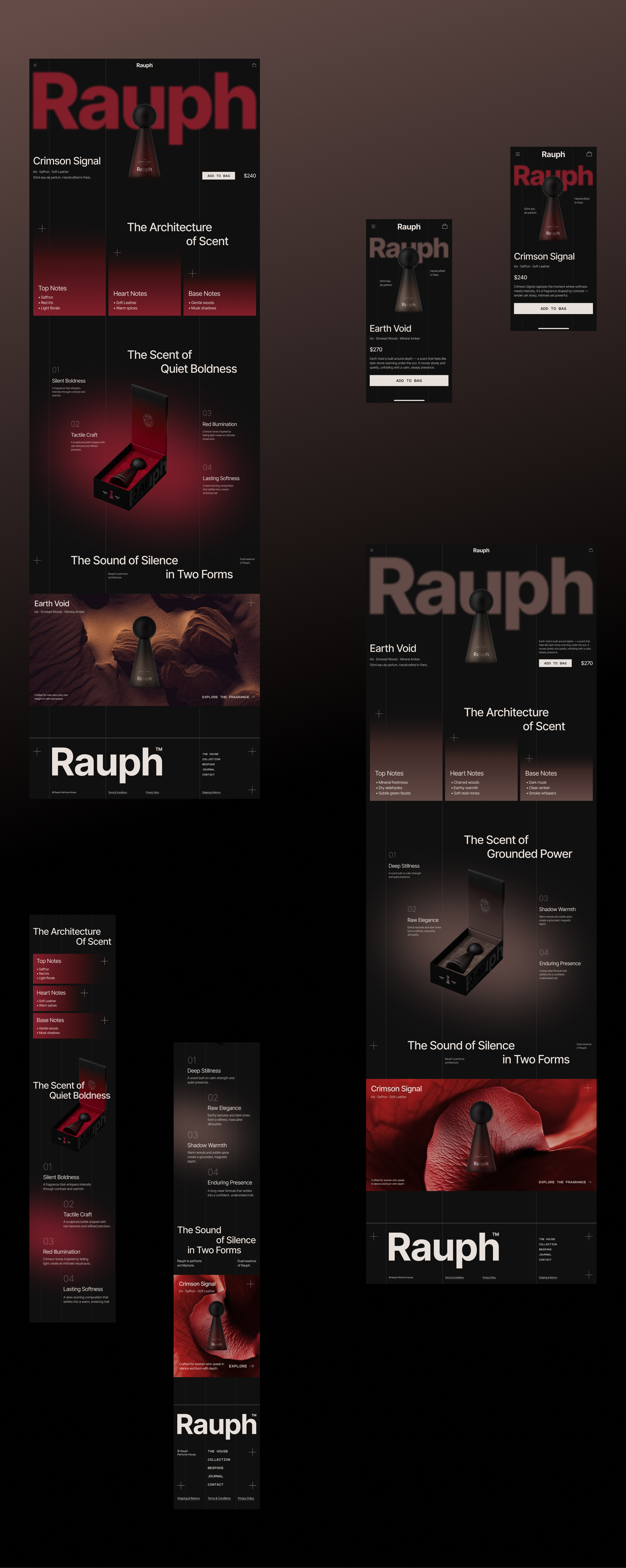
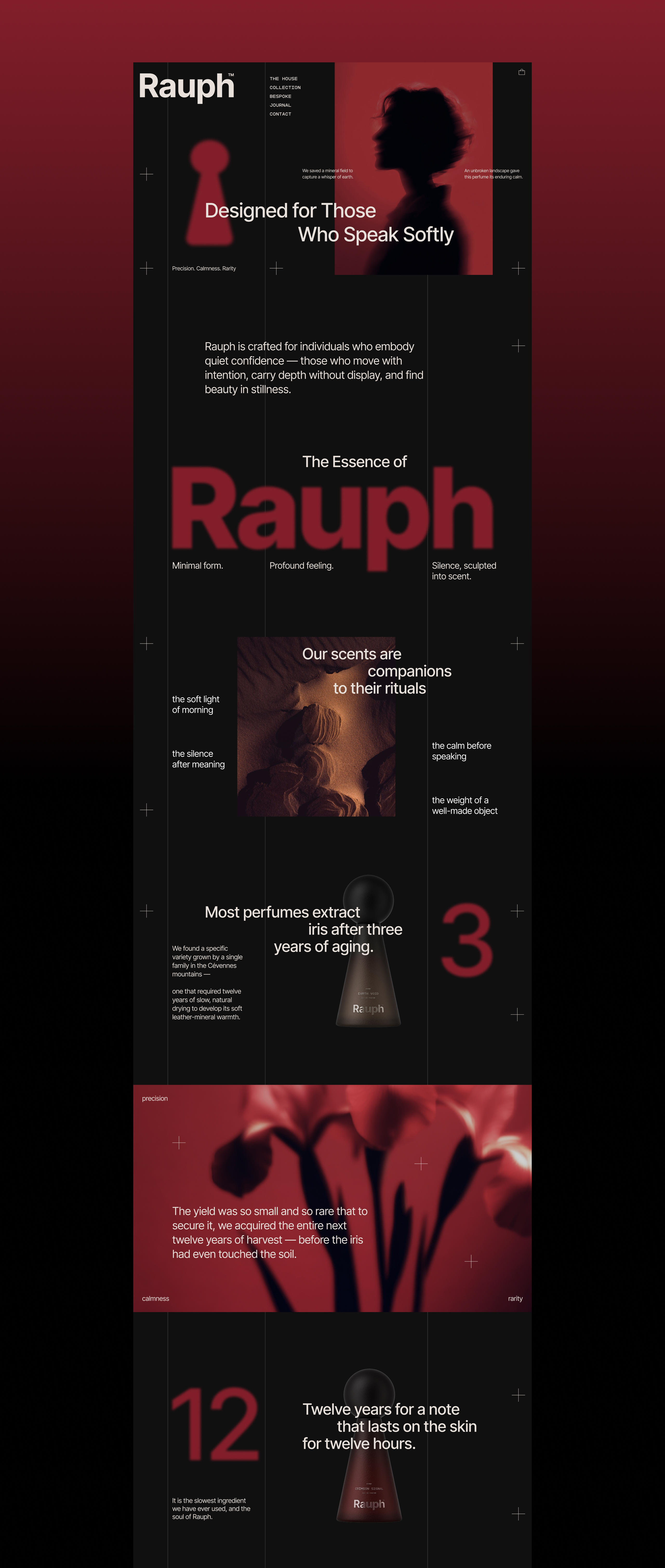
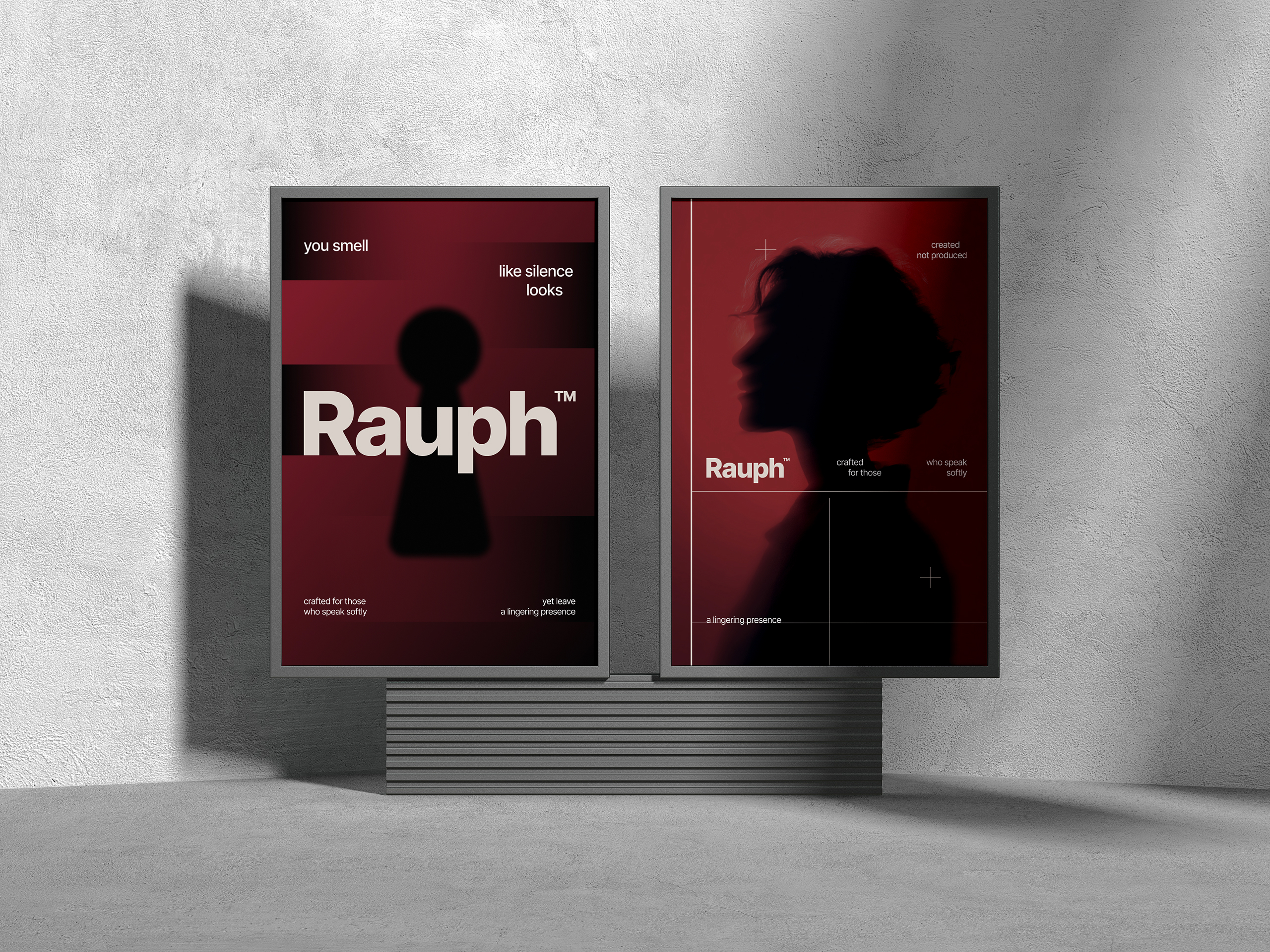
Guided by the phrase “You smell like silence looks,” every element of the visual system (color, typography, grid structure, photography, packaging, and digital experience) was crafted to carry depth without making noise. Blurred silhouettes, tactile crimson gradients, and drafting-inspired micro-grids formed the emotional and structural foundation of the brand. The logomark and keyhole motif act as architectural thresholds, inviting the viewer into an intimate, almost secret interior world that repeats across packaging and UI.
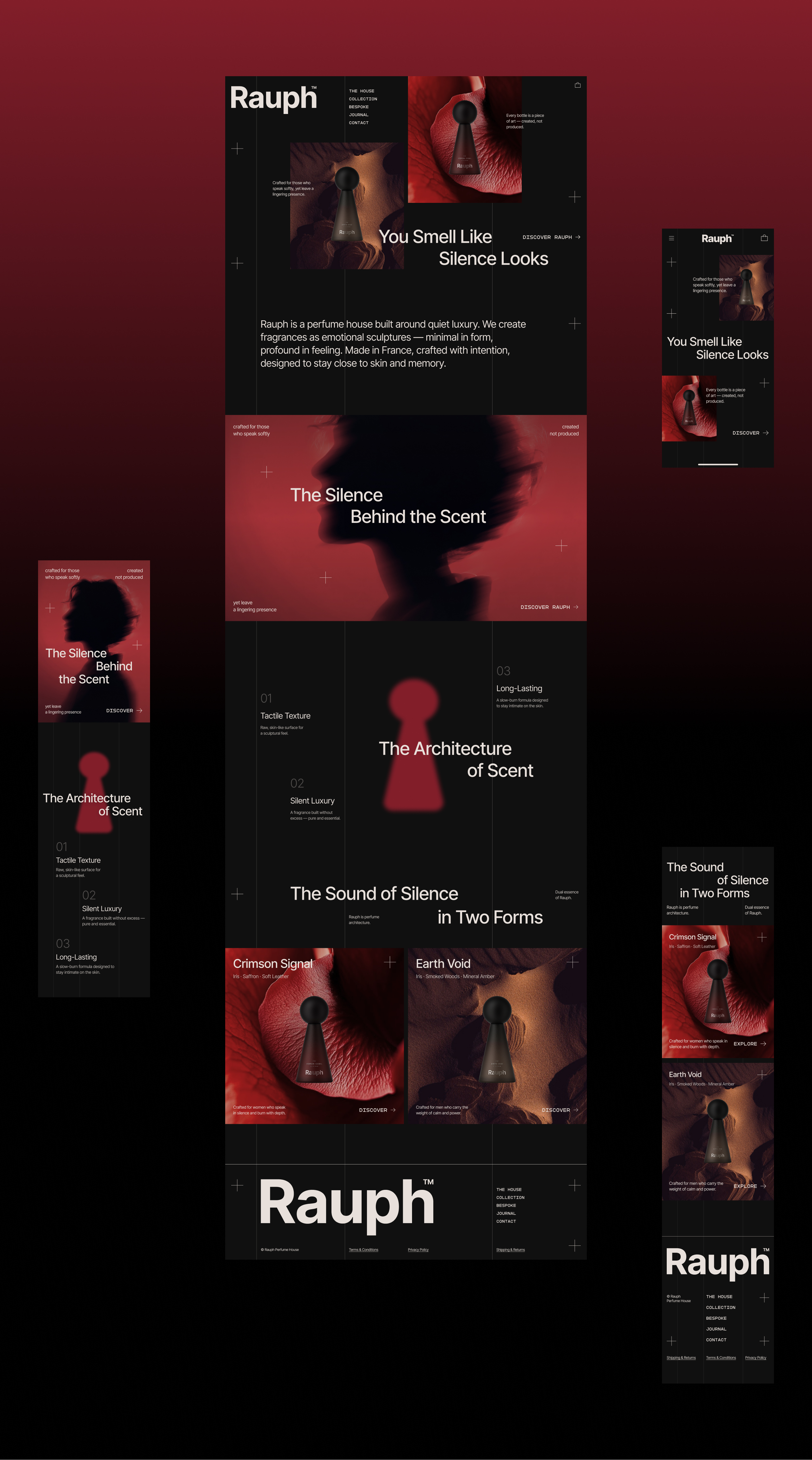
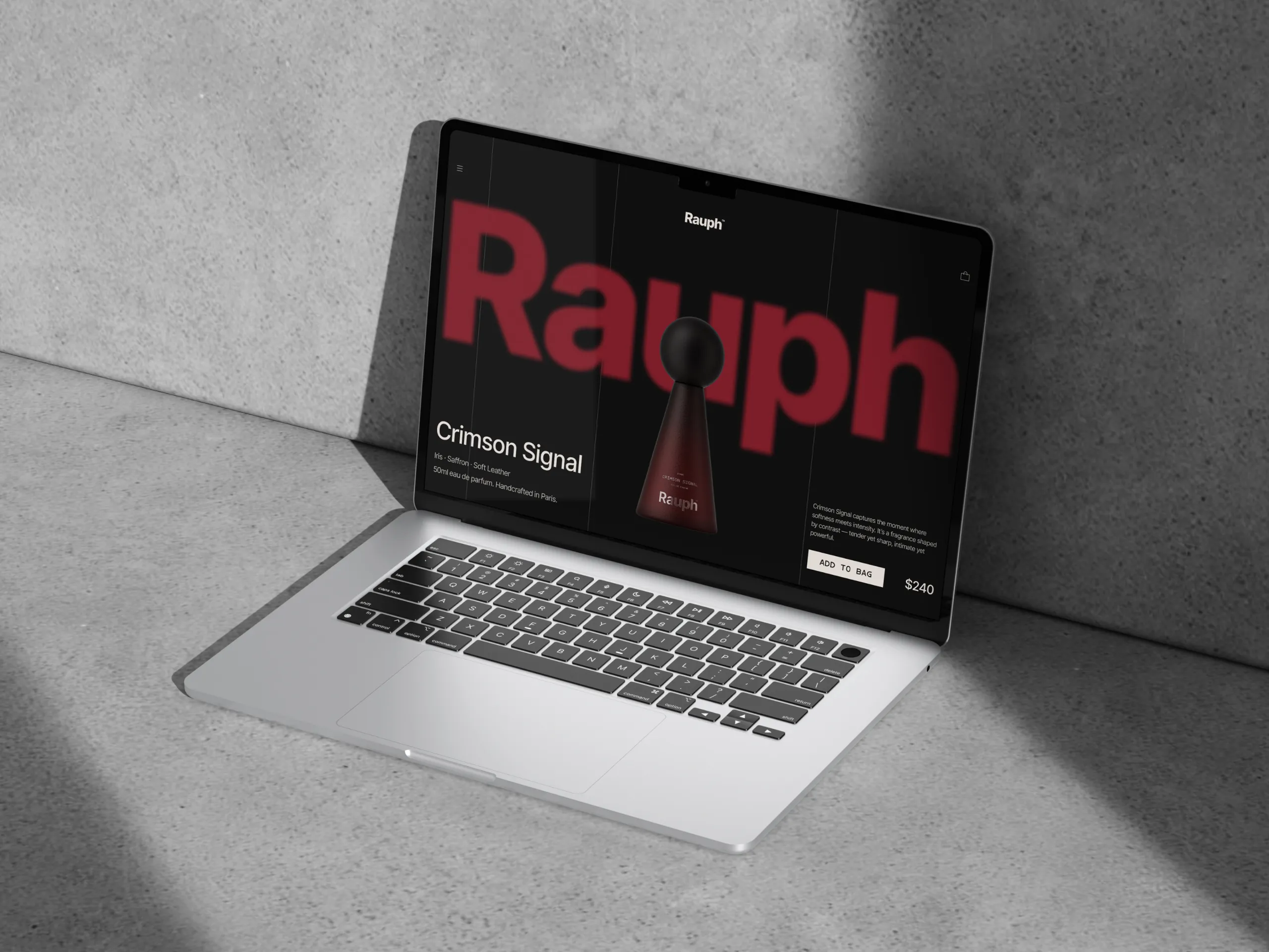
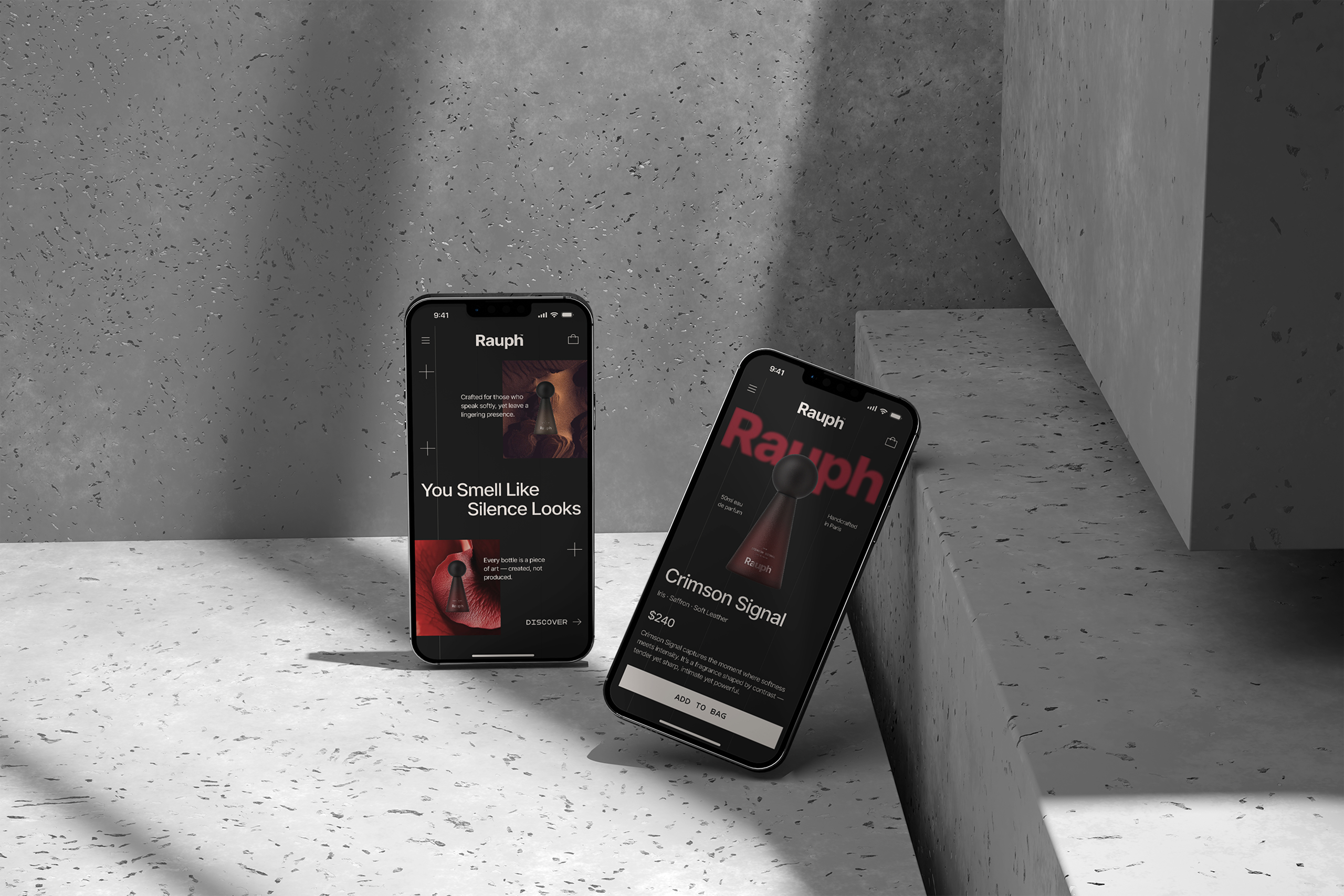
The website rejects fast consumption and instead embraces a slow, editorial rhythm with generous negative space, quiet typography, and restrained motion, guiding the user not through pages, but through rituals. Each section frames the fragrances as sculptural objects surrounded by texture, narrative, and atmosphere, from the twelve-year iris maturation story to the tactile vocabulary of the bottles themselves.
Packaging was designed as an emotional artifact: a hewn, almost ceremonial object where gradients, shadows, and precise grid lines create a sense of crafted stillness. The result is a perfume house that stands apart not by volume but by presence, a brand that speaks softly, lingers deeply, and turns silence into a form of luxury.
Fragrance branding has no product to show, which is why Rauph treats silence as material. MarkaWorks built the system to carry depth without noise: blurred silhouettes, tactile gradients, and drafting inspired micro grids give the brand a structure borrowed from architecture rather than from cosmetics. The logomark and keyhole motif work as architectural elements inside that structure. We built every surface, from packaging to the digital experience, to the same rule, so the restraint reads as intent rather than as absence.
See more web and digital design and cosmetics, skincare and home fragrance branding case studies.

Let’s make the work they’ll copy.
Talk to an expert now
Work with a 38 team of the
industry’s top 1% talent.



