Updated October 2026
Cosmetics, skincare and home fragrance branding: 15 case studies
Listed on this page are 15 MarkaWorks case studies: 7 in skincare and beauty, 3 in fragrance and 5 in candles and home fragrance, each showing the finished work. In this category the pack is read on a shelf and on a phone screen at once, and a buyer who liked one product finds it again by color, because the range shares one layout and only the color changes.
Restraint as the premium signal
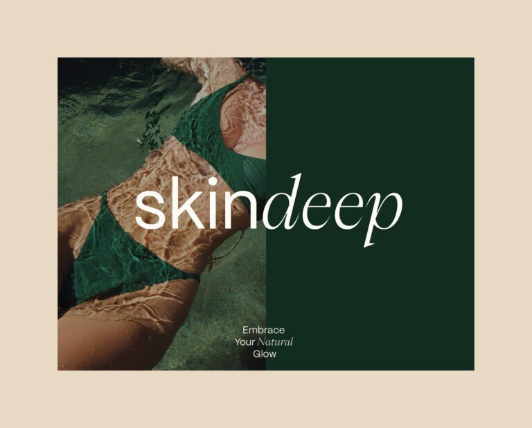
Cosmetics and skincare branding is the identity and packaging system that lets a range of similar bottles and tubes be told apart at arm’s length and recognized again on a phone screen. In natural skincare the shelf is crowded with botanical illustration and green on white, so on Skindeep the differentiator was sobriety. A refined serif sets “deep” and a clean sans sets “skin”. The palette is deep green with beige, and the low contrast between them is what makes the pack feel considered next to brighter neighbors. Freya was built on two words written down before any visual work, simplicity and trust, with a rounded logotype, soft pastels and warm neutrals, and labeling kept minimal so the hierarchy carries the weight. Roys Natural Skincare runs on one idea: let color do the identifying and keep everything else still. The top half of every pack is soft gray with only the logotype, the bottom half carries the product’s own pastel with the product name, the weight and the phrase “Organic ingredient.”, and only the color and the name change from product to product.
Color as the navigation system
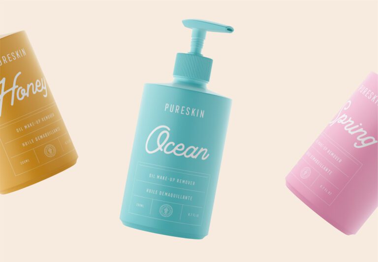
Pureskin assigns each pastel tone to a product and its association, selected against printed proofs because pastels on recycled stock carry less pigment and shift with the material. Glowie goes the other way: modern minimalism merged with neon color, geometric shapes and saturated color that separate the products on a shelf of white, cream and pale green, and survive being reduced to a thumbnail. The candle brands use the same logic for scent, which cannot be sensed through the pack. Odeur Botanical Candles gives each scent a color, earthy neutrals, deep blues, warm ambers and muted terracotta, so a returning buyer finds a scent by color. Atolye Candle keeps variant cues in color and form to keep the range navigable.
Fragrance and objects with nothing to show
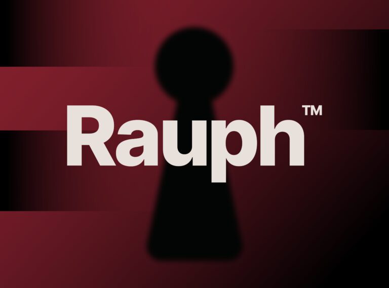
Fragrance branding has no product to show, which is why Rauph treats silence as material: blurred silhouettes, tactile gradients and drafting inspired micro grids give the brand a structure borrowed from architecture. Amos Fragrances was built as one system from concept to final packaging around sophisticated masculinity. HOLME was approached as an atmosphere rather than a product line, with proportion, materiality and negative space resolved together so the system holds across objects, digital touchpoints and communication; its website gives each product its own visual space and keeps the navigation deliberately slow.
Cases by product type
| Product type | Cases on this page | Examples |
|---|---|---|
| Skincare and beauty | 7 | Freya, Glowie, Pureskin, Roys Natural Skincare, Skindeep, Noir Argan Oil, ROOT |
| Fragrance | 3 | Amos Fragrances, Rauph, Rauph UI |
| Candles and home fragrance | 5 | Atolye Candle, Oda Candles, Odeur Botanical Candles, HOLME, Holme UI |
The cases on this page
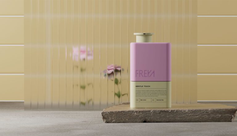
Freya: simplicity and trust as the foundation, rounded logotype, soft pastels with warm neutrals, minimal labeling with explicit hierarchy.
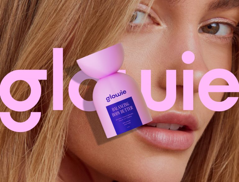
Glowie: minimalism with neon color, geometric packaging that holds its edges at thumbnail size, a Shopify store built with 3D product models.
Pureskin Natural Skincare: two logotype versions, a secondary mark for the natural composition, pastels chosen against proofs on recycled stock.
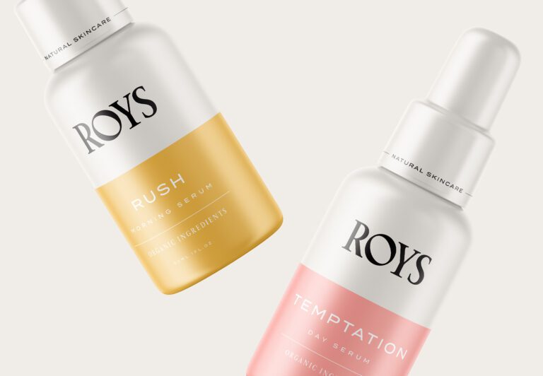
Roys Natural Skincare: serif logotype, a neutral range and a pastel per product, one shared layout across the range.
Skindeep: a split wordmark in serif and sans, deep green with beige, natural materials and soft lighting in the imagery.
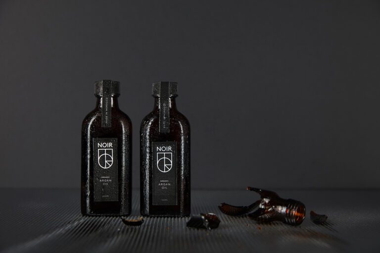
Noir Argan Oil: the name did the directing, a bold sans serif logotype in capitals and a monogram from the same letters.
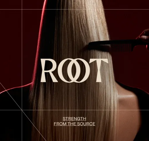
ROOT: a hair care identity with a custom serif wordmark, an interlocking circular symbol and sculptural packaging.
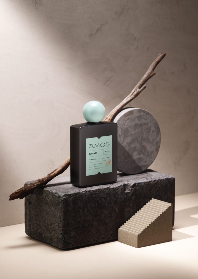
Amos Fragrances: visual identity, logo, art direction and label and packaging design as one system.
Rauph: restraint, balance and intentional simplicity across packaging, stationery and brand materials.
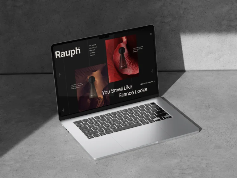
Rauph UI: the same system carried into the digital experience, with the logomark and keyhole motif as architectural elements.
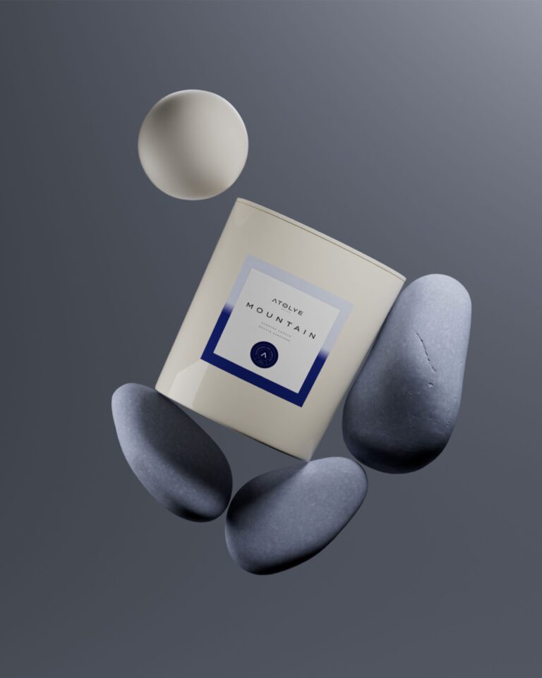
Atolye Candle: a restrained palette that keeps the scent profile central, variant cues in color and form.
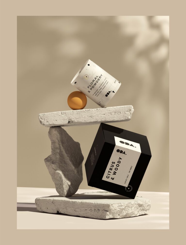
Oda Candles: label layouts that put scent and key details first, material and finishing matched to a premium candle shelf.
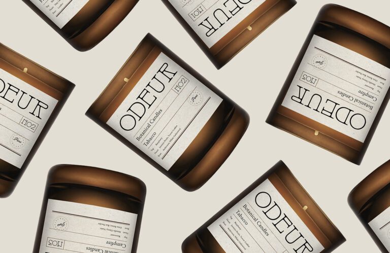
Odeur Botanical Candles: an editorial typographic system, a color per scent, amber glass vessels.
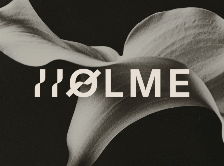
HOLME: an atmosphere rather than a product line, built by reduction, with light, space and form doing the identifying.
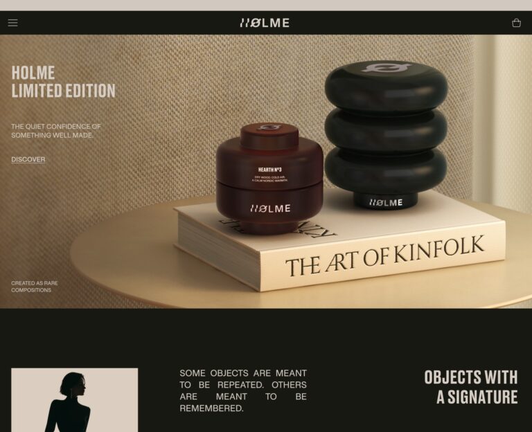
Holme UI: each product given its own visual space, deliberately slow navigation, soft contrasts.


Questions cosmetics and skincare brands ask us
We do. Our cosmetics and skincare branding runs from Freya's calm skincare identity, soft pastels with warm neutrals, and Skindeep's grounded serif and sans pairing to Pureskin's natural skincare identity, Roys' pastel led system and Glowie's neon leaning world for a younger audience. Five brands in the category, five different problems.
For a premium skincare brand, restraint usually reads richer than decoration. In Skindeep's branding we paired a refined serif with a clean sans and held the palette to deep green and beige, so the presence comes from typography and material rather than ornament. That is the studio judgment to look for.
For a skincare packaging redesign, hire an agency that treats the range as one system. On Freya, minimal labeling, a clear hierarchy and soft color variations keep the product family cohesive while each item stays distinct; on Skindeep, deep green and beige sit at low contrast, so the line reads as considered next to brighter neighbors.
We design cosmetics logotypes as systems rather than single marks. Freya's logotype carries harmony and flow through rounded forms and controlled geometry; Skindeep splits its name across a serif and a sans, and that split is a production decision as much as a stylistic one: two weights in one wordmark stay separable at small sizes and in single-color printing.
Cosmetics packaging usually looks expensive through subtraction. On Skindeep the deep green and beige scheme and the serif and sans pairing carry the pack alone, with no ornament competing. Space, one confident typographic decision, and a palette that stays put do more than detail does.
Oral care branding and packaging sits close to the skincare work we already do: a shared layout, one variable that separates products, and clear information on a small surface. We have no published oral care case yet, so this is our approach rather than a portfolio claim.