
Pureskin Natural Skincare
vibrant natural french beauty
Pureskin is a French natural skincare brand that champions simplicity and vibrancy in every product. Their commitment to environmental responsibility is reflected in their eco-conscious packaging, designed to embody the essence of pure, natural beauty.
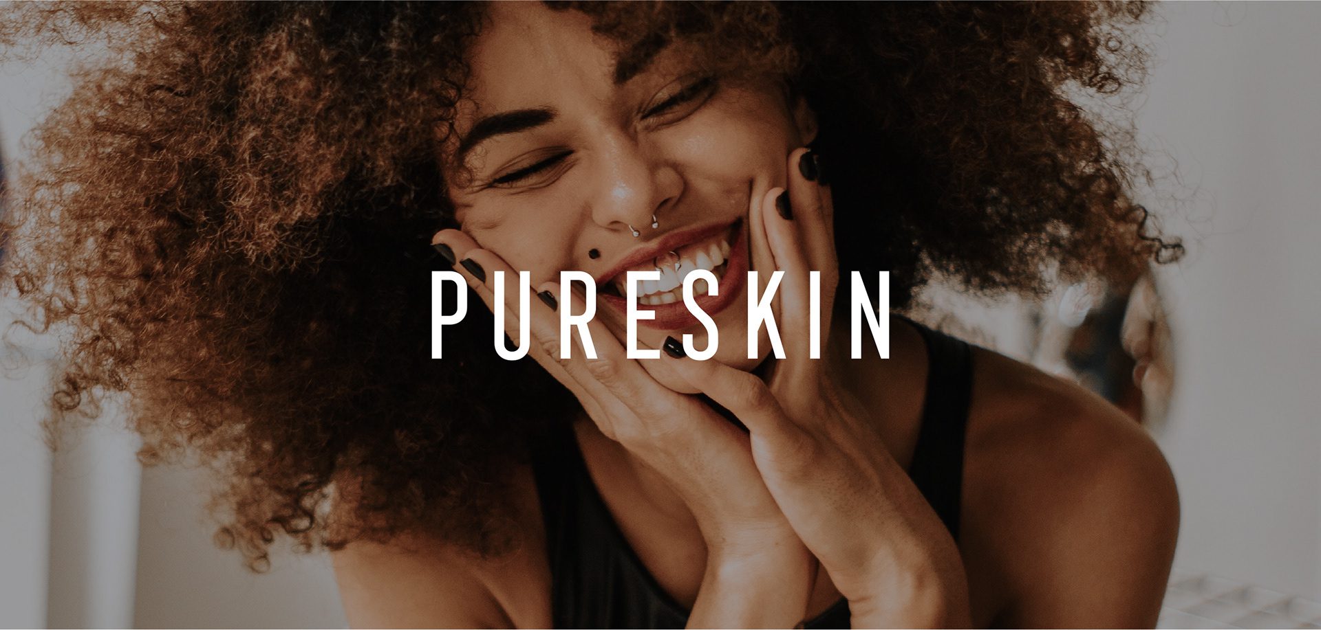
The Pureskin Brand Development Journey
Pureskin is a French natural skincare brand built on two ideas that usually cancel each other out: simplicity and vibrancy. The brand also makes an environmental commitment and keeps it in the material, producing its packaging from recycled stock.
See more cosmetics, skincare and home fragrance branding case studies.
The Pureskin Vision: Simplicity and Vibrancy
That last decision set a real constraint on the design. Recycled substrates take ink differently from bleached stock, and colours that look correct on screen shift on a rougher, warmer surface. A palette for this kind of pack has to be chosen with the material in mind rather than corrected afterwards.
Keywords: Vibrant, Minimal, Bold
At MarkaWorks we developed two Pureskin logotype versions. One is bold and classic, the other soft and fluid. Having both lets the brand carry the same name in registers a single drawing cannot cover, from a firm statement on an outer carton to a lighter treatment on a small product face. We added a secondary mark to signal the natural composition and to work on surfaces where the logotype does not fit.
The Solution: Logotype and Secondary Mark
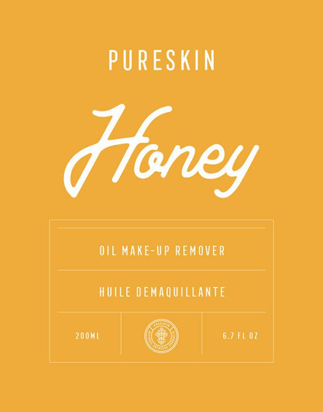
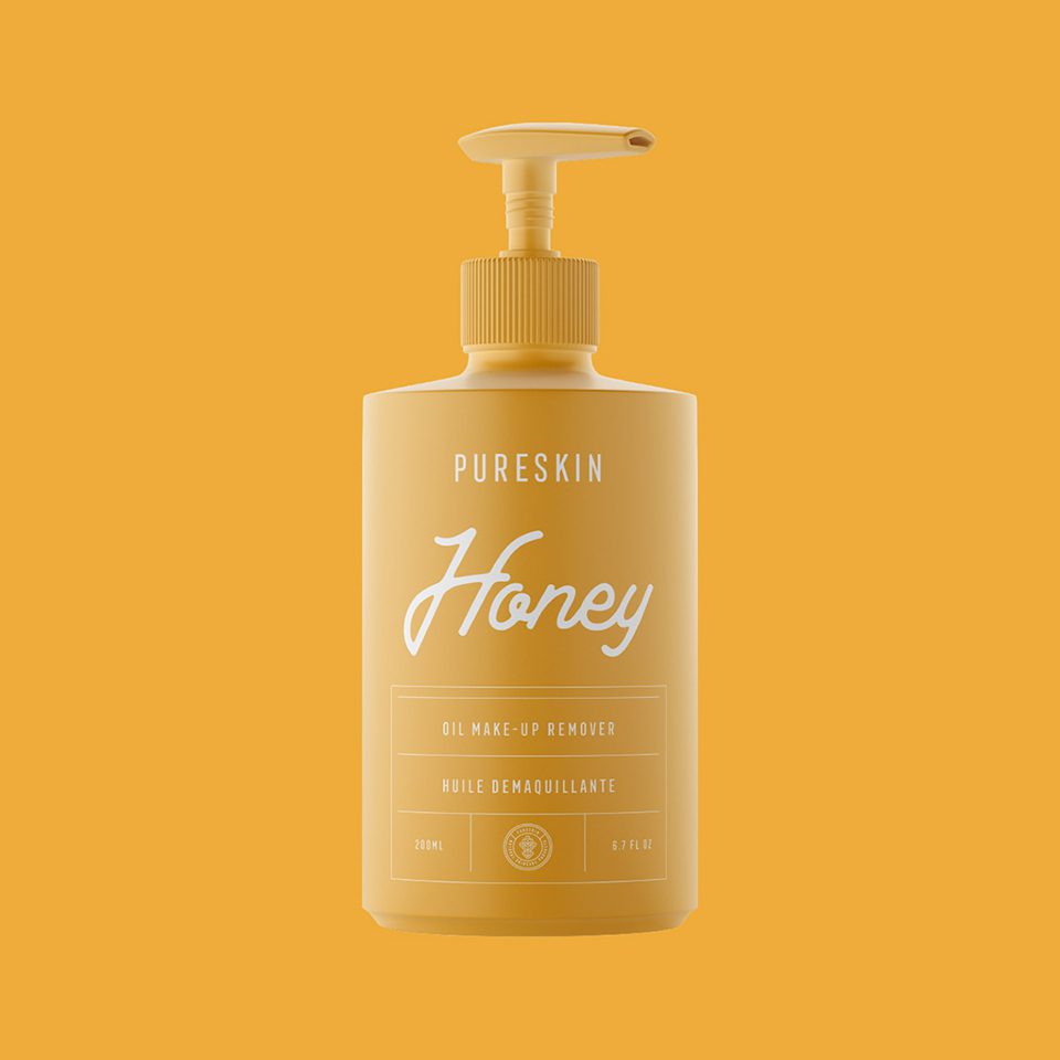
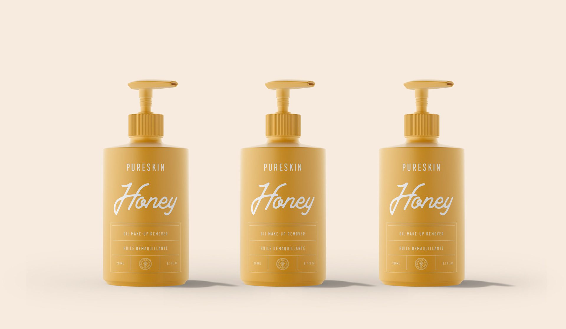
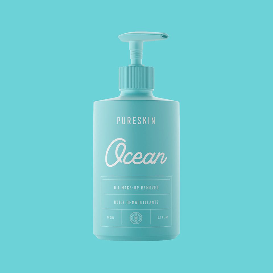
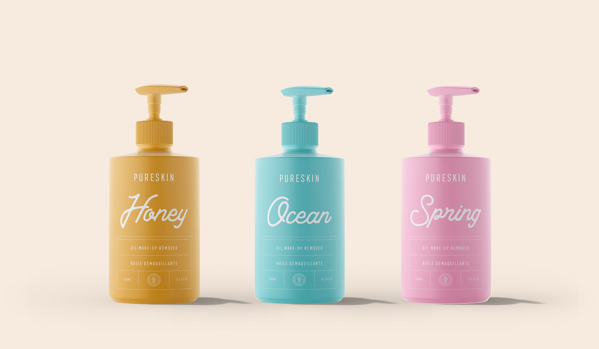
The palette is built on soft pastels, with each tone assigned to a product and its association. Pastels are the harder choice on recycled stock: they carry less pigment, so any shift in the substrate shows immediately, and we selected the tones against printed proofs rather than approving them on screen. A yellow pastel, for example, was tied to its matching product rather than distributed across the range. In skincare this assignment does the work a name cannot: the buyer who liked one product finds it again by colour, on a shelf where every bottle is a similar size and shape.
Colour Palette and Product Association
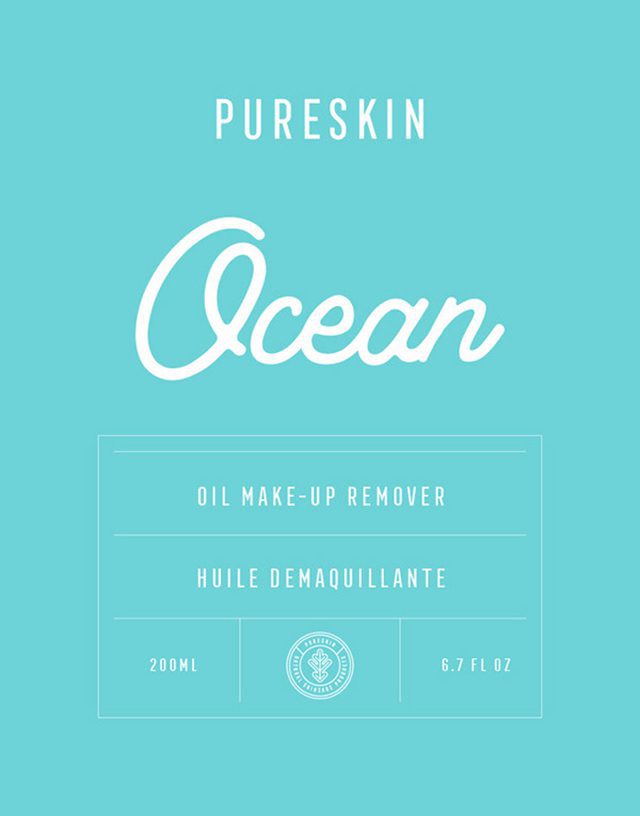
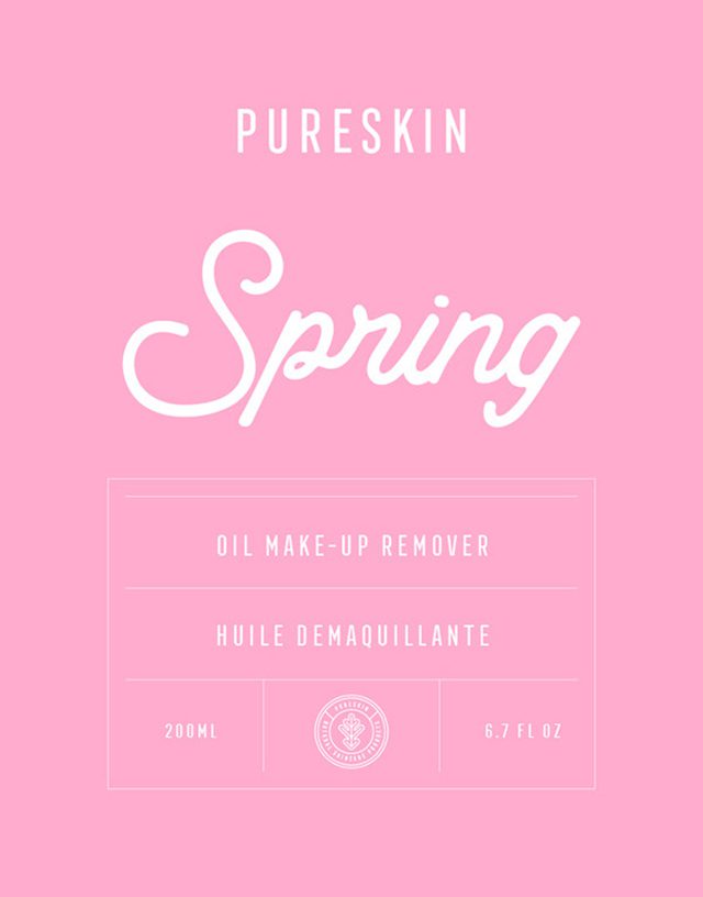
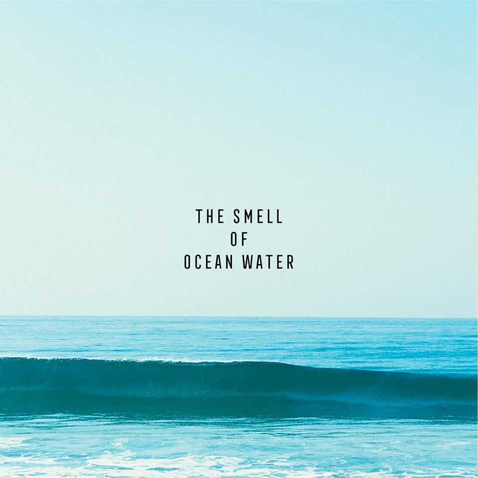
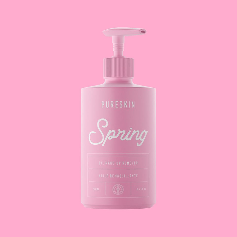
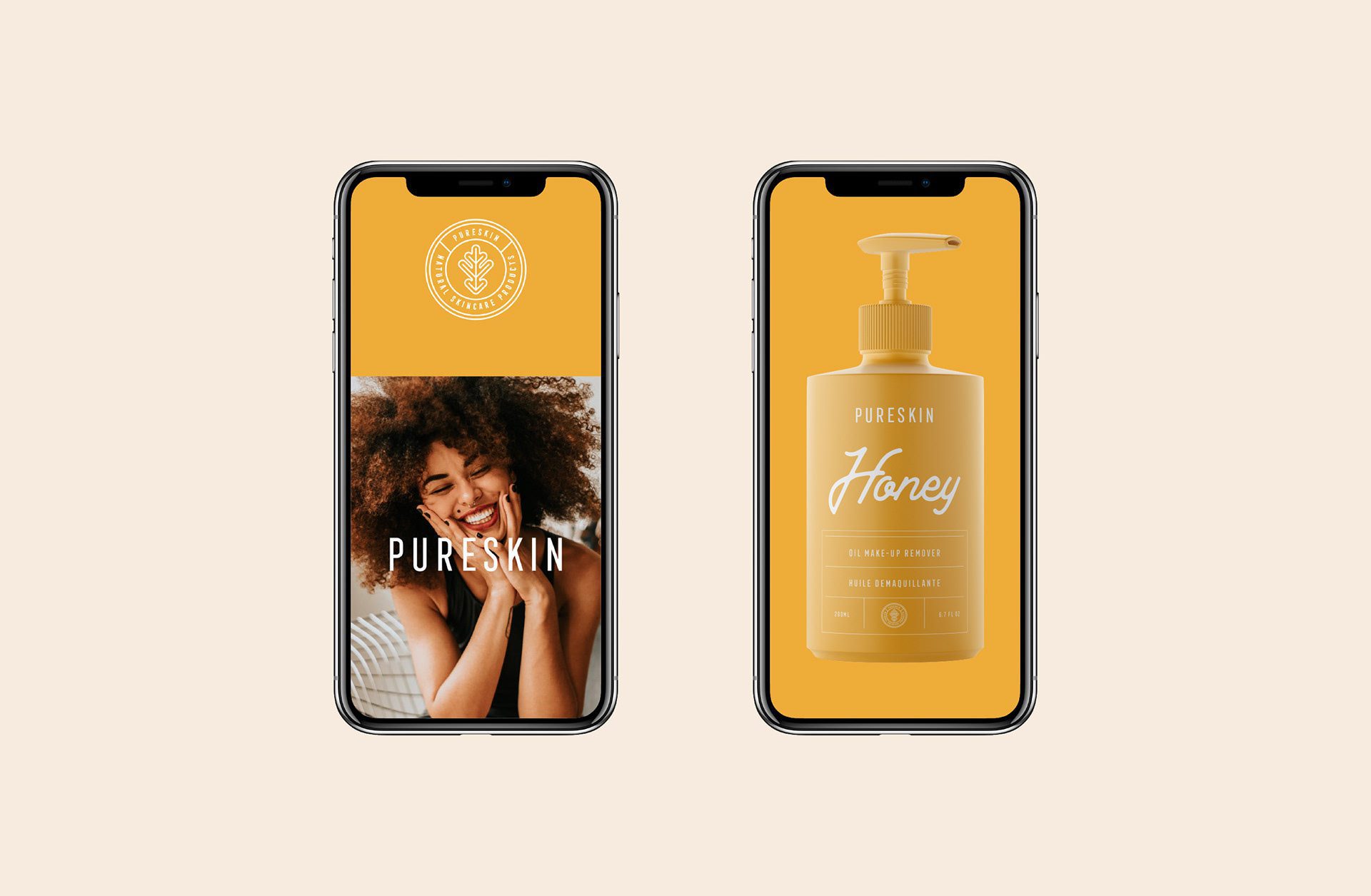
As for the colour palette, we have selected soft pastel colours and assigned them to each product and its association. For example, a yellow pastel colour was selected for the “Honey” oil make-up remover, a blue colour for the “Ocean” make-up remover, and pink was picked for the “Spring”. Each colour has an association with an aroma or psychological meaning.
Minimalist Packaging Design
The packaging designs we have created are simple and minimal. The background colour covers the whole bottle design, and for a more luxurious feel, we added a matte cover. As for the layout, we placed the sans serif logo at the top, and designed the name of the product in a big cursive font. The rest of the information is minimally placed on the table at the bottom of the bottle.
Box and Bag Design
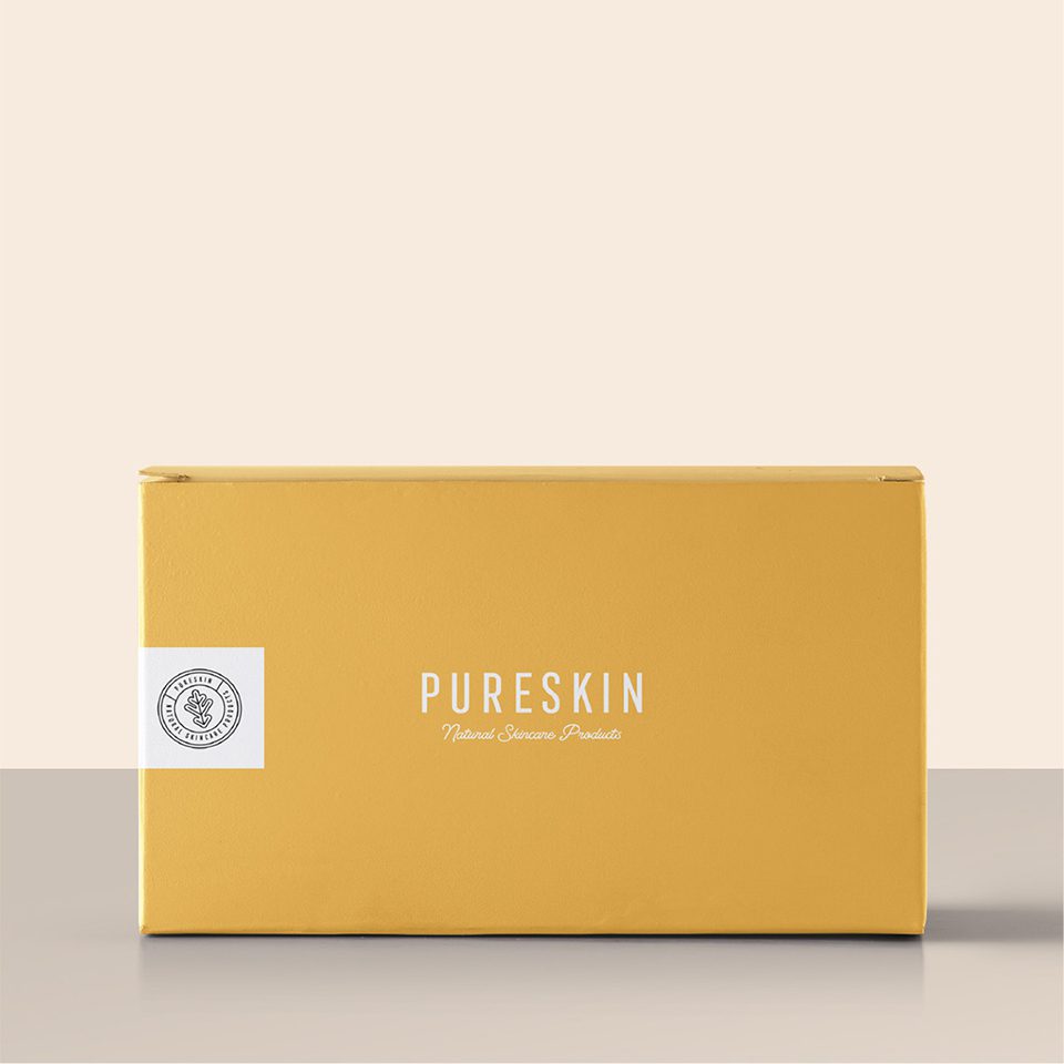
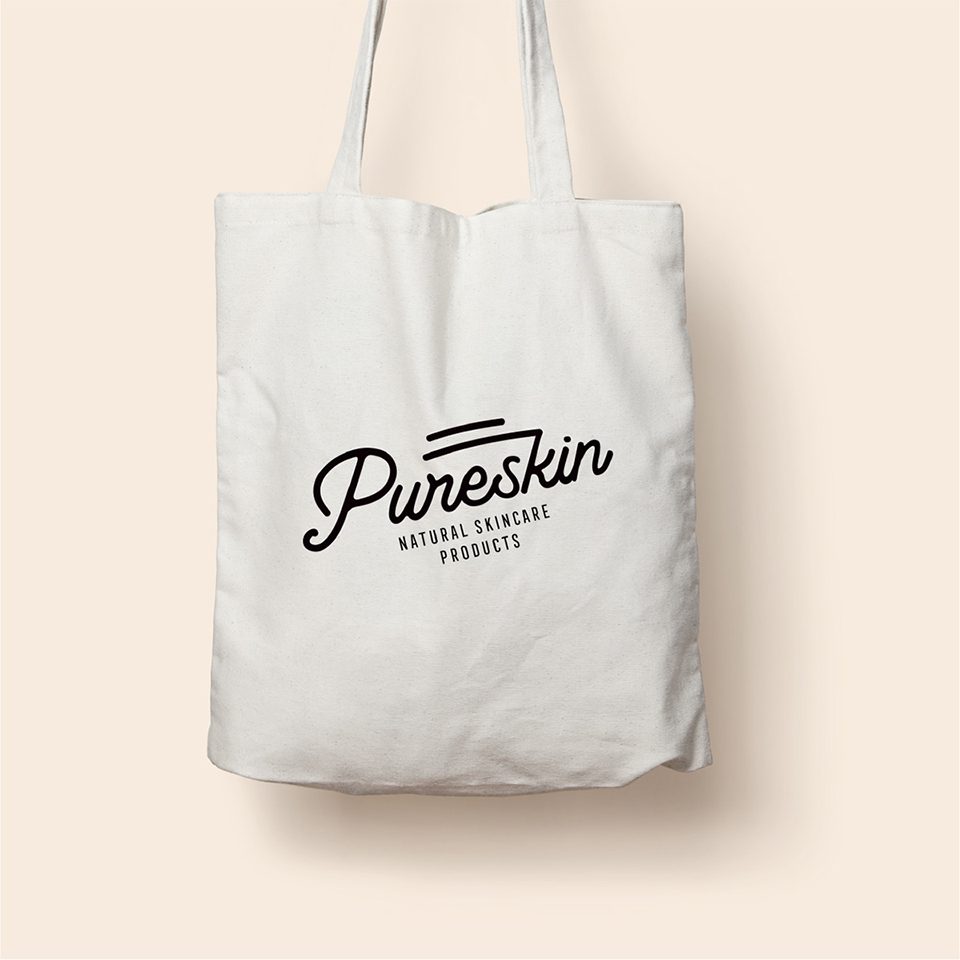
We have also designed the box, which is similar to the product design as well. For the bag design, we picked a script font and a clean white background.

Let’s make the work they’ll copy.
Talk to an expert now
Work with a 38 team of the
industry’s top 1% talent.



