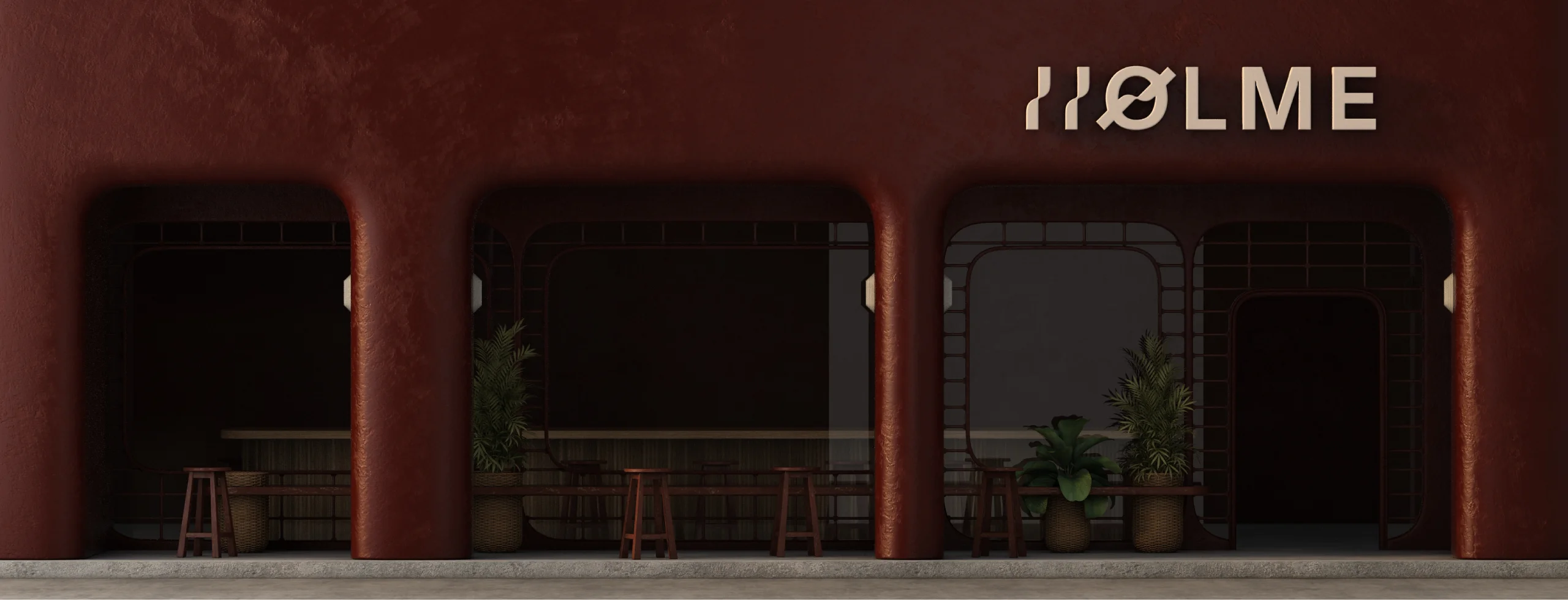
HOLME
Lifestyle brand identity and digital experience
HOLME is a lifestyle brand shaped through a design-led process focused on clarity, balance and restraint.
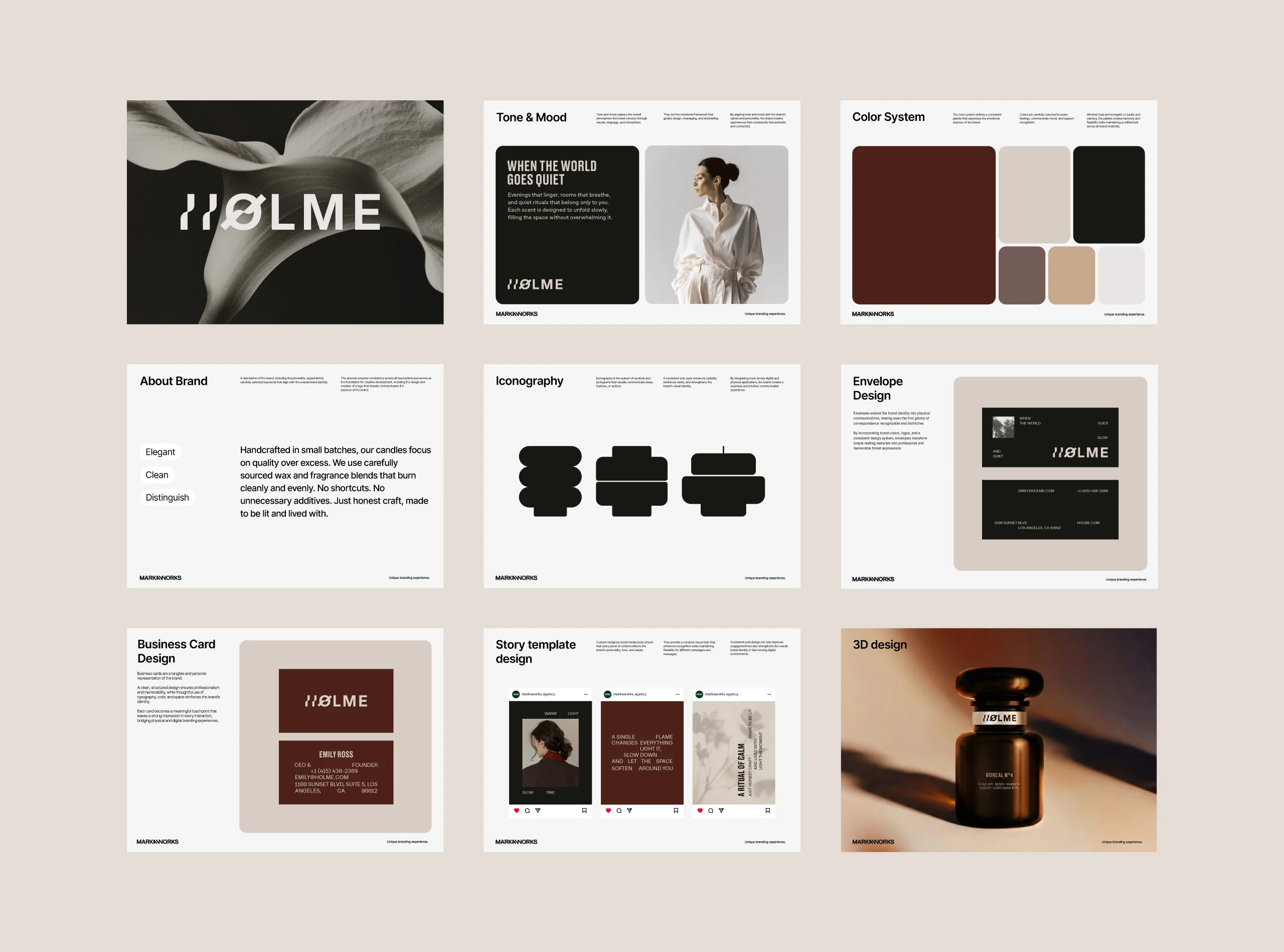
MarkaWorks approached HOLME as an atmosphere rather than a product line. That decision was made at the earliest concept stage and it set everything that followed, because a brand built as an atmosphere has to be consistent in places a product catalogue never has to think about.
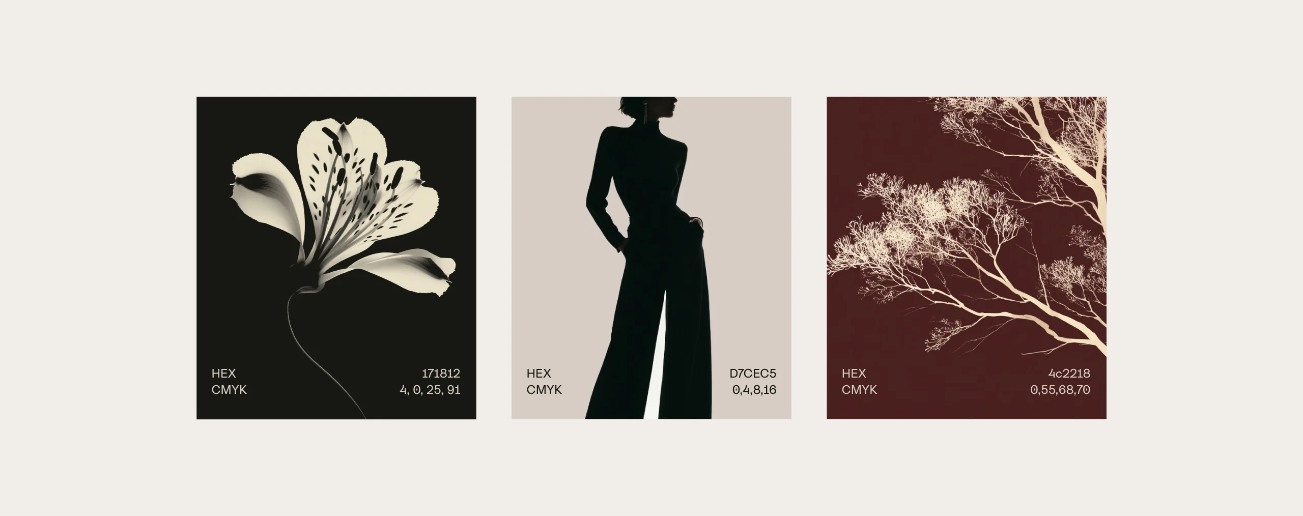
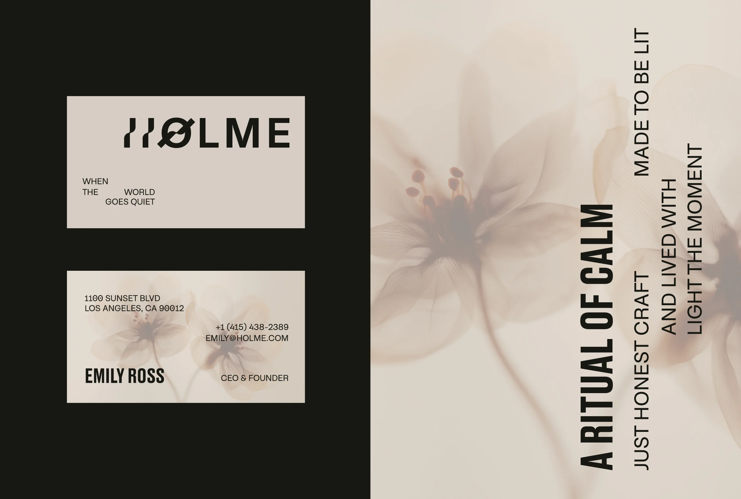
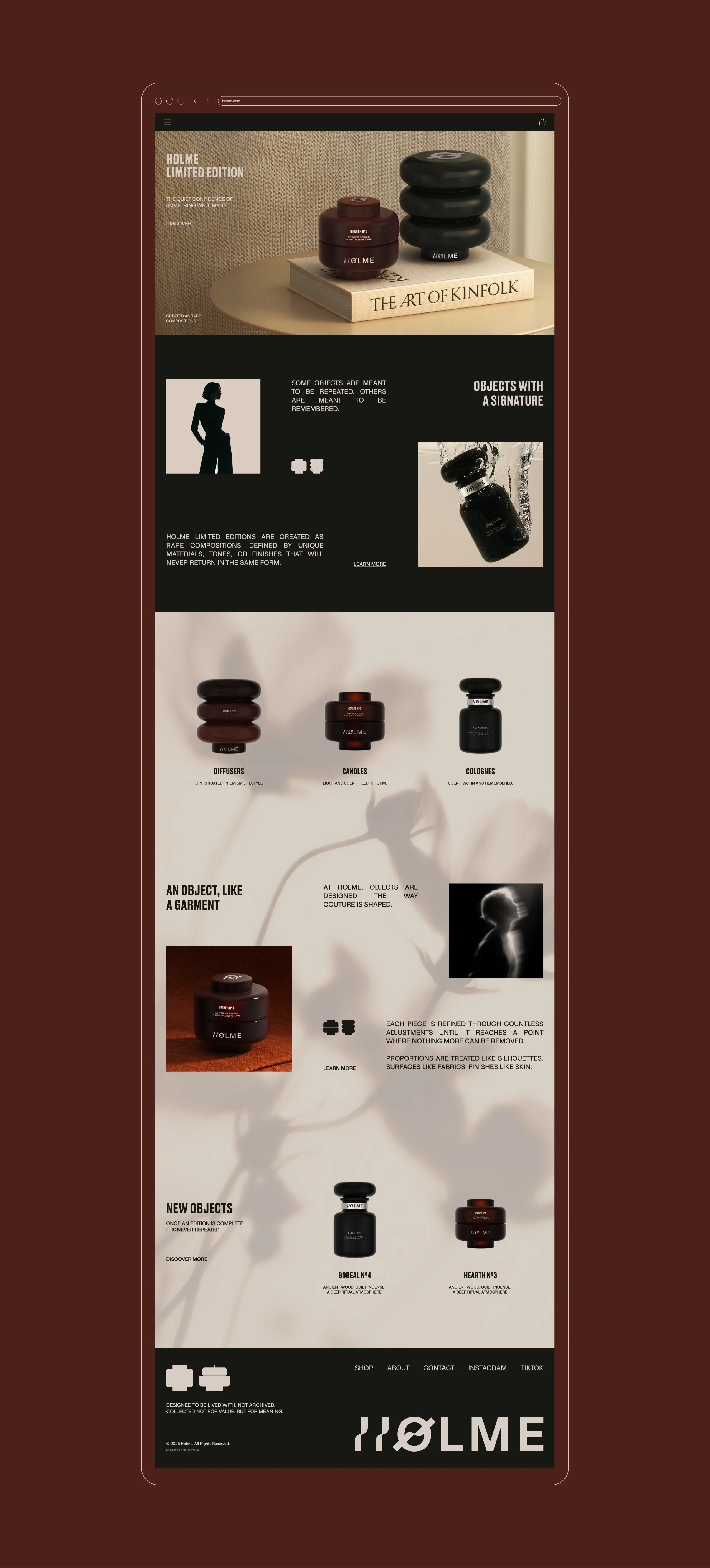
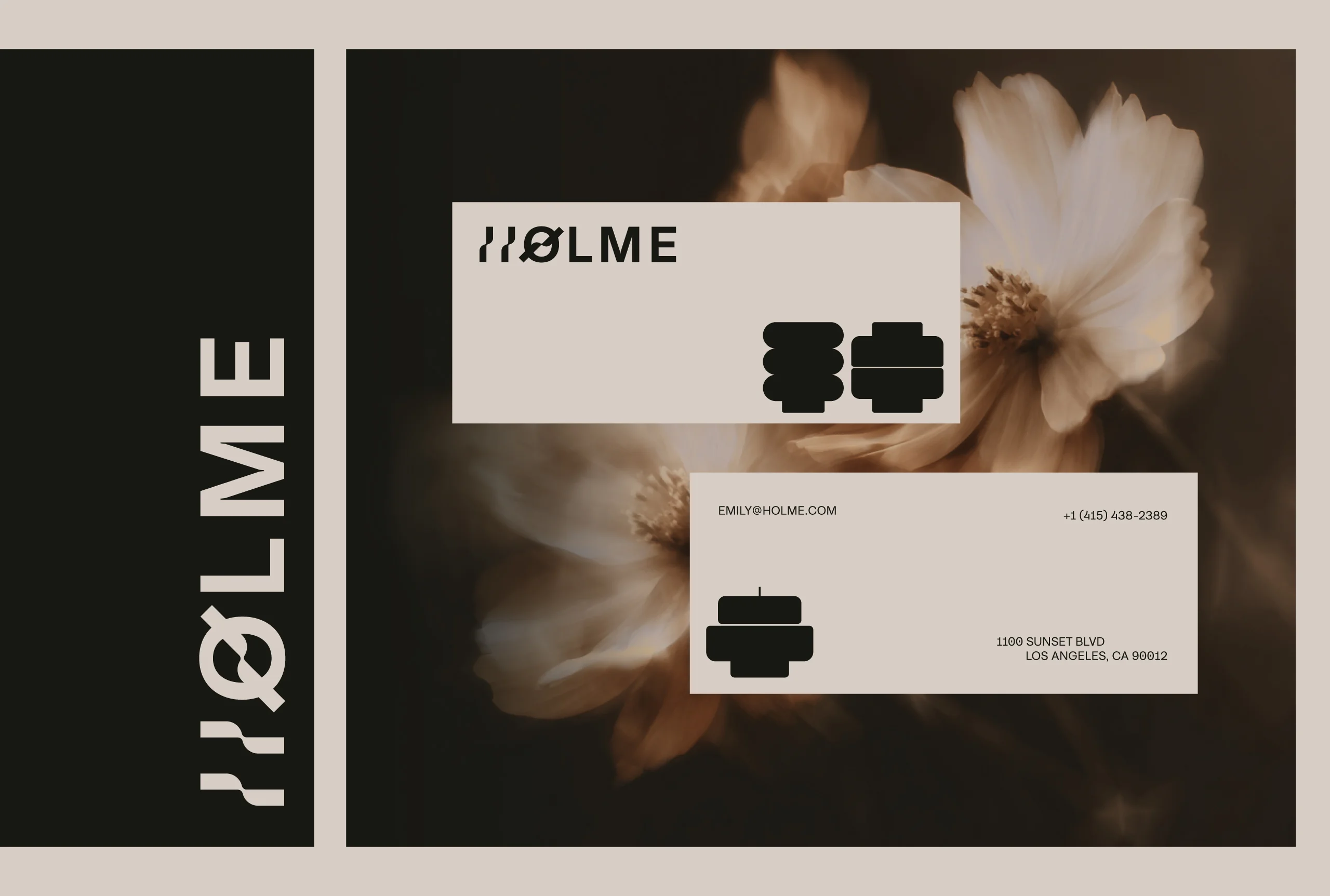
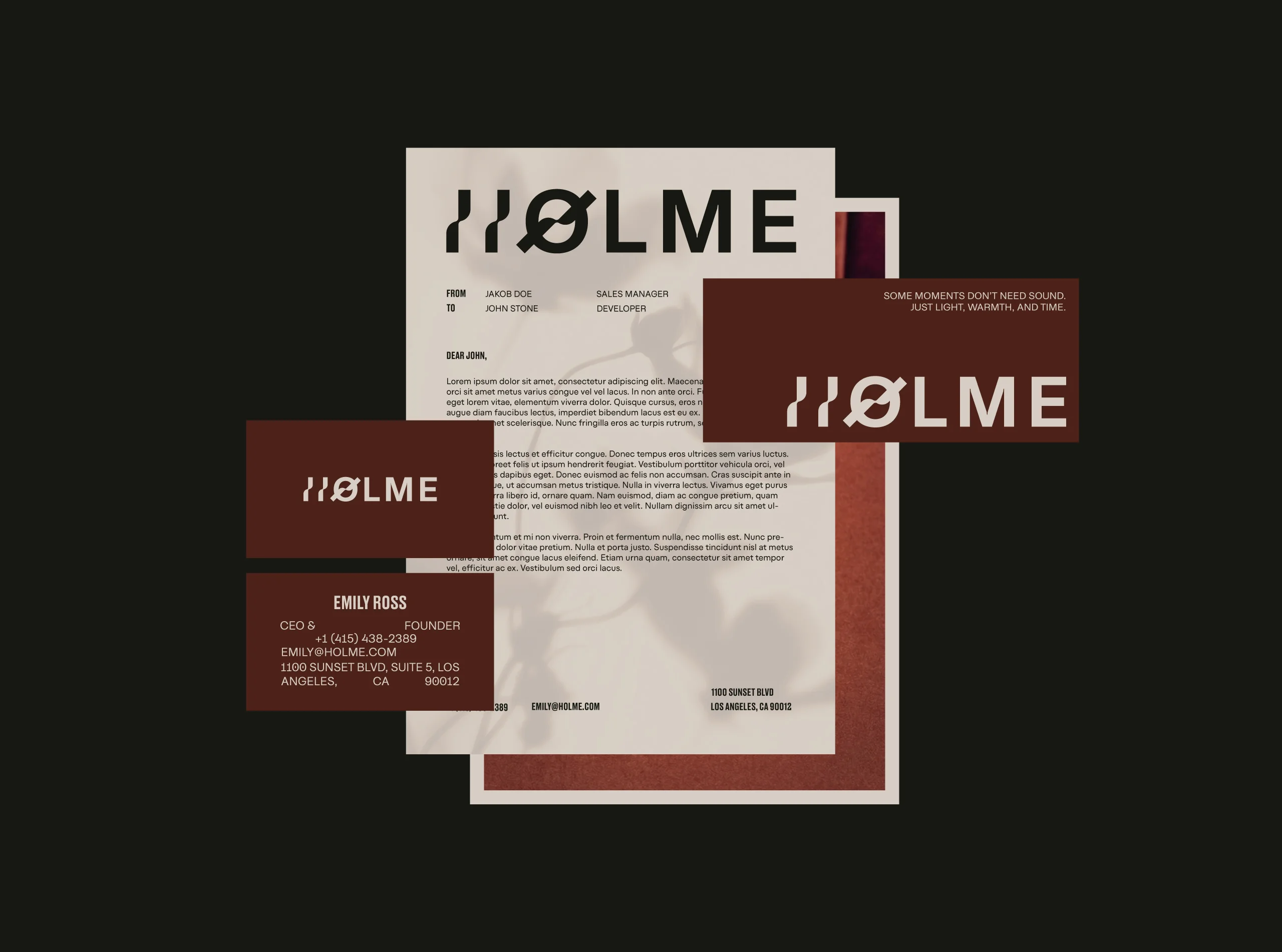
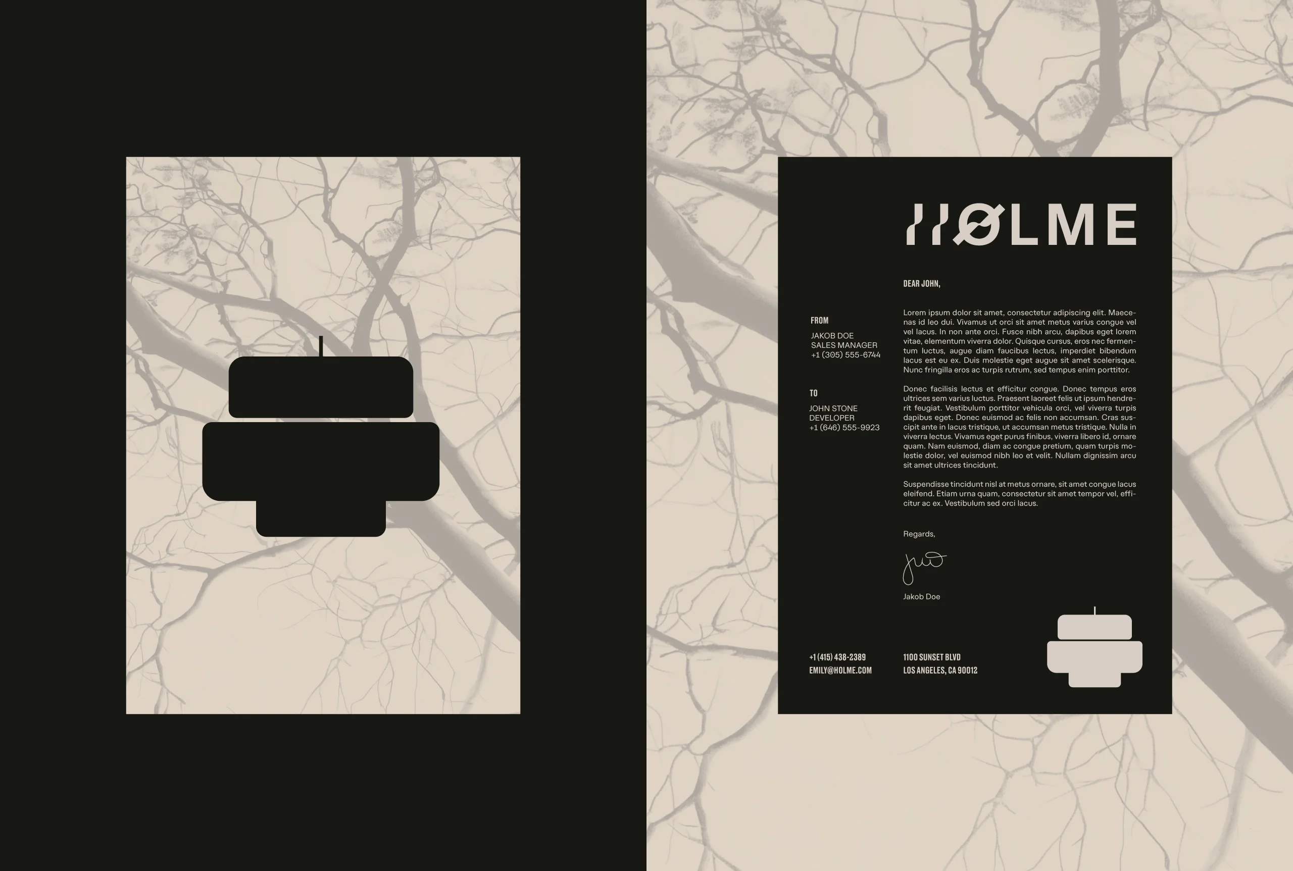
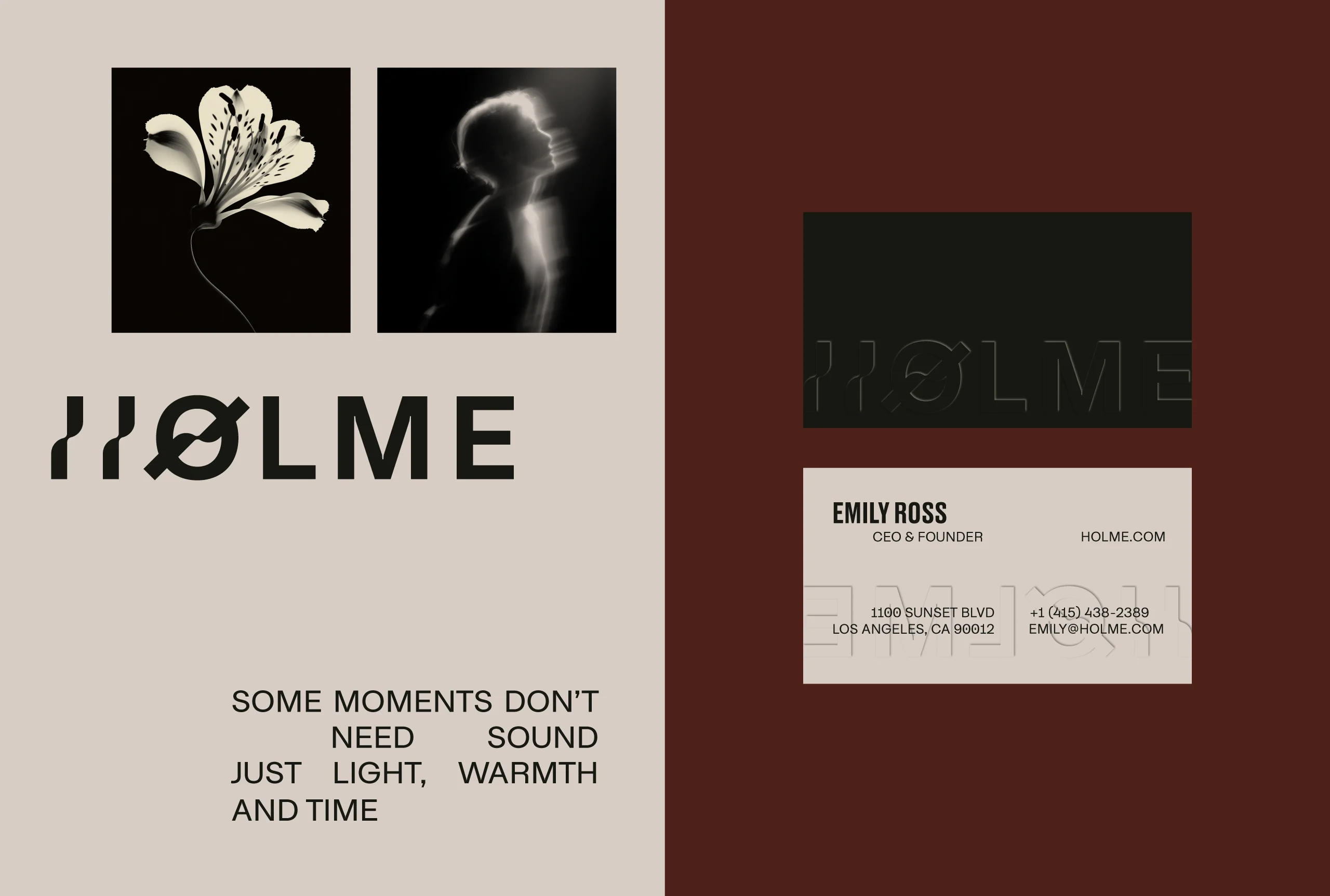
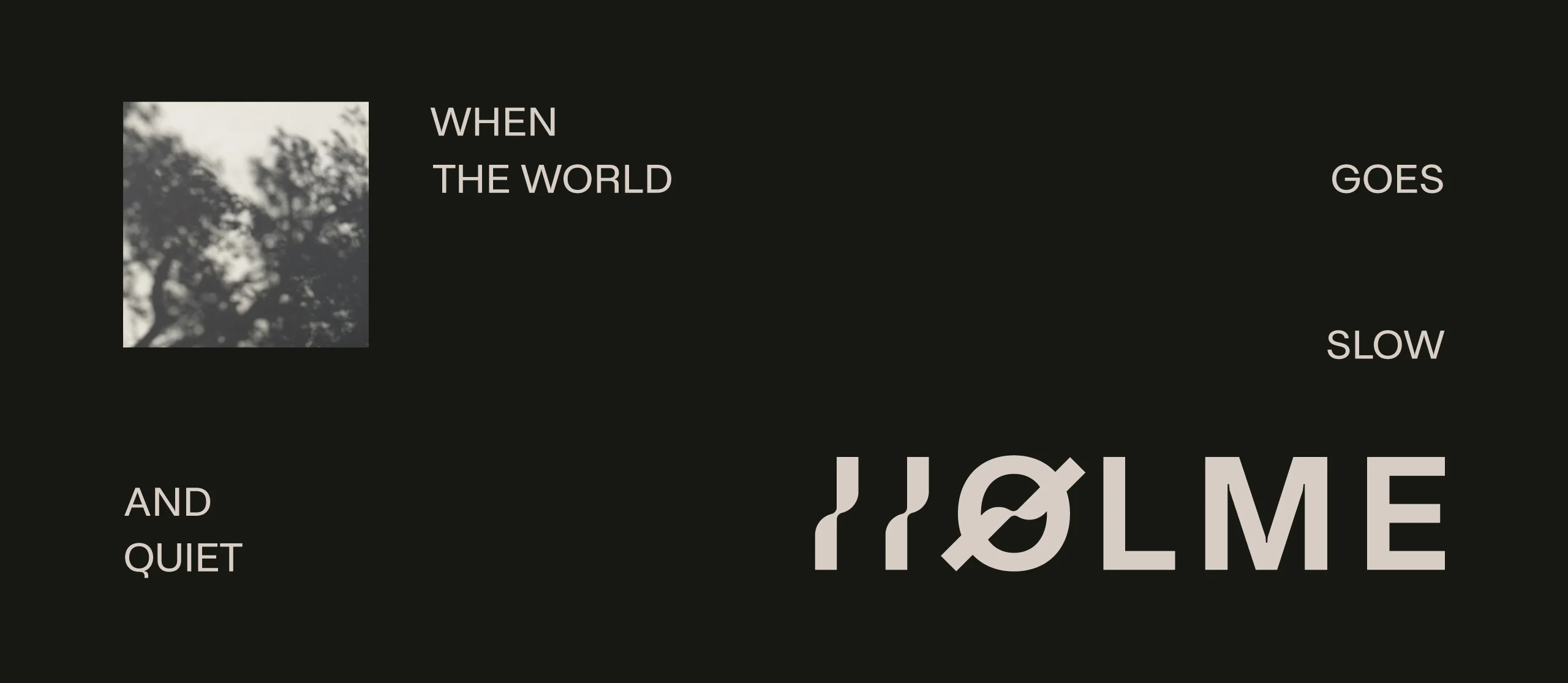
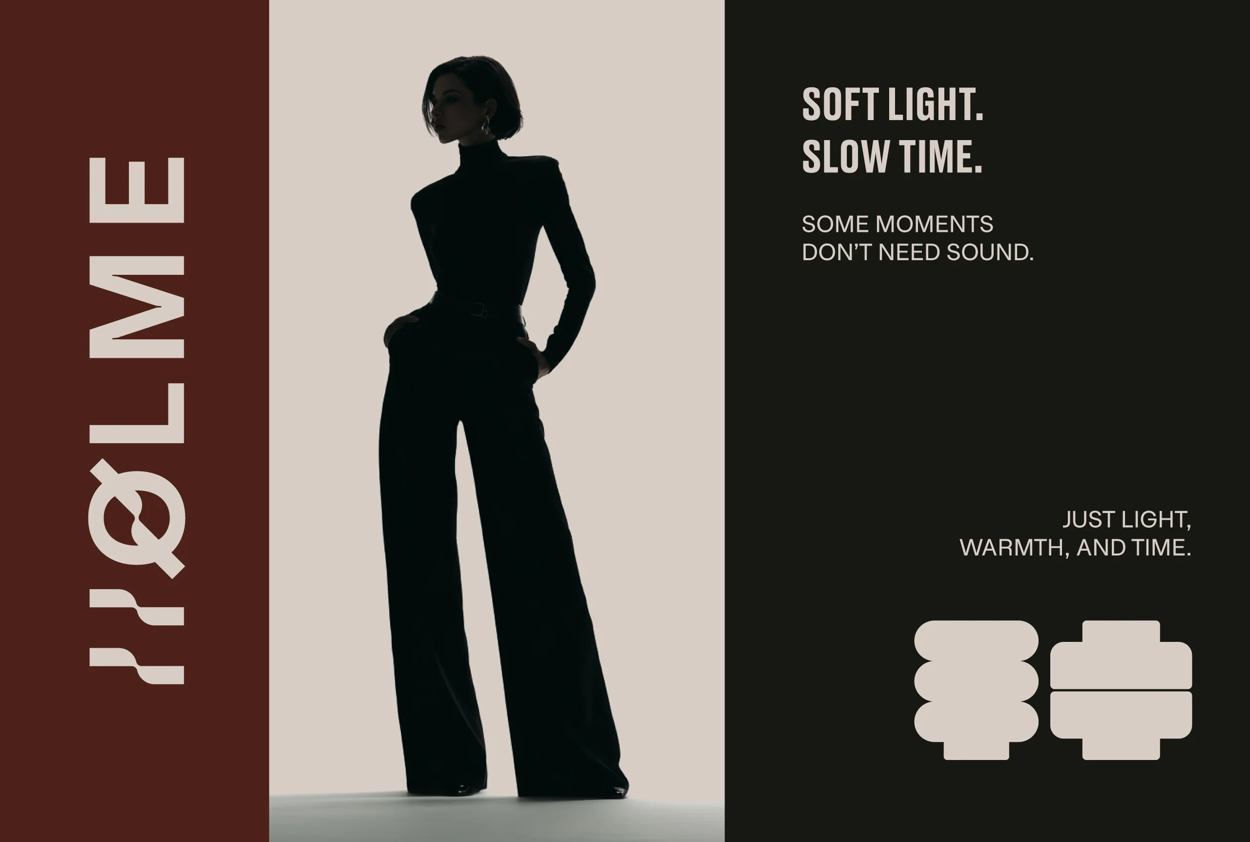
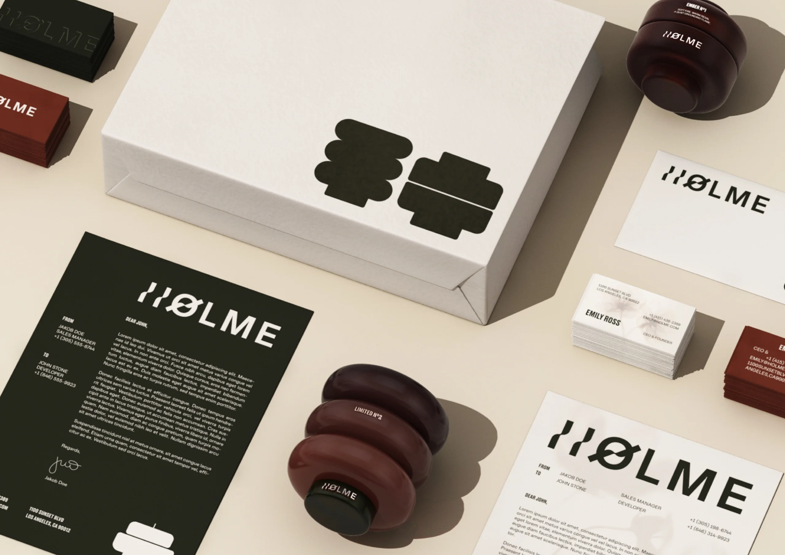
The visual language starts from proportion, materiality, and negative space. Color, typography, and form were developed in parallel rather than in sequence, which matters more than it sounds: when type is chosen after a palette is fixed, the two end up negotiating. Here they were resolved together, so the system holds across physical objects, digital touchpoints, and brand communication without any of the three feeling like an adaptation of the others.
The method was reduction. Each element was refined by removing anything that did not serve the core idea, and that is a harder discipline than addition because it requires knowing what the core idea actually is before you start cutting. What survives in a product brand identity built this way is only what earns its place.
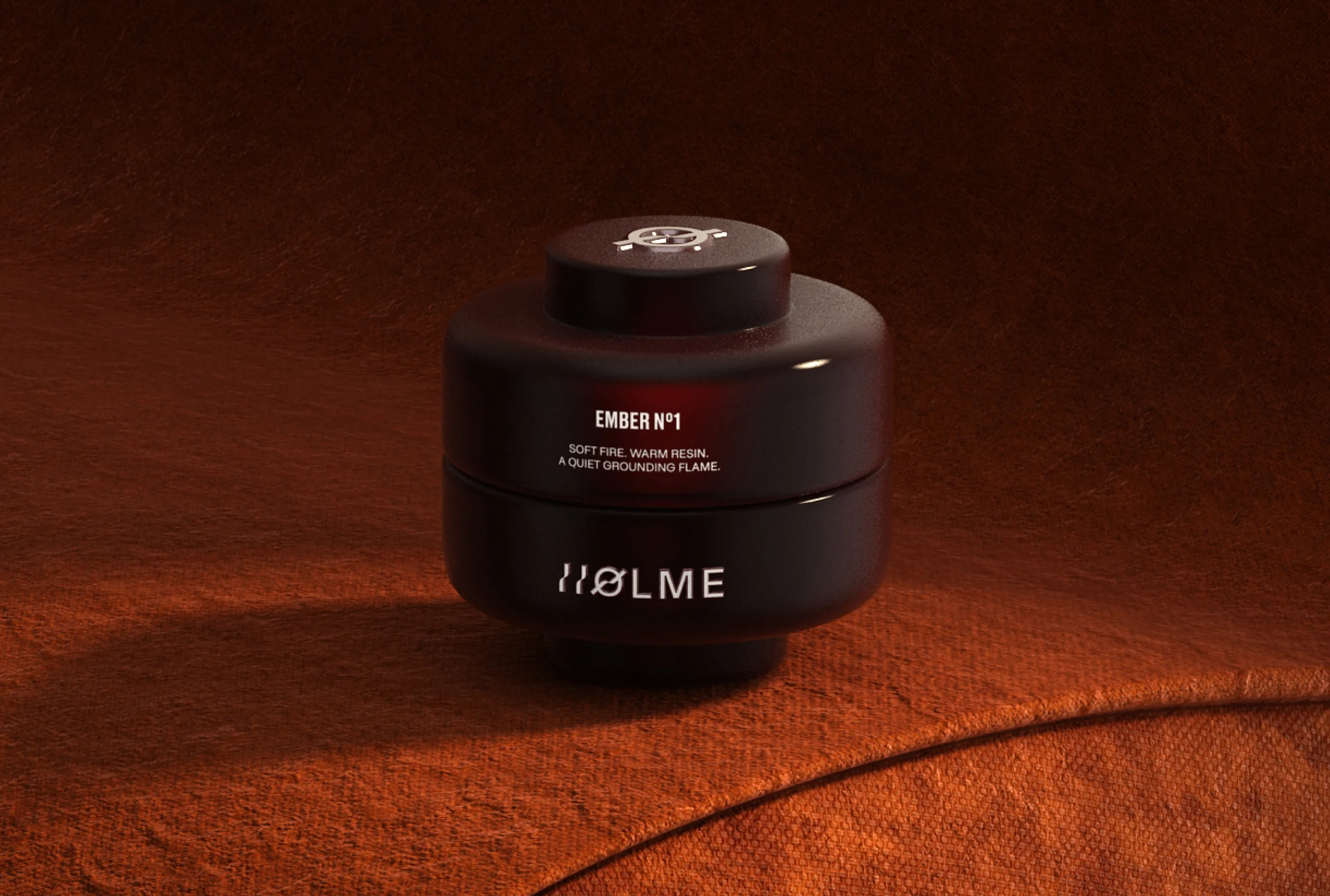
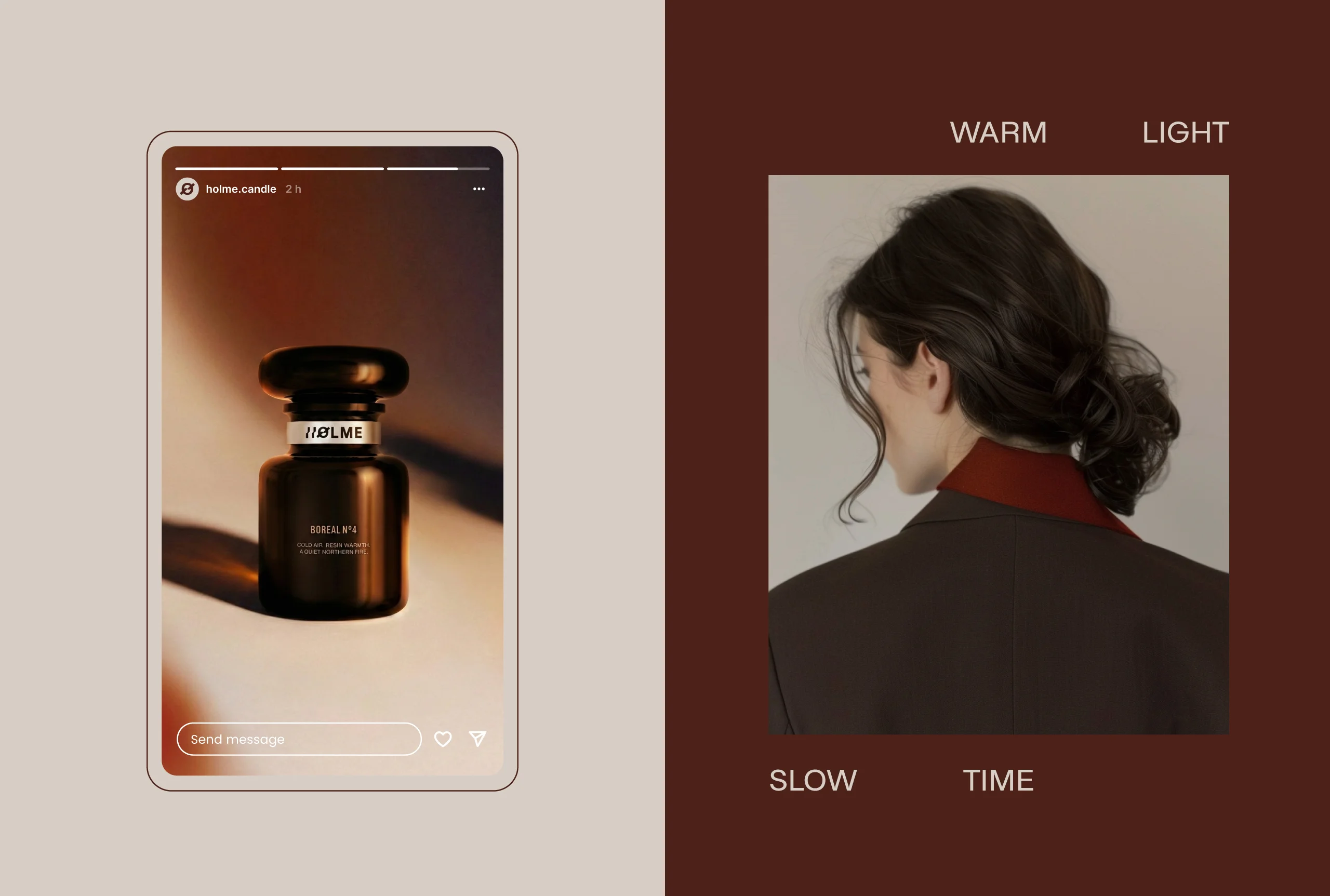
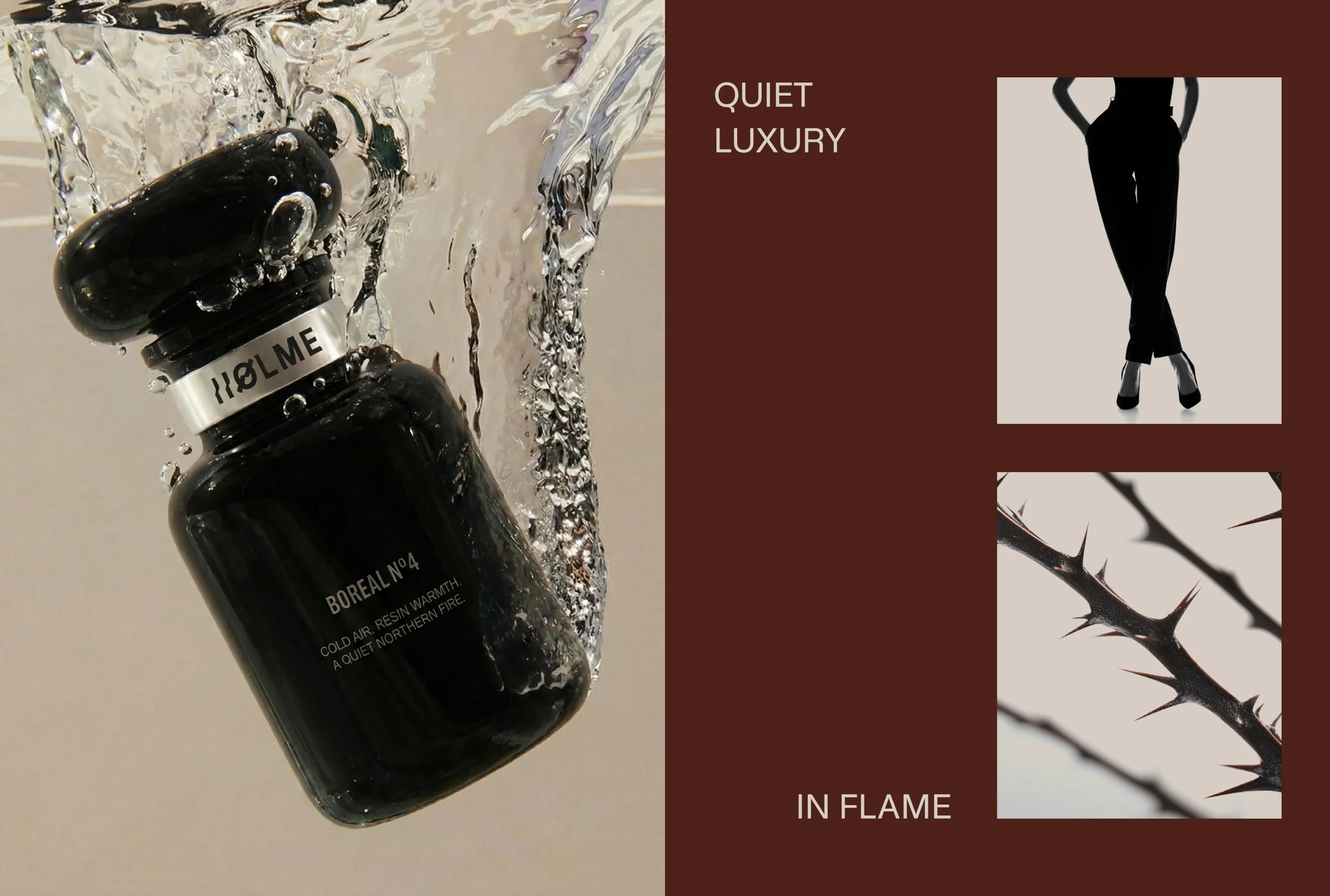
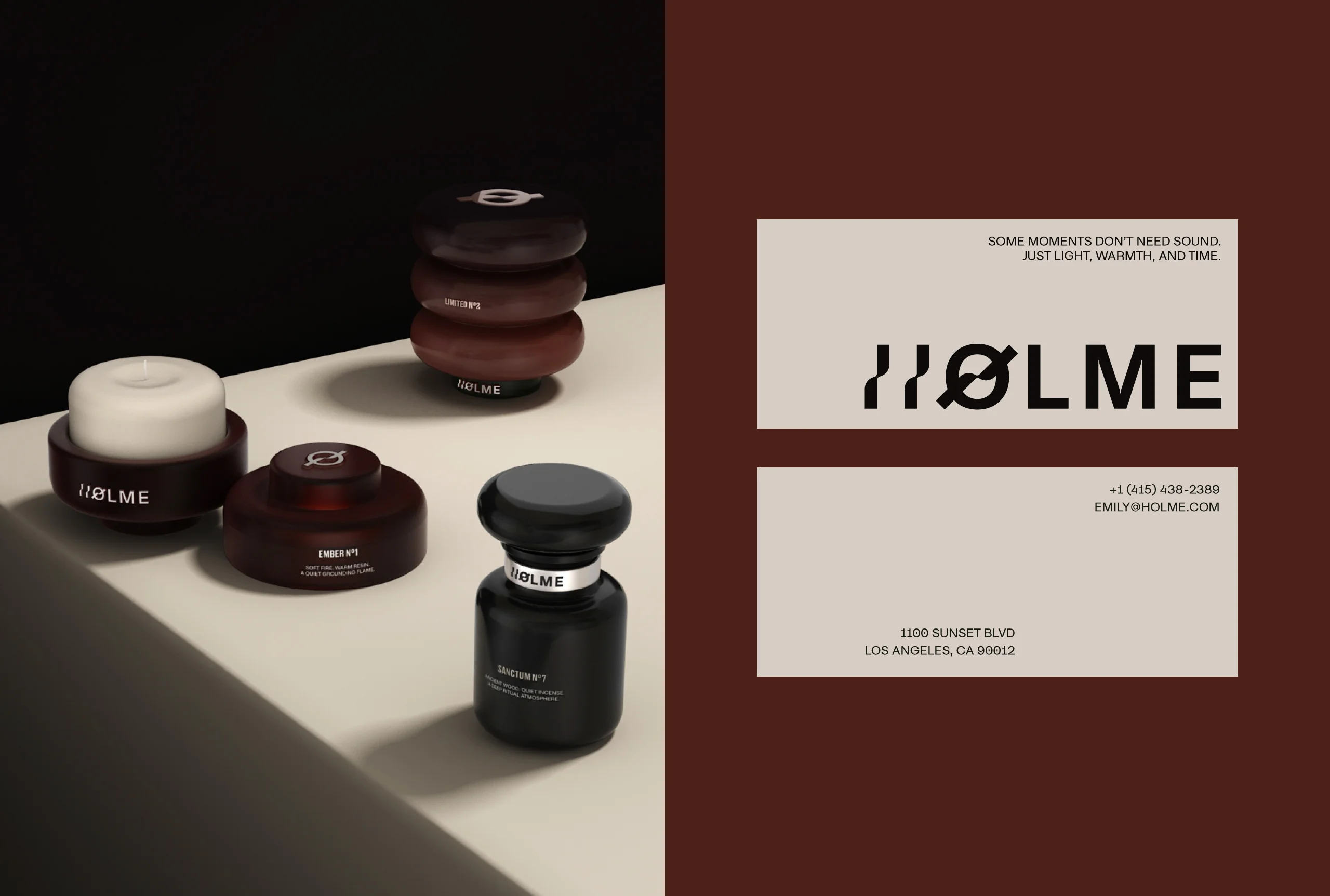
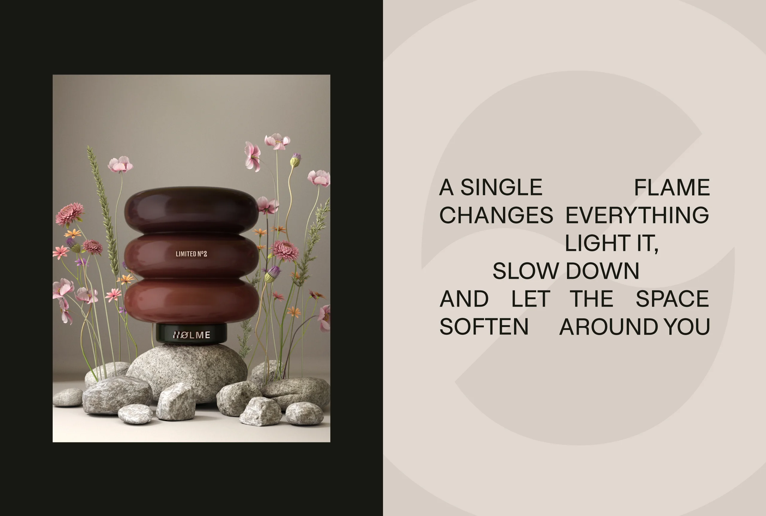
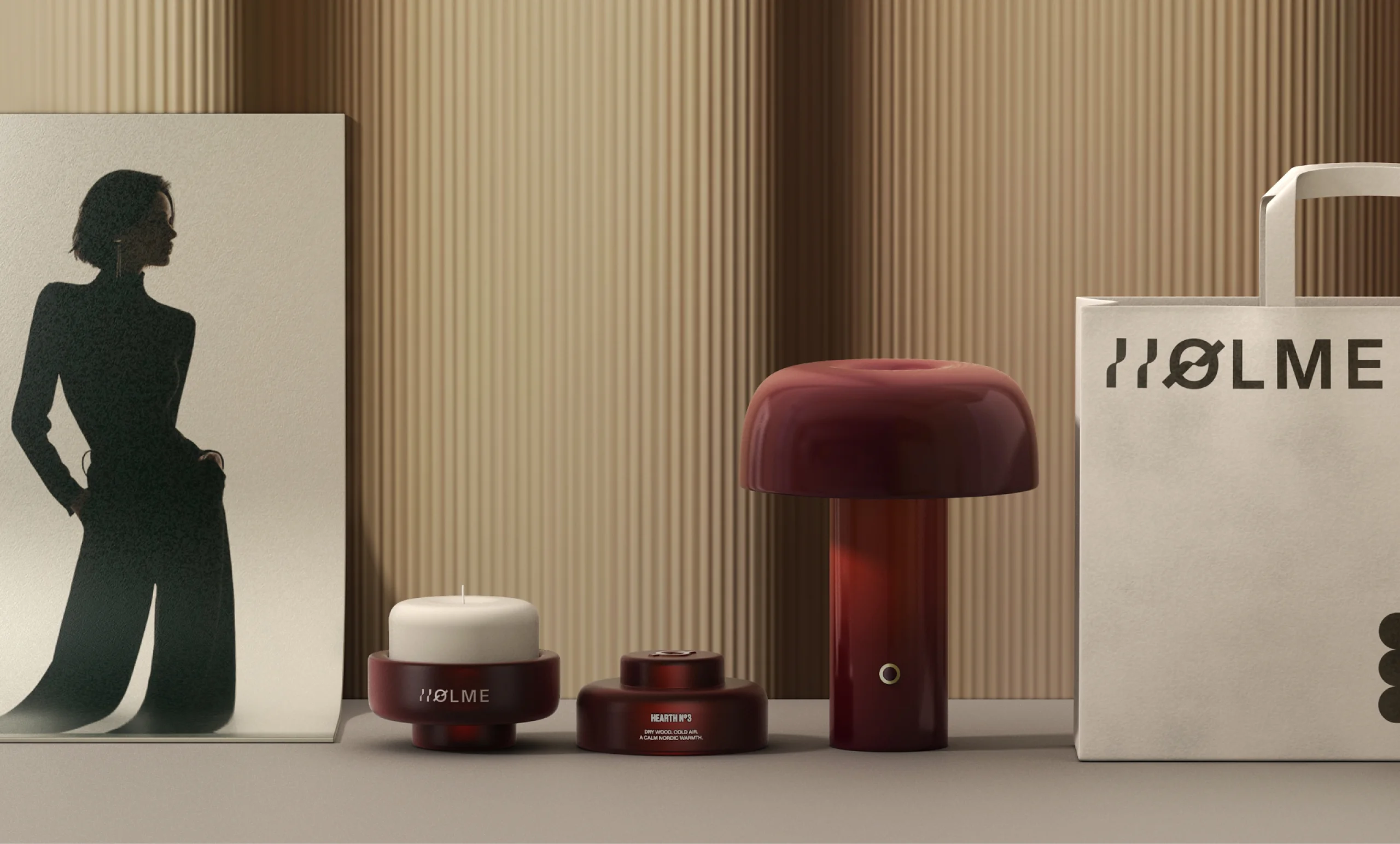
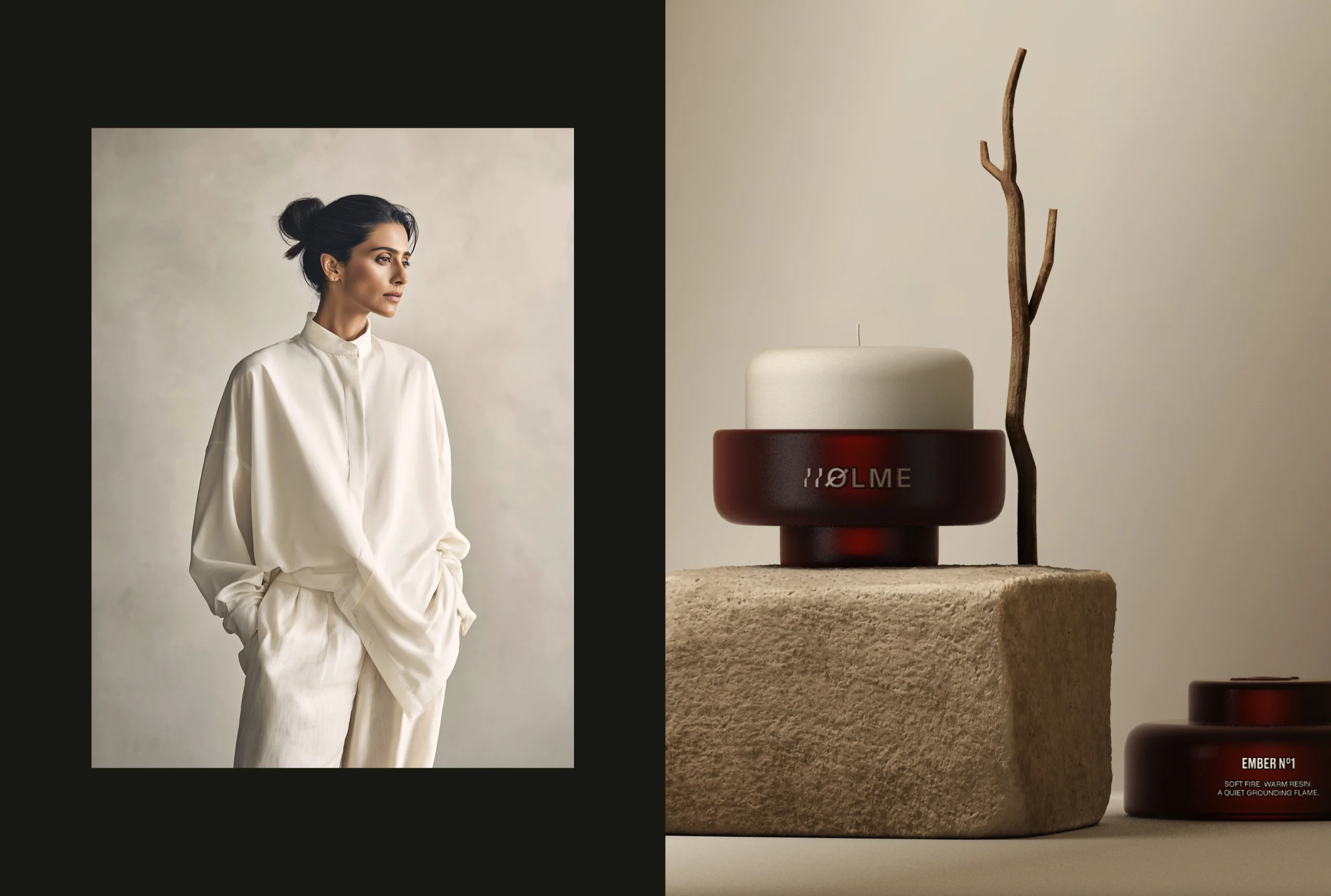
Products were treated as designed objects rather than decorative items. Sculptural forms, tactile surfaces, and controlled contrasts were studied rather than styled, which is what gives the range its coherence: the objects are related by how they are made and how they behave in light, not by a repeated motif applied across them.
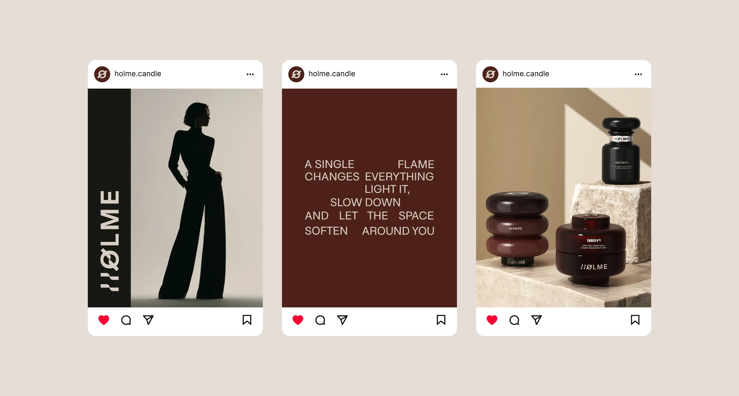
The supporting layer was built to the same standard. Photography, three dimensional scenes, and layout structures carry a quiet editorial tone, and the restraint there is deliberate. A calm object photographed loudly stops being calm, so the imagery had to be as disciplined as the objects themselves.
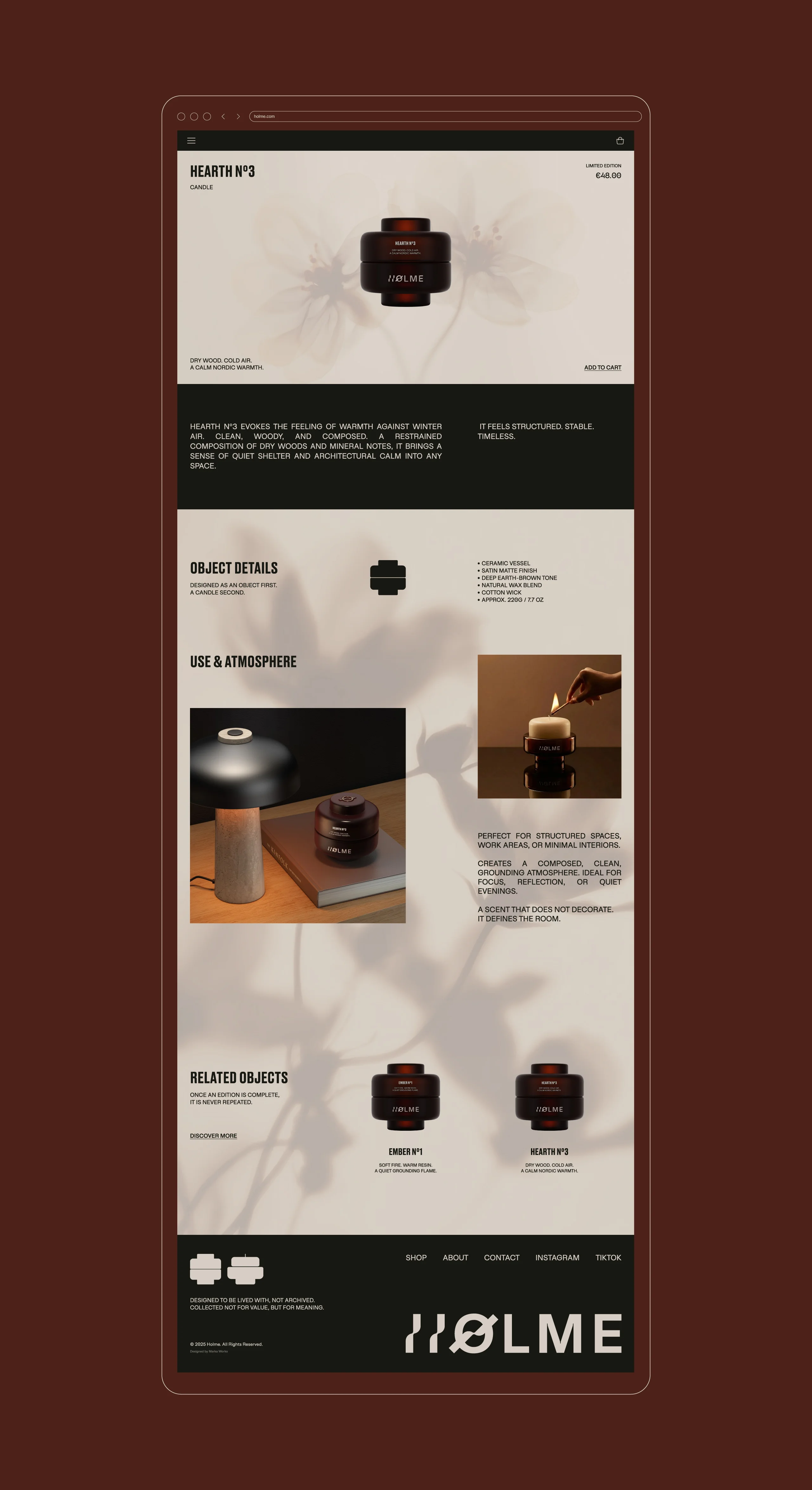
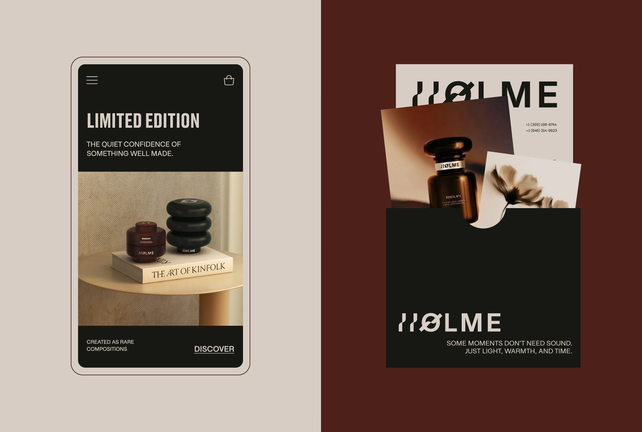
Consistency across those three surfaces is the part that usually breaks. An object photographed for a catalogue, the same object on a product page, and the same object described in brand communication are three different reading conditions, and a system that was designed for only one of them starts to drift in the other two. Because color, typography, and form were resolved together rather than in sequence, the same rules survive all three without needing a separate set for each.
What HOLME ends up with is a system where light, space, and form do the identifying. There is no ornament holding what we delivered together, which is exactly why it holds: nothing in it depends on a decoration that a future product might not be able to carry.
See more cosmetics, skincare and home fragrance branding case studies.

Let’s make the work they’ll copy.
Talk to an expert now
Work with a 38 team of the
industry’s top 1% talent.



