ROOT
Hair Care Branding & Packaging Design
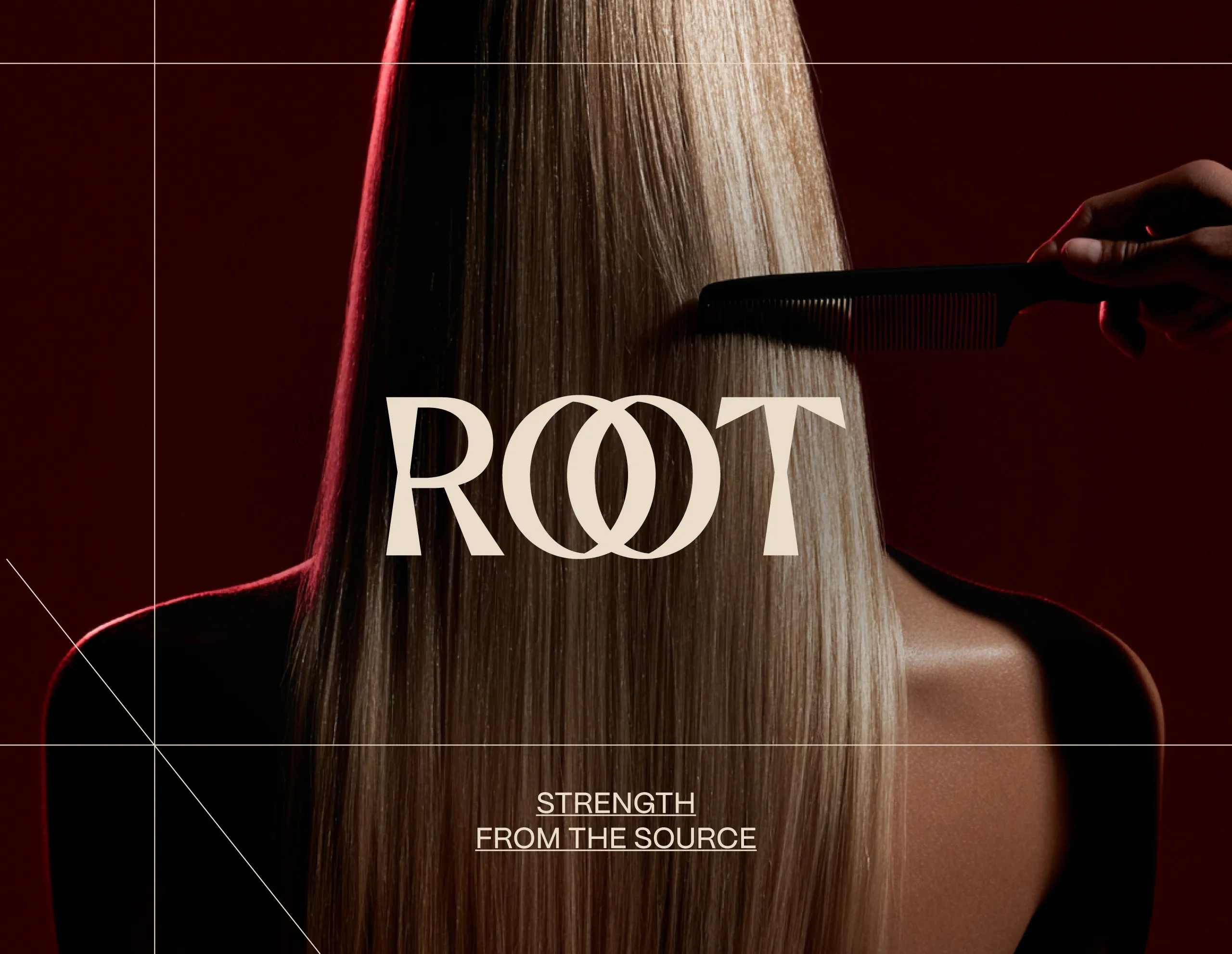
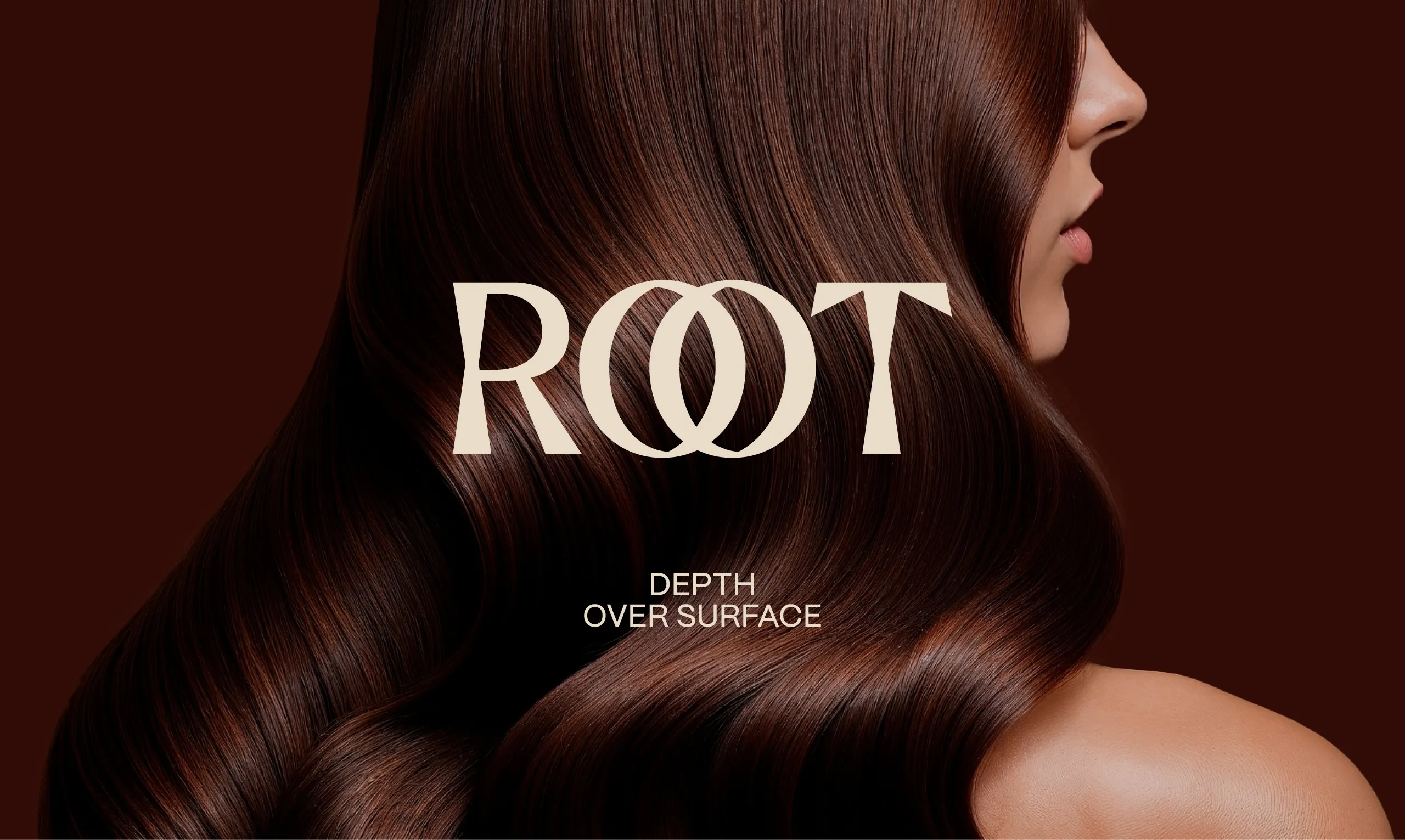
Depth Over Surface
MarkaWorks developed the brand identity, packaging and art direction for ROOT, a contemporary hair care brand, translating the idea of restoring hair from its foundation into a tactile and distinctive visual system.
The Challenge
ROOT needed to stand apart from a category dominated by clinical formulas, botanical clichés and polished beauty conventions. The brand had to communicate repair, strength and efficacy without feeling pharmaceutical, while still carrying the desirability and visual presence of a premium lifestyle product.
The Solution
"Depth Over Surface" became the central idea behind the identity.
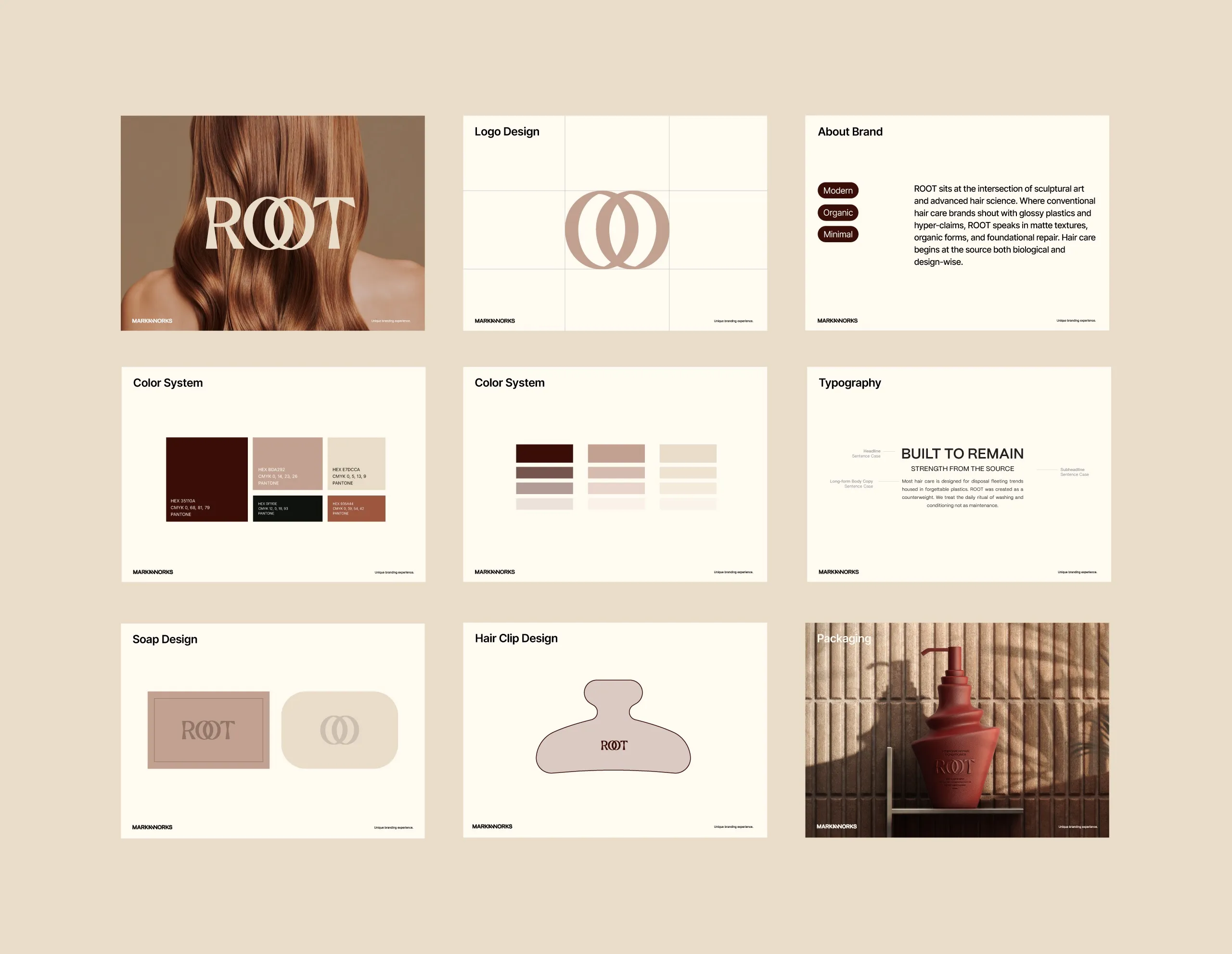
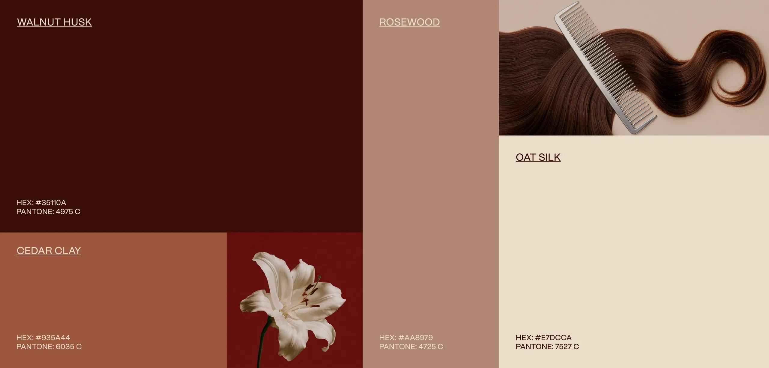
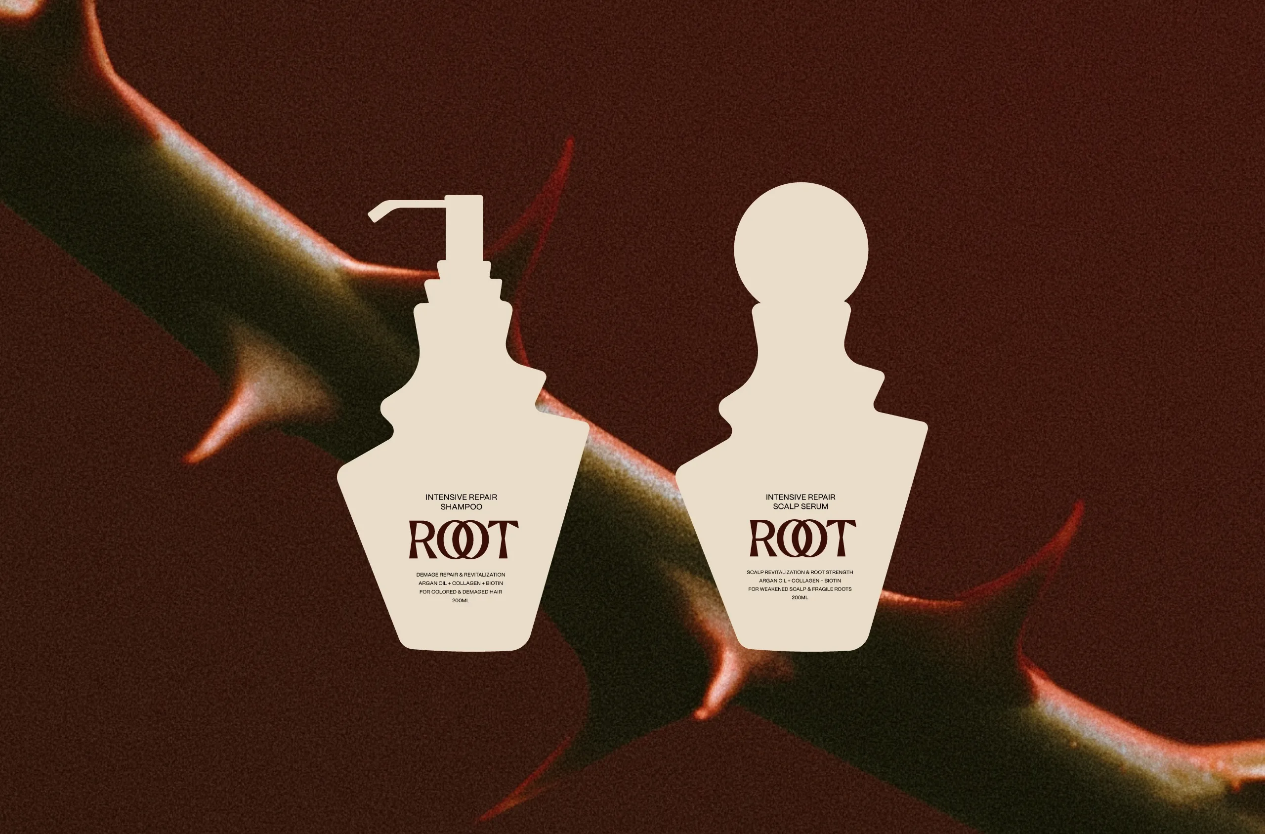
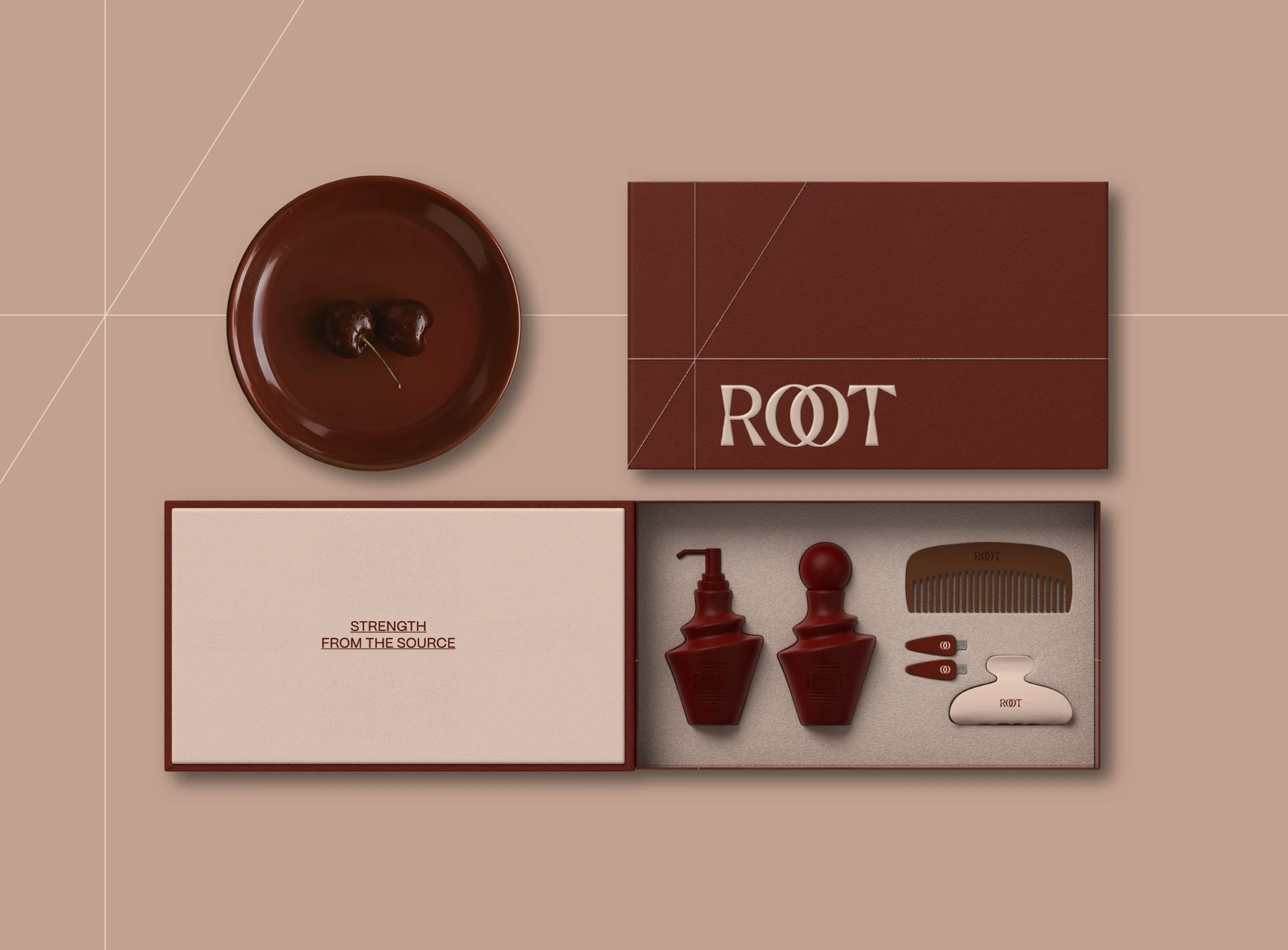
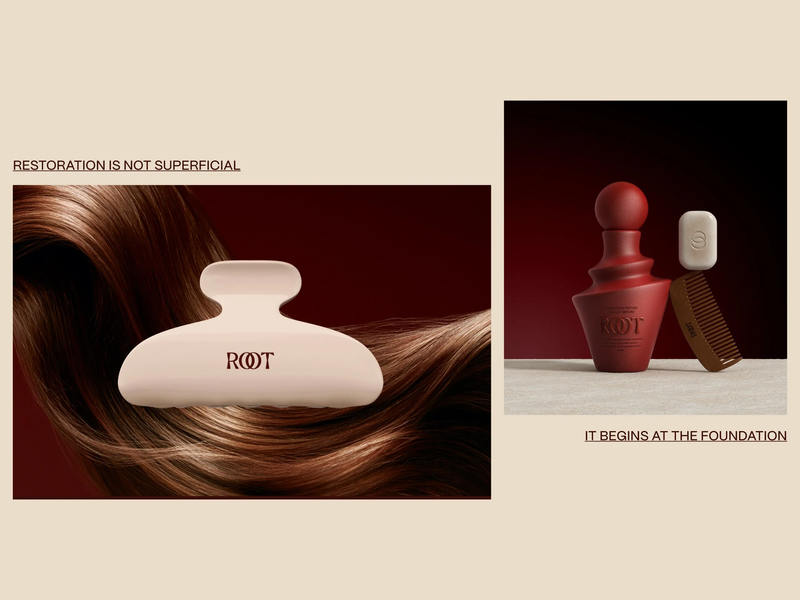
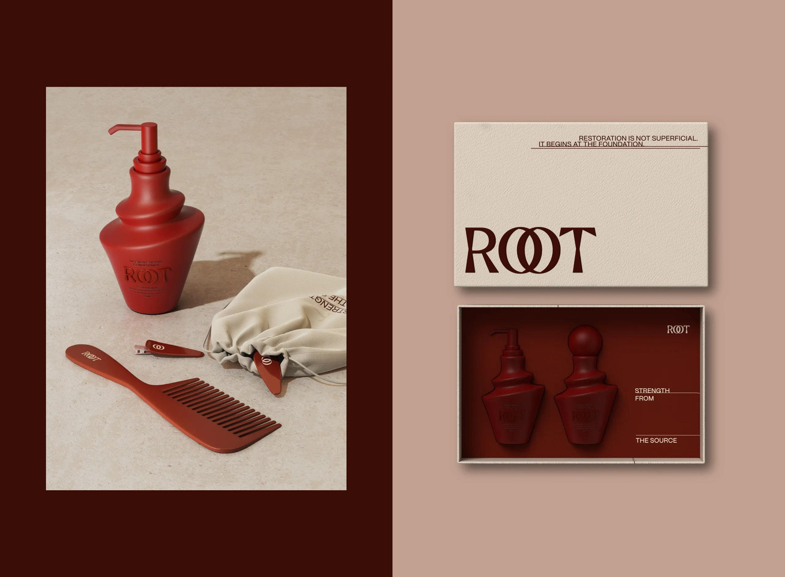
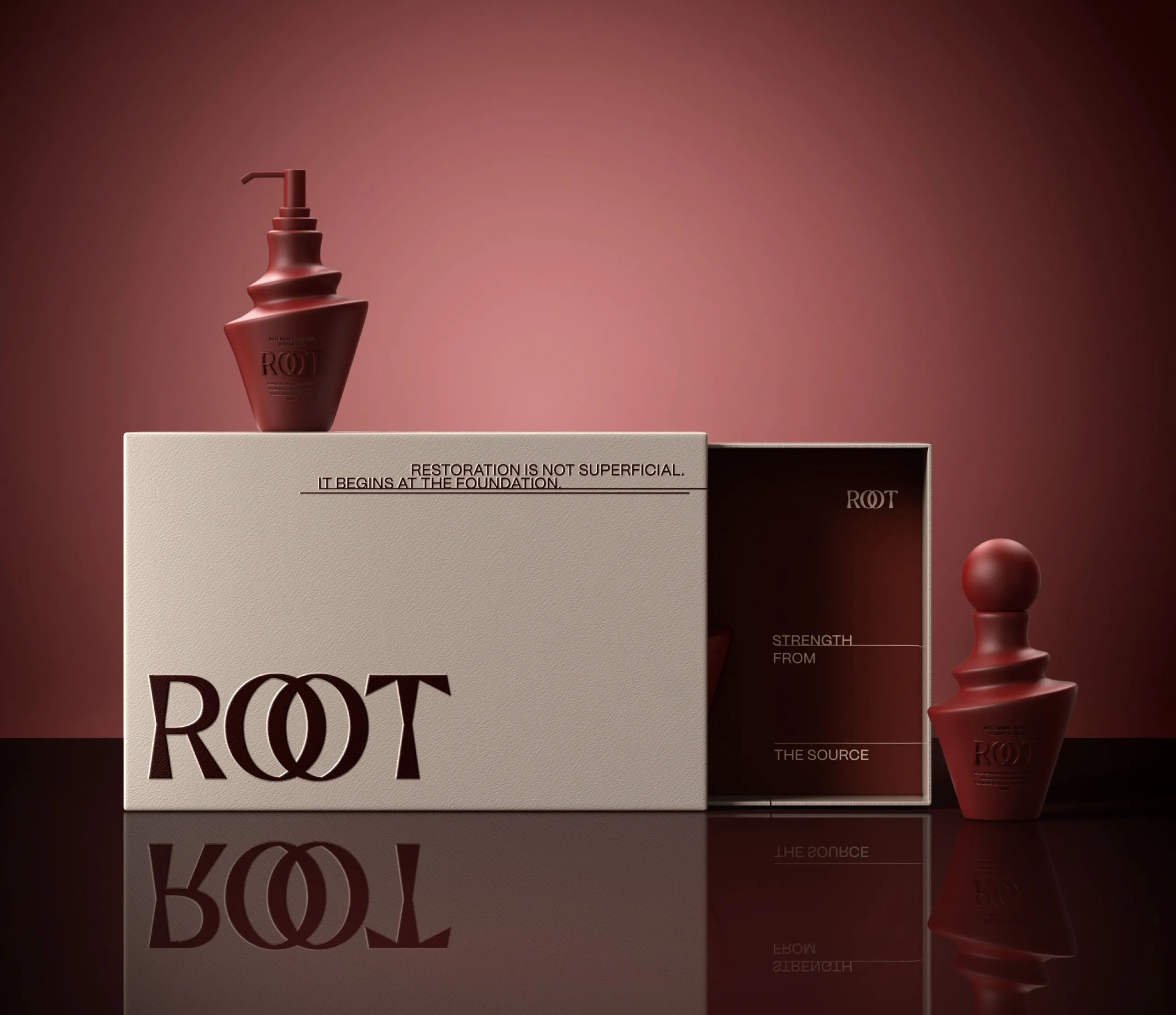
Rather than framing hair care as a cosmetic fix, ROOT positions restoration as something that begins at the source. A custom serif wordmark, interlocking circular symbol and sculptural packaging language establish a more architectural expression of beauty. Deep walnut, rosewood, clay and oat tones create warmth and depth, balancing scientific credibility with a more sensorial character.
The Process
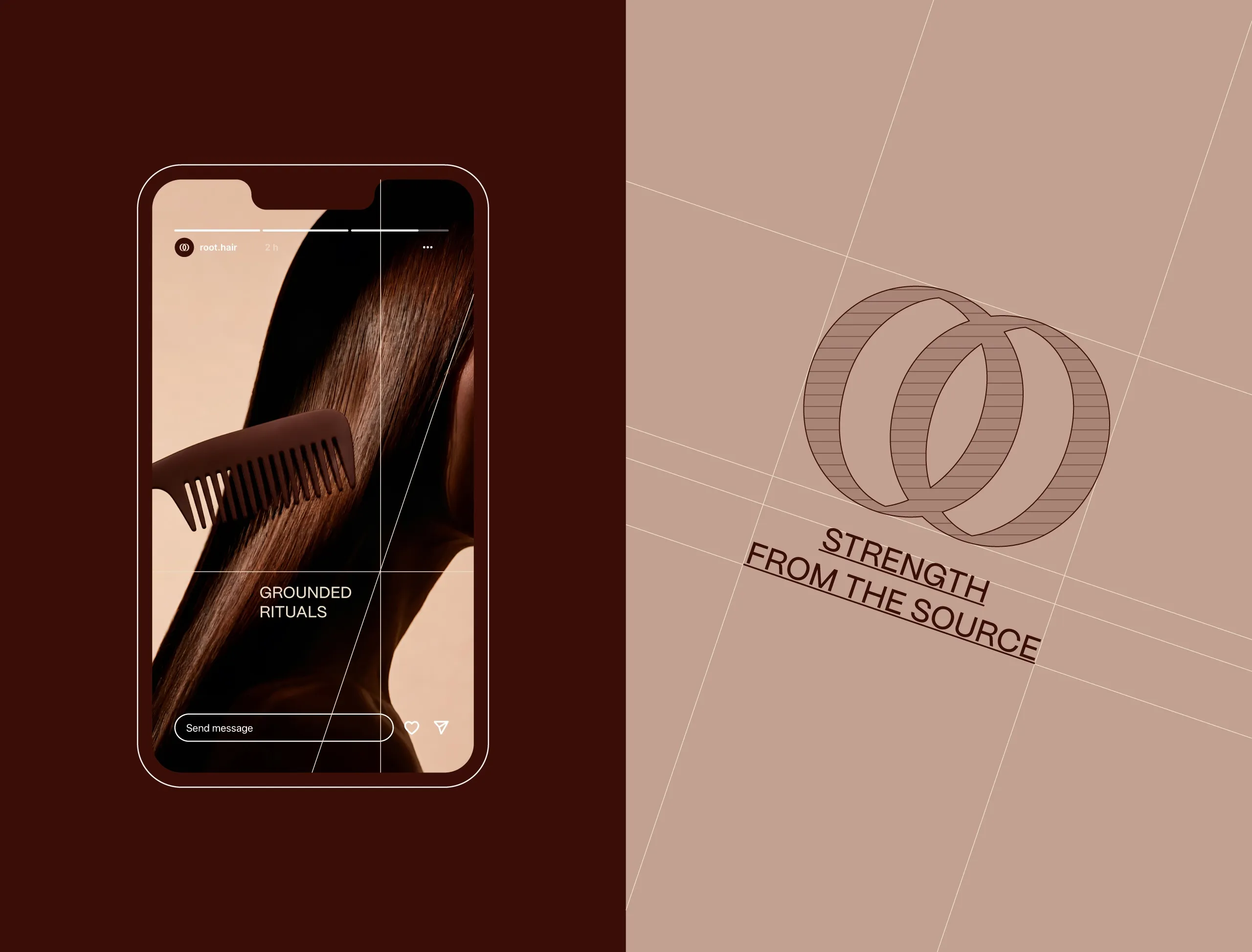
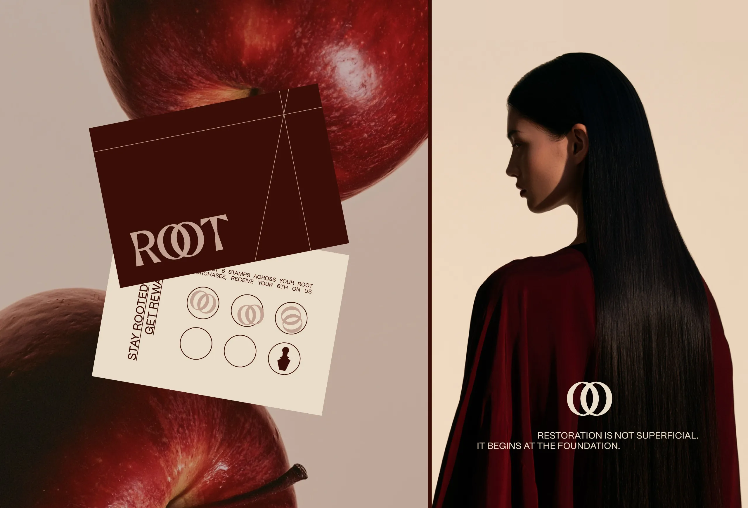
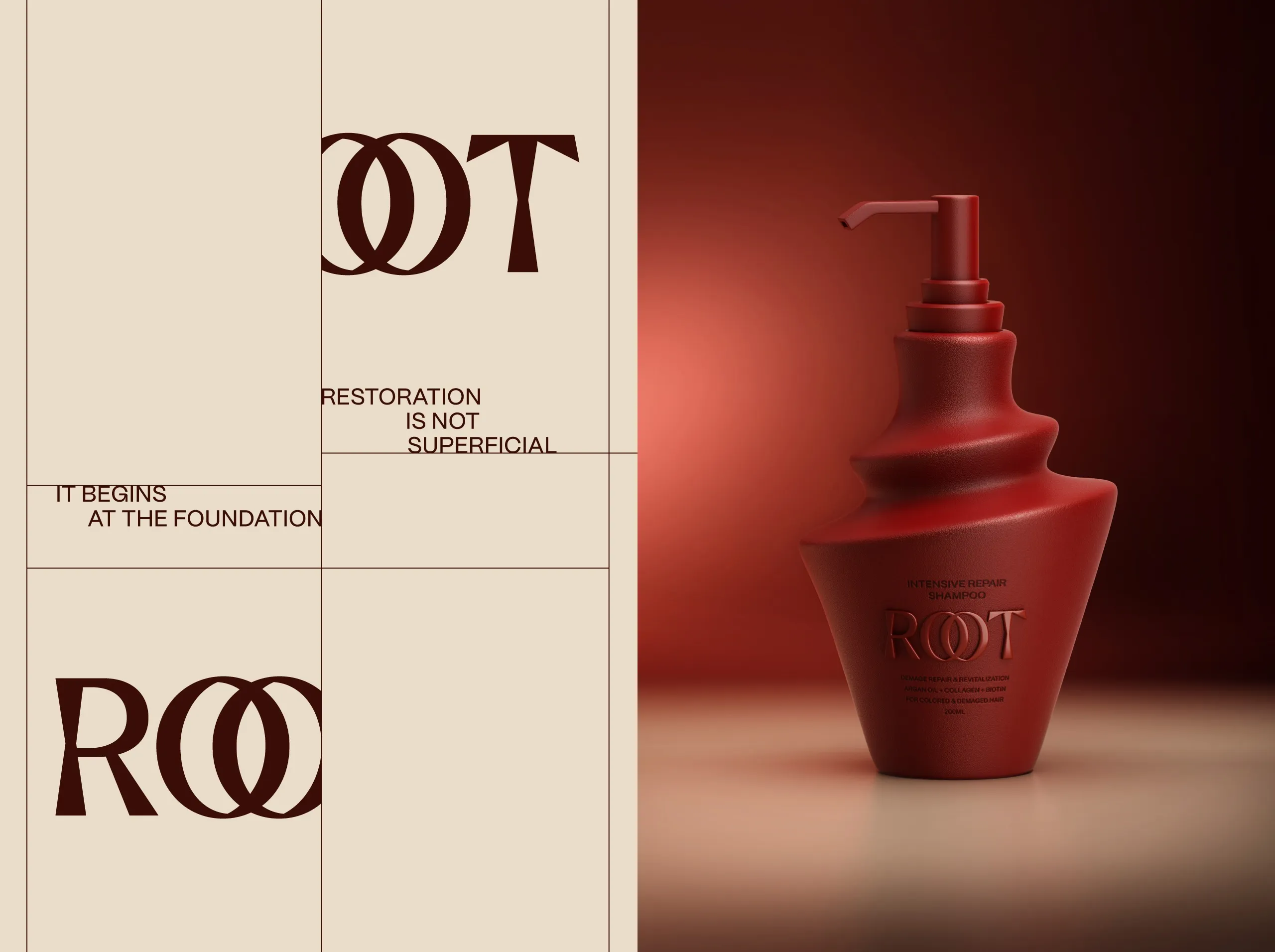
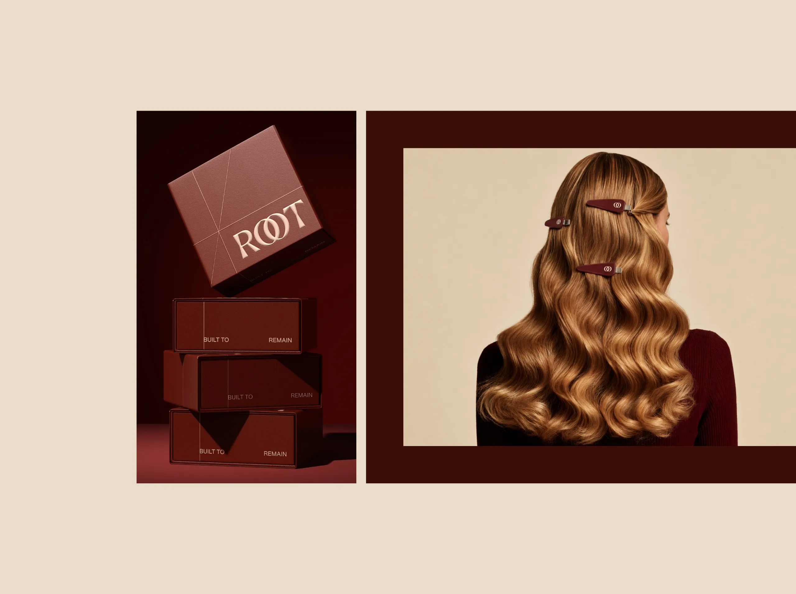
The ROOT wordmark was designed around two interlocking O forms, creating a visual metaphor for connection, continuity and the relationship between root and strand. The same geometry was extracted into a standalone symbol used across packaging, accessories and digital applications.
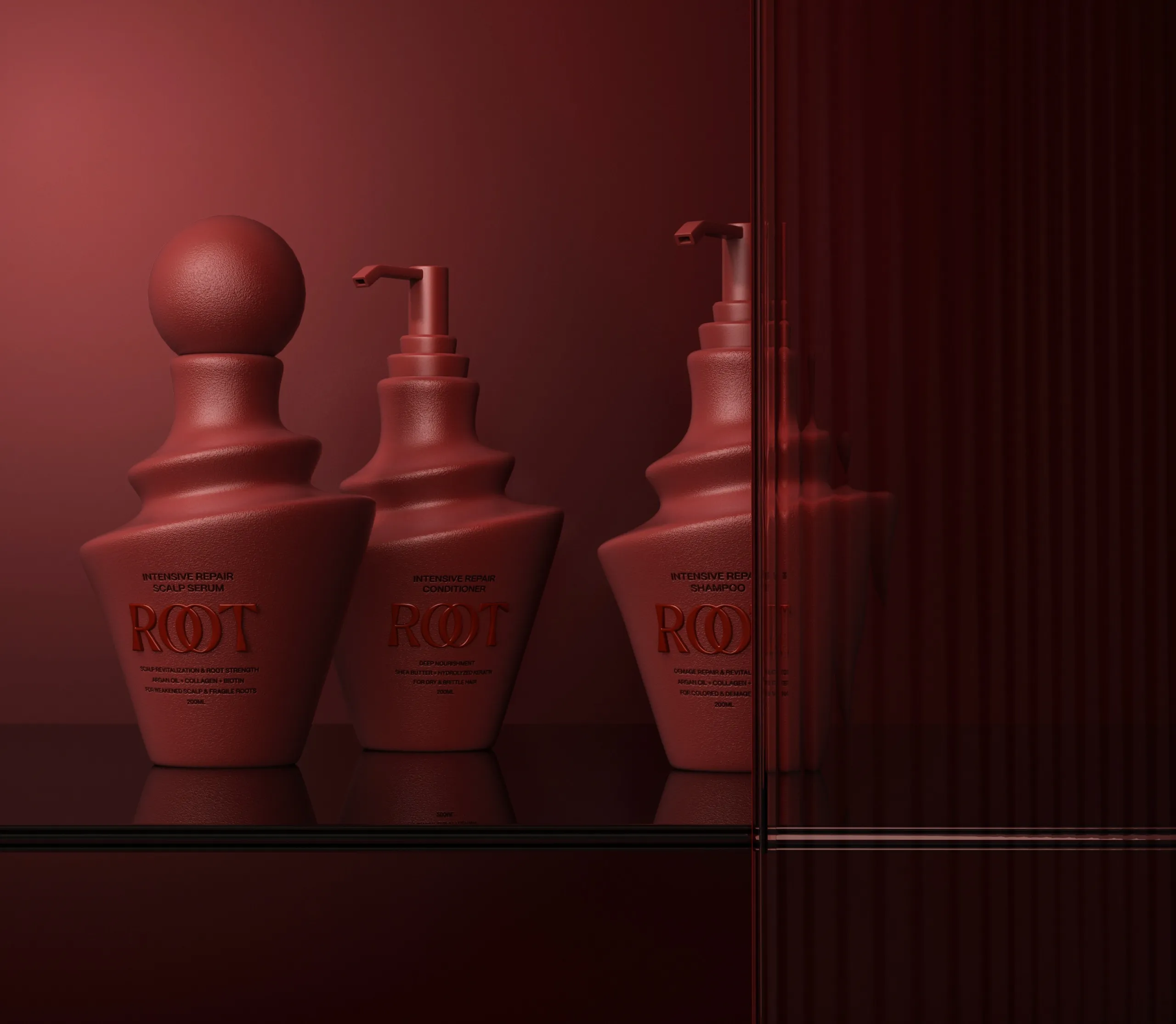
Packaging became a key part of the identity. Instead of conventional cylindrical bottles, the range uses layered, sculptural forms that feel closer to designed objects than disposable cosmetics. Each silhouette is distinctive while remaining part of the same family, allowing shampoo, conditioner and scalp treatments to be recognised individually without breaking the system.
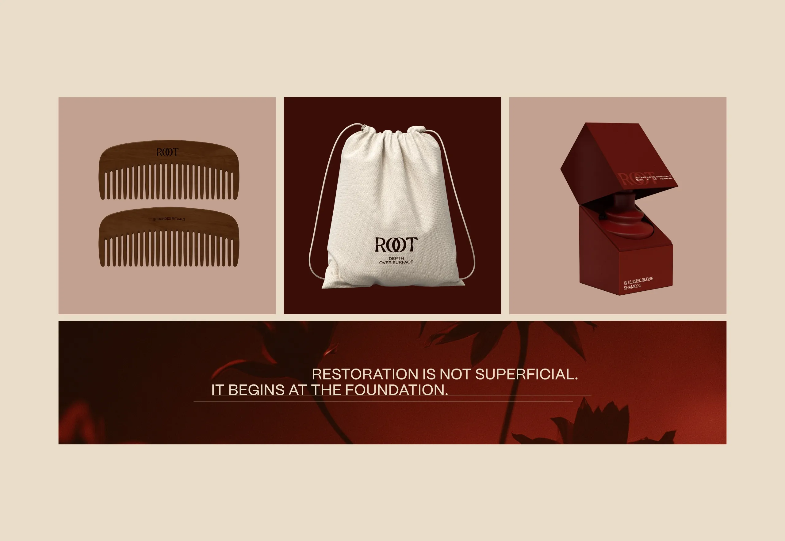
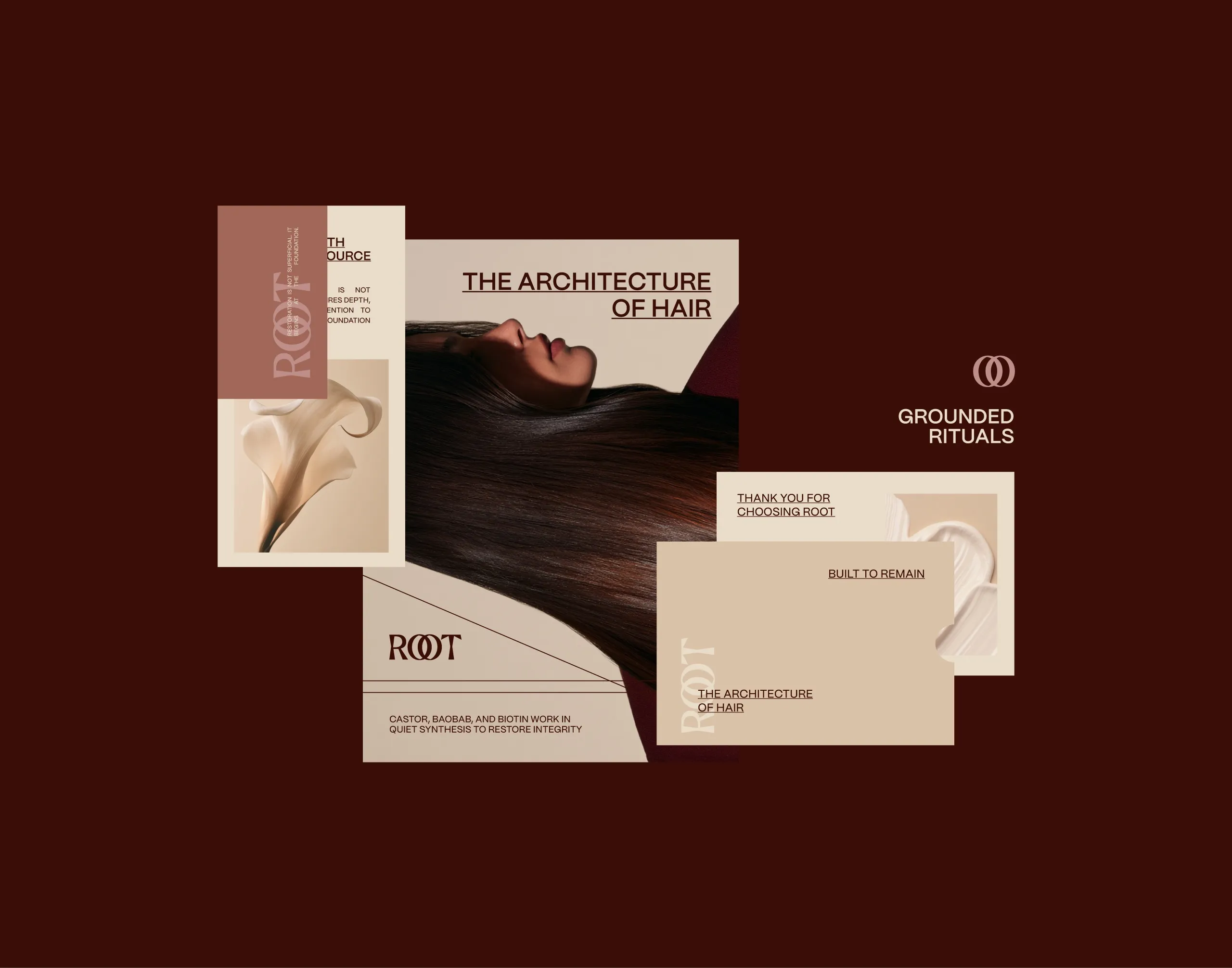
Typography and layout introduce a contrasting layer of structure. Fine rules, open grids and restrained sans-serif typography organise information around expressive product forms and photography. Art direction builds on the concept through rich hair textures, botanical references, warm shadows and architectural compositions, reinforcing messages such as "Restoration is not superficial. It begins at the foundation."
The Outcome
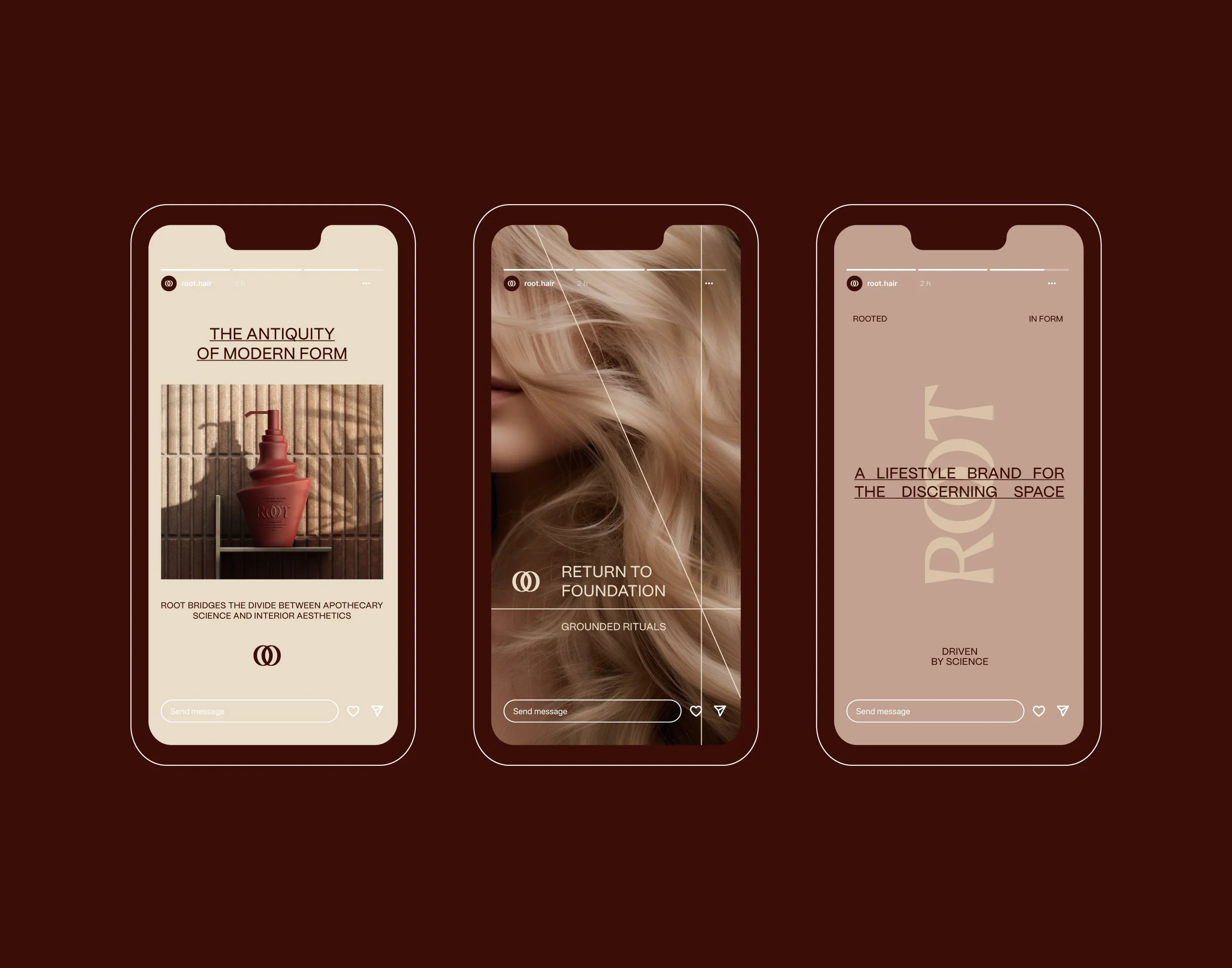
ROOT creates a hair care identity where formulation, packaging and visual language support the same idea: lasting results begin beneath the surface. The system gives the brand a recognisable presence across products, accessories, packaging and digital communication, while providing a flexible foundation for future treatments and category expansion.
See more cosmetics, skincare and home fragrance branding case studies.

Let’s make the work they’ll copy.
Talk to an expert now
Work with a 38 team of the
industry’s top 1% talent.