
Snax
protein bar brand
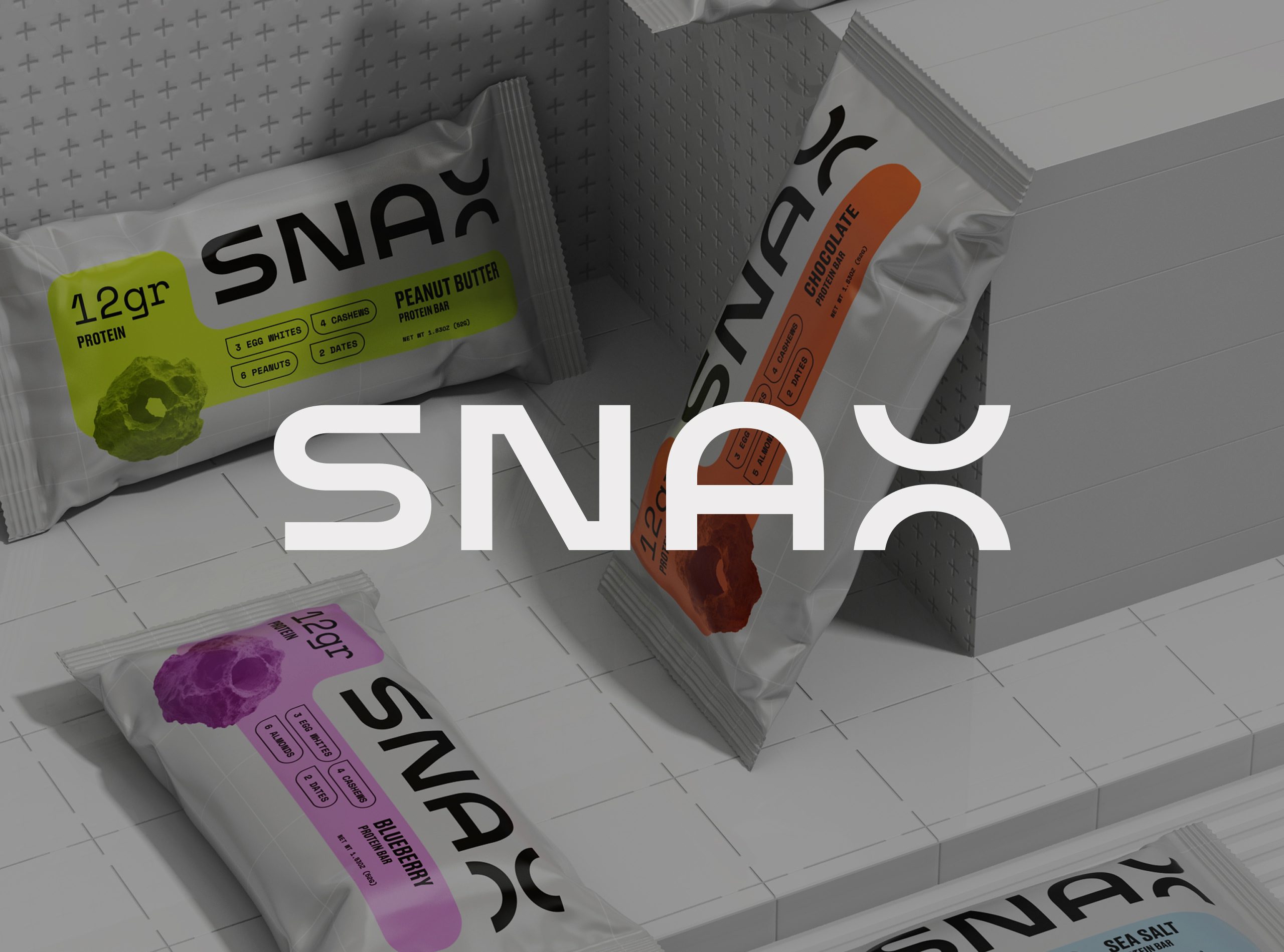
SNAX is a protein bar brand designed to redefine the fitness snack category. Developed by MarkaWorks, the brand breaks away from cliché aesthetics through bold geometry, vibrant energy, and a modular visual system that bridges performance and design precision.
Research & Strategy
SNAX is a protein bar brand built to break the visual defaults of sports nutrition. Market analysis at the start of the project found the shelf split between two looks: dark, hyper-masculine sports packaging, or generic health cues that could belong to any product. Neither speaks to buyers who care about design as much as performance, and that gap defined the brief.
At MarkaWorks we set three strategic pillars before any drawing began. Bold and minimal, built on strong geometry and whitespace. Energetic and playful, carried by a modular color system. Tech-inspired and scalable, so the same system holds from a wrapper to a screen.
See more nutrition and wellness branding case studies.


Visual Identity
We drew a custom wordmark to hold motion and structure at once, combining sharp industrial forms with softer curves. The extended X became the brand’s core symbol, used as a mark for balance and expansion where the full logotype does not fit.


Packaging Design
The color system is the part that does the heaviest work. Flavours are organized as a modular grid, with saturated tones set against sterile neutrals. On a protein bar shelf this solves a real problem: bars are small, they are stacked densely, and they are usually chosen in a hurry. A buyer looking for one flavour among eight is sorting by color block, not reading names, and a system where each variant owns a tone finds the right bar faster than any typographic hierarchy could.
SNAX typography is bold and monospaced. The technical register reinforces the performance side of the positioning, and monospaced setting gives the small pack a rhythm that stays even when the copy length changes between variants.


Digital Presence
We built the system to translate without redrawing, so packaging and digital surfaces share one visual logic rather than two related ones. That matters more on a wrapper than on a screen: a bar’s printable area is small and curved, ink sits on a flexible film rather than on board, and fine detail that survives a monitor closes up in print. Designing the marks to hold at wrapper scale first meant nothing had to be simplified later.


Let’s make the work they’ll copy.
Talk to an expert now
Work with a 38 team of the
industry’s top 1% talent.



