
Wildbars Protein Bar
bold, natural, active fuel
Wildbars protein bars are a bold and natural fuel for your active life. MARKAWORKS crafted a vibrant brand identity, featuring a unique vertical logo and nature-inspired patterns, to communicate strength and wholesome ingredients.

A Bold and Natural Brand Identity for Wildbars
Natural fuel for an active life is how Wildbars was positioned in the protein bar category. Wildbars is a protein bar brand, and at MarkaWorks we designed the brand identity and packaging to hold two ideas at once, strength and naturalness, which is the recurring brief in sports nutrition branding: the product has to look powerful without looking synthetic.
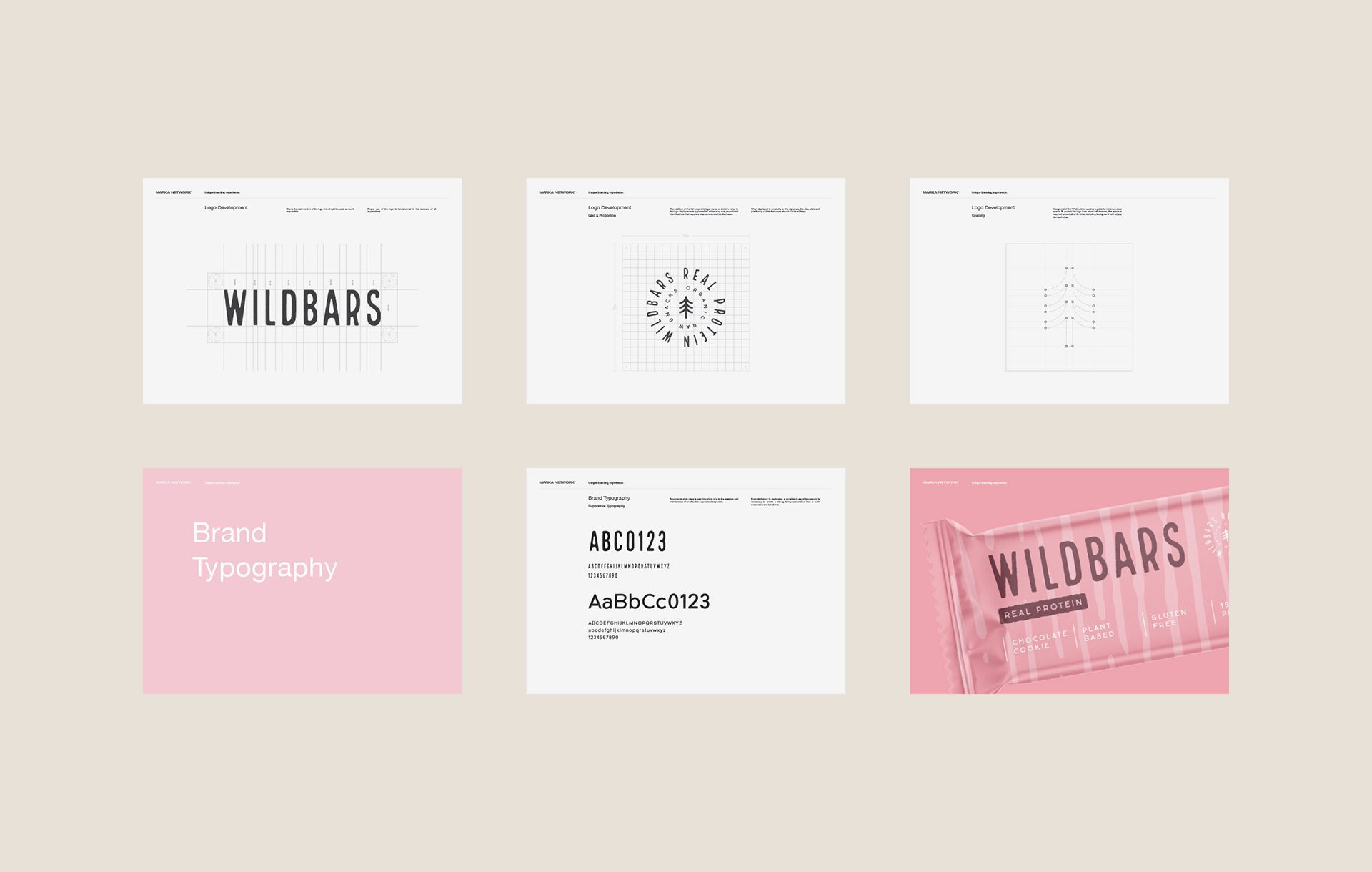
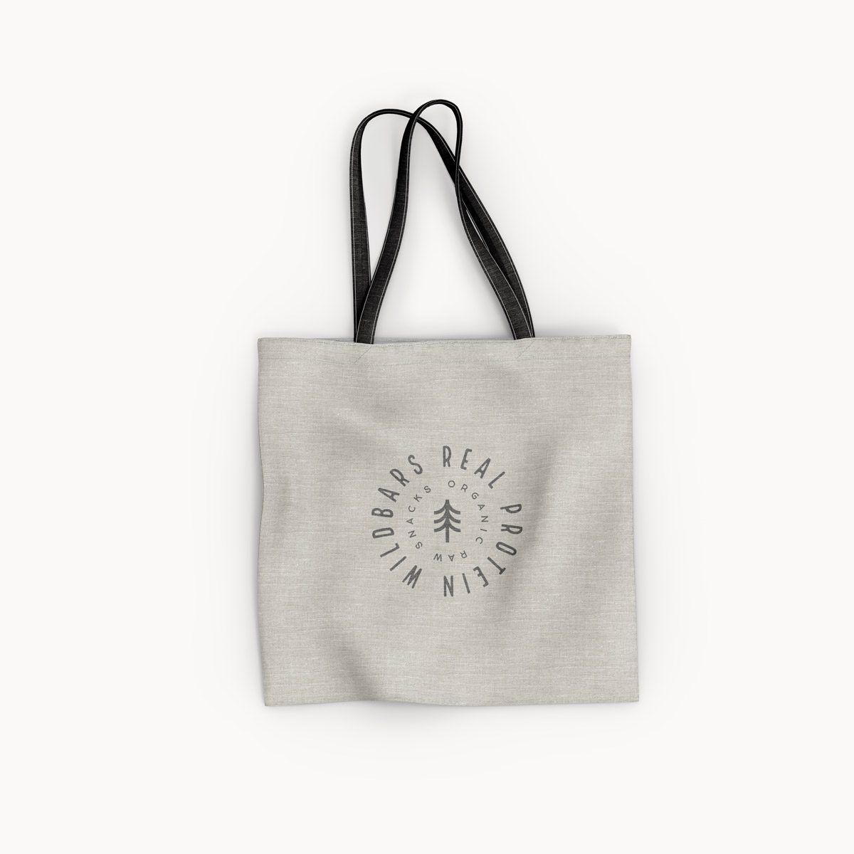
Strength is carried by the logo. It is a bold mark whose weight is tempered by vertically stretched letterforms, so it reads strong without reading heavy. Its natural half lives in the emblem: a vector tree illustration that signals the wholesome, plant-side character of the protein.


The Logo: Boldness with Vertical Elegance
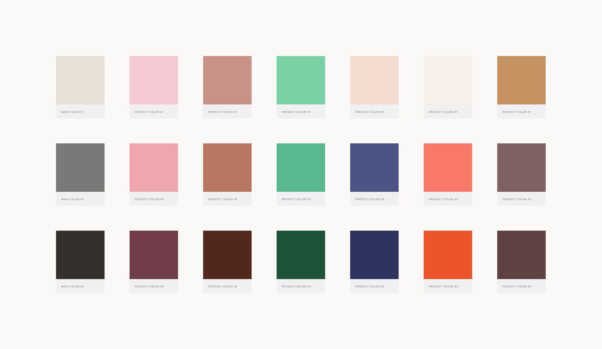
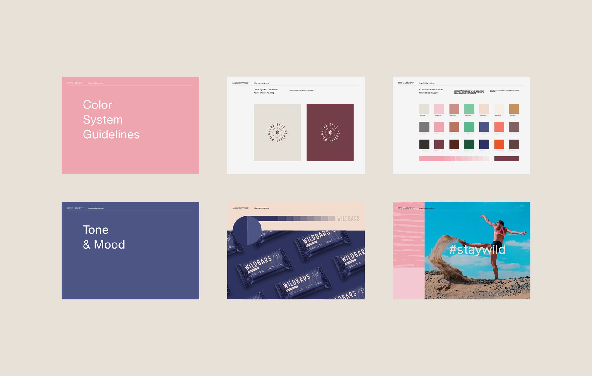
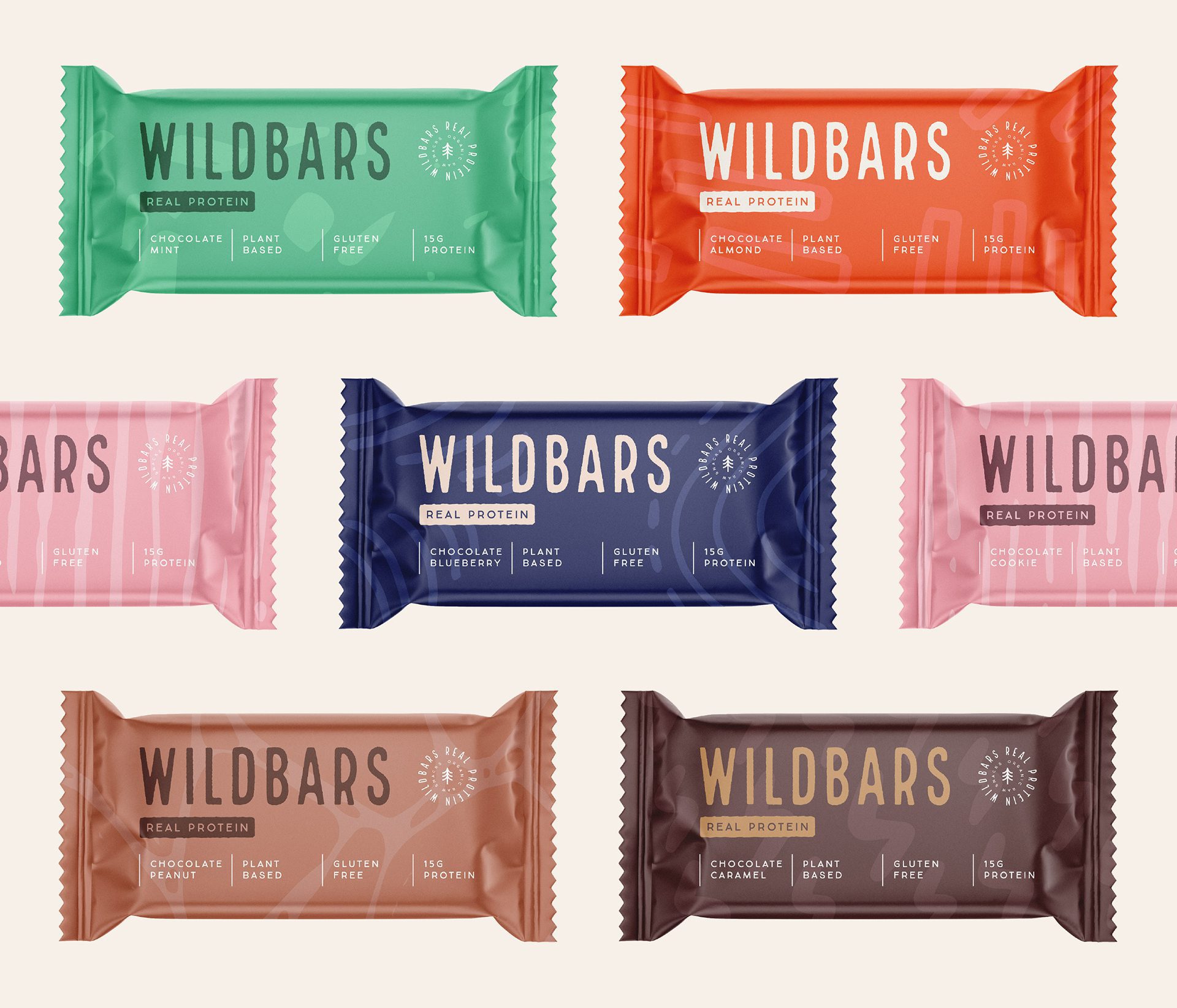
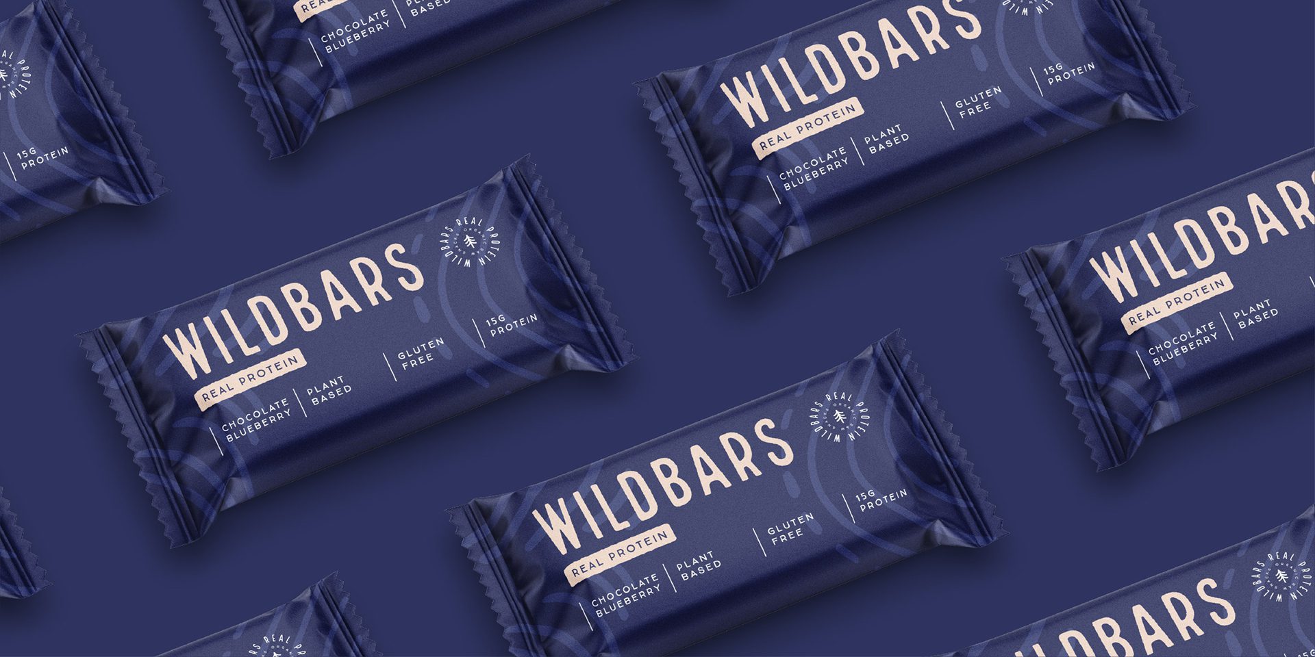
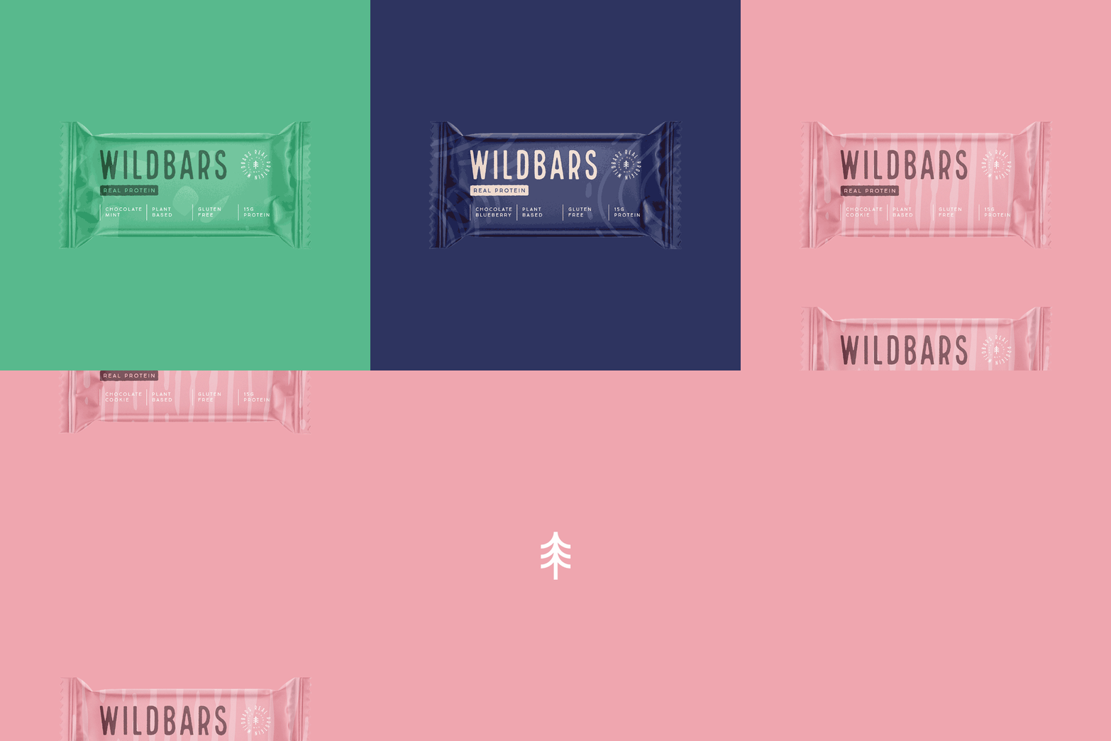
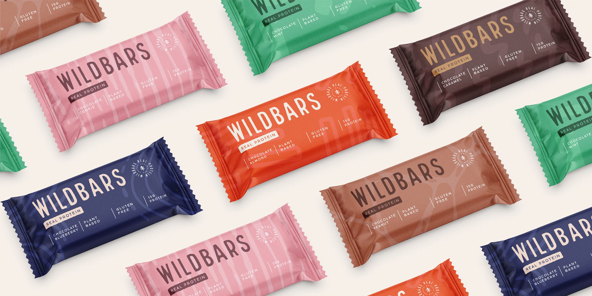
We built the color system for range architecture from the start. The palette combines saturated colors with their lighter and softer tones, including soft creamy shades, and each flavor’s pattern is generated from one color and its shades. That single-color-per-flavor rule is what lets the range grow: every new flavor gets its own recognizable pattern while staying unmistakably Wildbars.
Vibrant Color Palette and Pattern Variations
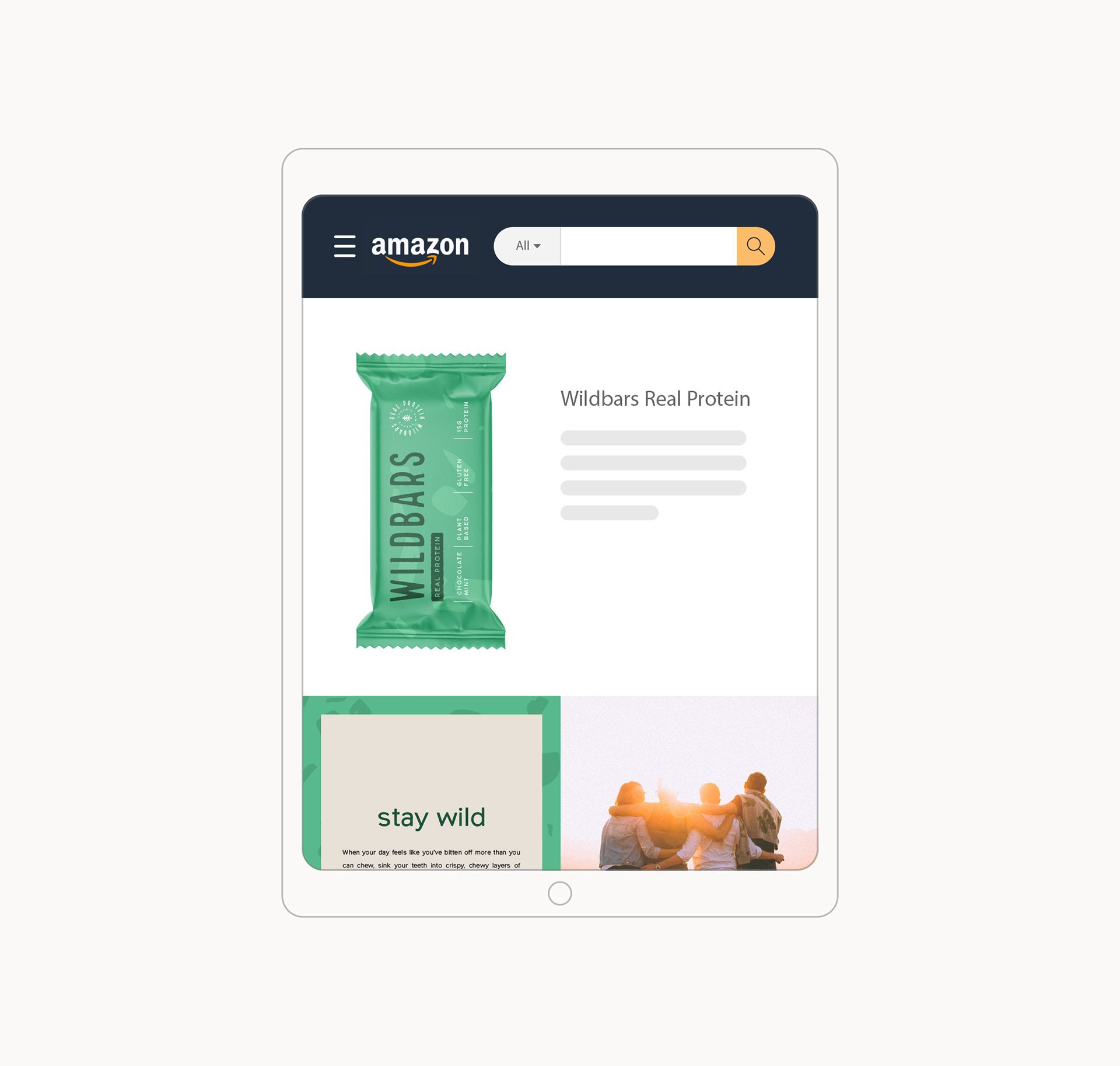
Pack layout stays minimal: the logo, the emblem, and a compact table of the essential product information. On a protein bar, where the buying decision happens fast and the pack is small, that restraint is the design position, the pack states what the product is and lets the pattern system do the shelf work.
One practical limit shaped the whole layout. A bar wrapper is small, printed on flexible film, and seen folded rather than flat, so anything that depends on fine detail or precise registration is at risk. The pattern system was drawn to survive that, which is why it carries the range instead of a detailed illustration.
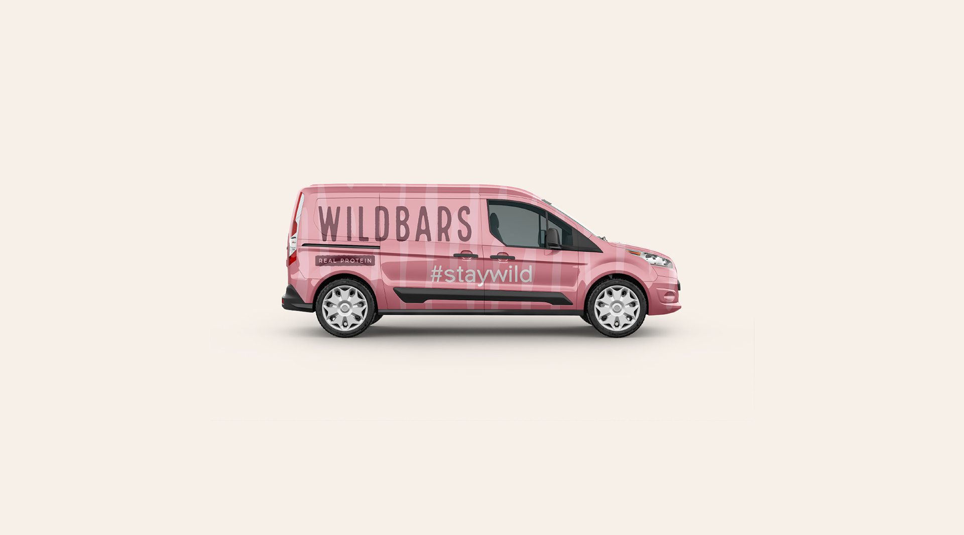
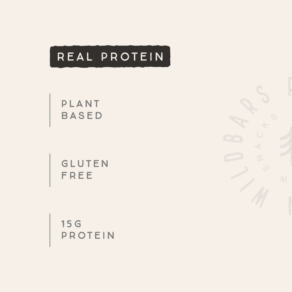
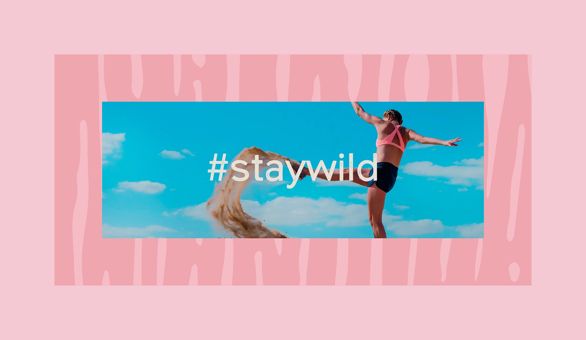
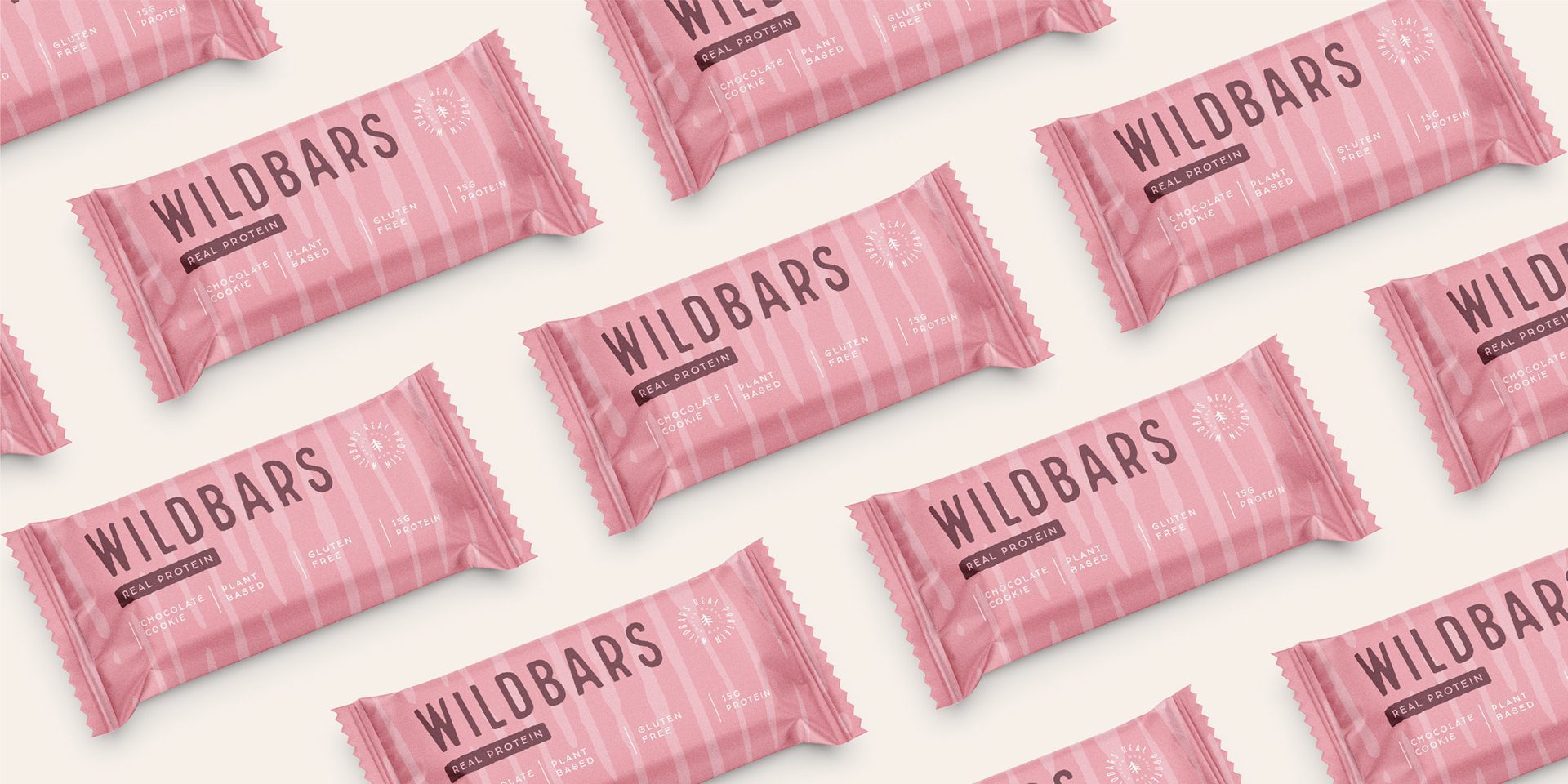
Minimalist and Affirmative Packaging Design
Scope in plain terms: a wordmark and emblem, a flavor-keyed pattern system built on single-color palettes, and a minimal packaging layout designed for small-format shelf legibility.


Let’s make the work they’ll copy.
Talk to an expert now
Work with a 38 team of the
industry’s top 1% talent.



