
Roys Natural Skincare
pastel hues, organic ingredients
Roys Natural Skincare, developed by MARKAWORKS, offers a holistic approach to beauty. This brand provides consciously crafted skincare, where each product’s pastel hue signifies its organic ingredients and elegant, minimal design. Roys champions a refined and natural path to healthy, radiant skin.

A Holistic Approach to Skincare Brand Development
Roys Natural Skincare is a skincare brand built on organic ingredients and a quiet, minimal presentation. This page documents the brand identity and packaging design system we created for it at MarkaWorks, and the system runs on one idea: let color do the identifying, and keep everything else still.
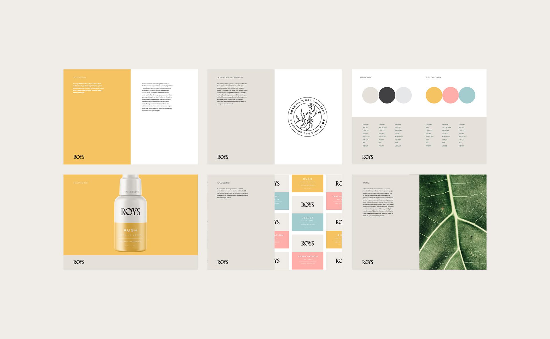
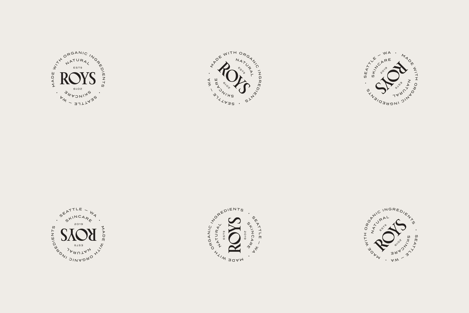
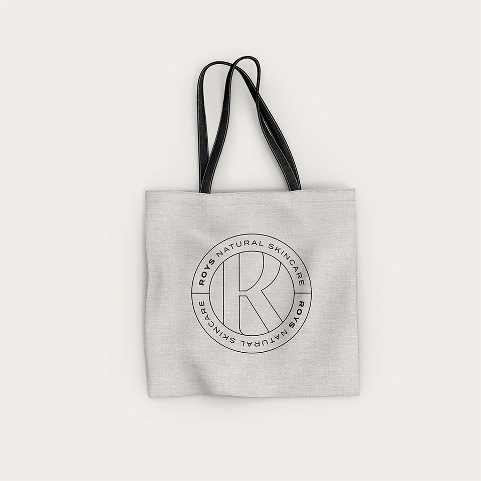
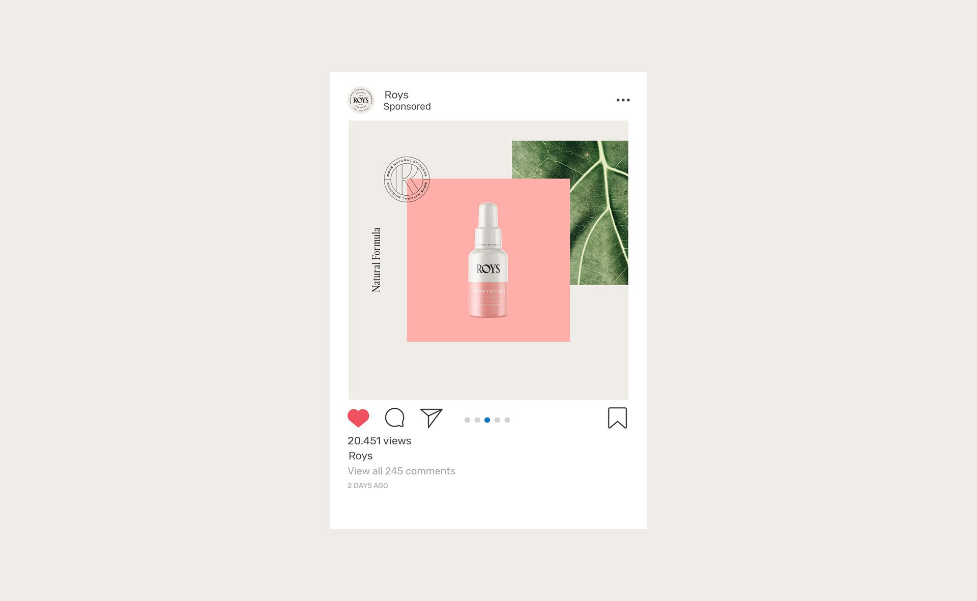
We kept the logo deliberately simple: a minimal primary mark supported by multiple prototypes of a secondary mark, prepared so the brand can be applied across different surfaces and purposes without being redrawn each time. For the logotype we chose a serif face; its classical cut is there to carry the brand’s sense of prestige.
See more cosmetics, skincare and home fragrance branding case studies.
The Color Palette
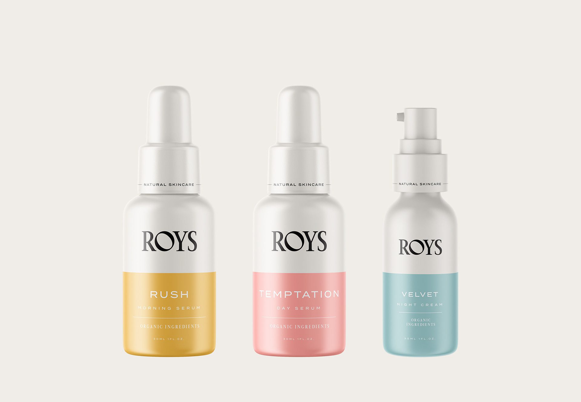
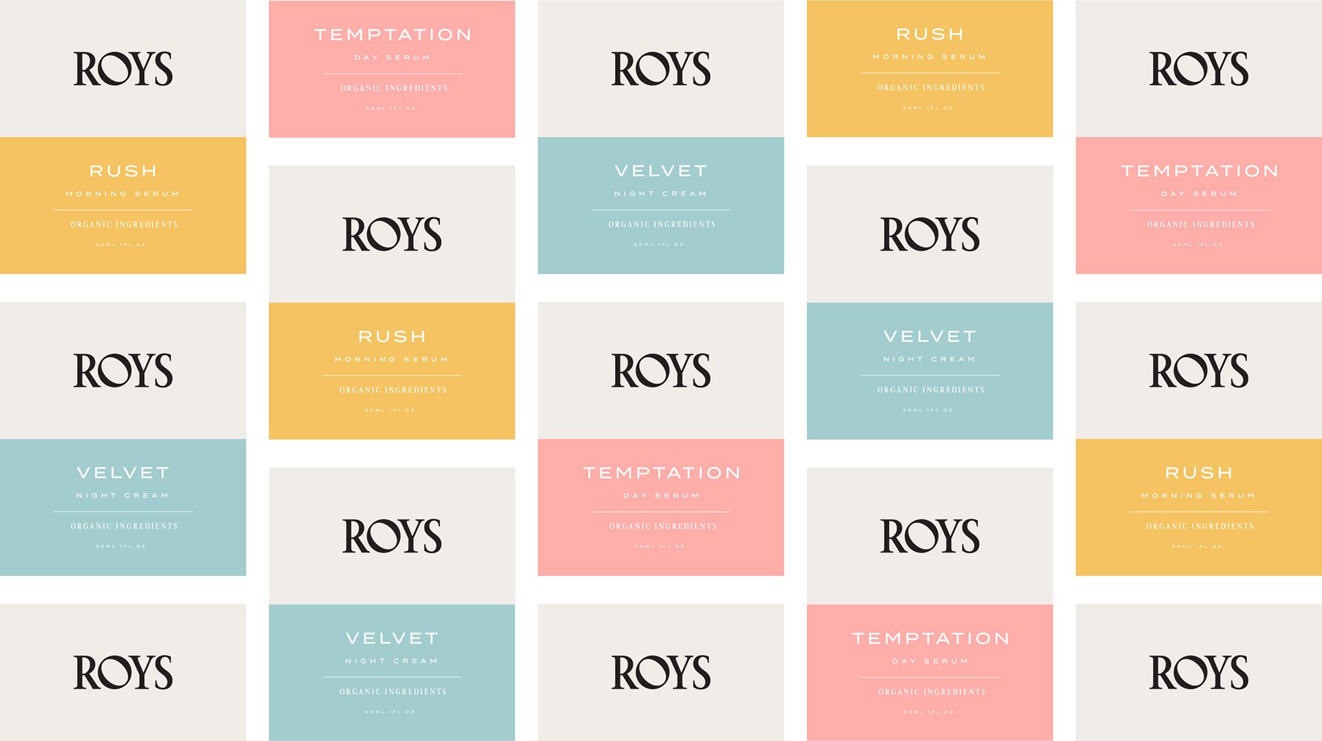
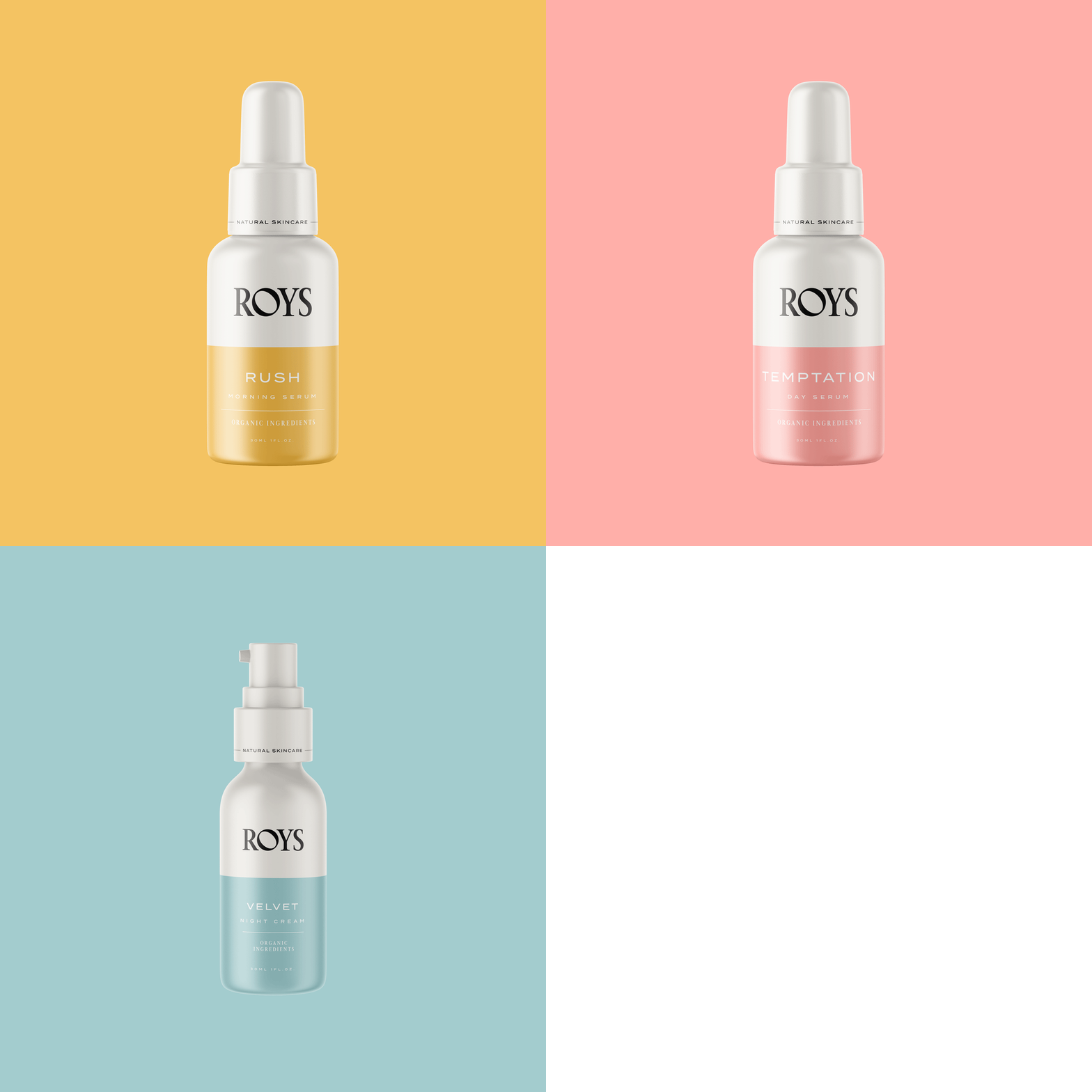
We divided the color palette into two ranges. The first is neutral, black and grey shades that hold the structure. The second is a collection of pastels, and this is where the system does its work: we set each pastel for a specific product, so the shade on the pack is identification rather than decoration.
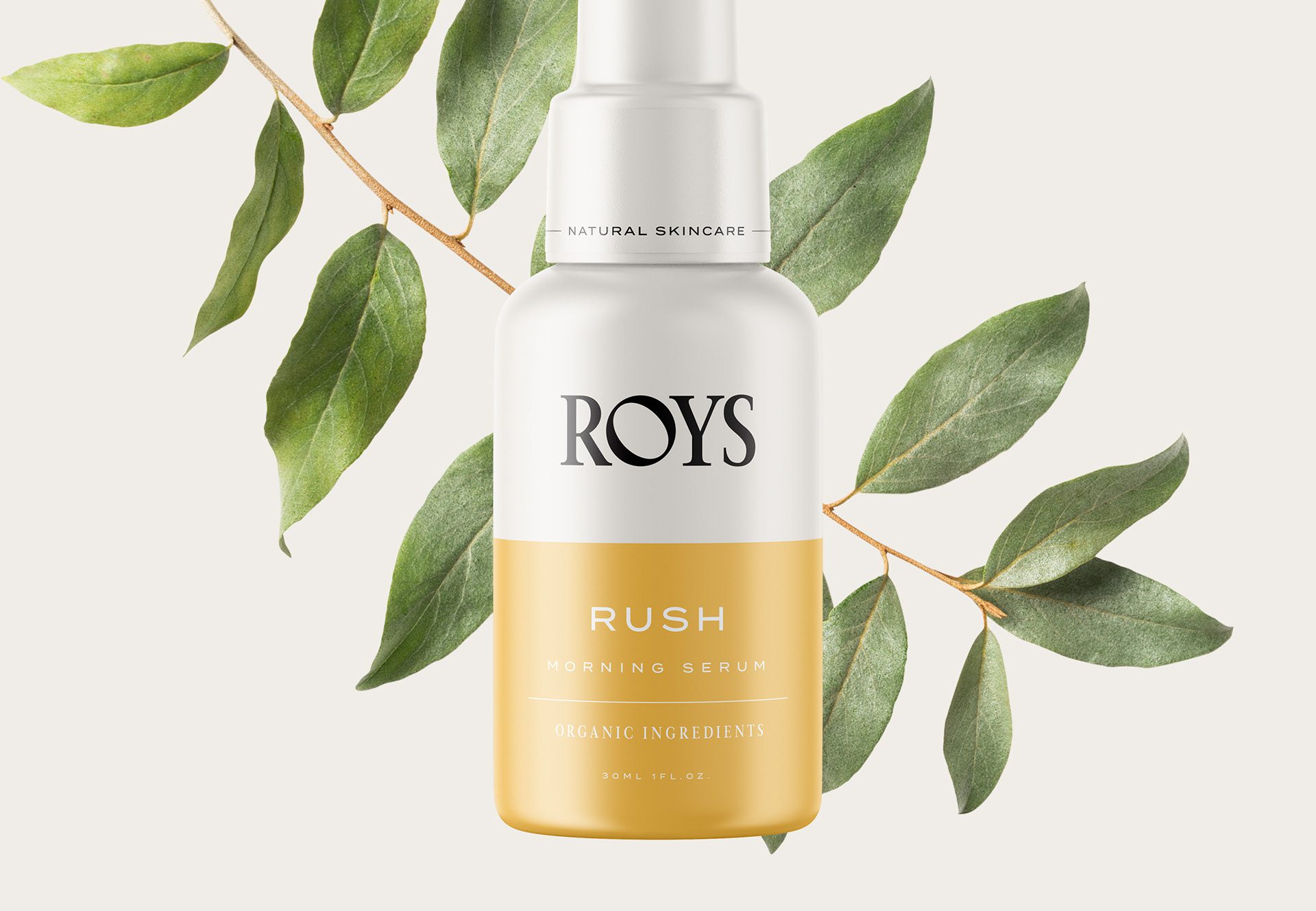
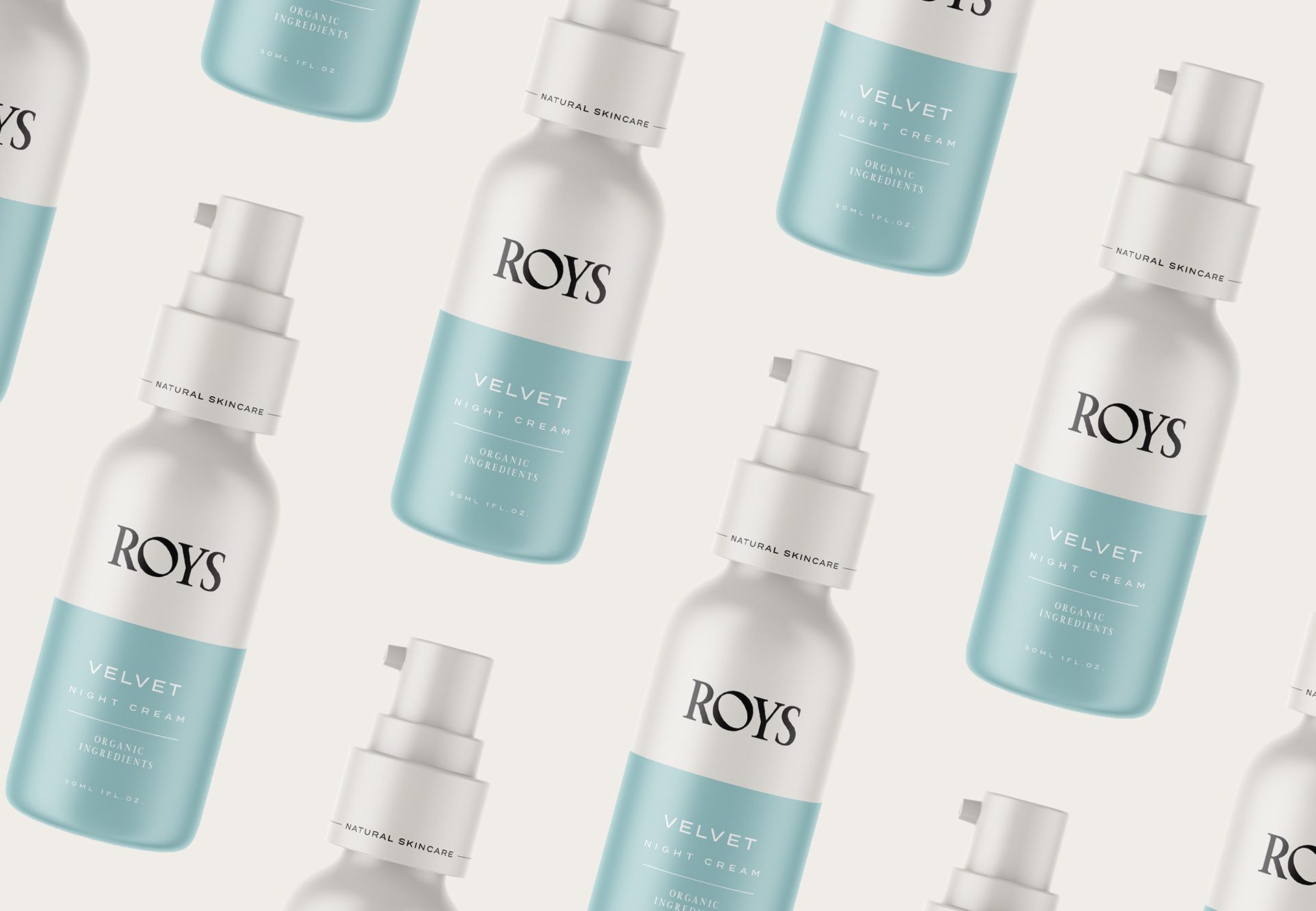
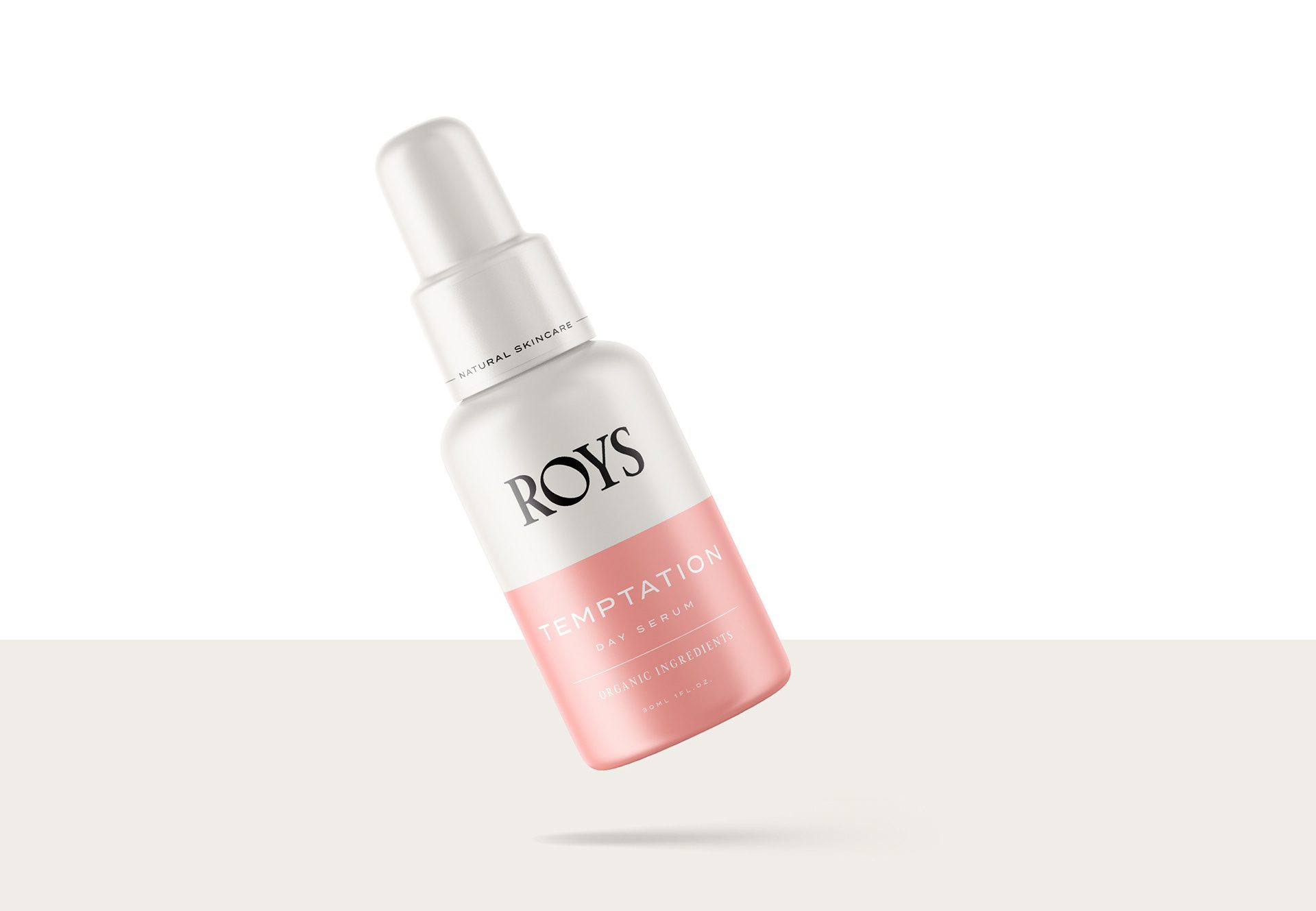
For the packaging design we used one shared layout across the whole range. The top half of every pack is a soft grey and carries only the logotype; the bottom half carries the product’s own pastel with a minimal layout: the product name, the weight, and the phrase “Organic ingredient.” The only elements that change from product to product are the color and the name. That restraint is the point of the system: the range reads as one family at a glance, and each product still identifies itself instantly.
Packaging Designs
The result is a holistic skincare identity in which the organic positioning is carried by the palette itself: pastel hues signal the ingredients, the shared layout keeps the promise of simplicity, and the serif logotype holds a professional, prestige presence across every product.


Let’s make the work they’ll copy.
Talk to an expert now
Work with a 38 team of the
industry’s top 1% talent.



