Enough that someone who never met you can apply your brand correctly. The test is not length, it is whether every rule is written as something checkable: 2 of the most useful entries are contrast thresholds of 4.5:1 for body text and 3:1 for everything else, taken from the W3C accessibility criteria.
One test to apply to every page
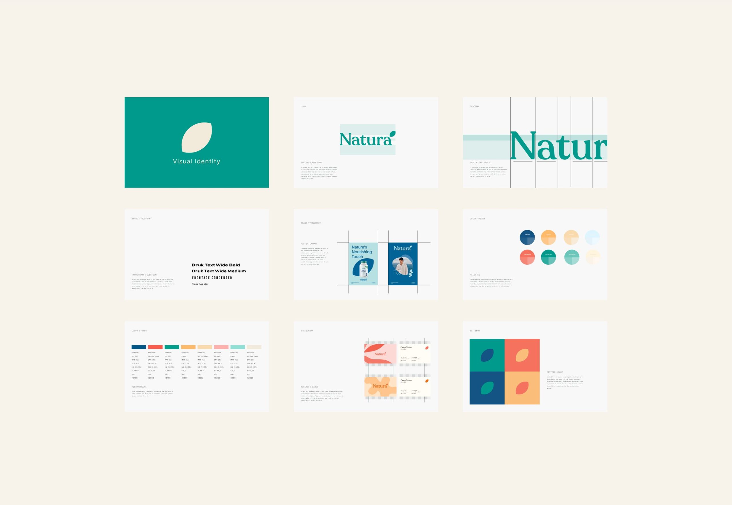
A guidelines document is written for the people who were not in the room. That is the test to apply to every page of it. Beyond the logo, its clear space and its misuse examples, a full guidelines document carries the type scale and how it behaves at small sizes, the colour system with the values for each medium rather than a single reference, the grid or spacing logic, and the imagery rules. Accessibility thresholds belong in it as measurable criteria rather than as intentions: contrast minimums and text spacing tolerances are numbers a document can be tested against, and a system that has not been tested against them tends to break where it is used most. Not every brand needs the full document. A lighter brand style guide, which shows the visual style without the full rule set, is also a deliverable we hand over, and it is worth agreeing at the start which of the two you are buying.
Numbers that make it testable
A guideline written as an intention cannot be audited. A guideline written as a number can.
Under the W3C accessibility criteria, body text needs a contrast ratio of at least 4.5:1 against its background, and non-text elements such as icons and interface components need at least 3:1. Those are thresholds, not preferences, and a ratio of 2.999:1 does not round up.
Ask for the same treatment on every other rule: clear space expressed in a unit rather than as “generous”, minimum sizes in points or millimetres, and colour values given per process instead of one number reused everywhere. A document written that way can be handed to a printer, a developer and a freelancer in the same week without three different interpretations coming back.
A lighter version, and when it is the right answer
Not every brand needs the full document, and pretending otherwise wastes money. A brand style guide shows the visual style without the full rule set, and MarkaWorks hands that over as a deliverable in its own right.
The practical test is how many people will touch your brand without speaking to you. One in-house designer who sits near you needs less written down than a printer in one country, a developer in another and an agency you have not hired yet. Where the answer is “just us for now”, the lighter guide is the honest purchase, and it grows into the full document later without redrawing anything, because both carry the same process values.
The contents, section by section
No published standard sets what a brand guidelines document must contain. There is no ISO specification for it and no industry body that defines the sections, which is why two documents with the same name can be nothing alike. What follows is the checklist MarkaWorks works to. Read it against whatever you are handed, and mark what is missing.
Four sections are the system itself, and every identity project delivers them. The mark is usable when it states clear space in a unit, a minimum size and every approved variant; it is useless when it says “use with plenty of space around it”. Type is usable when it carries a scale with sizes, behaviour at small sizes and a named fallback; a font name on its own tells a developer nothing. Colour is usable when it gives values per medium and records the contrast ratios; one reference value reused for every medium will fail in one of them. Layout is usable when the grid or spacing logic can be reproduced by someone who has never seen the file; example layouts with no rule behind them cannot be.
Two more are a scope decision, agreed at the start and priced with the rest of the work. Imagery says what is in scope, what is not and how images are treated, rather than arriving as a mood board. Application covers the surfaces you actually sell on, not mockups of surfaces you do not use. A lighter guide carries fewer of these, and which ones is settled in the same conversation rather than discovered at handover.
Three of the six are not set by any studio, and those are the ones for you to check first. Colour carries the W3C accessibility criteria: body text needs 4.5:1 against its background and non-text elements need 3:1, under success criteria 1.4.3 and 1.4.11. Type stops being a brand decision the moment it lands on a regulated surface. On a food pack in the UK, Article 13 of Regulation (EU) No 1169/2011 sets a minimum x-height of 1,2 mm for the mandatory particulars, so a guideline that specifies a smaller size for that surface is not a preference, it is wrong. Other markets set their own floors, which is the reason the type section names a behaviour at small sizes rather than one number. Application inherits the same logic wherever a barcode appears, since its size and colour are set by GS1 rather than by the brand.
The other three, the mark, the layout and the imagery, rest on no external rule at all. They are MarkaWorks’ judgement, and you should read them as such. They are written as numbers so that you can hold the studio to them rather than agree with it, and the point is stated here so that a house habit does not reach you dressed as a requirement.
Every one of these is written so that someone who was not in the room can check it against the file in front of them. A rule that needs the designer present to interpret it is exactly the situation the document exists to prevent. Keeping the rules current after handover is part of a MarkaWorks design retainer, where guideline updates are planned month by month with the rest of the work.
Three things to agree before the work starts
Settle three things at the start rather than at delivery, and put them in the proposal rather than in a conversation. MarkaWorks writes all three into scope before the work begins.
- Which of the two documents you are buying, in writing.
- Who owns the source files at the end, which is the item most often assumed and least often stated.
- What happens when a rule turns out to be wrong in use, because every system meets a case it did not anticipate and somebody has to be allowed to update the document.
How to read the one you already have
If you already hold guidelines, open them and count two things: how many rules carry a number, and how many require a judgement call. A document where most rules are judgement calls is a presentation of the brand rather than an instruction for it, and that is usually why your suppliers keep asking you questions the document was supposed to answer.
MarkaWorks guidelines, written as rules
MarkaWorks writes guidelines as checkable rules: clear space in a stated unit, colour values per medium with the contrast ratios recorded, and a type scale with sizes. We agree at the start which of the two documents you are buying, the full guidelines or the lighter style guide, and put that in the proposal; both sit inside the brand strategy and visual identity service.
Written for the people who were not in the room. What belongs in it, which numbers make it testable, and when a lighter style guide is the honest answer.
More brands we brought to life: