A brand identity project typically covers 6 things, counted from the deliverable lists agencies publish: the strategic frame, the marks and their variants, type, colour with usable values, the imagery rules, and the documentation that lets other people apply all of it. The applications are whatever the contract names. Scope varies by agency, so read a proposal for what it lists and put that list in writing.
Brand identity and visual identity, defined once
Brand identity is the full system a brand uses to be recognised: name, voice, marks, colour, type and the rules for using them. Visual identity is the visible part of that system. Every visual identity belongs to a brand identity, and the reverse is not true. That is why a project sold as “a logo” and a project sold as “an identity” can differ by months of work and still look similar on a mood board.
The register makes a narrower distinction still. In the UK you can register a trade mark, in the words of the government guidance, “to protect your brand, for example the name of your product or service”, and “a trade mark lasts 10 years”. Registration protects a name or a mark. It does not protect the system around it, and it does not tell anyone how to use it. That second job belongs to the guidelines, which is the last item on the list below and the one most often left out of the quote.
The strategic frame before any drawing
The first deliverables are written, not drawn. On the MarkaWorks services page the “Brand Strategy & Visual Identity” group lists 9 items, and the first 5 are strategy: brand positioning, audience and persona analysis, naming and story building, brand voice and messaging, and competitor analysis. The mark comes sixth. That order is not decoration. A logotype drawn before the positioning is settled gets redrawn when the positioning changes, and the redraw is usually billed twice.
The published cases show the same order. The YU tea brand page opens with “01. Research & Strategy” and “02. Brand Naming & Concept” before “03. Logo Design”. The name itself was part of the scope: “The name YU carries dual meaning in Japanese symbolizing both superiority and connection.” Naming is a separate craft with its own checks, trademark search, pronunciation in every target language, and it is worth asking whether it is in the proposal or assumed to be yours.
The mark and its variants
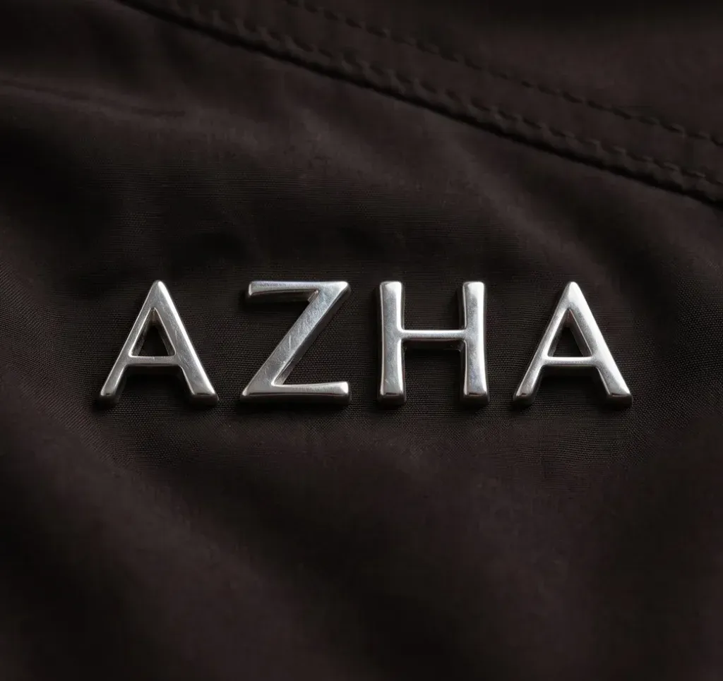
A mark is rarely one file. The useful vocabulary is short: a wordmark or logotype is the name set in type, a lettermark is the initials, and a logomark or brandmark is a symbol that works without the name. Most identities carry two or three of these, plus lockups that fix how they sit together, so the same brand can appear on a shop front, a 30 mm label and a favicon without being redrawn each time.
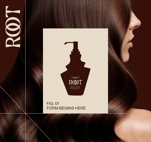
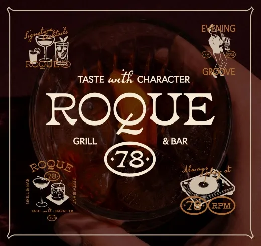
Public guidelines show what “variants” means in practice. The European Commission’s visual identity page states that “three variations of the logo exist but the main version to use is the horizontal version”, and then lists the terms of use. On the MarkaWorks side, the Pureskin identity carries “two font versions” of the logotype, one bold and one soft, and “a secondary mark … applicable on any surface”; the Elevated identity pairs a lowercase logotype with an “e” monogram that the case page calls “a distinct, memorable icon”. What you should receive is each variant in vector, in colour, in one colour and in reverse, with the rule for when each one is used.
Type, colour and the numbers that make them usable
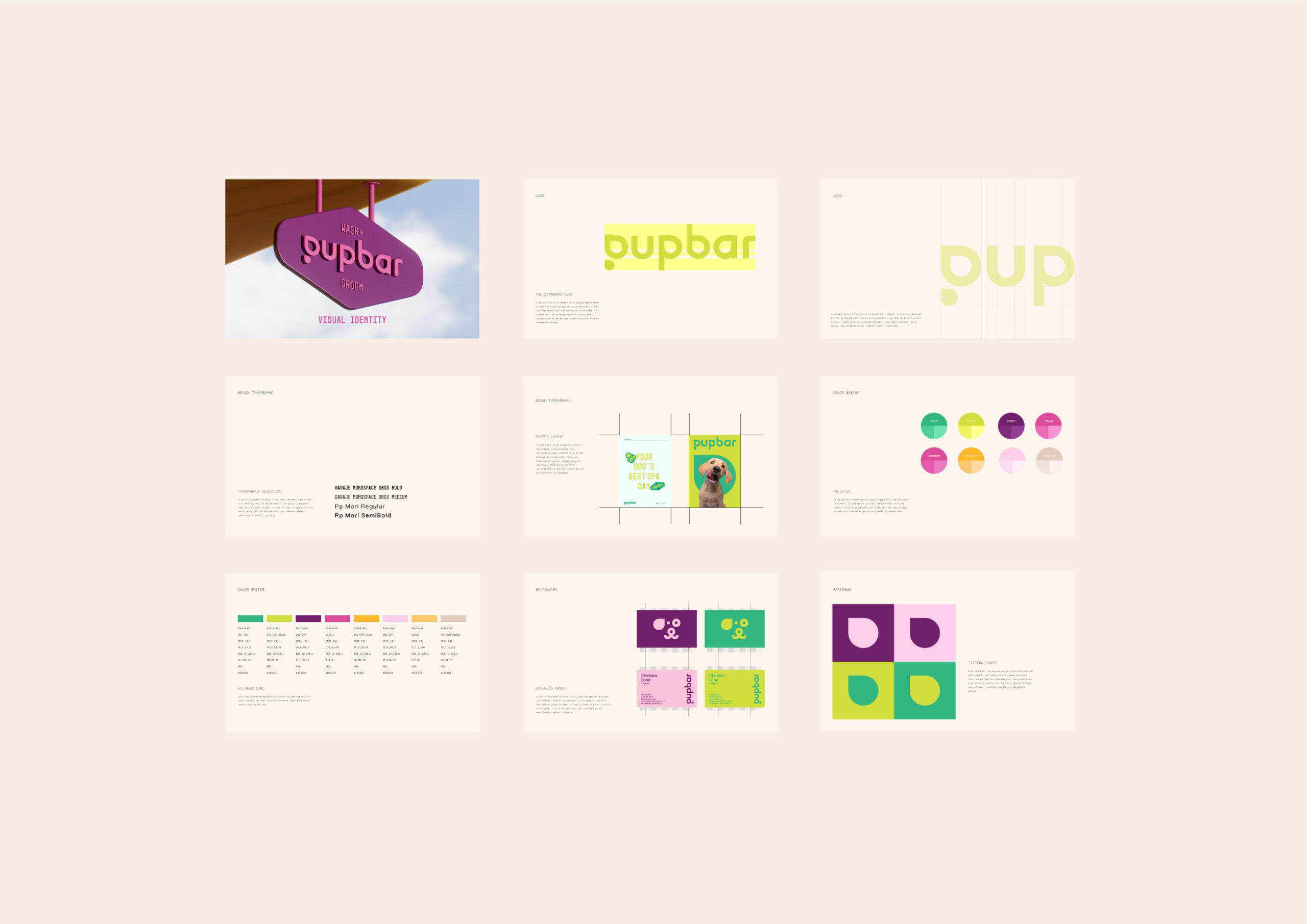
A typographic system is a choice of families plus the rules for size, weight and hierarchy at each scale. A colour system is a set of values per medium, not a swatch. The test for both is whether someone who never met the designer can reproduce them. A colour given as one hex value will drift the first time it is printed, and a type scale given as “headline, body, caption” will be reinvented by every new supplier.
Three numbers belong in the colour part of any serious system. Under WCAG success criterion 1.4.3, body text needs a contrast ratio of at least 4.5:1 against its background, and large text at least 3:1. One exemption is written into the criterion: “Text that is part of a logo or brand name has no contrast requirement.” Under criterion 1.4.11, icons and other meaningful graphics need 3:1. The same document warns that “2.999:1 would not meet the 3:1 threshold”. A palette delivered without these checks will fail on the website first, because that is where the values are measured by machines.
Ownership of a colour is a separate question from its value. Tiffany’s own press page records that “since 1998, Tiffany Blue has been registered as a color trademark by Tiffany and, in 2001, was standardized as a custom color created by Pantone exclusively for Tiffany and not publicly available”. Few brands need that, and all brands need the ordinary version: the exact values, per medium, written down where the printer and the developer can both find them. The current way to hand those over is a token file. The Design Tokens Format Module, in its 2025.10 version, defines the unit plainly: “An object with a $value property is a token.” A colour delivered that way, with a $type and a $value, is the same colour in the design tool, on the website and in the print file.
Applications, and where scope usually hides
Scope varies by agency, so read a proposal for what it names rather than for what it promises. A typical identity project covers the strategic frame, the logo and its variants, a typographic system, a colour system, the rules for imagery, and the documentation that lets other people apply all of it. What is often left out and worth checking: how many packaging formats are included, whether digital templates are covered, whether 3D visualisation is part of the work, and who owns the source files at the end. The last one is the item most often assumed and least often written down.
The MarkaWorks list ends with “Brand Assets (business cards, templates, packaging, etc.)”, and that “etc.” is what to pin down before signing.
Two case pages show what a written-out application set looks like. The Nutrio page runs through 9 numbered sections and 4 of them are applications: packaging design, digital experience, iconography and 3D system, and brand communication. The SOLANKI page lists its delivered scope as brand strategy, visual identity, art direction, brand guidelines, environmental design and digital experience. When a case page names its scope like that, you can compare it with your proposal line by line.
What goes inside a brand guidelines document
Ask which of the two documents your proposal covers, because they are different deliverables: the full guidelines with the rules, the exceptions and the production detail, or the lighter brand style guide that shows the style without the full rule set. MarkaWorks hands over both, and which one you need depends on how many people will apply your brand without speaking to you.
The section-by-section checklist, the contrast thresholds that make a rule testable, and how to read guidelines you already hold are in what should be inside a brand guidelines document.
The list to put in the contract
| Item | What to ask for | How to check it later |
|---|---|---|
| Strategic frame | Positioning, audience, naming scope, voice, in a written document | Can a new hire read it and describe the brand in one paragraph? |
| Marks and variants | Wordmark, lettermark or logomark as agreed, lockups, vector files in colour, one colour and reverse | Open each file at 30 mm and at favicon size |
| Typography | Families, licences, type scale with sizes and weights per medium | Set a label and a web page from the scale alone |
| Colour | Values per medium, contrast checks at 4.5:1 and 3:1, token file if digital work follows | Run a contrast checker on text and icons |
| Imagery | Photography and illustration rules with examples of use and misuse | Brief a photographer from the document only |
| Applications | Every format by name and count: packs, templates, 3D, web | Compare the list with the case pages the agency published |
| Guidelines | Full guidelines or a brand style guide, decided at the start | Hand it to someone outside the project and watch them apply it |
| Source files | Who owns them, in which formats, delivered when | Check the files arrive with the final invoice |
How MarkaWorks delivers this
MarkaWorks is a branding agency, and the identity work follows the order on the services page.
- Strategy first: positioning, audience, naming scope and voice, in writing.
- Then the logo and the identity design, with each variant in vector, in colour, in one colour and in reverse.
- Then colour, typography and grid systems, with the values per medium and the contrast checks recorded.
- Then the brand guidelines and the brand assets named in the scope.
The published case pages write the delivered scope out, as YU, Nutrio and SOLANKI do above, so a prospective client can compare a proposal with a finished project rather than with a promise. Where a full guidelines document is more than a brand needs, we hand over a brand style guide instead, and that choice is made at the start of the project, in writing.
The strategic frame, the marks and their variants, type and colour with usable values, imagery rules and the guidelines document. What to put in writing before you sign.
More brands we brought to life: