Updated October 2026
Brand Strategy and Visual Identity
Strategy decides what a brand stands for; the visual identity is how that decision becomes visible. MarkaWorks does both, together or one at a time: positioning, naming, brand identity design as a system, and the guidelines that keep it stable. Of the case studies published on this site, 25 are in nutrition and wellness and 20 in coffee and tea, counted page by page.
Strategy that shapes the identity
Strategy here means four decisions made in order.
- Who the product is for.
- What it stands against.
- What it will be called.
- What it must never say.
The four decisions fix the boundaries a designer works inside, and a brand that already has its answers starts from them.
We run market positioning and competitor analysis to set those boundaries, then write them down as a differentiation frame the client can hold us to. Naming belongs to this stage as well.
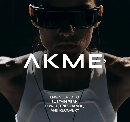
On AKME Performance the organizing idea was “discipline over motivation”, and the identity was built from it: a geometric wordmark, structured grids, and a black, white and gray base with acid yellow accents for energy.
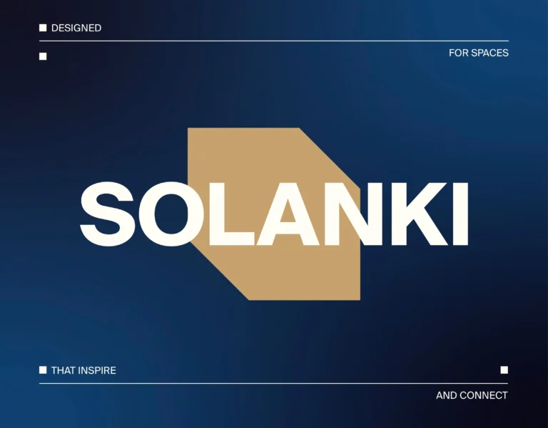
Differentiation is decided at this stage. Rauph, a perfume brand, was built on restraint and intentional simplicity, with a visual language that feels architectural rather than decorative. SOLANKI, a real estate and development company based in Dubai, built its identity on three words the company uses about itself: trust, structure and long-term vision. In a market where a premium look is the default, restraint became its position.
The identity system
A visual identity is a system, not a logo. The mark is one element inside it, and on most of our case pages the elements doing the daily work are the type, the color build and the layout rules.
A full system covers the mark and its variants, the type hierarchy, the color build with process values, and the layout rules that tell anyone where things go. Those rules are the commercial part of an identity: they let a brand grow without calling a designer for every asset.
We design the system against the surfaces it will actually meet. Packs, a product page and a trade stand are three different geometries to satisfy, and a mark drawn for one of them fails quietly on the other two. A selection of the identity systems, wordmarks and applications we designed in 2026 is collected on Logos & Marks 2026.
Guidelines, and the lighter version of them
Some clients need a full brand guidelines document: the system, the rules, the exceptions and the production detail, written for anyone who will ever touch the brand.
Others need less. A brand style guide is a lighter deliverable that shows the style without the full rule set, and for a small team with one designer it is often the honest answer. We ask which one the brand actually needs before the stage starts.
Both versions carry the same process values, so a brand that starts with a style guide can grow into full guidelines without redrawing anything.
What agency structure means here
MarkaWorks is an agency, and the practical meaning of that, for a brand strategy and design agency, is a specialist per discipline: strategy, naming, identity, packaging, 3D and web are separate skills held by separate people. Each project draws on the specialists it needs, and all of them work in-house at MarkaWorks, so no part of the design work goes to outside contractors.
The specialist structure shows up in the portfolio as category depth. Our case pages are grouped by category, and each group carries the vocabulary, the regulatory detail and the shelf conditions of its own sector.
| Category | Case studies on the category page | Identity work the category demands |
|---|---|---|
| Nutrition and wellness | 25 | Range architecture across flavors and formats, mandatory panels inside the layout |
| Coffee and tea | 20 | Origin storytelling with a fixed information block, formats that change by grind |
| Food and drink | 17 | Category signals read in under a second, identity that survives chiller conditions |
| Cosmetics and skincare | 15 | Restraint as the premium signal, color as the navigation system |
Brands that launch in more than one market

An identity built for a single market carries assumptions nobody wrote down: the alphabet it was drawn for, the shelf it was proportioned for, the claims that are legal where it started. Those assumptions surface at the second market, usually as a redraw.
We work with brands selling across Europe, the Gulf and the United States, so the identity system is specified for the widest set of surfaces the brand will meet. Type is chosen with the character sets the brand will need. Color is built with process values that hold across print standards. Mandatory information is planned as part of the layout instead of a late addition.
The premium categories make this sharper. In fragrance and skincare the identity is often the only differentiator on a shelf where every competitor uses the same finishes, and a system that reads as premium in one market can read as generic in another. We test the system against the categories the brand will actually compete in.
Rebrands and the traffic you already have
A rebrand is the one project where the risk is subtraction. The brand already has recognition, search traffic and shelf memory, and a redesign that ignores those throws away an asset nobody has priced.
Our rebrand work starts by listing what must survive: the elements a buyer uses to find the product, the pages that already earn visits, the names people search. Everything outside that list is open. This is also why we do not change a brand’s addresses or page titles as a side effect of a design decision.


Frequently asked questions
Yes. Positioning, naming and the differentiation frame can be delivered on their own, and some clients take that stage first and decide on the identity later.
Guidelines carry the full system: rules, exceptions and production detail. A brand style guide shows the style without the full rule set. Smaller teams often need the second one, and we ask which before the stage starts.
Yes, and it is planned rather than hoped. We list the elements and pages that already earn visits before any design starts, and addresses and page titles are not changed as a side effect of a design decision.
Yes, and naming sits in the strategy stage rather than after it. A name chosen after the identity has to survive a design it did not shape.
When a brand takes both, the identity system is designed against the surfaces it will meet, the pack among them, and the packaging stage inherits the type, the color build and the layout rules instead of inventing them again.


A first call about your brand
Tell us in a first call where the brand stands today, or ask for a written proposal; either way we come back with a suggested scope.
Talk to an expert now