Updated November 2026
Competitor Analysis & Differentiation
Competitor analysis reads a product’s category before any design: what most brands on the shelf already look like, and which cue a new brand can take instead. It is part of the MarkaWorks brand strategy work, and in the 7 cases on this page, all published since November 2025, the identity was built away from that shared look.
For Planty the project began with a full category audit across plant-based milks and dairy alternatives, and it found most competitors leaning on clinical, overly functional packaging. The Vivvira brief arrived with its rule already written: no pharmaceutical cues.
What the analysis produces
- A category audit before the design
- The look most competitors share
- A design cue the brand takes instead
- A differentiation frame in writing
What the category already shows
Each case page below names what its category usually looks like, and the identity takes a different cue. The wording in every row comes from the case page.
- The category usually shows
Clinical, overly functional packaging that lacks emotional connection
The cue we used insteadGentle gradients, pastel hues and a minimal drop symbol
- The category usually shows
Distant clinical brands, or the same green palettes and botanical graphics
The cue we used insteadA palette drawn from sand, linen, stone and dark wood
- The category usually shows
Cold, clinical aesthetics
The cue we used insteadA soft blue color system, minimal typography and fluid forms
- The category usually shows
A clinical look for functional food
The cue we used insteadRounded typography, warm chocolate tones and playful organic forms
- The category usually shows
The usual pharmaceutical signals
The cue we used insteadLaboratory environments, biomedical technology and futuristic materials as references
- The category usually shows
Luxury signals, where a premium look is the default
The cue we used insteadMinimal layouts, intentional spacing and timeless color relationships
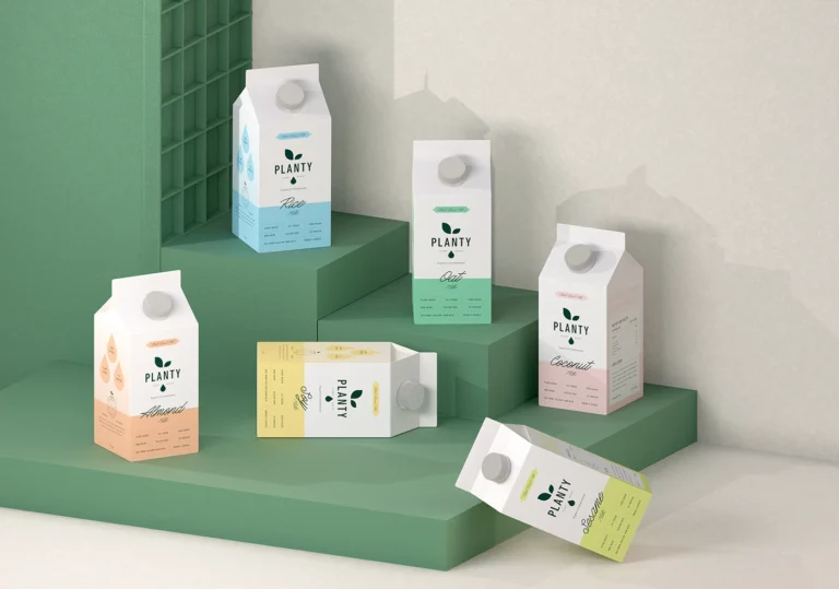
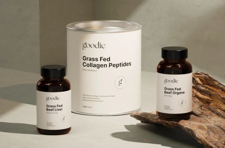

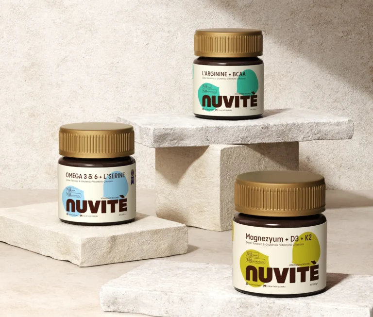

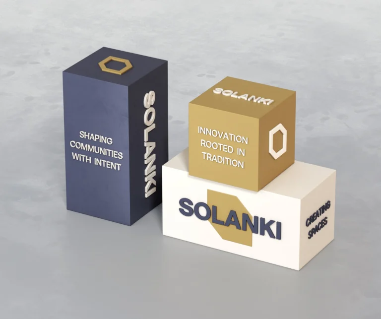
In five of these six briefs, part of the shared look was a clinical or pharmaceutical register, which is why so many of the chosen cues are warm or soft.
A category audit before the design
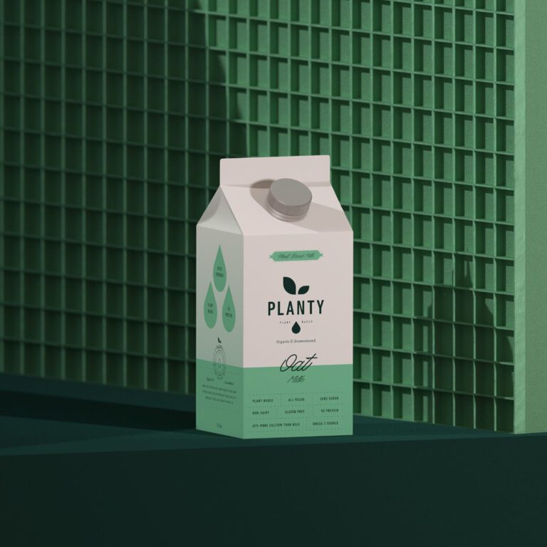
Planty is a plant-based milk brand, and the project began with a full category audit across plant-based milks and dairy alternatives. The audit found a clear opportunity: most competitors leaned heavily into clinical, overly functional packaging that lacked emotional connection.
From that finding we set three pillars before the identity was drawn: natural and honest, warm and uplifting, unified and scalable. The minimal drop symbol, the pastel color system and the ingredient-led packs all follow from those pillars.
A rule written against the category
The difference can also be agreed as a rule at the start. The Vivvira brief came with one: no pharmaceutical cues. Its category is full of cold, clinical aesthetics, so the packaging was built from the opposite direction, around clarity and calmness.

A rule like that also decides what to leave out. Every element left on the Vivvira pack has a reason to be there, and in a category where dense labelling is the norm, restraint reads as confidence.
We write these boundaries down as a differentiation frame the client can hold us to, so every later design choice can be checked against it.
Standing apart from familiar cues
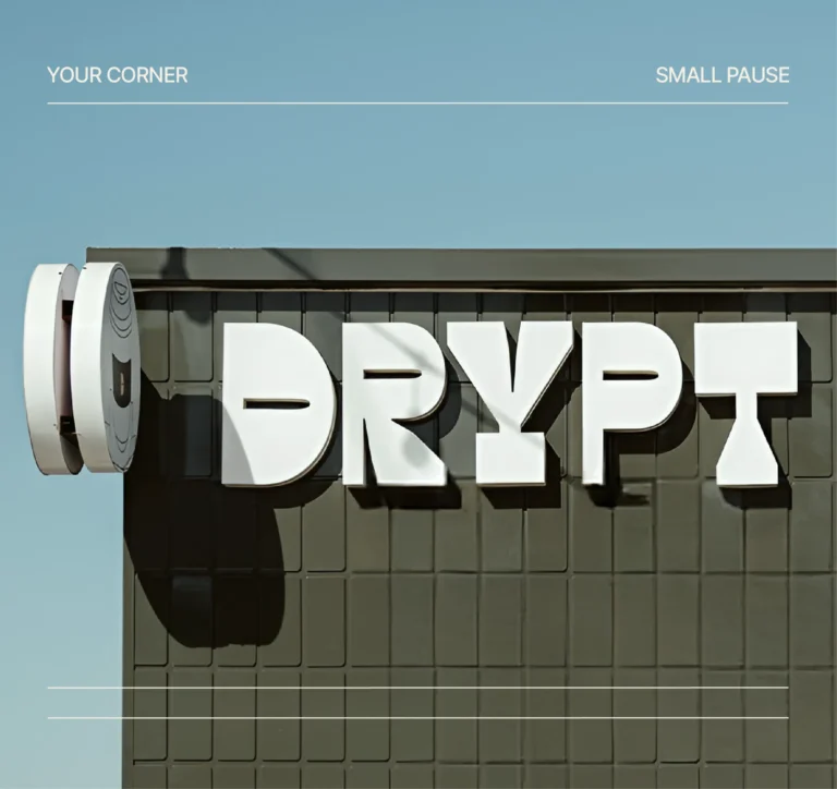
Some categories are crowded with sameness rather than with one habit. Drypt is a specialty roaster, and the goal was an identity with a stronger presence than the familiar café aesthetics of its category.
We made a custom emblem the brand’s most recognizable asset. Its bold geometric construction lets the same mark work cut into signage, printed small on a bag, stitched into merchandise and cropped for a profile picture.
The palette keeps the same distance: warm neutrals, deep coffee tones, muted greens and soft accent colors reflect specialty coffee culture without relying on clichés.
Difference inside one range
Differentiation also works inside a brand. Once a range has several products, a shopper has to tell them apart at a glance and still read them as one family.
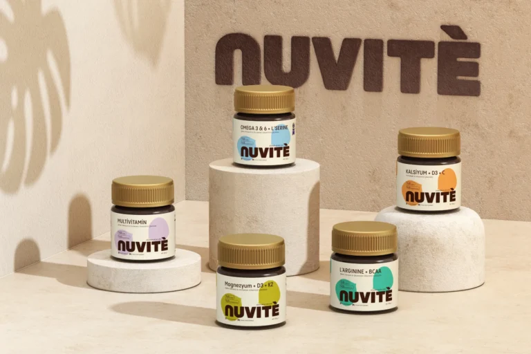
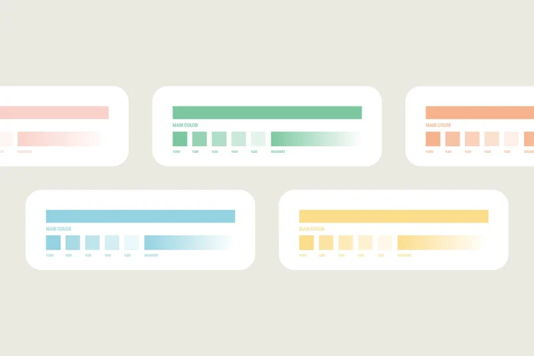
For NUVITÉ the typographic structure stays fixed and color is the variable: each product carries its own color personality, so the range can grow without a new design decision each time.
Planty follows the same rule. Each flavor has its own color story, which keeps the full range cohesive while every carton stays identifiable at a glance.
From the analysis to a position
Competitor analysis describes the category as it is; positioning decides where the brand will stand in it. Our brand positioning page shows how the same stage ends in a written position and a central idea for the identity.
If your team is running the analysis in house, our guide to positioning a product brand sets out the decisions one at a time.


Frequently asked questions
In our projects it is a read of the category before any design. For Planty it was a full category audit across plant-based milks and dairy alternatives, and the result is written down as a differentiation frame the client can hold us to.
The analysis describes what the category already looks like; positioning chooses where the brand stands in it. Both sit in the same strategy stage, and our brand positioning page covers the second step.
It can, as part of the strategy stage. Positioning, naming and the differentiation frame can be delivered without a new identity, and some clients take that stage first and decide on the identity later.
Before the design starts. For Planty the category audit came first, and the three pillars it led to were defined early enough to shape the whole brand world.
The seven cases here cover plant-based milk, supplements, functional chocolate, biotech, real estate and specialty coffee. All of our case studies are grouped by category on the projects page.


A first call about your brand
Tell us in a first call where the brand stands today, or ask for a written proposal; either way we come back with a suggested scope.
Talk to an expert now