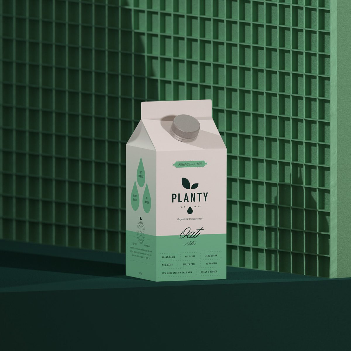
Planty
Building a Brand for the Modern Plant-Based Consumer
Our approach to Planty focused on creating a brand that is fresh, inspiring, and strategically aligned with the growing plant-based movement. Planty needed to communicate purity, simplicity, and everyday joy while differentiating itself in a category crowded with generic “healthy” cues. The result is a warm and contemporary identity system designed to feel approachable, trustworthy, and instantly recognizable.
Research & Strategy
The project began with a full category audit across plant-based milks and dairy alternatives. We identified a clear opportunity: most competitors leaned heavily into clinical, overly-functional packaging that lacked emotional connection.
Our strategy centered around three core pillars:
Natural & Honest – A visual language rooted in transparency, minimalism, and ingredient-first storytelling.
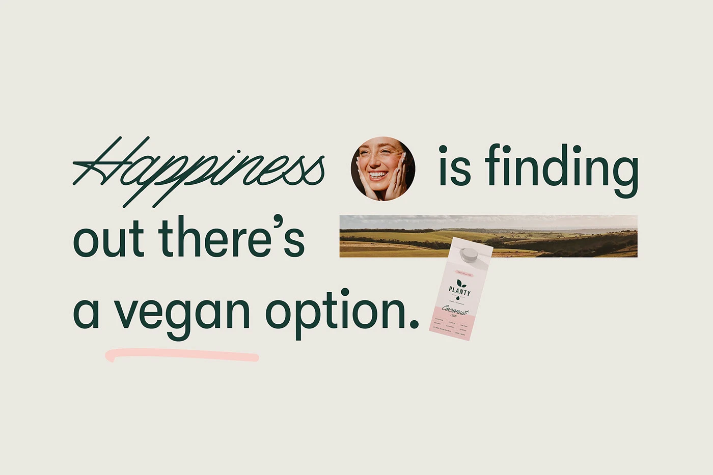
Warm & Uplifting – Soft tones, friendly typography, and lifestyle cues that evoke comfort and happiness.
Unified & Scalable – A flexible identity that works across flavors, packaging SKUs, retail shelves, digital presence, and future product extensions.
By defining these pillars early, our team shaped a brand world that feels both modern and emotionally resonant.
See more food and drink branding case studies.

Visual Identity
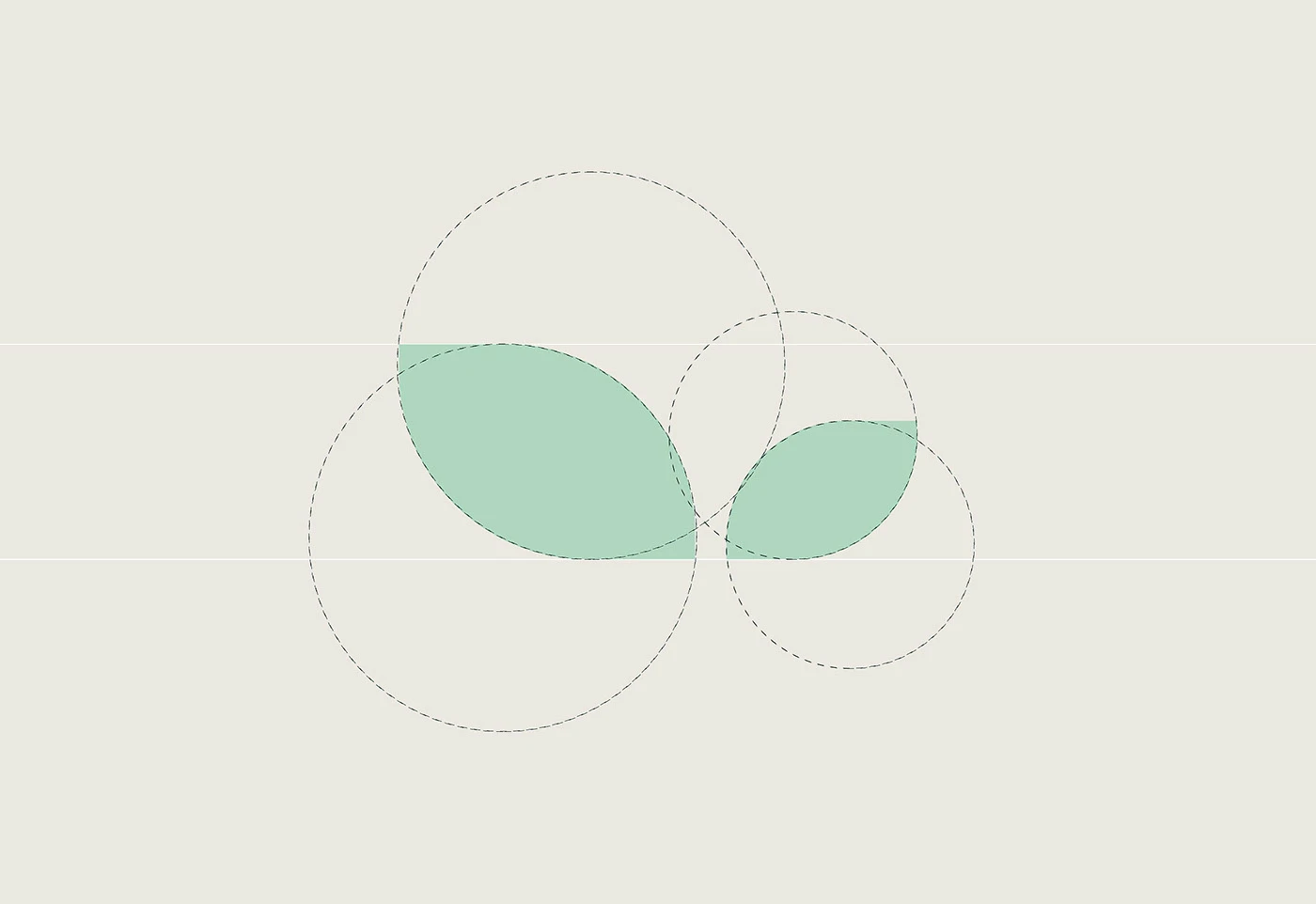
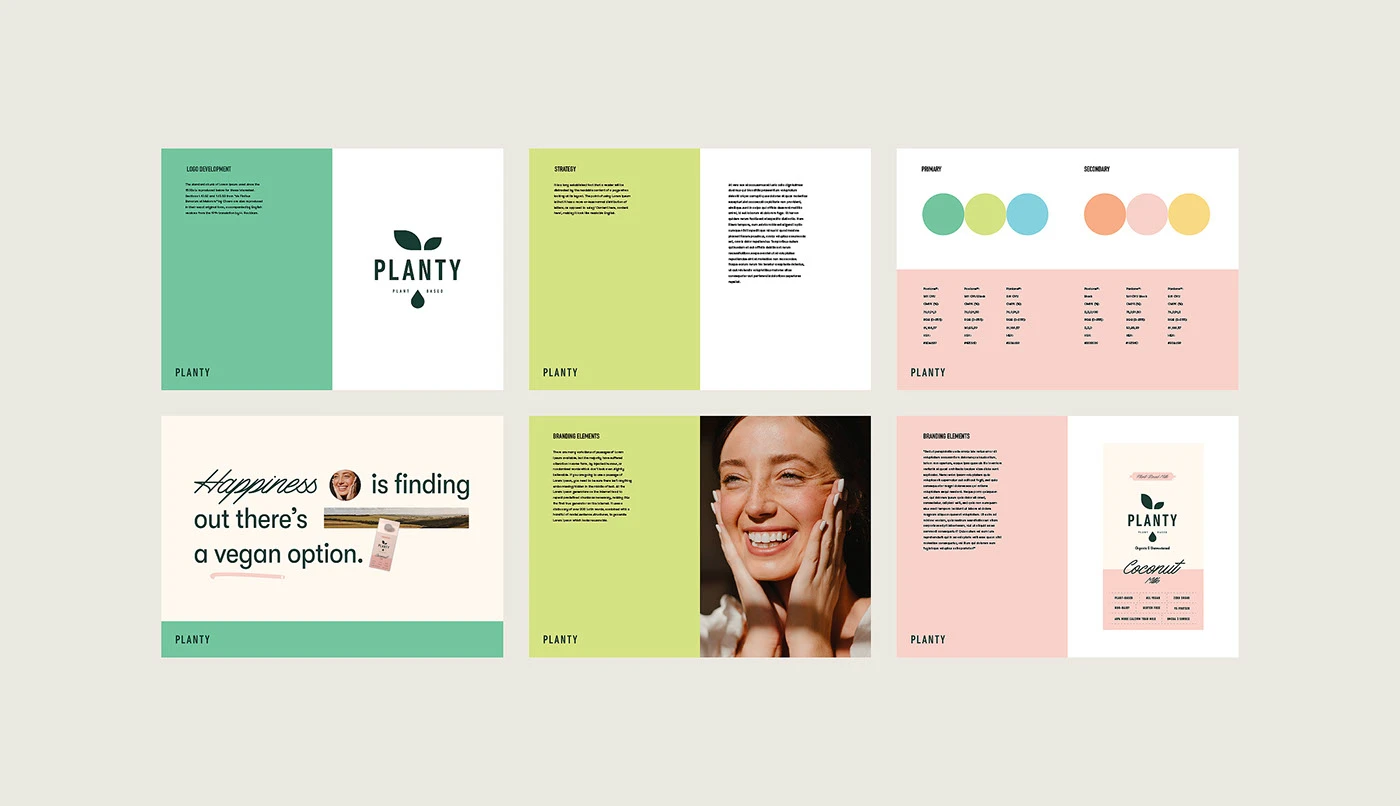
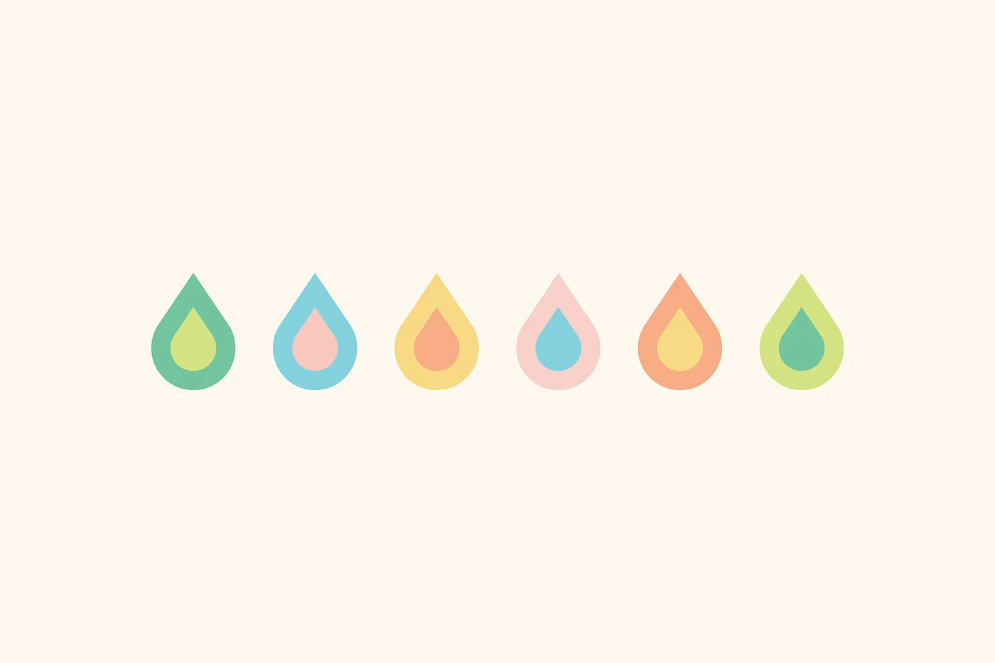
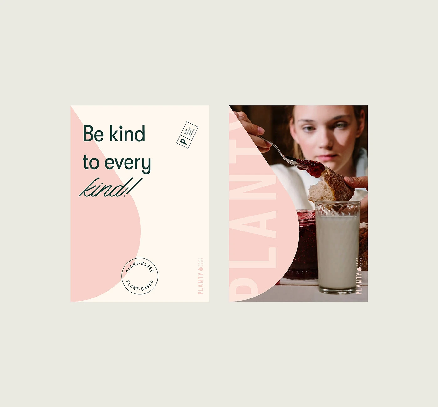
Planty’s visual identity was built to embody freshness, softness, and clarity. The logomark, a minimal drop symbol, captures the essence of plant-based milk while giving the brand a distinctive shape that becomes a core visual asset. The wordmark balances structure and friendliness, ensuring a clean presence across print and digital applications.
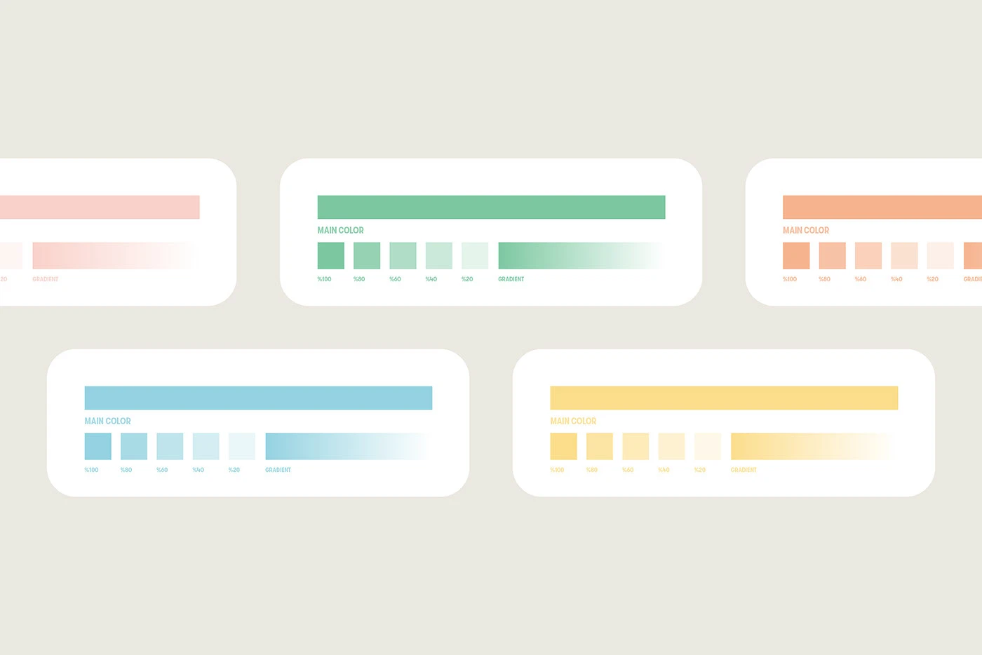
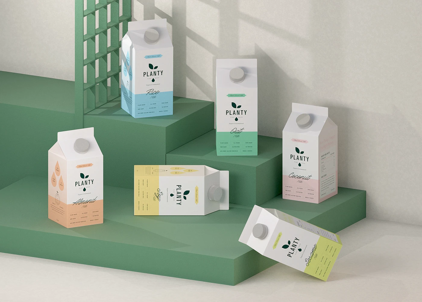
The color system is designed around gentle gradients and pastel hues, inspired by natural ingredients and the soothing character of plant-based living. Each flavor has its own color story, allowing the full range to feel cohesive but uniquely identifiable at a glance.
This design language was extended across every touchpoint: brand books, lifestyle communications, social templates, and marketing materials.
Packaging Design
One of the main challenges was creating packaging that feels premium yet comforting: modern enough for a design-oriented audience, but soft enough to signal natural, plant-based purity.
Our solution focused on:
Ingredient-Led Storytelling – Iconic droplet illustrations highlight key product attributes and instantly communicate flavor.
Minimalist Layout System – Balanced grids, clear hierarchy, and generous white space improve readability and elevate shelf presence.
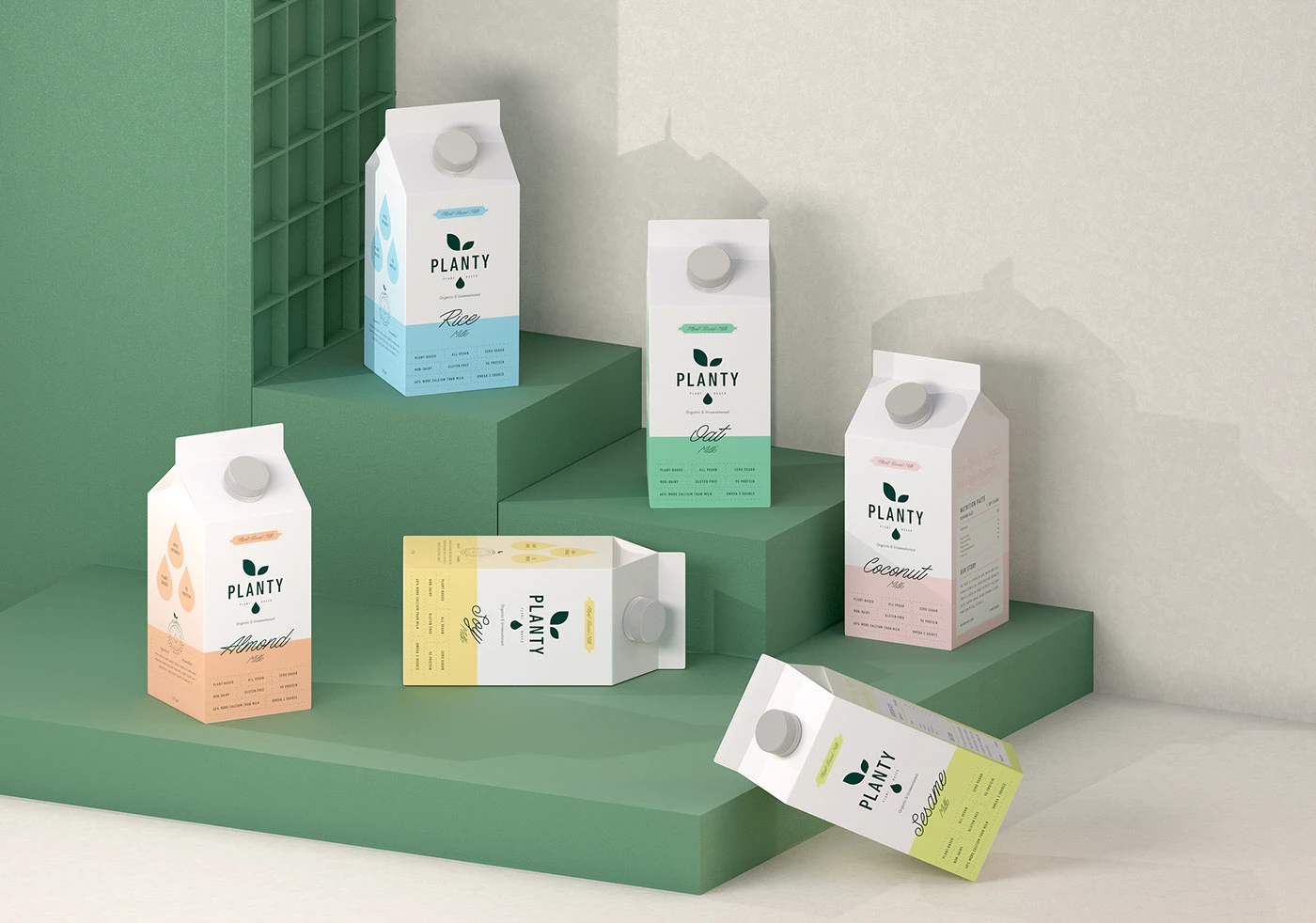
Cohesive Color Families – Each variant uses a distinctive color tone and gradient style, offering strong differentiation while maintaining a unified product line.
The result is a packaging system that stands out on shelves, photographs beautifully, and communicates the brand’s personality with clarity and warmth.

3D Visualization
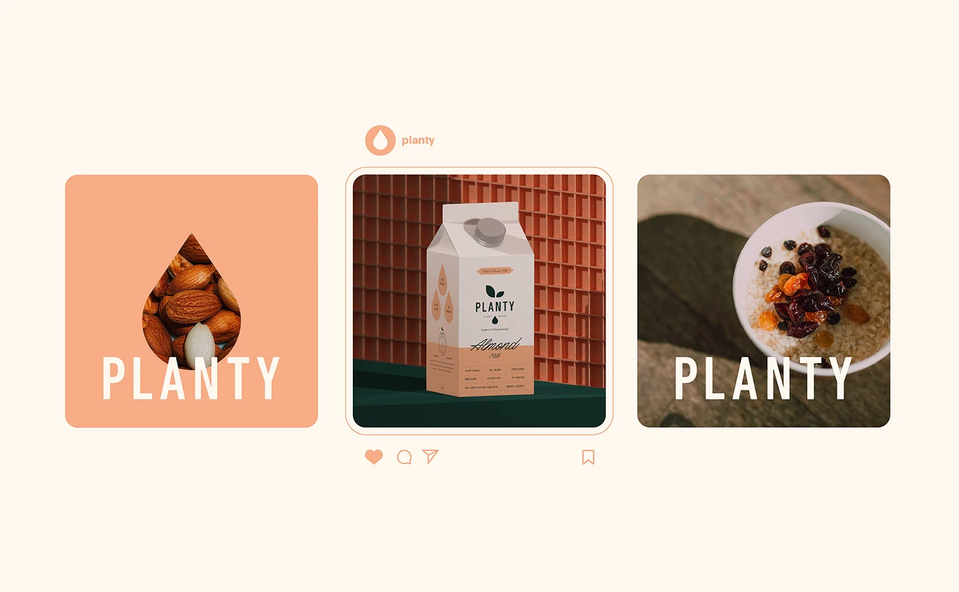
To bring the brand world to life, our team designed a full set of 3D visualizations that capture Planty’s gentle, modern aesthetic. Textured environments, soft shadows, and clean compositions were crafted to showcase the packaging from multiple angles, making the brand feel tactile and premium.
These visuals were used across digital campaigns, websites, and promotional materials, ensuring that Planty presents a polished and consistent look in every environment.
Outcome
Planty evolved from a simple plant-based milk concept into a lifestyle-forward brand that resonates with health-minded consumers. Through strategic positioning, soft yet confident design choices, and a unified packaging system, Planty established a visual identity that feels joyful, honest, and effortlessly modern.
MarkaWorks helped shape a brand that blends emotional warmth with clean design, resulting in a product line that stands out both on shelves and across digital touchpoints.

Let’s make the work they’ll copy.
Talk to an expert now
Work with a 38 team of the
industry’s top 1% talent.



