Updated October 2026
Food and drink branding: 17 case studies
The 11 packaged food and drink brands on this page cover chocolate, ice cream, juice, plant based milk, olive oil and natural foods, and 6 restaurant identities below them apply the same discipline to a room instead of a pack. A food shelf is read fast and from an angle, so on each pack the variable that separates products is decided before the decoration.
Category signals, used or refused
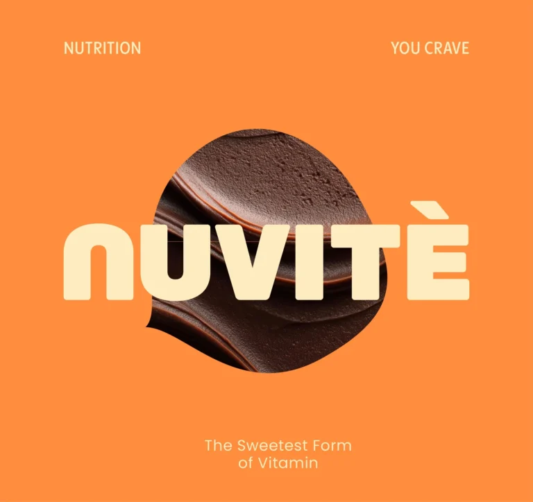
Food and drink packaging design is the label, pack and identity system that lets a product be found and told apart on a shelf that is read fast, and that lets a range grow without a redesign each time. Every fine chocolate brand meets the same problem: the category’s signals for quality are so consistent that following them makes a product invisible and abandoning them makes it read as cheap. Chocolate Dorado answers with a deep palette that has a deliberate clash inside it, rich blues against warm tones, so gold and brown register as a choice. NUVITÉ sits between chocolate and function on purpose, with rounded typography, warm chocolate tones and playful organic forms held inside a fixed typographic structure. Palamidas balanced heritage against modern restraint so the pack reads as provenance without costume.
The variable that sorts the range
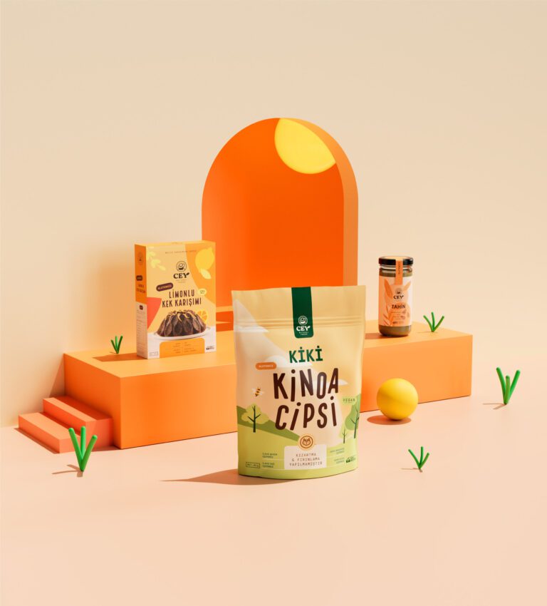
Vero Gelato assigns distinct tones that correspond to the flavors themselves, so a buyer finds a variant without reading and then confirms by reading. Scoop and Cones splits the work between two marks, a minimal sans for the logotype and a vintage secondary mark built from spoons and cones. Lif communicates ingredients, flavor profile and product purpose in a fixed order on every juice. Pilky, a plant based milk range of almond, oat and soy, separates each variant by color inside one system, on a palette of soft earthy tones, muted greens and warm neutrals. Amano lets one bold logotype carry two product lines, olive oil and balsamic vinegar, with pastel shades that leave the product information legible. Cey Natural Foods puts ingredient transparency first, with visual cues that separate product formats. Planty was built on a category audit of plant based milks, around three pillars its page names as “Natural & Honest”, “Warm & Uplifting” and “Unified & Scalable”, with ingredient first storytelling and a system that works across flavors and formats.
Food service identities
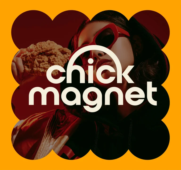
A restaurant brand is met in a room before it is met anywhere else. The six hospitality cases on this page, Capeesh Cucina Italiana, Chick Magnet, Gaia Traditional Italian Kitchen, Mister G’s BBQ, Roque 78 and Soiree, carry their identities across signage, menus, interiors and digital surfaces, and each case page shows the finished applications.
Cases by product type
| Product type | Cases on this page | Examples |
|---|---|---|
| Chocolate and desserts | 4 | NUVITÉ, Chocolate Dorado, Scoop and Cones, Vero Gelato |
| Drinks and plant based milk | 4 | Lif Juices, Pilky, Planty, Rally |
| Olive oil and natural foods | 3 | Amano, Palamidas, Cey Natural Foods |
| Restaurants and food service | 6 | Capeesh, Chick Magnet, Gaia, Mister G’s BBQ, Roque 78, Soiree |
The cases on this page
NUVITÉ: functional chocolate with rounded typography, warm tones and a color personality per product.
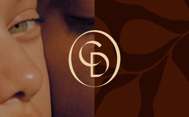
Chocolate Dorado: rich blues against warm tones, a streamlined logo, a quiet surface that rewards the closer look.
Scoop and Cones: a minimal sans logotype and a vintage secondary mark from spoons and cones.
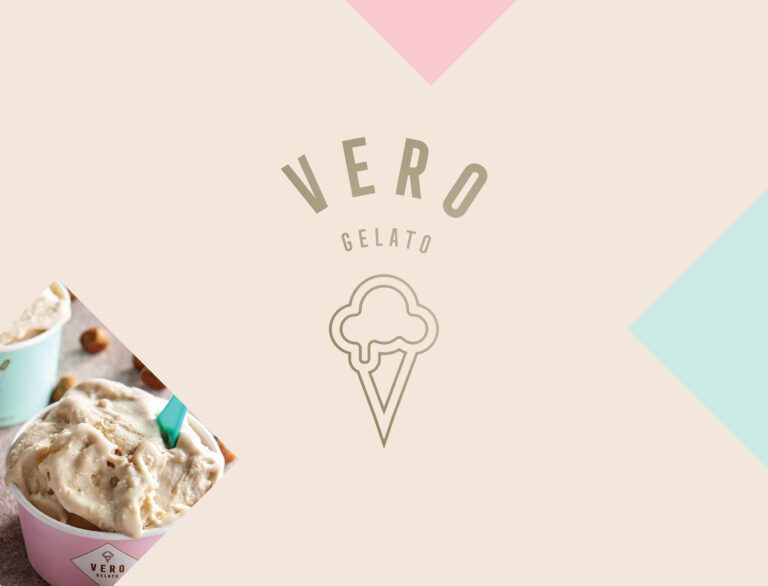
Vero Gelato: typography that holds structure at speed, colors keyed to the flavors.
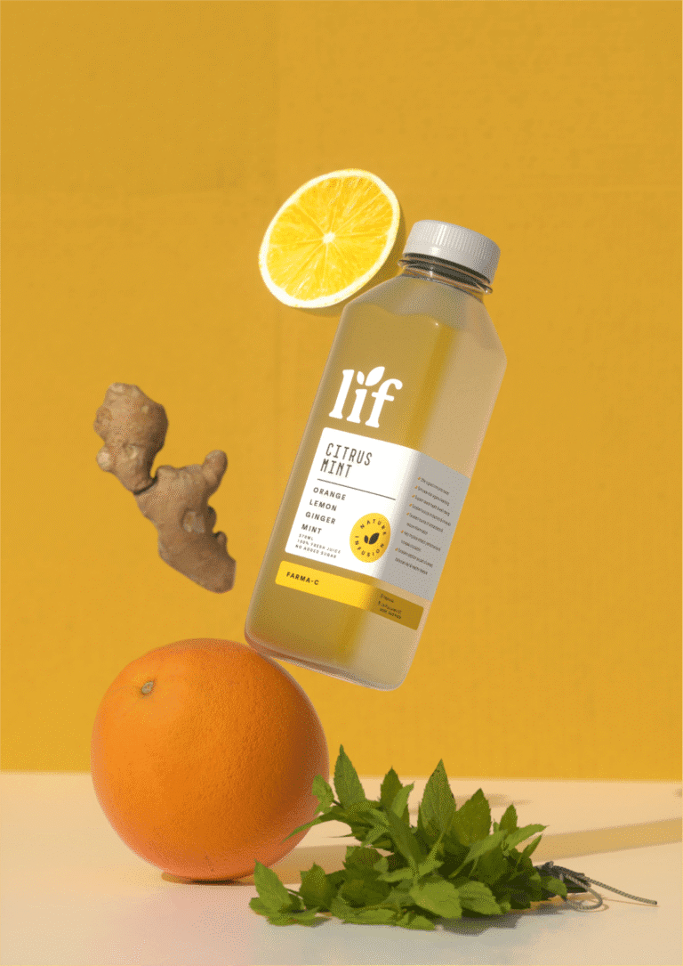
Lif Juices: ingredients, flavor and purpose in a fixed order on every pack.
Pilky: a plant based milk brand with almond, oat and soy in the range, each variant separated by color, soft earthy tones and warm neutrals.
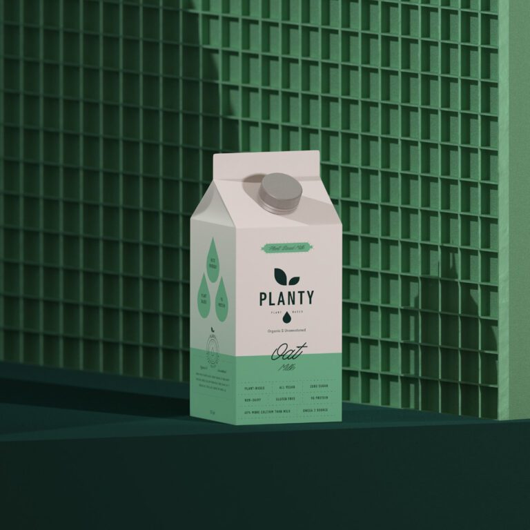
Planty: a plant based milk identity built on three named pillars, from a full category audit.
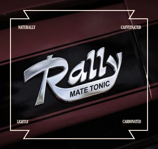
Rally: a sparkling yerba mate tonic with a bold visual system inspired by automotive culture and racing graphics.
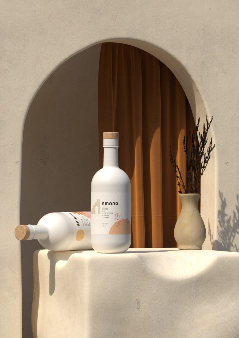
Amano Olive Oil: one bold logotype for olive oil and balsamic vinegar, pastel shades, no separate emblem.
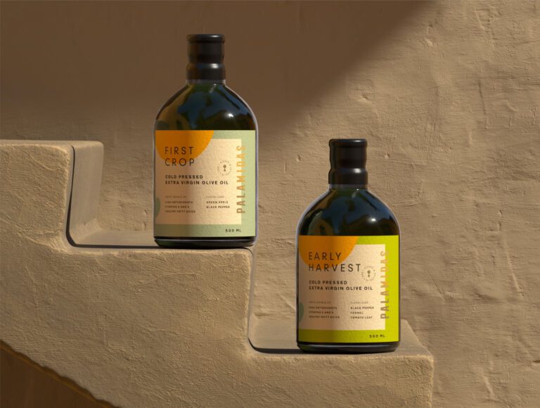
Palamidas Olive Oil: heritage led storytelling balanced against modern restraint.
Cey Natural Foods: transparency first, typography set for legibility across formats.
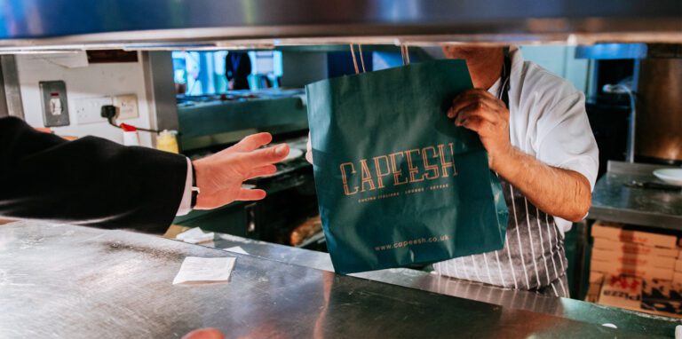
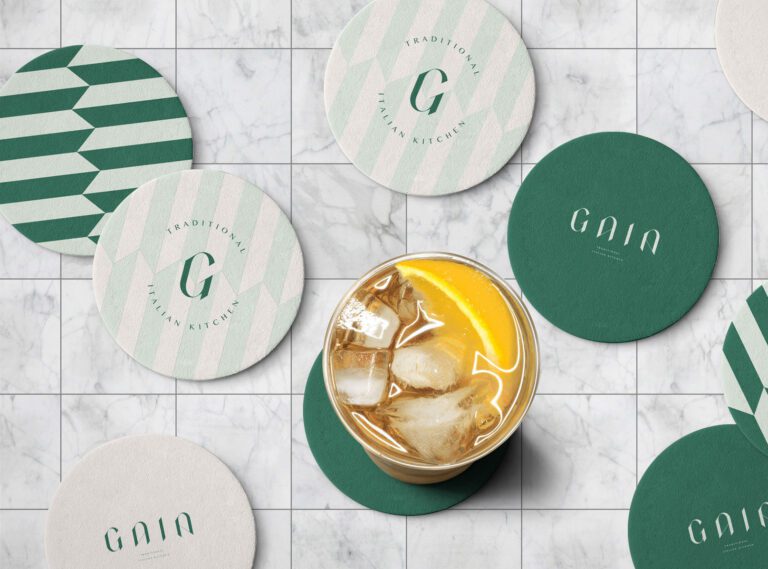
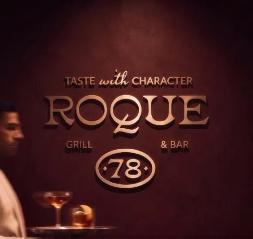
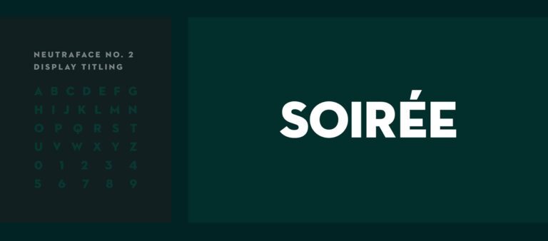
Capeesh Cucina Italiana Lounge and Skybar, Chick Magnet, Gaia Traditional Italian Kitchen, Mister G’s BBQ, Roque 78, Soiree Restaurant: identities for food service, on their own pages.


Questions food and drink brands ask us
Yes. Cey Natural Foods is a plant forward range built on whole and minimally processed products, and the identity we designed there is organized around ingredient transparency and clear separation between product formats. Pilky, a plant based milk brand with almond, oat and soy in the range, carries the same idea in soft, earthy tones.
Our closest branding and packaging work sits next to dairy brands rather than in them. Pilky and Planty are plant based milk alternatives, designed for the same chilled shelf with ingredient first storytelling, and Scoop and Cones is an ice cream brand with a minimal sans logotype and a vintage secondary mark. Every pack has to survive cold, condensation, and a fast decision.
NUVITÉ is our functional chocolate work: rounded typography, warm chocolate tones and playful organic forms, with each product carrying its own color personality inside one family. Chocolaté Dorado is the artisan side: a deep palette where rich blues meet warm tones, a streamlined logo and an elegant typeface, carried from the packaging through to the digital side as one piece.
Drinks in the sports category live on the same rule as the rest of the range work we do: one shared structure, and a single variable, usually color, that separates flavors. We have no published sports drink case, so this is method rather than portfolio.