Rally
Sparkling Yerba Mate Branding & Packaging Design
Shift the Day
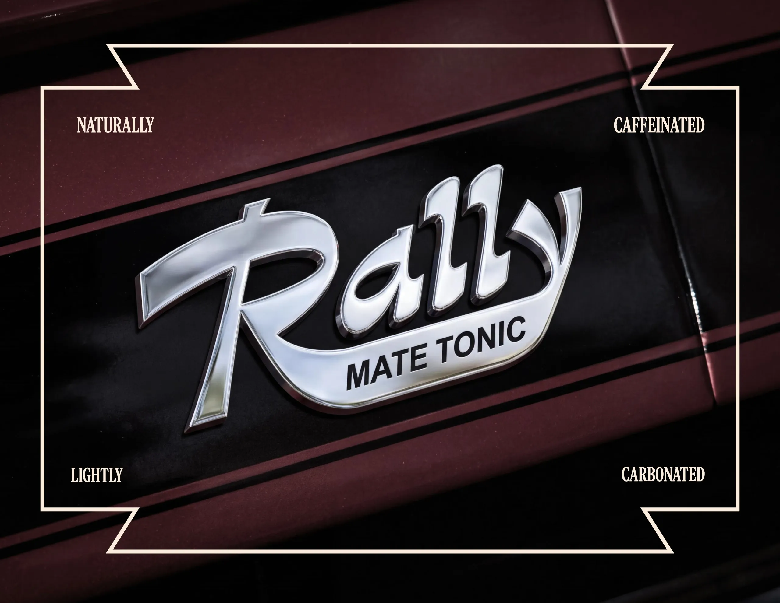
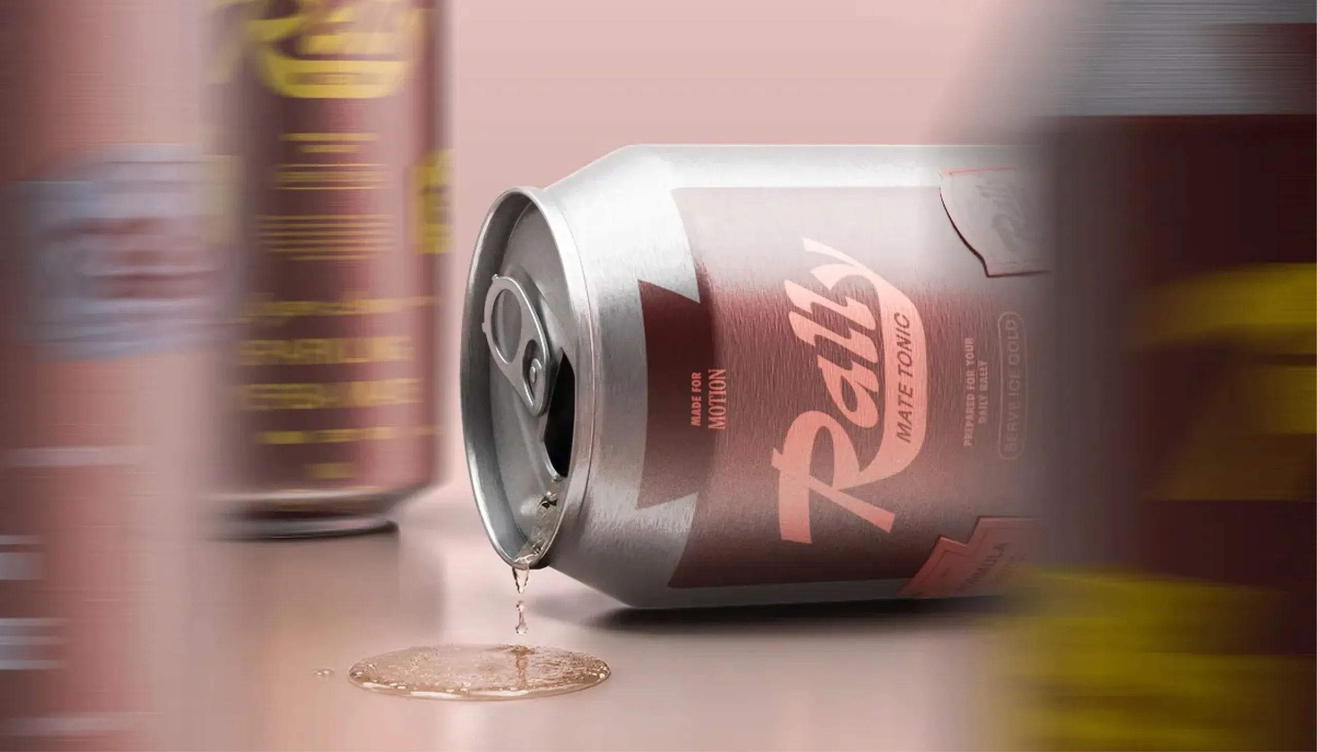
MarkaWorks developed the brand identity, packaging and art direction for Rally, a sparkling yerba mate tonic, translating everyday energy and forward momentum into a bold visual system inspired by automotive culture, racing graphics and the rhythm of motion.
The Challenge
Rally needed to communicate natural caffeine and everyday energy without falling into the visual codes of conventional energy drinks. The brand had to feel energetic without becoming aggressive, and nostalgic without looking retro for nostalgia’s sake. With multiple flavours in the range, the packaging also needed a clear system that could differentiate each formula while keeping the brand instantly recognisable.
The Solution
"Shift the Day" became the central idea behind the identity.
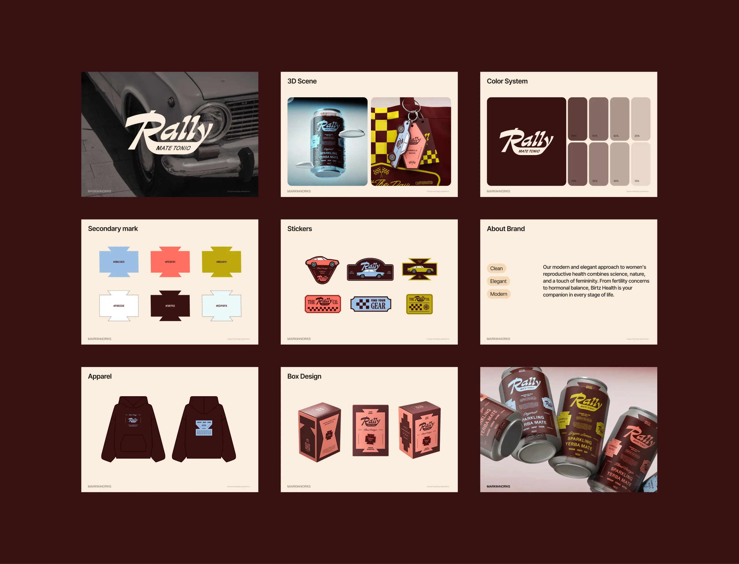
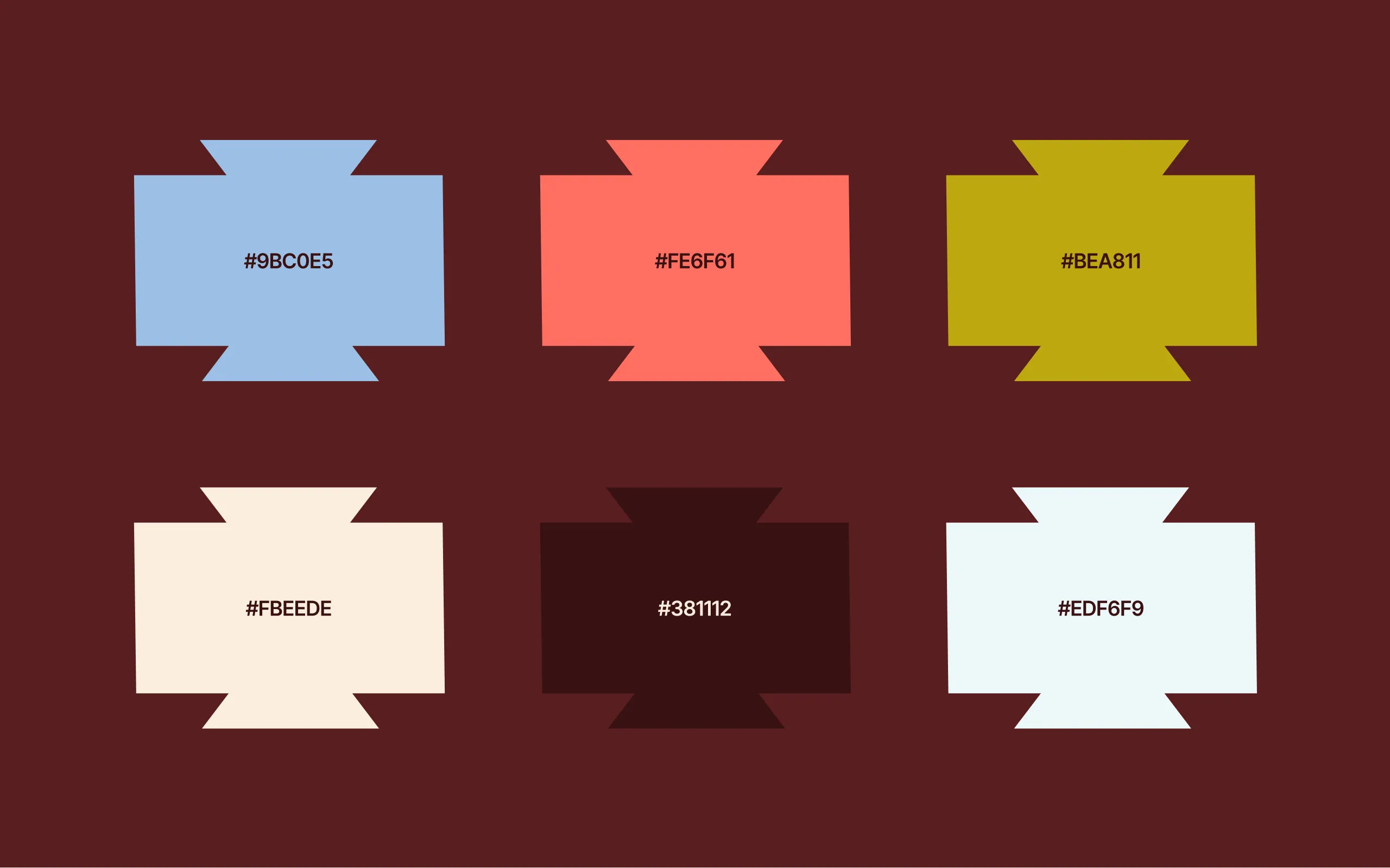
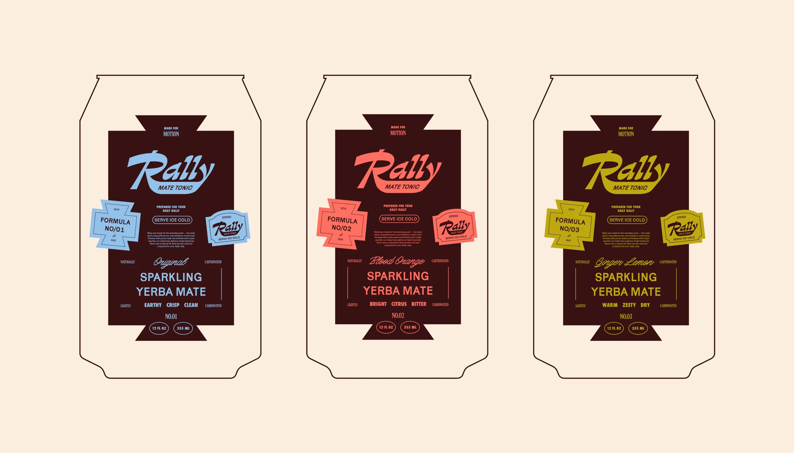
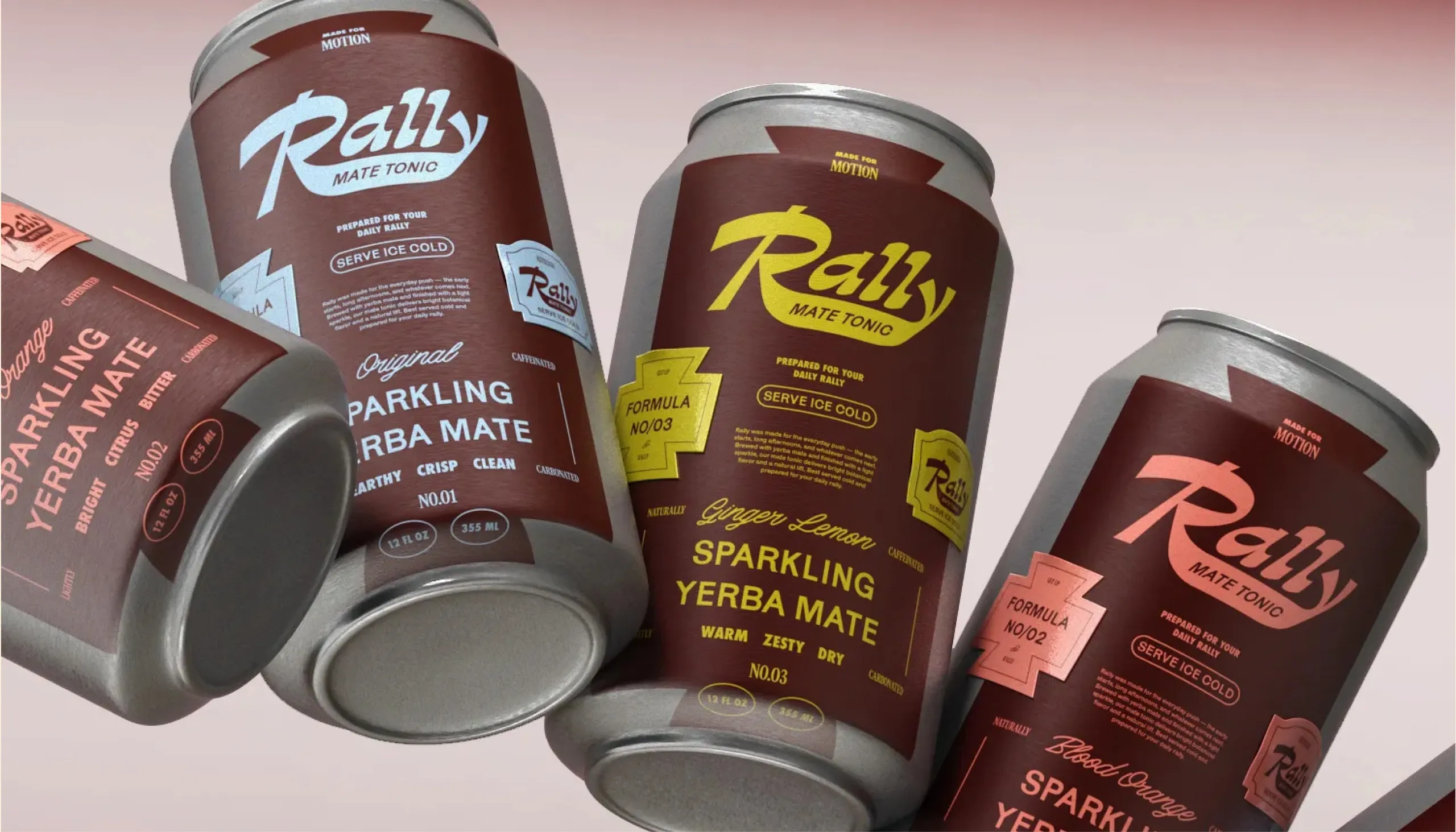
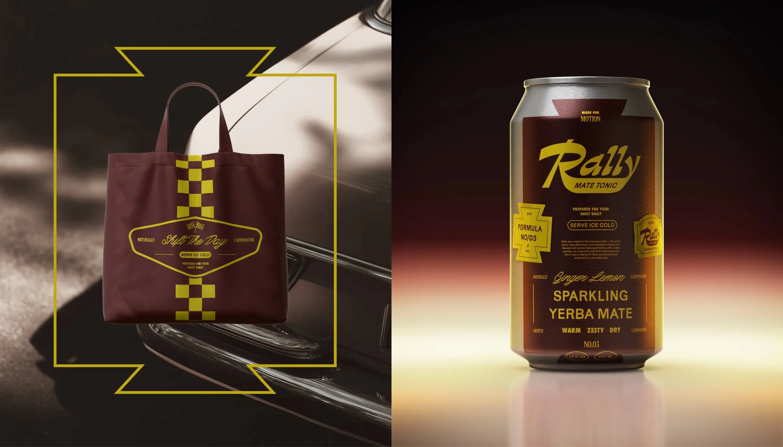
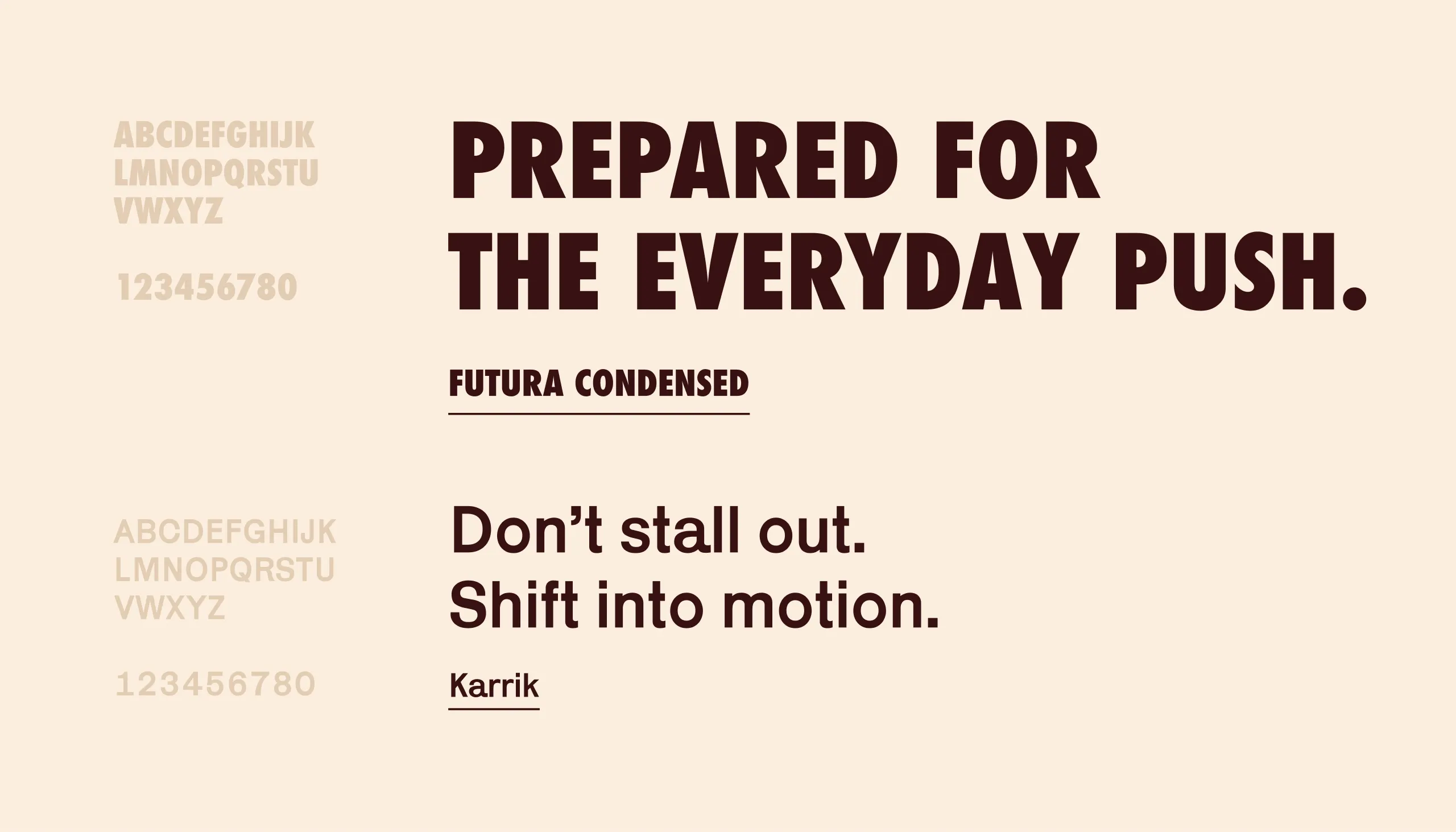
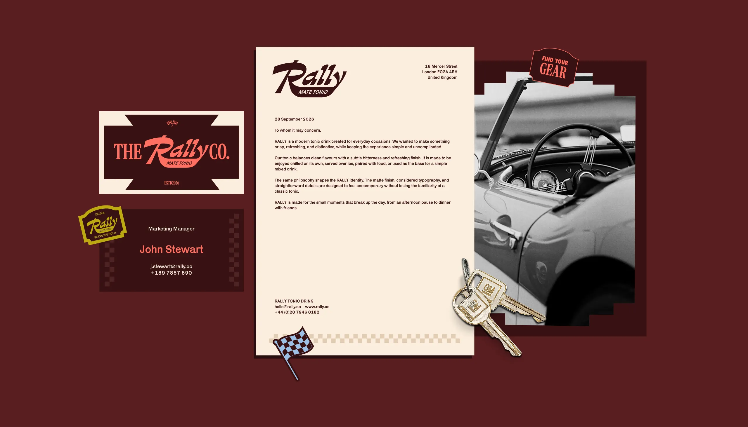
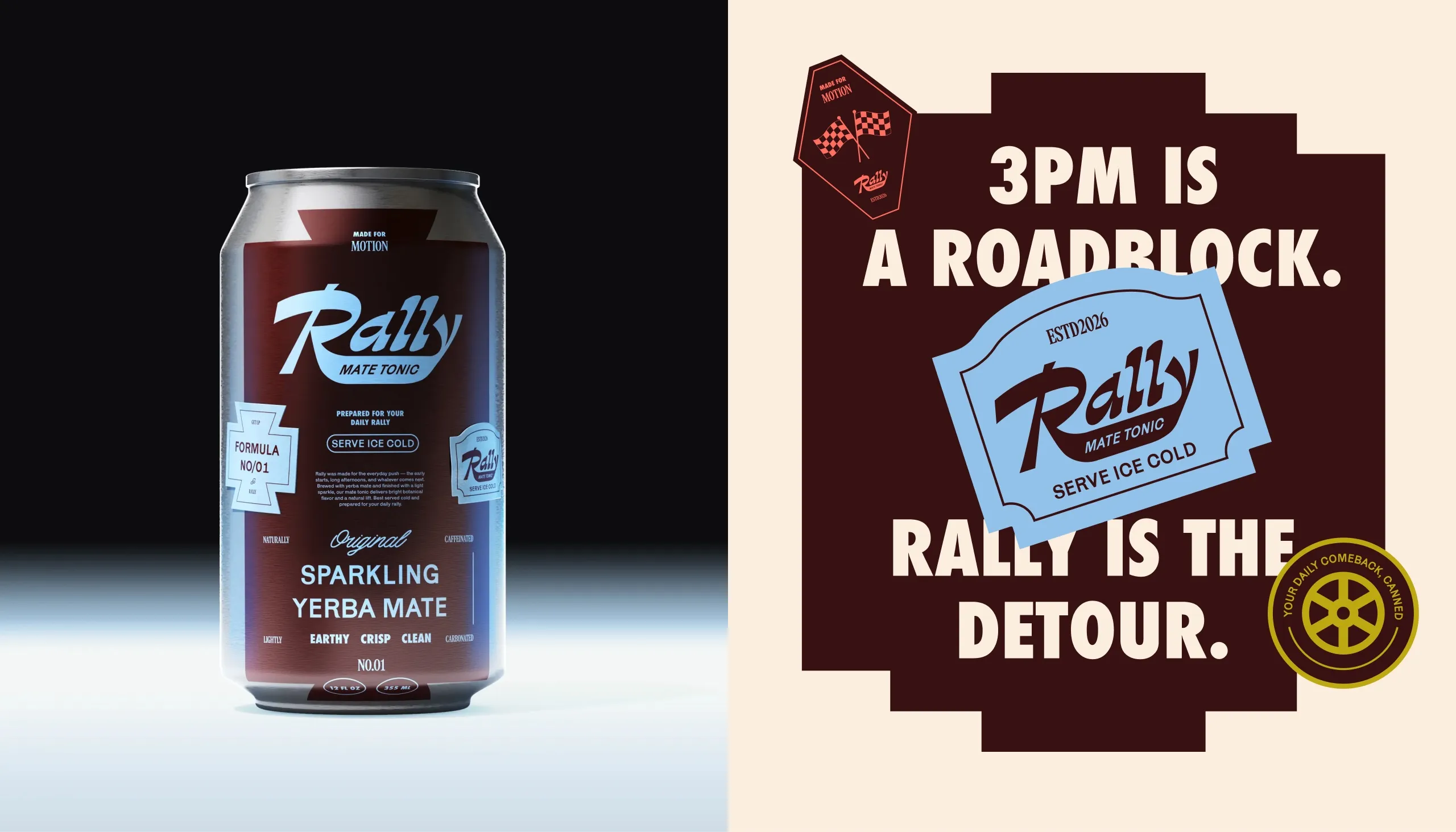
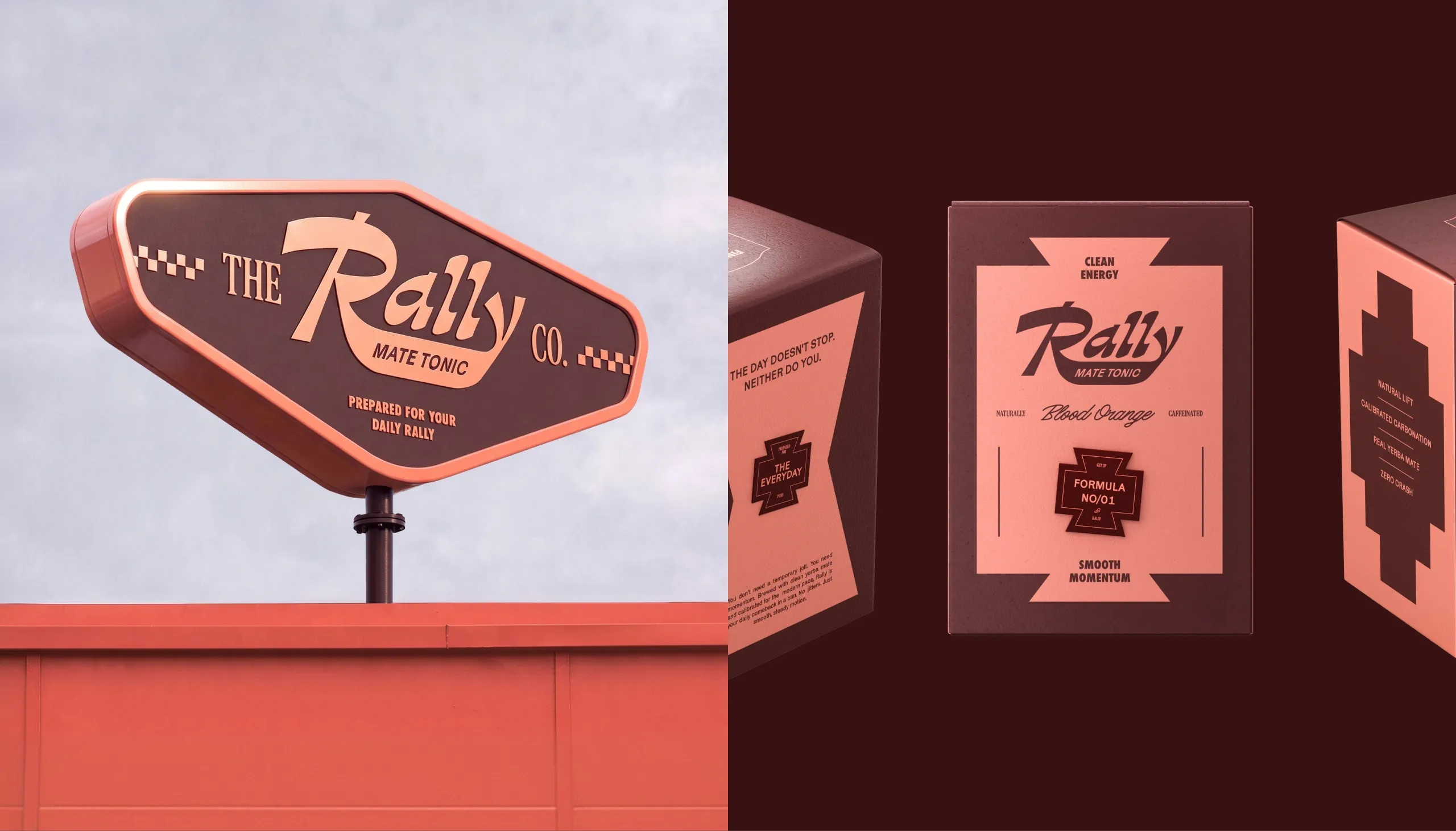
Rally is positioned less as an energy boost and more as a way to regain momentum during the day. A custom script wordmark, motorsport-inspired badges, checker patterns and bold condensed typography create a visual language built around movement. Deep burgundy forms the base of the system, while blue, coral and yellow act as flavour-specific signals across the range.
The Process
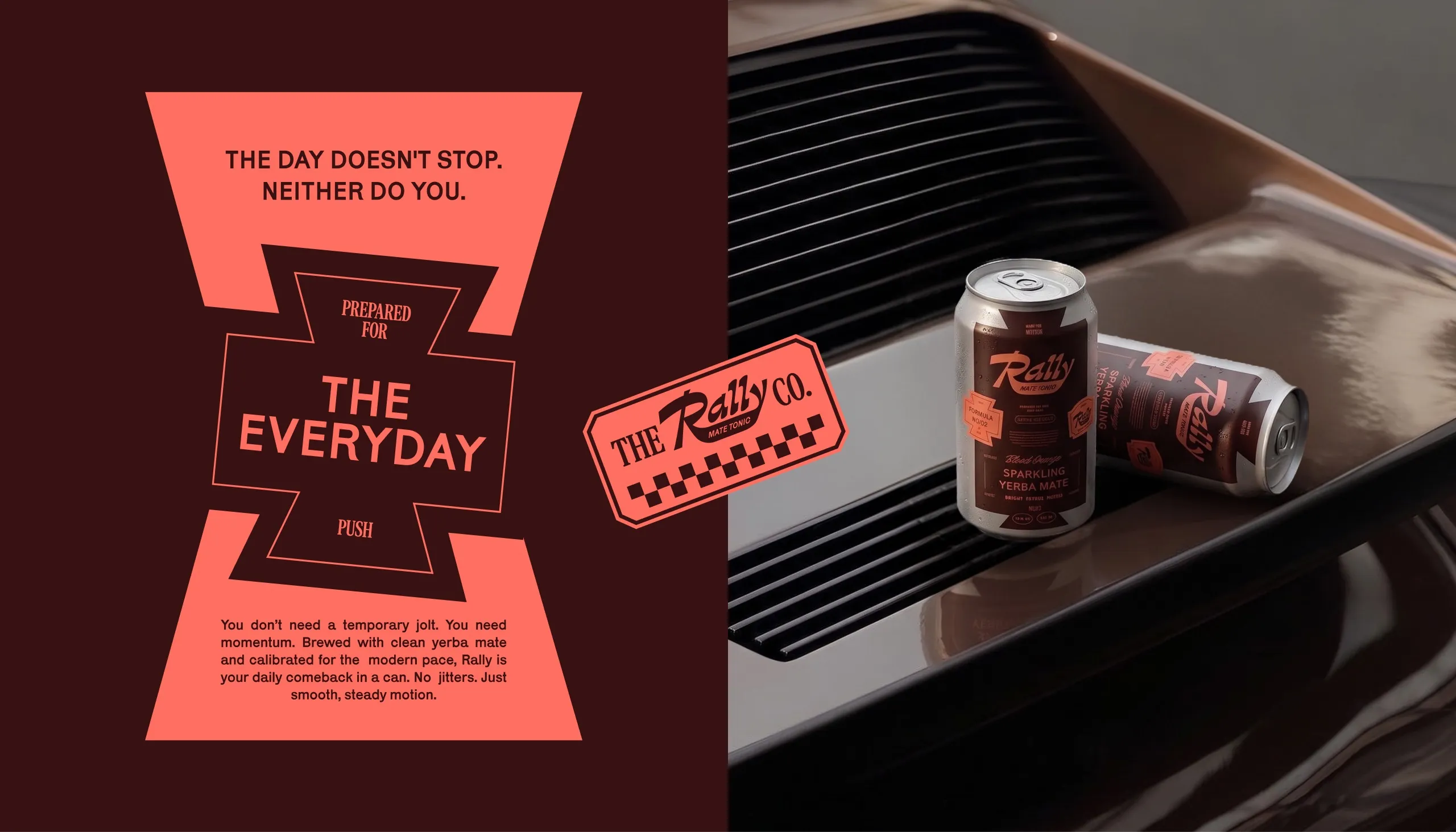
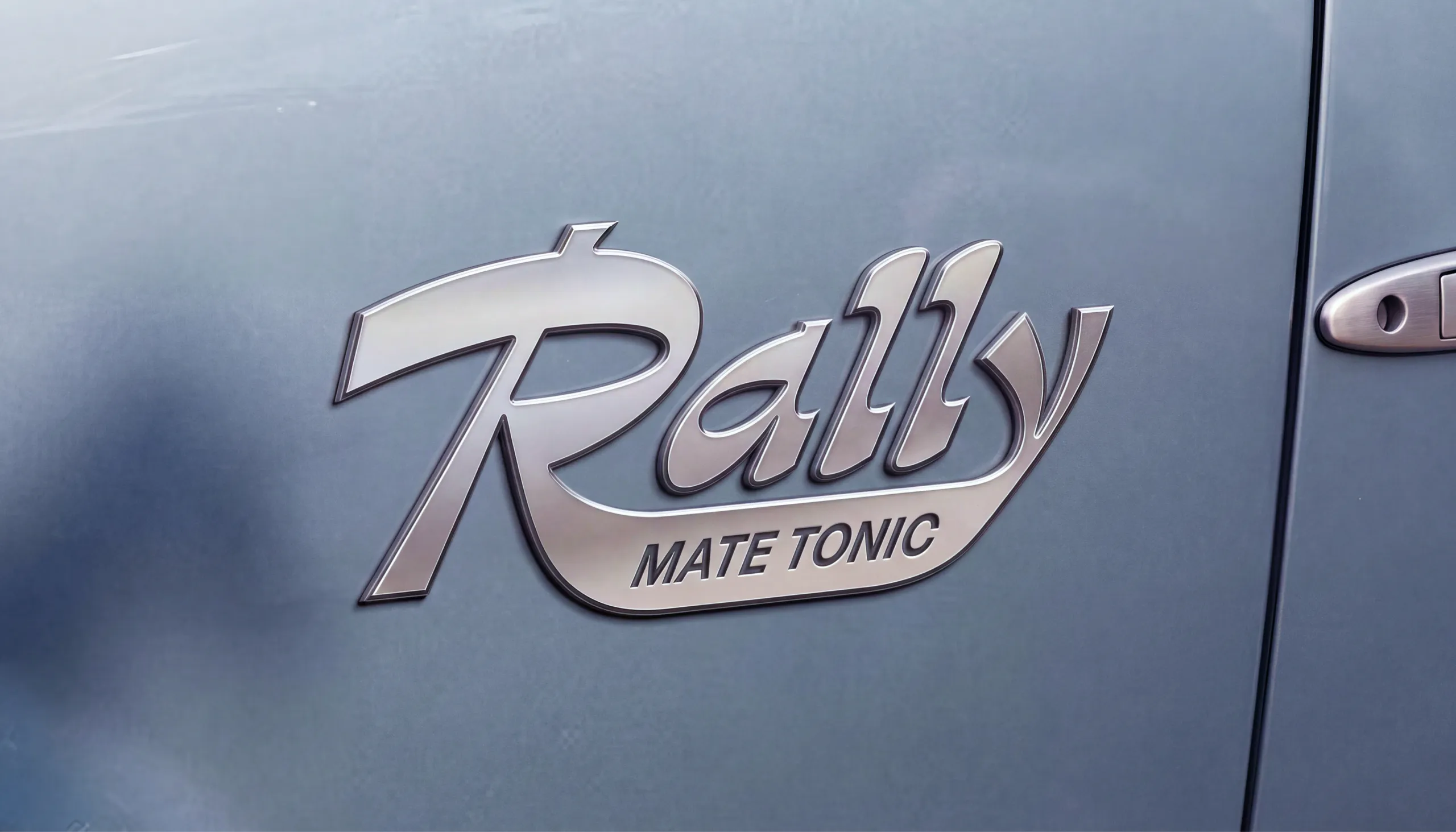
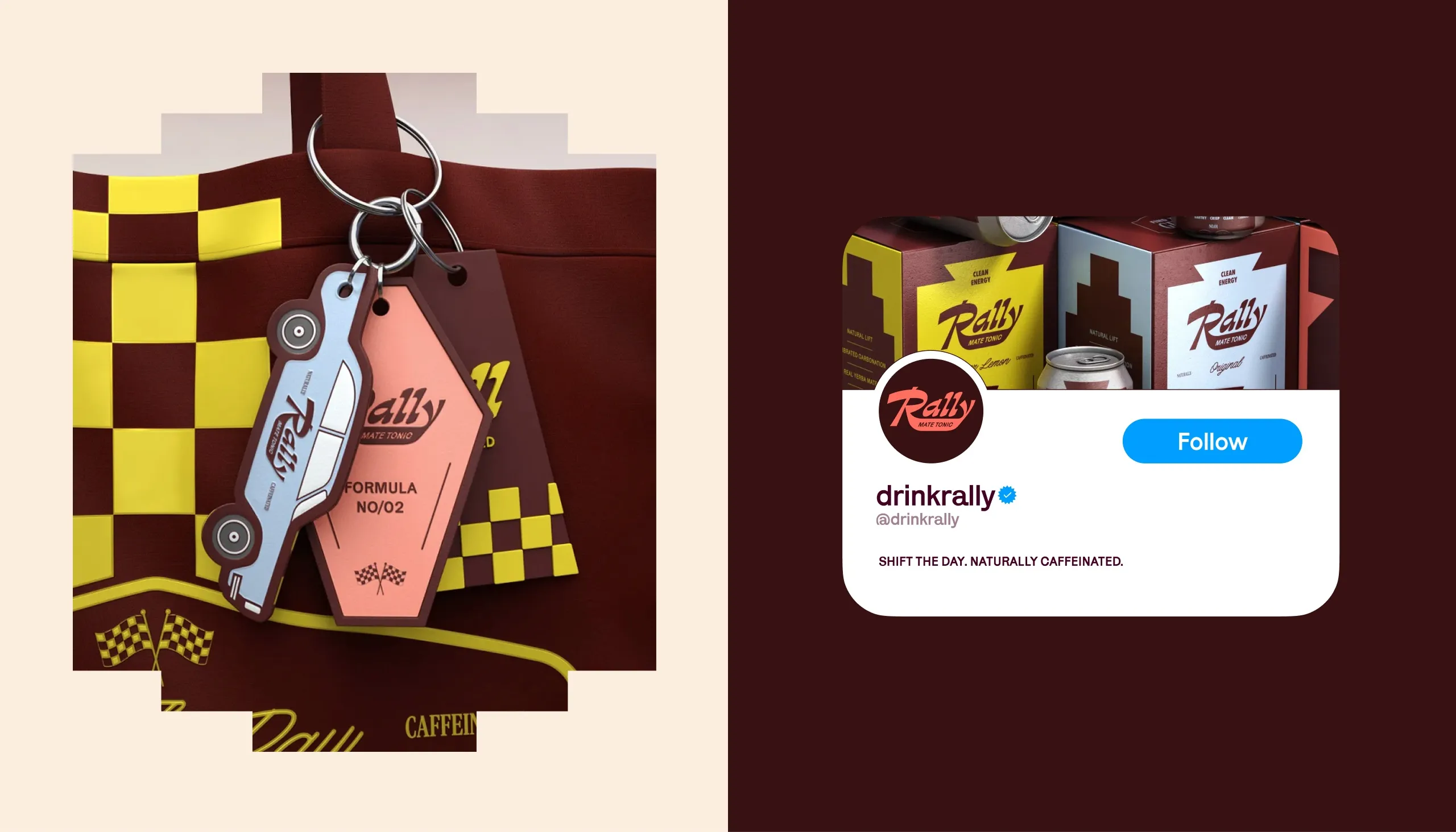
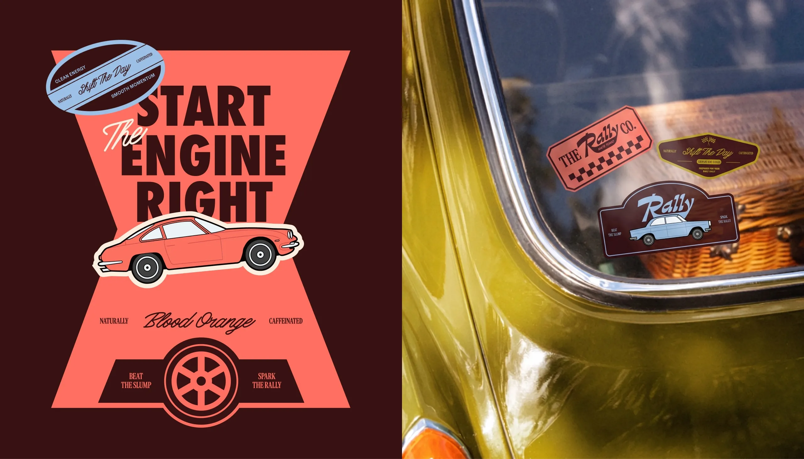
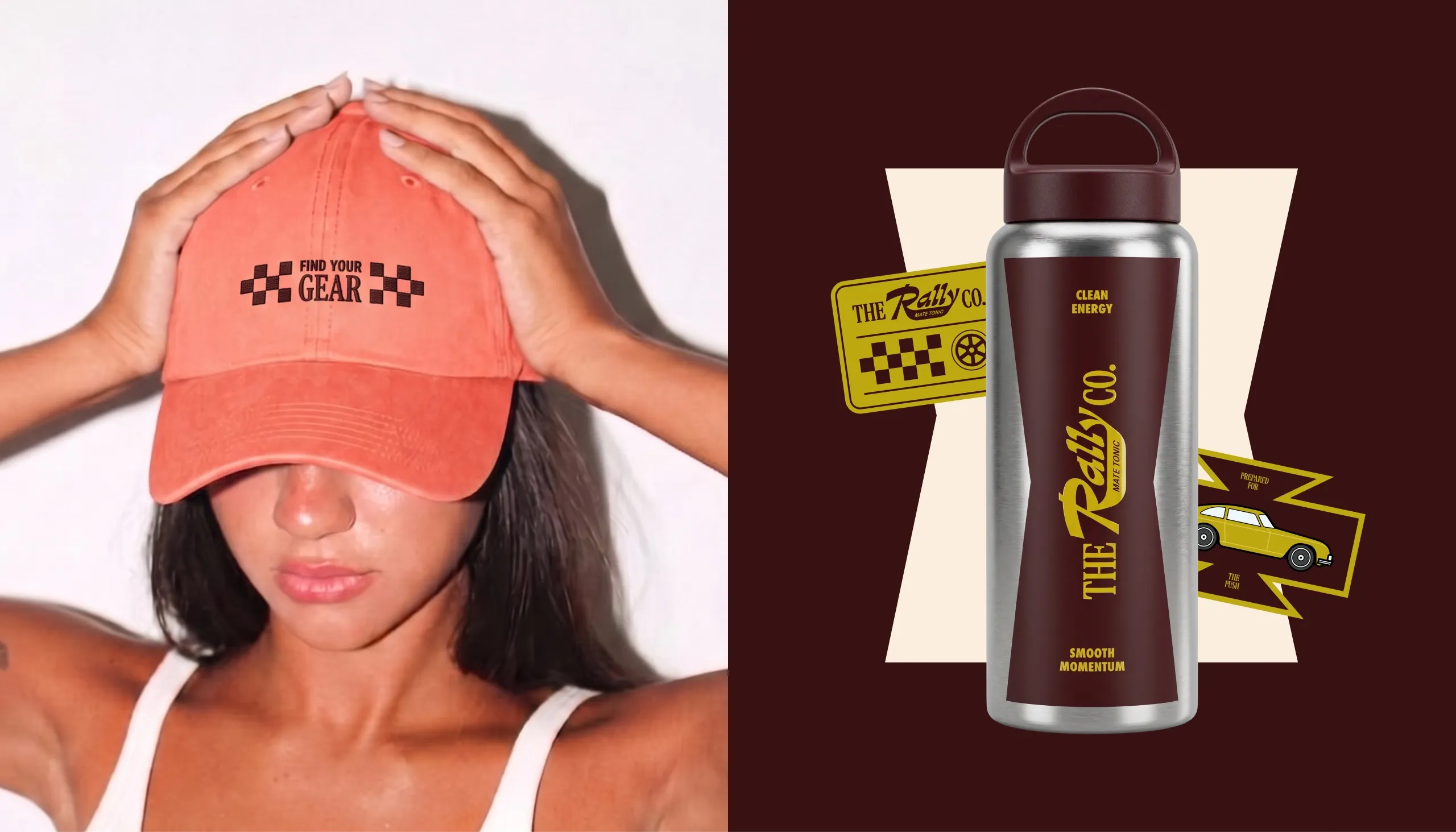
The Rally wordmark combines the fluidity of hand-painted automotive lettering with the speed and attitude of vintage racing graphics. Around it, a secondary system of badges, tickets, directional forms, checker patterns and mechanical references creates a flexible identity that can shift between packaging, apparel, stickers and digital communication.
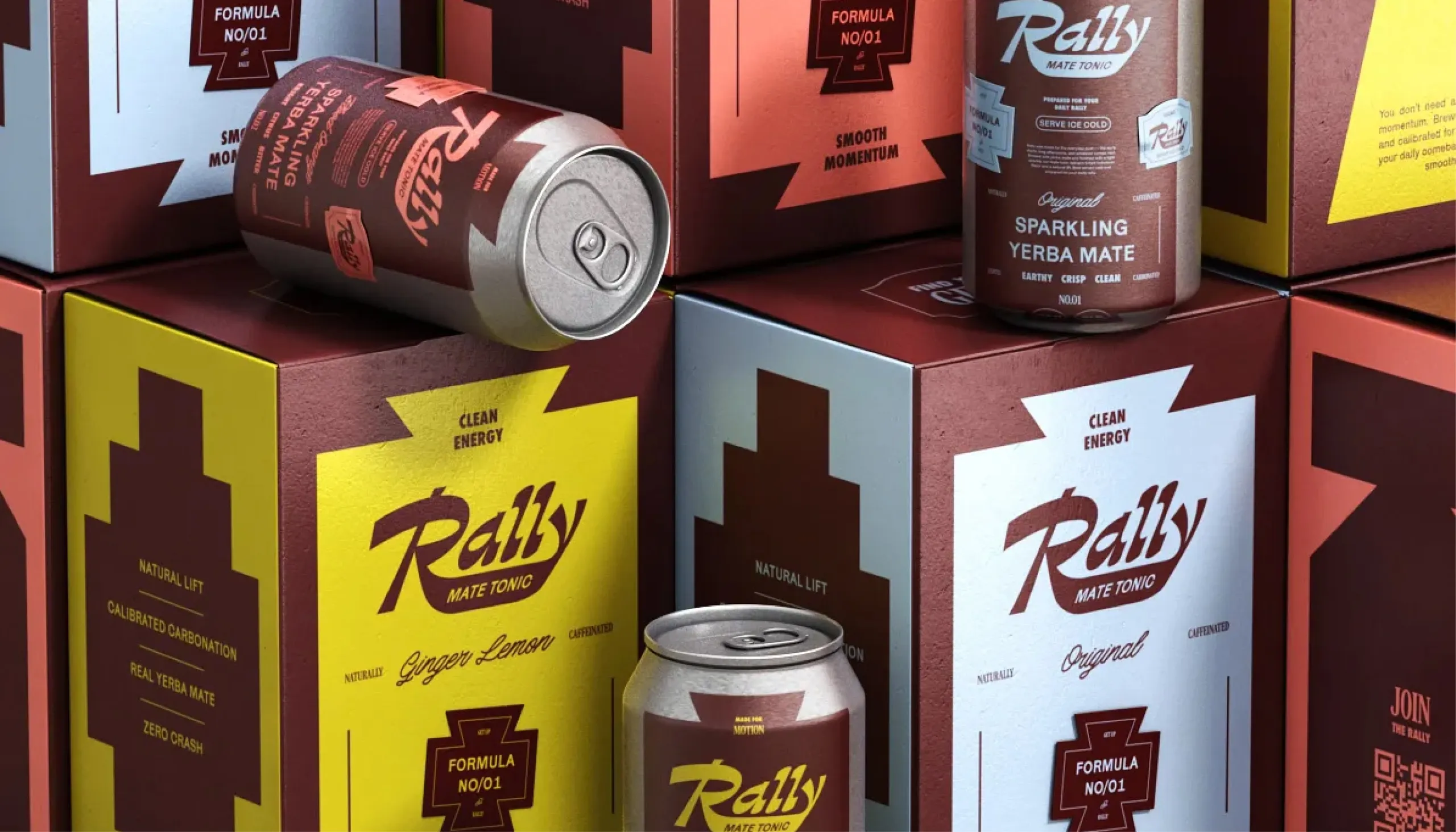
Packaging follows a consistent hierarchy: brand first, flavour and formula second, followed by product descriptors and functional information. Each variant uses the same structural layout while changing accent colour, allowing Original, Blood Orange and Ginger Lemon to feel distinct without fragmenting the range.
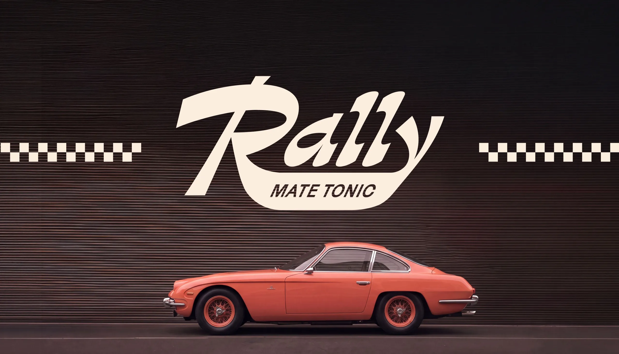
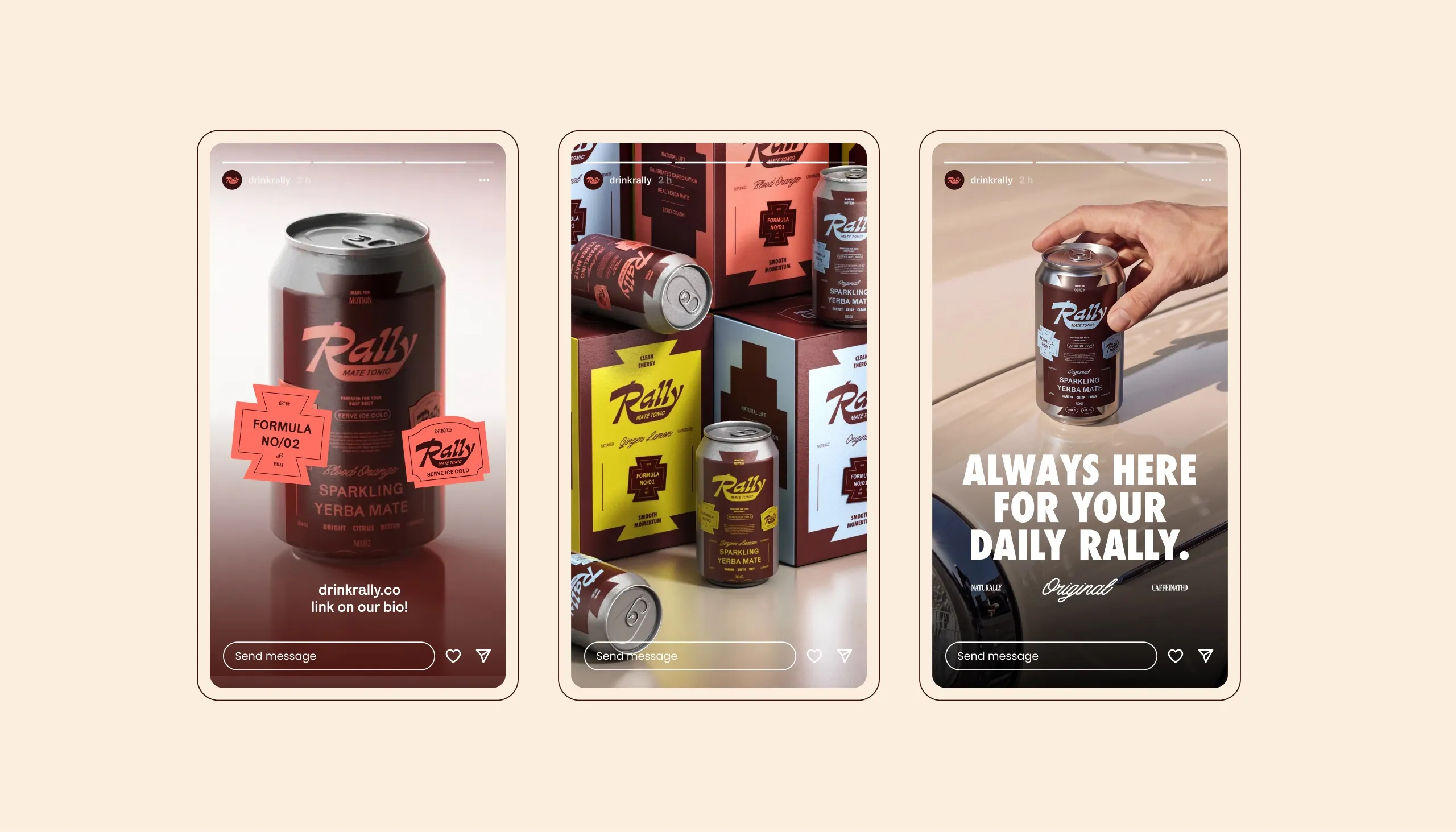
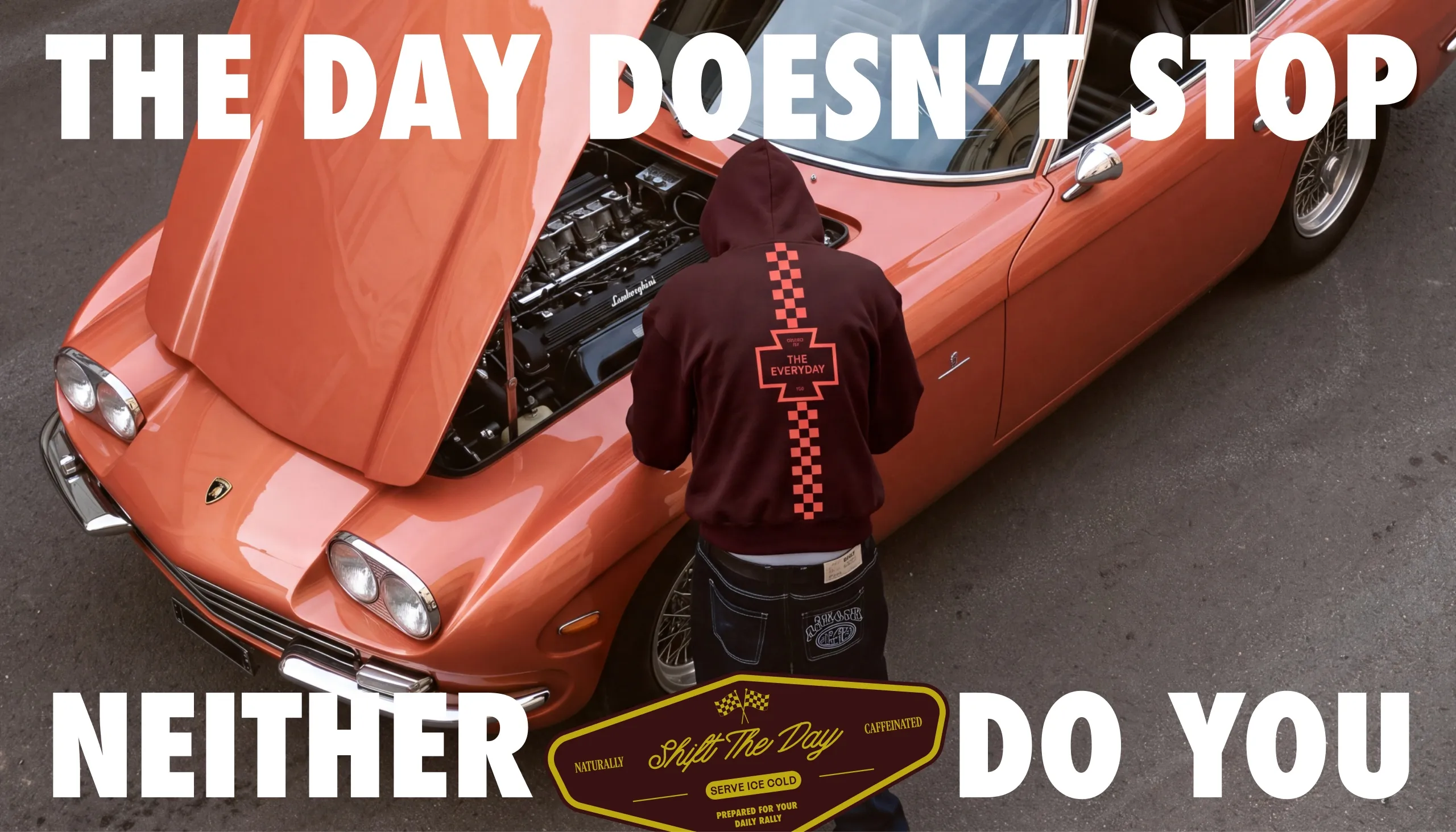
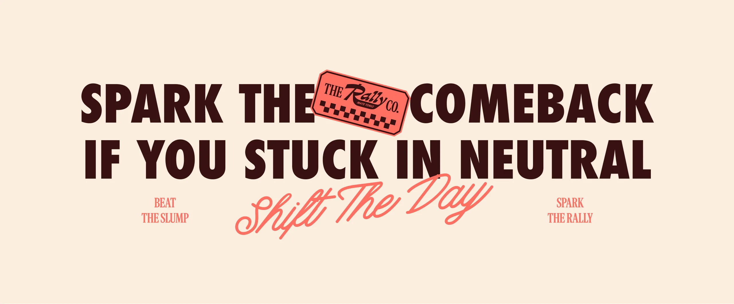
The wider art direction expands the idea of motion through classic cars, racing details, road culture and dynamic compositions. Phrases such as "The day doesn’t stop. Neither do you.", "Prepared for the everyday push." and "Spark the comeback." turn the brand voice into part of the visual identity, connecting product benefit with a broader lifestyle around momentum.
The Outcome
Rally combines natural energy, beverage packaging and automotive culture into one recognisable brand world. The system gives each flavour a clear identity while maintaining consistency across cans, multipacks, merchandise and social content. The result is a scalable platform that can grow with new flavours, products and collaborations without losing the brand’s sense of movement.
See more food and drink branding case studies.

Let’s make the work they’ll copy.
Talk to an expert now
Work with a 38 team of the
industry’s top 1% talent.